Posts

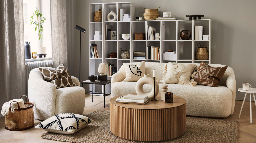
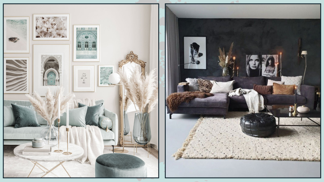
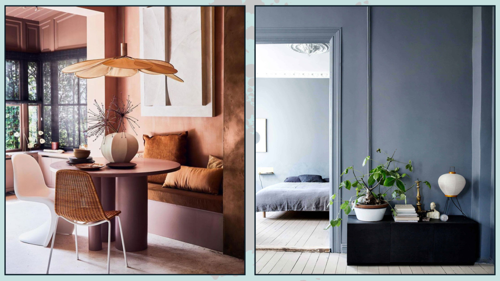
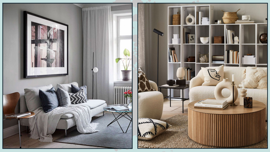
Decorating a home with geometric shapes and patterns is a great way to add character to a space and make it feel special and unique!

Geometric shapes and patterns are versatile and unique elements for decoration!

Today, I’d like to explore with you how and where to use these designs to give your spaces an eye-catching and original look!

GEOMETRIC SHAPES AND PATTERNS

Let’s start by taking a look at different shapes and what patterns actually are.

GEOMETRIC SHAPES

The basic geometric shapes are the square, the circle, and the triangle.

Just like colors, these three shapes have symbolic meanings that are good to know to use them in the best possible way:

– The square is a symbol that represents the Earth.

Thanks to its straight, parallel sides, it conveys a sense of solidity, stability, balance, and protection.

– The circle is a symbol that represents the sky.

Its shape, with no sharp edges, feels like an embrace!

And since it has no beginning or end, it also represents spirituality and the idea of cycles and continuity.

– The triangle sits in between.

It has a stable base like the square, but its two slanted sides point upward, giving it energy, movement, and vibrancy!

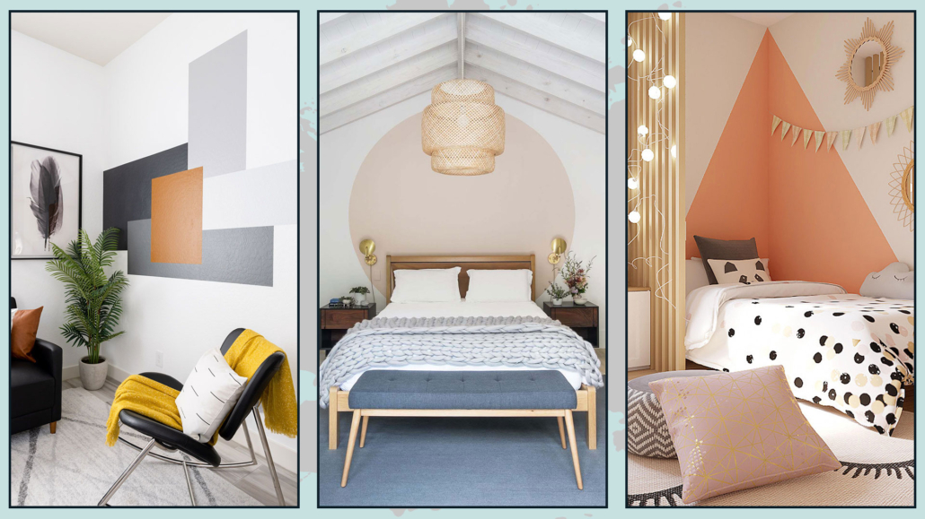
(credits: Anjo Tintas e solvente;blog.mybespokeroom.com; Decoideas)
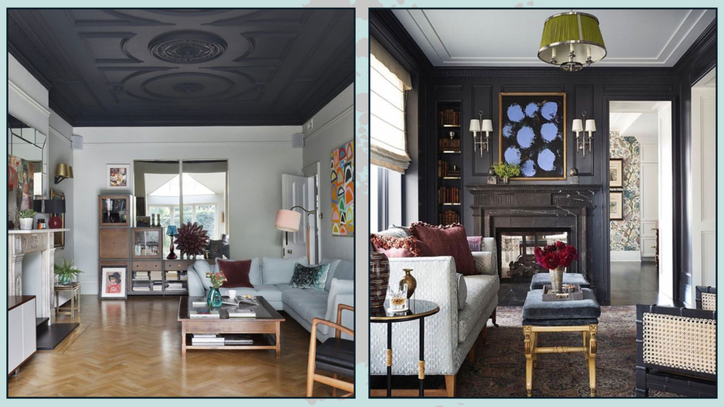
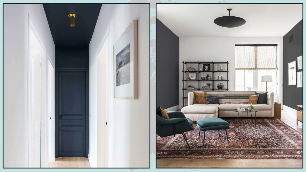
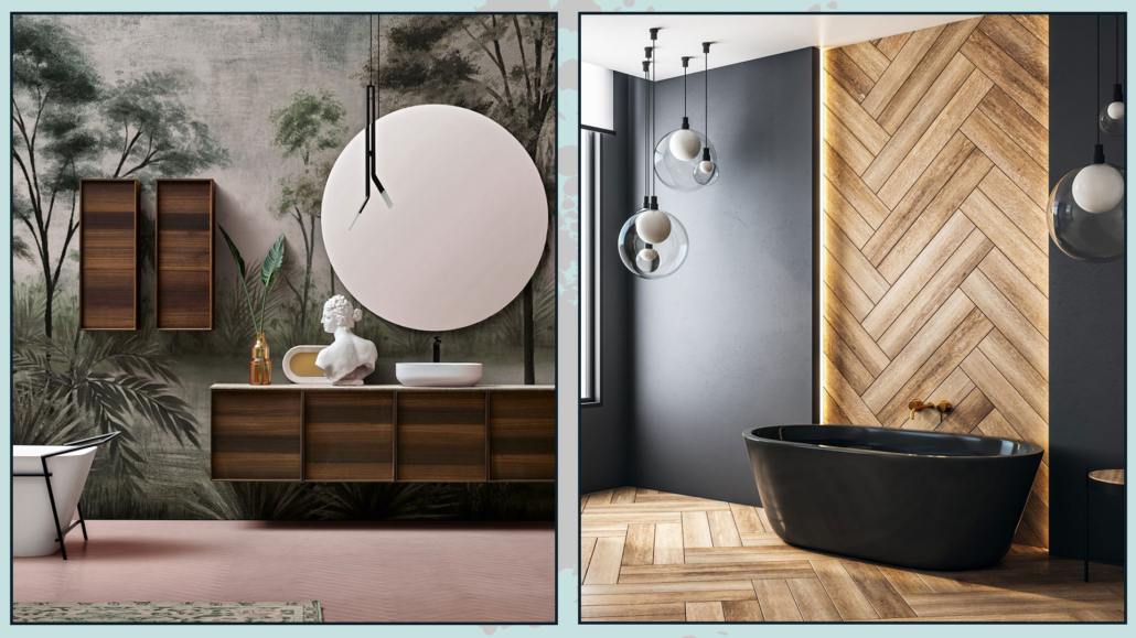
LINES

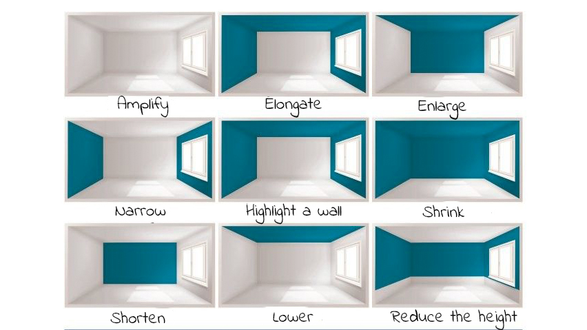
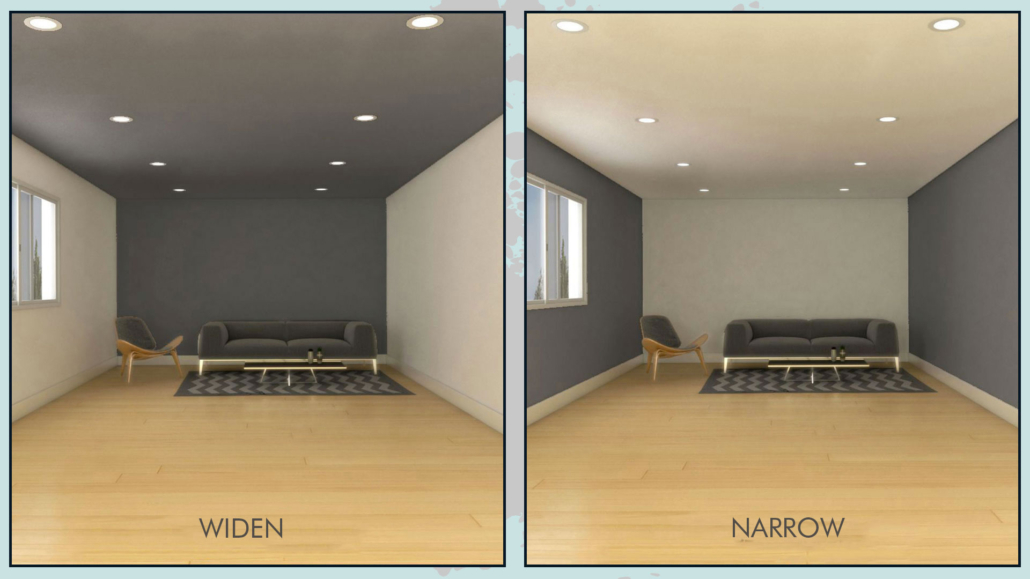
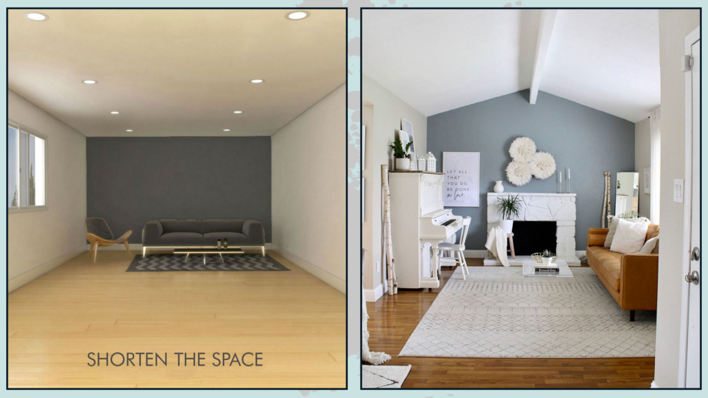
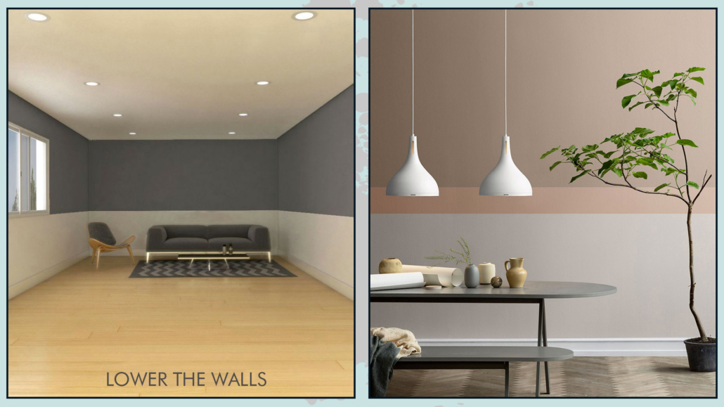
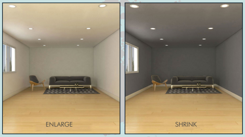
– Vertical lines symbolize strength – when used on walls, they visually make a space appear taller.

– Horizontal lines symbolize balance – when used on walls, they visually make a room look wider.

– Diagonal lines, often used in contrast to each other to create the pattern known as Chevron, are dynamic and lively.

When applied to walls, they can also make a space feel broader!

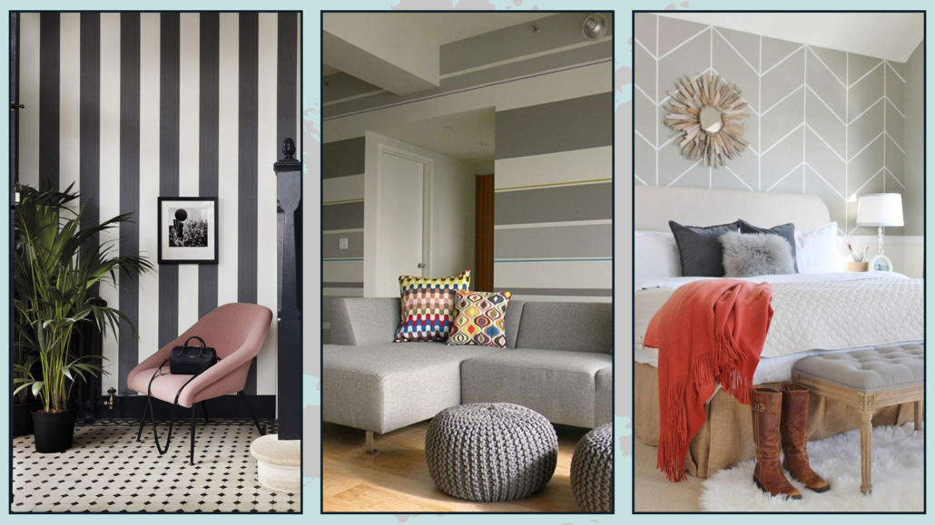
(credits: verniciroma.it; tuttocasa-piemonte.com; cityfarmhouse.com)

PATTERNS

A pattern is a decorative design that repeats vertically, horizontally, or diagonally.

There are countless types of patterns in all shapes, sizes, and colors, and they definitely add movement and rhythm to a space!

(credits: Serena & Lily; archiproducts.com; medium.com)

HOW AND WHERE TO USE THEM?

How and where to use geometric shapes and patterns to decorate your home?
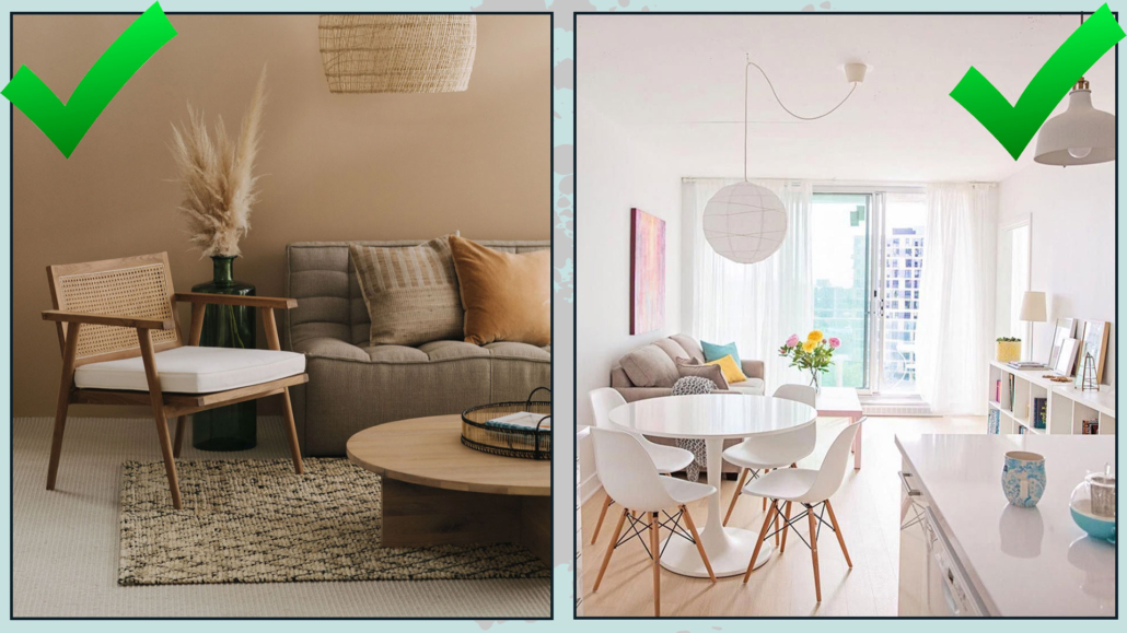
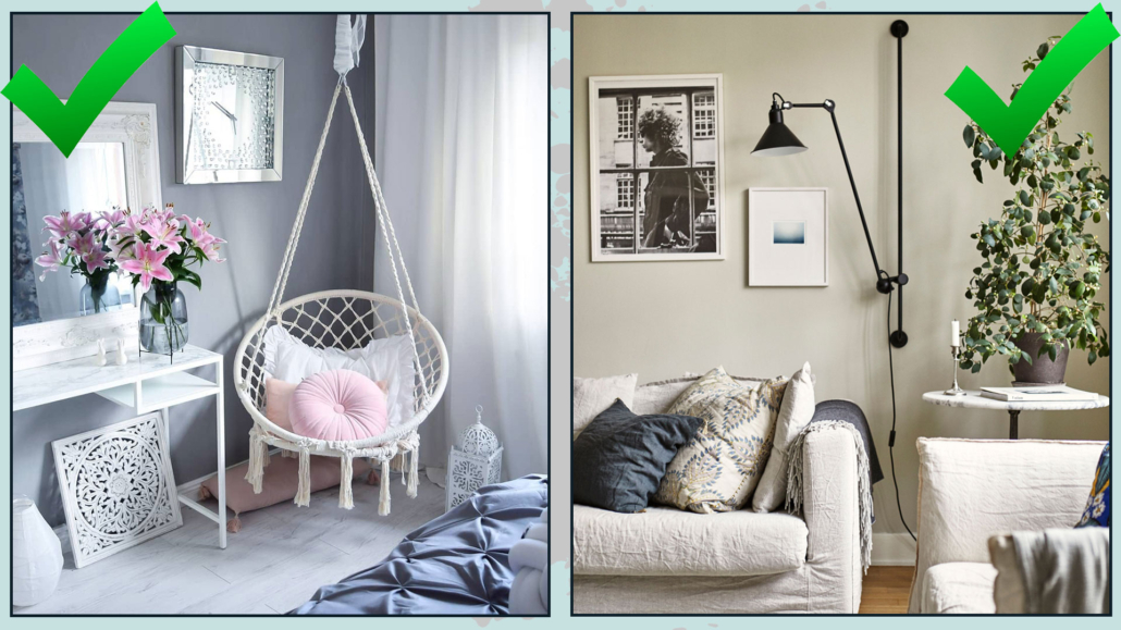
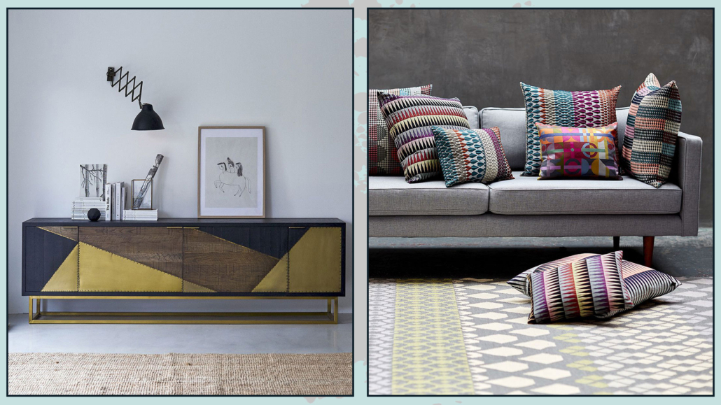
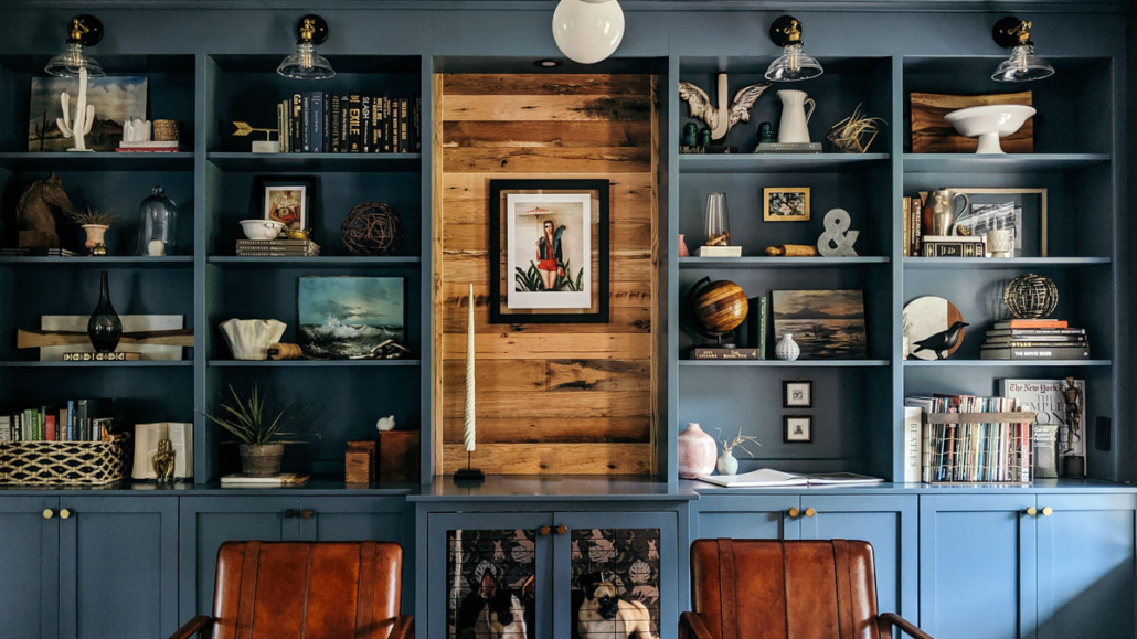
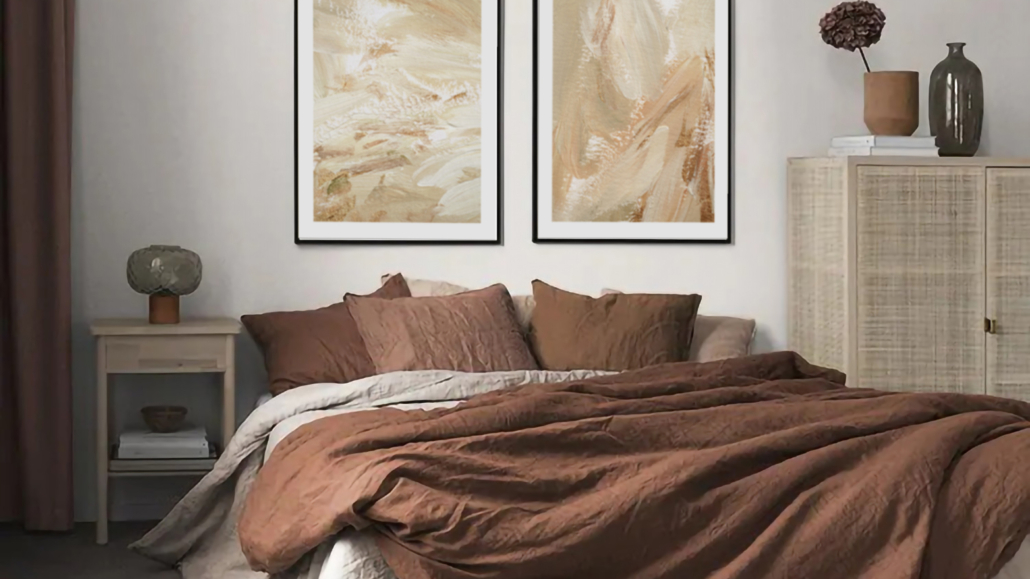
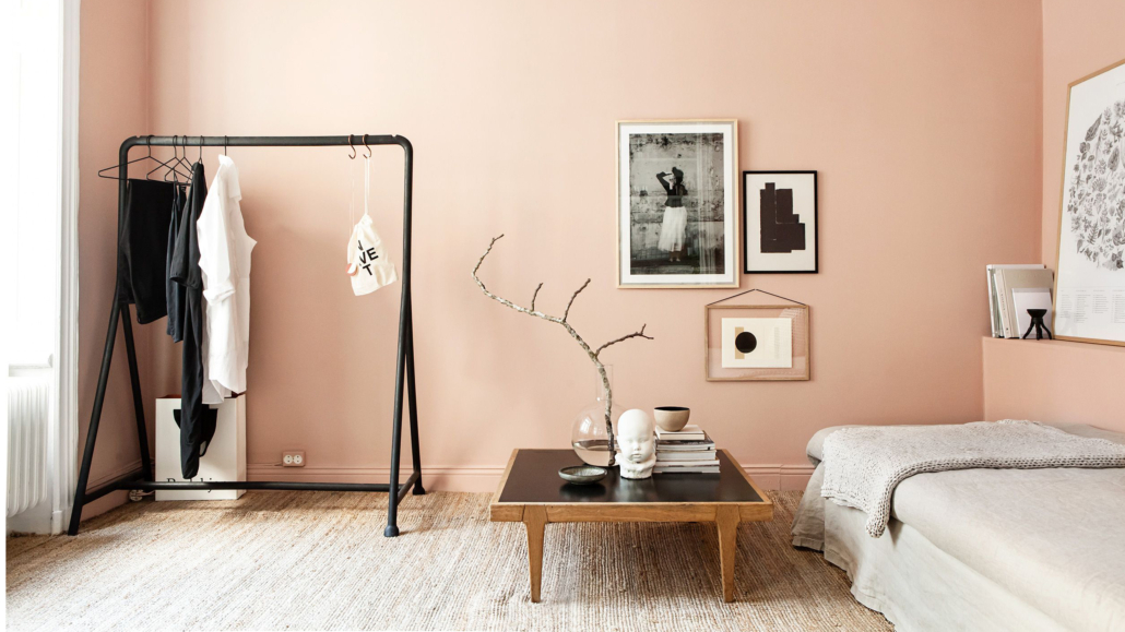
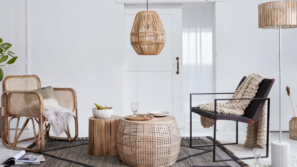
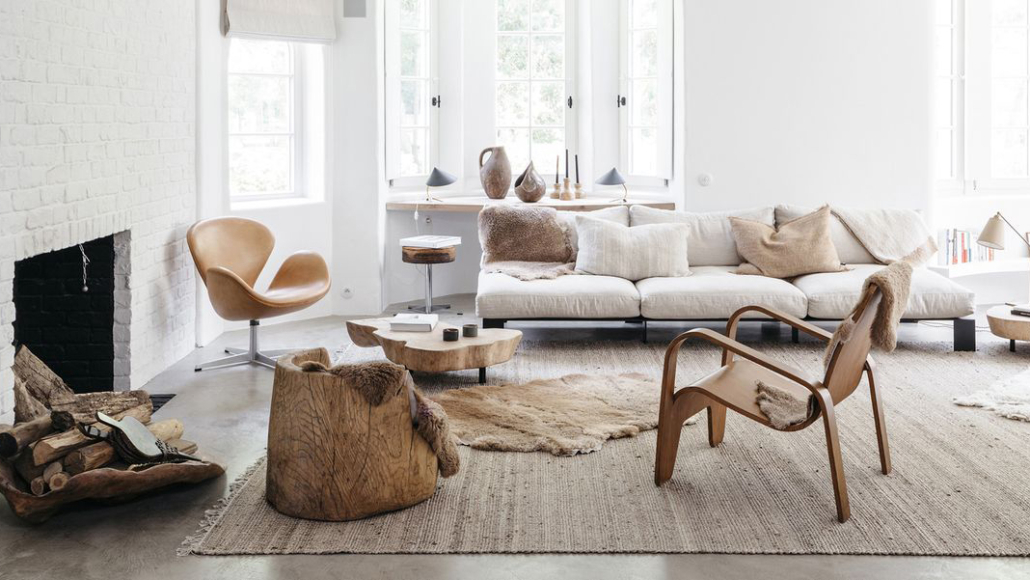
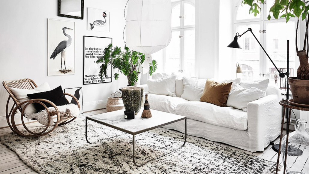
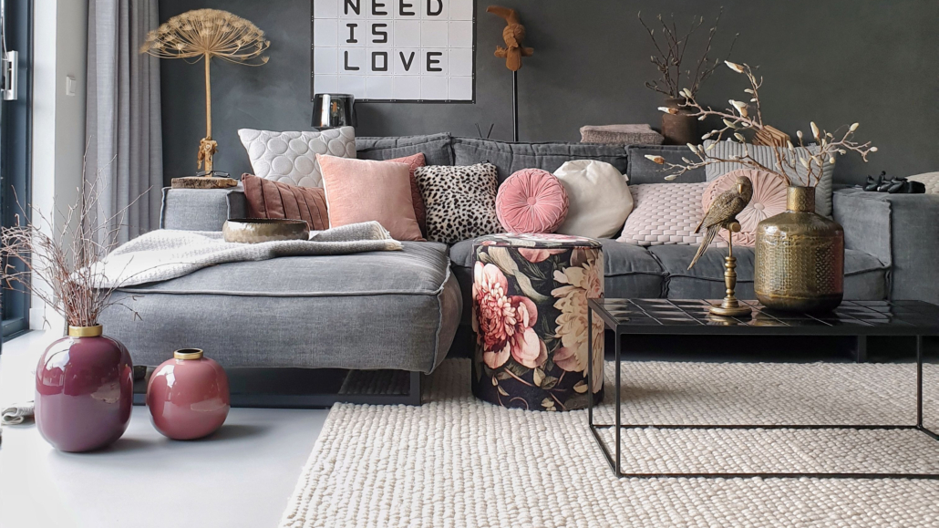
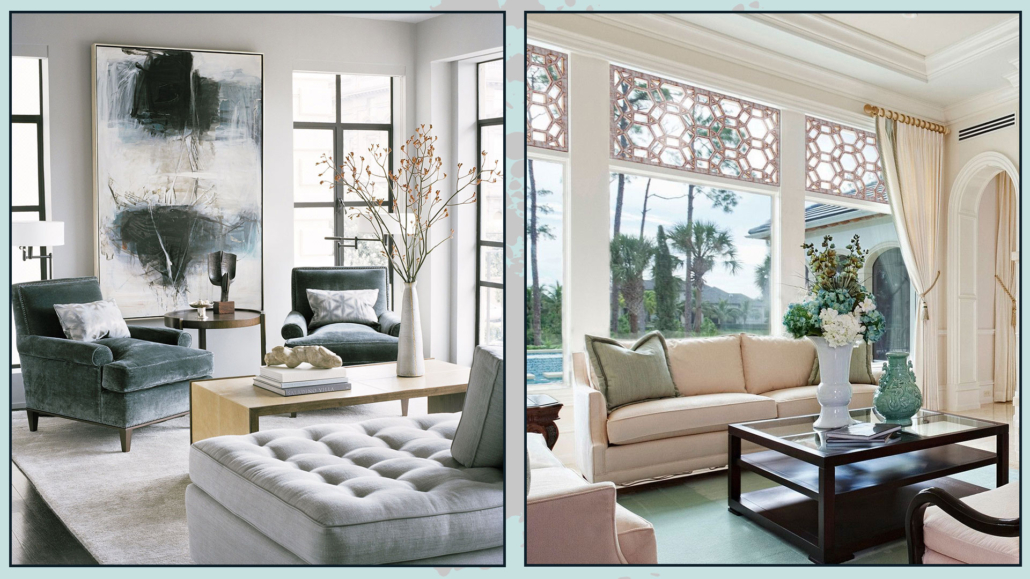
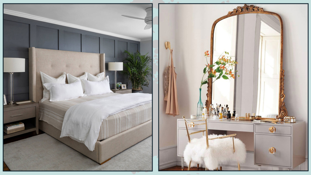
FURNITURE & DECOR

That is the best way to introduce these types of designs in small doses!

You can find furniture or accessories with geometric shapes or patterns.

Textiles are an easy win: you’ll definitely come across lots of curtains, cushions, and rugs featuring these motifs.

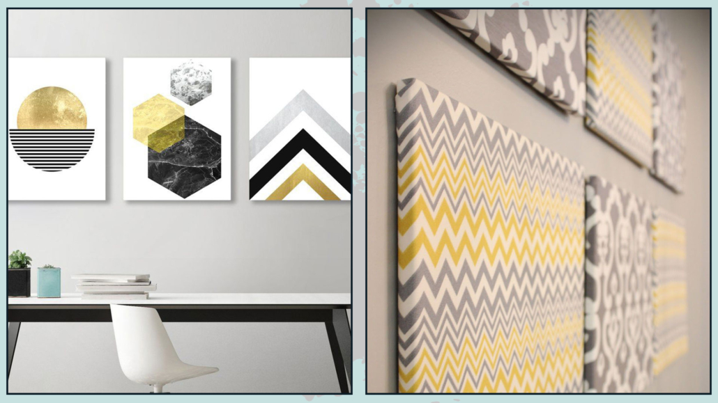
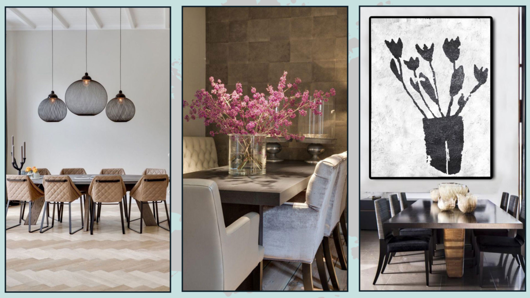
You can also decorate your walls with geometric-patterned artwork, which you can make yourself!

Try using colorful wall decals, or if you are a bit crafty, paint directly onto the surface.

If you love patterns, you can also create wall art using fabrics in the designs and colors you like most.

These will be truly unique and personal touches for your space!

(credits: tikamoon.it; margoselby.com)

(credits: americanflat.com; livingspaces.com)
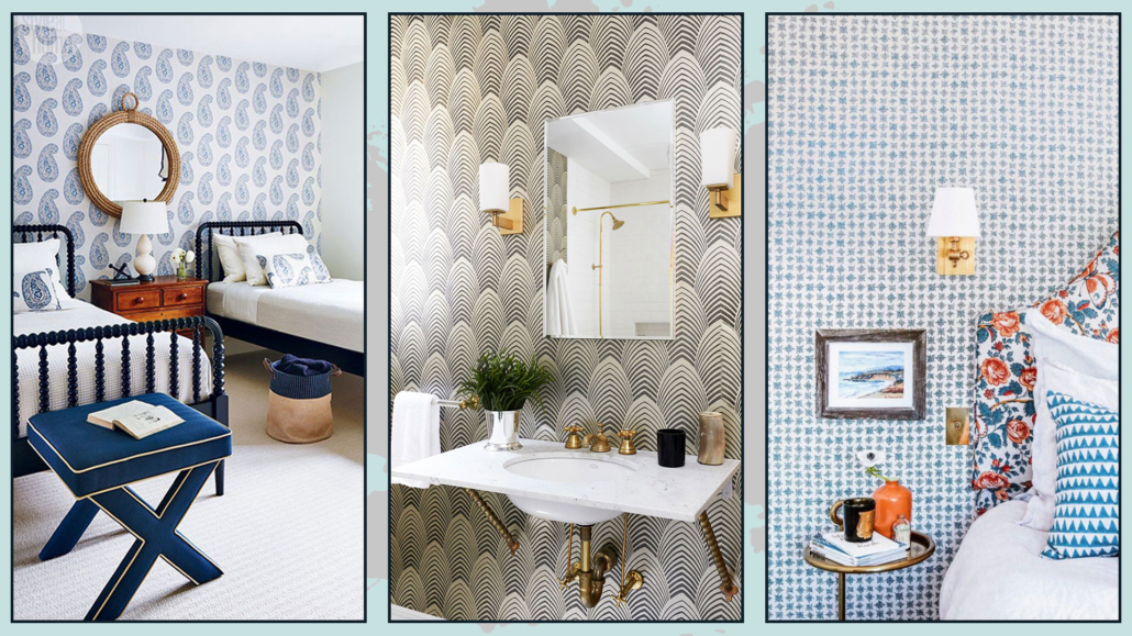
WALLS

You can decorate your walls with geometric shapes and patterns in many ways:

– Tiles

– Paint

– Wallpaper

– Wall decals

– Wainscoting or paneling
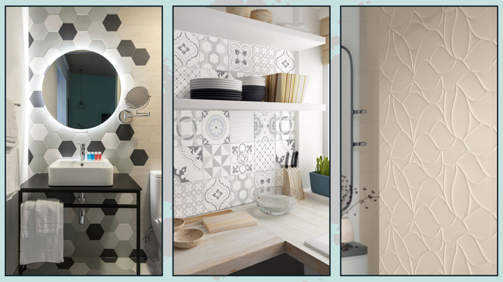
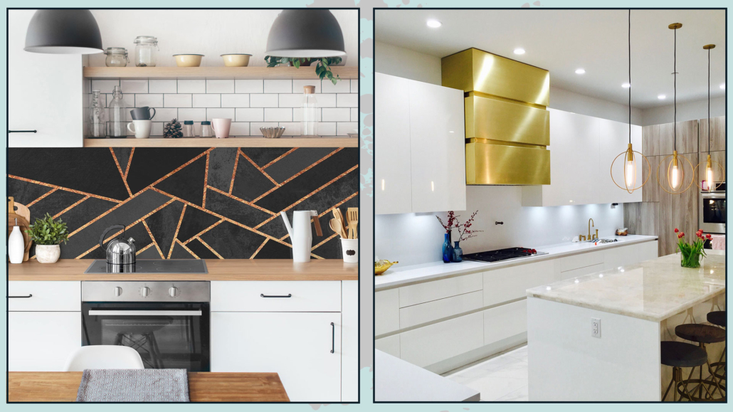
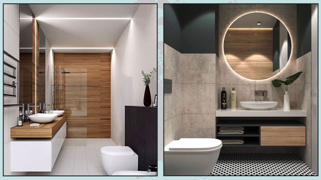
– TILES

Tiles are most commonly used on walls in the kitchen—usually as a backsplash—and in the bathroom, especially around the shower or bathtub area.

There’s a great variety to choose from: you can go for hexagonal tiles or ones with decorative patterns.

There are even 3D tiles that add texture and a tactile feel to your space!

And don’t forget—mosaic is also a pattern in its own right!

tiles to decorating geometric shapes and patterns

(credits: designmag.it; cesiceramica.it; dom_ceramiche)
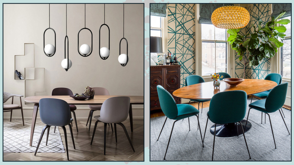
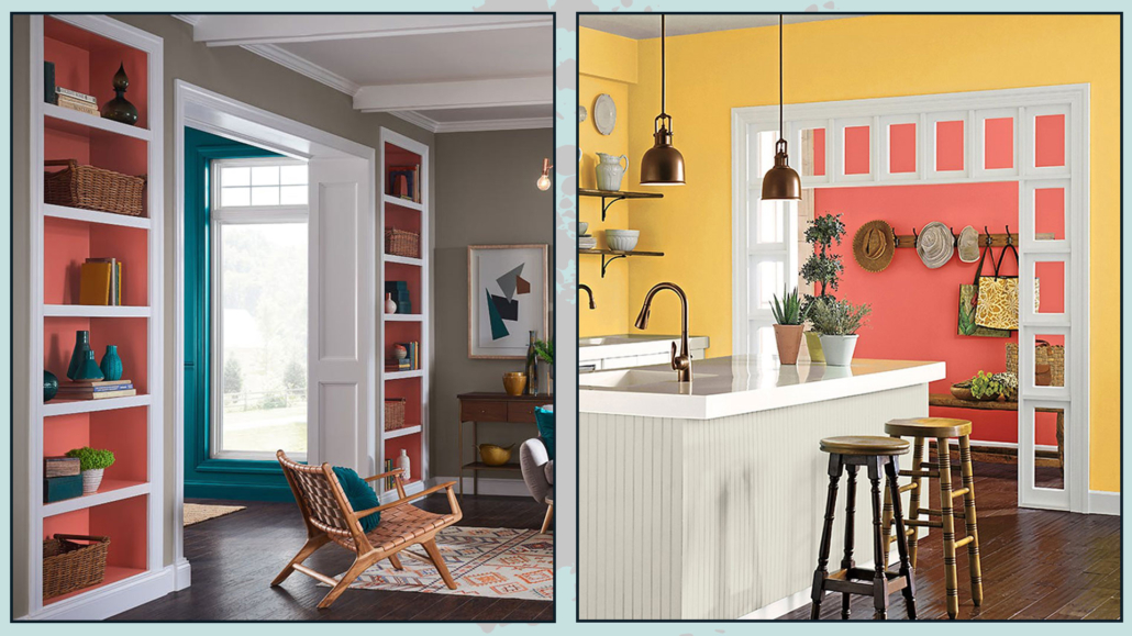
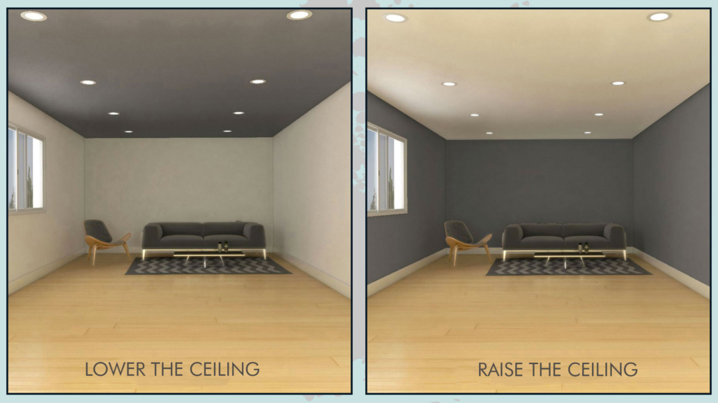
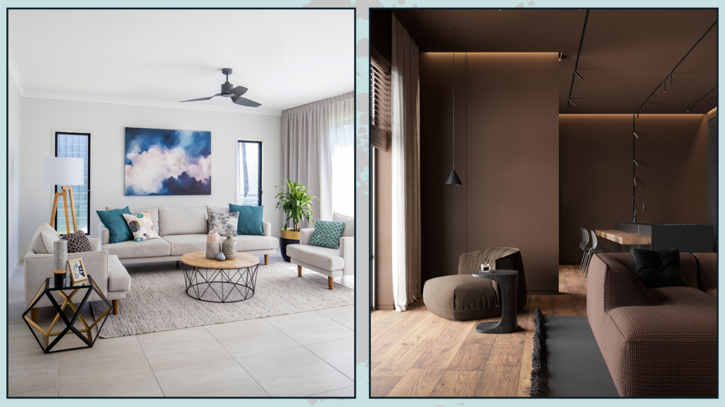
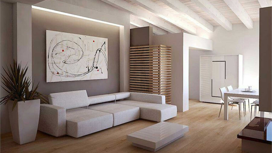
– WALL PAINTINGS

Beyond vertical and horizontal stripes, it’s quite common to see walls divided by diagonal lines forming large triangles, each painted in different colors.

But really, you can get creative with circles and squares, too – offering terrific alternatives!

For instance, a circle or square can frame artwork, shelves – or even highlight a sofa or dining table, giving these elements extra emphasis.

You can also use them to liven up a section of the wall that might otherwise feel a bit empty.

As always, it all depends on what you want to convey and the style of your home!

Remember, you don’t have to paint all four walls – even the chosen wall doesn’t need to be fully covered.

The goal is to create a focal point in the room!

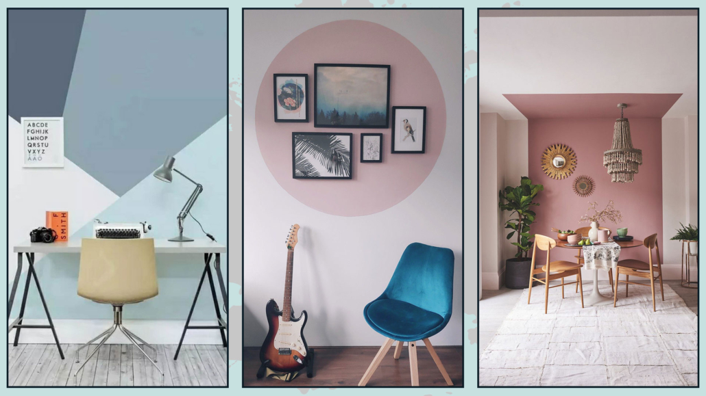
(credits: clubedastintas.com; pinterest; danilocesana.com)
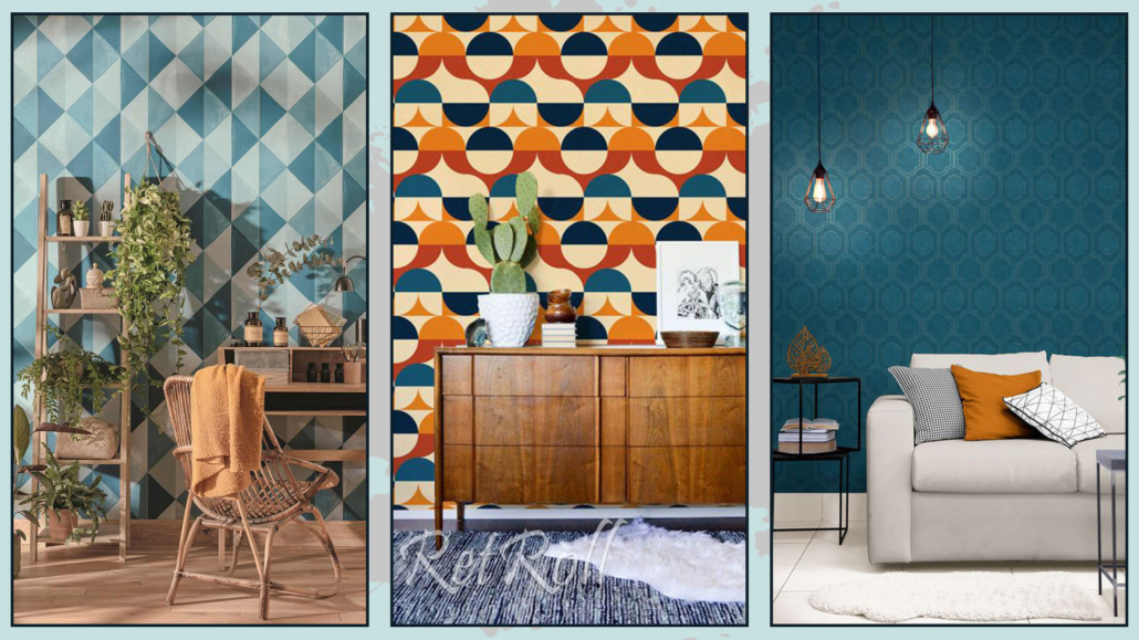
– WALLPAPER

These days, wallpaper comes in every style imaginable – including tons of options with geometric shapes and all kinds of patterns!

Finding one that perfectly fits your home’s style and color palette won’t be hard.

Like with paint, you don’t have to cover all four walls.

You can wallpaper an entire wall, or just a portion of it, to create that famous focal point!

Study the space and your furnishings carefully to decide where the wallpaper makes the most impact and how much to use.

wall paper to decorating geometric shapes and patterns

(credits: caselio.com; etsy.com; newwalls.as-creation.com)
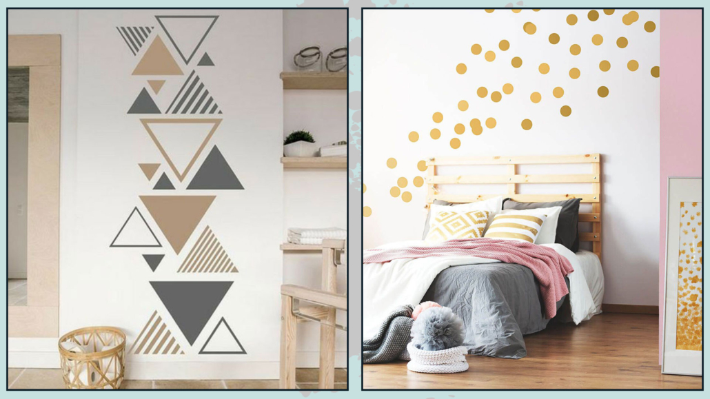
– WALL DECALS

A creative and definitely budget-friendly way to decorate your home with geometric shapes and patterns is by using wall decals!

You can buy them in ready-made shapes or get colorful adhesive sheets and cut them into any shape you like.

A little tip: before sticking anything to the wall, try laying out your design on the floor or a flat surface to see if it looks balanced and visually pleasing.

You could even test it directly on the wall using painter’s tape to hold the shapes in place—then, if you like the result, go ahead and stick them on for good.

Better safe than sorry!

decals patterns

(credits: wandtattoos.de; dreamstime.com)

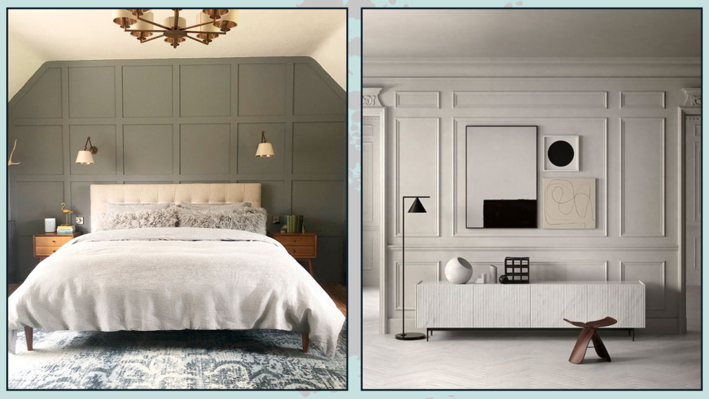
– WAINSCOTING OR PANELING

When I talk about wainscoting, as I said other times, I don’t mean the old-fashioned kind our grandparents used to have!

At its core, wainscoting is simply wood used as a decorative element on walls—and there’s so much you can do with it!

You can really get creative by designing geometric shapes with the wood, and if those shapes are repeated, they can even become patterns in their own right.

play with WAINSCOTING -decorating geometric shapes and patterns

(credits: The Light Shade Studio; salvatoriofficial.com)

FLOORING

If you think about it, all floors are made up of geometric shapes and, through the repetition of tiles, create patterns.

But there are also creative ways to design more playful, eye-catching flooring!

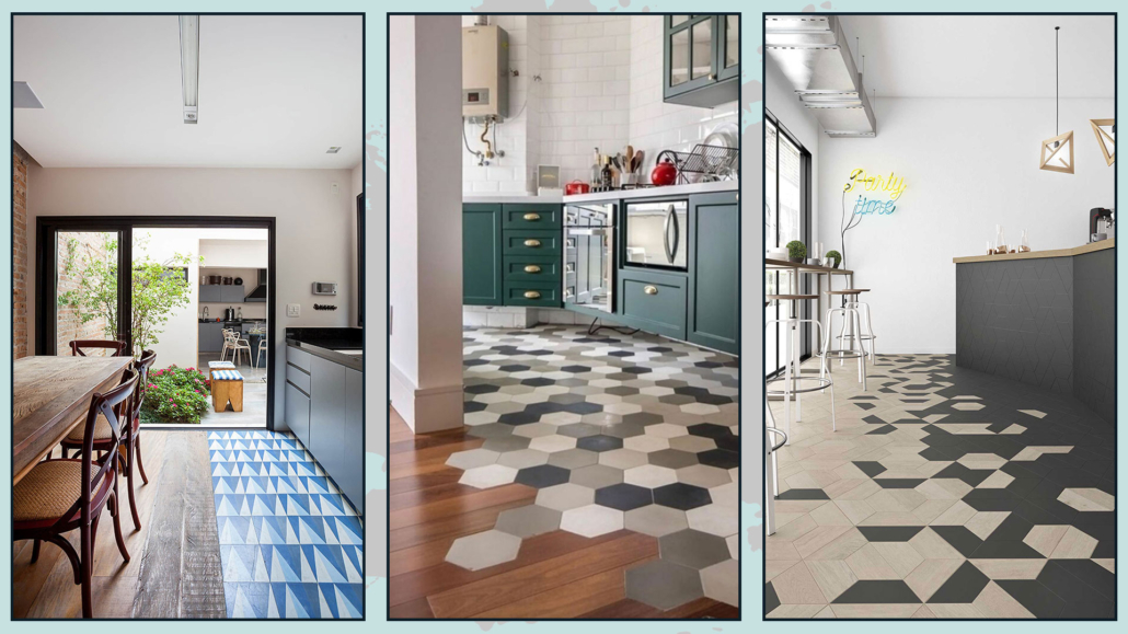
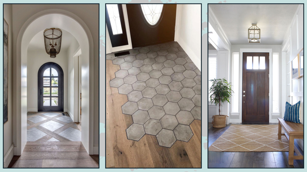
– MIXING FLOORING TYPES

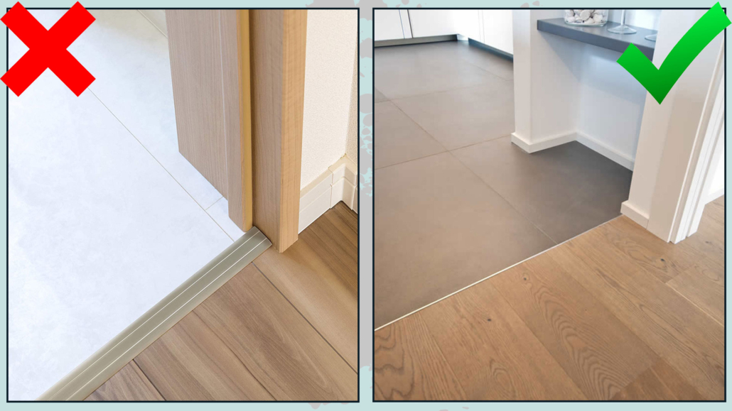
It’s absolutely possible to use two different types of flooring in the same room—especially if your entry opens into the living area or you have an open-plan kitchen and living space.

Changing the flooring is a great way to divide the two areas visually.

There are three main ways to transition between flooring types:

– Clean break

– Jagged edge

– Degraded

A clean break is easy to understand: a straight, defined line separating the two materials.

A jagged edge is when the tiles are cut to fit into each other in a fun, irregular way—like a plank meeting a hexagon tile.

Finally, a degraded not only uses a jagged edge but also gradually mixes elements of one material into the other, creating a soft, seamless transition.

patterns on flooring

(credits: homepro.co.th; Tua Casa; wowdesigneu.com)

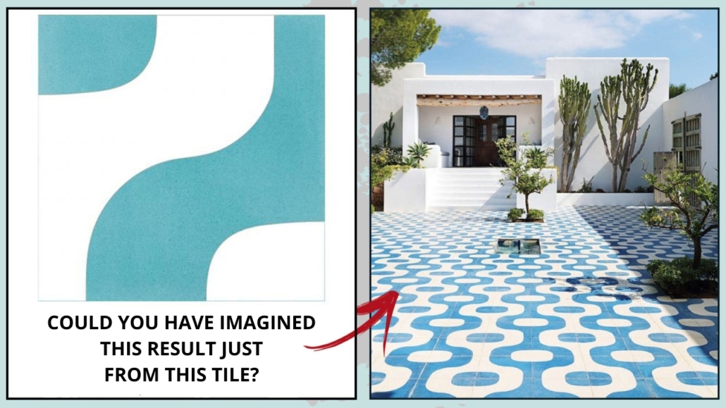
– PATTERNS CREATED BY TILE DESIGNS

Some tiles have decorative designs that, on their own, might not seem particularly striking—but when placed together, they can form stunning patterns!

It’s all about how the individual pieces come together to create an exceptional, more impactful visual.

patterns on tiles - decorating geometric shapes and patterns

(credits: casafacile.it)
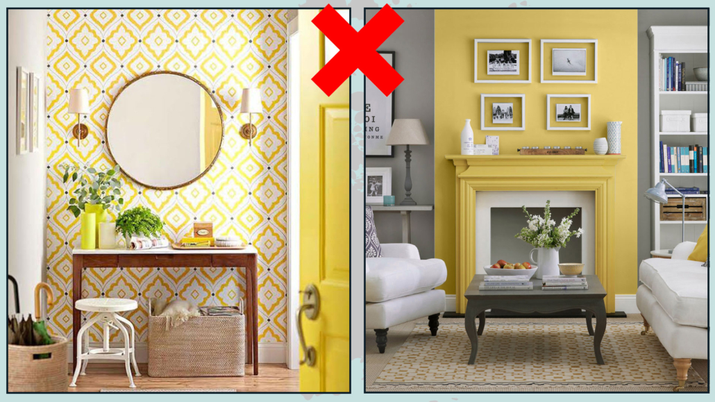
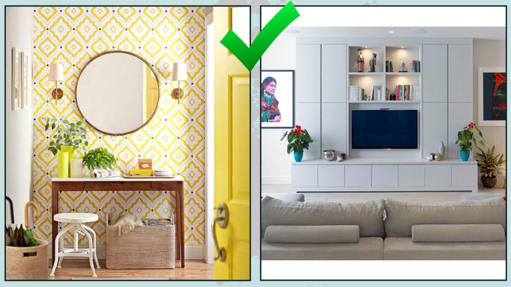
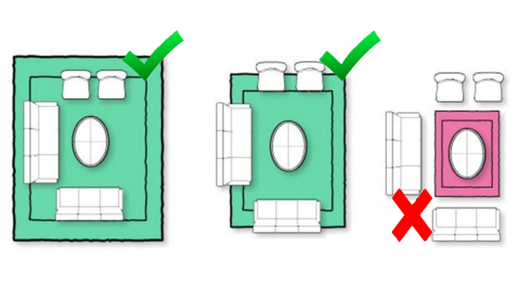
SOME PRECAUTIONS…

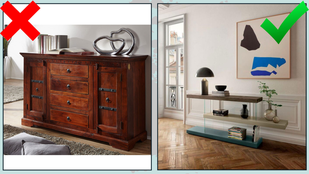
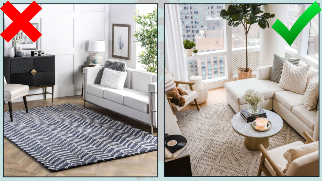
Decorating your home with geometric shapes and patterns can create striking and inspiring spaces—but the golden rule is: DON’T OVERDO IT!

– Avoid filling every surface—walls, floors, and decor—with these types of designs.

– When the geometric shapes or patterns are bold or oversized, keep the furniture and other decor more minimal to prevent the space from feeling overwhelming.

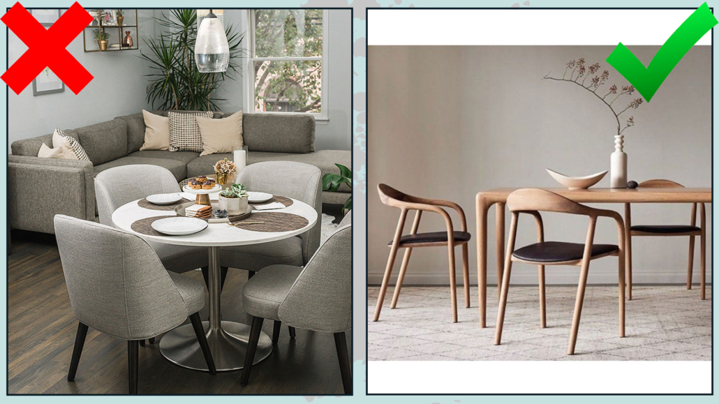
– You can mix different geometric shapes and patterns, but they should have something in common—like color—and vary clearly in scale.

One should always stand out more than the other!

I hope you enjoyed this article about decorating your home with geometric shapes and patterns and found it helpful.

If so, don’t hesitate to share it with someone you think might be interested; I would be honored, and it will help me get known.

If you feel that your home, or any part of it, doesn’t reflect you enough, don’t wait any longer: fall in love with your place again and book your consultancy!

How to choose the proper lighting for your home?!
It’s a question I’m often asked, so I decided to answer it with this article.

We know perfectly well that lighting is absolutely essential, and the wrong lighting can ruin your entire furnishing and décor project.

As mentioned other times, you could choose the most beautiful furniture, the best colors, and the finest materials, but if you get the lighting wrong, everything will fade away!

I’ve already discussed lighting by explaining color temperatures, color rendering, and more (you can find the video here!).

Today, I want to focus on choosing the right lights for your home and how to position them correctly for perfectly lit spaces!

Let’s first look at the different types of lighting based on their function.

We can divide lighting fixtures into two main categories:

– decorative

– architectural

(credits: Mooeilight; cb2.com; shopee.com; amazon.com; pinterest; obsoleteinc.com; astrolighting.com; indiamart.com)

DECORATIVE LIGHTS

Decorative lights, of course, provide illumination, but they also enhance the design and aesthetics of our spaces.

They come in various forms:

– Chandeliers

– Table lamps

– Floor lamps

– Wall lamps


(Mooeilight; cb2.com; pinterest; obsoleteinc.com)

And each can have different styles!

In addition to providing illumination, decorative lights enhance the design and aesthetics of a space.

Therefore, they are essential elements when designing the décor of any space.

To understand how to choose the right lights for your home, we need to consider two key aspects:

– How the light spreads

– Shape, style, and color

HOW THE LIGHT SPREADS

– SHADED LAMPS

Shaded lamps emit a soft, even light.

This type of lamp helps create the room’s general lighting.

Chandeliers, table lamps, floor lamps, or wall lamps with shades help create a warm and inviting atmosphere.

These lamps are ideal for areas where you want to relax, such as the bedroom or living room.

(credits: urbanoutfitters.com; behance.net)

– DIRECT LIGHTING

This type of lighting illuminates specific areas for tasks like reading, studying, drawing, eating, or cooking!

In addition to being highly functional by providing the right light for each activity, these lights are also a key part of the décor.

(credits: amazon.it)

Depending on how a lamp emits light, it will be more suitable for certain areas than others.

So, this is the first aspect to consider when choosing a lamp!

SHAPE, STYLE, AND COLOR

Once you’ve determined the best type of lamp based on how it emits light, you’ll need to choose its shape, style, and color to match the design you’ve selected for your home!

For example, if you love the minimalist style, you can use lamps with simple shapes and clean lines to maintain the style. Or, if you enjoy mixing, you can add lamps that contrast, making them the focal point!

(credits: jdpinteriors.com)

In a room, there are usually several decorative lamps.

These lamps should have a common thread to ensure the space feels cohesive and harmonious.

You can achieve it by using lamps with similar shapes but different colors and materials or, on the contrary, lamps with different shapes but the same material and color!

ARCHITECTURAL LAMPS

Architectural lamps are subtle lights that, in a way, are part of the structure of a space; for this reason, you can use them regardless of the home’s style.

They are practical and functional for illuminating areas.

We can include in this group:

– Recessed spotlights

– Ceiling lights

– Regular spotlights

– LED strips

(shopee.com; amazon.com;astrolighting.com; indiamart.com)

In addition to illuminating spaces, these elements can highlight decorative objects or architectural features.

Let’s see where and how to use these lights.

– RECESSED SPOTLIGHTS

People commonly use recessed spotlights for general room lighting.

A false ceiling made of drywall is required to install them.

They are functional and discreet lamps that one can use in any room without altering the style.

They can have a wide or narrow light beam.

You can use recessed spotlights with wide beams anywhere as general lighting.

If the beam is narrow, they are best used to highlight a specific area, such as a wall with unique wallpaper or beautiful artwork.

(credits: lednews.lighting; splash-of-light.co.uk)

– CEILING LIGHTS

Ceiling lights fulfill the same purpose as recessed spotlights and work well when you cannot have or do not want a false ceiling.

Their primary function is to provide general lighting.

There are countless different shapes of ceiling lights, and you will need to find one that best fits the shape, style, and color to match the room’s décor!

(credits: archiexpo.com; lampadaribartalini.it)

– REGULAR SPOTLIGHTS

On the other hand, regular spotlights usually have a narrow light beam, which makes them perfect to highlight a specific area, such as an architectural detail, a painting, a sculpture, or a wall with a unique texture!

You have to position spotlights to point exactly where you want them.

There are also spotlights mounted on tracks.

They’re ideal for spaces without a false ceiling but with a single central light source.

Thanks to the track, you can still distribute the light evenly.

(credits: Vicki Fabian; ikea.com)

– LED STRIPS

Thanks to their versatility, LED strips have become widely used in interior design for the past few years!

LED strips can define volumes and illuminate furniture or functional areas like beneath kitchen cabinets!

They emit a soft, diffused light, perfect for general lighting and setting the mood!

(credits: krow.rs; maisondorstudio.com)

SOME ADVICE

Now that you know the various types of lighting, I’d like to give you a few tips on how to better plan the lighting for your spaces:

– Use multiple lamps

One light source is not enough to properly illuminate a space and create contrast and depth!

The ideal setup is layering light: having general lighting to fully illuminate the room, spotlighting to highlight specific areas, and task lights that assist with activities like cooking, reading, studying, and so on.

– Be careful how space will be used

Try to understand how you will use a particular space to determine which lights to choose!

For example, in a study, you’ll need specific table lamps to make the space more comfortable for working.

– Design the lighting system

When designing a lighting system, base it on how you want to arrange the furniture in the room.

This way, you’ll have a truly functional and efficient lighting setup!

Otherwise, the risk is having lights in places where they’re not needed and lacking them where they are.


I hope you enjoyed this article and found it helpful.

If so, don’t hesitate to share it with someone you think might be interested; I would be honored, and it will help me get known.

If you feel that your home, or any part of it, doesn’t reflect you enough, don’t wait any longer: fall in love with your place again and book your consultancy!

Is it possible to transform spaces, at least visually?

Of course, it is, without construction work, only with… color!!!

Color has the power to alter our perception of spaces.

That means it can optically change the appearance and proportions of a room, making it feel taller or shorter, smaller or larger, and so on!

Therefore, color is a fantastic ally for those unique spaces: when used correctly, it can trick the mind and give us the impression of entirely different dimensions.

Today, I’d like to share some tips on using color to your advantage to visually transform spaces in line with what you want to express in them!

– LIGHT COLORS AND DARK COLORS

This difference is quite well-known: light colors enlarge, while dark colors make spaces feel smaller.

Light colors also make a space brighter because they reflect light.

If you need to make a space feel huger, it’s best to use light colors everywhere: on the ceiling, walls, and floors.

Using light colors also for the furniture will amplify the effect.

While white is undoubtedly the color that reflects light the most, I don’t mean only white when I refer to light colors.

ANY color in its lighter, less saturated shades can help make spaces feel bigger!

While it’s true that dark colors make spaces feel smaller, they also create a sense of “closeness.”

The space feels cozier.

The risk is making a space feel a bit stifling, but when used in large, well-lit areas, the result can be stunning!

(credits: posterstore.it; room108.be)

– WARM COLORS AND COOL COLORS

We all know warm colors include shades like red, yellow, and orange because they evoke images of sunsets, fire, and similar elements.

They create a sense of warmth, bring cheer, and feel inviting, setting up pleasant atmospheres.
Warm colors shrink the spaces, making them more intimate and cozier.

On the other hand, cool colors include blues, purples, and greens, as they remind us of water and nature.

They give a sensation of freshness, serenity, and relaxation.

Cool colors also help to visually enlarge spaces by creating the illusion that walls are receding.

That makes them ideal for tight spaces like hallways or small bathrooms.

When choosing a color, it is crucial to understand the room’s specific conditions to select the proper shade, the one that will absolutely help you experience the feelings you want in that space.

(credits: Cleo Scheulderman; talianbark.com)

– NEUTRAL COLORS

Neutral colors have a significant visual impact!

Remember that, aside from pure neutrals like white, gray, and black, all other neutrals have an undertone you need to consider.

The undertone is what makes all the difference in the final result, as it determines whether a neutral appears warm or cool.

Even among warm neutrals, the undertone will influence whether a space feels more yellowish or rosy, and this will, of course, affect the perceived mood.

I discuss neutral colors in greater detail here.

Neutral colors are fantastic as a background or base in interior design as they’re incredibly versatile, pairing well with any style and color!

(credits cocolapinedesign.com; H&M Home)

– VISUAL EFFECTS

Now that you know how colors can visually change the appearance of a room, let’s explore how to use them to create specific visual effects!

– Lower/Raise the Ceiling

If you have a room with a low, somewhat suffocating ceiling, paint the walls and leave the ceiling white.

That will instantly give the impression of a taller room.

On the other hand, if the ceiling is high and feels too expansive, paint it a darker color than the walls!

Visually, the ceiling will seem lower, creating a cozier and more intimate atmosphere.

(credits: @coelholimaarq)

(credits: Future; summerthorntondesign.com)

– Widen/Narrow the Space

To make a space appear larger, use a darker color on the ceiling and the farthest wall while keeping the side walls light.

That will visually bring the ceiling and the far wall closer, creating the illusion of a larger room.

That trick works wonders for long and narrow spaces like hallways!

To narrow the space, do the opposite: keep the far wall and the ceiling light and use darker colors on the side walls.

That will elongate the room slightly, making it feel more proportionate.

(credits: @coelholimaarq)

(credits: @IndiverPlast; stherbb.us)

– Shorten the Space

To make a generous space feel more intimate, paint the far wall darker while keeping the other surfaces light.

The far wall will appear closer, making the space more inviting and cozy.

(credits: @coelholimaarq; kmdesignco.com)

– Narrow the Walls

To “shorten” the walls and make them feel narrower, the ideal solution is to add a dark-colored stripe along the upper part of the wall.

(credits: @coelholimaarq; living.corriere.it)

– Enlarge/Shrink the Space

As mentioned earlier, with light and dark colors, paint all surfaces in light tones to make a space feel larger by reflecting more light.

That creates the effect of a more open and airy room.

Use the same color on walls and ceiling for an even more powerful effect.

On the other hand, if you want to make a room feel smaller, opt for warm, dark colors.

As we’ve seen, these tones bring surfaces closer together.

That approach is perfect for huge rooms that otherwise might feel “empty” or impersonal!

(credits: @coelholimaarq)

(credits: tailoredspace.com.au; igorsirotovarchitects.artstation.com)

As you’ve seen, color is indeed a fantastic ally.

Not only does it set the mood of a room, but it can also help transform visually unique spaces, like long and narrow hallways…

I hope you enjoyed this article and found it helpful.

If so, don’t hesitate to share it with someone you think might be interested; I would be honored, and it will help me get known.

If you feel that your home, or any part of it, doesn’t reflect you enough, don’t wait any longer: fall in love with your place again and book your consultancy!

How to decorate a bookshelf?

That is a question asked in the community of my YouTube channel, and today, I have decided to answer.

Whether you’re an avid reader or not, the bookshelf is a piece of furniture found in every home!

It can be a full-wall bookshelf, a divider bookshelf that visually separates two areas of the same open space, or just a series of shelves.

It doesn’t matter: we all have this space in our homes!

The problem is that it’s often not highlighted to its full potential, and books and objects are placed without criteria.

So, let’s see how to decorate a bookshelf to make it truly pleasant to the eye, a little work of art!

– START FROM SCRATCH

That is obvious if you buy a new bookshelf, but if you want to give an existing one a new look, remove everything and start from scratch!

Removing some items and adding others can create chaos and confusion.

Of course, you can take a photo before clearing everything off, so if the final result doesn’t convince you and you want to put everything back the way it was, it won’t be difficult!

HOW TO ORDER THE BOOKS?

Let’s start with a bookshelf primarily filled with books; there are many ways to arrange them:

– ALPHABETICALLY BY AUTHOR

This method makes it really easy to find what you’re looking for.

Start with the author’s name and then the book title; in the case of a series, you’ll have all the books together.

To add a touch of movement and color, you could place decorative wooden letters corresponding to the author’s name!

– BY LITERARY GENRE

If you enjoy different genres, you can divide your books based on their subject matter.

Here, too, you can add an object or image to bring color and movement and “signal” the type of genre!

– BY COVER COLOR

You can also choose to arrange your books according to the color of their covers, creating shelves with a terrific visual impact!

Finding a book might be more challenging, but the look will be stunning!

In all three cases, remember that books should be placed either horizontally or vertically, never at an angle, to avoid damaging them!

(credits: journal.homemania.ru; Emily Solilak; See Jane Work)

DECORATE THE BOOKSHELF WITH MORE THAN JUST BOOKS

It is not mandatory to decorate the bookshelf with only books; quite the opposite, especially if it is in a living room or a double-sided bookshelf, it is possible, and even preferable, to pair other items with the books:

– vases

– paintings, photos

– various objects

– plants

For a bookshelf with a WOW effect, here are some suggestions:

– THE 1/3 RULE

With this rule, you should use 1/3 of the space for a large statement piece, 1/3 for books, and 1/3 for smaller objects.

You don’t have to apply this rule to every shelf: it’s perfectly fine to have one or two shelves just for books!

If followed correctly, however, this rule will create visual movement and give the impression of something absolutely sophisticated!

(credits: roomfortuesday.com; HomeLilys; Jersey Girl in the South Design Company)

– START WITH LARGE OBJECTS

Always look at the bookshelf as a whole, not just each individual shelf.

Try to place large items so that they communicate with each other through height, shape, material, or color.

Don’t place them in the same spot on different shelves; instead, create a zigzag or triangular arrangement.

(credits: domino magazine; but.fr; guggenheim-venice.it)

– ADD BOOKS AND SMALLER OBJECTS

Once you’ve placed the larger pieces, add the books, always keeping in mind a common thread between the various items and across the shelves.

Finally, place the smaller elements, following the same principle and being careful not to overdo the quantity!

(credits: Nancy Artsy Chicks Rule; arredamentiriva.it; leroymerlin.com)

– CREATE SMALL COMPOSITIONS

Create small compositions with objects consistent with each other, but ensure they have varying heights to create movement.

For example, you could place a vase, basket, painting, or photograph together!

You can also use horizontally stacked books to elevate an object, changing its height!

Make each shelf unique, but remember to check the bookshelf as a whole.

Balance the objects, colors, heights, and materials/textures, echoing them across multiple shelves.

(credits: briahammelinteriors.com; farmhouse-decor-home-tour-2020; Kelly-Wearstler)

– DO NOT BE AFRAID OF EMPTY SPACES

Don’t feel anxious about filling every inch; on the contrary, leave some empty spaces here and there on the various shelves.

That will create more breathing room and, more importantly, highlight what you’ve placed on the shelves, which would otherwise get lost!

(credits: prattandlambert.com)

– ADD PLANTS

Indeed, it’s a great idea to decorate your bookshelf with something alive, bringing a bit of nature into the mix!

This detail will instantly add a touch of elegance and uniqueness to your bookshelf.

It could be a vase of flowers, a vase with some branches or leaves, or even an authentic plant!

Again, don’t just add one; skillfully repeat the touch of green across multiple shelves!

(credits: Heart & Paper Studio; cutypaste.com; mistudiodesign.com)

I hope you enjoyed this article and found it helpful.

If so, don’t hesitate to share it with someone you think might be interested; I would be honored, and it will help me get known.

If you feel that your home, or any part of it, doesn’t reflect you enough, don’t wait any longer: fall in love with your place again and book your consultancy!

How correctly to furnish the entryway? It’s a question I’m often asked!

The entryway is your home calling card, the first impression a guest will have of the rest of the house.

The entryway is a transition from the outside world to the heart of your home, so it should be welcoming and give a sense of the style and atmosphere that awaits inside!

First, you should interpret your available space: a small space does not necessarily have to be less welcoming than a large one!

Sometimes, the opposite is true because a generous space can feel empty and impersonal!

You can create a welcoming entryway even if you don’t have one walking straight into the living room!

Let’s go over 6 rules for furnishing your entryway perfectly, no matter the available space!

1 – FLOORING OR RUG

As we mentioned earlier, the entryway is a transition from the outside to the inside, so ideally, the flooring should highlight this transition.

You could choose different flooring from the rest of the house, which is ideal if your entry leads directly into the living room to divide the two areas visually.

You’d want to avoid having two floors with strong contrasts in a tiny space, but different flooring helps define specific areas.

Alternatively, you could use a rug: only remember to choose one simple to clean.

That can help prevent guests from bringing dirt into the rest of the house!

Naturally, having a doormat outside the door is also helpful to get rid of most of the dirt.

(credits: karstinteriors.com; Stefania Damaggio; Pinterest.com)

2 – ALWAYS HAVE A SURFACE TO SET THINGS ON

It’s paramount to furnish the entryway with a surface whose dimension will depend on the available space.

It could be a beautiful round table in the middle of the room, a console table against the wall, or even a simple shelf!

First and foremost, it’s functional because it’s where you’ll “empty your pockets” when you come home, but it will also serve as the focal point of the entryway.

You can place a lovely plant, a vase of flowers on it, or a tray with candles or diffusers. In short, you can decorate it as you see fit!

That is where you give a preview of your home’s style!

If space allows, you could add a small seat, like a simple pouf!

It can be handy if you change your shoes right at the entrance.

(credits: amazon.com; studio-mcgee.com; ohmeohmyblog.com)

3 – LIGHTING

To welcome your guests, lighting in the entryway is vital; you should study it, recalling that there is a transition from the outside, where lighting is totally different.

Get creative, for instance, using recessed ceiling lights: as for the flooring, if your entryway opens into the living room, lowering the ceiling can visually separate the two areas.

You can furnish the entryway with unique and original chandeliers or wall sconces, anything that not only lights the space effectively but, like the surface area, gives a sense of your home’s style and atmosphere!

Play with different types of lighting: use recessed lights or chandeliers for general lighting, but where possible, add a floor lamp or a beautiful table lamp to create a cozy ambiance!

(If you want to know a little more about how to correctly light I talk about it here)

(credits: vogliadiristrutturare.it; amazon.it; houseofjadeinteriors.com)

4 – STORAGE ELEMENTS

When someone visits you, especially in winter, they’ll likely have something to take off and set down, and the same goes for you when you come home!

Of course, a built-in closet isn’t always possible, but many different solutions on the market can adapt to any space.

There are open shelving units that function as coat racks, classic coat racks, or even wall-mounted hooks—some are incredibly original and, when placed correctly, can be very artistic!

You can add a few baskets for smaller items; this will also give a stylish touch to the entryway!

And don’t forget an umbrella stand—if it rains, at least you won’t have wet umbrellas dripping all over the place!

(credits: cutlerkitchenandbath.com; dienlanhsapa.com; elmueble.com)

5 – MIRROR

Having a mirror at eye level in the entryway is very important because:

– You can take a final look at yourself before heading out;

– Your guests can check they look presentable before fully entering the house!

That is a detail not to overlook! Just as you prepare your home when expecting guests, they also want to look their best when visiting you. Coming in from outside, they might need a quick touch-up, so give them that chance!

Depending on the space, you can place a beautiful mirror above the console table or create a composition of mirrors—feel free to get creative according to your style!

Plus, the mirror will help enlarge the space by reflecting light!

(credits: twotwentyone.net; Marina Karpilovsky; lagnappe.com)

6 – PLANTS AND FRESH FLOWERS

By now, you know that plants are vital in any room of the house; in the entryway, they also have a psychological significance: as earlier mentioned, the entryway is the transition space from outside to inside, and plants help to create a smoother connection (even if you live in the city!).

Plants, vases with branches, leaves, or fresh flowers, it doesn’t matter; what is paramount is to have something, even tiny, that brings a touch of nature!

Plants also add fragrance, texture, and color, making them ideal for decorating an entryway!

(credits: brainstudy.info; Muebles Home Direct; amazon.es)

I hope you enjoyed this article and found it helpful.

If so, don’t hesitate to share it with someone you think might be interested; I would be honored, and it will help me get known.

If you feel that your home, or any part of it, doesn’t reflect you enough, don’t wait any longer: fall in love with your place again and book your consultancy!

Often, I receive questions about how to make one’s home cozier, warm, and inviting, so I’ve decided to answer with this article.

When designing a house, commonly, we focus on the aesthetic aspect, neglecting the emotional one: that is what we want to feel in that particular environment!

But to truly feel comfortable and relaxed 100%, the house, besides being beautiful, must also be welcoming and inviting.

So today, I want to share five essential elements to make your home cozier and inviting, regardless of your style!

– WARM LIGHT

Light is a fantastic ally for changing the mood of a room.

The same room, colors, and textures visually change depending on the type of light or, more precisely, the light color temperature chosen (I discuss lighting in detail here).

Lighting with a cool color temperature (above 5000 Kelvin) will give environments tending toward blue, and the perception will be of cold and unwelcoming rooms.

Using instead lighting with a warm color temperature (between 2700 and 3000 Kelvin) will change everything radically, without having to change anything in the room.

This color temperature produces a light that slightly veers towards yellow, creating inviting and warm atmospheres.

(credit: housmag.it)

(credit: morabitoimmobiliare.it)

But there’s a “problem”; this type of lighting changes our perception of colors and spaces, which could ruin some of your design choices.

I’ve said it often: you can design the most beautiful spaces in the world, but if you get the lighting wrong, you ruin everything.

So, what to do?

Well, since there are various types of lighting, the ideal is to use a neutral color temperature (around 4000 Kelvin) for general lighting and warm lighting for secondary lighting, such as table lamps or floor lamps.

(credit: jowebster.com)

Playing with different lights and different color temperatures will allow you to easily change the atmosphere of a room, all with just the use of different bulbs!

Today, there are even some special bulbs on the market that you can not only dim (meaning you can decide the light intensity) but also change the color temperature.

With these bulbs, you can modify the mood of your spaces whenever you want!

Another relevant element to consider is using lampshades that can soften the light.

That also helps to make the spaces warmer and more comfortable.

Additionally, to add a bit more warmth and romance, I suggest adding some candles

(credit: firstforwomen.com)

Candles not only illuminate but also immediately create the atmosphere.

And if you get scented ones, you can give that extra touch that makes a difference!

– SCENTS

As I’ve mentioned before, good design goes beyond aesthetics, and how we perceive spaces through all our senses can also improve our quality of life.

So, we should use everything at our disposal to stimulate the senses and create the atmosphere we want to live in.

(credit: istock.com)

Stimulating the sense of smell is a simple way to make instantly a home more welcoming and inviting.

In addition to scented candles, as mentioned earlier, you can use small aroma diffusers.

Of course, you can use fresh flowers, adding a little color and freshness.

(credit: shutterstock.com)

Some inviting and enveloping essences that help with relaxation and feeling good are cinnamon, orange, cedar, lavender, chamomile, jasmine, rose, and vanilla.

These essences help slow down the nervous system and thus bring many benefits to the mind and body.

(credit: homedics.it)

Of course, be careful not to overdo it with essences, especially with chemical ones; too much could have the opposite effect.

– WARM COLORS

It’s well known that colors have a strong psychological impact and are an excellent ally in creating elegant and attractive environments (I’m talking about color psychology here).

Warm colors, needless to say, are highly recommended for spaces where you want to feel immediately welcomed, almost like being in an embrace.

(credit: desenio.it)

Using warm colors is even more vital in large rooms or open spaces, which otherwise could feel empty, somewhat impersonal, and especially cold.

(credit: larizzadesign.com)

In smaller spaces, the key is to use light shades to maintain that sense of warmth without overwhelming the space.

(cretid: living corriere)

– NATURAL ELEMENTS

Plants, in particular, are an incredible way to make a home comfortable and inviting!

(credit: istock.com)

Regardless of your style, a plant will liven it up and add that extra touch of elegance.

Not only that, plants help purify the air, making it healthier!

Additionally, as mentioned other times, they bring shapes, textures, and a touch of color that never hurts!

Other natural elements like wood, terracotta, rattan, or fibers such as linen help us feel closer to nature, which relaxes us and makes us feel good!

(credit: H&M)

(credit: Sebastian Erras)

If you like, you can also add nature sounds in the background at home: for instance, classical music accompanied by the sound of the sea, rain, or crackling fire.

That could also be a great way to feel even more relaxed!

– TEXTURES

Soft textures are essential to create a warm and enveloping home feel and stimulate the sense of touch.

Look for materials that are pleasant to the touch and can make spaces more comfortable and inviting.

(credit: entrancemakleri.se)

A soft rug will immediately help warm up the environment, and walking barefoot on it will help you relax!

(credit: soopush.com)

Blankets, casually draped over the sofa or bed, immediately give a sense of warmth, also adding a touch of color!

Likewise, cushions are indeed the best way to add comfort and decorate a sofa or bed.

(credit: favim.com)

As you can see, making a home more welcoming and inviting is not difficult.

Use what you have, make changes if necessary, such as changing a few light bulbs, and add some details, and you’re all set.

Your home should represent you and, most importantly, make you feel good and comfortable.

Choose things based on your style and personality!

I hope this article on how to make your home cozier and inviting has been helpful and enjoyable for you. If so, let me know in the comments!

Feel free to share it with anyone you think might be interested, I would be honored, and it will help me gain more exposure.

If you feel that your home, or any specific area of it, doesn’t reflect your personality enough, don’t wait any longer and book your consultancy!

Did you know that the most important element in interior design is the focal point?

It’s actually a fundamental element to consider when designing the furnishings of a home!

What is the focal point, such an important element in interior design? 

It’s the area of the room that captures the gaze because of its greater visual interest.

It’s an element that should stand out from the other elements in the same room due to color, size, style, or material!

The focal point is a valuable element in interior design because it somehow defines the space: the other elements and furniture and their position, and consequently the use of the room, will be decided concerning this.

Study each room, looking for those that can already be major architectural elements to enhance.

If there aren’t any, try to understand which area could be most suitable for creating an attractive viewing area.

You can do this by looking at how you wish to move and live in that space.

Can you have multiple focal points in a house? 

Absolutely yes! Each room can (indeed must) have its focal point.

The care to take is not to make these focal points “compete” with each other because otherwise, you will lose the very meaning of a focal point!

Therefore, one should aim to create focal points that are visually different!

If, for example, you’ve used a wall color as a focal point at the entrance in the living room, it should be something else, like a fireplace, a mirror, or even the TV wall!

(credits: vivadecora.com; Rugh Design)

These two focal points will not compete: they will attract attention, stimulating the desire to enjoy each space!

(credits: vivadecora.com; alibaba.com)

Now, let’s see how to create a focal point, room by room!

– ENTRANCE

If you’re fortunate enough to have an entrance, even a small one, remember that it’s the first thing people will see and the first impression they’ll get of the house.

The focal point could be a large mirror above a console, a vibrant painting, or an extraordinary vase of flowers!

The important thing is to choose ONE main element that catches the eye, then use other items, like lighting or decorative objects, to emphasize the main one!

This element should grab attention and “invite” people in!

(credits: albertolamaphotography.com; studio-mcgee.com; pianetadesign.it)

– LIVING ROOM

As mentioned earlier, in the living room, the focal point could be a beautiful fireplace, for those fortunate enough to have one, or the TV wall.

But you could also decide to have a wall filled with photos and paintings or a beautiful and particular wallpaper.

If you’re lucky, even a large window with a superb view can be the focal point!

Once you’ve figured out where and how to create this focal point, which must somehow “dominate” over the rest of the room, you’ll arrange your furnishings accordingly!

(credits: edilnet.it; vault-light.com)

– DINING ROOM

Usually, the table takes center stage in the dining room. Thus, the focal point could be a large and unique centerpiece! 

Alternatively, you could have a beautiful and stylish chandelier above the table, immediately drawing the eye.

Whether you choose the centerpiece or the chandelier, remember that the walls should remain simple and linear to not “steal the show.”

Of course, you can decide the opposite and choose a wall as the focal point with a beautiful mirror, painting, or even a particular wallpaper.

In this case, the chandelier and centerpiece will be more “modest” to avoid competing with the wall!

(credits: dearkitchen.it; casatuaitalia.it; beiboerfineart.com)

– KITCHEN

Even in the kitchen, it’s possible to have a focal point!

Study the space to evaluate potential areas to transform into focal points.

You could choose a colorful or textured backsplash, a unique hood (perhaps a design piece), or a splendid credenza.

As always, the important thing is using the other elements, like lighting or color, to emphasize this focal point. 

(credits: bilderwelten.it; homedesignlover.com)

In the case of an open space with a living room or dining room, consider how these two areas are connected and look for the most significant and attractive point.

Since it’s a unified space, having a single focal point is better!

(credits: pinterest.co.uk)

– BEDROOM

Just as in the dining room, the table takes center stage; in the bedroom, the bed is the main element.

Thus, the focal point of the room could be the bed wall!

You can decide to have a particular headboard or decorate the wall with a contrasting color with the bed, a wallpaper, a picture gallery, or use the boiserie!

There are many ways to decorate the bed wall; I discuss them here!

However, if entering your room, there is something else you want to “draw attention” to, such as a vanity with a lovely mirror, why not make that the focal point?

(credits: thespruce.com; casamagazine.it)

– BATHROOM

Even in the bathroom, it is paramount to have a focal point to give that extra touch!

Typically, the focal point is the mirror area. 

You can choose to use a distinctive mirror, perhaps backlit, colored tiles with particular textures, but here, too, you could use wallpaper (there are special ones, highly resistant to moisture!)

If entering, the first thing you see is the shower or bathtub area, you could decide to make that area your focal point, always with a particular wall covering that contrasts with the rest of the room in terms of colors, shapes, or materials. 

(credits: il-bagno.it; arredobagno.shop)

The toilet shouldn’t be the first thing you see in a bathroom, but this isn’t always possible!

However, properly studying the focal point can help draw attention to captivating elements while making the rest less prominent!

(credits: pinterest; pianetadesign.it)

As you can see, the focal point is actually crucial in interior design for every room in the house! 

To achieve this, in each room, try to find the best area to create it; remember first to see if there are already architectural elements worth emphasizing.

Then, consider how you want to experience that space and what you want to be noticed first in that room.

Use focal points to draw attention where you want it!

Utilizing contrast, whether it’s in color, shape, or material, is the best way to create effective and impactful focal points.

(I discuss the contrast of the six basic concepts in interior design here.)

Creating a focal point is essential to make that room unique and special!

I hope this article about the most important element in interior design has been helpful and enjoyable for you. If so, let me know in the comments!

Feel free to share it with anyone you think might be interested, I would be honored, and it will help me gain more exposure.

If you feel that your home, or any specific area of it, doesn’t reflect your personality enough, don’t wait any longer and book your consultancy!

Furnishing a small house is actually a challenge, but it can be done with a little bit of cleverness and attention.

There are at least five general common mistakes made when furnishing a small house, and I’d like to discuss them in this article, giving you some tips and tricks to avoid or fix them!

Ready? Let’s see them together:

1 – DARK AND HEAVY FURNITURE

One of the most common mistakes is using heavy and dark furniture.

Furniture with substantial, solid structures and dark colors visually shrinks the spaces, making them feel a bit suffocating!

It’s better to avoid them by opting for furniture with light profiles, such as chairs and tables with thin legs.

Try to choose furnishing elements through which you can see the structure; this is a trick to deceive the mind: if you can see the space beyond a piece of furniture or an accessory, it will seem like the environment is larger!

Additionally, lighter furnishings will make the environment feel more airy, elegant, and, therefore, more pleasant!

So, NO to bulky, heavy, and dark furniture, and YES to ones with light, open, and bright structures!

(credits: moebel.ladendirekt.de; lago.it)

(credits: Room & Board; hackrea.com)

2 – SMALL RUGS

Another general common mistake is opting for a small rug; this never works well, not even in a large house, but it becomes detrimental in a small one.

A small rug will give the impression of a smaller space because it creates boundaries.

That will cause the mind to be somehow drawn to those boundaries, separating the part of the rug from everything else.

The rug should be large enough to enclose, contain the furnishings, or at least be under the front legs of the furniture.

That will show fewer edges of the rug and, consequently, fewer boundaries!

So, NO to small rugs (it’s better not to have them at all); YES to large rugs that go under the furniture!

(credits: rugsusa.com; Margaret Boatner)

3 – DIFFERENT AND CONTRASTING FLOORING

Having different floors with strongly contrasting colors is another classic mistake.

Contrast is a fundamental element in interior design, but it must be used wisely!

Different and contrasting floors are great when you need to visually divide an ample space containing two functionalities, such, for example, as an open-plan area with a kitchen and living room.

But in a small space, it’s somewhat similar to the principle we just discussed with rugs: different floors with different and contrasting colors create boundaries and visually shrink the space.

When space is limited, uniformity is crucial, so if you want to use two different floors, choose ones with the same tone.

The transition from one floor to another will be subtle, making the various zones feel like a single, larger space!

For this reason, where there are rugs, it would be ideal for them, besides being large, to have the same tones as the floor.

You’ll notice the different textures, but you won’t see barriers that sharply divide the space into diverse areas!

So, NO to great contrasts on floors, YES to uniformity; it’s okay to change textures, but try to maintain the same tones as much as possible!

(credits: progressprofiles.com; materiesuperficiarredo.it)

4 – FAILURE TO PLAN THE SPACE

Not planning the spaces when furnishing is a common mistake, but it becomes particularly noticeable when space is limited!

It’s crucial to make, in small environments, the most of the space according to your lifestyle.

So, every time you want to buy something, ask yourself:

– How do you use that space?

– Who lives there?

– What are your real needs?

That is essential to buy only what is necessary to make your spaces functional and efficient.

Let me give you an example: if two people live in a small house, there’s no need to get a 3-seater sofa or a sectional; a comfortable 2-seater sofa will suffice, along with maybe some extra seating that can be used near the table when you have guests!

Of course, you’ll need to ensure that all elements harmonize with each other for stunning spaces!

Multifunctional elements are essential for furnishing a small house:

– As in the previous example, a seating option that can serve as a relaxation spot near the sofa but also be used as a chair near the dining table when needed.

– A coffee table that transforms into a dining table;

– A pouf that doubles as a coffee table or storage unit;

These elements allow you to need fewer items and have more free space!

So, NO to furniture chosen just because you like it, YES to planning the spaces according to your needs.

(credits: graziademonte.com; instagram.comp60U_nKM-AFtaken-by=jackieruedaphotography)

5 – USING ONLY FLOOR SPACE

Yet another common mistake is using only the floor area, but the space is three-dimensional, and in small environments, we really need to take advantage of every available surface.

So, walls, but also ceilings where possible!

Think vertically, perhaps with shelves or wall-mounted furniture as storage space; in the kitchen, you could consider attaching a fold-down table instead of a traditional one.

Use wall lights instead of floor lamps: you’ll properly illuminate while leaving more floor space.

Of course, pendant lights, but you can also consider hanging a seat from the ceiling or lowering it to create additional storage space if the height allows it!

Even plants, instead of placing them on the floor, you could consider hanging them.

Thinking vertically will allow you to have everything you like and desire in your home without cluttering the floor and enabling better use of space.

You’ll thus have a functional home for your lifestyle, but also beautiful and, above all, comfortable!

So, NO to everything resting on the floor, YES to unleashing your creativity by making the most of every available surface!

(credit: carousell.sgpbohemian; elle.se Johanna-bradford)

I hope this article about furnishing a small house has been helpful and enjoyable for you. If so, let me know in the comments!

If you’d like, here are some more small tricks to make the most out of living in a small apartment!

Feel free to share it with anyone you think might be interested, I would be honored, and it will help me gain more exposure.

If you feel that your home, or any specific area of it, doesn’t reflect your personality enough, don’t wait any longer and book your consultancy!

How to create a color palette for your home?

The topic of color is absolutely fascinating and quite beloved.

I often get questions about which colors to choose for your homes!

Knowing how to choose and manage colors isn’t easy, but it’s vital for creating harmonious environments that truly represent us.

Designing and choosing the colors and materials that will be present in your home is truly important to ensure that the various spaces communicate with each other in a coherent and balanced manner.

The color palette is really one of the first things to start with!

As we now know, colors create mood and evoke sensations and emotions, so choosing them carefully and consciously is paramount!

Therefore, let’s see the fundamental steps to create a color palette that suits you, your tastes, and your style!

– CONSIDER THE FUNCTION OF THE ROOM AND COLOR PSYCHOLOGY

Different colors evoke diverse sensations, such as excitement, relaxation, introspection, mystery, passion, etc. (I talk about the color psychology here)

Color can transform a space:

– making it seem warmer or cooler.

– visually expanding the room.

– enhancing the sense of well-being.

– brightening up the space.

Color is indeed the fundamental tool for creating the right atmosphere!

(different colors different atmosphere! Credits: mooielight.com; Sean Litchfield)

To choose a color, you need to ask yourself a few questions:

– What is the function and purpose of that room?

– What emotions do you want to experience in that space?

– Which color can help you achieve this goal?

The answers to these questions will help you find the right color!

This color will impact sensations and behavior, making the space functional and suitable for the specific activities of that environment.

PAY ATTENTION ALSO TO THIS…

There are other, somewhat more technical aspects to consider:

– Where is the room located?

– How many windows are there, and how are they oriented?

– Is there anything that could alter the perception of color in any way?

These questions give an idea of the room’s conditions and further aid in color selection (or at least in determining its brightness and saturation!).

Let me give you an example: if a room doesn’t receive direct light, it’s better to use light colors to bring the space more breathing room and allow the indirect light to reflect more.

That will still enable you to make natural light more efficient, as it reflects better on lighter colors!

– CHOOSE NEUTRAL COLORS

Neutral colors are essential in a color palette because they serve as a backdrop and can enhance various furniture elements.

Walls painted in neutral colors open up numerous opportunities; they allow us to incorporate furniture pieces with stronger colors without overwhelming the space.

When selecting the right neutral, the first thing to do is to determine whether to choose warm or cool neutrals.

(Warm or cool neutral give a different result! Credits: cocolapinedesign.com; H&M)

Opt for those that best represent your personality and style and complement the other colors in the palette and furnishings.

Choosing a warm or cool neutral may not be simple due to its undertone.

For example, you might choose a white color, but once the wall is painted, it may appear slightly yellowish or bluish.

That occurs due to the undertone.

Except for pure neutrals like white, black, and gray, all others are obtained by combining two complementary colors or adding a pure neutral to one color.

That results in a white, for instance, appearing pure, but ultimately, due to its undertone, it may indeed have a slight yellowish or bluish tint.

I discuss this aspect of neutrals in more detail here!

– CHOOSE AN ACCENT COLOR

Accent colors are crucial for creating movement and contrast and emphasizing significant elements of the environment.

Choosing neutral colors will facilitate the choice of an accent color, which doesn’t necessarily have to be vibrant but should contrast with the other colors.

To better understand, if you had a home with a palette of soft neutral colors and added a bit of dark gray or black, that would still be considered an accent color because the contrast between light neutrals and dark gray or black is high.

(Credits: leclairdecor.com)

If, however, you want to add a touch of a “real” color, the questions we asked at the beginning will be helpful.

For example, green could be the right solution if you have a living room where you want to convey a sense of calm, relaxation, and freshness!

(Credits H&M)

If you decide to have more than one accent color, you need to know how to pair them, and for this, it’s essential to understand color theory and use the color wheel!

How??? Well, I explain it here.

LOOK AT THIS

There’s a small detail to pay attention to when choosing one or more accent colors: it should be accurately distributed throughout the space.

Let me explain further: suppose you choose the color green; you should use it, for example, on a seating piece, in fabrics like cushions, rugs, curtains, objects, and artworks.

You can even paint a wall or a portion of it if you like!

(Credit: interior by @interiors_dd)

In short, it shouldn’t be a single point of color that otherwise would seem randomly placed!

Doing this will help you create rhythm, one of the six basic concepts of interior design (I discuss it here), and make everything cohesive and harmonious.

That’s good: now you’re ready to create your color palette and bring it into your home!

– 3 SMALL CONSIDERATIONS

To avoid massive upheavals when using colors that you like on paper, follow these three little cautions:

  • Start with one wall or room:

You never know, so begin with a small portion to be sure you like the colors!

  • Test the shades:

unfortunately, a color swatch is NOT enough to understand how a particular color looks in your home, nor is seeing it in the store.

Where possible, get small samples and try them on the walls.

You’ll also see how they adapt to your spaces and the natural and artificial light you have.

Light can change the perception of colors.

  • Choose where to use the color:

It’s not a trivial choice; light colors enlarge, while dark ones shrink, so using color in one place rather than another can change the perception of spaces!

If you use different colors in various rooms, consider how they communicate with each other; if you can see the dining room from the kitchen and decide to use two different colors, make sure they harmonize.

(Credits: Sherwin Williams)

My suggestion is to use a single palette for the entire house, with the only exception being children’s rooms, and if necessary, use more than one color in one room and another in another.

That creates harmony and cohesion.

I hope this article about bedroom color combinations has been helpful and enjoyable for you.

If so, let me know in the comments!

Feel free to share it with anyone you think might be interested, I would be honored, and it will help me gain more exposure.

If you feel that your home, or any specific area of it, doesn’t reflect your personality enough, don’t wait any longer and book your consultancy!

How to choose neutral colors for home environments?

Neutral colors are widely used in interior design because of their versatility, providing a perfect backdrop for furnishings and architectural forms.

They help infuse elegance into spaces and evoke a sense of calm.

However, it’s easy to say ‘neutral colors,’ yet there are important factors to understand and consider when choosing the right color for your home.

Let’s explore them together.

WHAT ARE NEUTRALS?

Firstly, it’s essential to understand what colors we define as neutrals! Essentially, neutrals are colors that lack a high chromatic intensity; they have low brightness and saturation.

Neutrals fall into two categories:

– pure neutrals, which are white, gray, and black.

– near neutrals, achieved by mixing a color with a pure neutral or blending two complementary colors.

For example, if you take a blue and add white, at a certain point, it will lose saturation until it becomes almost white, with a hint of blue undertone!

That created white effectively becomes a neutral color but differs from pure neutrals due to its undertone.

1 – PAY ATTENTION TO THE UNDERTONE

The undertone is what sets near neutrals apart and is the reason why choosing them isn’t as straightforward.

It’s also why the result on the wall often differs from what we expected.

Due to this undertone, neutrals, even if they appear colorless, actually have them:

A white, for instance, unless it is a pure one, could have a slightly yellow or blue undertone.

That changes the perception of the space; a white with a yellow undertone will feel warmer than one with a blue undertone!

So, it becomes crucial to identify their undertone to be able to choose the right neutral colors!

Recognizing this elusive undertone isn’t immediate, but there’s a trick to uncover it: comparing the near-neutral with a pure neutral.

Essentially, you should place the color sample on a sheet of pure neutral paper, and the undertone will become immediately straightforward!

If you take a white by itself, it might seem just white, but when compared to pure white, you’ll immediately notice the undertone it tends toward!

The same applies to grays and blacks!

2 – WARM AND COLD NEUTRALS

Due to their undertones, near neutrals are further divided into warm and cold neutrals.

Warm and cold when choosing a neutral color are another crucial element to consider!

Knowing the undertone of a particular neutral makes it easy to position it on the color wheel and understand if it falls in the half of cold or warm colors.

From this, it’s evident that neutrals with blue, purple, and green undertones will be cold, while those with red, yellow, and orange undertones will be warm.

fotooooooooooooo

Choosing the correct “temperature” of neutral is paramount because it serves as the background and foundation for your spaces, style, and the emotions you want to evoke.

It’s also the starting point for creating your color palette.

Colors need to harmonize with each other to create cohesive and unified environments.

So, by knowing the undertone of the neutral you choose, then you can pair it with other colors following one of the six ways to combine colors on the color wheel (discussed here).

3 – PAY ATTENTION TO LIGHT:

The type of light in a room is a crucial element because it alters our perception of colors.

Direct natural light differs from indirect natural light and, of course, artificial light.

Artificial light, as we’ve seen on other occasions, changes depending on the color temperature of the bulbs, which can be warm, neutral, or cold.

For instance, a wall painted in pure white may appear slightly yellow with warm light and blue with a cold one!

To maintain the perception of the actual colors, it’s ideal for the ambient light, the general one, to be neutral (more on color temperature and lighting here).

For these reasons, it’s advisable to conduct tests and paint a portion of all the walls, observing their appearance throughout the day with both light, natural and artificial.

Also, look out for the various elements in the room and how they reflect light because this reflection will also change the color perception.

4 – STYLE AND ATMOSPHERE

Knowing what style and atmosphere you want to create in a specific environment is another crucial element in choosing the right neutral color for you.

Warm neutrals are generally the right choice if you want to give an inviting, cozy, and comfortable feel.

(credits H&M HOME)

Cold neutrals are more suitable if you prefer something more sophisticated and relaxed.

(credits cocolapinedesign.com)

For a minimalist style, pure neutrals are ideal.

(credits rikreainteriors.it)

In recap, when choosing a neutral color, you need to:

– decide whether to go for pure neutrals or near neutrals.

– if you choose near neutrals, understand their undertone.

– choose between warm and cold neutrals to best match them with the color wheel and the rules of color theory.

– finally, pay attention to the light and how it may alter the perception of colors.

I hope this article has been helpful and enjoyable for you. If so, let me know in the comments!

Feel free to share it with anyone you think might be interested, I would be honored, and it will help me gain more exposure.

If you feel that your home, or any specific area of it, doesn’t reflect your personality enough, don’t wait any longer and book your consultancy!