Today I would like to talk about designing the perfect bedroom so that it is a super inviting, relaxing, and beautiful room!
The bedroom is the most intimate and personal room, and it is often the one we care for the least because “only I see it anyway”!
Actually, it should be the one we pay the most attention to because it is the one where we drop all our defenses when we go to sleep, so it is the one that should make us feel the best of all!
So let’s look at some suggestions to make the perfect bedroom for you!
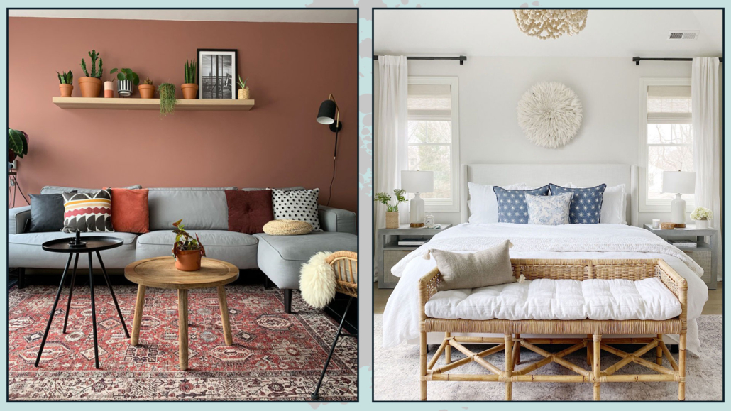
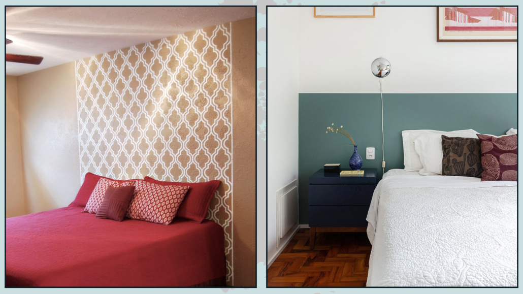
– USE THE RIGHT COLORS
Use soothing and cozy colors, colors that can make you feel good.
Recommended colors for the bedroom are shades of green, beige, and light blues, but really any color that you feel is yours will do!
The only caution will be not to use too vivid colors, except as an accent, but try to make it more neutral by adding white if you want light colors or black or gray if you want darker colors.
Doing this will allow you to have your favorite color, making it softer.
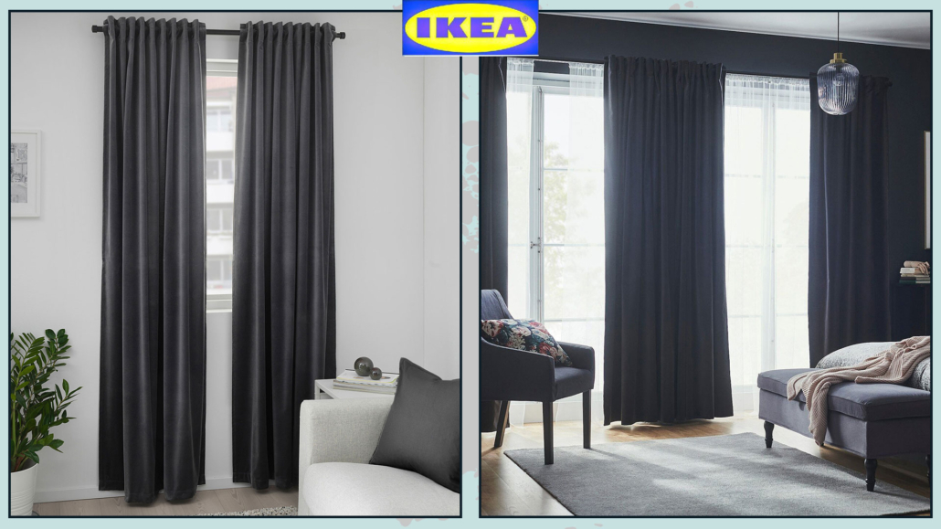
As you noticed, I mentioned not only light colors but also dark colors; this is because dark colors make the room more intimate, and therefore, it could really be a good idea for the bedroom!
(credits: lillytaylorinteriors; Pella Hedeby)
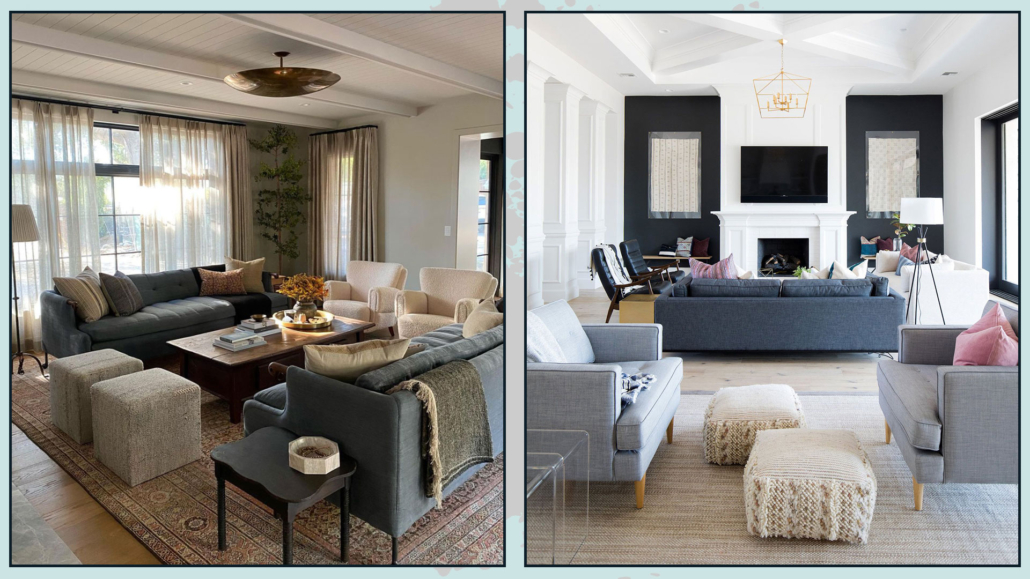
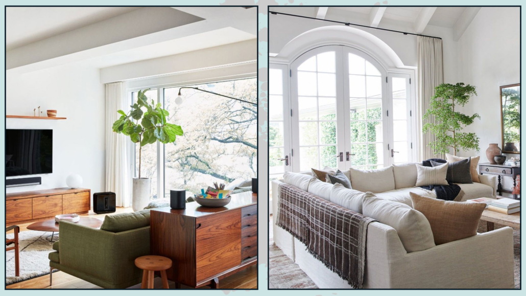
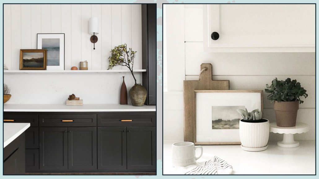
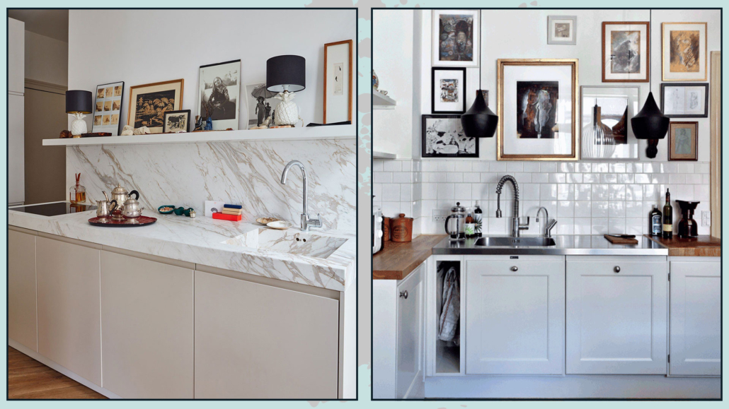
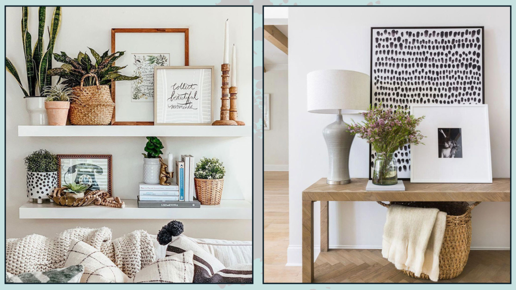
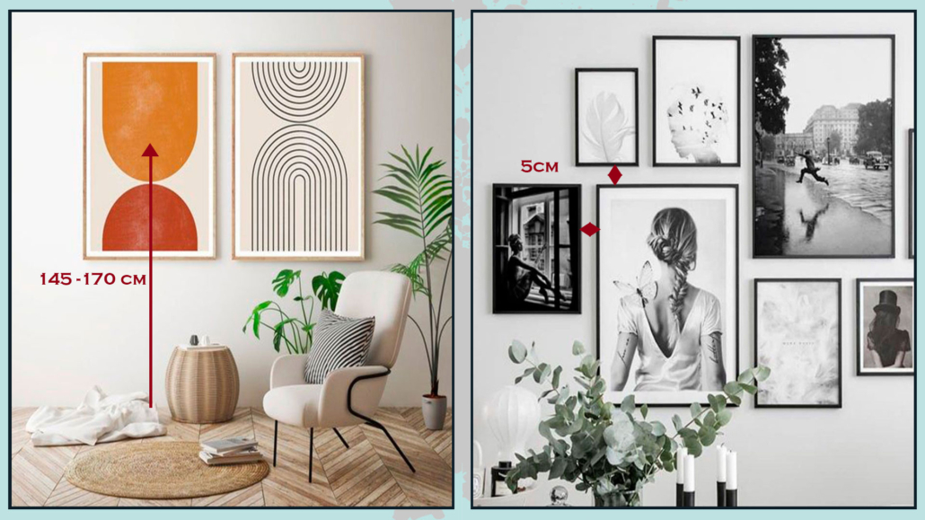
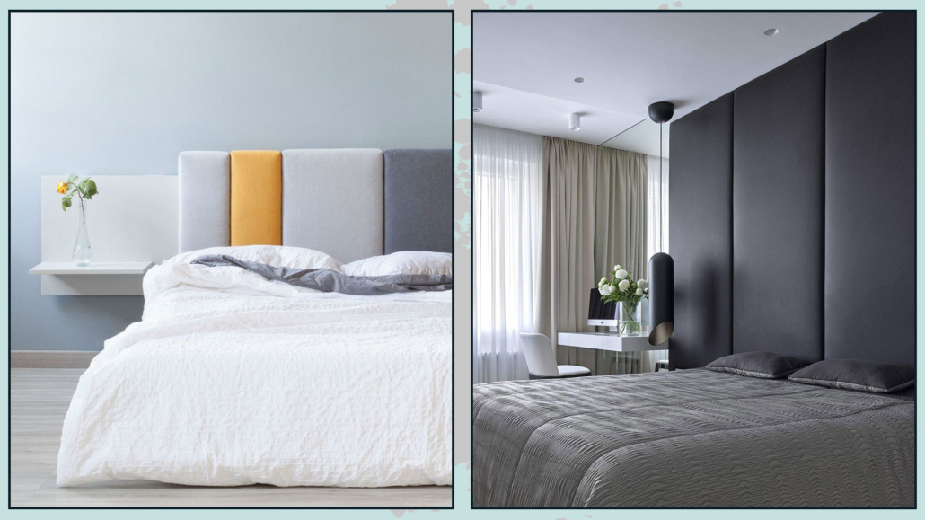
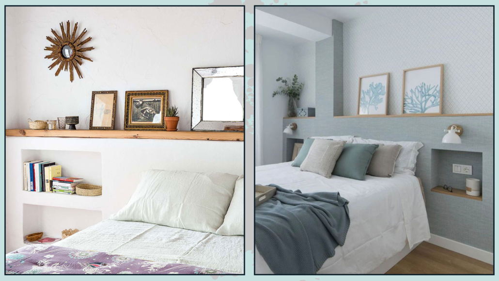
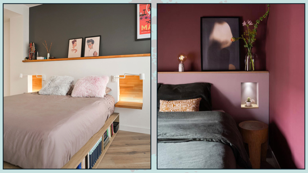
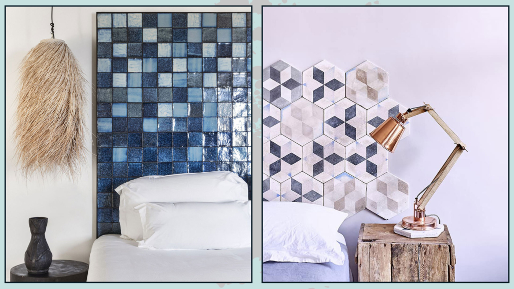
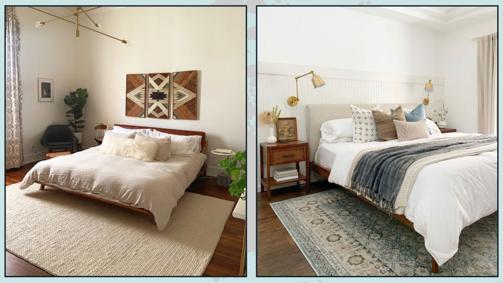
– CUSTOMIZE THE BED WALL
In most cases, the bed wall is the focal point of the room, so make it significant for you!
It could be a simple painting that has a special meaning or excites you, or a photo gallery or the display of particular objects; there is no rule: the important thing is that it draws you in and excites you!
Here are some ideas on how to decorate a bed wall.
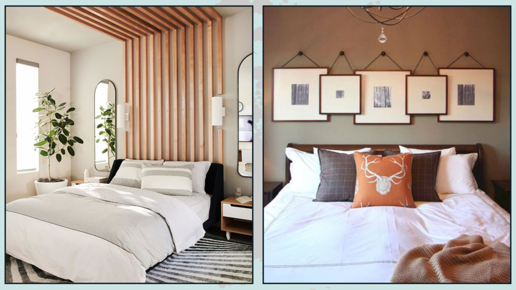
(credits: bobbyberk.com; Bria Hammel Interiors)
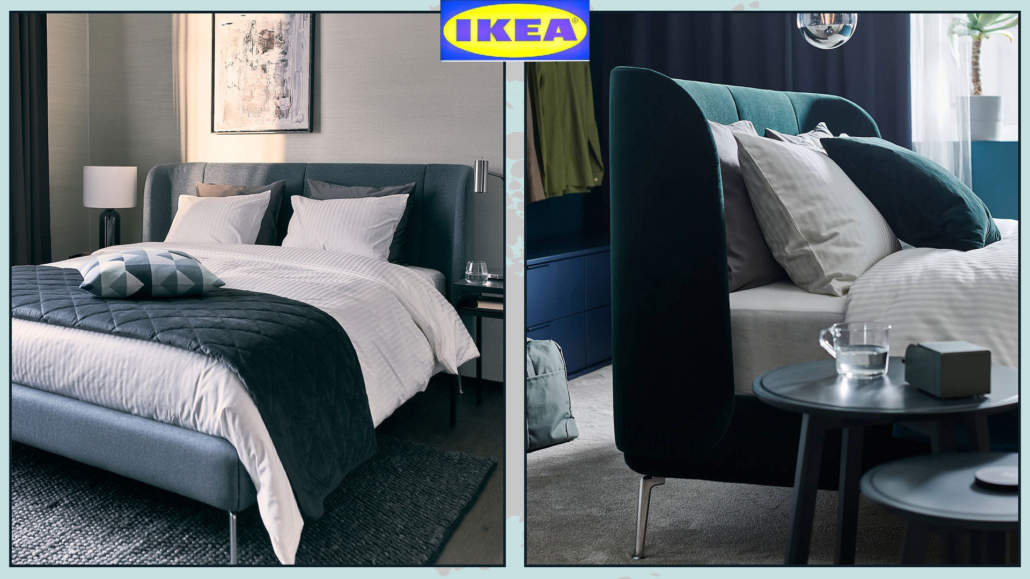
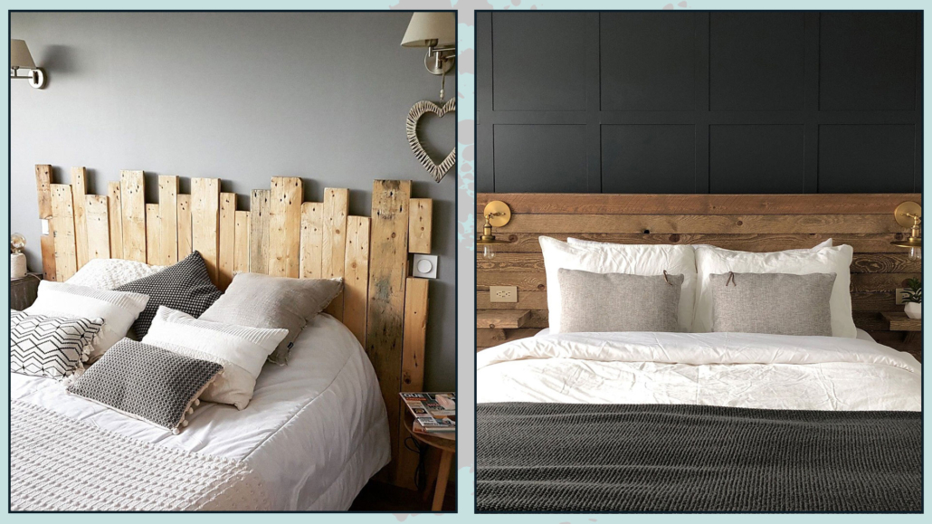
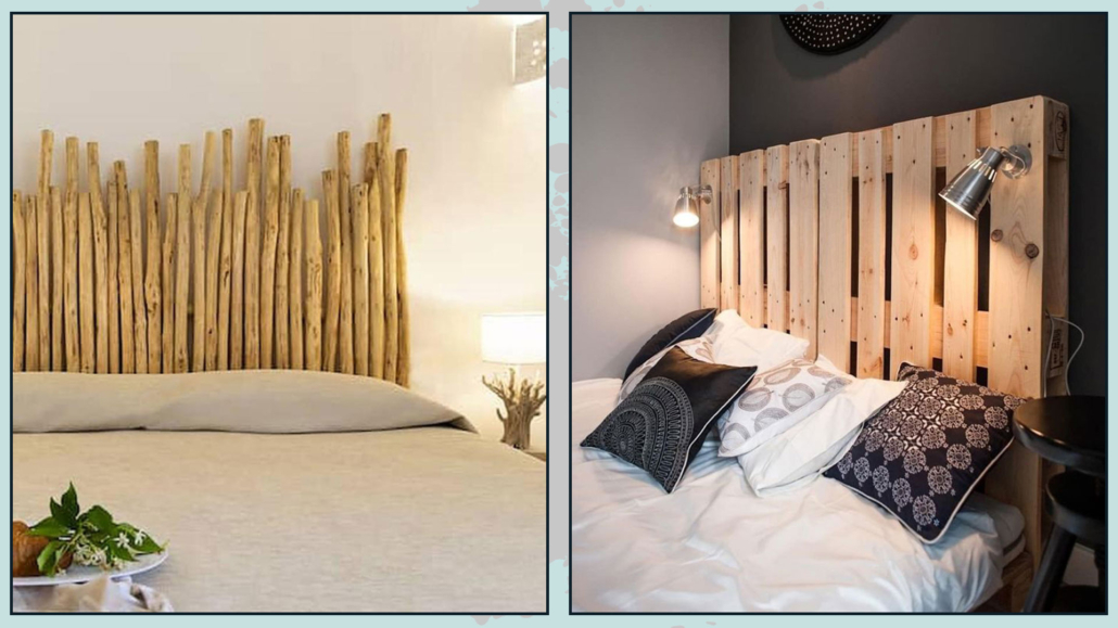
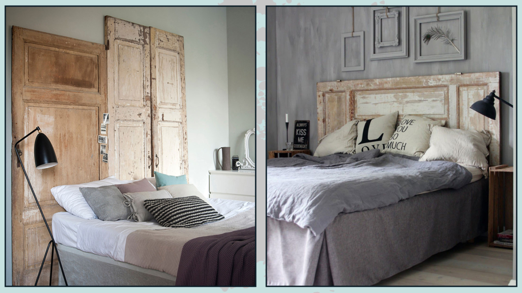
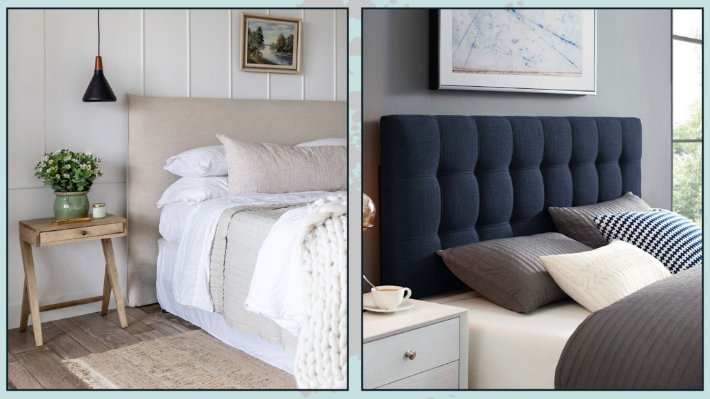
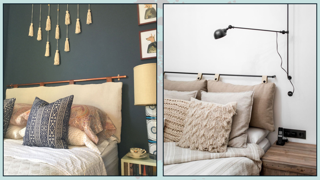
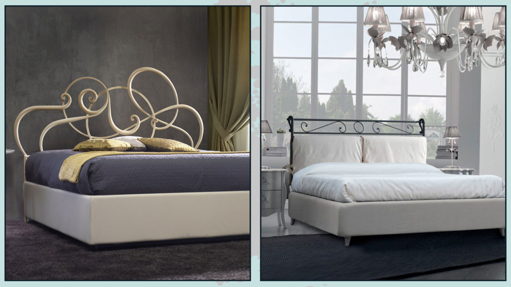
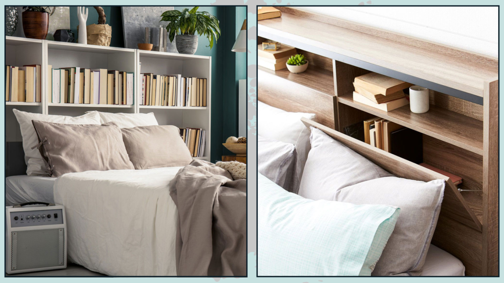
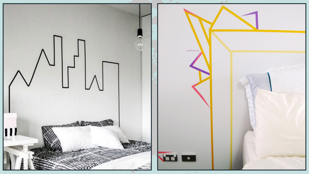
– CHOOSE THE RIGHT BED
By the right bed, I don’t mean so much the aesthetic part, which certainly has its importance, as much as the bed base and mattress so that you can have a good sleep!
These are two items, especially the mattress, that you really cannot go cheap on!
It is absolutely essential to get the right products that will allow you to get the best rest because only then will you be fresh and relaxed to face the coming day!
The bed frame is an extra, which will undoubtedly be important aesthetically but not functionally.
You might even decide to have only one particular headboard, maybe only designed on the wall on the wall!
(Here you can find some ideas for the bed headboard!)
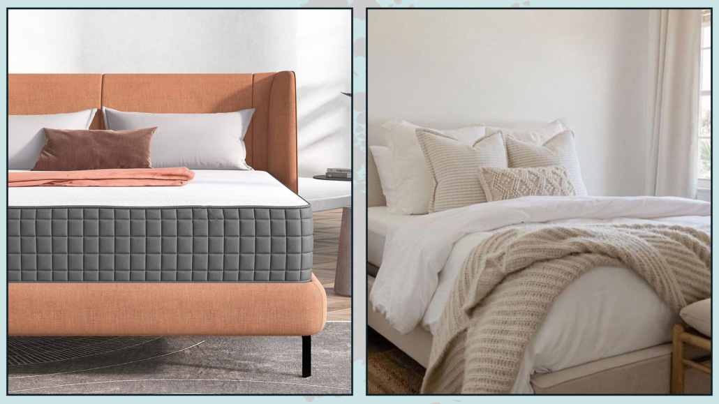
(credits: amazingbargains.com; @CarleysWorld)
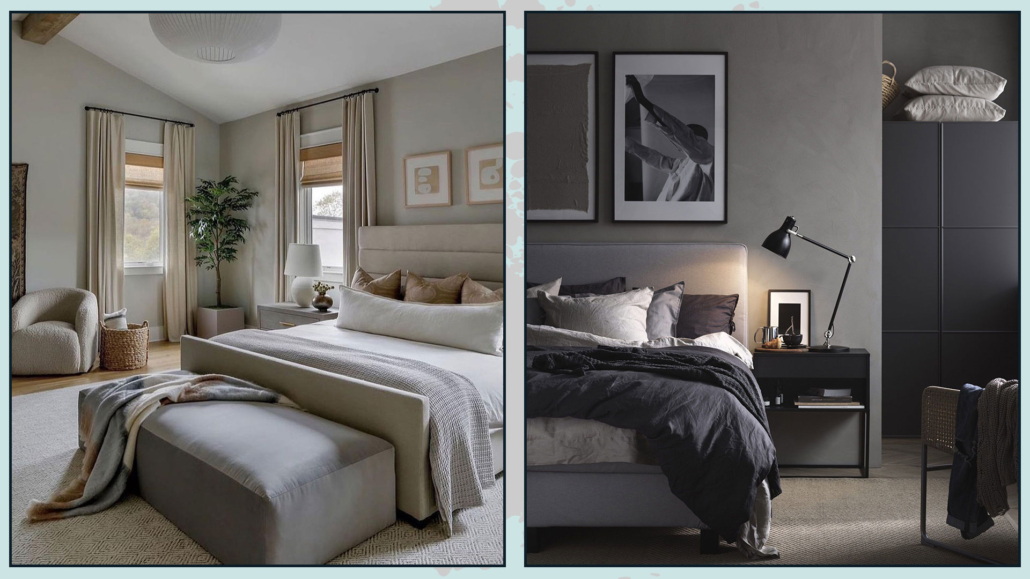
– I RECOMMEND THE NIGHTSTANDS!!!
No matter how small the bedroom is, it is really paramount to have something to serve as a countertop next to the bed!
That is for being able to rest the necessities, from an alarm clock to a book or even the phone (although that would be better not to have it near at night)!
If you don’t like classic nightstands, you can use a chair or place a super simple shelf, but it’s really mandatory to have something!
It will also be relevant to pay attention to the height of this tabletop for easy use, which should be at mattress height.
When this is not possible, it should be a little higher, but a maximum of 10cm!
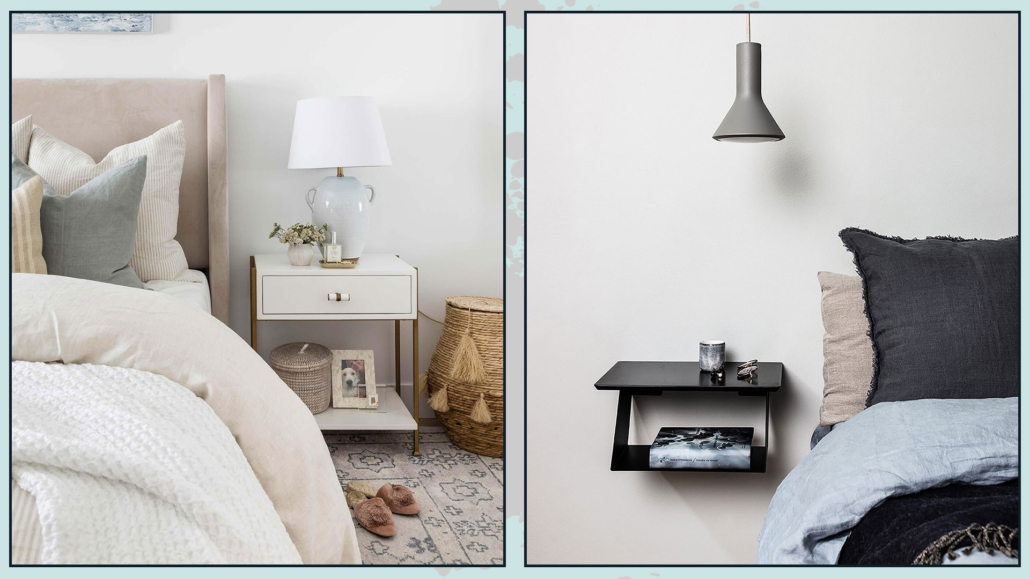
(credits: shoppe.puresaltinteriors.com; royaldesign.se)
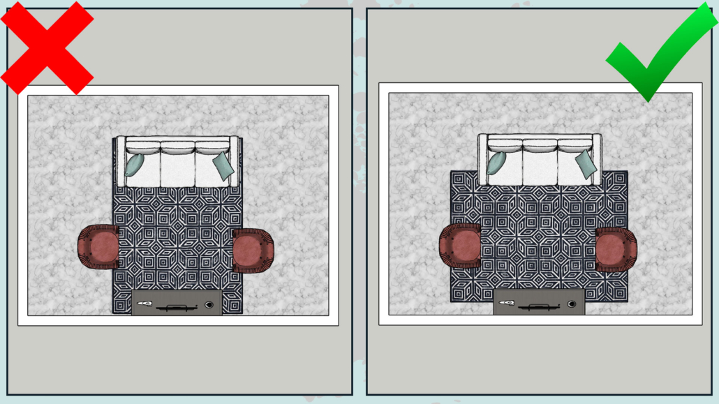
– DON’T PURSUE SYMMETRY AT ALL COSTS!
When choosing nightstands, you don’t have to feel compelled to buy them the same, perhaps coordinating with the bed and closet.
This choice is often made because symmetry is thought to be visually more beautiful in the bedroom!
Well, NO, it is not mandatory; an asymmetry, on the contrary, if well balanced, could make everything much more interesting!
Also, if there are two of you, you likely have different tastes and, above all, different needs, so one type of nightstand may suit one but not the other!
So don’t worry if there are two different nightstands in terms of shape: the important thing will be that they can perhaps have a commonality like color or material!
If then the two nightstands were also very different as visual weights, you could balance them with lamps, pictures, or, why not, a plant!
(credits: stylebyemilyhenderson.com; modsy.com)
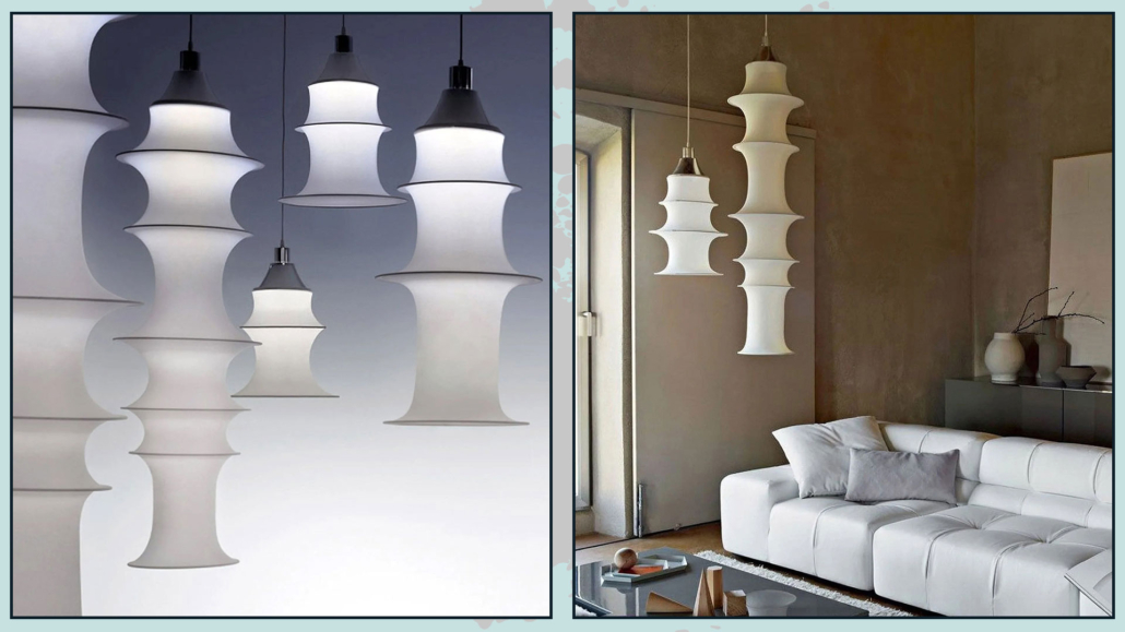
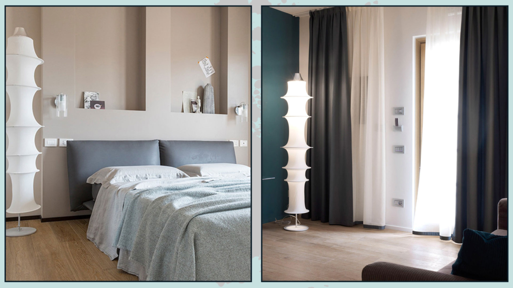
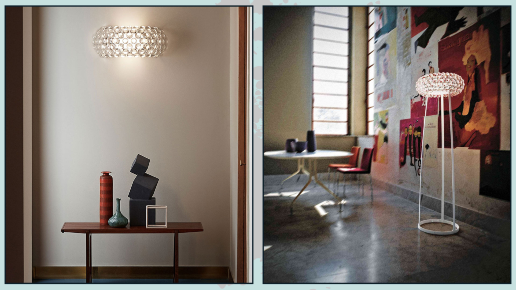
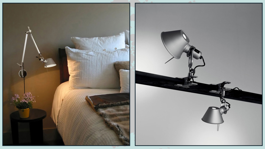
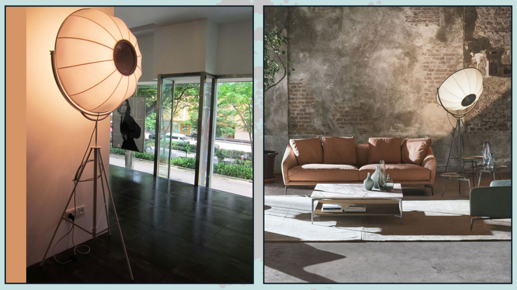
– ABATJOUR
While having multiple lighting points is always very important, in the bedroom even more so: it is essential to have a light near the bed.
It can be a table lamp to rest on the nightstand, a sconce light, or even (and we increasingly see more and more of these) pendant lights.
Some renovation work obviously needs to be done for the latter, but they have a spectacular effect that is truly amazing!
Wall lamps might be more functional where the bedside table top is cramped to avoid “stealing” practicable space for something else!
Another crucial thing in designing the perfect bedroom is the color temperature of the bulbs!
In the bedroom, it is preferable to use warm lights because they remind our brain of the color of the sunset, and this puts us in a position to relax and then sleep better.
(credits: behance.net; target.com)
– THINK ABOUT CONTAINING
It may sound silly to you because you definitely have a closet, but it’s essential that the bedroom is really uncluttered!
That is because the disorder creates unconscious discomfort that can also disrupt sleep.
So think about having more storage elements: in addition to the possible dresser, it can be the bed with a box or drawers, but it can also be boxes to put under the bed.
It could be a bench at the foot of the bed or even a simple ottoman.
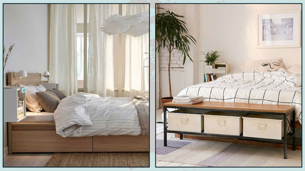
(credits: Ikea; urbanoutfitters.com)
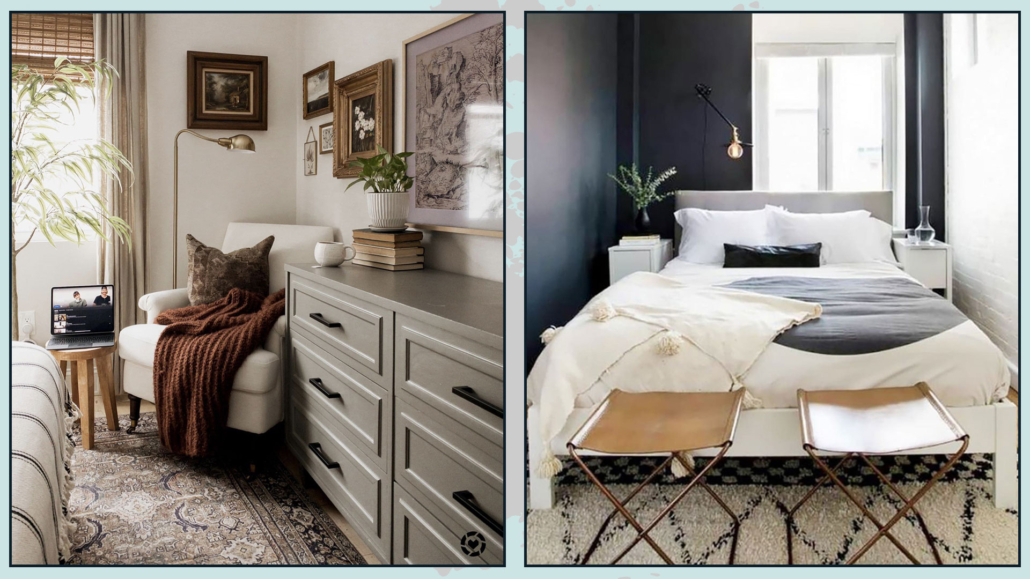
– ADD A SITTING
The bed should only be used for sleeping, so here, to make the room functional, it is relevant to add extra seating.
That can be useful for sitting down when you need to put on socks or shoes or to lay down a dress without precisely touching the bed!
Moreover, as seen in the previous point, the seat could be a container, thus also becoming a multifunctional element!
Not only that, it brings shapes and textures, and this gives some rhythm and movement to the room.
(credits: Pretty-Honeydew; Homepolish)
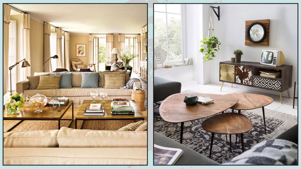
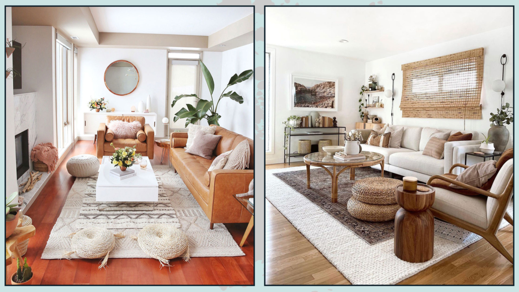
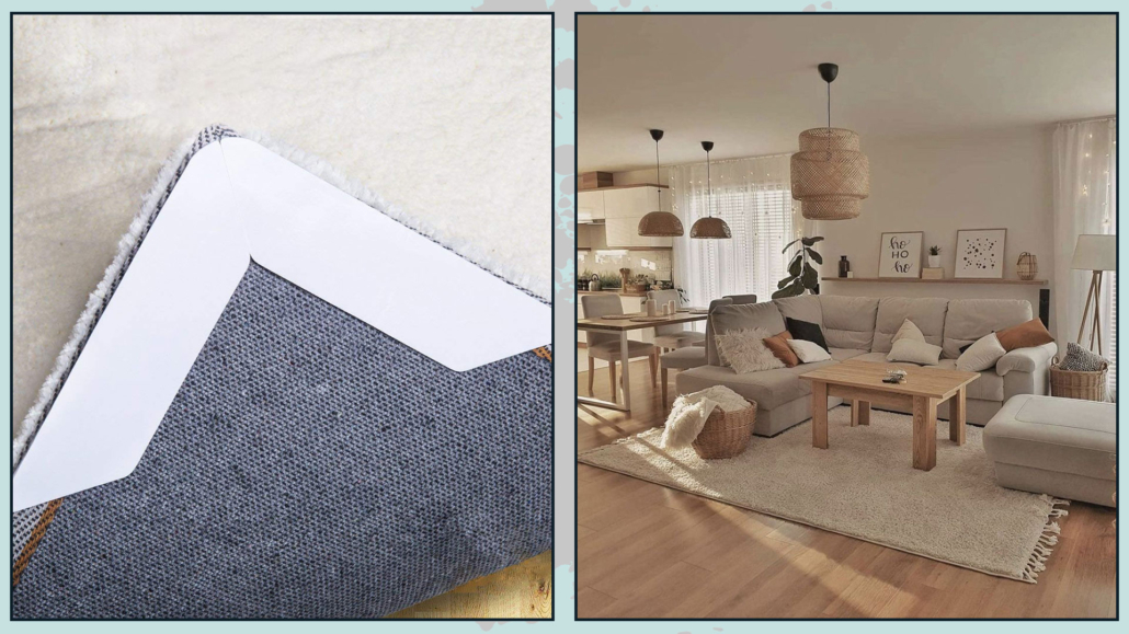
– USE THE RUG
The rug, as always, is a controversial element: if you think about it for the living room, it is much more difficult for this to happen in the bedroom!
And I’m not talking about the bedside rugs, which, let’s face it, are kind of sad!
I’m talking about a nice big rug to accommodate the bed, nightstands, and possible bench at the foot of the bed!
That will create an even more intimate sleeping area, but more importantly, it will be functional to avoid resting your feet on the cold floor!
And, again, it will contribute textures and colors, making the room more inviting!
(credits: Kristin DuFour; hartleyhomedesign.com)
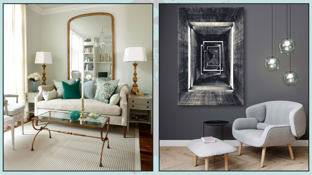
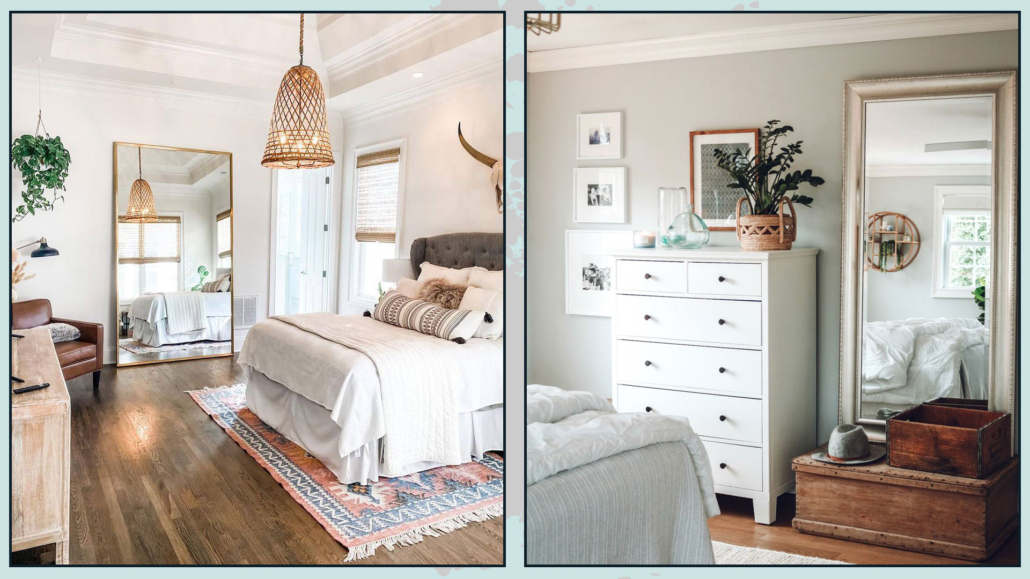
– DON’T FORGET THE MIRROR.
The bedroom is the place, 99 out of 100, where you dress and get ready for the day, so it is paramount to have a mirror where you can check that you are in order!
Personally, I really love the mirror resting on the floor, but the important thing is that it is a long mirror in which you can see yourself entirely!
The mirror also doubles the light giving more breadth to the room!
(credits: ideasdonuts.com; nestingwithgrace.com)
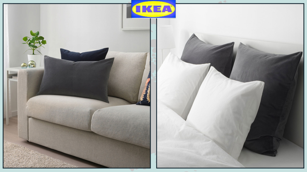
– CHOOSE THE SHEETS WELL
Like with the mattress and the bed base, it is important to feel “welcomed” by the bed sheets too!
As with room colors in general, I would advise against colors or patterns that are too strong because they excite and do not help sleep.
Choosing quality bedding that makes you feel a little snuggled and pampered will also be essential!
Therefore, choose good quality cotton or linen.
Of course, there are also satin and silk, and for them, allow me a very small digression: they are great for skin and hair care!
A satin or silk pillowcase will leave your facial skin brighter and the same for your hair by drastically avoiding knots, and for us curly-haired people, for example, it’s a boon!
Having closed this short aesthetic digression, having soft and snug sheets will surely help you sleep better!
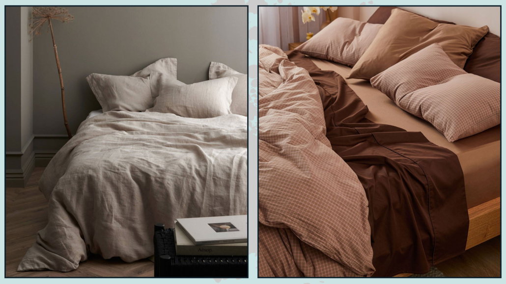
(credits: ellos.se; sheetsociety.com)
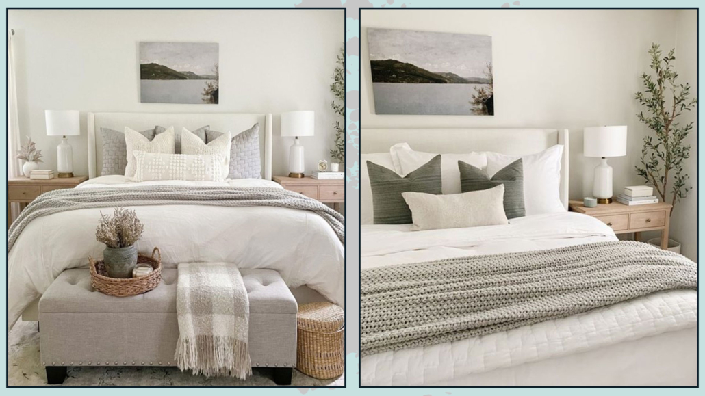
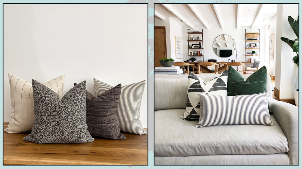
– DRESS THE BED
Don’t settle for putting a simple, albeit beautiful, bedspread on your bed: it would look a bit “incomplete”.
Add some decorative pillows and blankets to the bottom of the bed!
You might think it’s a bother to take everything off in the evening and put it back on in the morning, but this time will be amply rewarded!
Blankets and pillows will give that extra touch to your bed and the whole bedroom, especially if you choose different materials, textures, and colors, creating some contrast.
That will give some movement and character, but most importantly, it will make the bed and room even more inviting and cozy!
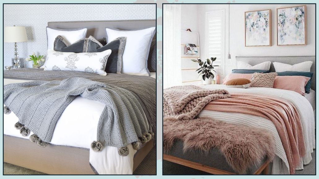
(credits: zdesignathome.com; messybits.com)
I hope this article was helpful and you love it; in case, let me know in the comments!
Feel free to share it with anyone you think might be interested, I will be honored, and it will help me get my name out there.
If you feel that your home, or some environment of it, does not reflect you enough, do not wait any longer and book your consultancy!