Colors, as we know, can influence our emotions, so it’s essential to consider how we want to feel in a given environment to choose the right ones.
That applies to the entire house, but especially to the bedroom because it’s where we most need to feel good and safe, thus promoting also good sleep!
So today, we’ll look at some suitable bedroom color combinations!
– DARK AND MOODY BEDROOM COLOR COMBINATIONS
Using dark colors is ideal if you love the idea of a cozy and enveloping bedroom.
Using deep blues with a warm undertone, rich browns, and charcoal grays gives a comforting sense of intimacy, like a hug and a sense of security!
Moreover, they are associated with the concept of sophistication and depth.
Dark shades also significantly enhance the cone of light from every light source, which is less visible with light colors!
That creates a beautiful contrast with the dark tones and intensifies the feeling of intimacy!
– BLACKS AND DARK GRAYS
Black or anthracite grays are quite beautiful but not so easy to use because they can result in a flat look.
If you opt for a monochromatic combination, it’s wise to use different finishes and textures to add some movement and play!
Wallpaper could be an example, but also in textiles like blankets and pillows; this, in addition to the movement mentioned earlier, also helps to soften everything!
I suggest painting the ceiling white anyway to maintain a minimum of openness in the room; everything completely dark could become overwhelming!
Another way to brighten the room could be to dress the bed with light textiles!
That will create some contrast and, as with textures, soften the environment a bit.
Everything doesn’t need to be solid color; conversely, introducing patterns, once again, creates some play and movement.
These patterns can be tone-on-tone, playing with various saturations, or you can introduce some other color to contrast and brighten things up.
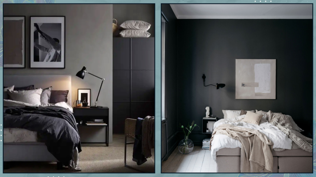
(credits: Ikea; Lovisa Häger foto Jesper Florbrandt)
– BROWNS
Browns are another way to create cozy and moody environments.
They are definitely lighter compared to blacks and also more natural.
However, it’s still a dark color, so it’s good to balance it with lighter shades.
For a more enveloping environment, with browns (if they’re not overly dark), you can use the same color for walls, floors, and ceilings.
Also, in this case, remember to play with textures and patterns to create movement!
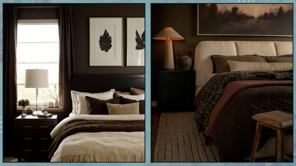
(credits: @ideabedroom; @rustandtrust)
– DEEP BLUES
In general, blues are calming tones, making them perfect for the bedroom.
Certainly less dramatic than black, one can use blue with more ease!
Blues are fantastic when paired with browns because they are the exact opposite in temperature.
Brown warms up blue, giving the rooms a relaxing sensation.
You can use brown as a color, but it’s even better as a material like wood.
Another great way to brighten blues is by using brass elements; the contrast is pleasant and elegant.
In the case of a monochromatic pairing, again, I recommend playing not only with various shades of blue but also with different textures and patterns.
That creates movement and adds character to the room.
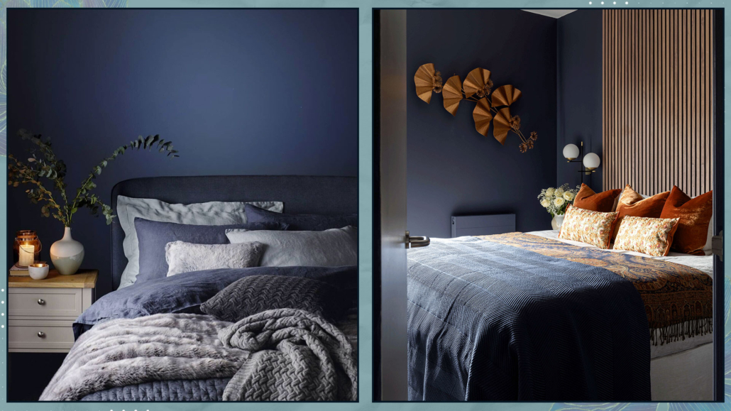
(credits: Jotun; Studio Enass)
– RELAXING AND REASSURING COMBINATIONS
For a relaxing and reassuring bedroom, softer colors like powder blue, sage green, and other pastel shades are most suitable.
These colors are associated with nature, such as water, sky, or tree leaves, elements that reinforce the feeling of calmness and tranquility.
– LIGHT BLUES
As we saw earlier, blues are calming colors, and lighter ones are reassuring and relaxing as well.
This color is cold and quite luminous, which will visually enlarge the room and give a sense of freshness and space.
One can use it on ceilings as well as walls, and even in a monochromatic pairing, the result will be pleasant and inviting.
Being so light, it almost becomes a neutral color and serves as a perfect background if you want to use some darker blue accents.
As mentioned earlier, it’s a cold color, so it’s always good to warm it up with elements like wood and wicker.
Alternatively, you can add a bit of cheerfulness by incorporating some touches of orange, its complementary color.
That will add some dynamism and make it more contemporary.
As always, to add some movement and character, it’s also good to play with textures and patterns here as well.
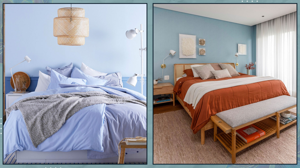
(credits: Ikea; dudasenna_garden)
– GREENS
Greens are relaxing and rejuvenating colors and come in numerous shades, from pale green to richer olive green.
Sage green is the most commonly used because it’s less intense and imposing than olive green and deeper than pale green.
Although a monochromatic pairing, always playing with textures and patterns, is undoubtedly appealing, I recommend adding some browns either as colors or as elements like wood.
That combination is fabulous because it emphasizes the connection to nature!
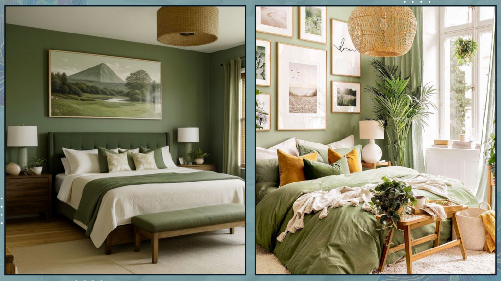
(credits: @ideabedroom; posterstore)
– DUST PINK
Pink is a very delicate color, and if taken with a slight hint of brown, it’s perfect not only for a nursery but also for a master bedroom.
However, avoid candy pink or overly “sugary” shades, which are actually more challenging to pair and can become somewhat noisy!
Since it’s a very light color, it’s wise to have a few darker elements to add depth to the room.
If you don’t like dark colors, create contrast with whites to prevent the pink from becoming too flat.
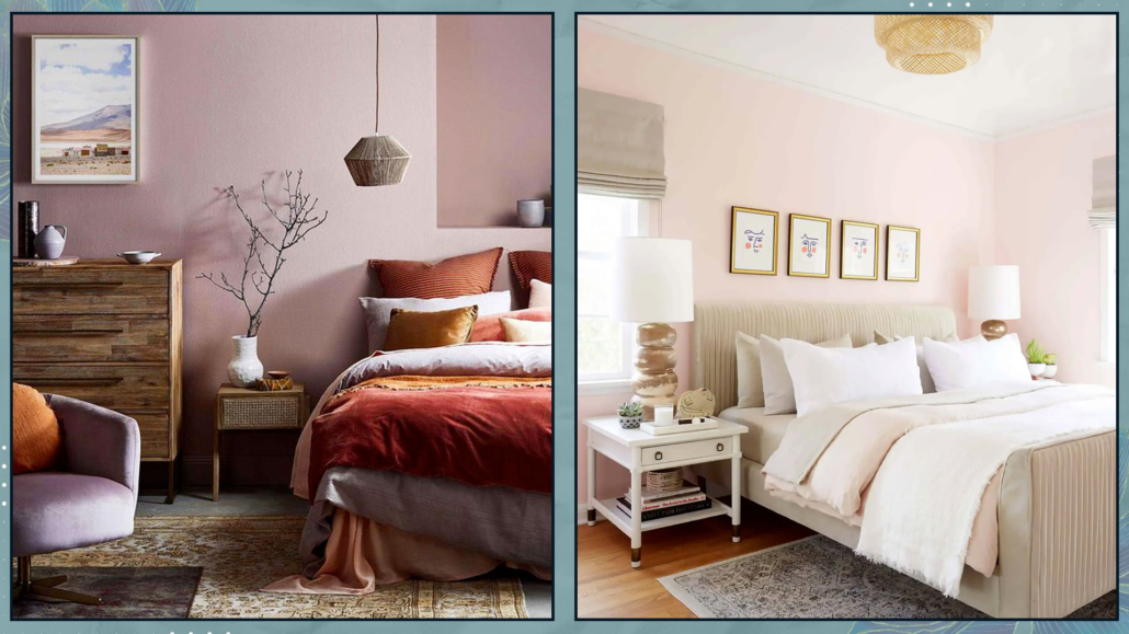
(credits: @emilycapes1; stylebyemilyhenderson.com)
– LIGHT GRAYS
Light grays are the ultimate neutral colors for relaxing and reassuring bedrooms.
However, if you choose this color, you’ll need to pay close attention to its undertone, which could tend towards blue, green, or yellow.
The undertone drastically changes the perception of the environment.
Be careful to choose the one that best suits the existing finishes and furniture.
There is also a subcategory of gray called “greige,” a mix of gray and beige.
It’s a warm, enveloping color, very pleasant and subtle, with a contemporary and harmonious feel.
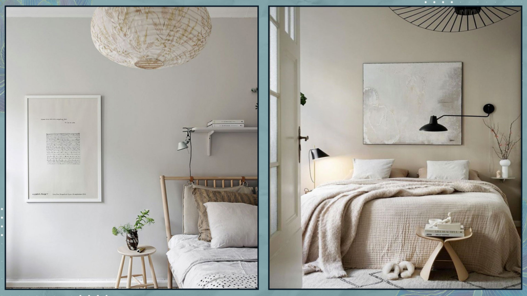
(credits: alvhem.com; Viktoria Askerow)
– WHITE BASES COMBINATIONS
We can’t talk about bedrooms without mentioning whites.
Whites are bright, timeless colors that complement every style and easily pair with any other color.
But, as explained here, it’s easy to say white because, besides pure white, there are at least another 150 shades, depending on its undertone!!!
Some people don’t like white because they think it can be flat and monotonous; however, it’s actually the perfect backdrop for any feeling you want to evoke.
Moreover, you only need to change details such as blankets, pillows, and a few decorative elements to have an ever-changing room.
Even a total white look can be fascinating if you create movement with different textures, finishes, and patterns, too!
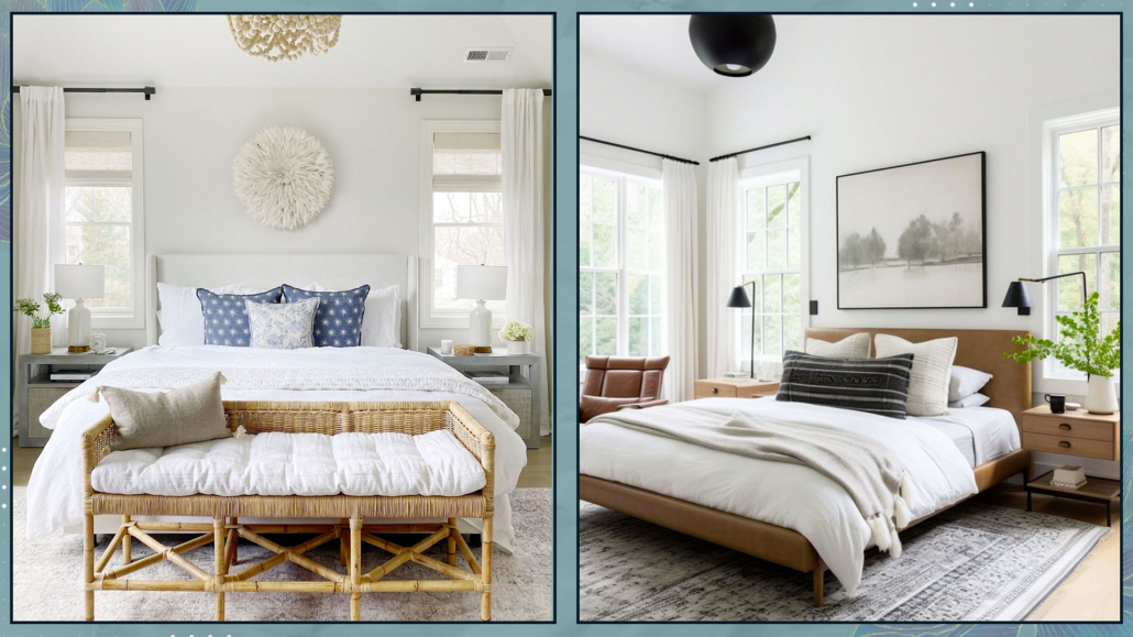
(credits: lifeoncedarlane.com; thebrainandthebrawn.com)
– VIBRANT AND ENERGIZING COMBINATIONS
For an energizing bedroom, it’s good to use warm colors like red, peach, salmon pink, yellows, and oranges.
The advice with all these colors (especially red, yellow, and orange) is to avoid their most vibrant version because they would be too stimulating and disturb sleep.
Use these shades in less saturated versions by adding white for lighter colors, grays, or blacks for darker colors.
This way, you’ll retain their energizing properties while creating a more relaxed and tranquil atmosphere.
Use the brighter tones in small accent elements like pillows or some decorations!
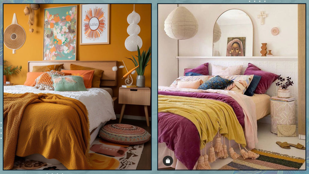
(credits: clemaroundthecorner.com; @toc_estudiocreativo)
– HOW TO CHOOSE THE VARIOUS BEDROOM COLOR COMBINATIONS
The choice between these color combinations will depend on the feelings you want to experience in your bedroom.
Another element to consider in the choice is the existing finishes, such as the flooring, unless you decide to change it (that’s also a color to think about).
If you’re having difficulty making a choice, you could start with something you love, like the headboard of the bed, a particular painting, a rug, etc.
Additionally, consider how much natural light enters the room and its orientation.
As we’ve seen other times, a north-facing room receives colder light than one facing south!
I hope this article about bedroom color combinations has been helpful and enjoyable for you. If so, let me know in the comments!
Feel free to share it with anyone you think might be interested, I would be honored, and it will help me gain more exposure.
If you feel that your home, or any specific area of it, doesn’t reflect your personality enough, don’t wait any longer and book your consultancy!