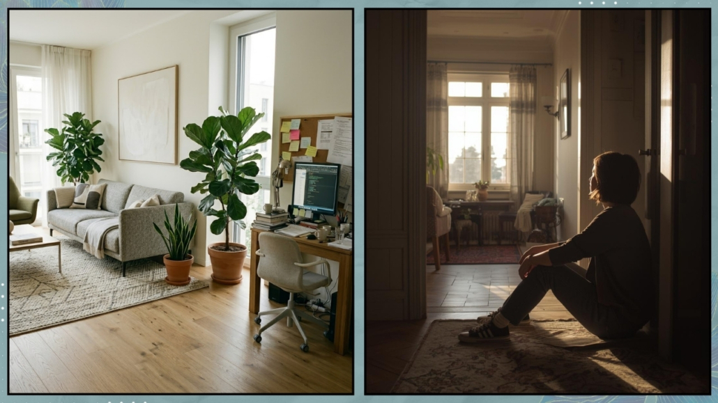
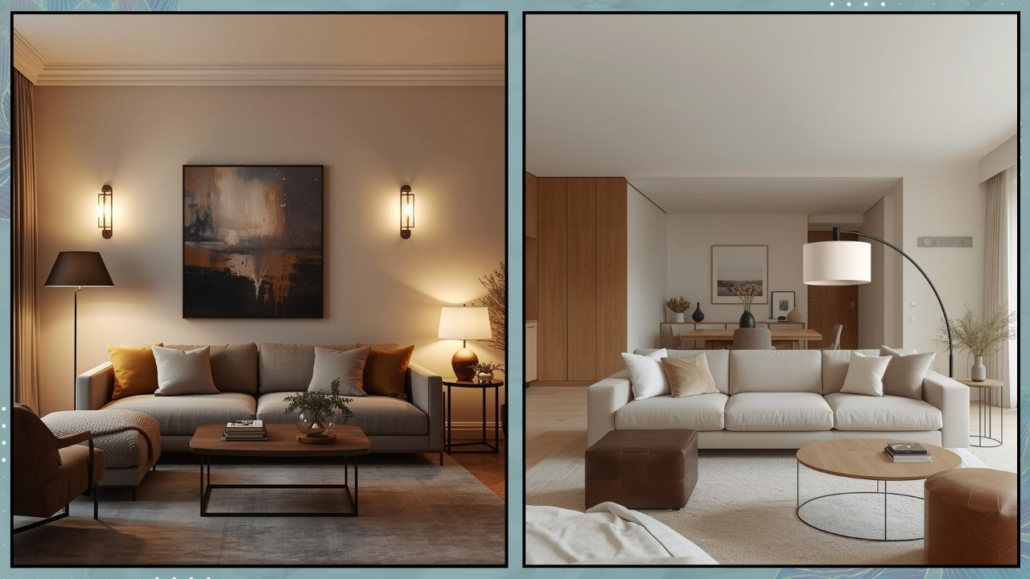
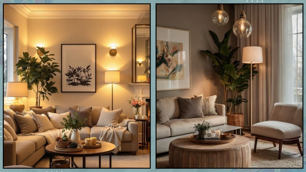
Have you ever stepped into a home that looks objectively perfect—like something straight out of a render or a design magazine—and yet felt a strange sense of distance?
Everything is in place.
The colors work perfectly together.
The furniture is thoughtfully chosen and well arranged, and may even be design pieces.
And still, something feels off.
You don’t feel that sense of comfort.
You don’t feel that quiet invitation to kick off your shoes and relax on the couch.
I call this a beautiful but cold home: a space that works for the eye, but doesn’t speak to the soul.
The truth is, decorating well doesn’t automatically mean creating a place where you truly feel good.
If your home feels like it’s missing a “heartbeat,” don’t worry.
It’s not a mistake—it’s simply a project that is still evolving.
Let’s explore why this happens and how to bring warmth into your space.
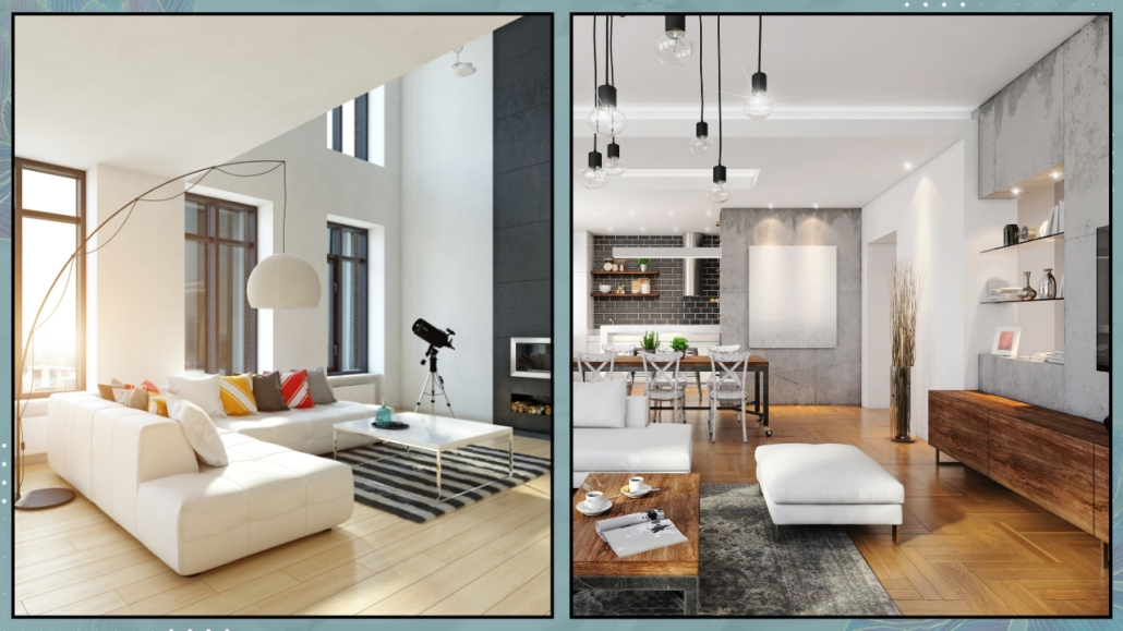
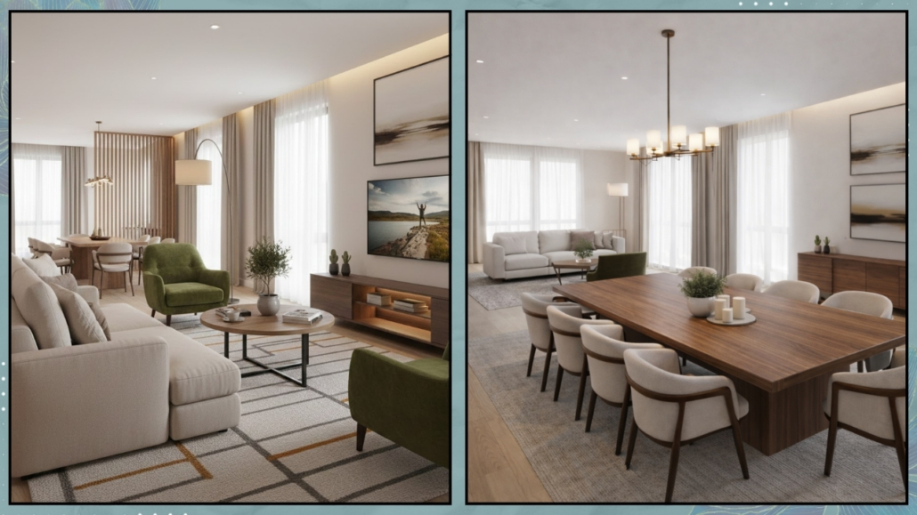
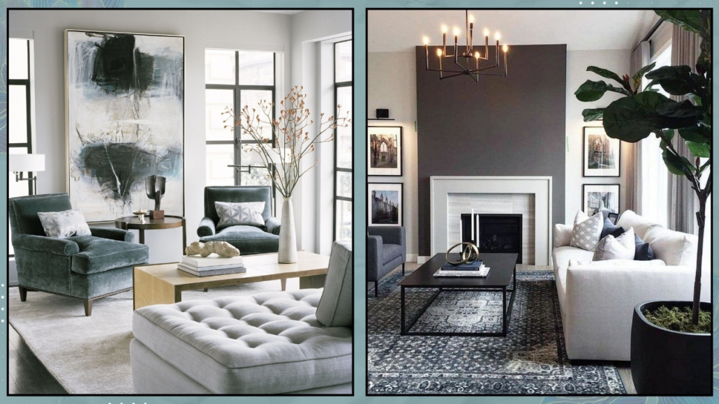
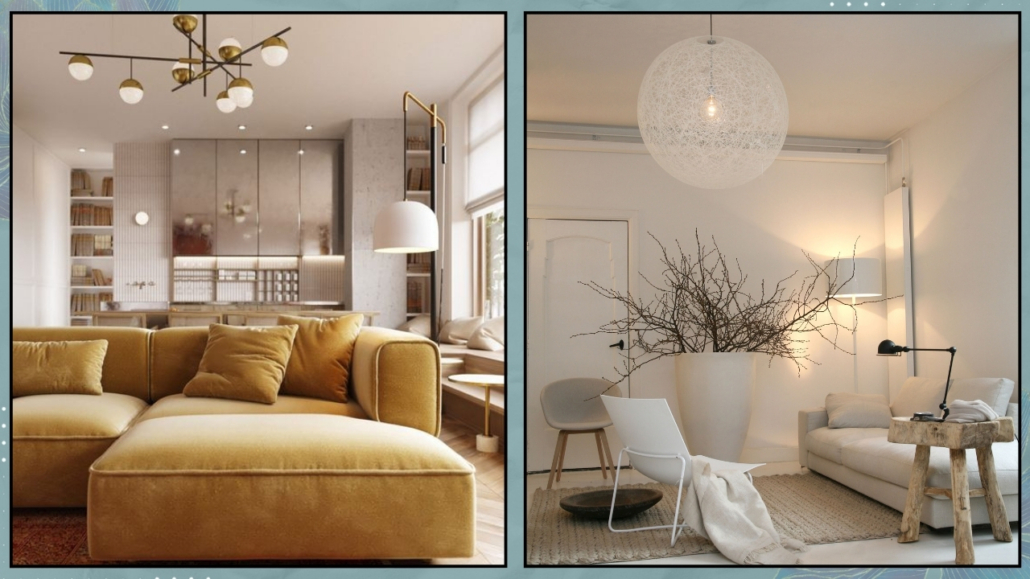
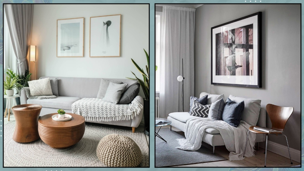
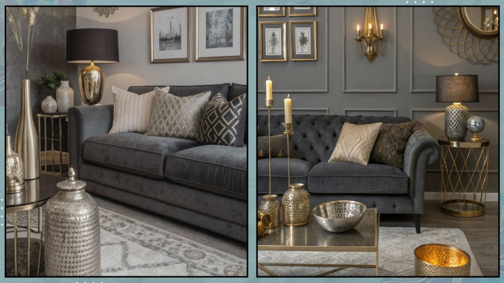
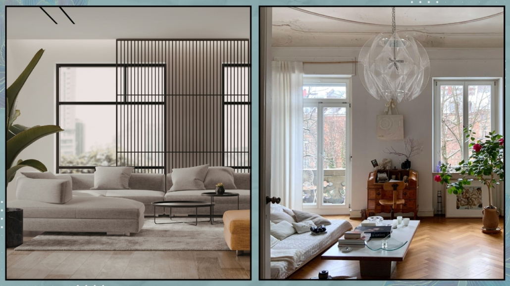
– The trap of frozen perfection
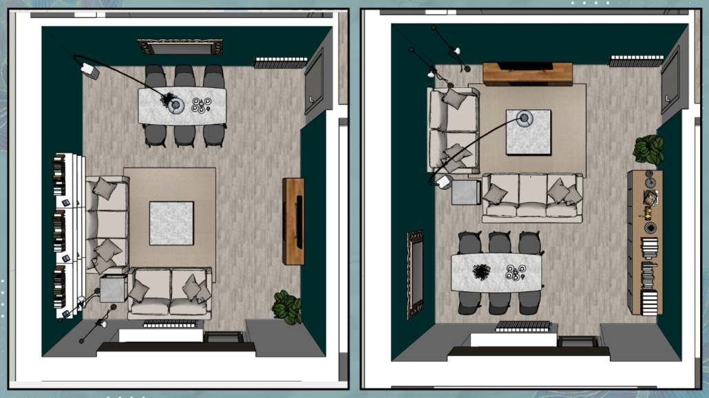
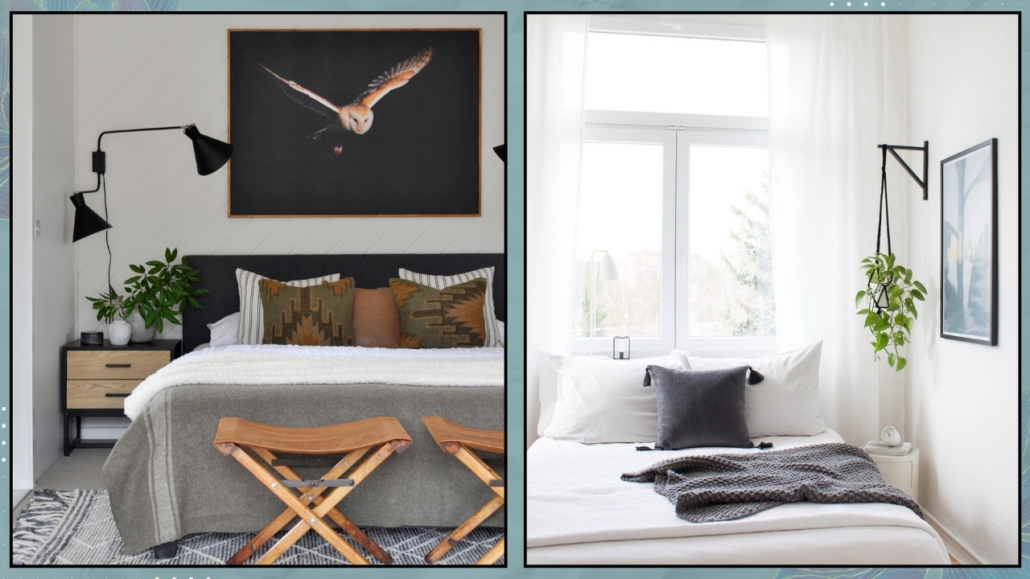
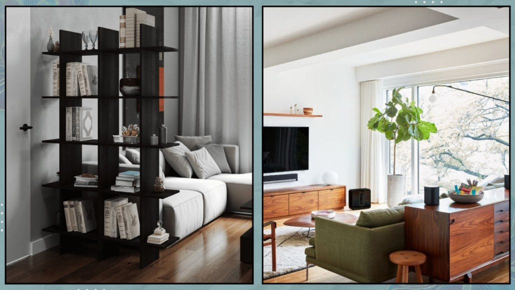
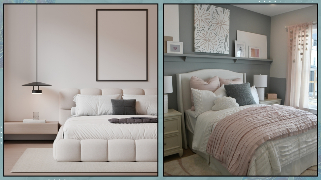
Some homes feel “frozen,” like a perfectly styled magazine spread.
Every cushion is fluffy and sits perfectly in place.
All surfaces are clear.
Nothing is out of place.
Every detail is carefully curated.
But absolute perfection is the enemy of comfort—it creates distance.
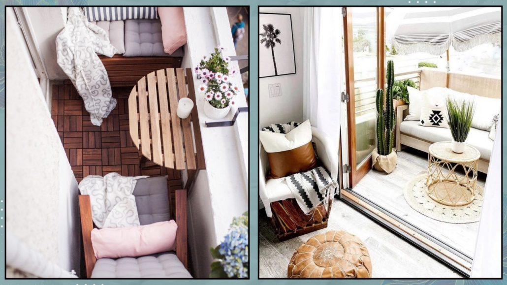
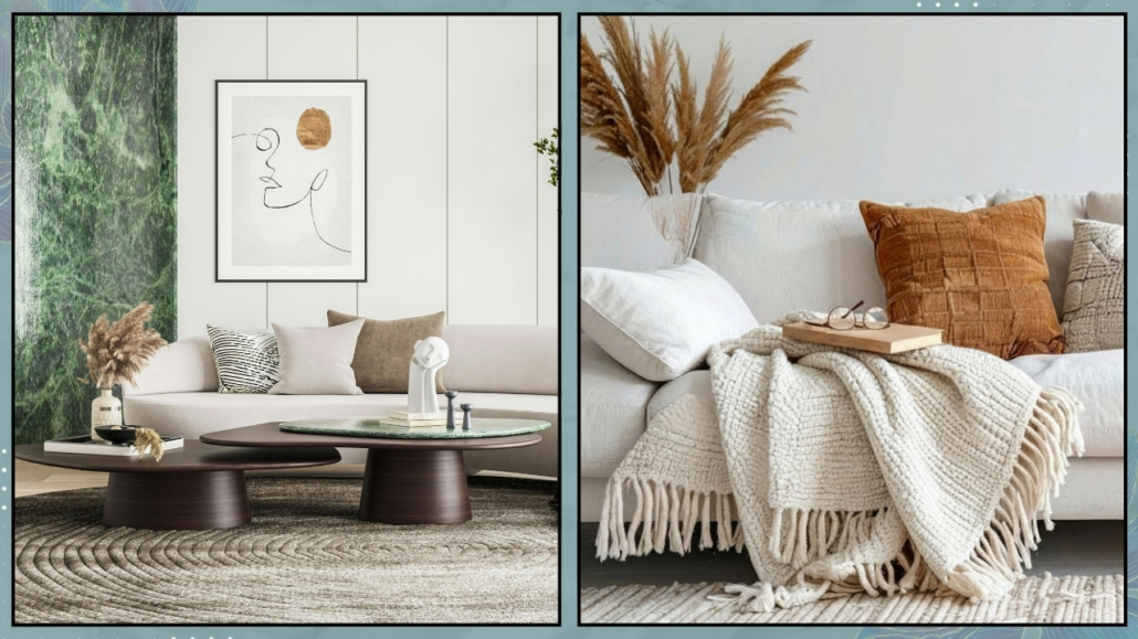
A lived-in home needs movement.
An open book left on the coffee table, a throw casually draped over a chair—these aren’t signs of mess, they’re signs of life.
Don’t be afraid of imperfection.
That’s exactly where warmth lives.
(credit: Canva)
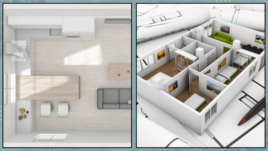
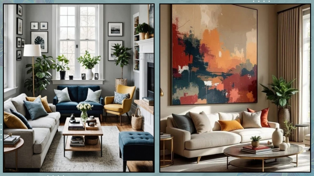
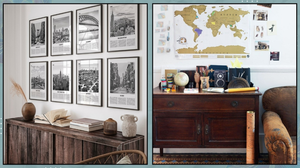
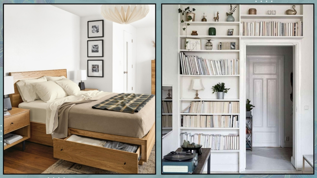
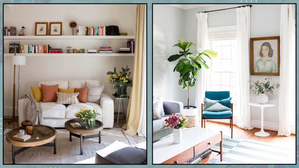
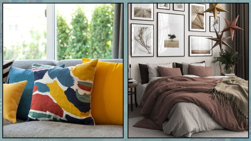
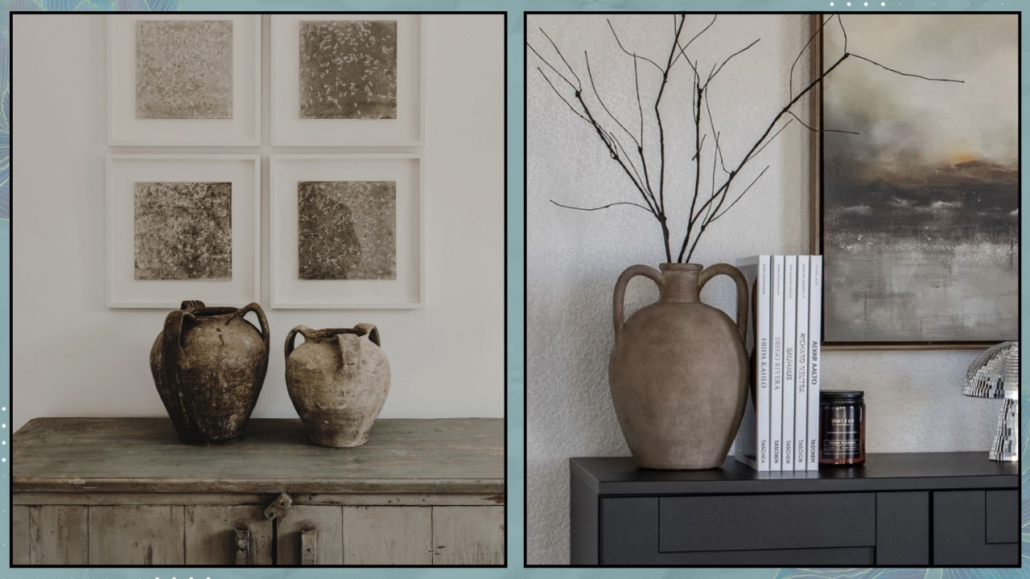
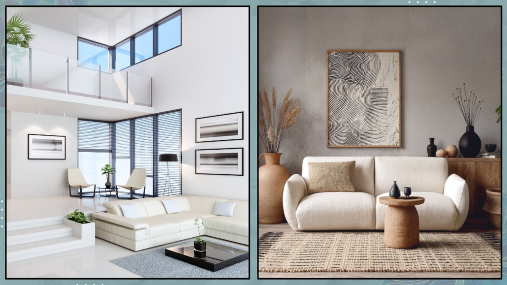
– The style is there, but where are you?
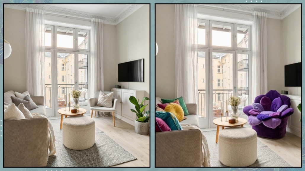
Often, in the effort to “get it right,” we choose furniture that is correct—but impersonal.
Objects that fill a space, but don’t tell a story.
The result? A home that could belong to anyone.
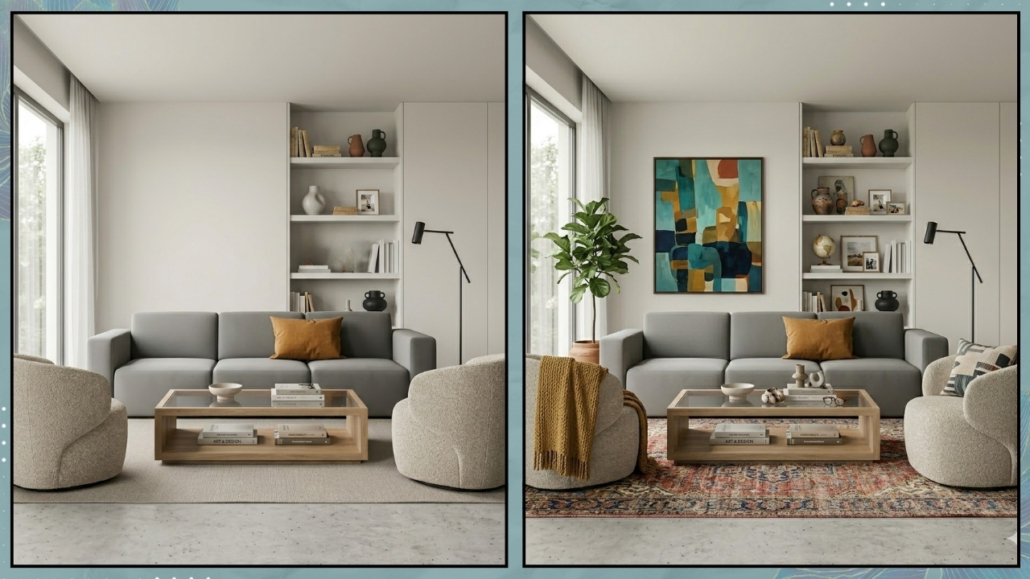
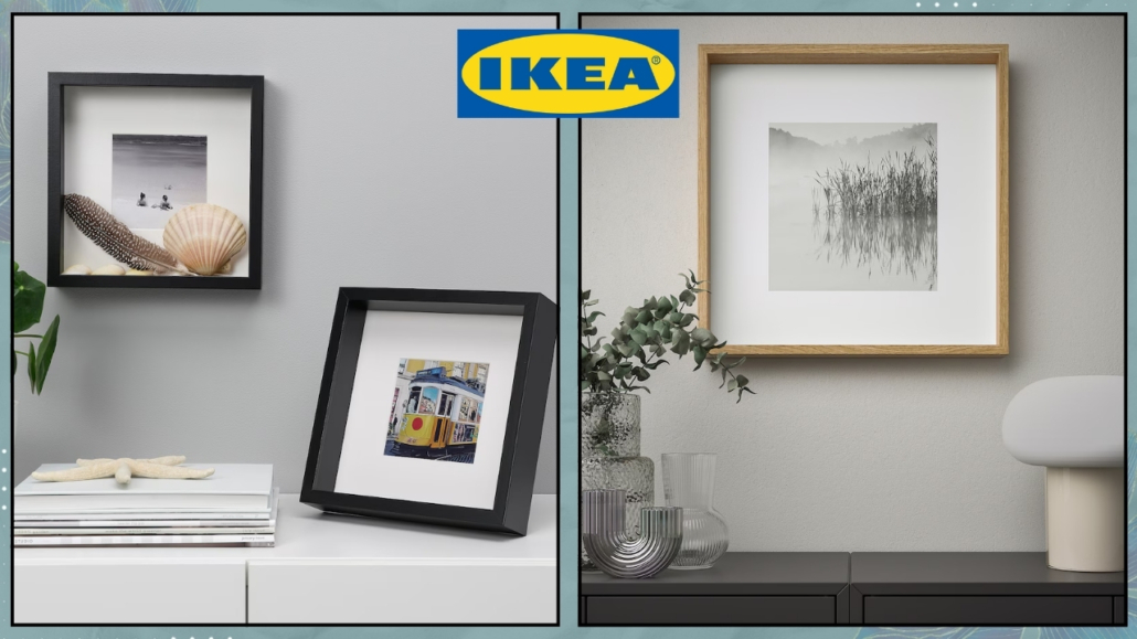
A beautiful but cold home happens when aesthetic choices overshadow your personal story.
Ask yourself: how many items in this room make me smile or remind me of a happy moment?
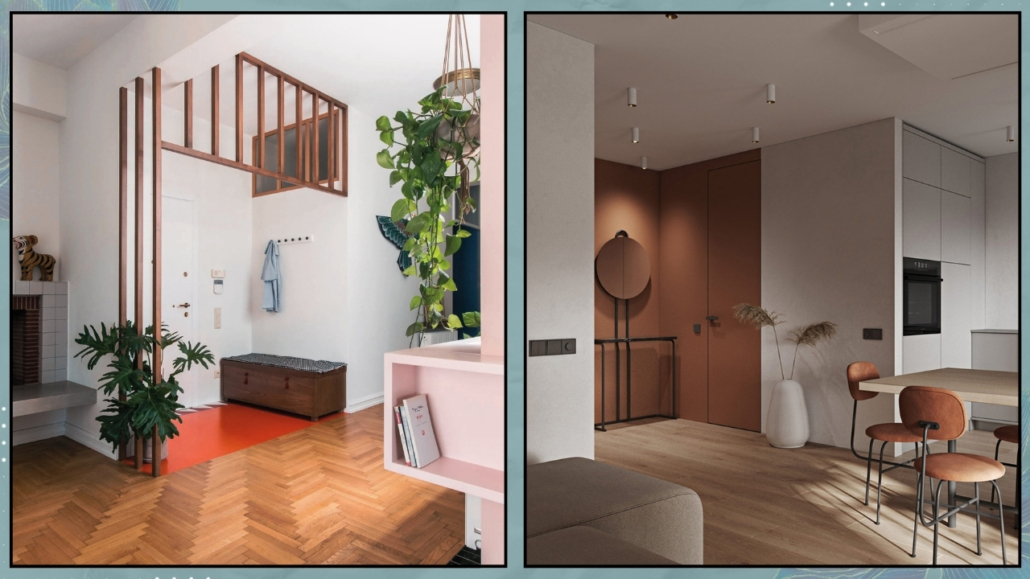
The soul of a home, the part that makes it feel welcoming, comes from meaningful pieces: a vase picked up on a trip, a well-framed old photograph, a vintage item you inherited that breaks the rigidity of a modern space.
(credit: Canva)
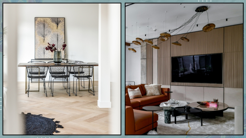
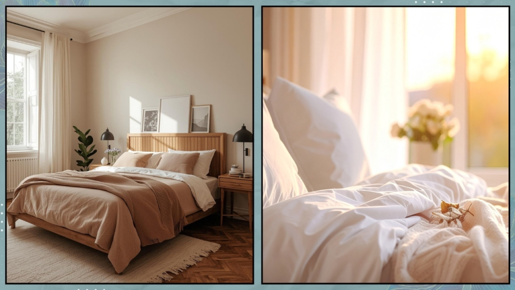
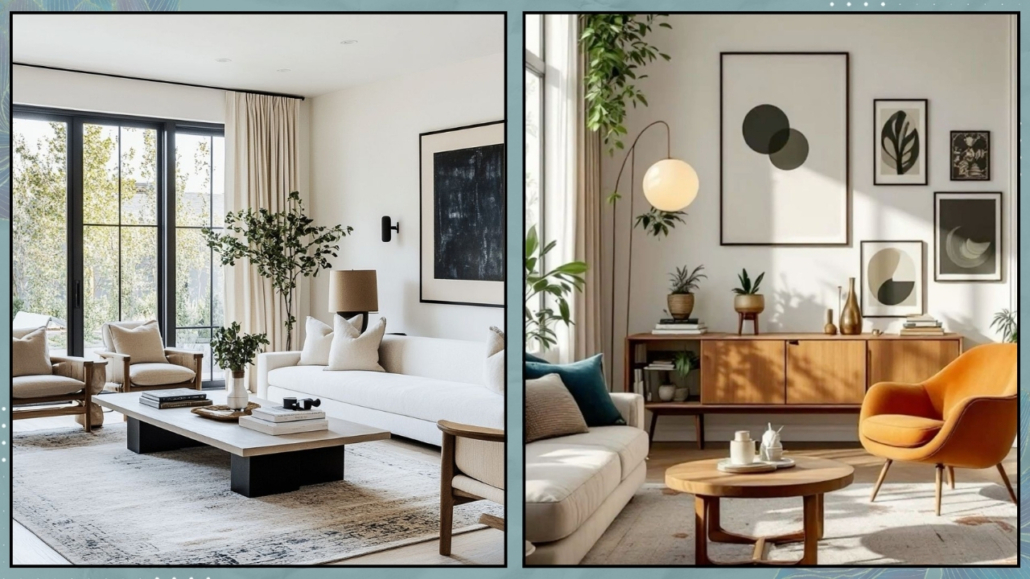
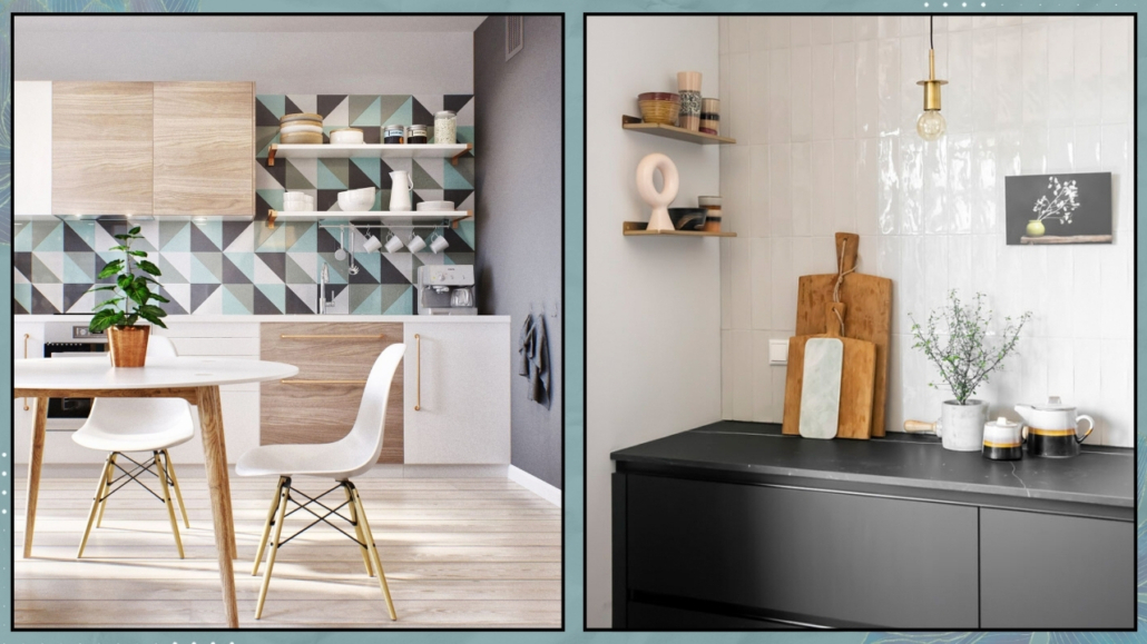
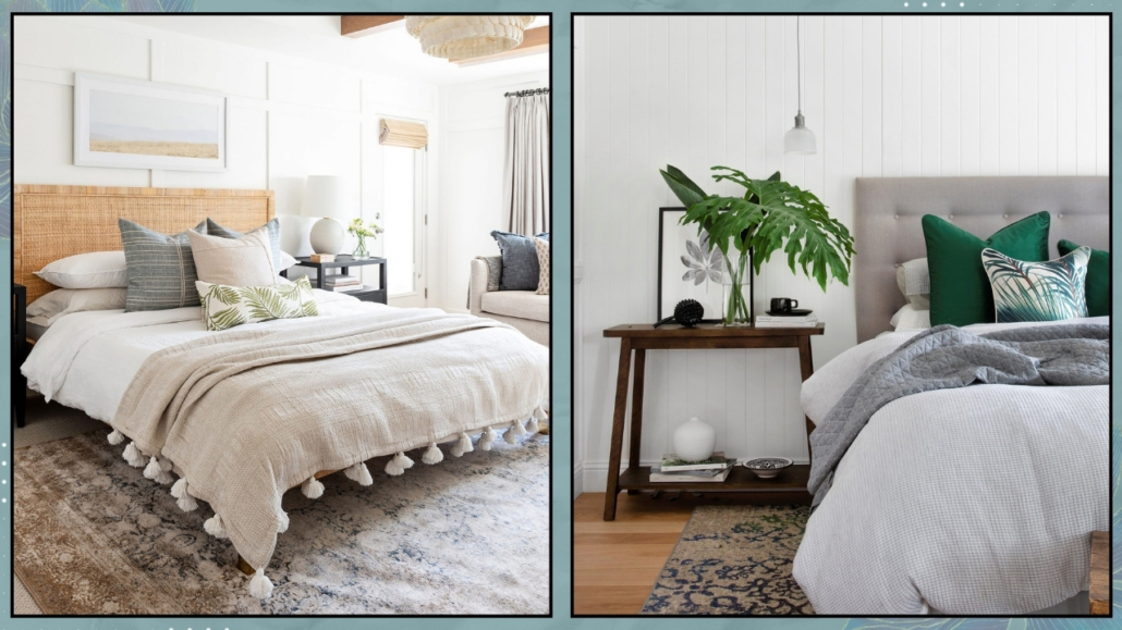
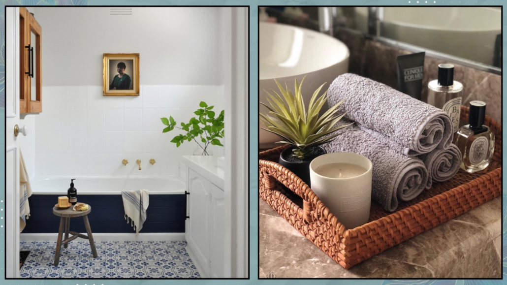
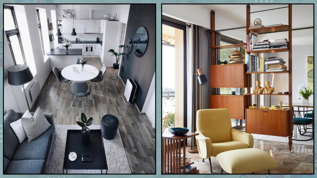
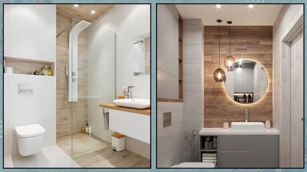
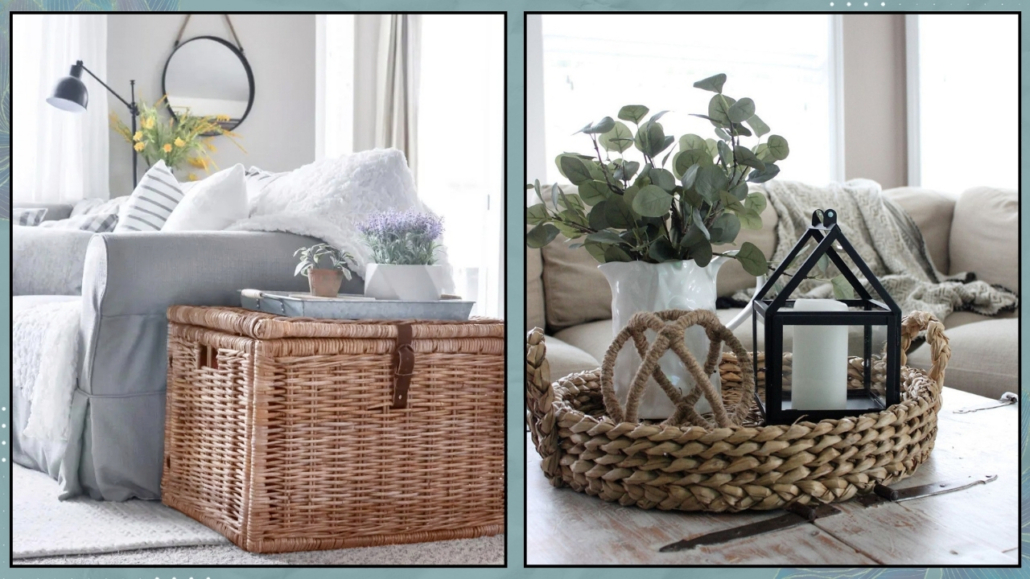
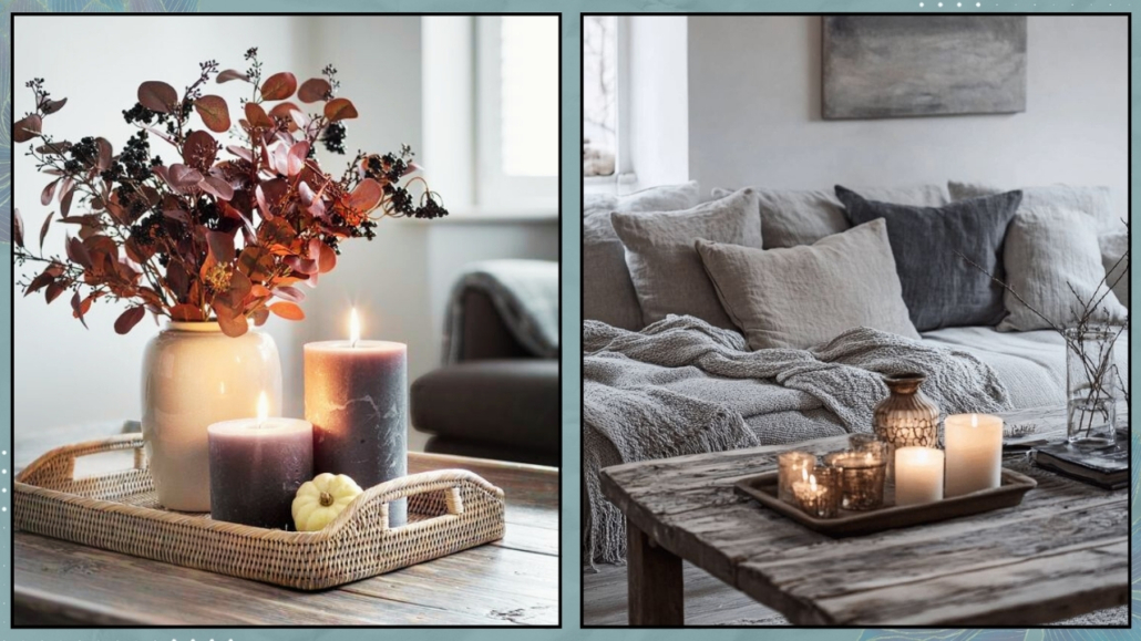
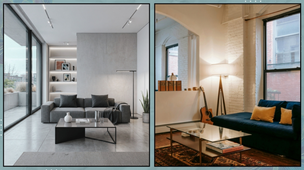
– The importance of touch: beyond aesthetics
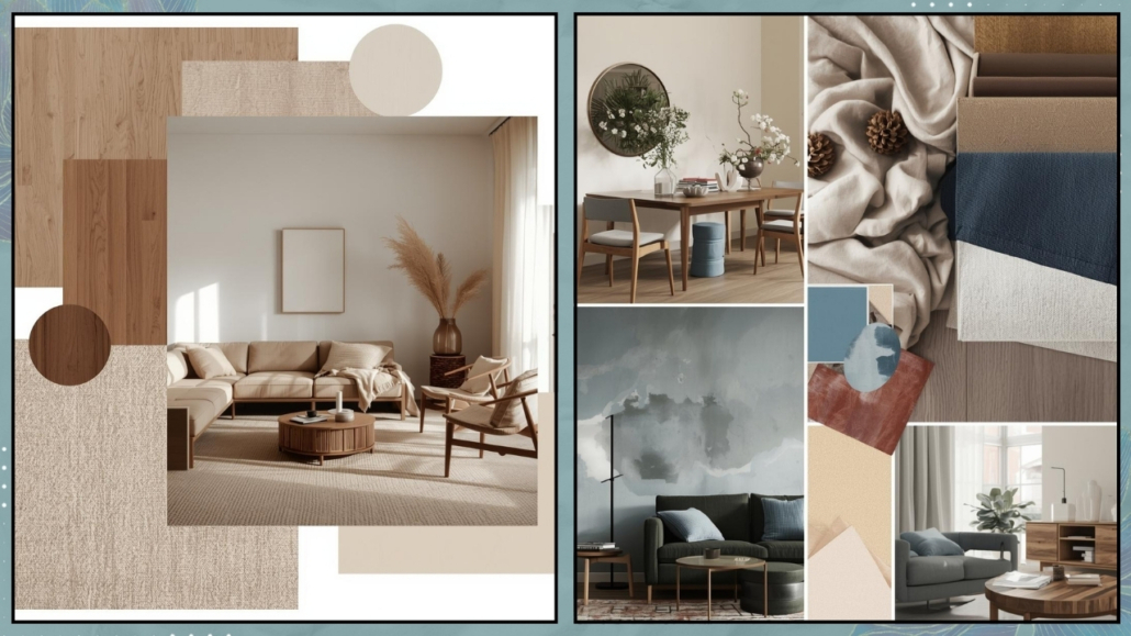
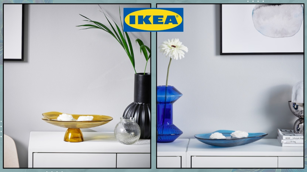
Interior design isn’t just visual—it’s also tactile.
Materials make a huge difference.
Surfaces that are too smooth, glossy, or rigid—like glass, metal, or high-gloss finishes—may look beautiful, but they tend to repel warmth, making the space feel less inviting.
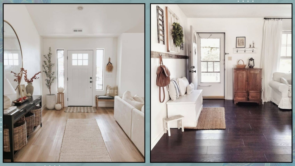
If your home feels cold, add texture.
A chunky rug, linen curtains that softly filter the light, and a bouclé wool throw.
Natural materials tell your body: you’re safe here, you can relax.
(credit: Canva)
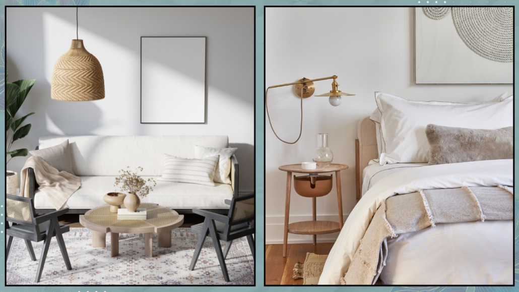
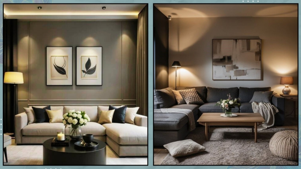
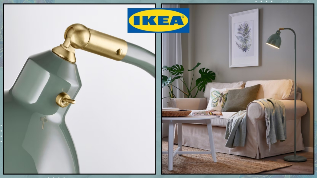
– Lighting: not just for seeing, but for feeling
One of the most common lighting mistakes is this: many homes are lit for function (strong overhead lighting, technical spotlights), but not to create atmosphere.
Cold or uniform lighting flattens volumes and makes spaces feel almost clinical.
Layer your lighting.
In addition to general lighting, add multiple light sources with warm tones.
The magic happens in the soft shadows and gentle light points—light is what shapes the emotion of a room.
(Here I talk about lighting)
(credit: Canva)
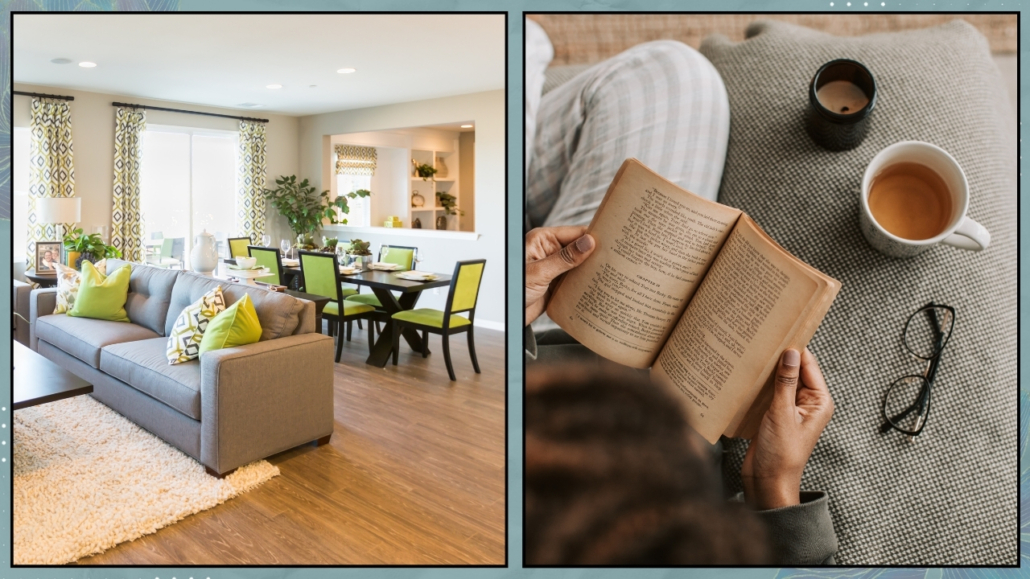
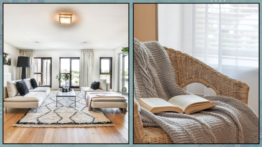
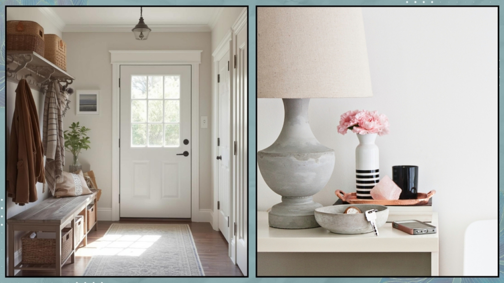
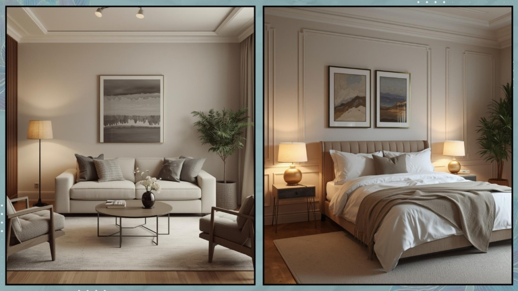
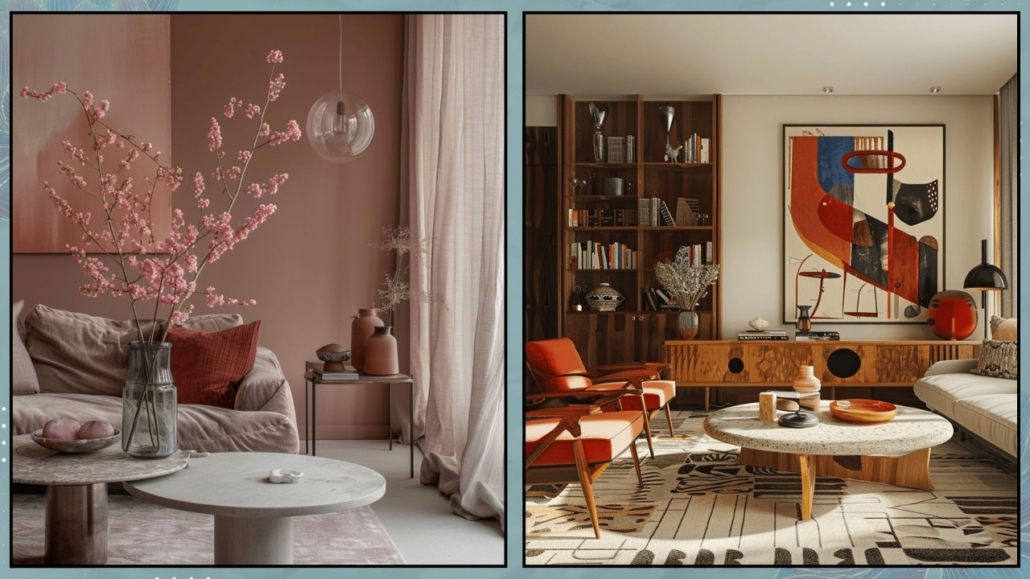
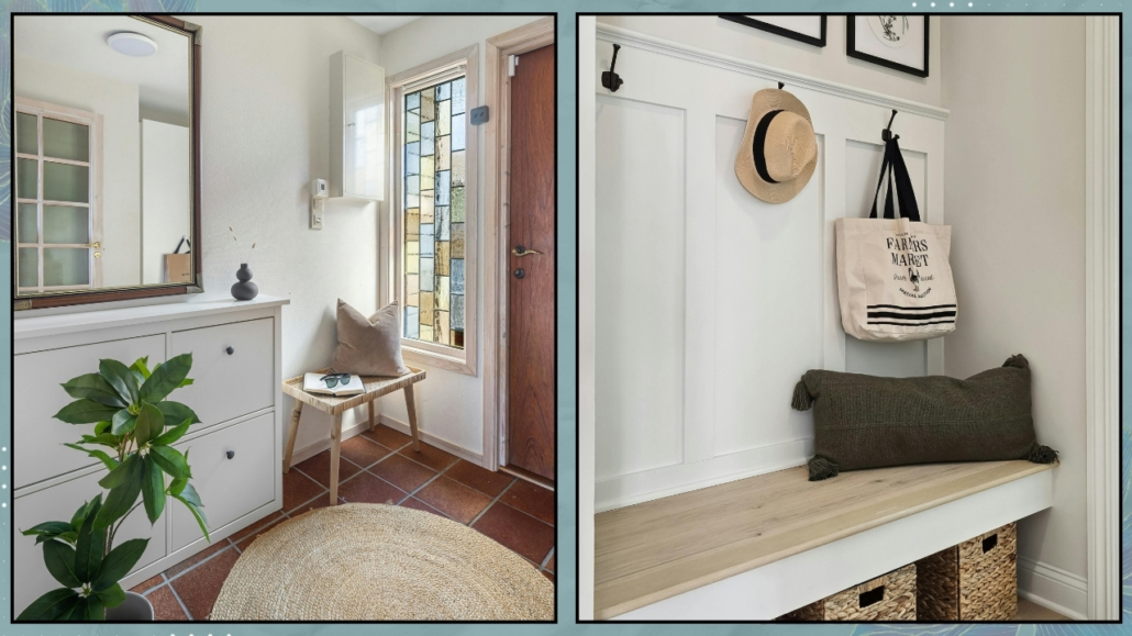
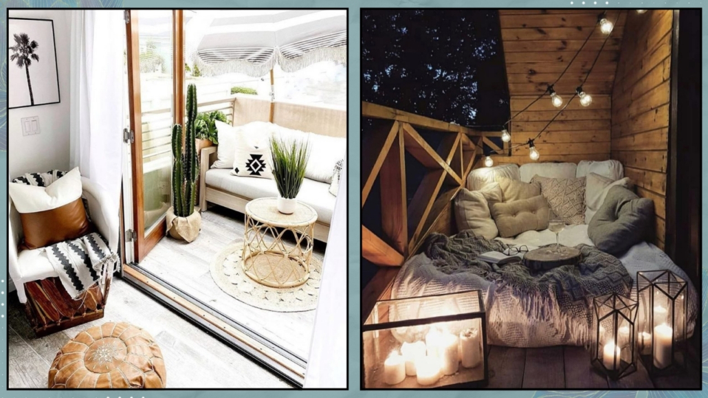
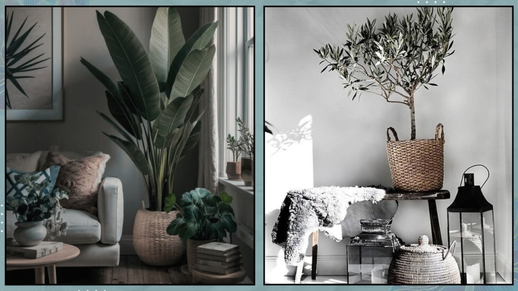
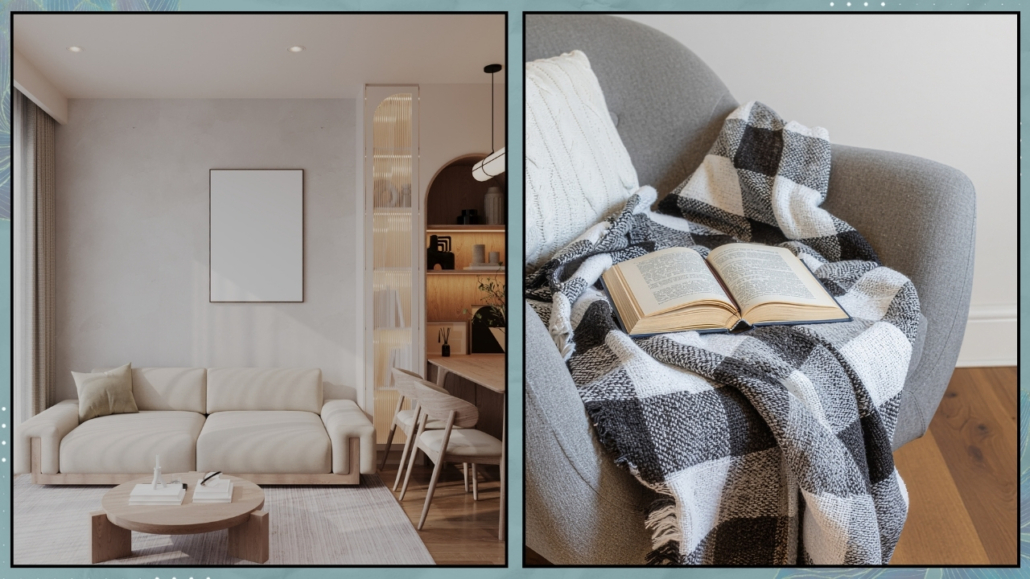
– A “retreat within the retreat.”
This point might be the most important aspect of all.
You can have a functional, tidy, aesthetically perfect home, but if you don’t have a corner that truly feels yours, the space will always feel a bit foreign.
A welcoming home has a “heart”—a place that acts as a personal retreat.
It doesn’t have to be perfect, but it has to be yours.
It could be an armchair by the window, a desk where your ideas come to life, or simply a green corner you care for with love.
If you don’t yet have a favorite spot to retreat to, it’s time to create one.
(credit: Canva)
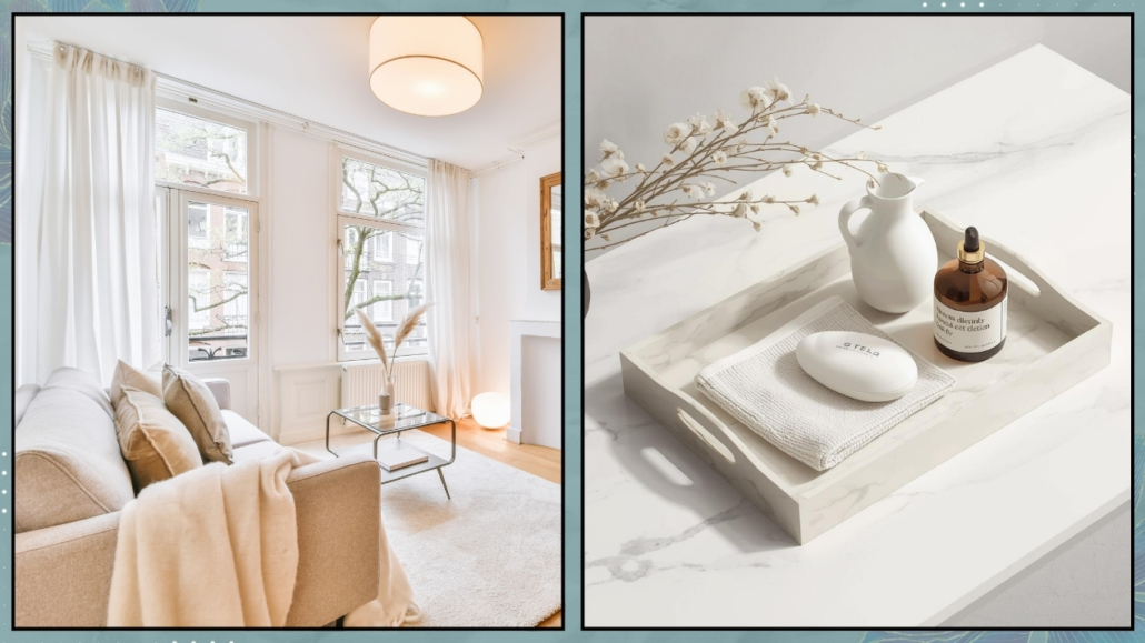
– From “showroom” to “sanctuary.”
The good news is: you don’t need major renovations or a complete overhaul.
A beautiful but cold home isn’t a mistake—it’s a starting point.
It simply means your space doesn’t match how you want to feel at home.
Often, it’s about shifting your perspective: stop seeing your home as a collection of furniture, and start experiencing it as an extension of your personality.
Small changes are enough—adding more personal elements, working with lighting, introducing warmer materials, and allowing space for something less perfect but more real.
(credit: Canva)
– In conclusion
It’s not about style—minimal, classic, or modern doesn’t matter.
The real difference lies in how your space makes you feel.
Because a home isn’t made only of furniture and colors, but of presence, energy, and connection.
And when those elements are there, you feel it immediately.
Does your home look beautiful, but still doesn’t feel like you?
If you sense that disconnect, don’t ignore it.
Your home has incredible potential—it’s just waiting to be unlocked, to become a space that truly welcomes you, supports you, and reflects who you are.
And you don’t have to do it alone.
If you’d like, we can go through this process together. I’ll help you see your space with fresh eyes and introduce those elements of warmth and contrast that can transform your home into a place that finally says, “Welcome back.”
Get in touch for a consultation—we’ll bring balance, personality, and harmony into your spaces and your everyday life.
Because feeling at home makes all the difference.