We all go through change in life, whether we want to or not. But when it happens, what happens to our home?
If you’re wondering what your home has to do with change, keep reading—you’ll see it right away.
Life moves, often faster than we expect.
Sometimes it’s a job change. Other times it’s a relationship shifting shape. Or simply a period when everything feels more fragile, unstable, and harder to hold together.
When that happens, our space changes too—or perhaps we’re the ones who stop recognizing it in the same way.
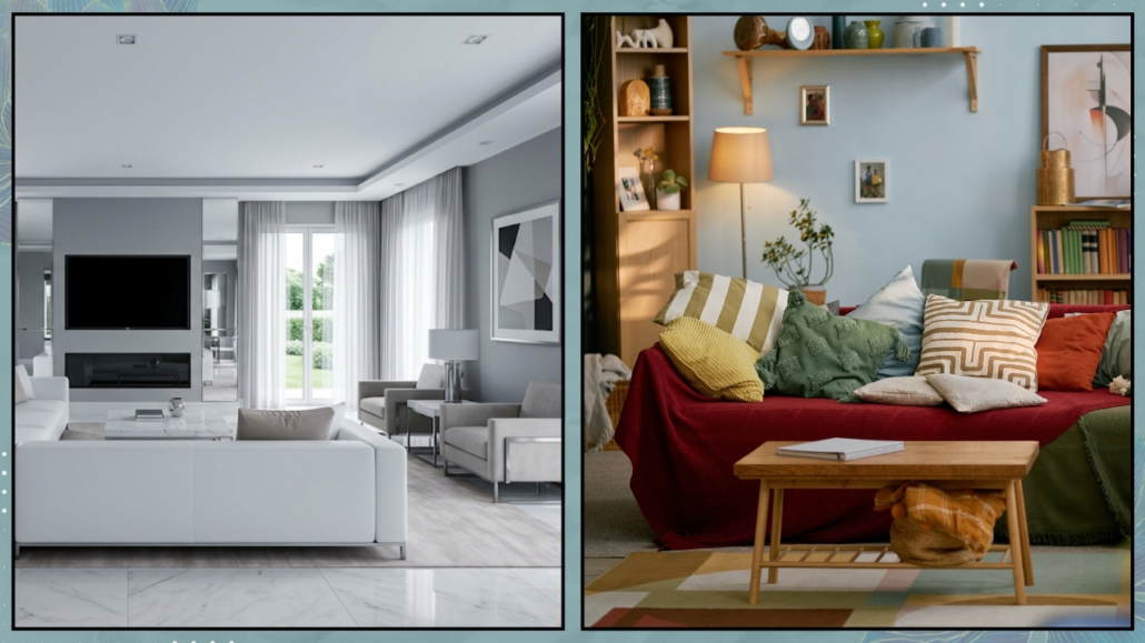
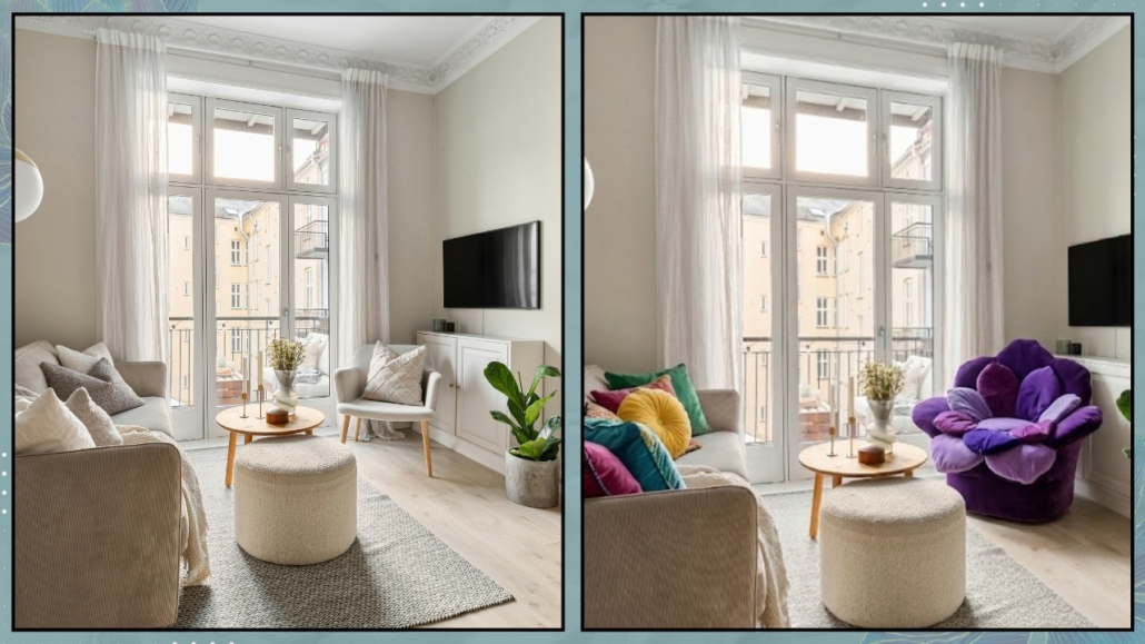
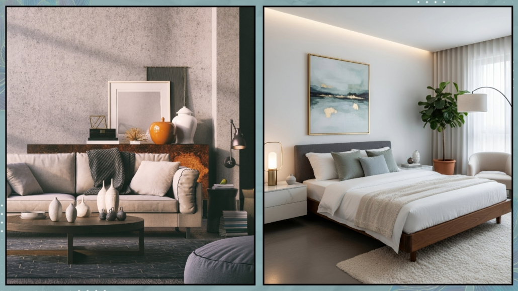
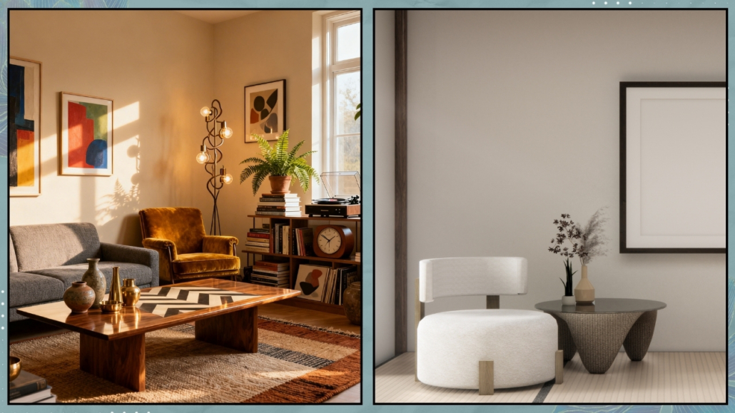
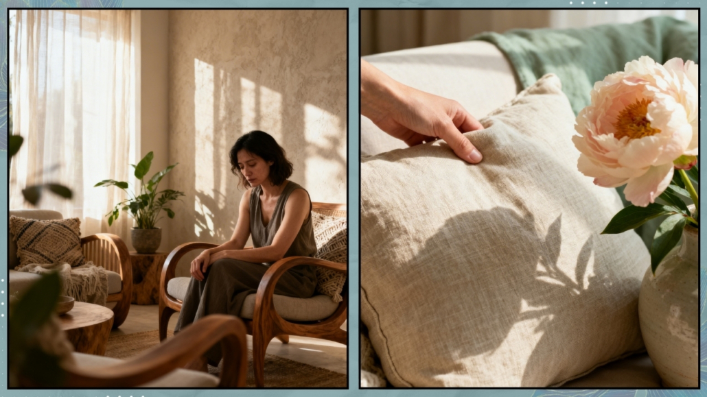
The home that once held us starts to feel noisy and cluttered.
Too full—or suddenly empty… but above all, it loses intention.
And it ends up reflecting exactly what we’re going through inside: a suspended space that no longer speaks our language.
(credits: Canva)
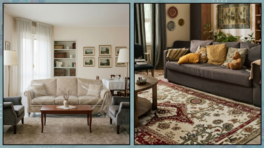
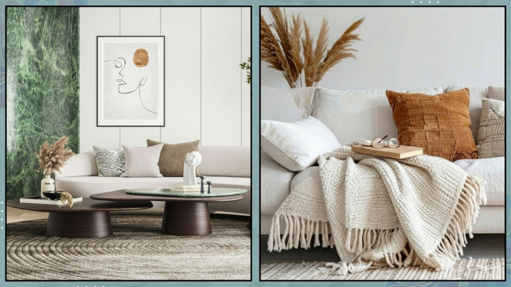
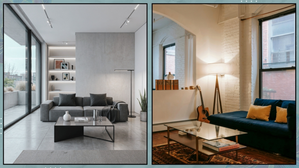
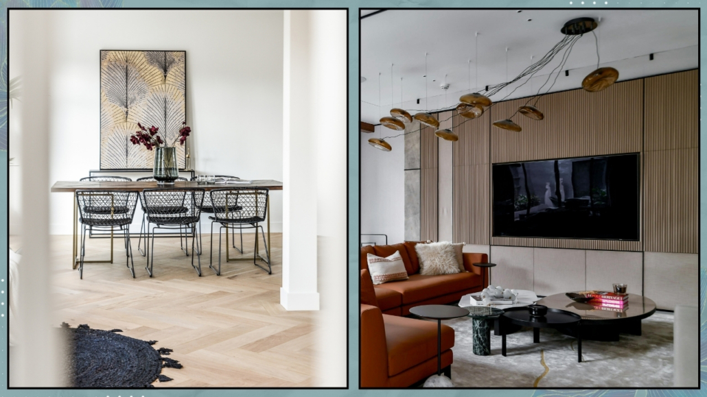
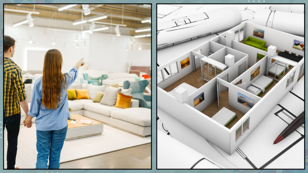
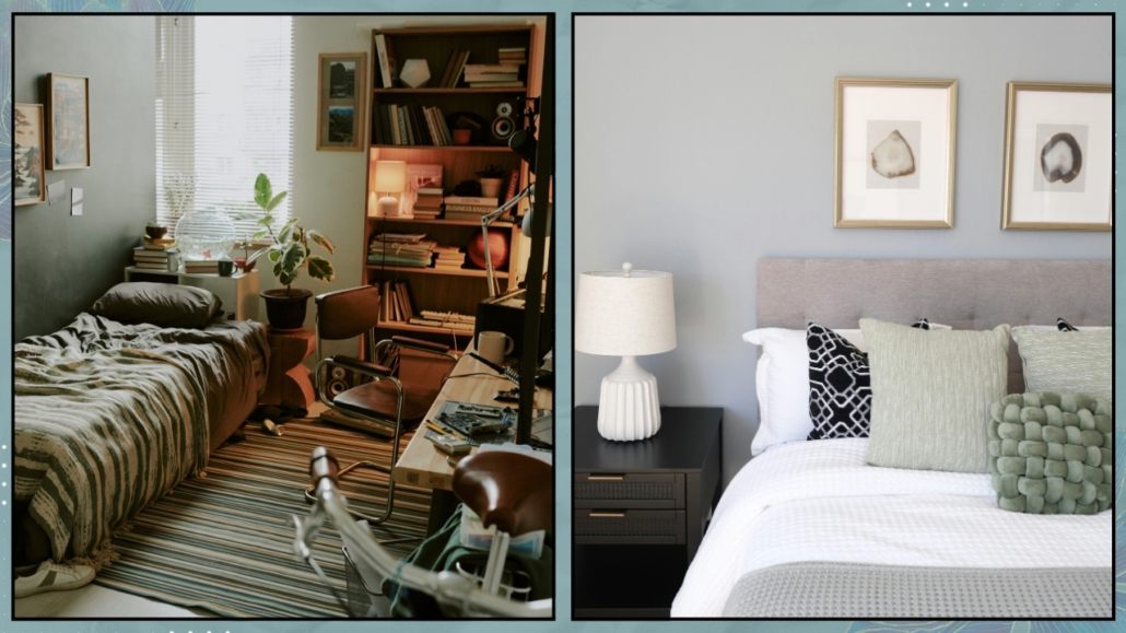
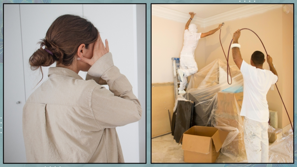
During times of change, we usually react in two opposite ways.
The first is to freeze—leaving everything as it is and hoping the feeling of disorder will pass on its own.
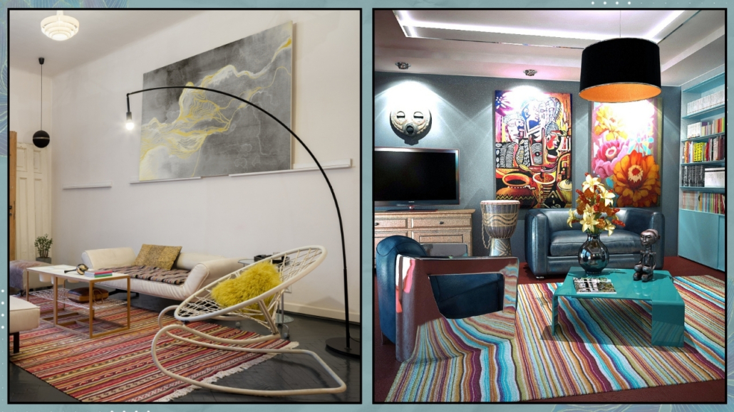
The second is the urge to overhaul everything, often without any clear direction.
We move furniture, buy new things, change layouts, colors, objects—trying to “start over.”
(credits: Canva)
But starting from everything rarely helps.
We need something simpler, more focused, and more human—and therefore truly possible: starting from one thing.
What I call the first stone.
– What is the first stone?
In ancient architecture, the first stone was the foundational block around which the entire structure was built.
If that stone were solid, stable, and well placed, the entire building would find its balance.
In our everyday spaces, it works the same way.
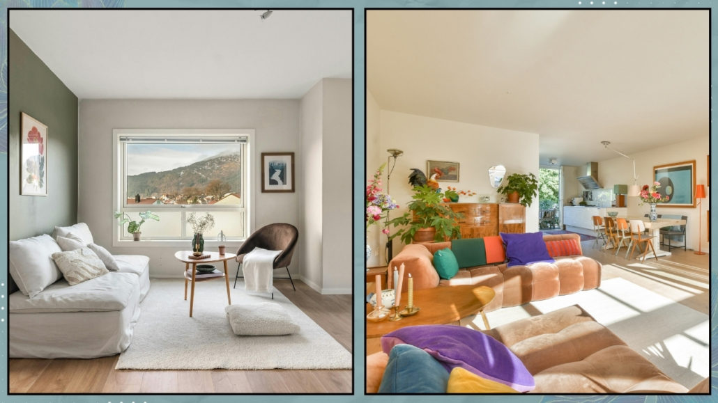
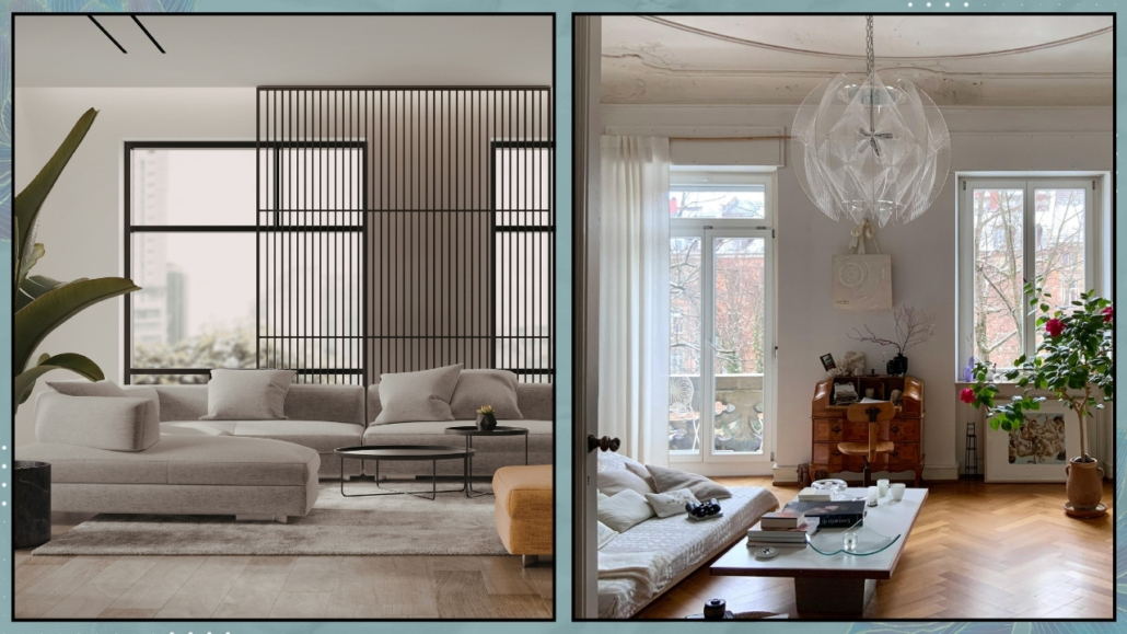
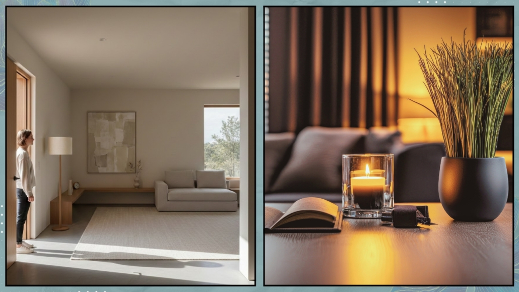
To move through this moment of home and change and truly begin again, you don’t need to fix every room at once.
You only need to identify your “first stone”: one small, defined corner that has the power to make you feel safe, present, and grounded.
It’s the space that, even when everything feels unstable, gives you an immediate sense of safety and presence.
You don’t choose it based on how it looks, but on how it makes you feel.
It’s a place that recognizes you, even when you struggle to recognize yourself.
It’s the point that, once you care for it or merely become more aware of it, makes you think: okay, I can start again from here.
(credits: Canva)
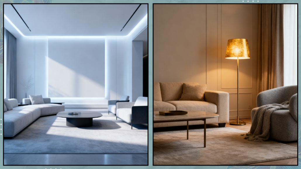
– Why starting from one point matters
During transitional periods, we need stability. The brain needs a fixed point.
Not ten. One.
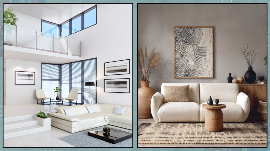
This is why the home can become either a powerful ally—or an amplifier of chaos.
Trying to fix everything at once spreads your energy too thin, creates pressure, and often leaves you feeling even more disoriented.
(credits: Canva)
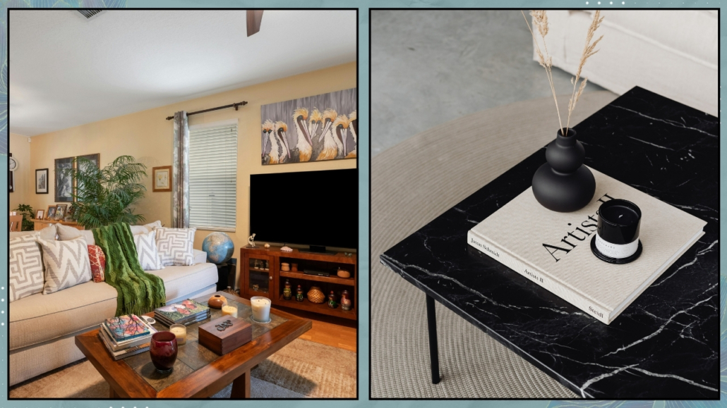
Working on just one space, instead, does something different.
It gives you back a sense of control, lowers mental noise, and offers a concrete place to return to.
It’s a small gesture, but a meaningful one: a way of telling yourself that you can start over without having to change everything.
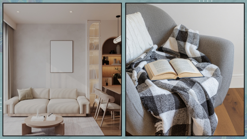
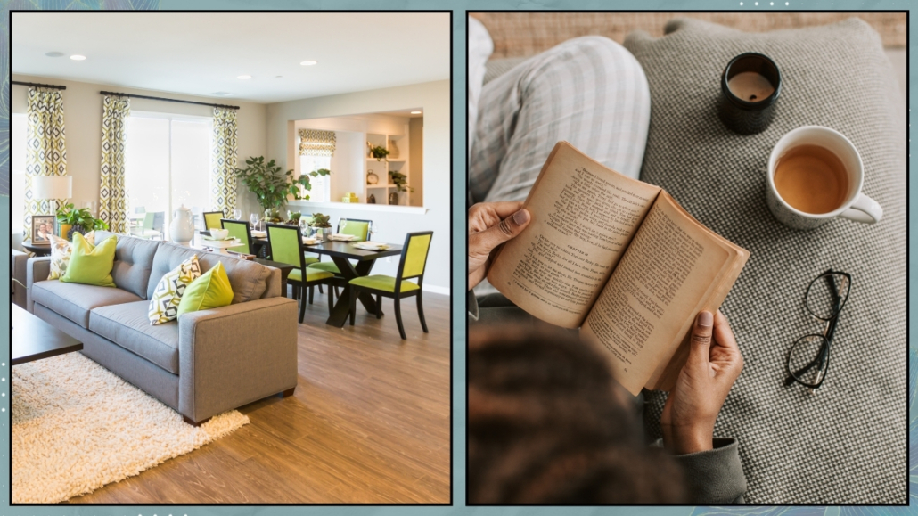
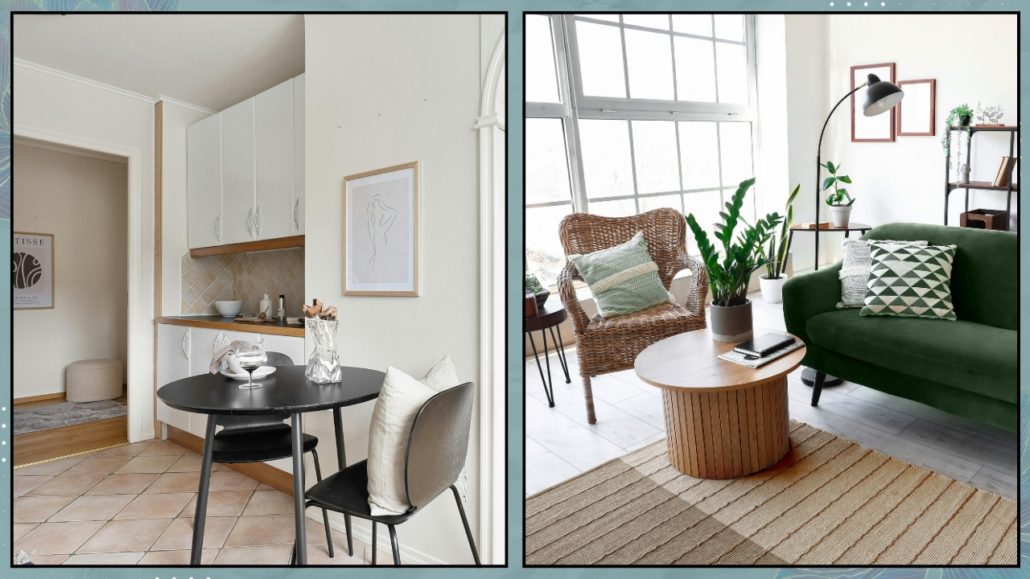
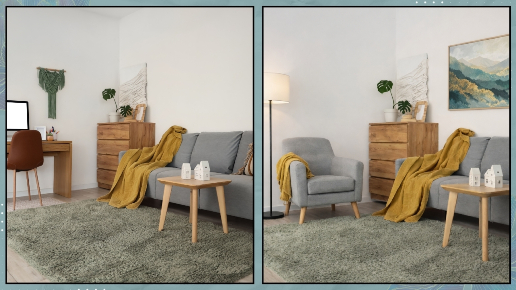
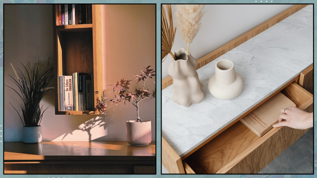
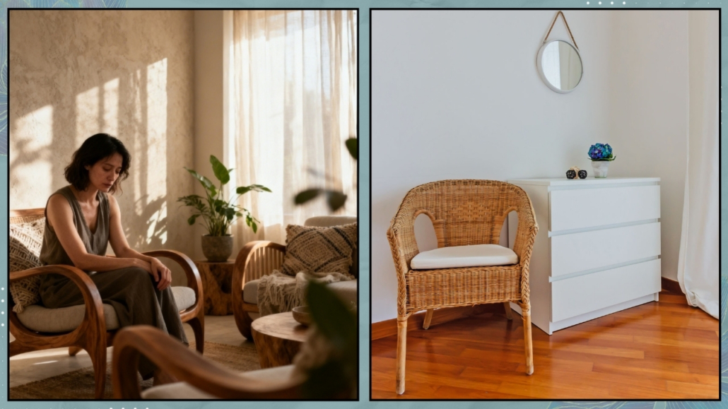
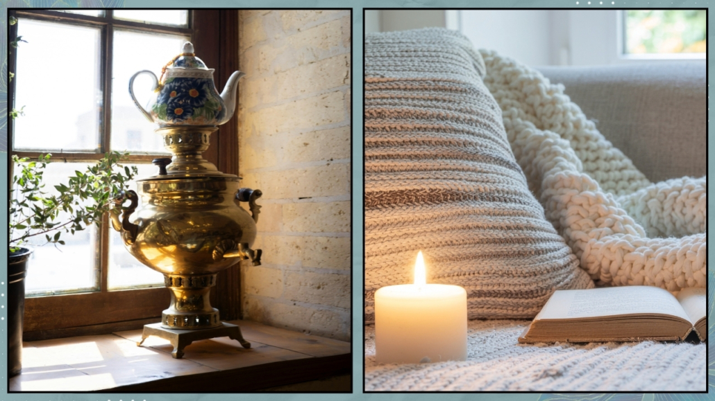
– How to choose your First Stone
The first stone is not chosen with the mind, but with the body.
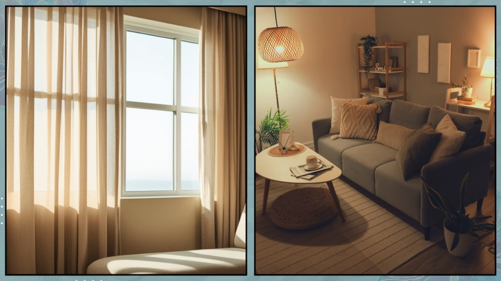
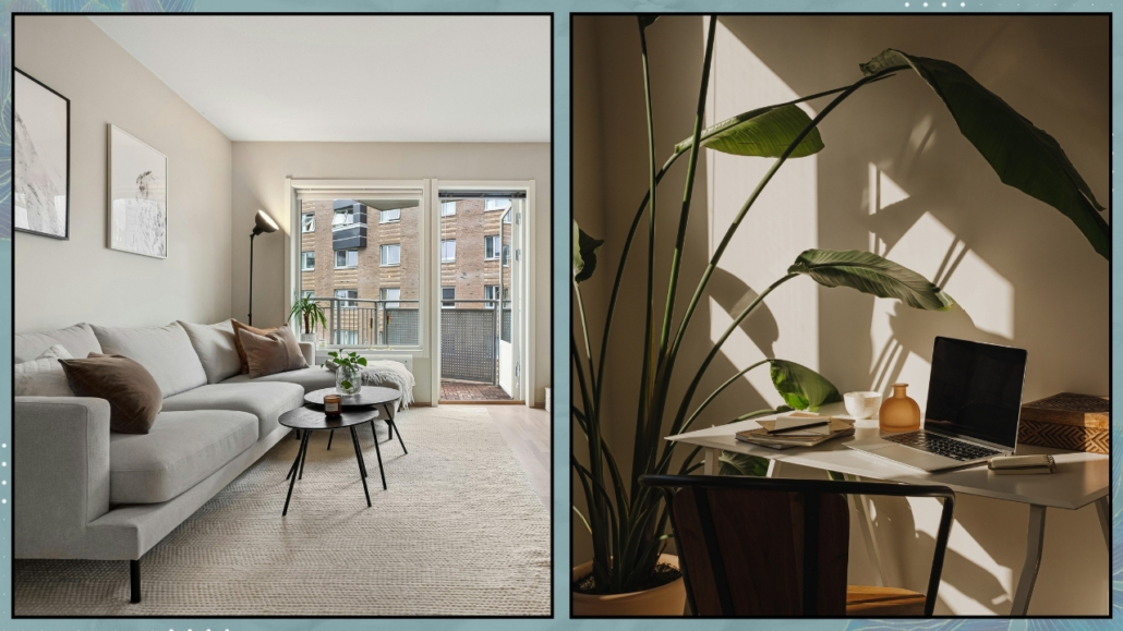
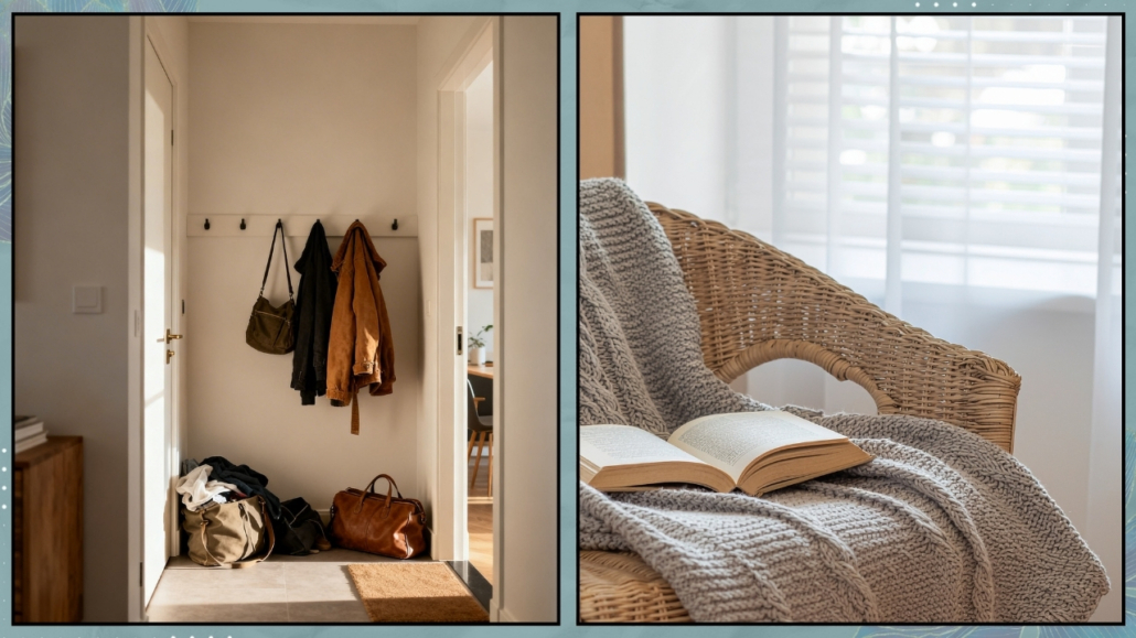
It’s rarely an entire room. More often, it’s a very specific spot that your body already recognizes as safe.
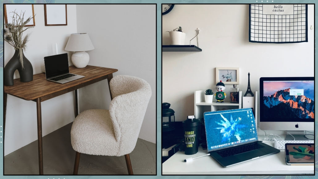
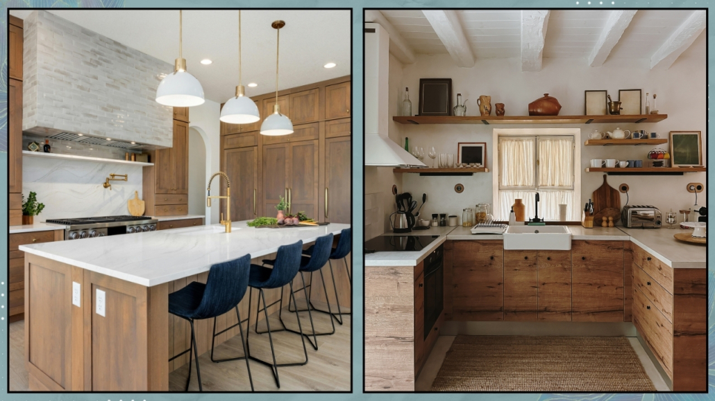
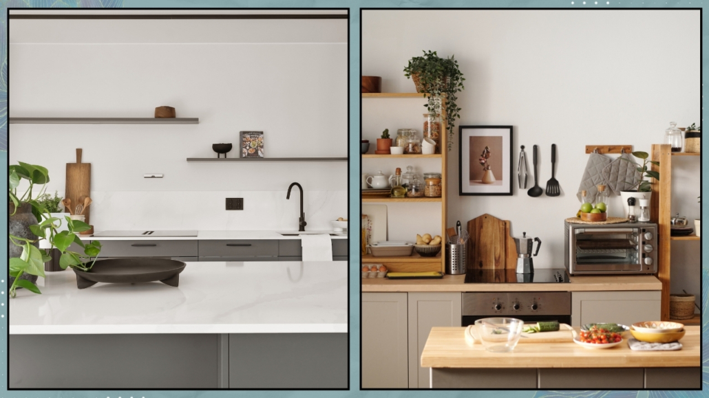
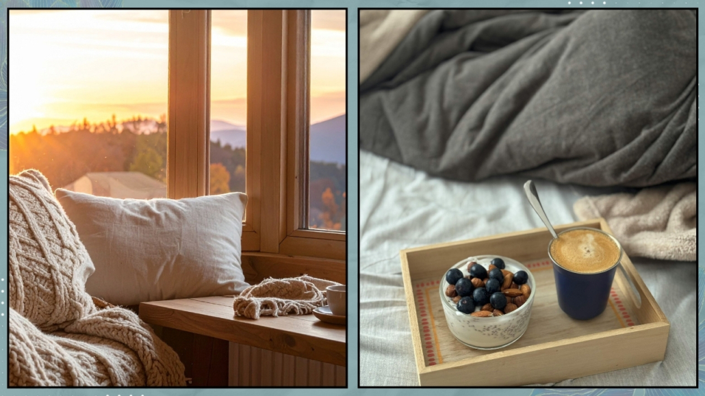
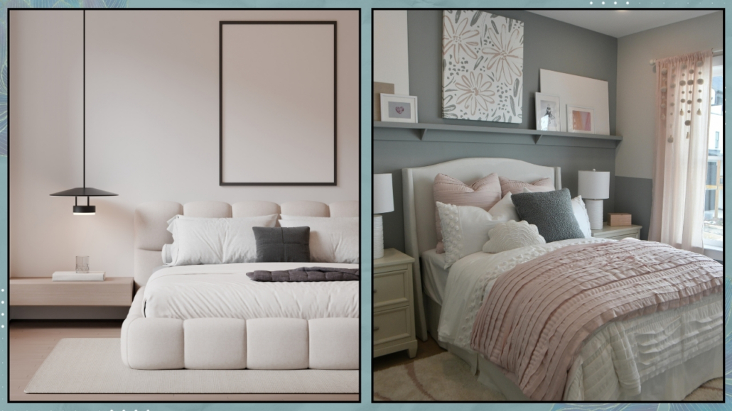
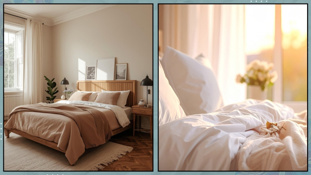
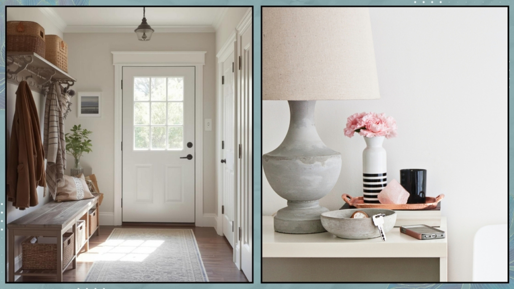
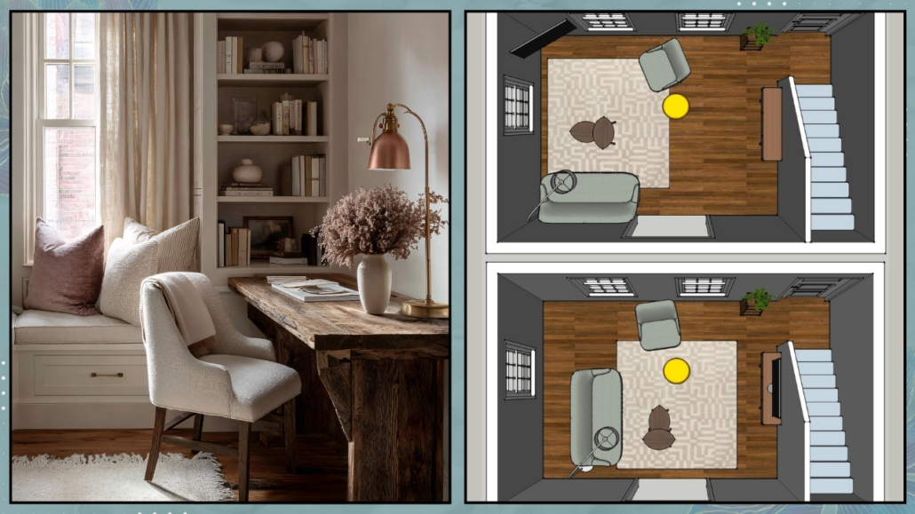
For some people, it’s the bed. For others, the kitchen, the entryway, or a desk.
There are no rules—there is only your personal point of stability.
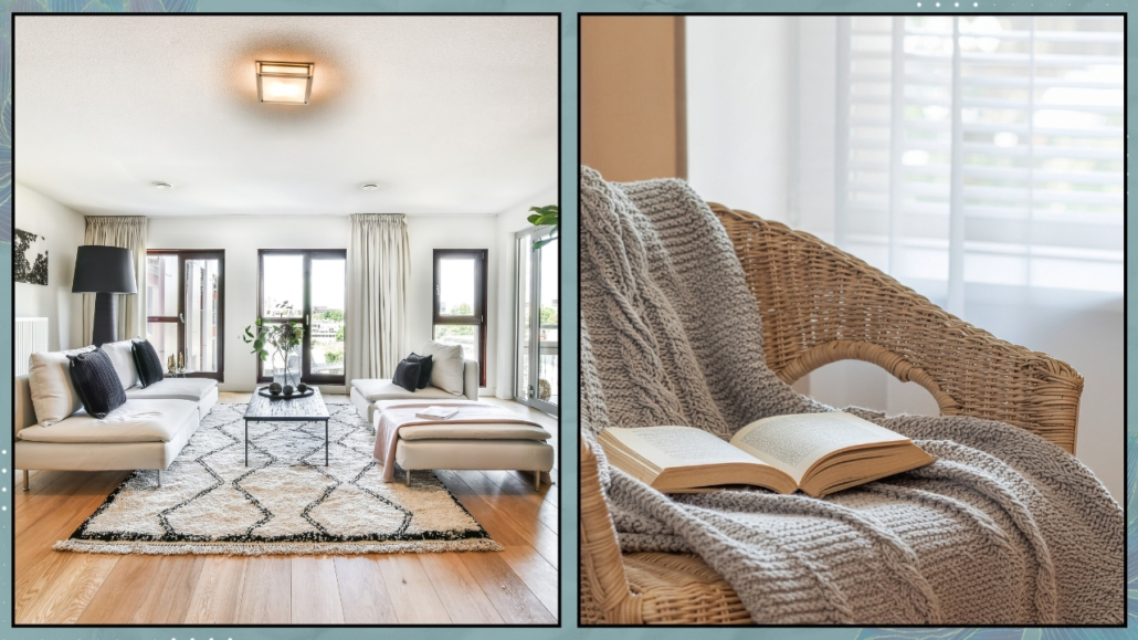
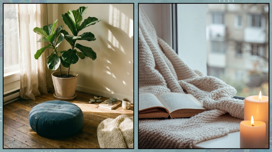
To find it, pause for a moment and observe:
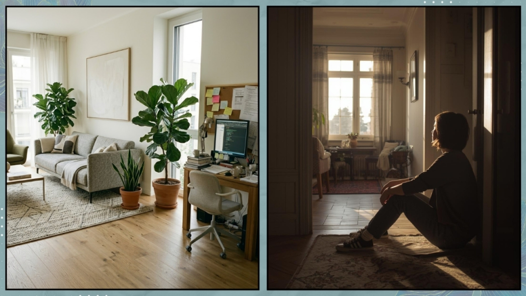
- Where do you go when you’re tired?
- Where do you sit when you need to breathe?
- What’s the place in your home where, even for a few minutes, you feel a sense of relief?
That is your space.
It doesn’t have to be perfect. It has to be real.
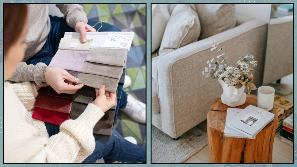
(credits: Canva; Vivere lo stile)
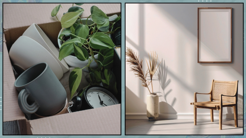
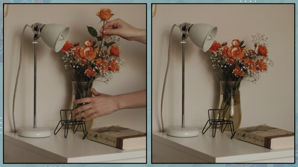
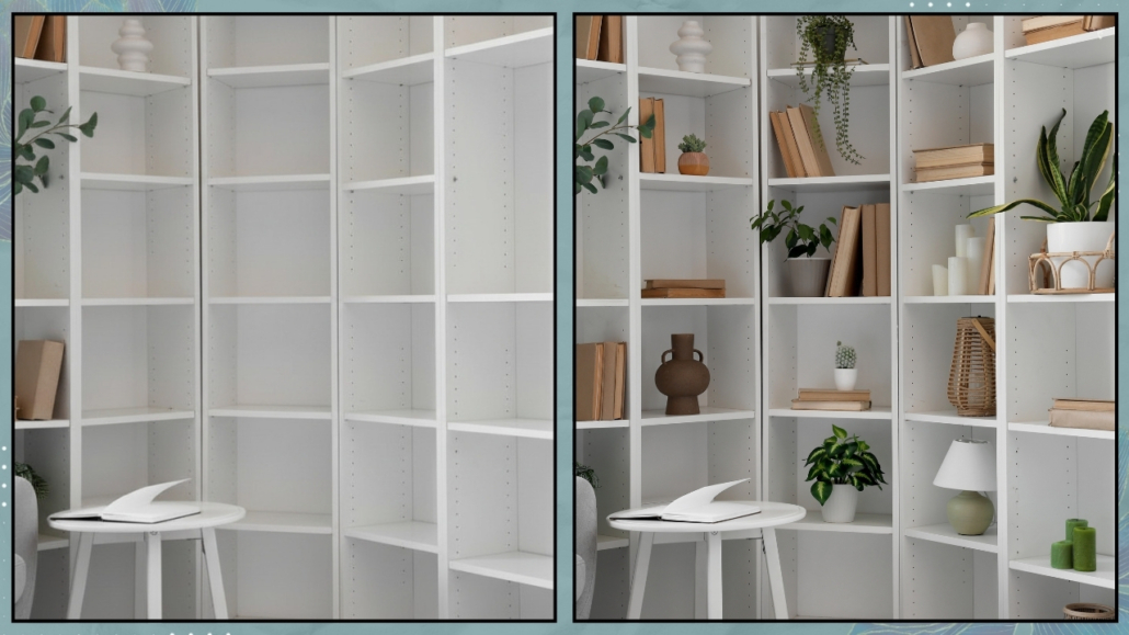
– What to do (without turning everything upside down)
Once you’ve found your first stone, do only this:
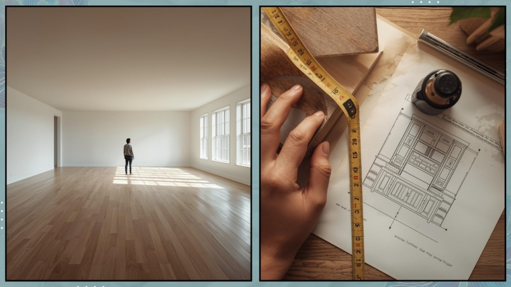
- Clear it
Remove everything from that space.
The act of clearing creates a mental reset.
- Clean it
Not just physically—symbolically.
It’s a way of saying: “We’re starting over.”
- Put back only what truly matters
Not what “should” be there.
Only what feels good to you right now.
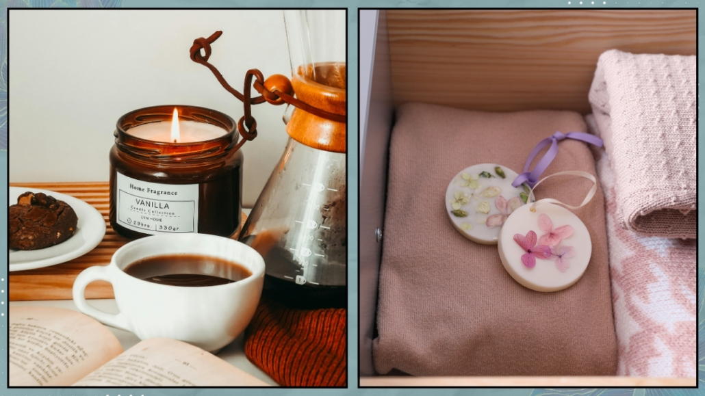
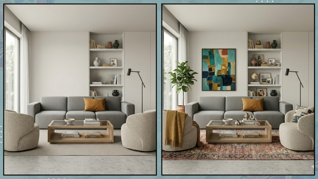
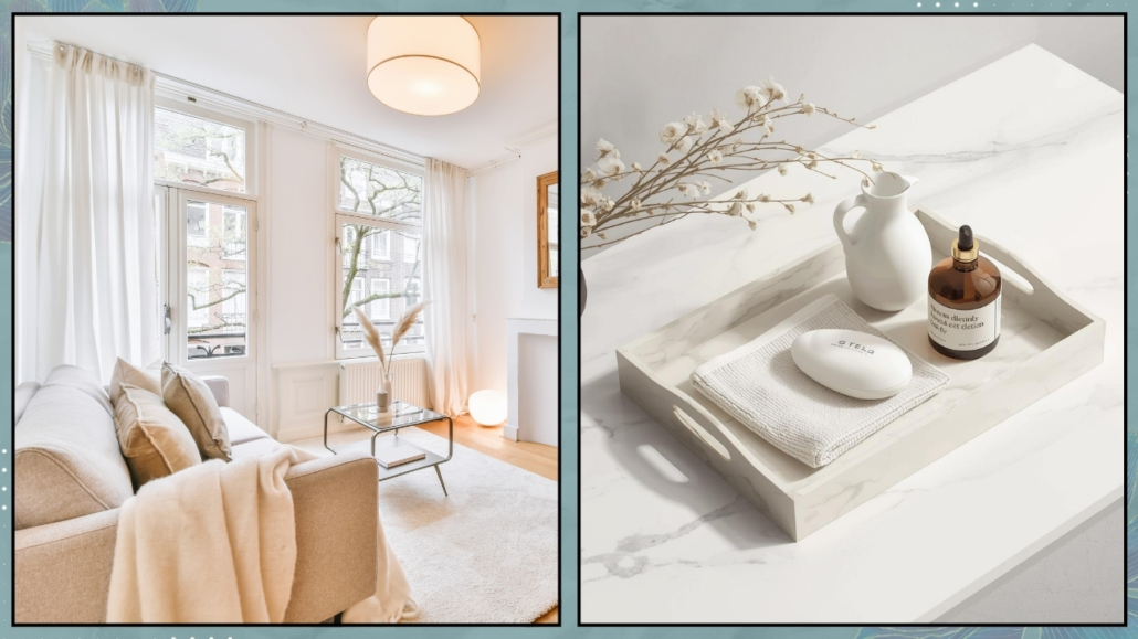
- Add one gesture of care
A light, something natural, a small plant, or an object that matters to you. It doesn’t need to match everything else.
- Look at it
Notice how it makes you feel.
Let the space speak to you—and more importantly, let it make you smile.
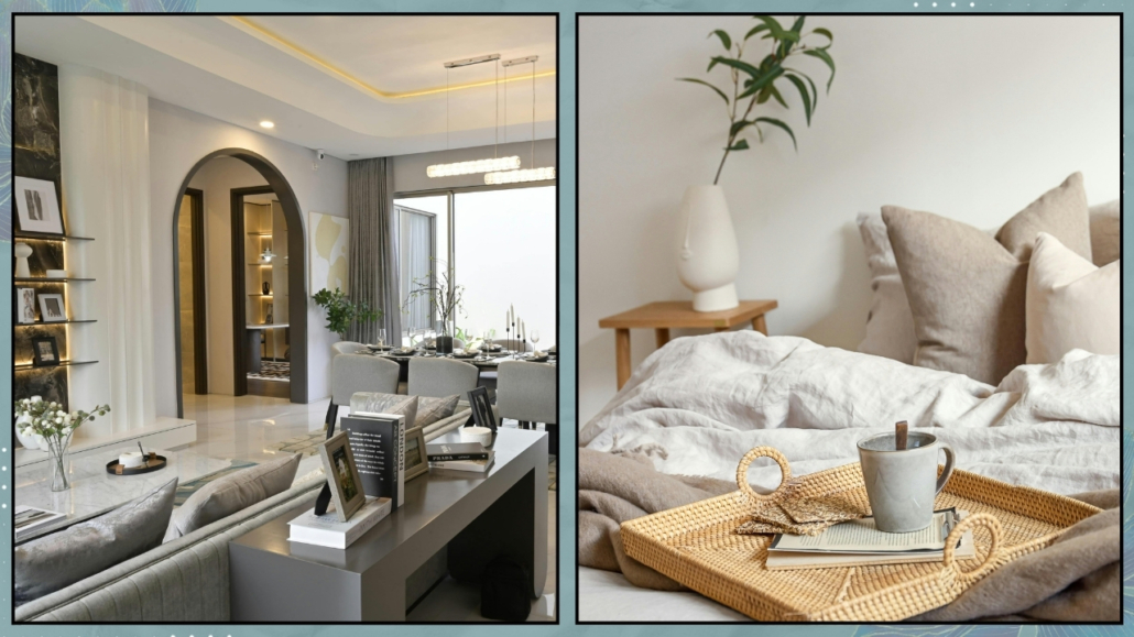
(credits: Canva)
– The real luxury is feeling like yourself again
Changing a small layout, moving an object, or clearing a surface won’t magically change external life events.
But it can radically change how you choose to face them.
If you’re going through a transition and feel like your home no longer supports your well-being, don’t rush to overhaul everything.
Find your first stone—and start from there.
Something surprising will happen: the rest of your home will begin to follow, effortlessly, simply because you’ve reactivated your center.
The first stone is a small gesture that opens a wide door.
It teaches us to adjust our spaces in small doses to support our biological and emotional needs.
In doing so, our environment stops being a container for furniture and becomes a quiet presence—a protective shell that supports us step by step.
(credits: Canva)
The connection between home and change is not something to suffer through.
It’s something to accompany, one step at a time.
– Let’s walk this path together
If you feel the need for guidance in re-reading your spaces with more awareness and in identifying the place that can bring you back to stability and center, I’m here.
Because feeling at home is not about the perfection we show on the outside, but about the truth and peace we feel inside.
Not going through a transition, but feeling like your home no longer represents you? This video might be helpful!