The bathroom as a spa? Here’s how to do it!
Many consider the bathroom one of the most practical spaces in the home.
It is where you wash up, get ready, and move on with your day.
But if you think about it, it is also where you spend moments alone, taking care of your body.
It is where your day begins—and where it ends.
It is also a place where you can release tension, let go of stress, and take a deep breath.
So why not turn it into a true sanctuary?
Even the smallest bathroom—even one without windows or full of outdated tiles—can become your personal spa, a quiet place where you can recharge, reconnect, and reset.
Let’s explore how to create that, step by step.
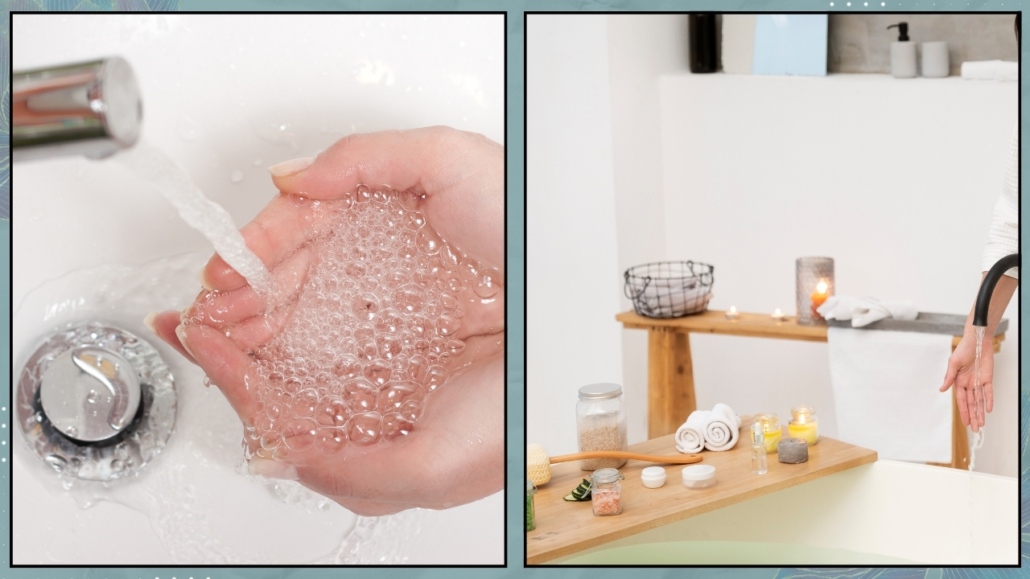
Water: the element of renewal and energy
Water doesn’t just clean your skin.
It holds powerful symbolism: it purifies, dissolves tension, and restores clarity.
Even something as simple as rinsing your face can become a moment of intention and care.
All it takes is intention, a conscious breath, and your full presence.
Close your eyes and imagine the water washing away not just dirt but tension, mental clutter, and emotional heaviness.
That is what makes a bathroom “holistic”: merging action with meaning.
Making the ordinary feel sacred.
(credits: canva)
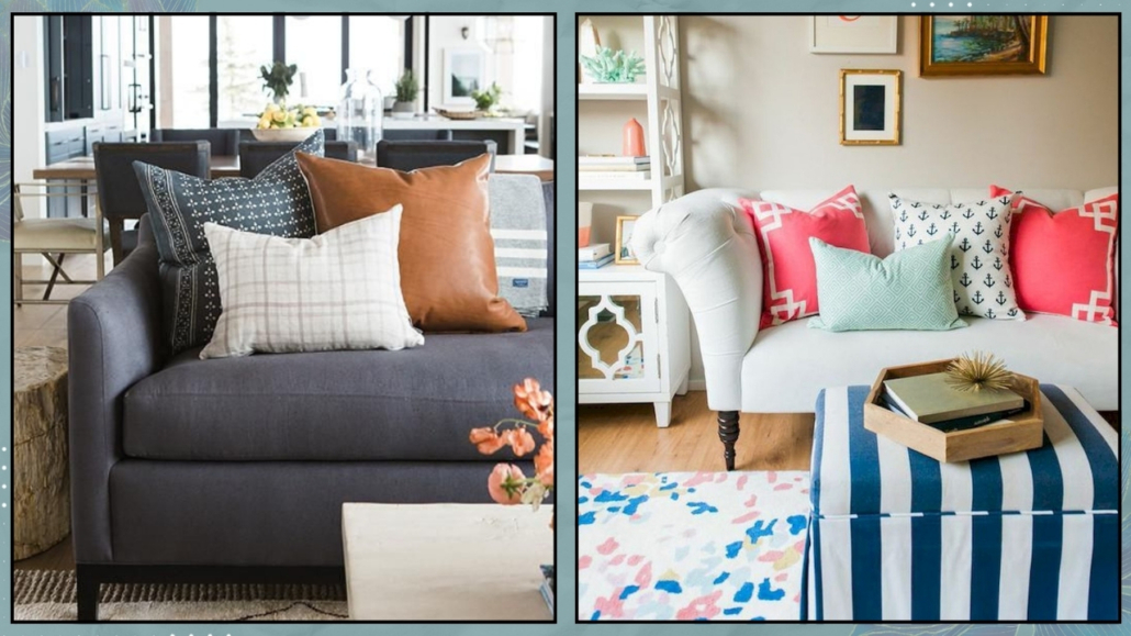
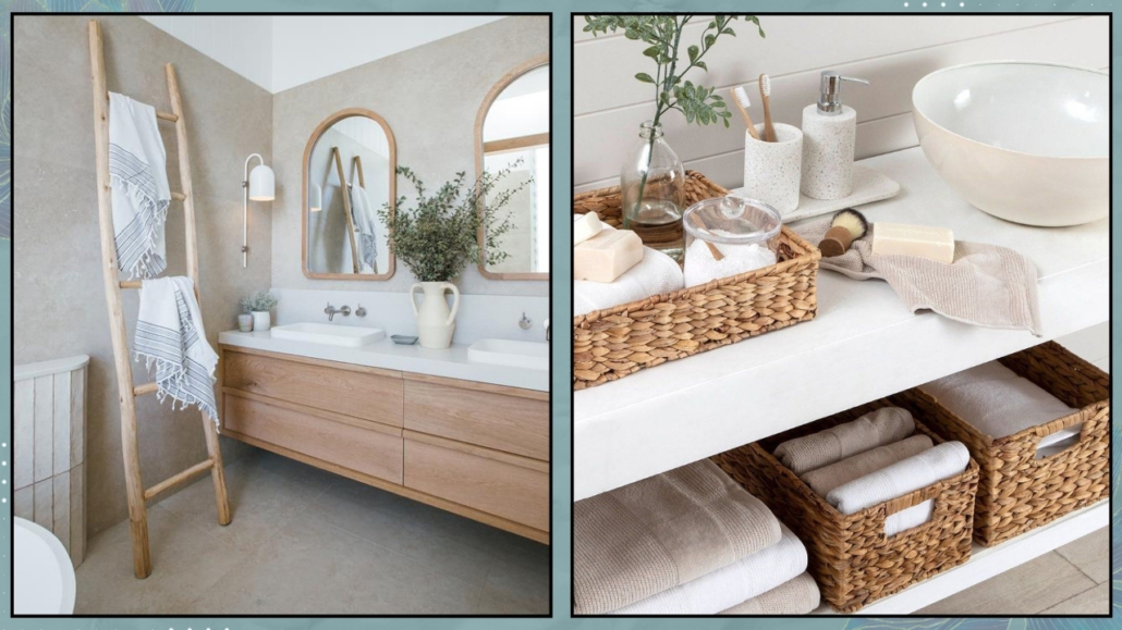
Declutter and simplify: create space to breathe
Crowded shelves, overflowing baskets, and mismatched products can turn your bathroom into a source of visual and mental stress.
But an organized, peaceful space? It soothes you instantly.
Start small: keep only the essentials visible, store what you don’t use daily, and toss duplicates.
Use a beautiful basket for towels, a small tray for your favorite products, and a cabinet that’s easy to keep neat.
Just like in life, less is more—when what remains is chosen thoughtfully.
(credits: oldbrandnew.com; group-hadara.com)
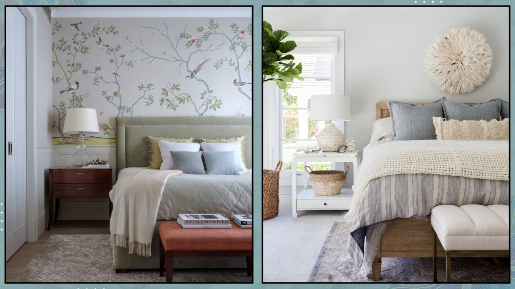
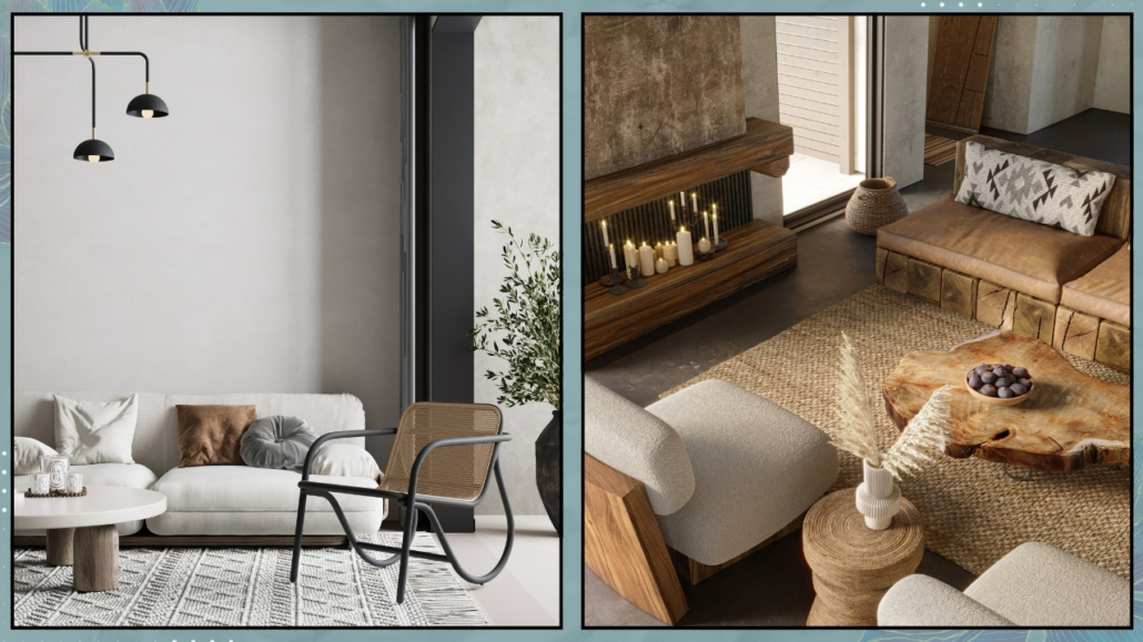
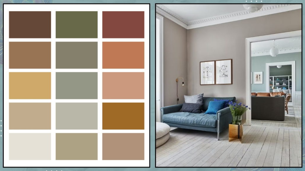
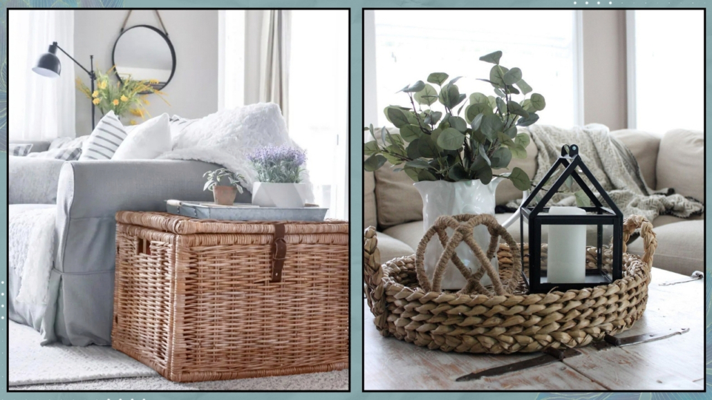
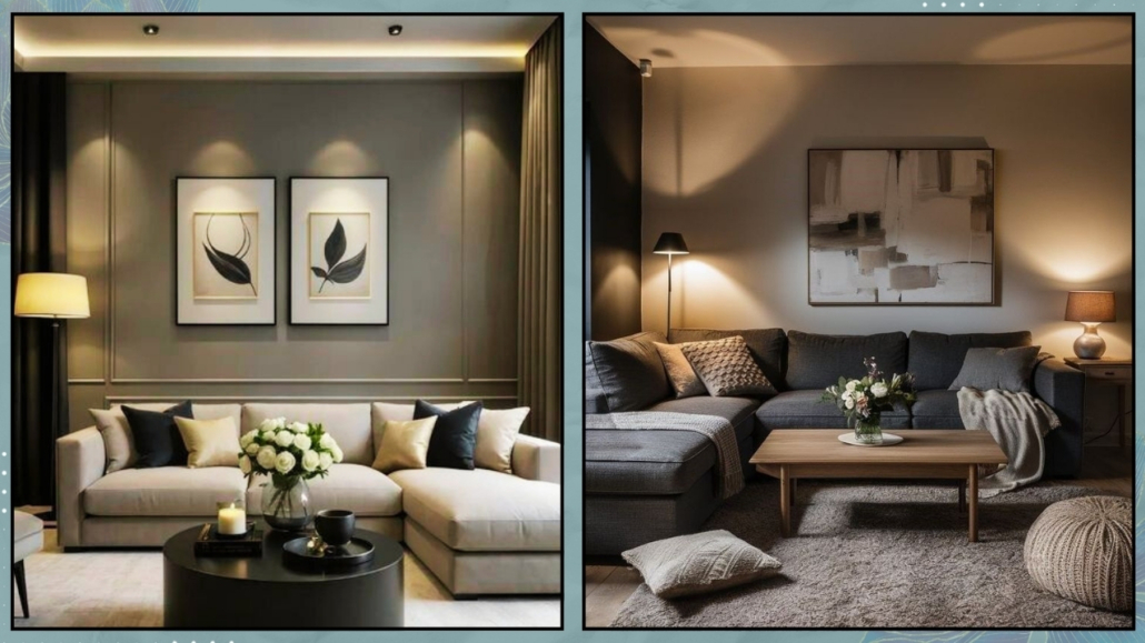
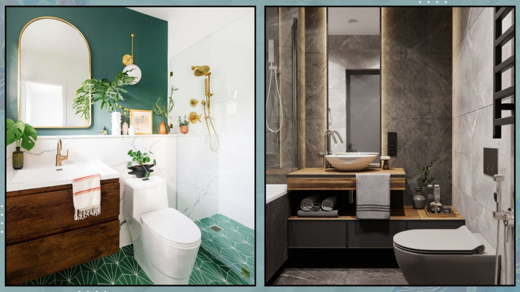
Colors and materials: bring nature inside
To create a calm, spa-like feeling, go for soft, natural tones and textures.
Bathrooms tend to lean white, but you can warm things up with soft beige, warm gray, sage green, or creamy ivory.
Avoid colors that are too bright or cold: your bathroom is not a gym—it’s a retreat.
Natural materials also help: a cotton bath mat, a bamboo or wicker basket, a wood shelf, and a linen curtain.
Each choice contributes to a space that reflects serenity and supports your well-being.
(credits: kylandkara.com; amazon)
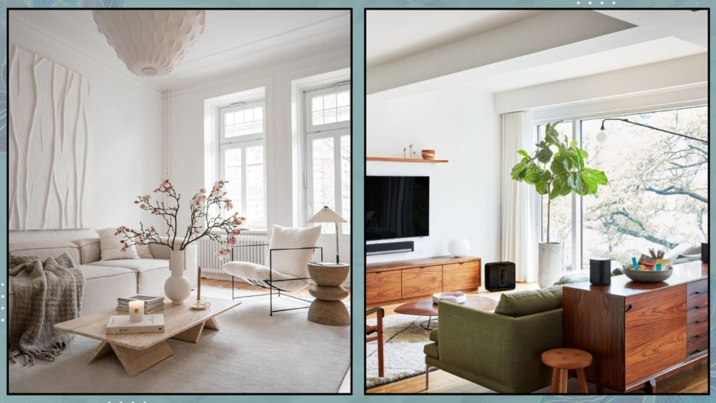
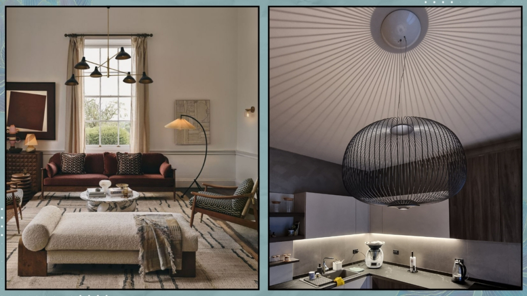
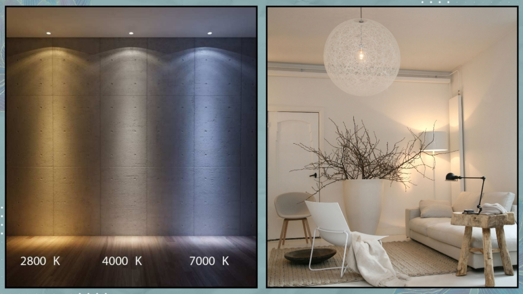
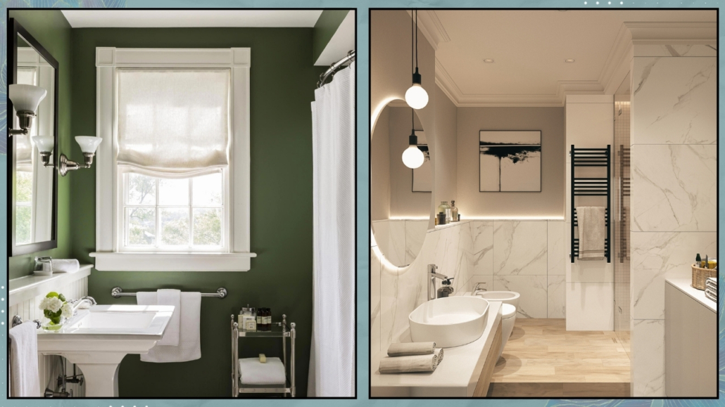
Lighting that sets the mood
Lighting makes a huge difference.
If you’re lucky enough to have a window, embrace natural light with light fabrics and reflective surfaces.
But if your bathroom is windowless, enhance the ambiance with thoughtful lighting and decor. (If you want to know more about windowless’ bathroom, I discuss about it here)
Choose warm-toned bulbs (2700–3000 kelvin) and place light sources at lower levels, such as little lamps, candles, and soft accent lighting.
Mirrors help bounce the light and make the space feel bigger.
Consider round or oval shapes—they soften the room and relax the mind.
(credits: ph Michael J. Lee; behance)
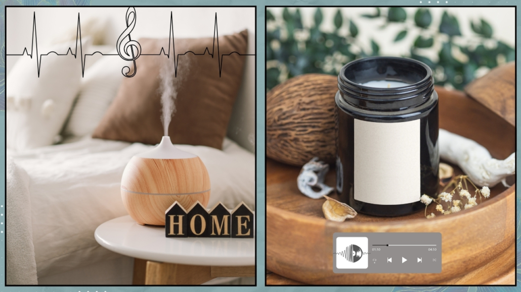
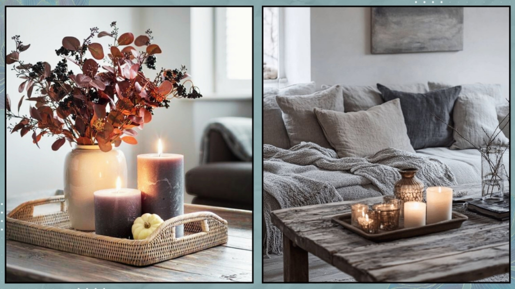
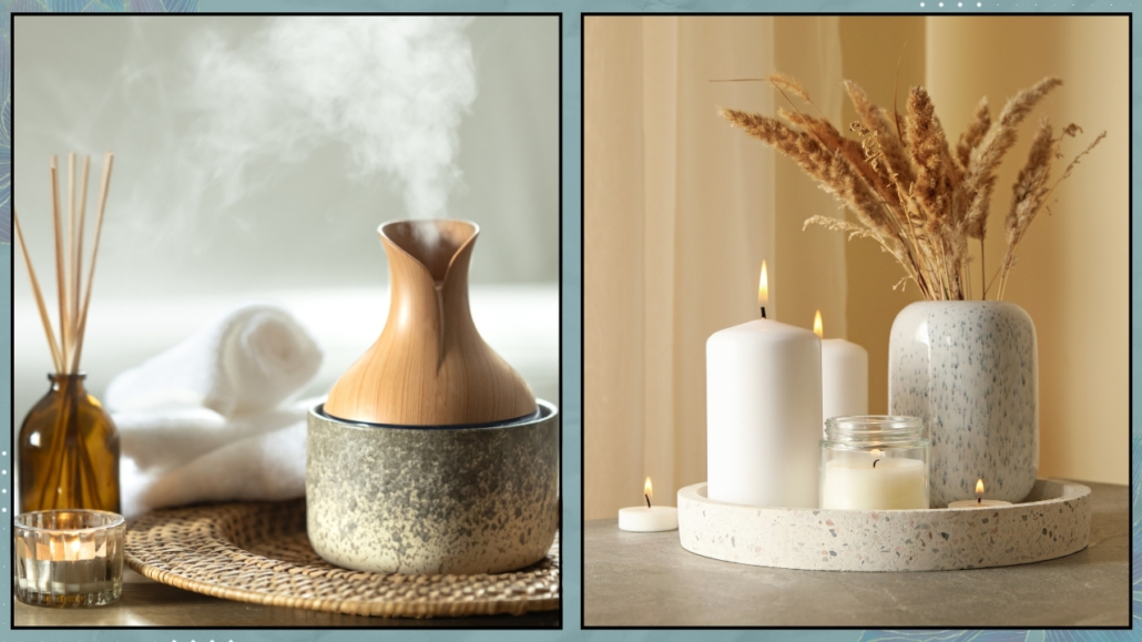
Scent: the invisible wellness tool
The perfume is powerful.
One smell can shift the entire mood of a space—and of your energy.
Here are some simple ideas:
– A diffuser with essential oils (lavender, sweet orange, eucalyptus, ylang ylang)
– A natural room spray
– Artisan soaps or bath salts
– A bundle of dried herbs or a small satchel of lavender
Choose scents that make you feel calm and uplifted.
Remember: your body responds to the environment even before you realize it.
Let scent speak to your nervous system in a gentle, loving way.
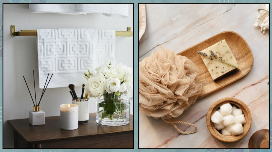
(credits: residencemagazine.se; canva)
Tiny actions that become rituals
Everyday tasks can become acts of self-love, especially in your bathroom.
Create a mini routine that brings you back to yourself, even in just a few minutes:
– Dry brushing before your shower (boosts circulation and energy flow)
– Massaging your body with natural oil after a shower (nourishes the skin and calms the mind)
– Conscious breathing under the water
– A kind word to your reflection
– An inspiring word written on your mirror
When your actions become rituals, they create a rhythm, a connection.
A deeper awareness of what your body needs.
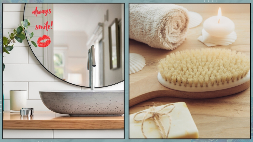
(credits: canva)
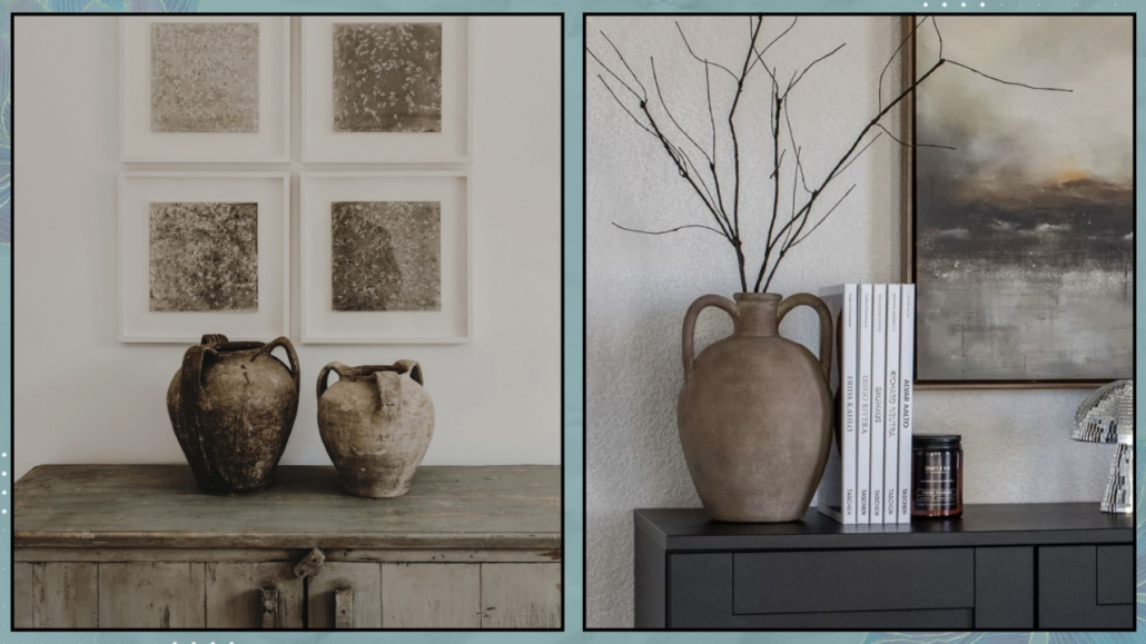
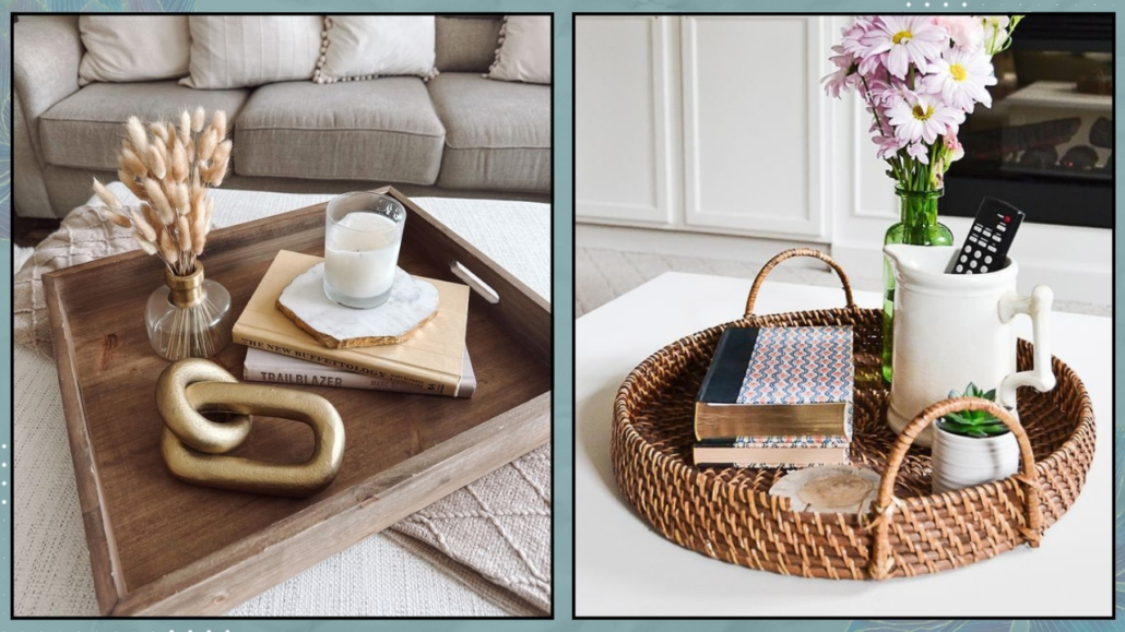
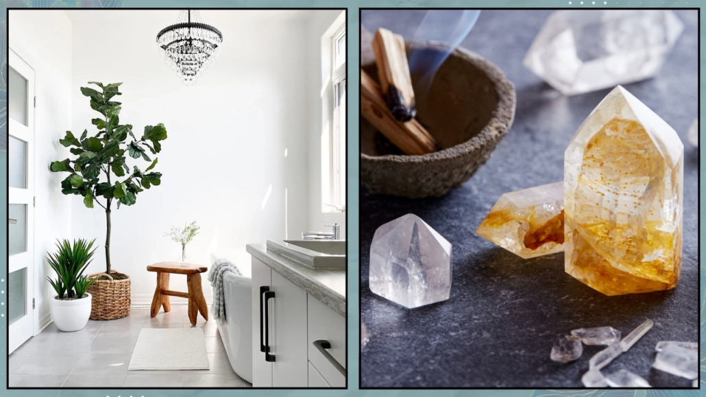
Holistic details: let spirit and space meet
Yes, even your bathroom can support your energy — through grounding details and calming touches
Try adding:
– A stone or crystal (amethyst, rose quartz, tourmaline)
– A small plant (pothos, snake plant, bamboo)
– An inspiring word or mantra on a note
– A natural object like a shell, feather, or twig
Don’t overdo it; just two or three meaningful touches are enough.
They’ll turn your space into something more than functional: a room that holds space for who you are and how you want to feel.
(credits: @mylittlesho_kingston; canva)
Evening ritual: wash the day away
To end the day with intention, try this simple evening spa ritual:
– Light a candle
– Prepare warm water (shower or bath) and add a few drops of essential oil
– Take three deep breaths and imagine the day melting off you
– Gently massage oil into your skin slowly, mindfully
– Whisper a kind word to your body or give thanks for the day
– Wrap yourself in a soft towel and let the silence settle in
Even just 10 quiet minutes at night can feel like a complete reset.
Final thoughts
The bathroom is the first room you enter in the morning and the last one you leave at night.
It’s the place of transformation. Of care. Of quiet presence.
You don’t need a big or fancy space.
All it takes is a fresh perspective — and the right questions:
How can I care for myself right here, right now?
If you’d like to turn your bathroom into a personal spa corner, I’m here to guide you: book a personalized consultation.
Because even the smallest space can hold considerable peace.