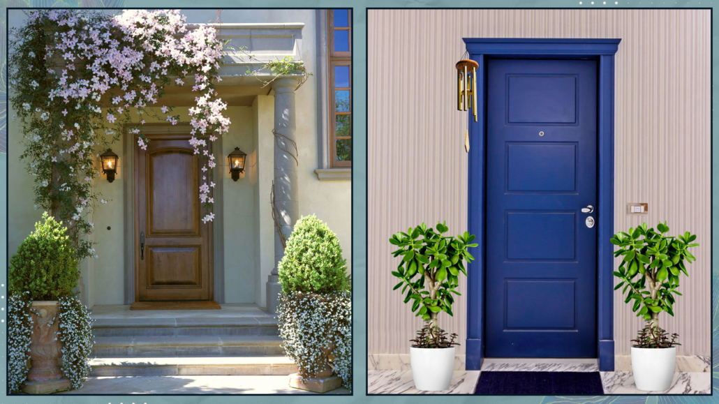
Why should you always start with interior design? Let’s talk about it.
When we think about renovating a home, our minds usually jump straight to knocking down walls, choosing new flooring, or updating systems and utilities.
All of that matters, of course.
But there’s one crucial step that’s often overlooked—or considered too late—and it’s the one that truly makes the difference between a home that looks good and one that actually works: interior design.
Interior design is not just about style or color choices.
It’s about planning spaces that support daily life and everyday routines.
This approach applies whether you’re renovating or not.
Furnishing a home doesn’t mean simply “filling” rooms.
It means giving them purpose, balance, and intention.
– Where to really start with interior design, before renovating
Before thinking about style, colors, or materials, there’s one key question to ask yourself: how do I want to live in this home?
Each room deserves careful, individual consideration, starting with its primary function.
Once that’s clear, the next step is to be functional: make a list of the furniture pieces that are actually essential for that function.
Of course, a room can have more than one purpose.
A living room, for example, might also include a dining area or a small home office.
Still, there is usually one primary function, and everything else naturally revolves around it.
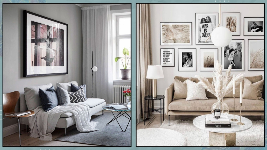
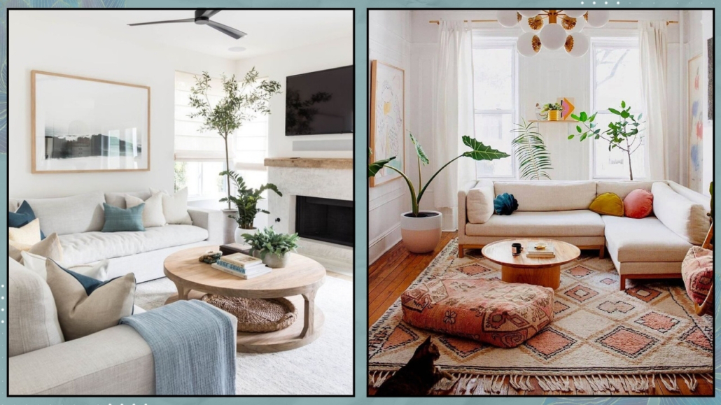
Let’s look at an example.
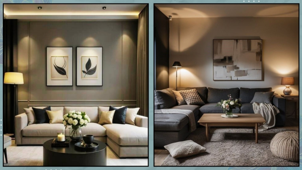
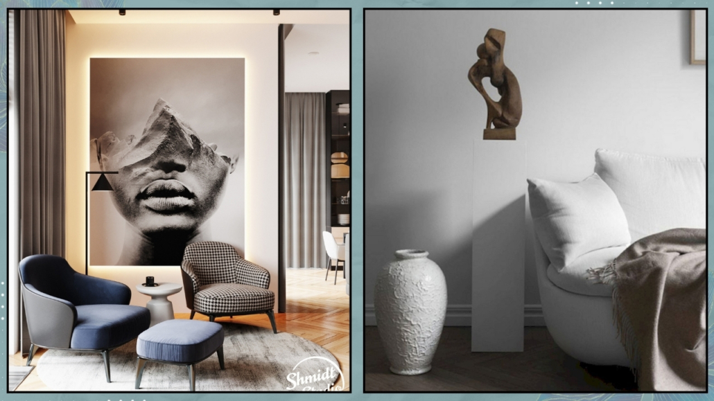
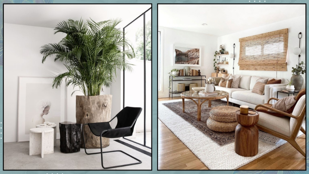
If you primarily use your living room to relax, the focus should be on a comfortable (possibly generous) sofa, a TV unit, and a well-designed circulation space.
I also suggest thinking about additional seating to encourage conversation when guests are over.
If the same space includes a dining area or a study corner, those zones should be designed and proportioned in relation to the principal function.
On the other hand, if you primarily use your living room for lunches and dinners with family and friends, then the table and comfortable chairs become the priority, and everything else comes second.
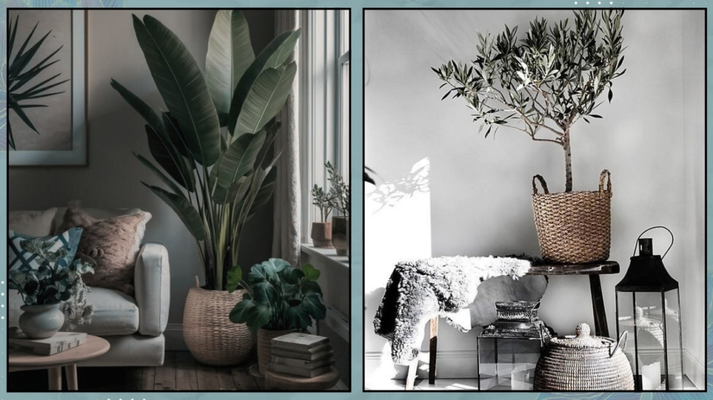
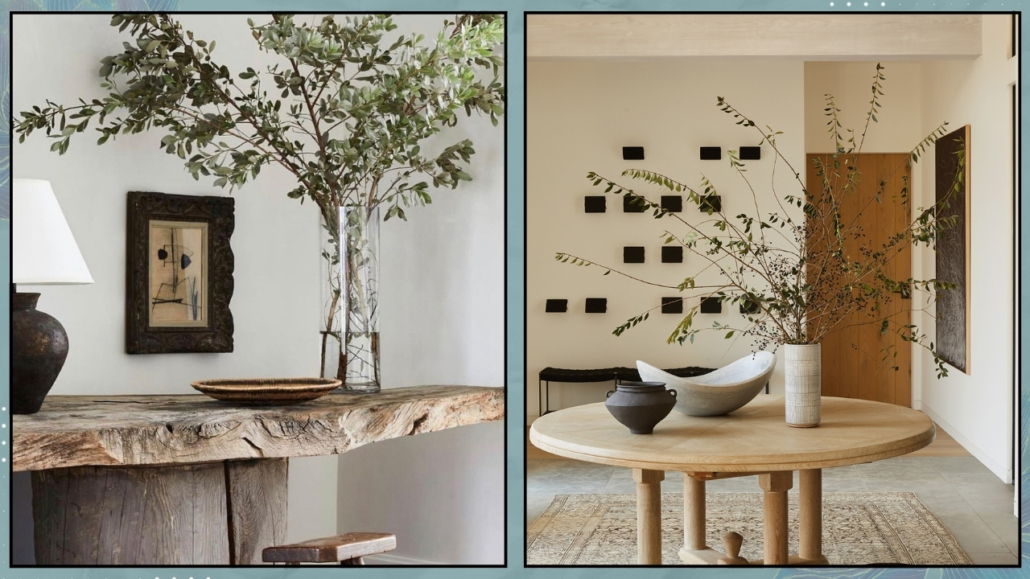
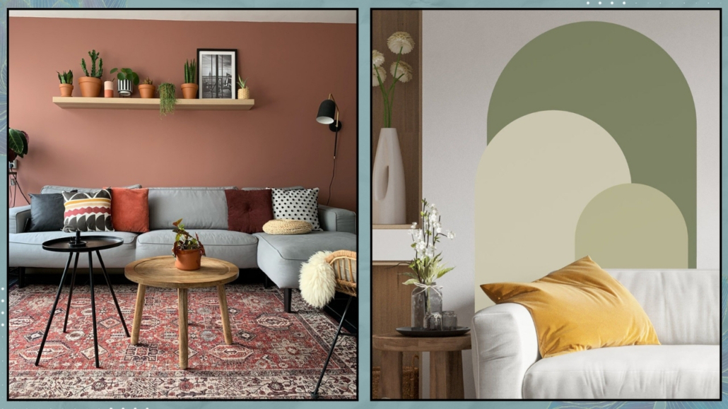
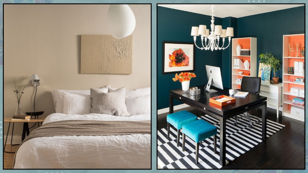
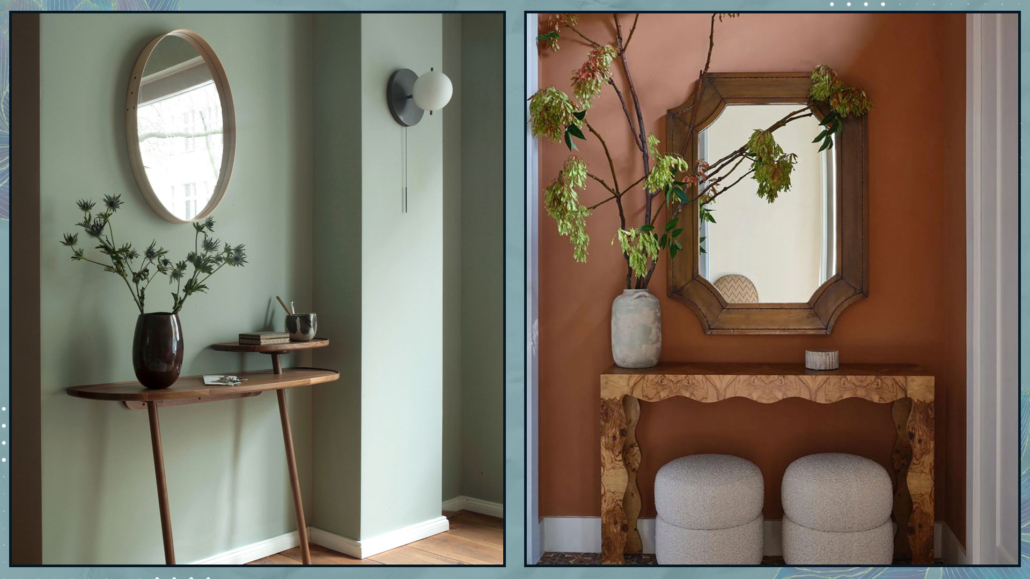
(credit: Gemini; ChatGPT)
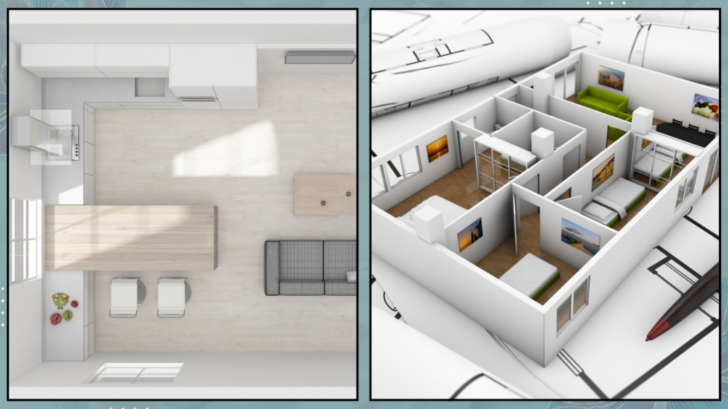
Once you complete this step, you move into one of the most valuable phases of the process: testing furniture layouts, even if only through a floor plan.
That’s when the magic happens.
Seeing real dimensions and clearances is the only way to understand whether a partition wall truly needs to be removed, slightly shifted, or opened to create a passage.
Without this overall vision, there’s a real risk of making structural decisions that don’t support everyday life.
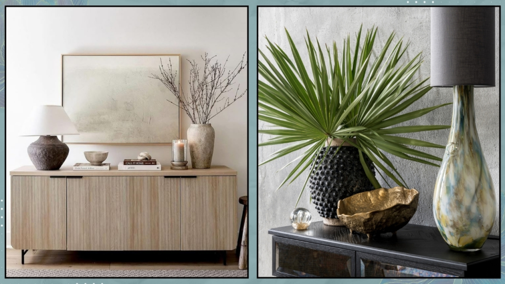
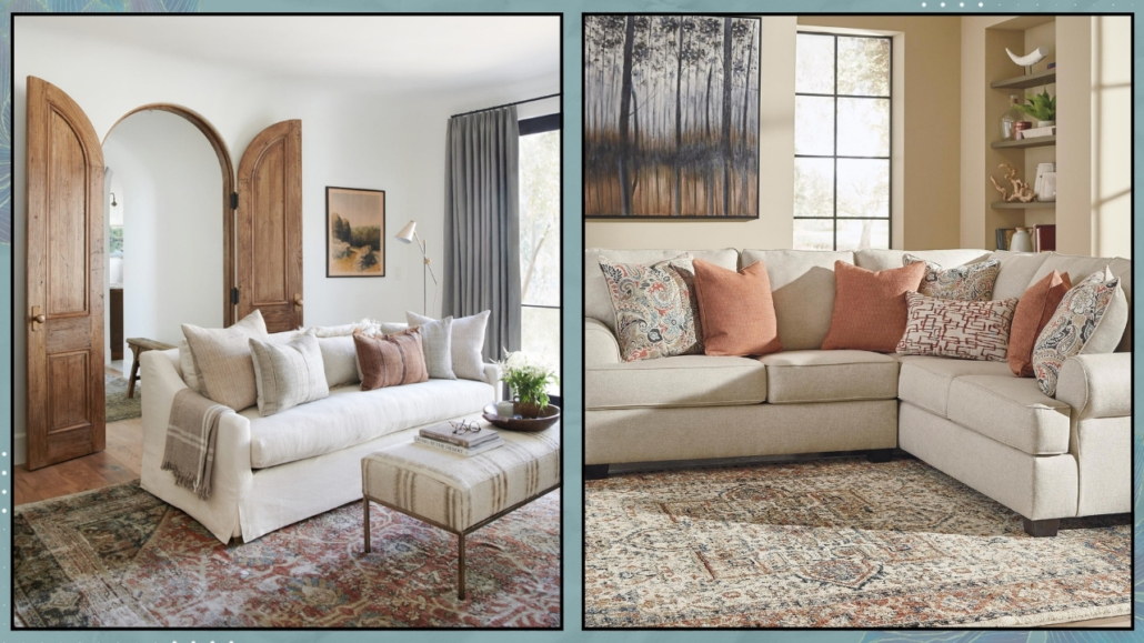
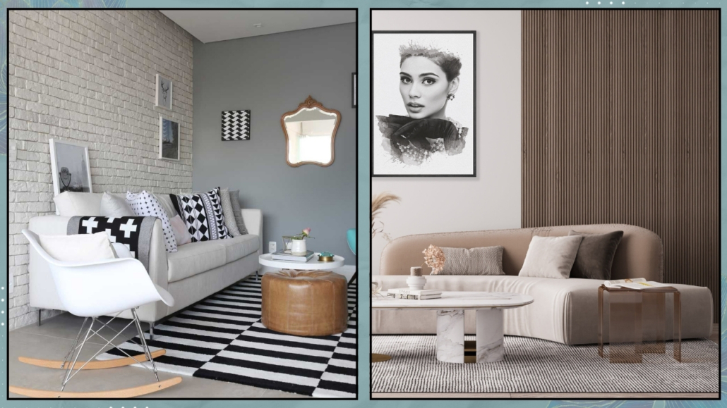
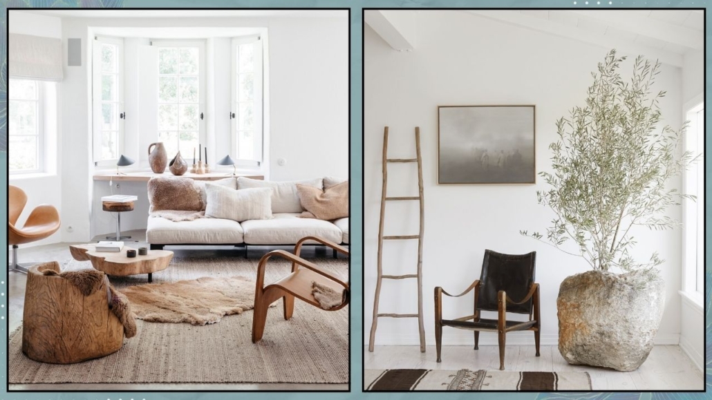
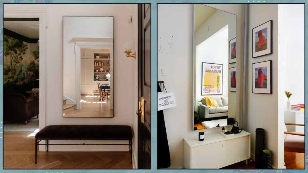
(credit: Canva)
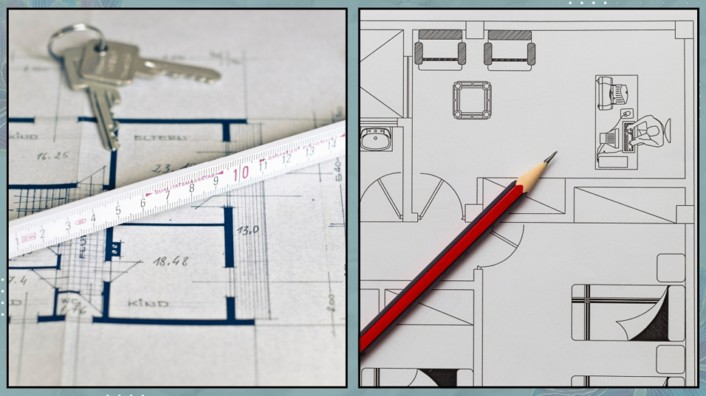
– You don’t need to know the style right away (and that’s ok)
Here’s something that often reassures people: you don’t need to decide on a style, colors, or finishes right away.
At this stage, what matters most is where, not how.
Knowing where the sofa will go, where the bed fits best, and how much space you need to open a wardrobe or move comfortably around a table allows you to work with real dimensions.
And those dimensions are what help you make smart technical decisions later on.
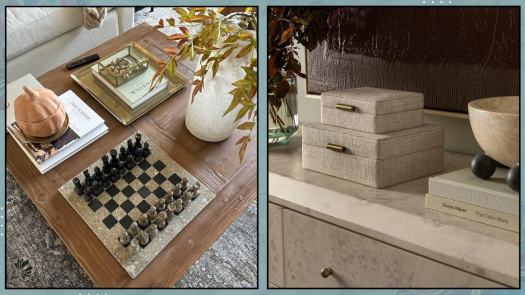
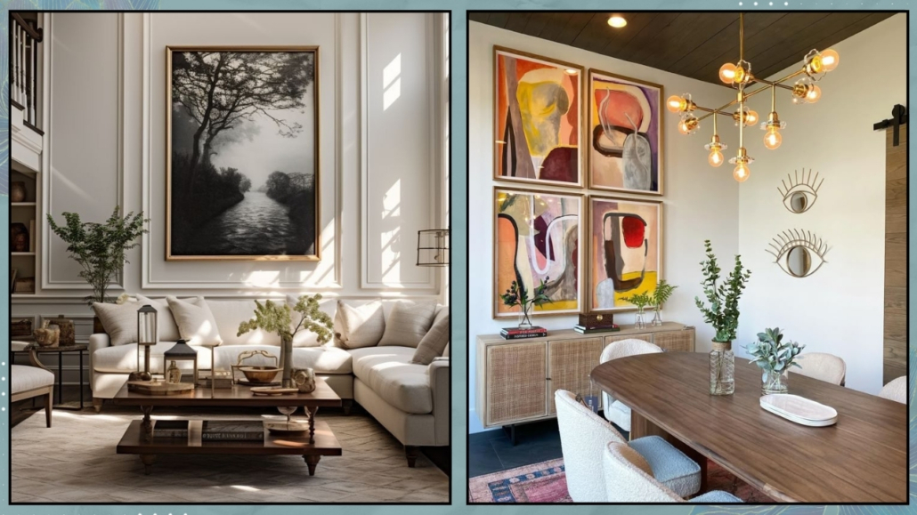
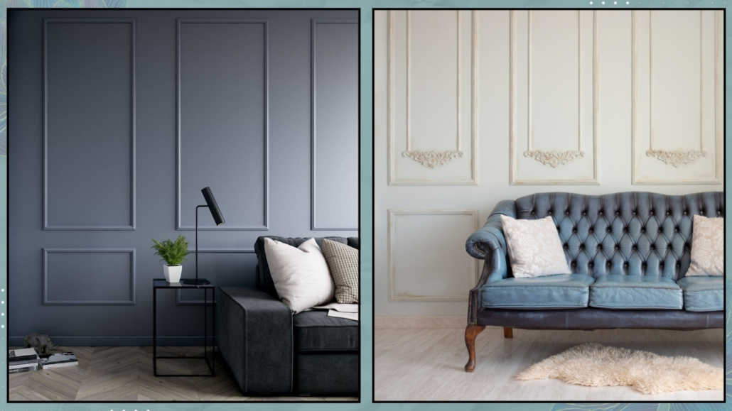
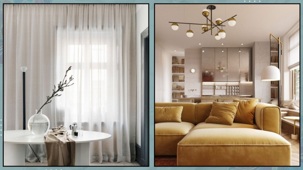
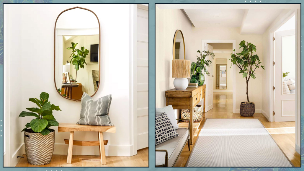
(credit: Canva)
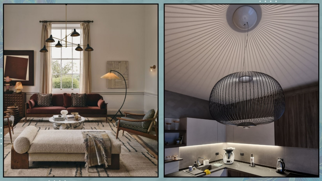
– Lighting and power outlets: decide before, not after
When the layout is clear, everything else becomes easier—and much more coherent.
Let’s talk about lighting.
A single central ceiling light is rarely the best solution on its own.
Each activity needs a different type of light: one for reading, one for cooking, and one for relaxing.
Only when you know where the furniture will be can you decide where to place light points, whether you need wall sconces, pendants, or spotlights, and where to plan floor and table lamps.
The same goes for electrical outlets.
Instead of placing them randomly “just in case” (with the risk that they are too far from where you need them or furniture hides them), you can position them exactly where they’ll be helpful.
This approach also allows you to place a sofa in the middle of the room—if that suits your lifestyle and your taste—paired with a floor lamp, without tripping over cables.
Because if you plan ahead, you can include a floor outlet.
And that’s the difference between a home shaped by compromises and one designed with intention.
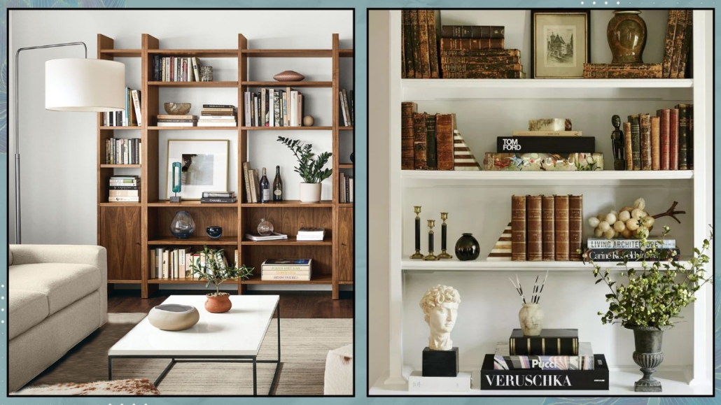
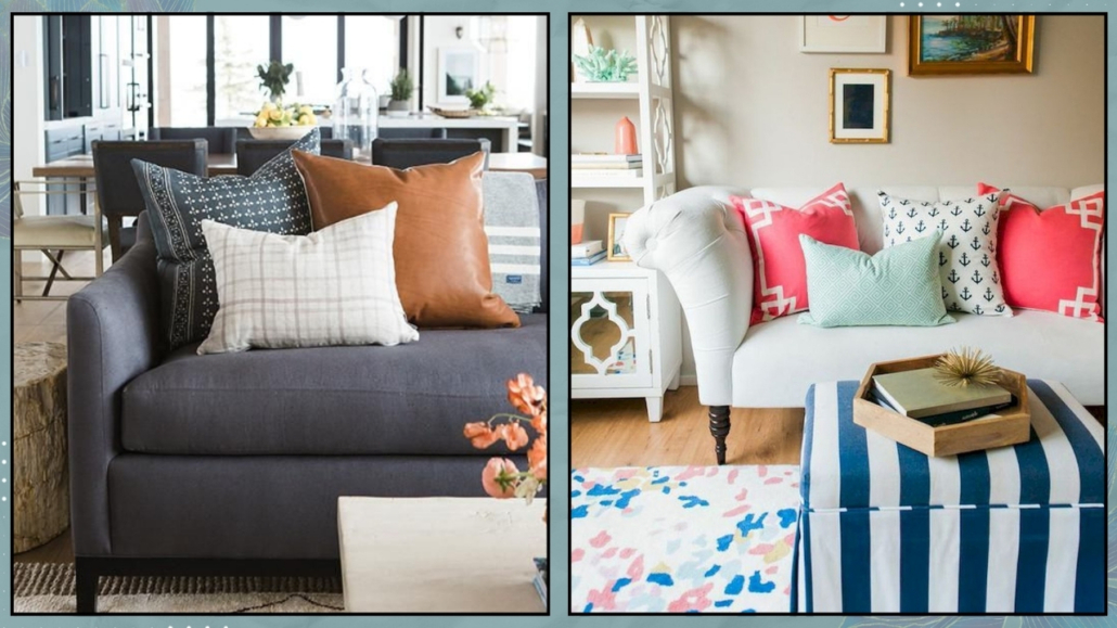
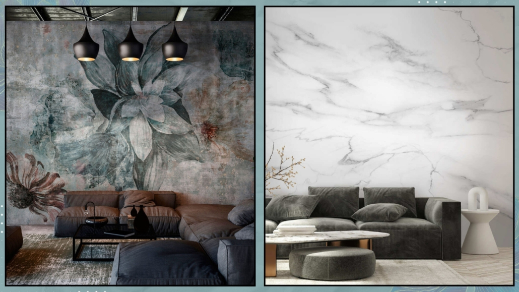
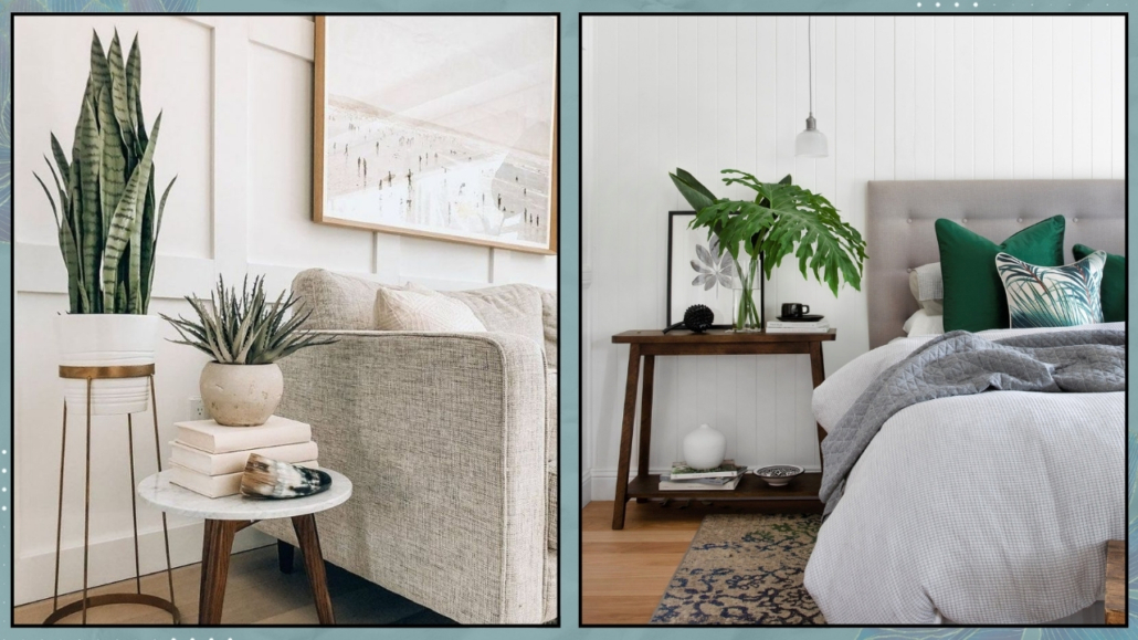
(credit: Canva)
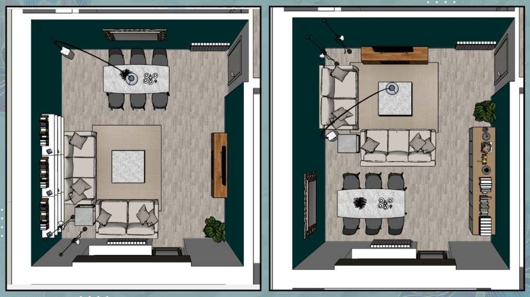
– Thinking in multiple layouts: a home that grows with you
When renovating, another interesting opportunity is to think about more than one possible layout.
Not to complicate things, but to leave room for flexibility.
Our lives change, and so does the way we use our homes.
Planning two possible furniture arrangements from the start allows you to reorganize spaces over time without invasive work.
This kind of planning is paramount for the electrical layout: even if you move furniture in the future, outlets will still be accessible.
It’s a clever and sustainable way to approach interior design.
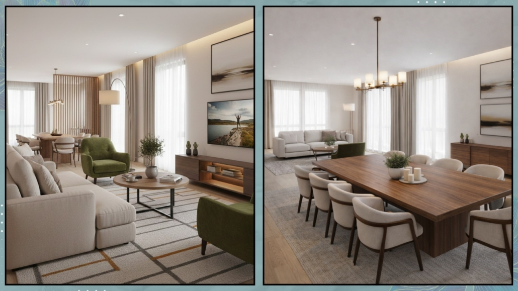
(credit: Vivere lo Stile)
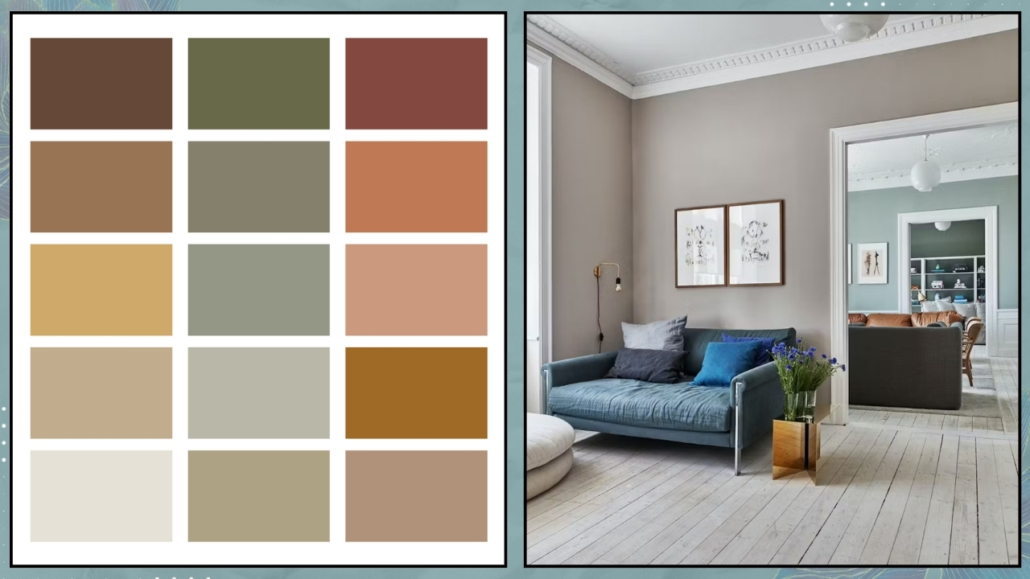
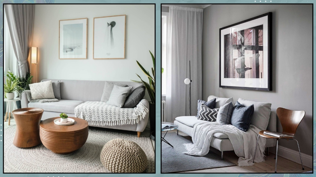
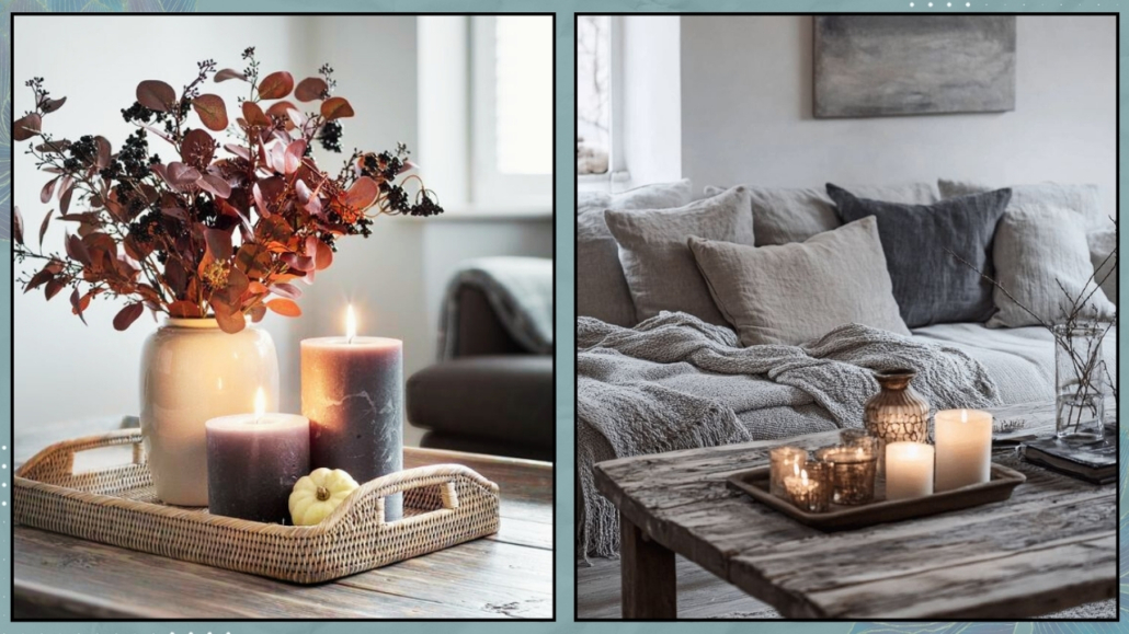
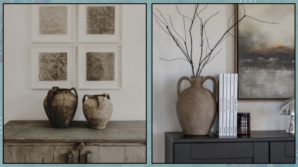
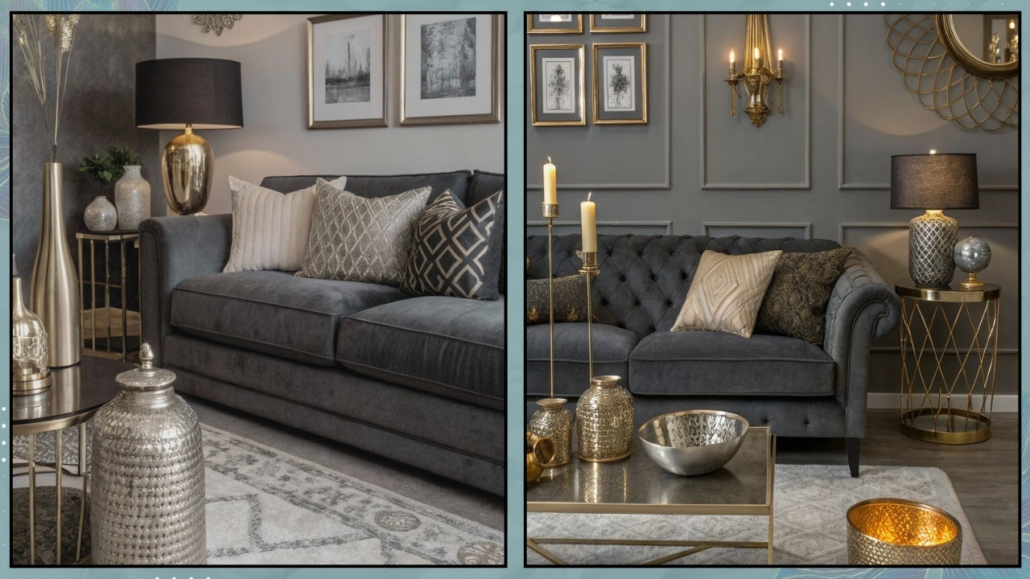
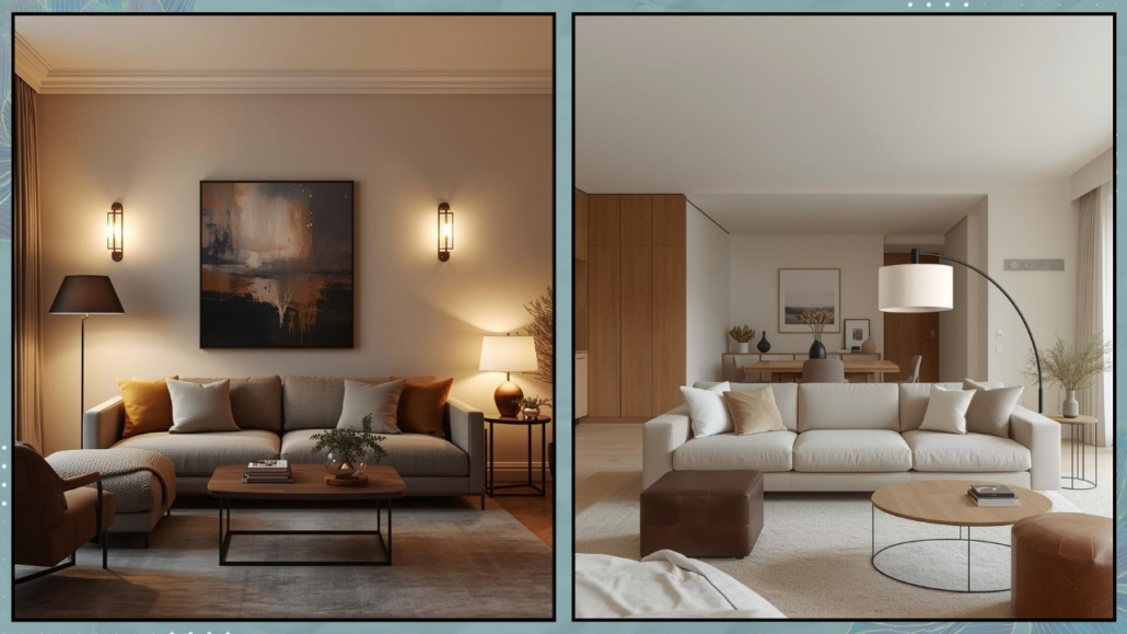
– Moodboards: when atmosphere comes into play
Only after defining functions, dimensions, and layouts does it make sense to focus on atmosphere.
That’s where the moodboard comes in.
It helps create an overall vision by combining feelings, materials, colors, and finishes.
It’s not the final project yet, but it helps guide your decisions and keeps everything aligned.
(Here I talk about how to create a moodboard)
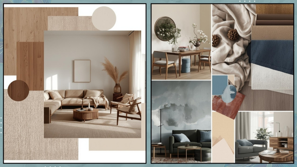
(credit: Canva)
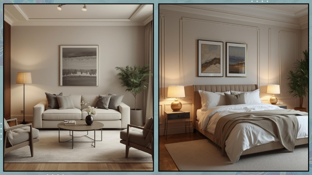
At this point, you can begin the actual renovation project with an architect, working with a clear plan.
The result? A home that truly works, not just one that looks good on paper.
– What if you’re not renovating?
All of this still applies even when you don’t have planned any structural work.
There may be fewer options, of course, but understanding the primary function of each room, listing essential furniture, defining minimum and maximum dimensions, and creating a moodboard helps avoid two common mistakes:
– rooms that feel overcrowded and suffocating, or, on the opposite end, empty and lacking character;
– spaces where furniture, accessories, and finishes don’t relate to each other.
To create a harmonious environment, the moodboard should build on existing elements such as flooring and interior doors.
You can enhance lighting by strategically using existing outlets, floor lamps, and table lamps to create layers that are both functional and welcoming.
(credit: Canva)
– A home designed before furnishing it.
The furniture plan is an integral part of interior design.
It’s not a final detail, but the foundation that supports every decision, big or small.
If you would like to clarify your ideas, organize your spaces more effectively, or approach a renovation with greater awareness, I am available for personalized consultations.
Sometimes, all it takes is starting with the right project to change the way you truly live in your home.