As the year comes to an end, the leading color brands reveal their predictions for the top trends for the coming year, so let’s dive in and explore each “2025 Color of the Year” proposal!
(Here you can find last year’s proposal)
– BENJAMIN MOORE – CINNAMON SLATE
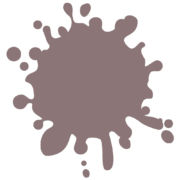
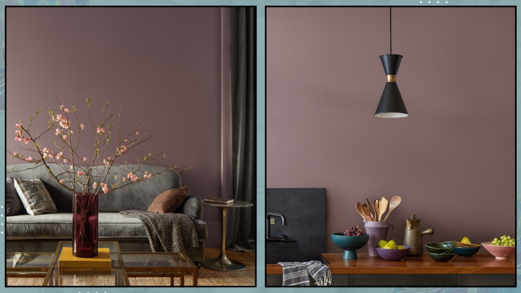
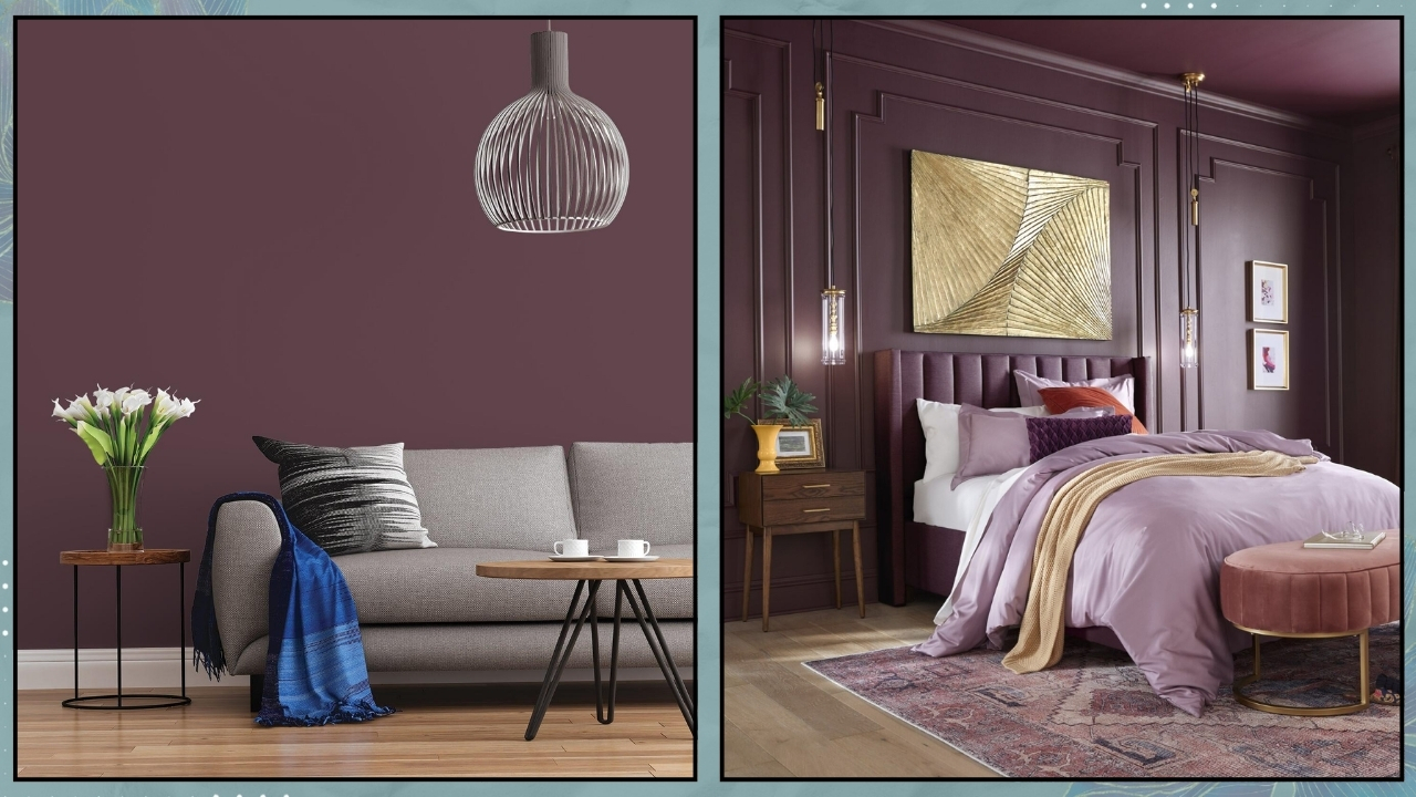
Once again, Benjamin Moore’s 2025 color of the year choice is an intriguing and delicate mix of colors: precisely between plum and brown.
It’s a rich, warm, inviting color that adds depth to any room!
In a press release, Andrea Magno, director of marketing and design for this brand said, “As the use of more saturated color in design has increased in recent years, we are seeing a growing interest in more nuanced colors, whose undertones add intricacy and dimension,” she said. “Cinnamon Slate is an inviting hue that offers enduring style and modern sensibility. Its depth and richness bring an air of approachability and sense of comfort throughout the home, making it a new favorite for years to come.”
Indeed, it’s a color that brings a sense of familiarity and is highly versatile, adapting to any style.
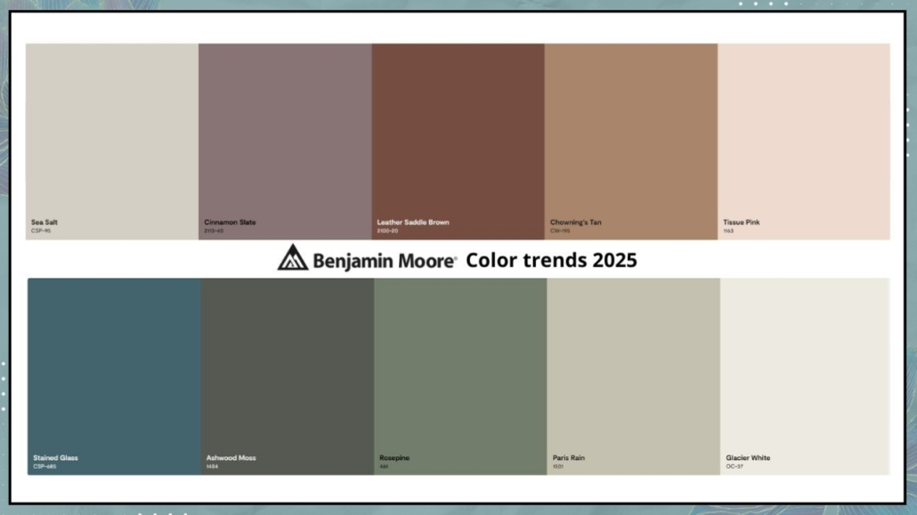
As always, Benjamin Moore also presents a color palette in which Cinnamon Slate naturally plays a central role, ranging from neutrals to more vibrant tones.
That truly allows for great personalization!
– SHERWIN WILLIAMS – CAPSULE
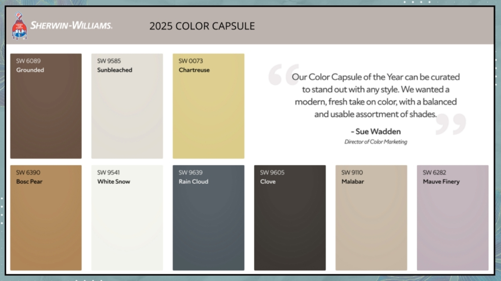
This year, Sherwin Williams is doing something different by not selecting a single color of the year but offering a stunning color palette: CAPSULE!
That expertly curated palette has the ability to create beauty and elevate any style!
It features rich, deep colors that alternate neutrals with a vibrant yellow-green and warm hues like brown.
The blue-gray and mauve add elegance and sophistication to the palette!
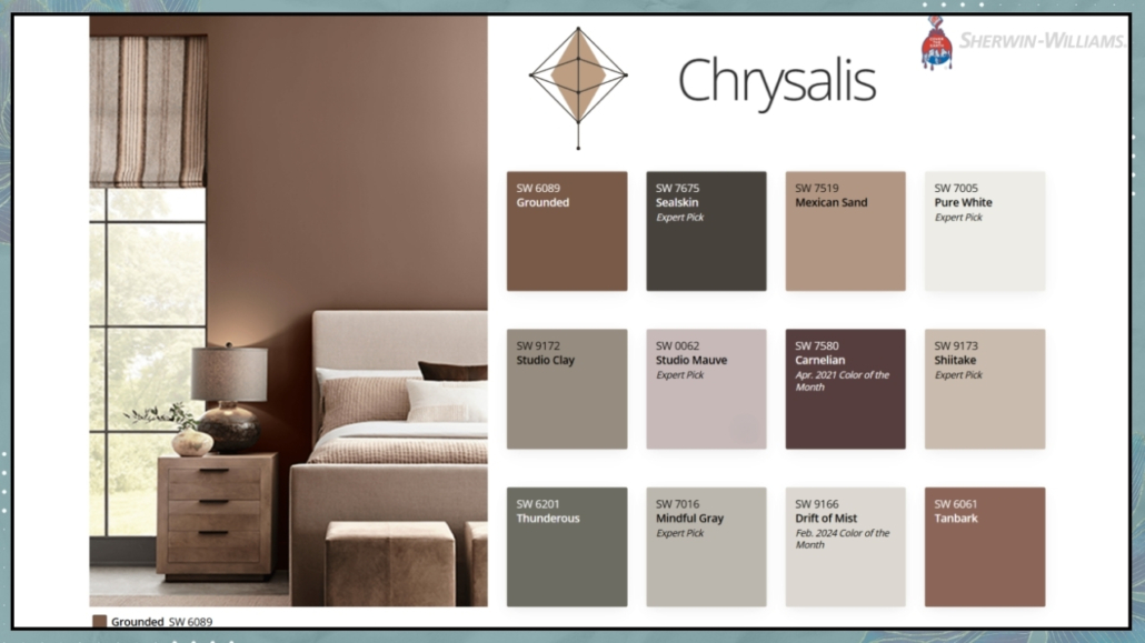
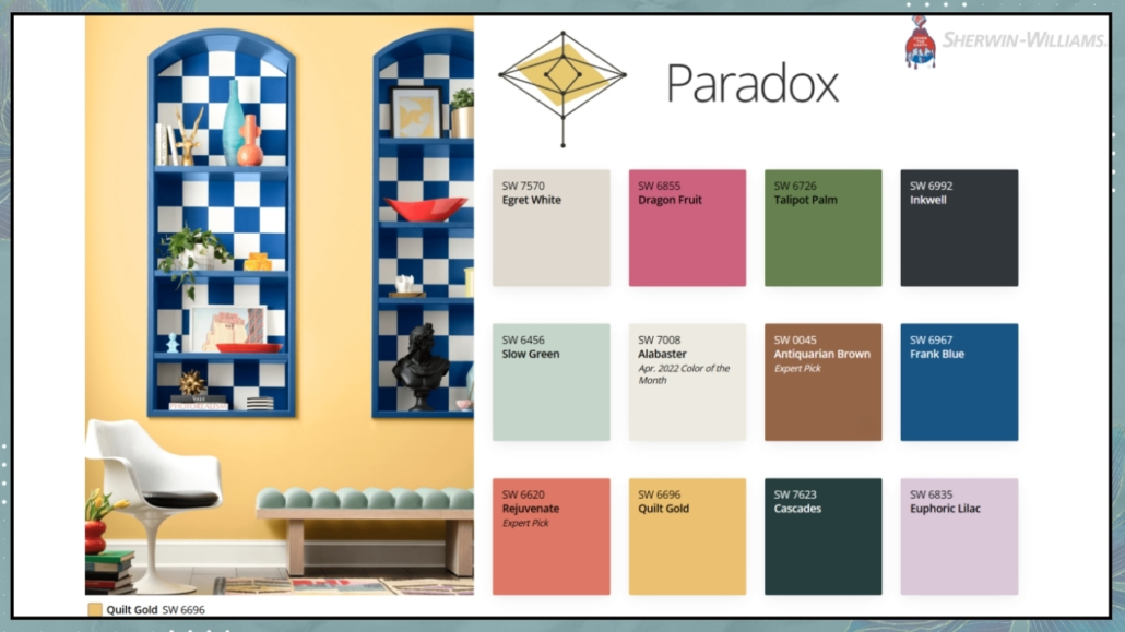
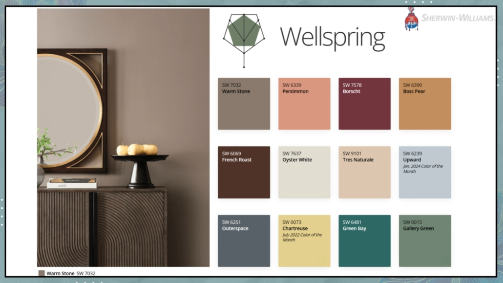
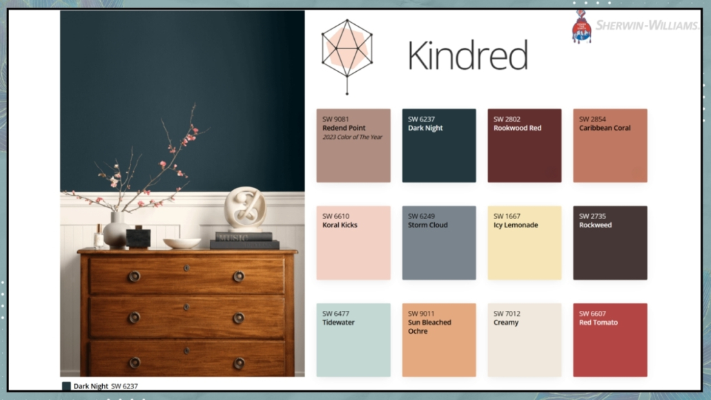
Sherwin Williams also introduces four additional palettes, known as Colormix Forecast, which explore the influences and emerging movements that the brand believes will shape tomorrow’s design.
– Chrysalis
“Capture the essence of peaceful, intentional living and transformative future thinking in a sanctuary of colors inspired by wood tones, sifting sands, and freshly turned earth.”
– Paradox
“Delve into the mystical blues, meditative midtones, and compelling chromas that connect us to the land, to creating things by hand, and to a richly personal epic narrative.”
– Wellspring
“Embrace a mindset of openness and belonging with a collection of warm neutrals, sheltering deeps, and warm-hearted colors that nurture and nourish.”
– Kindered
“Conquer the conventional with a palette of dopamine-drenched colors that defy expectations: electricbrights, grounding neutrals, and candy-coated accents.”
– PPG – PURPLE BASIL
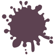
This year, PPG, as his 2025 color of the year, introduces a shade of purple that is fresh, provocative, and relaxing all at once!
In some European markets, it’s also known as Amethyst Shadow or Acai Berry.
Purple Basil is an elegant and sophisticated color suited to any style.
Its well-balanced warm and cool undertones make it inviting and mysterious, never dull.
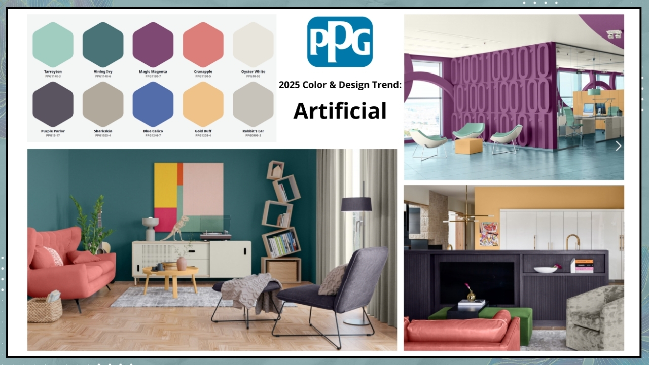
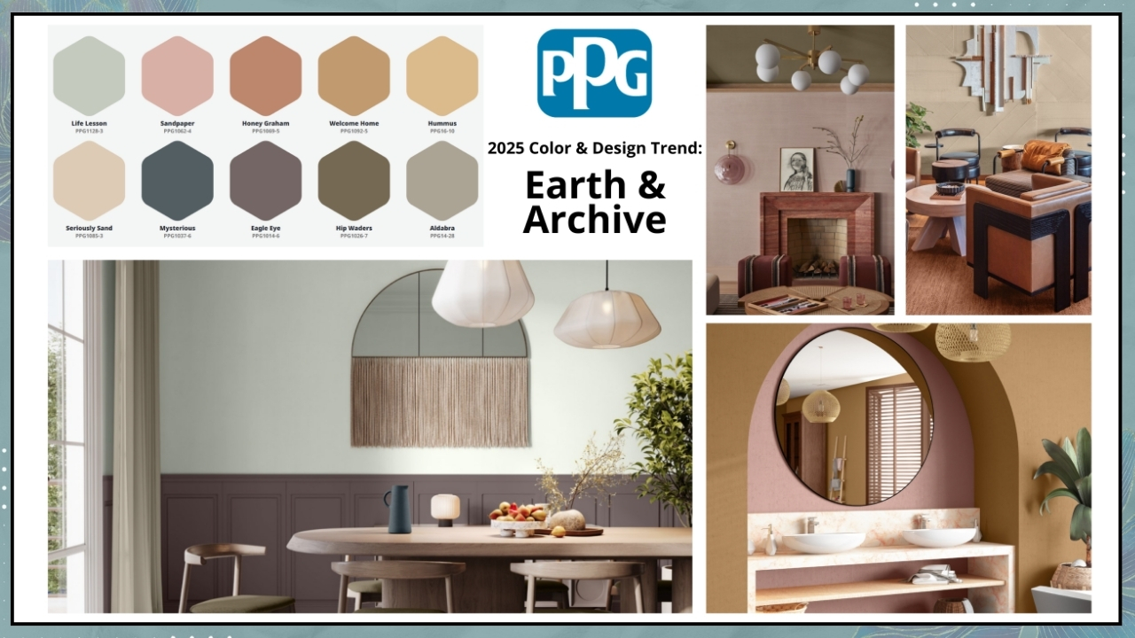
The blue and red tones within the color lend a certain kinetic energy, which forms the foundation of PPG’s four “Kinetic” palettes that pair beautifully with Purple Basil: Extra Celestial, Bio-Fuse, Artificial, and Earth & Archive.
“The theme of Kinetic color reflects the need for self-sufficiency in a fast-paced world.
It also highlights the interaction between nature and science driving innovation and the influence of new tools like artificial intelligence fostering boundless creativity,” said Vanessa Peterson, Global Color Styling Lead at PPG.
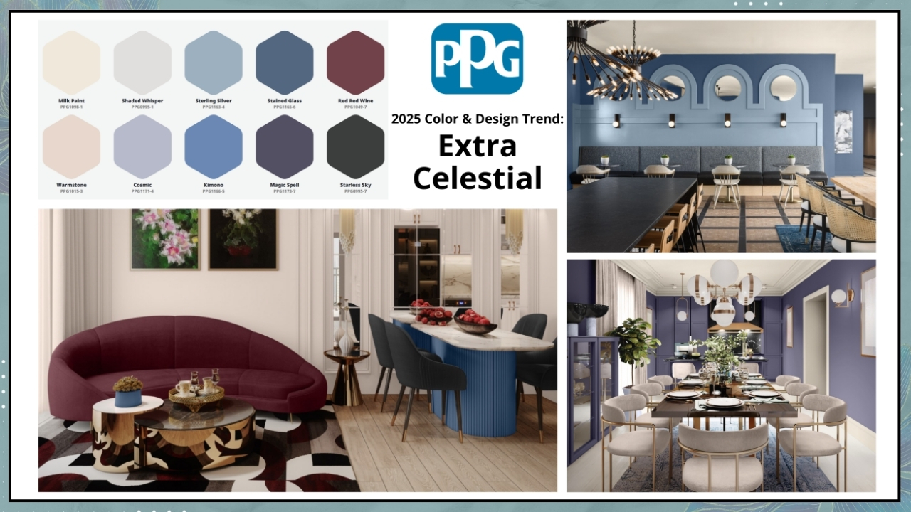
– Extra celestial
“Detached from cultural expectation or societal frameworks, consumers find greater wellness and renewable energy in living life on their own terms. Clear contrasts between dark and light hues, as well as a variety of blue and purple tones, reference the harmonies within our galactic sky.”
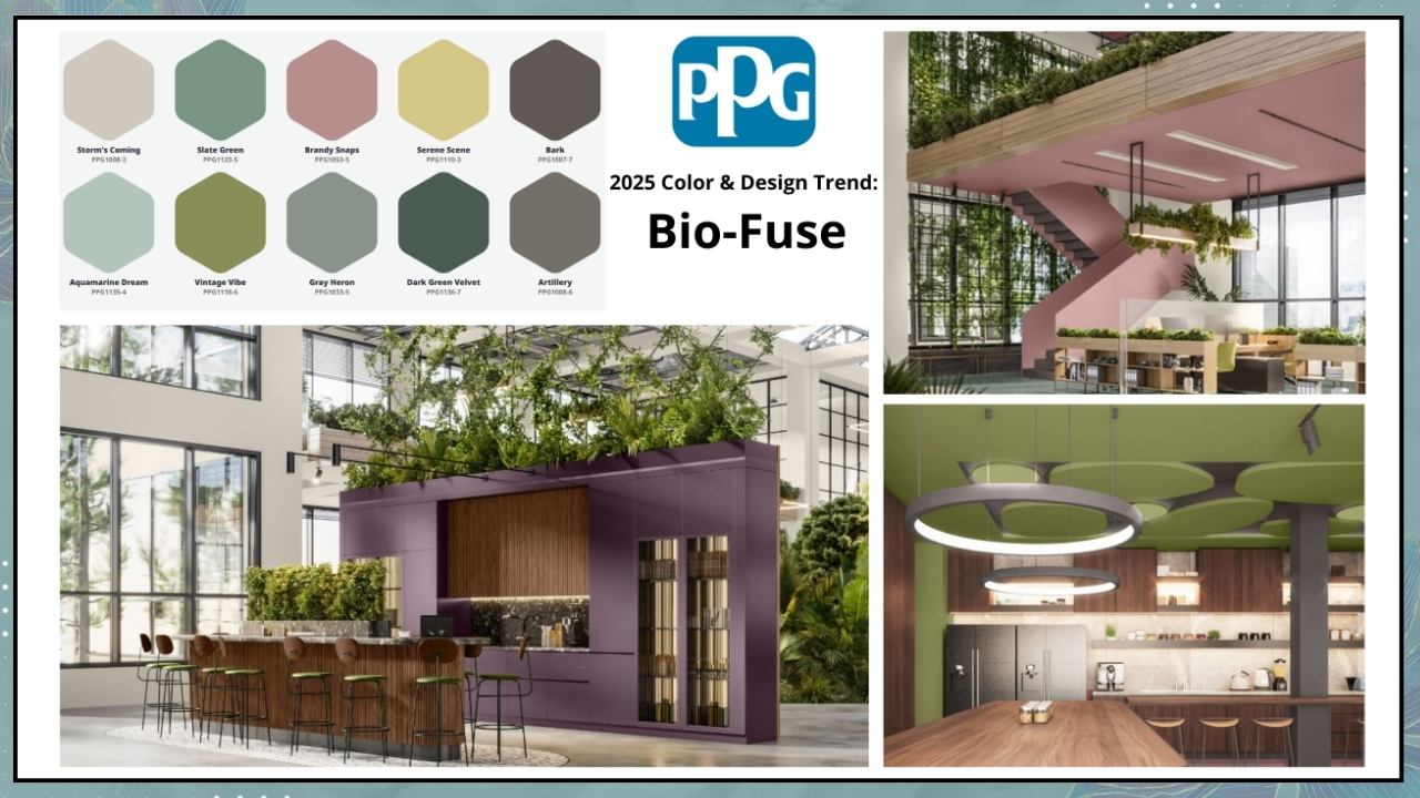
– Bio-fuse
“Consumers find comfort in ancient practices and future sciences. A growing desire for protection and safety drives purchasing and aesthetic directions. A hybrid of nature-based and laboratory colors, this palette is both calming and unusual.”
– Artificial
“Consumers look to play with designs and products that push boundaries, get noticed, and stand out while seeking sustainable solutions. The mix of bold, playful hues and neutrals hints at the balance between real and unreal worlds.”
– Earth & Archive
“Consumers return to the mindset that life is meant to be lived, enjoyed, appreciated, and valued. There is a great respect for quality and beauty. This warm and inviting palette is full of sunkissed tints and scorched earth hues.”
– BEHR – RUMORS
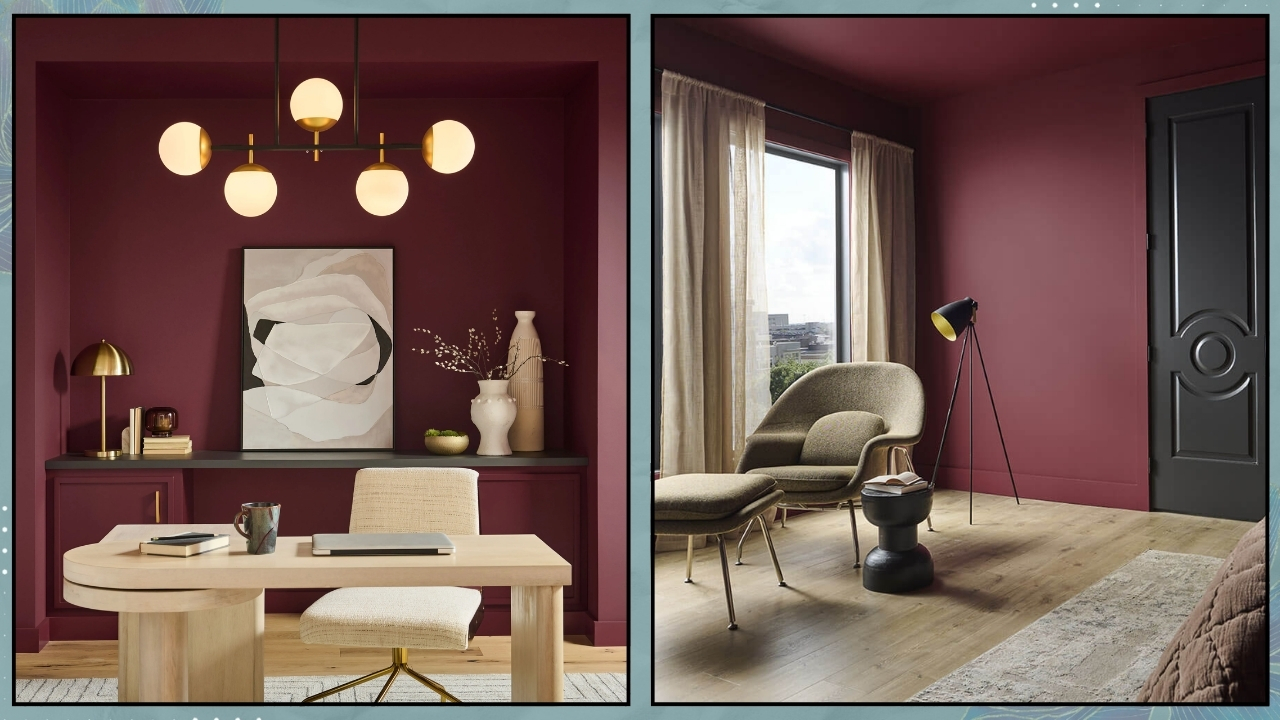
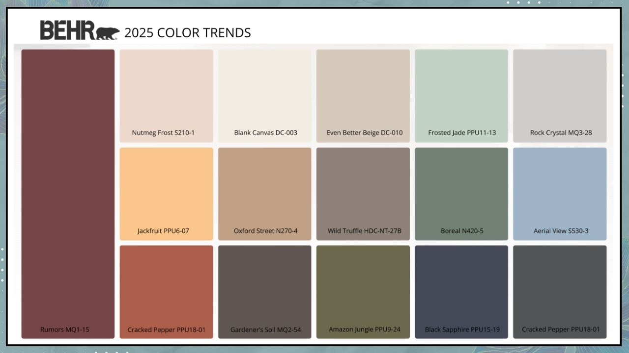
This year, Behr is making a bold choice with Rumors, a deep, dynamic crimson!
“It’s that perfect color that brings a balance of warmth and vitality to a space,” says Erika Woelfel, Vice President of Color and Creative Services at Behr.
The company turned to consumer opinions through an online survey to find inspiration for its color choice.
Most participants agreed that red on one’s mood has a positive impact, making them feel stronger and more confident!
When it came to Rumors specifically, respondents found it rich and enduring, glamorous and “luxurious.”
It’s a highly versatile color that complements any style, and you can also play with the finish, which can be shiny or matte!
Like every year, Behr also offers a curated color palette to pair with Rumors. Erika Woelfel recommends Cracked Pepper and Blank Canvas, the Colors of the Year for 2024 and 2023.
– SIKKENS – TRUE JOY

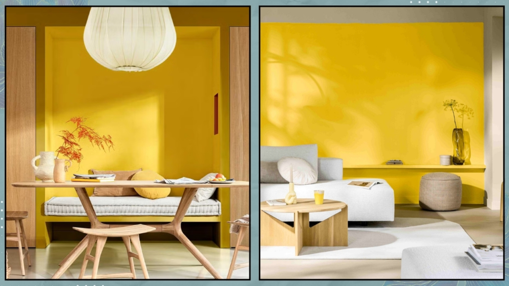
This year, Sikkens, as his 2025 color of the year introduces a decidedly positive and vibrant color that creates energizing spaces filled with optimism and pride.
It is a bold color, so it is better to use it in moderation!
Ideal for kids’ rooms, a study, or a kitchen where one can apply it more playfully, it also works well in social spaces—though sparingly, as it can become a bit “loud.”
So, consider it for an accent wall paired with various complementary elements!
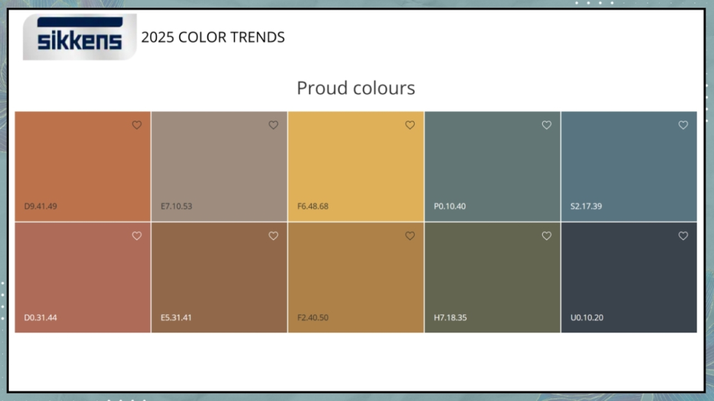
Once again, Sikkens presents three color palettes to pair with True Joy.
– Proud Colors
“Inspired by local cultures of the world, this palette aims to celebrate the heritage that makes each individual unique.”
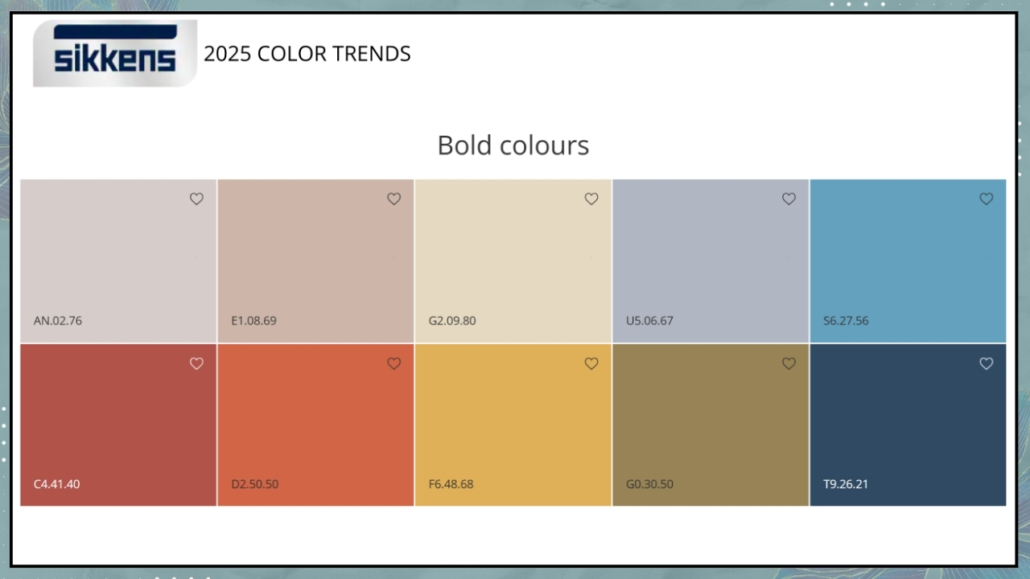
– Bold Colors
Vivid and contrasting colors for a dynamic palette.
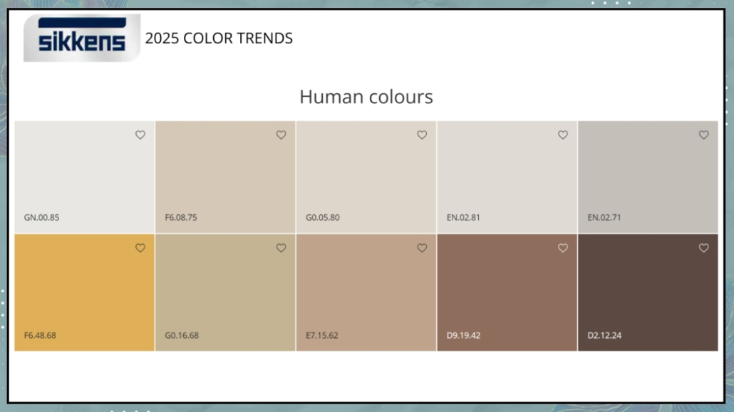
– Human Colors
Colors inspired by nature and the earth for a relaxing palette, with yellow adding a touch of brightness!
The proposals are rich and interesting! What’s your favorite?
Let me know in the comments!
I hope you enjoyed this article on 2025 colors of the year and found it helpful.
If so, don’t hesitate to share it with someone you think might be interested; I would be honored, and it will help me get known.
If you feel that your home, or any part of it, doesn’t reflect you enough, don’t wait any longer: fall in love with your place again and book your consultancy!
This post is also available in: Italian



Leave a Reply
Want to join the discussion?Feel free to contribute!