How to combine colors at home to create a palette that makes the environments unique?
Let’s see it together!
Color is a very powerful element with a deep psychological meaning (I tell about it here) that allows expressing one’s personality!
Proper use of color in the home will allow you to experience every room to the fullest because you will always feel represented!
A BIT OF THEORY
Let’s start with color theory, which divides all colors into three categories:
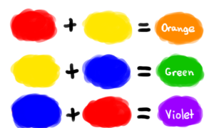
– Primary colors: red, yellow, and blue
They are colors that cannot be produced by mixing other colors.

– Secondary colors: orange, green, and purple,
they are obtained by mixing 2 primary colors (green, for example, is obtained by mixing yellow and blue!).
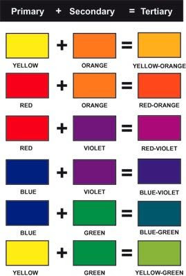
– Tertiary colors: the six colors obtained by mixing a primary color with an adjacent secondary color.
These three categories of colors, put together, form what is called the color wheel, and it is the one we will use to figure out how best to match colors!

SMALL PREAMBLE
Before we look at the various possible combinations, I would also like to give a very brief explanation of some of the terms that are used when talking about color:
– saturation or intensity: indicates the intensity and strength of the color.
We could say that it indicates color in its purest form; the more saturated a color is, the more vivid and bright it will be; the less saturated it is, the more muted, softened… tending to gray!
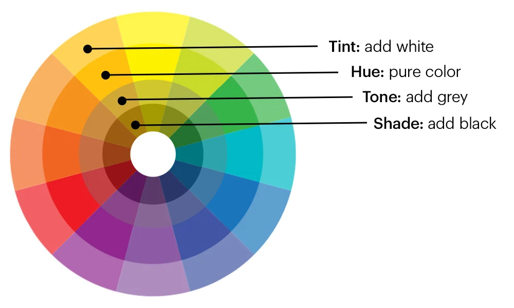
– hue: it is the pure color.
– tint: it is a color to which white has been added, which has therefore been lightened.
– tone: it is a color to which gray has been added.
– shade: it is a color to which black has been added.
In the color wheel, we find, for each color, its hue, tone, and shade.
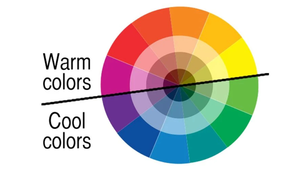
Finally, colors are still divided into warm colors and cool colors:
– warm colors range from yellow to violet-red and are so defined because they are associated with the heat of the fire and the sun.
– cool colors range from purple to green-yellow, which are so defined because they are associated with the sea, sky, and glaciers.
AND NOW LET’S SEE HOW TO COMBINE COLORS AT HOME
After making this necessary introduction, let’s now see the possible combinations!
1) MONOCHROMATIC matching
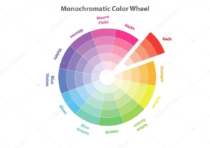
You choose a single color, but of this color, you use the various tints, tones, and shades.
It’s a scheme that definitely emphasizes that color a lot!
To avoid the risk of falling into monotony, I recommend playing with different patterns, fabrics, and sùrfaces to add movement!
Also, remember to add natural fabrics or metals to give more three-dimensionality.
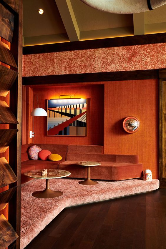
(credit Elledecore.com)
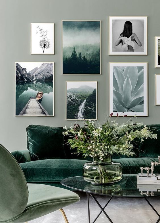
(credit posterstore.co.uk)
2) Matching by ANALOGY
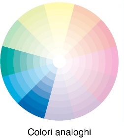
Once you have chosen a color, you match it with those immediately to its right and left on the color wheel.
These colors are also called adjacent colors.
Having the same undertone it will give a sense of harmony to the color scheme.
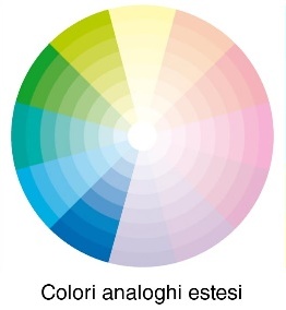
There is also the extended analogy, that is combining the first two colors to the right and left of the chosen color.
This combination will make the color scheme a bit more dynamic than the pure analog.
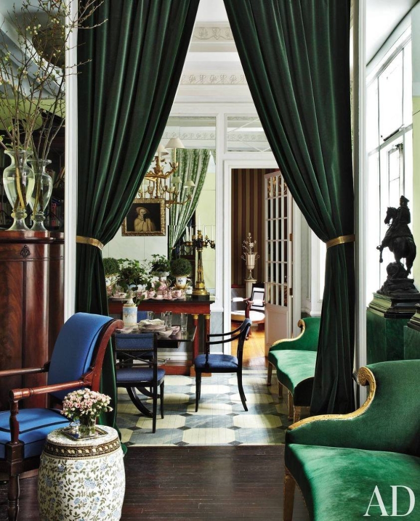
(credit AD)
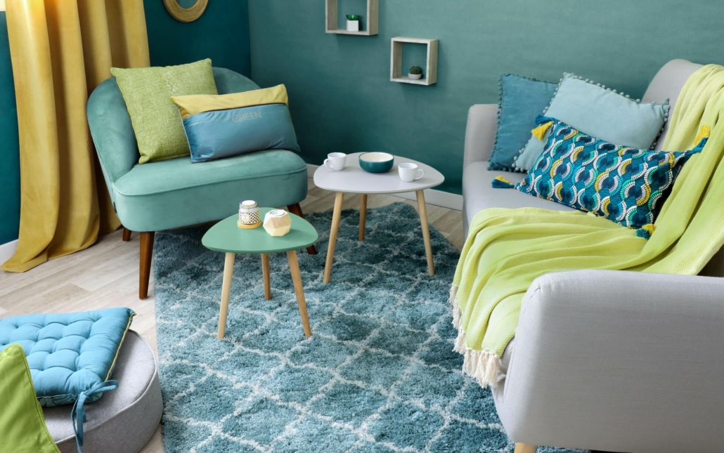
(credit eminza.it)
3) matching by COMPLEMENTARIES

In this type of combination, you choose the colors that are at opposite poles of the color wheel.
It is a decidedly dynamic, high-contrast combination, so it is a good idea to use it in small doses or at least calm it down with neutral colors!
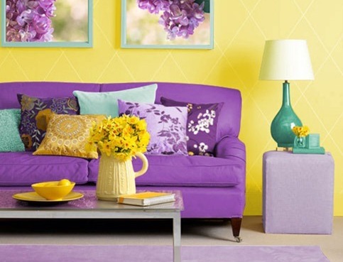
(credit 4betterhome.com)
(credit countryliving.com)
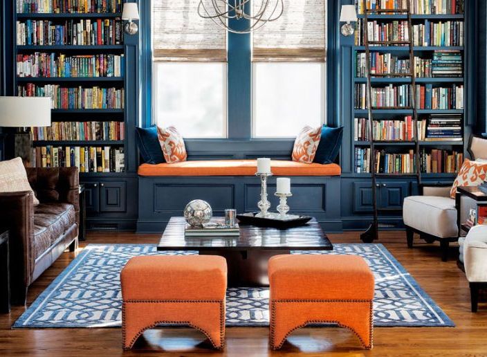
4) matching by SPLIT COMPLEMENTARIES
It’s the combination of a color with the two colors on the right and the left of the direct complementary.
Also, in this case, calming the contrast with neutrals is a good rule!
(credit welovehomeblog.com)
(credit thekitchn.com)
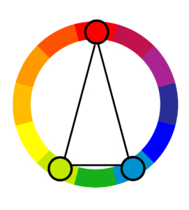
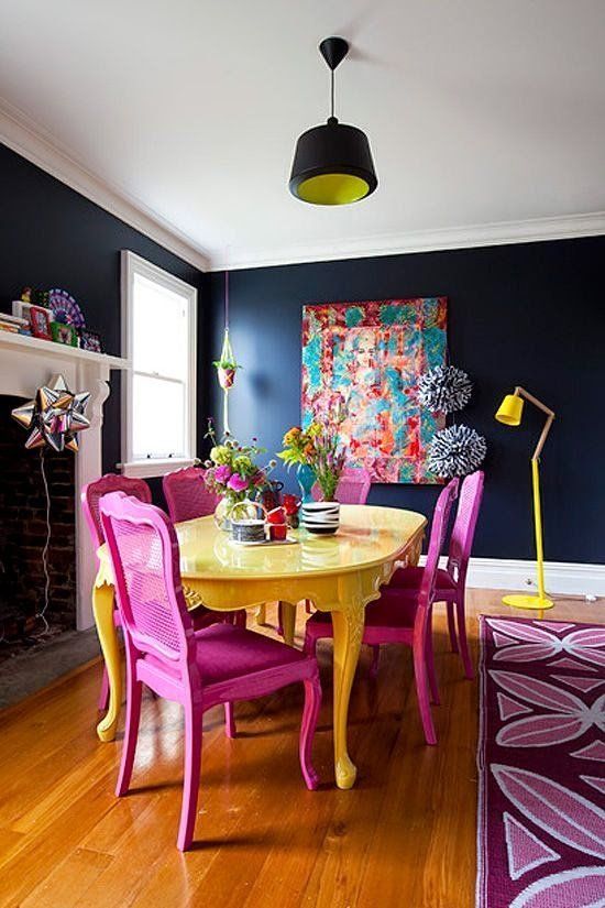
5) TRIADIC matching
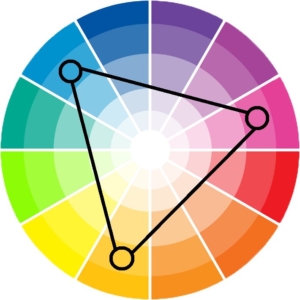
As for matching by analogy or split complementaries, you use three colors, which are obtained by drawing an equilateral triangle in the color wheel.
The primary colors and secondary colors form, between them, a triadic!
That is a dynamic and often unusual pairing!
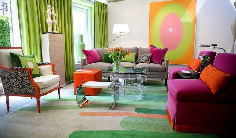
(credit homedit.com)
(credit homedit.com)
There is a small rule that might be useful in matching colors of these various combinations to the best effect: namely, the 60-30-10 rule.
It means choosing one color as the “dominant” color and using it 60% of the room, perhaps on walls and in larger items.
Another color will be secondary and used at 30%, perhaps in curtains and less large items such as an ottoman.
Finally, one color will be an “accent” color and used at 10%, perhaps in pillows and objects.
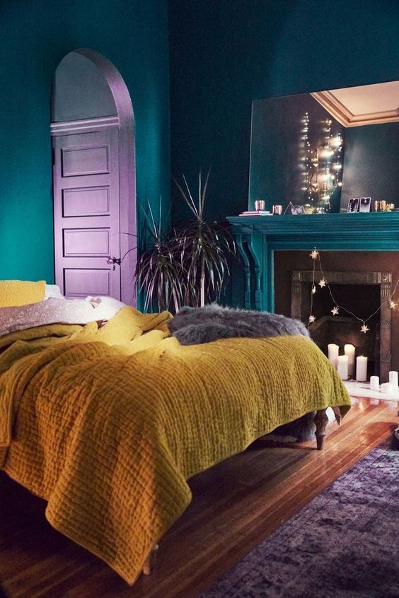
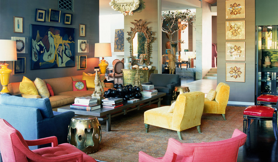
6) TETRADIC matching
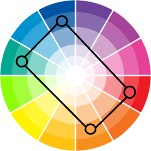
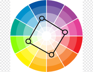
It is a 4-color match that you obtain by drawing a rectangle or square in the color wheel.
Honestly not an easy match that might give pleasing results, but the risk of a loud and unpleasant result is just around the corner!
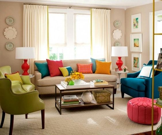
(credit nzawa)
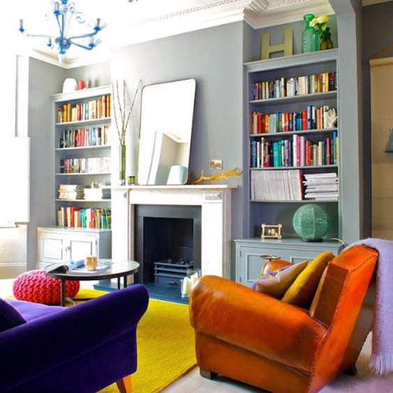
(credit Ingrid Rasmussen)
SMALL TIPS:
Before concluding, let me point out a few suggestions:
– it does not have to be all colorful: if you are a person who likes neutrals but you are drawn to these color schemes, you can include them in small elements, in decorations, such as pictures and pillows, in textiles, and other objects.
– with shrewdness and moderation, you can combine several palettes: for example, in a predominantly monochromatic room, you can give vibrancy with objects and decorations that have another type of palette, perhaps complementary!
– if you have different colors in the various rooms, tie them together with an accent color: it will act as a common thread making the various rooms, more harmonious and balanced.
For any doubts, do not hesitate to write to me in the comments, or book your consultancy!
This post is also available in: Italian


Leave a Reply
Want to join the discussion?Feel free to contribute!