How to choose neutral colors for home environments?
Neutral colors are widely used in interior design because of their versatility, providing a perfect backdrop for furnishings and architectural forms.
They help infuse elegance into spaces and evoke a sense of calm.
However, it’s easy to say ‘neutral colors,’ yet there are important factors to understand and consider when choosing the right color for your home.
Let’s explore them together.
WHAT ARE NEUTRALS?
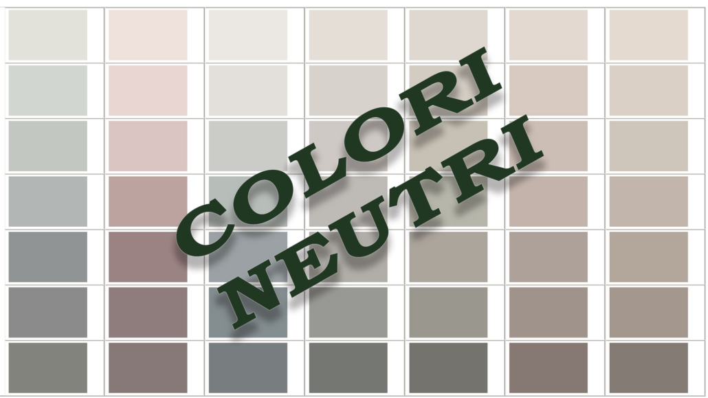
Firstly, it’s essential to understand what colors we define as neutrals! Essentially, neutrals are colors that lack a high chromatic intensity; they have low brightness and saturation.
Neutrals fall into two categories:
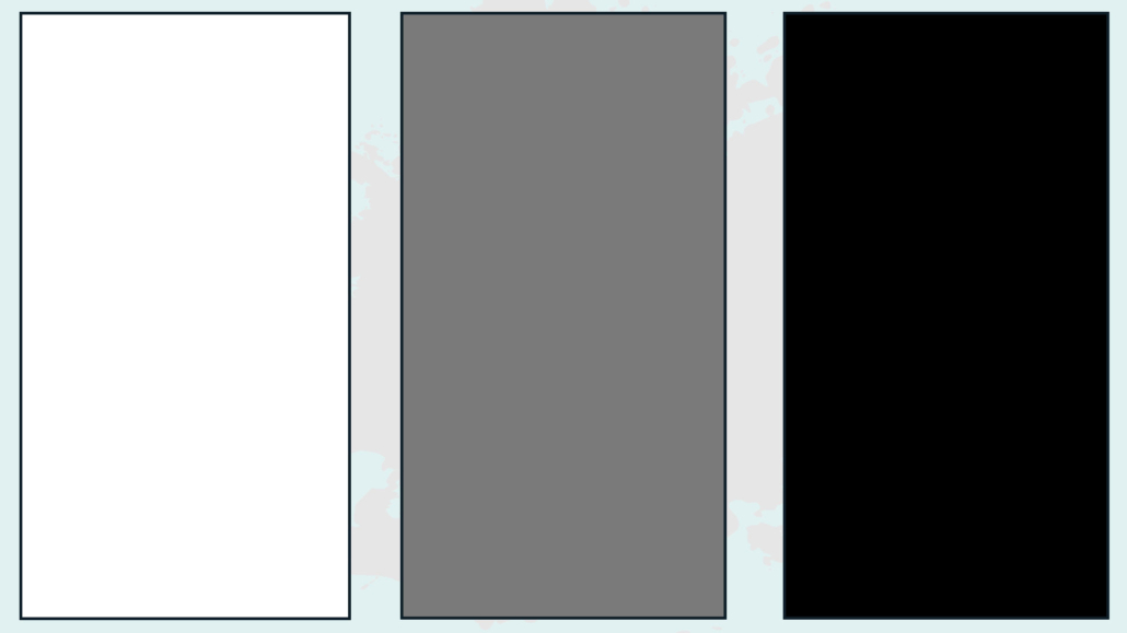
– pure neutrals, which are white, gray, and black.
– near neutrals, achieved by mixing a color with a pure neutral or blending two complementary colors.
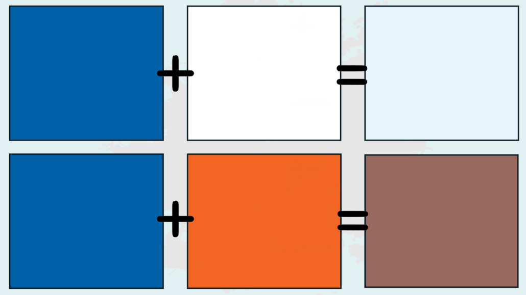
For example, if you take a blue and add white, at a certain point, it will lose saturation until it becomes almost white, with a hint of blue undertone!
That created white effectively becomes a neutral color but differs from pure neutrals due to its undertone.
1 – PAY ATTENTION TO THE UNDERTONE
The undertone is what sets near neutrals apart and is the reason why choosing them isn’t as straightforward.
It’s also why the result on the wall often differs from what we expected.
Due to this undertone, neutrals, even if they appear colorless, actually have them:
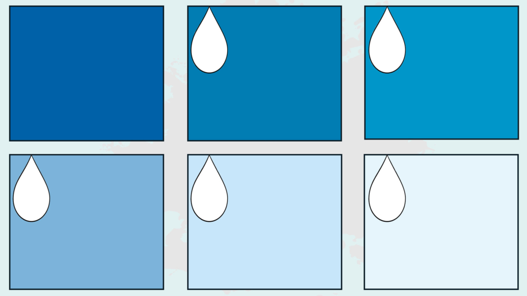
A white, for instance, unless it is a pure one, could have a slightly yellow or blue undertone.
That changes the perception of the space; a white with a yellow undertone will feel warmer than one with a blue undertone!
So, it becomes crucial to identify their undertone to be able to choose the right neutral colors!
Recognizing this elusive undertone isn’t immediate, but there’s a trick to uncover it: comparing the near-neutral with a pure neutral.

Essentially, you should place the color sample on a sheet of pure neutral paper, and the undertone will become immediately straightforward!
If you take a white by itself, it might seem just white, but when compared to pure white, you’ll immediately notice the undertone it tends toward!
The same applies to grays and blacks!
2 – WARM AND COLD NEUTRALS
Due to their undertones, near neutrals are further divided into warm and cold neutrals.
Warm and cold when choosing a neutral color are another crucial element to consider!
Knowing the undertone of a particular neutral makes it easy to position it on the color wheel and understand if it falls in the half of cold or warm colors.
From this, it’s evident that neutrals with blue, purple, and green undertones will be cold, while those with red, yellow, and orange undertones will be warm.
fotooooooooooooo
Choosing the correct “temperature” of neutral is paramount because it serves as the background and foundation for your spaces, style, and the emotions you want to evoke.
It’s also the starting point for creating your color palette.
Colors need to harmonize with each other to create cohesive and unified environments.
So, by knowing the undertone of the neutral you choose, then you can pair it with other colors following one of the six ways to combine colors on the color wheel (discussed here).
3 – PAY ATTENTION TO LIGHT:
The type of light in a room is a crucial element because it alters our perception of colors.
Direct natural light differs from indirect natural light and, of course, artificial light.
Artificial light, as we’ve seen on other occasions, changes depending on the color temperature of the bulbs, which can be warm, neutral, or cold.
For instance, a wall painted in pure white may appear slightly yellow with warm light and blue with a cold one!
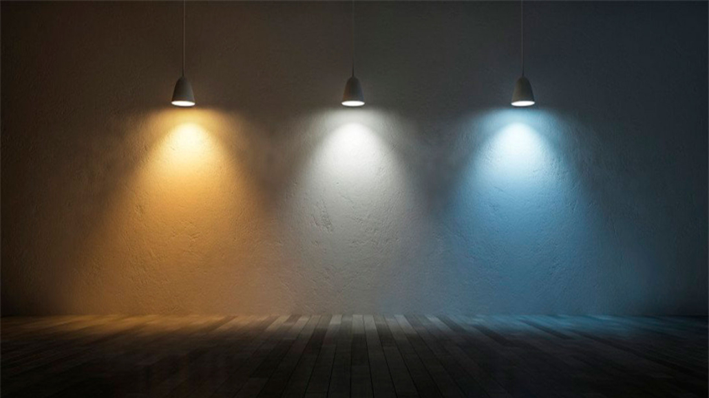
To maintain the perception of the actual colors, it’s ideal for the ambient light, the general one, to be neutral (more on color temperature and lighting here).
For these reasons, it’s advisable to conduct tests and paint a portion of all the walls, observing their appearance throughout the day with both light, natural and artificial.
Also, look out for the various elements in the room and how they reflect light because this reflection will also change the color perception.
4 – STYLE AND ATMOSPHERE
Knowing what style and atmosphere you want to create in a specific environment is another crucial element in choosing the right neutral color for you.
Warm neutrals are generally the right choice if you want to give an inviting, cozy, and comfortable feel.
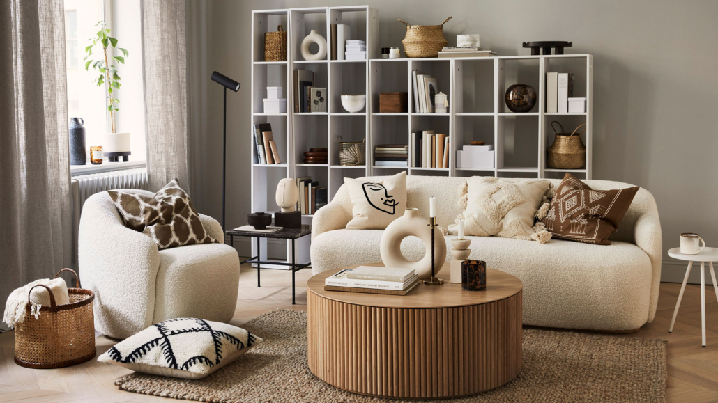
(credits H&M HOME)
Cold neutrals are more suitable if you prefer something more sophisticated and relaxed.
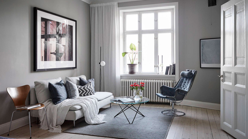
(credits cocolapinedesign.com)
For a minimalist style, pure neutrals are ideal.
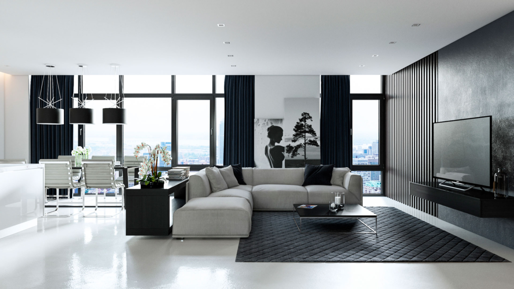
(credits rikreainteriors.it)
In recap, when choosing a neutral color, you need to:
– decide whether to go for pure neutrals or near neutrals.
– if you choose near neutrals, understand their undertone.
– choose between warm and cold neutrals to best match them with the color wheel and the rules of color theory.
– finally, pay attention to the light and how it may alter the perception of colors.
I hope this article has been helpful and enjoyable for you. If so, let me know in the comments!
Feel free to share it with anyone you think might be interested, I would be honored, and it will help me gain more exposure.
If you feel that your home, or any specific area of it, doesn’t reflect your personality enough, don’t wait any longer and book your consultancy!
This post is also available in: Italian


Leave a Reply
Want to join the discussion?Feel free to contribute!