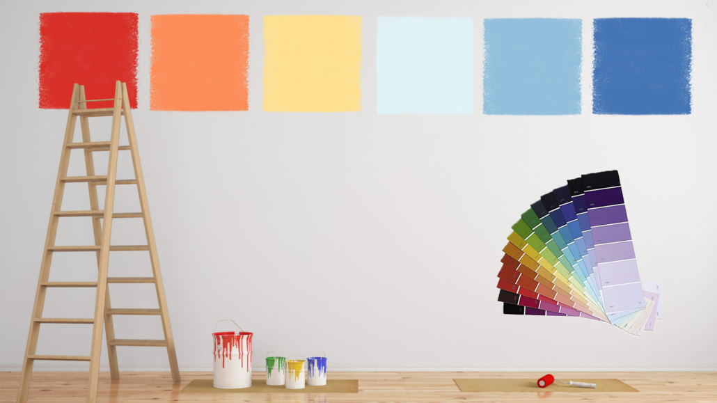
How to use neutral colors the right way!
Some homes welcome you with calm and lightness, while others — even if they’re tidy and well-curated — feel a bit cold or impersonal.
Often, the issue isn’t the furniture or the accessories, but the way one works with neutral colors.
They’re powerful and delicate at the same time.
When used with intention, neutrals bring balance, elegance, and versatility.
Used without awareness, they can make a room feel flat and lack personality.
In this article, I’ll guide you step by step in choosing and combining neutral colors, enhancing them with materials, textures, and details, and transforming each room into a harmonious and enjoyable space.
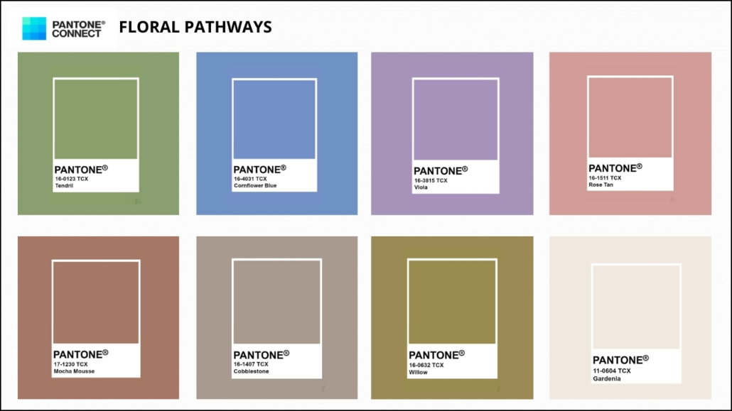
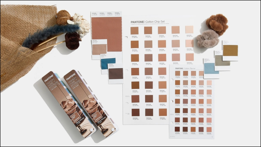
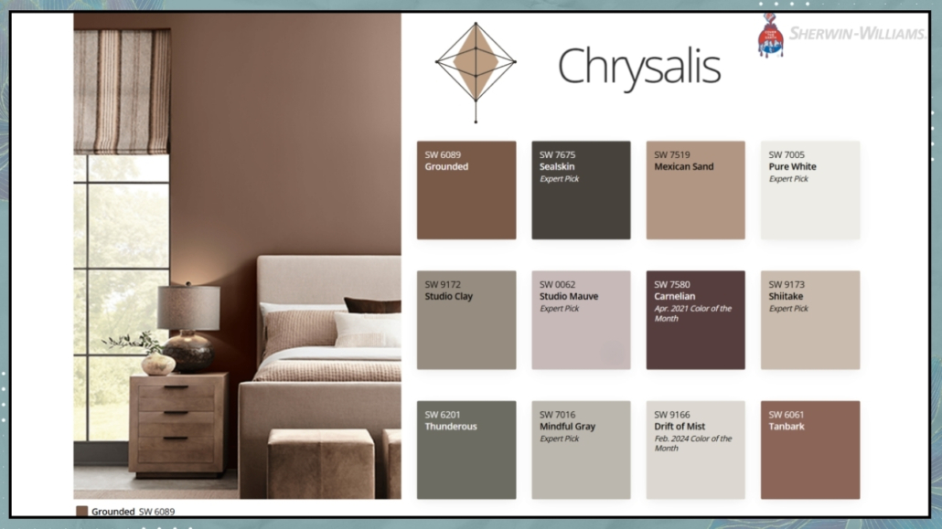
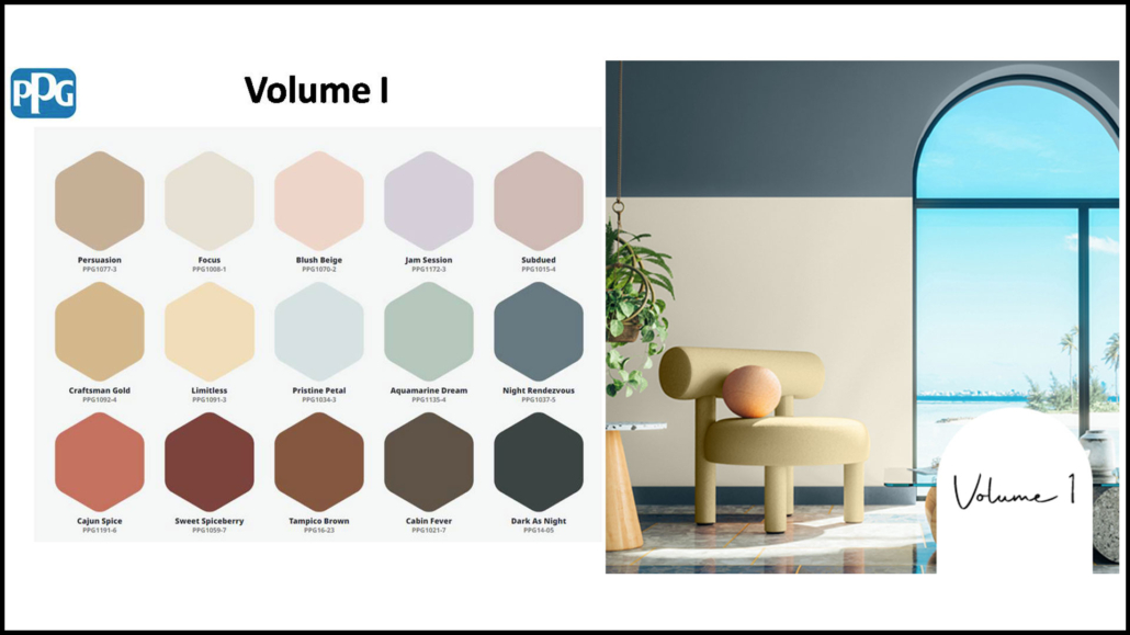
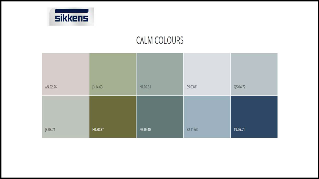
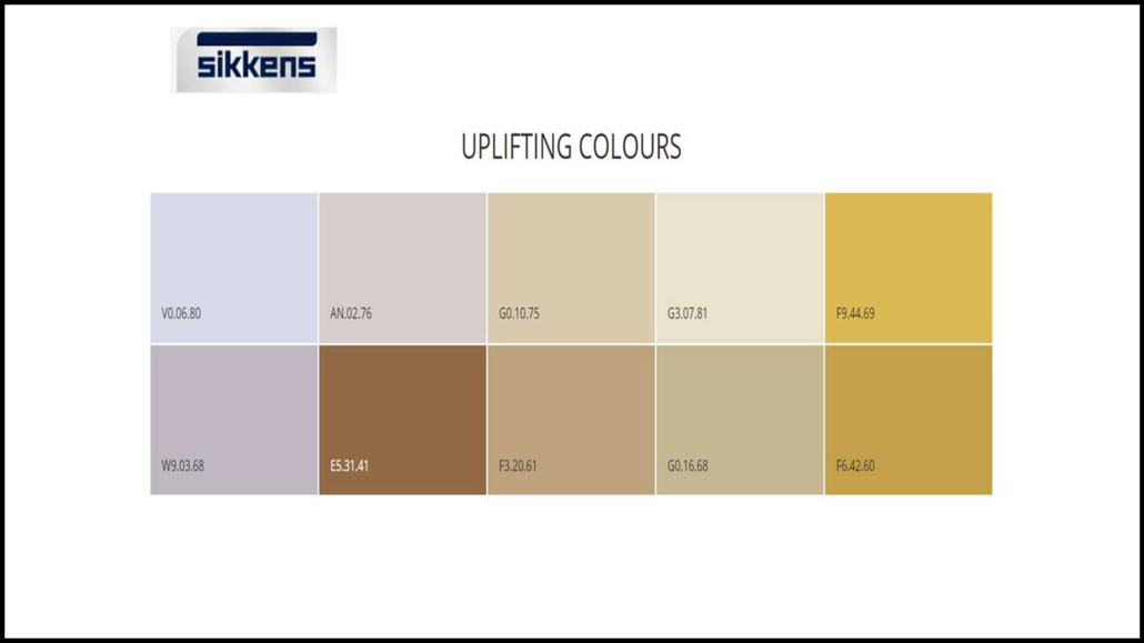
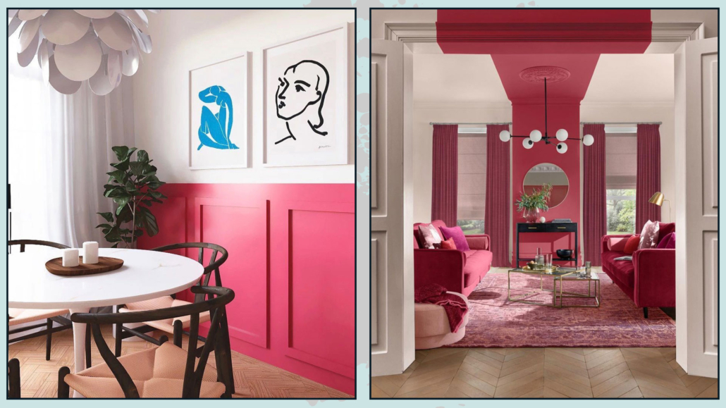
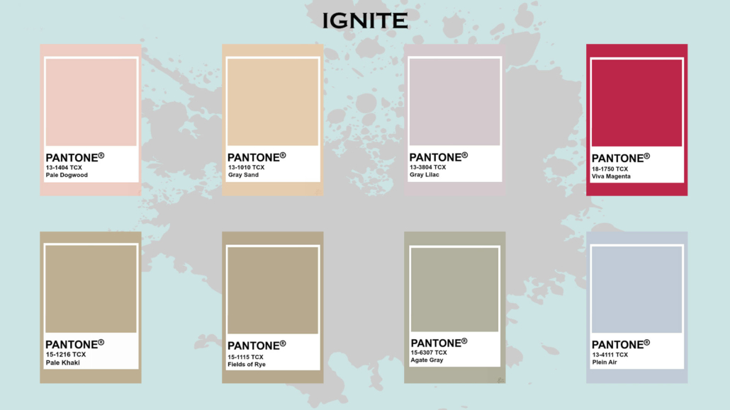
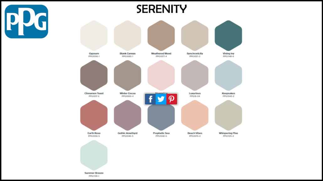
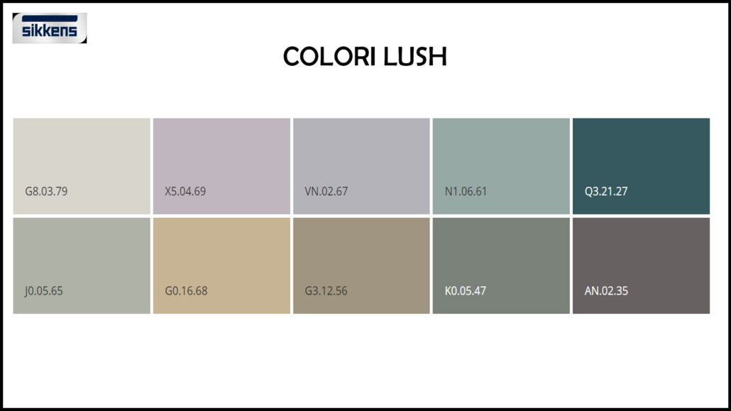
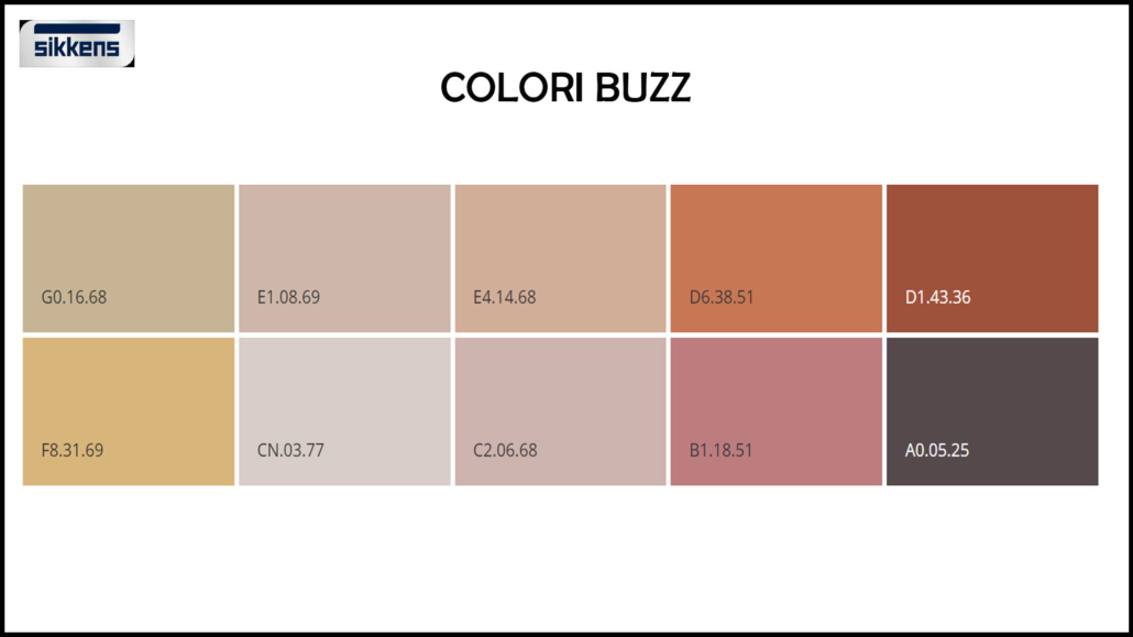
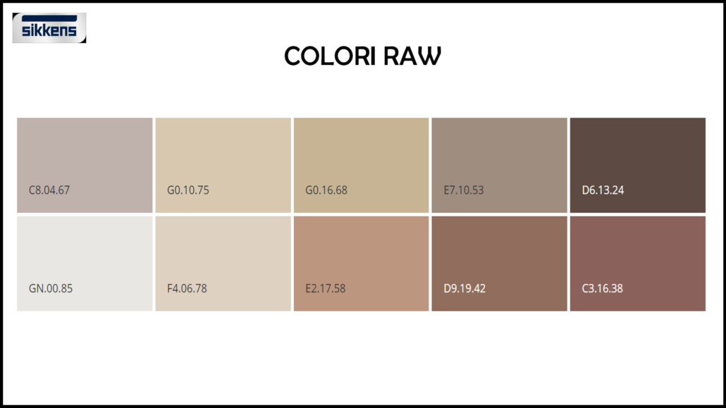
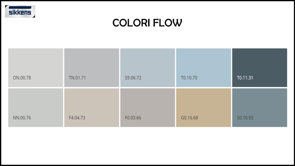
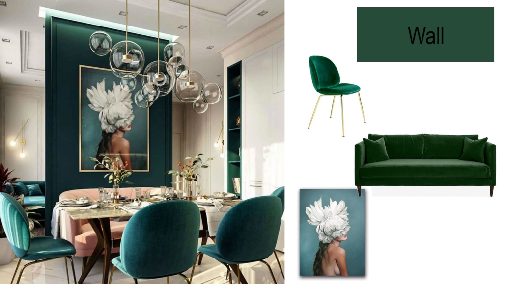
(Here you can find how to recognize and choose the right neutrals!)
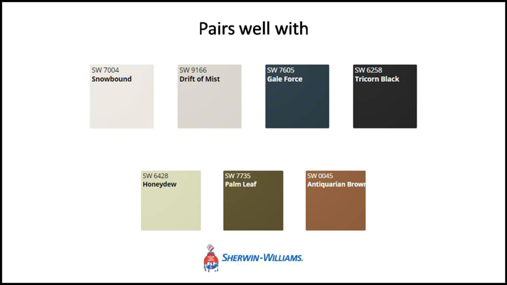
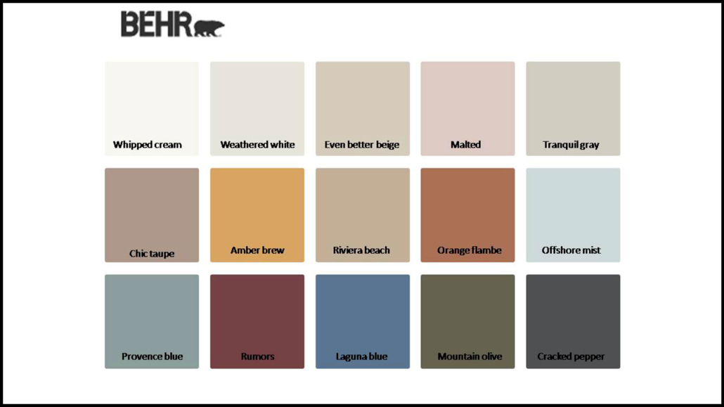
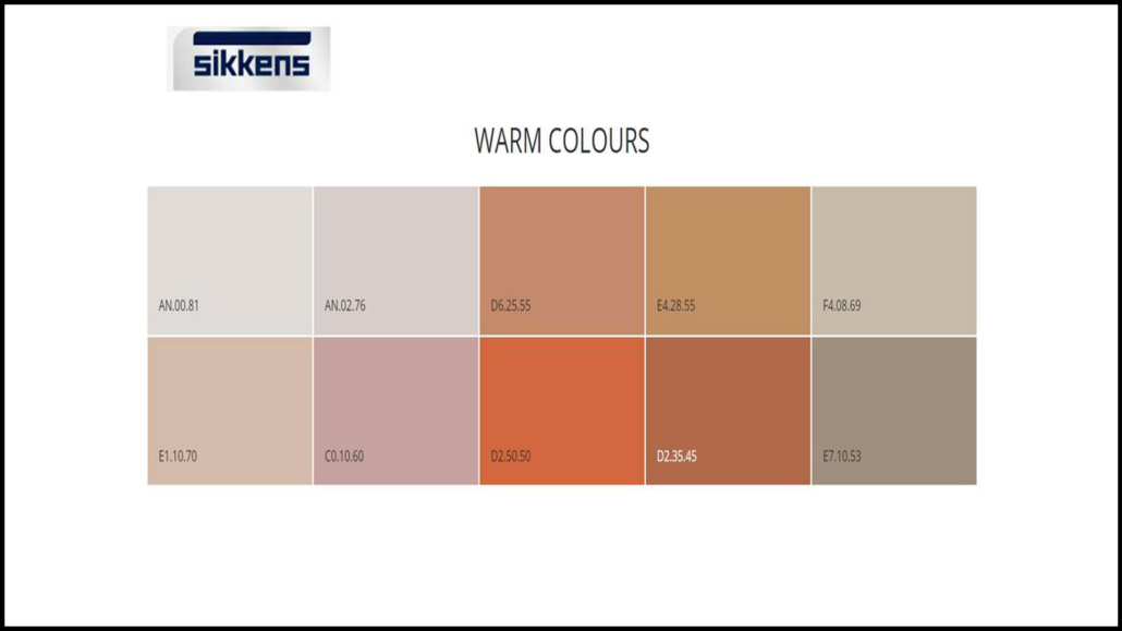
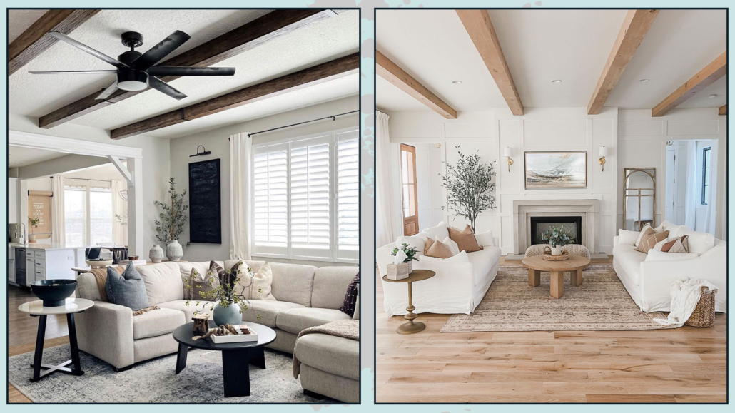
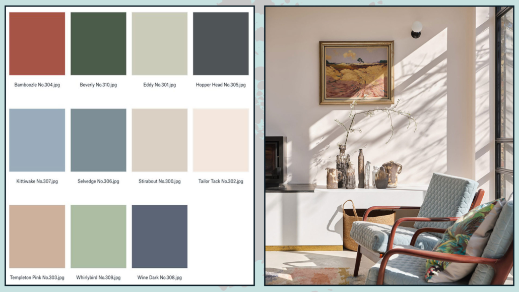
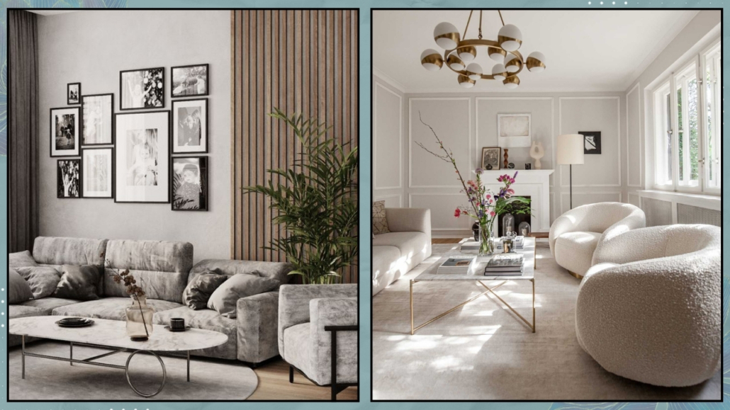
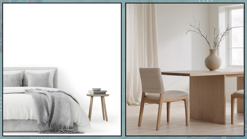
1 – Start with the basics: select your primary neutrals
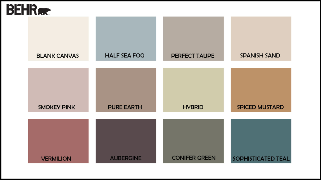
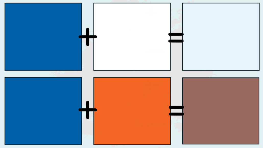
Not all neutral colors are the same.
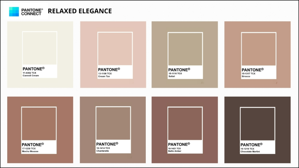
Beige, taupe, warm or cool grays, cream, and sand tones—each has its own character and energy.
Begin by choosing the base, the primary neutral that will appear throughout most of your space.
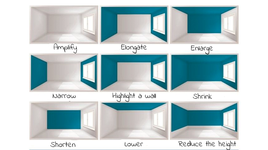
To determine which tone works best, observe the natural light in the room.
North-facing rooms, which are usually cooler, benefit from warm neutrals.
South-facing rooms, with stronger light, can support cool grays or slightly deeper tones.
Don’t forget to consider the existing elements: flooring, doors, window frames, and finishes.
Honey-colored wood enhances warm neutrals, while gray flooring pairs beautifully with cooler tones or more defined neutrals.
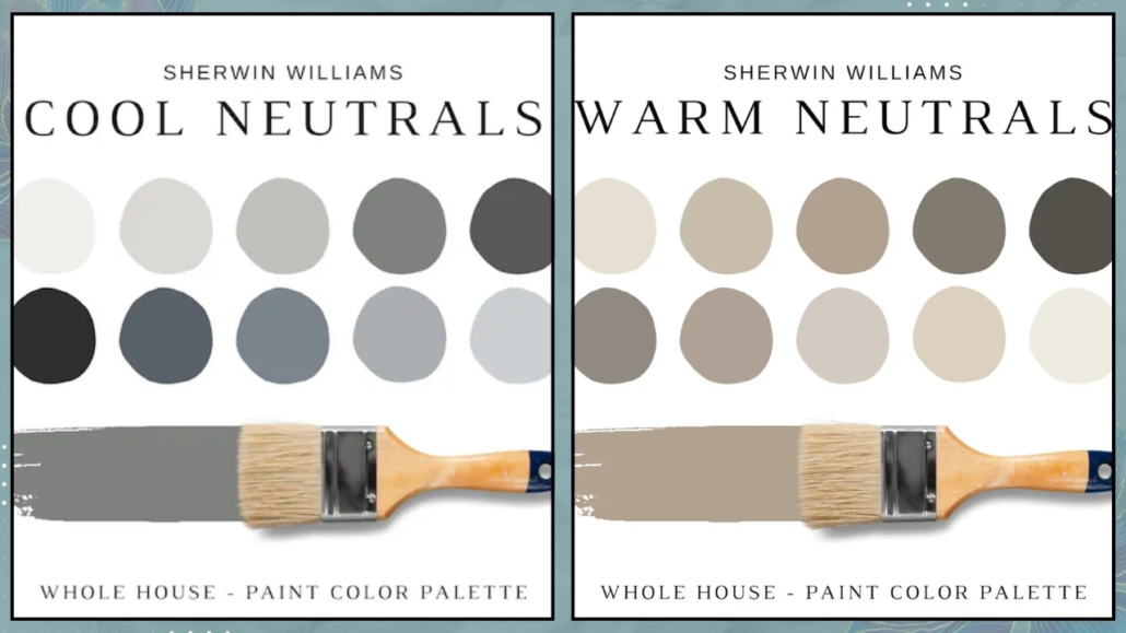
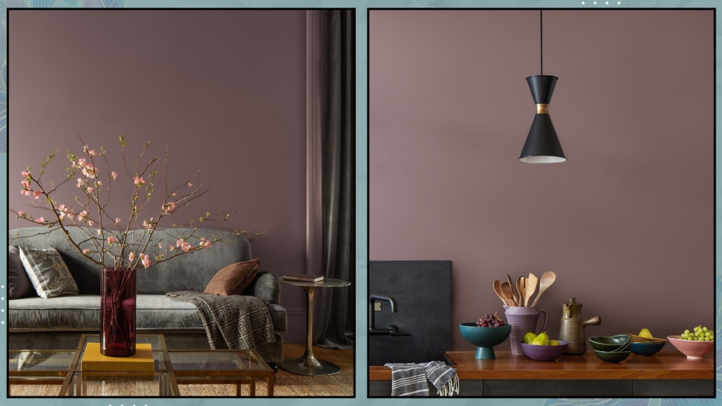
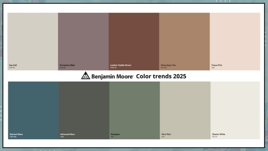
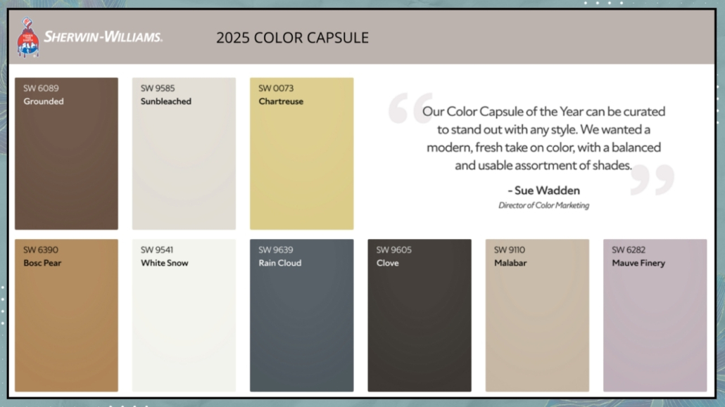
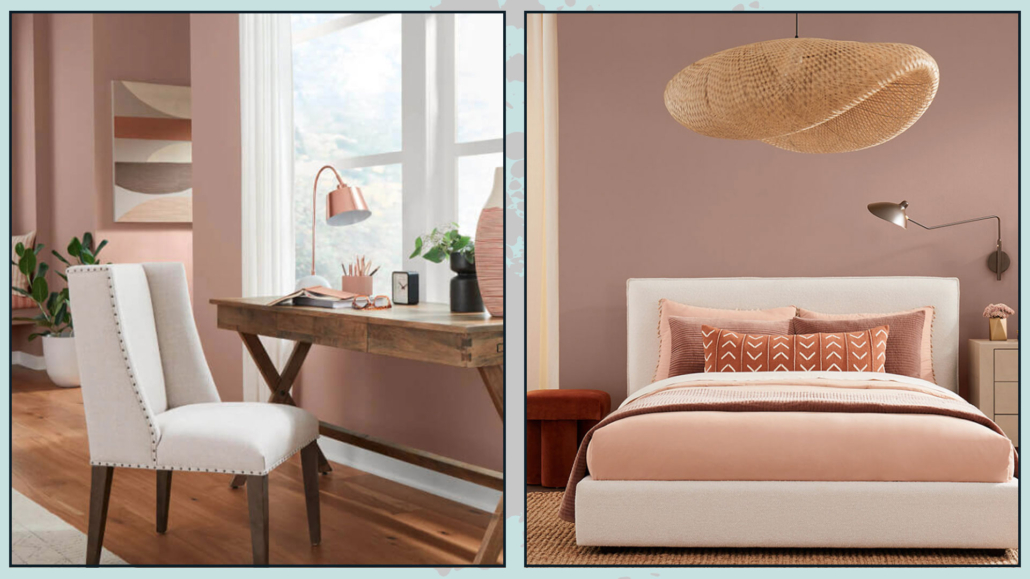
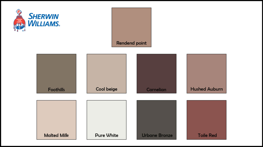
(credit: Sherwin Williams)
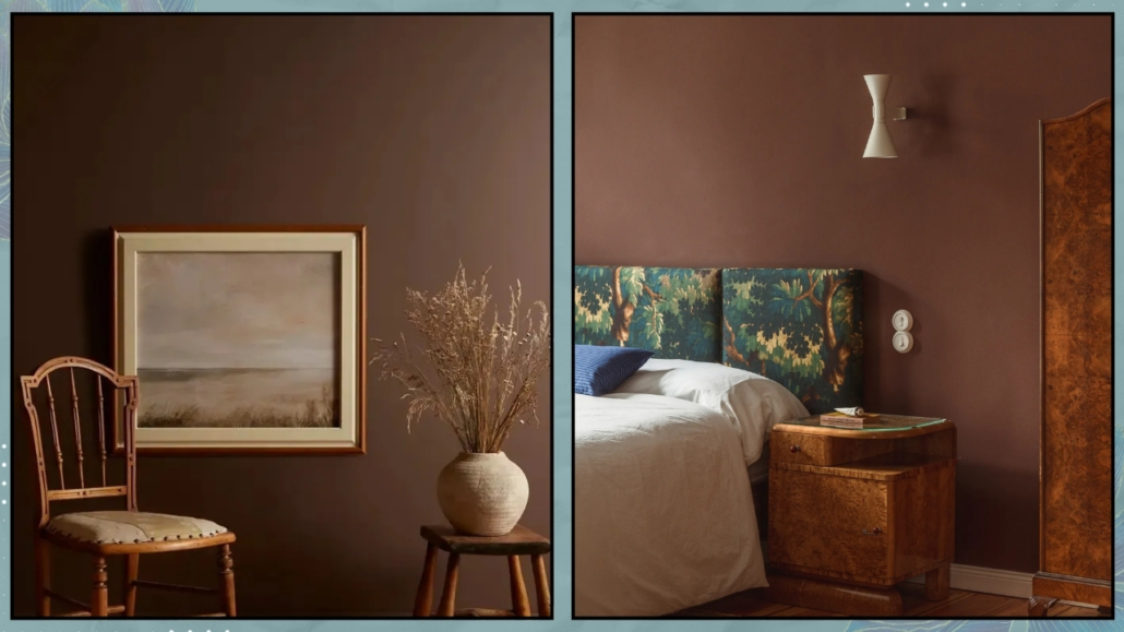
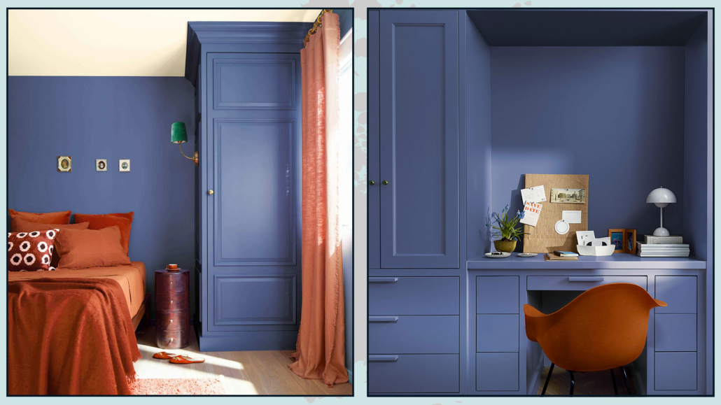
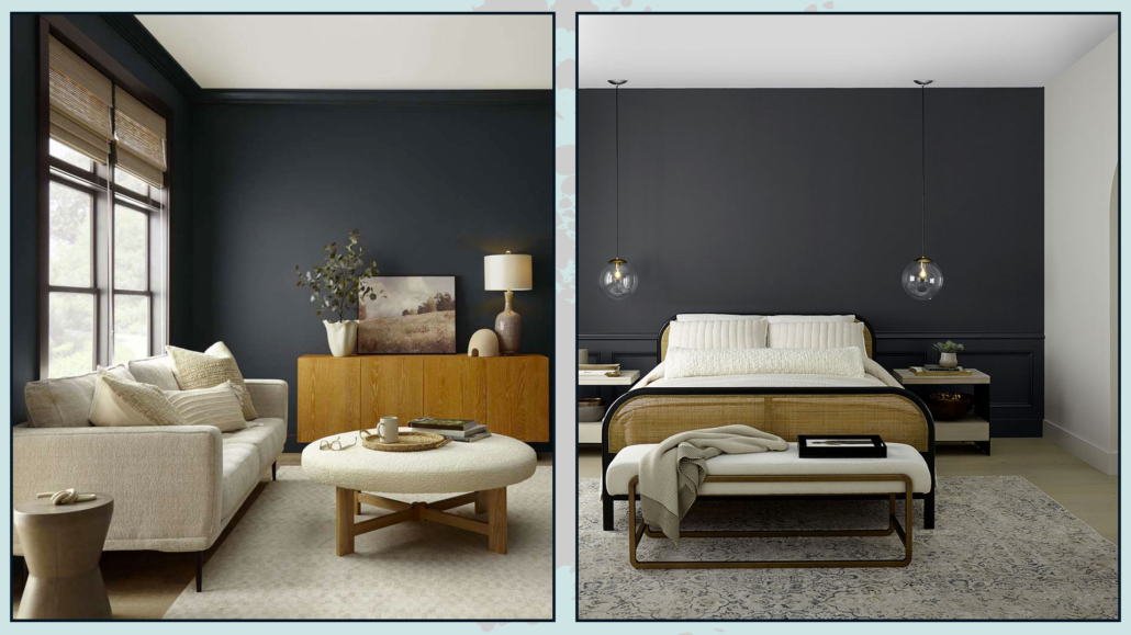
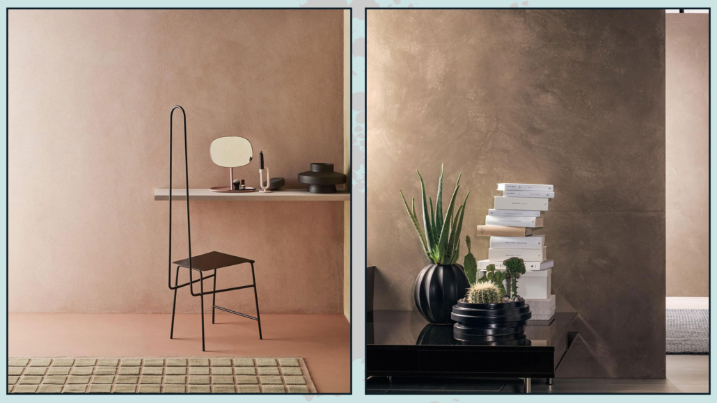
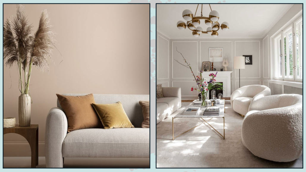
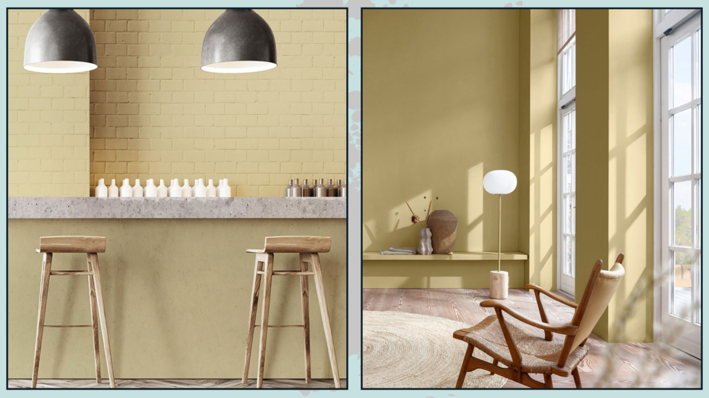
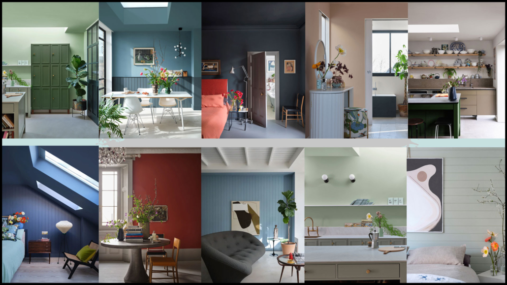
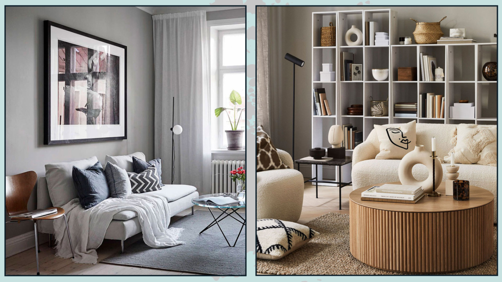
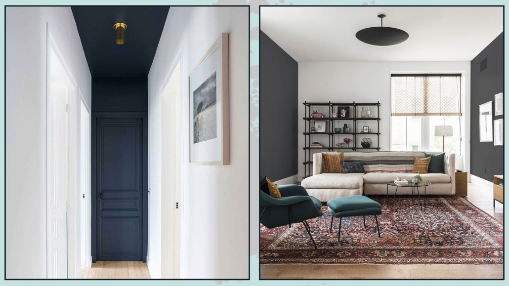
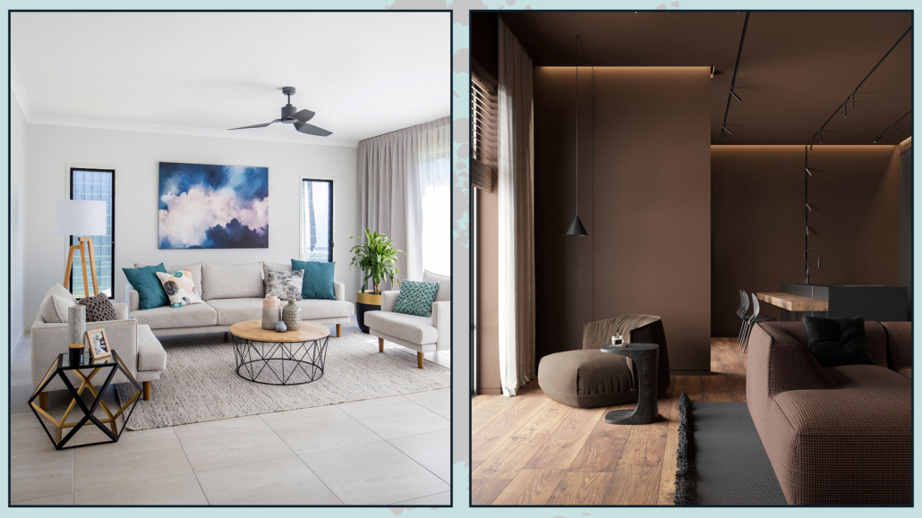
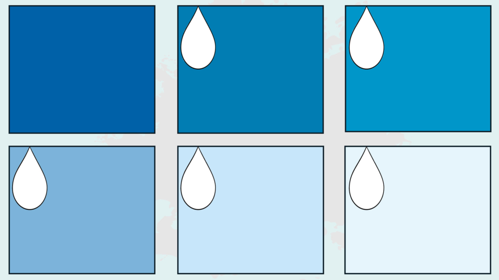
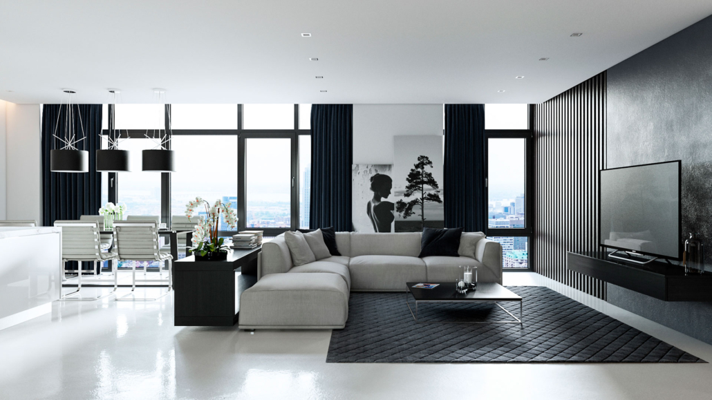
2 – Play with shades
A completely beige or entirely gray room can easily feel flat.
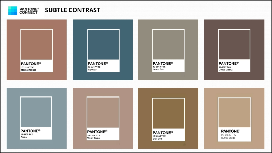
The secret lies in mixing shades and adding a subtle contrast.
Layer different tones of the same neutral: light gray walls, medium-gray textiles, and charcoal accents create depth without making the space feel heavy.
Think of neutrals like a musical palette: the base is the main melody, and the shades are the notes that add movement and rhythm.
This way, the eye moves through the room without ever getting bored.
(credits: Canva; cocolapinedesign.com)
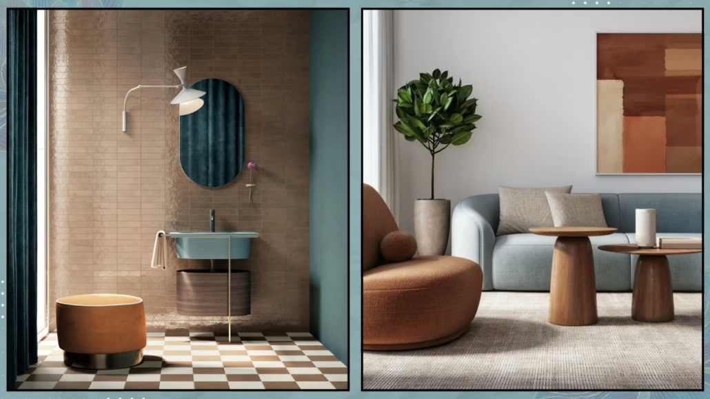
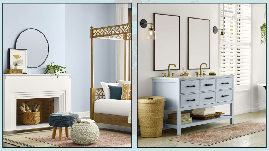
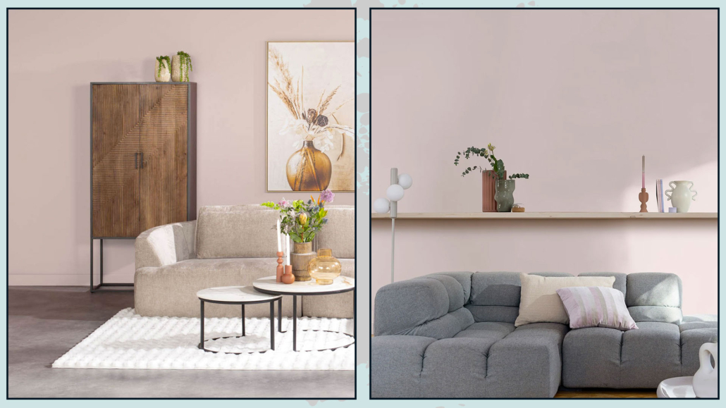
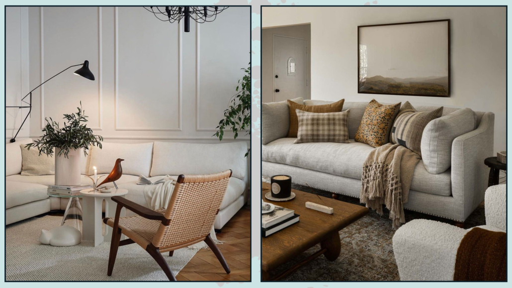
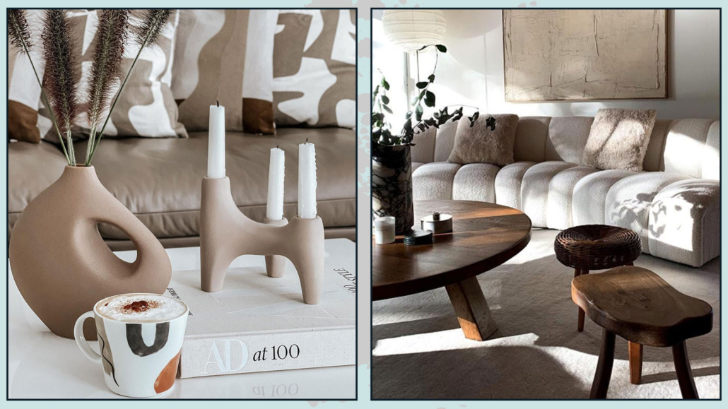
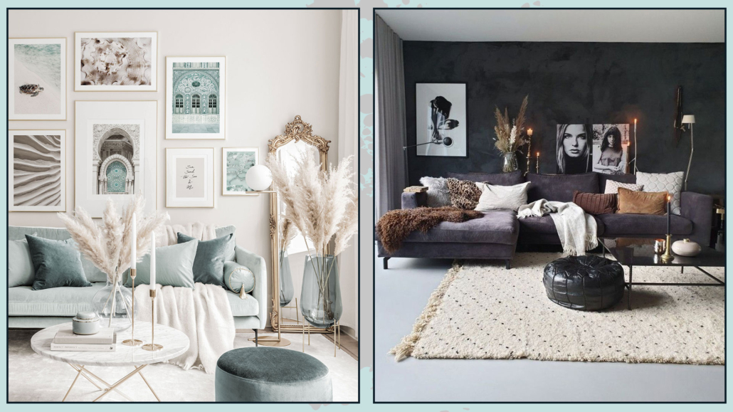
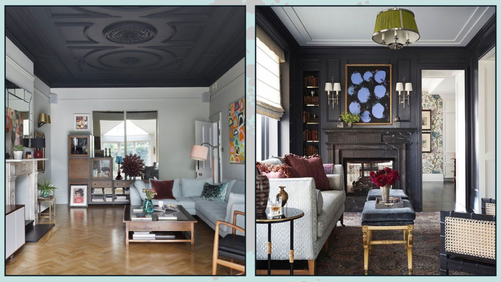
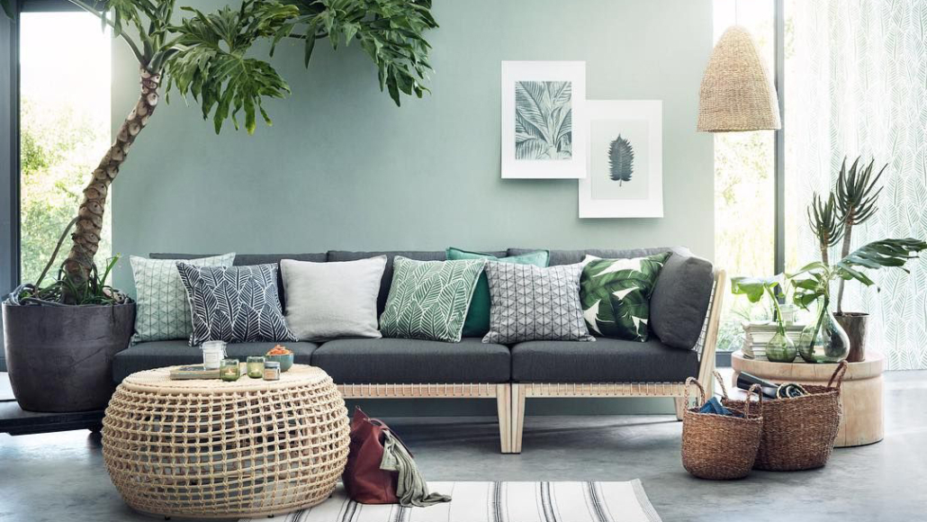
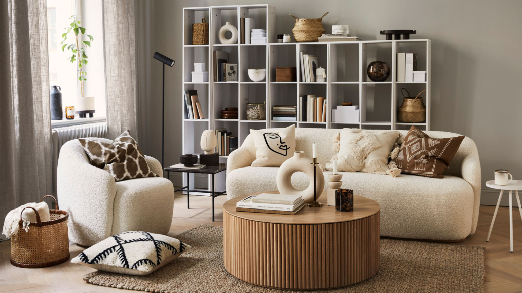
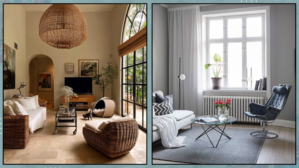
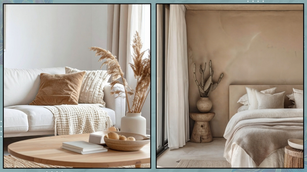
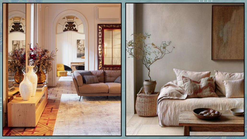
3 – Texture and materials: the key to a lively space
Neutrals alone might look cold, but pairing them with different materials brings the space to life.
Natural wood, linen, cotton, wool, stone, metal — every texture tells a story and adds visual interest.
A beige wool rug, a taupe linen sofa, and brass or copper details can turn a neutral living room into a warm and welcoming space.
Light also plays a significant role: glossy surfaces, mirrors, and metals reflect light, adding movement and preventing neutrals from looking monotonous.
(credits: behence.net; editionnoire.com)
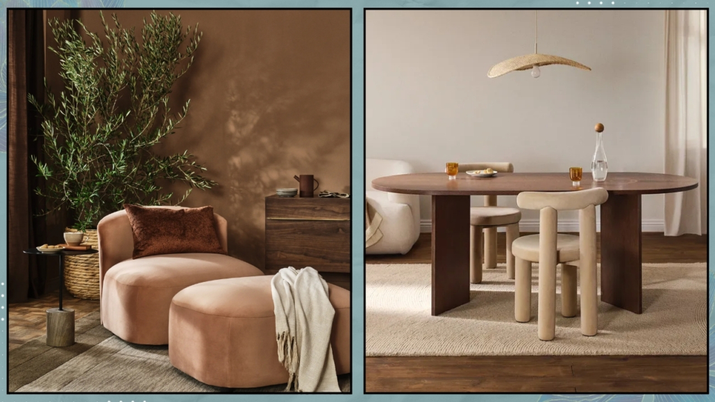
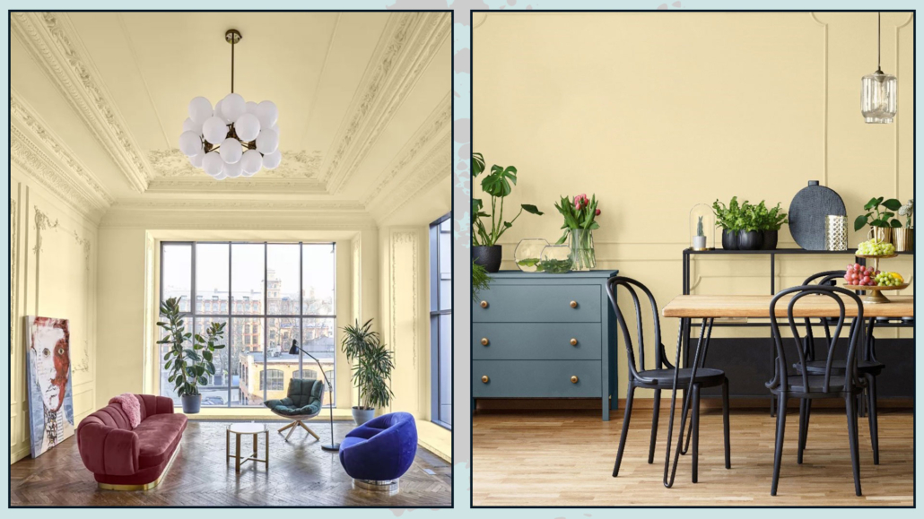
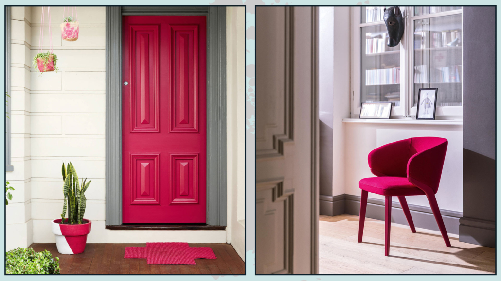
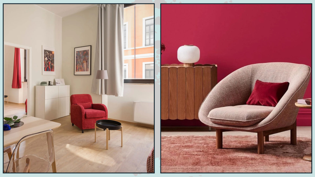
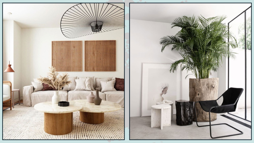
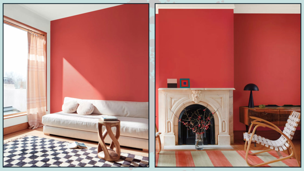
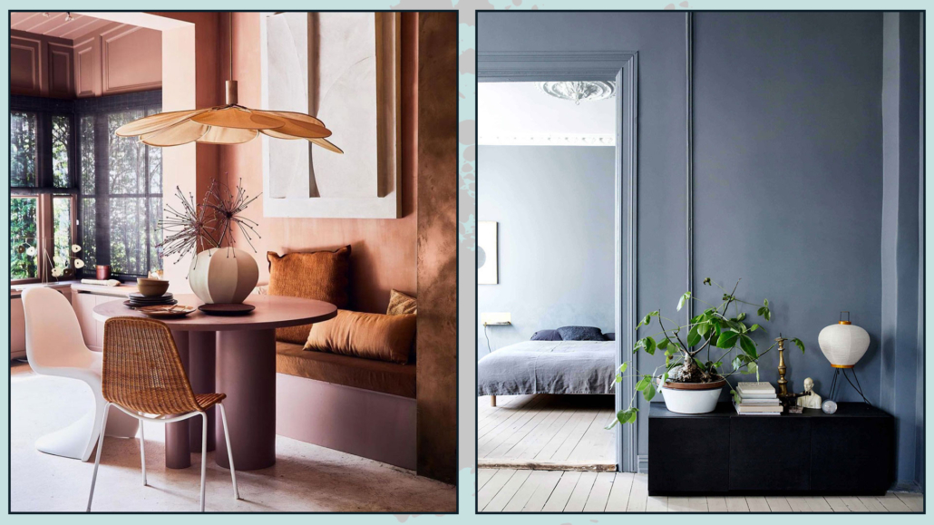
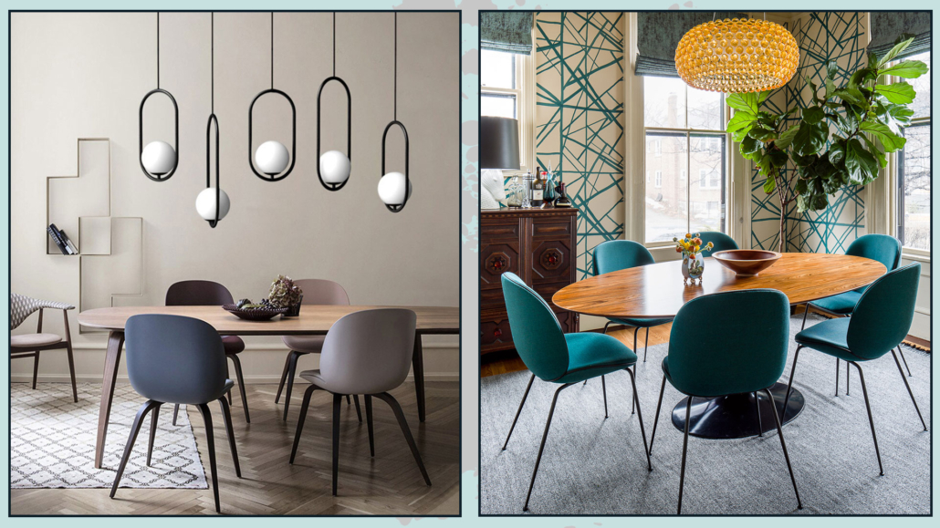
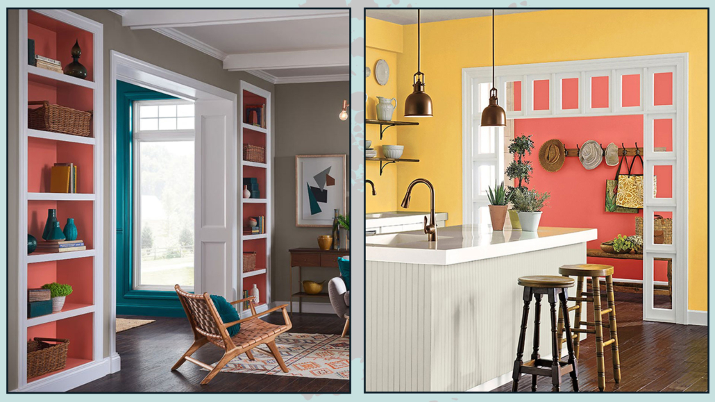
4 – Add color accents
You don’t need bold colors everywhere — just a few well-chosen accents.
A coral object, a sage-green vase, or a navy-blue book can add character and guide the eye without disrupting the calmness of neutrals.
Remember: neutrals are the stage where accessories shine.
If everything is bright, nothing stands out; if everything is neutral, you need a few points of interest.
Accents, used thoughtfully, let you play with color while maintaining harmony.
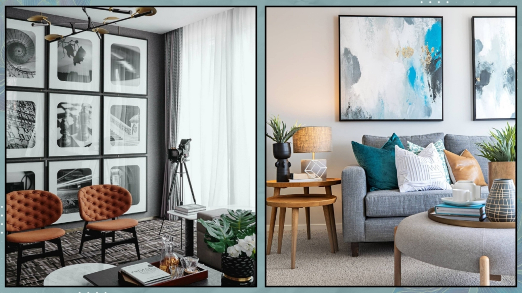
(credits: Boxerjam; tlcinteriors.com.au)
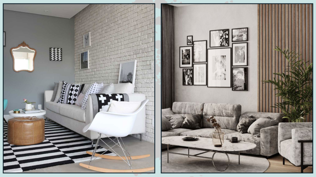
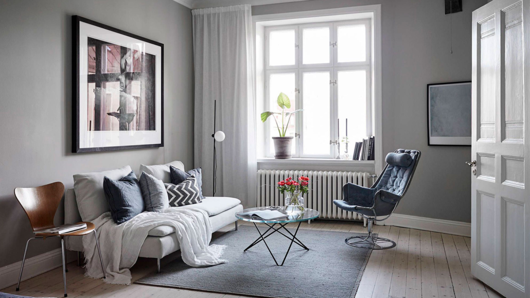
5 – Keep consistency between rooms
A common mistake is treating each room as a separate world.
But your home is a visual journey that needs continuity.
Repeating a neutral from room to room — changing only its intensity or how you pair it with materials — creates flow and cohesion.
For example, a light gray in the living room can turn into a warmer greige in the bedroom, while accessories and textiles repeat the same tones.
Each room maintains its identity, yet the entire home speaks a harmonious language.
(credits: Canva)
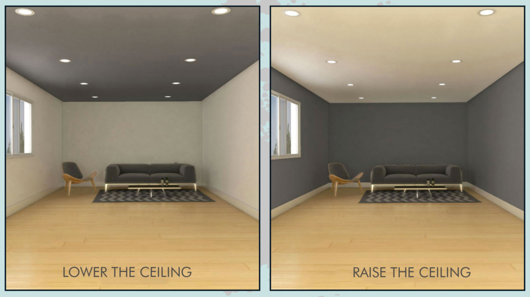
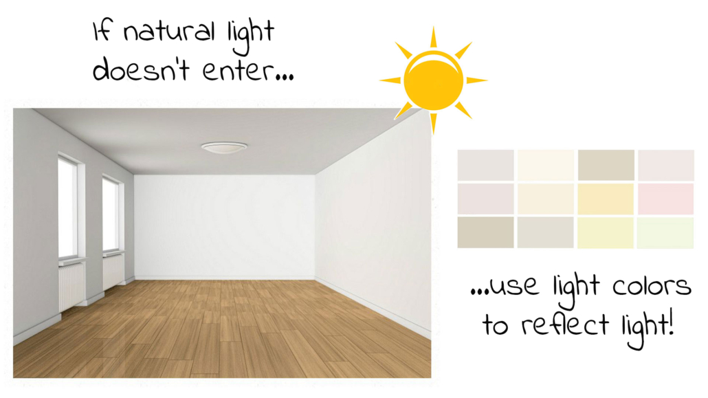
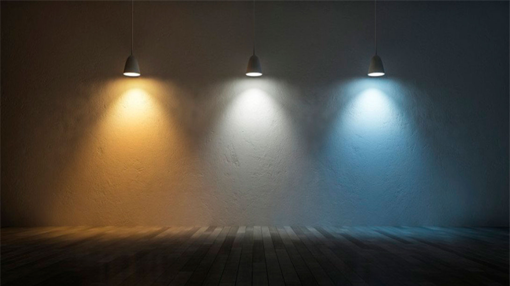
6 – Light up and enhance neutrals
Lighting is essential when working with neutral colors.
Don’t rely on just a single ceiling lamp: use layered lighting — floor lamps, wall sconces, focused lights — to bring out the nuances of your neutrals.
If the room lacks natural light, compensate with reflective or lighter surfaces.
Strategic mirrors, glass elements, and glossy metals not only brighten the room but also add visual movement to softer neutrals.
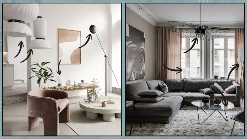
(credits: Bronxes Studio; cocolapinedesign.com)
7 – Small mistakes to avoid
- Too many similar neutrals: they make the space look flat. Mix warm and cool tones for more depth.
- Neutrals without texture: if your sofa blends with the flooring, add rugs, cushions, and a mix of fabrics to create contrast.
- Overlooking natural light: test your colors at different times of day to see how they truly behave.
- No accents at all: even in a neutral space, a touch of color adds personality and visual interest.
(credits: Canva)
8 – Let your home tell your story
Neutral colors are the perfect base to highlight your personality through details and meaningful objects.
They make change smooth — you can evolve your home without feeling like you need to start all over again.
A special vase, a book you love, a painting, or a treasured object can bring energy into the space without overwhelming your palette.
Neutrals offer an elegant, versatile backdrop that brings out your story and creates calm, welcoming, deeply personal spaces.
(credits: Canva)
Conclusion
Neutral colors are never monotonous when used with awareness: paired with texture, materials, accents, and the proper lighting, they create elegant, harmonious, and personal spaces.
Starting with neutrals means building a solid — yet lively — foundation where details, accessories, and personality naturally stand out.
Your home won’t feel flat; it will feel warm, refined, and comforting — a place where you can sincerely feel good, every single day.
If you want personalized support in choosing and combining neutral colors, I can guide you with a tailored consultation. Together, we’ll find the perfect palette for your space and your energy.