Posts

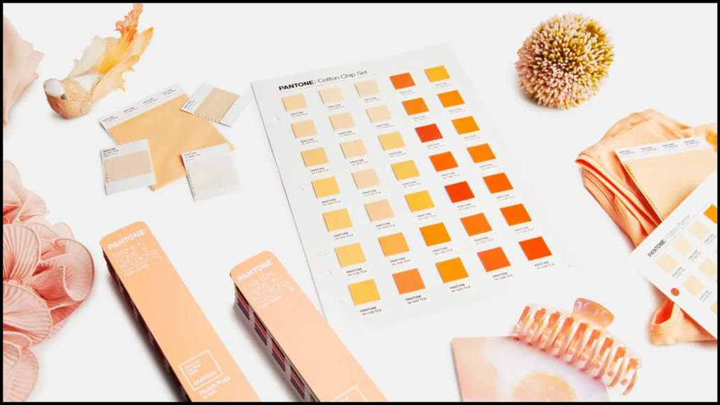
And here it is, the Pantone Color of the Year 2024: Peach Fuzz (13-1023).

The Pantone Color Institute celebrates its 25th anniversary with a delicate and soft peach color this year.
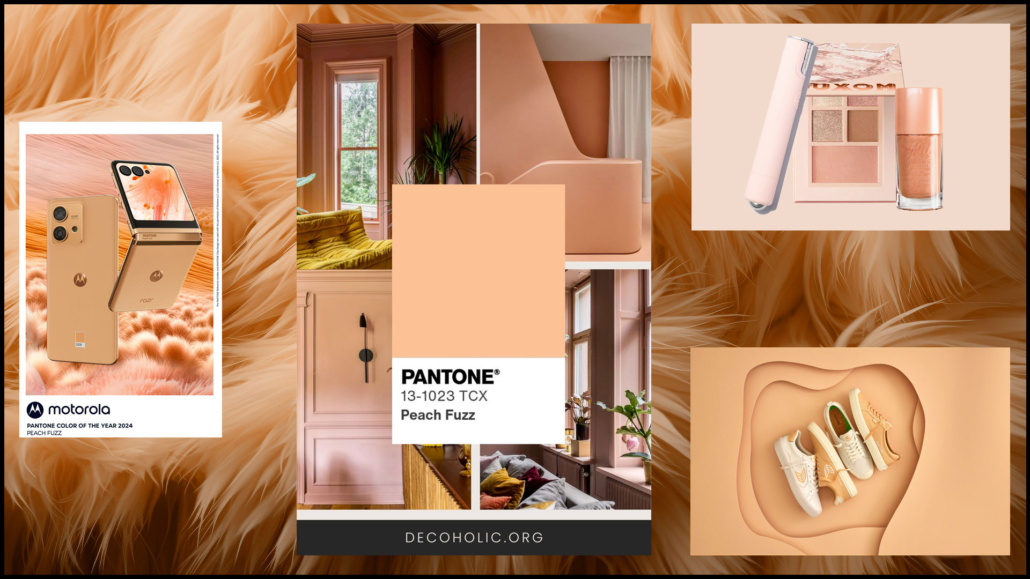
“A velvety and gentle peach whose all-encompassing spirit enriches the mind, body, and heart”

is how the company describes this delicate and simultaneously fresh color.

It’s a color we can define as neutral and calming but full of positivity, definitely very different from last year’s vibrant Viva Magenta!

The Viva Magenta, in fact, was a cochineal red, intense, and meant to galvanize the spirit and build inner strength.

This color is enveloping, delicate, and radiant, aiming to help strengthen empathy and compassion in a indeed tumultuous period.

“PANTONE 13-1023 Peach Fuzz brings belonging, inspires recalibration, and an opportunity for nurturing, conjuring up an air of calm, offering us a space to be, feel, and heal and to flourish from whether spending time with others or taking the time to enjoy a moment by ourselves”

Those are Leatrice Eiseman’s words, Executive Director of the Pantone Color Institute.

How to use this color in your home?

As mentioned earlier, it’s a delicate color that allows you to incorporate it into any home, whatever the style!

You can confidently use it on the walls, keeping in mind that, being a warm color, it may visually shrink the space a bit.

You can use it indiscriminately in all rooms, creating warm and inviting environments!
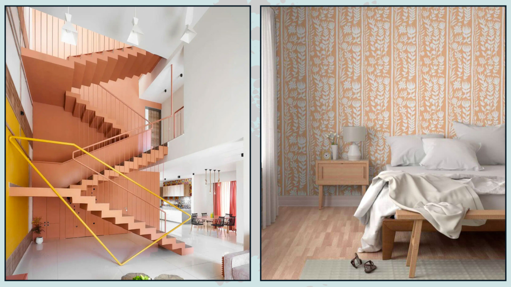
(credits: Manoj Patel Design Studio; Spoonflower)
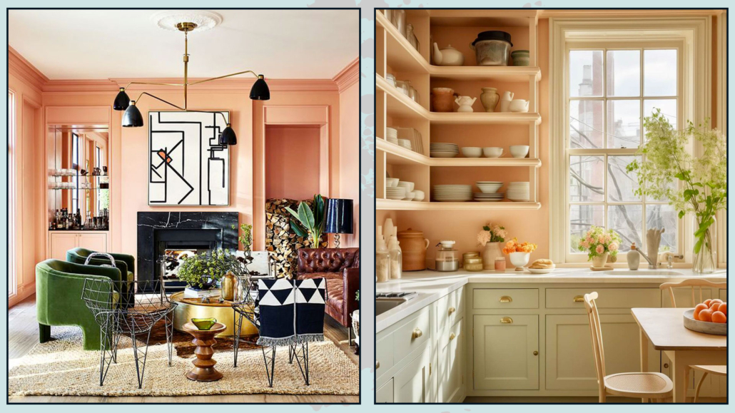
(credits: Stacy Zarin Goldberg; the nordroom)

Regarding the walls, you can also use this color with wallpaper.

It works well in not overly large furnishings, such as a pouf, an armchair, a bench, or chairs.

You can incorporate paintings and objects with this color without any problem.

Of course, fabrics like blankets, pillows, and rugs can feature this color!
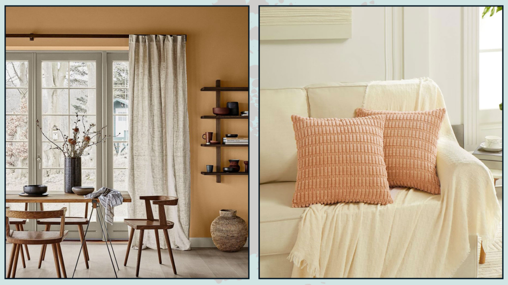
(credits: Jotun; Fanci home)
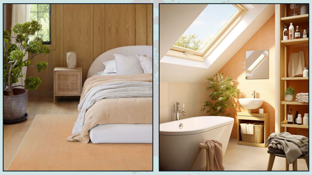
(credits: ruggable; the nordroom)

If you’re looking for wallpaper, fabrics, or rugs in this color, you can check out Spoonflower or Ruggable, brands that Pantone has collaborated with for his color of the year 2024!

Peach Fuzz is a color that easily complements many colors, both warm and cool tones, and pairs well with wood!

Pantone offers us 5 color palettes that are not the easiest to use:

– LIBATIONS

Consisting of a sophisticated mix with a sophisticated and elegant mood.

The colors create subtle and refined contrasts.

It’s a palette that blends well with various styles.
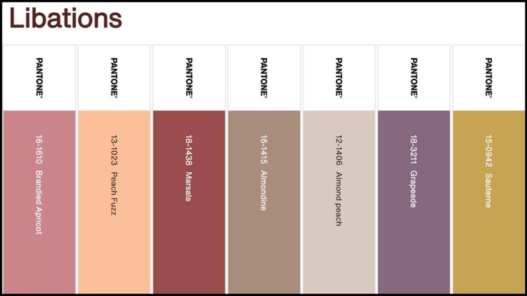
(credits: Pantone)

– FLAVOR FULL

It’s an engaging palette but not the easiest to combine because there’s a risk of creating “harlequin” environments.

Especially the first two colors (Mango Mint and Party Punch), it’s preferable to use them in small doses as accent colors!
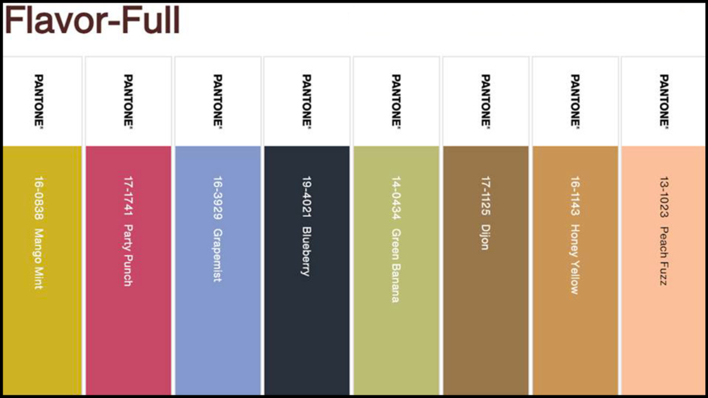
(credits: Pantone)

– HYBRID HUES

It’s a true dichotomy of various colors that can indeed be harmoniously combined, although appearing quite discordant.

They are intense colors, mostly dark, so be careful not to weigh down the environment!
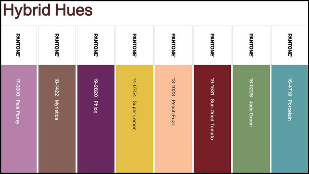
(credits: Pantone)

– PEACH PLETHORA

It is a monochromatic palette that embraces various peach tones, from the lightest and delicate to the most saturated and vibrant.

This palette, as well, is not the easiest to use because there’s a risk of a decidedly Barbie effect!

If you love this palette, use the softer colors as a base (principally Pristine, Honey Peach, and Peach Puree) and incorporate the more saturated ones in small doses, in decor items, and, perhaps, in a few cushions.
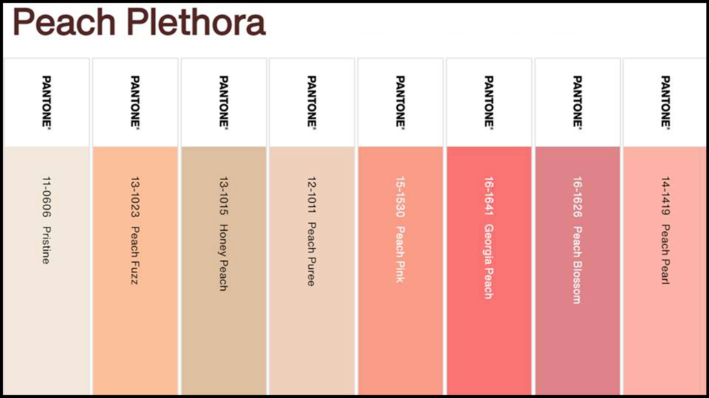
(credits: Pantone)

– PAIRINGS

This palette is composed of decidedly vibrant colors.

Excluding Peach Fuzz and Little Boy Blue, with which you can be a bit bolder, I would use the other colors sparingly.
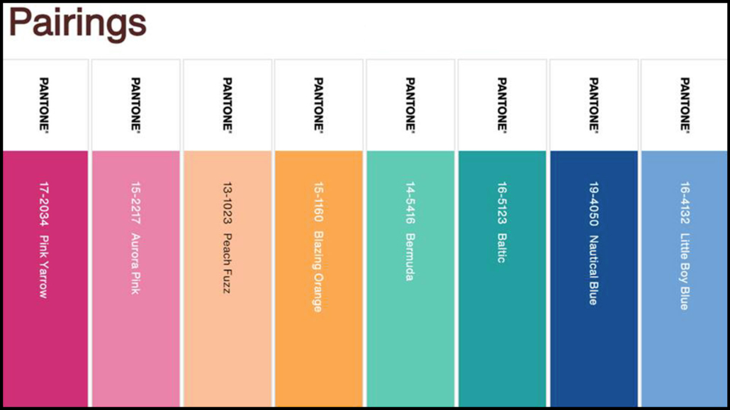
(credits: Pantone)

Do you like this Pantone color of the year 2024? Will you use it? Let me know in the comments!
(credits: Pantone)

I hope this article has been helpful and enjoyable for you. If so, let me know in the comments!

Feel free to share it with anyone you think might be interested, I would be honored, and it will help me gain more exposure.

If you feel that your home, or any specific area of it, doesn’t reflect your personality enough, don’t wait any longer and book your consultancy!

As every year, in the autumn, the major brands in the color industry make their suggestions for the color of the upcoming year; let’s see what the proposed for “The Color of the Year 2024” are!

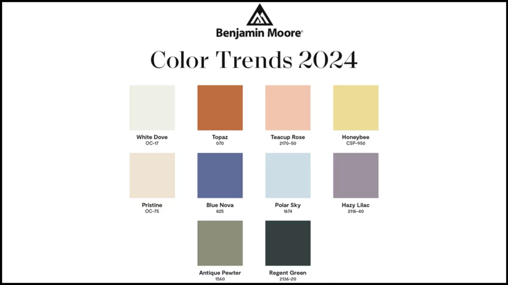
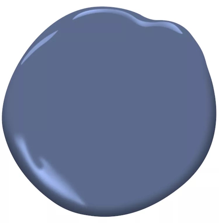
– BENJAMIN MOORE – Blue Nova 825

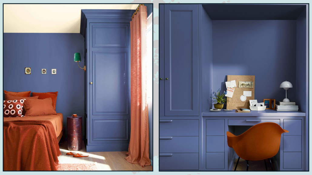
This year, Benjamin Moore proposes a color that is actually a blend of blue and purple, an intense color described by the company as “inspired by the brilliance of a new star formed in space.”

Being part of the blue spectrum, it’s a soothing and, undoubtedly, very elegant color!

Andrea Magno, the Director of Marketing and Color Development, described the color as “a seductive mid-tone that balances depth and intrigue with classic charm and reassurance.”

It’s a color that can also be used on walls, but one should be mindful of the house’s orientation.

If the room faces north, it might be better to avoid using it on all walls, as it could become a bit gloomy and chilly.

Once again, Benjamin Moore offers a complete color palette to pair alongside Blue Nova 825.

This palette can be used in its entirety or selectively.

It’s a dynamic palette because it contains both warm and cool colors, light and dark!

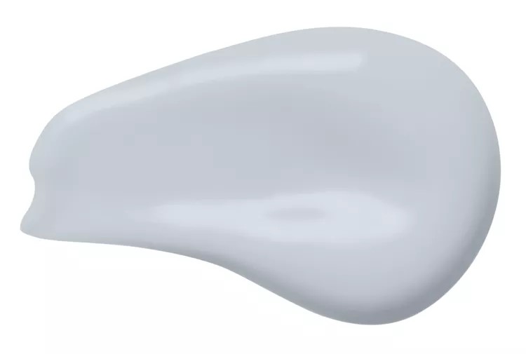
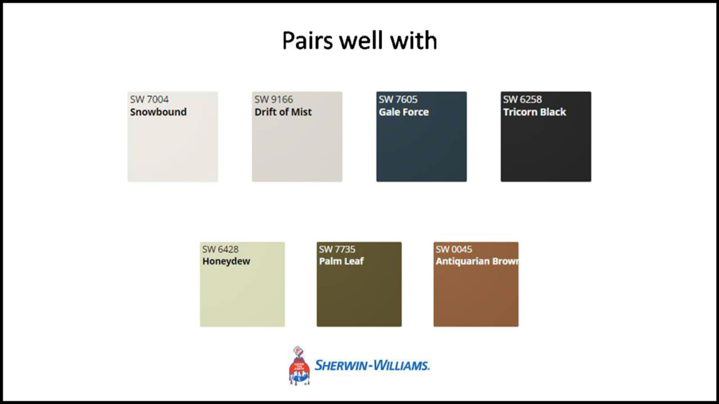
– SHERWIN WILLIAMS – Upward

Sherwin Williams also opts for a shade of blue described as “airy and blissful.”

It’s a truly relaxing, bright, and energizing color!

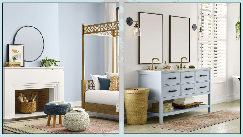
Being very light and delicate, one can use it on all walls.

Upward is a color that pairs well with all styles and can even be used to give a fresh look to some furniture.

However, it’s a cold color, so it’s a good idea to warm it up somewhat with some warmer colors and perhaps some wood accents!

Here’s an interesting tidbit: Sherwin Williams collaborated with the French pastry chef Dominique Ansel for his vegan cronut filled with rice milk and glazed with dark chocolate, both made with butterfly pea flowers, a flower whose shade reflects Upward!

Sherwin Williams also offers a color palette you can pair (one or even all of them) with Upward.

These are colors that draw inspiration from the hues of nature, creating enveloping and relaxing environments.

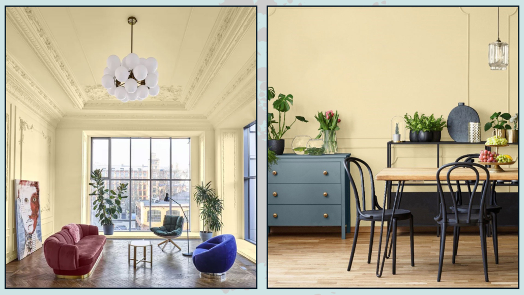
– PPG – Limitless

For 2024, PPG proposes a warm and enveloping neutral color that, as the name suggests, can be used without limits!

It’s a sunny and energizing shade that one can apply to all surfaces and complements various styles.

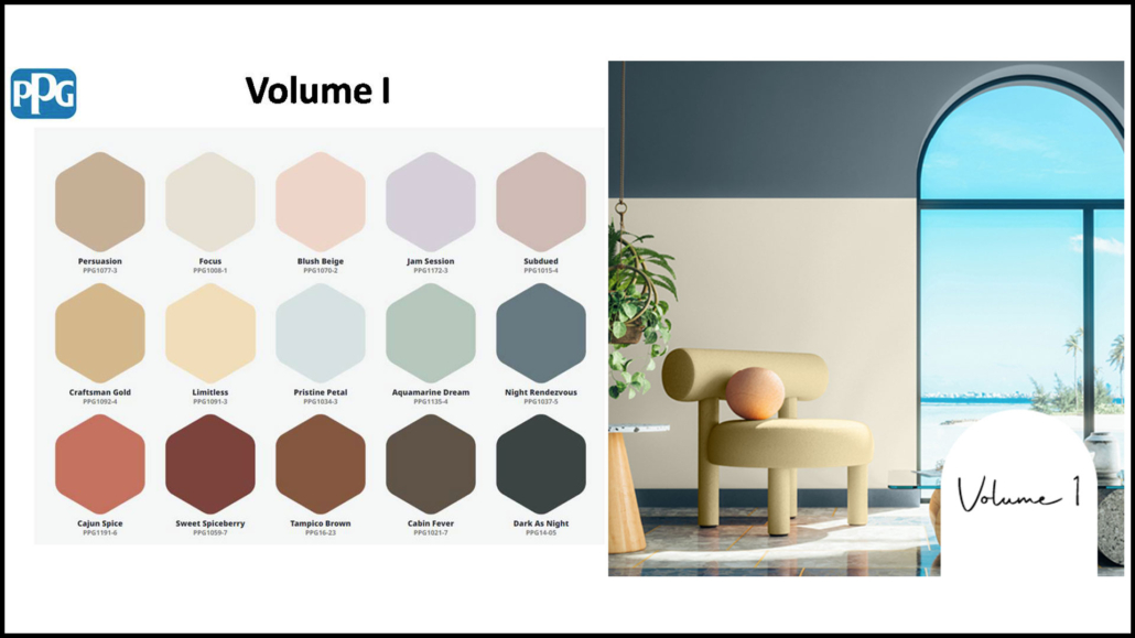
As is the tradition, PPG also offers three types of color palettes:

– Volume I

It consists of calming hues and tones paired with earthy shades and cooler tones; it aims to represent the exploration of the world and harmony!

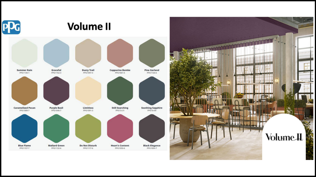
– Volume II

This palette consists of earthy and natural greens alongside warm, floral tones with some touches of vibrant blues and deep neutrals.

It symbolizes the transformation of the world with wonder and amazement!

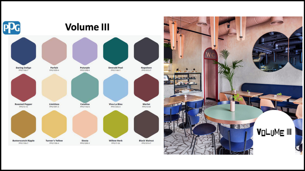
– Volume III

These colors draw inspiration from the Baroque and Renaissance periods, Art Deco, and Pop Art, remarkably combining them.

In some sense, it’s a palette that speaks to challenging and reinventing the world!

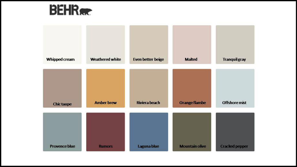
– BEHR – Cracked Pepper

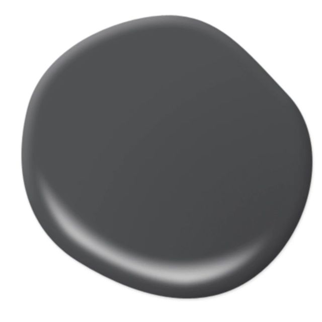
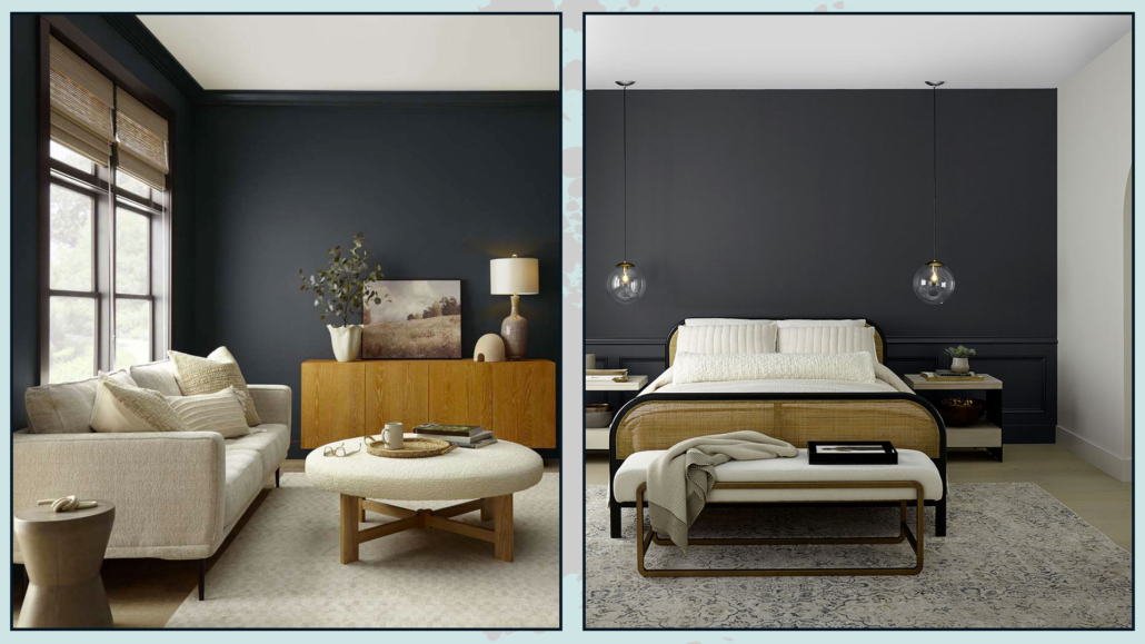
This year, Behr presents the exact complementary of last year’s color by proposing a black!

However, it’s not a pure black that might feel a bit dark; instead, it’s a soft and enveloping charcoal black that actually adds an extra dimension to spaces.

It’s a timeless color that fits well with every style, “awakening the senses and exuding confidence”!

It’s a versatile color that one can use as a neutral in any room of the house.

Like the other brands, Behr also offers a color palette to combine with its Cracked Pepper.

In this palette, you’ll find whites, neutrals, and pastels, accompanied by some bolder and more energetic colors, all inspired by nature.

– SIKKENS – Sweet Embrace

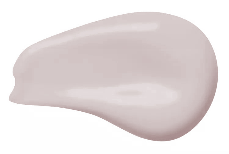
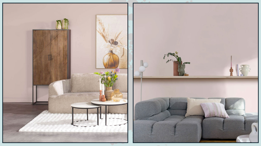
Sikkens’ Color of the Year for 2024 is a very delicate and soothing hue “inspired by soft feathers and the subtle evening clouds.”

It’s a dusty pink with a subdued beige-gray undertone that creates intimate spaces and atmospheres that exude calm and stability.

This color is a neutral and can be used in every room of the house, complementing any style!

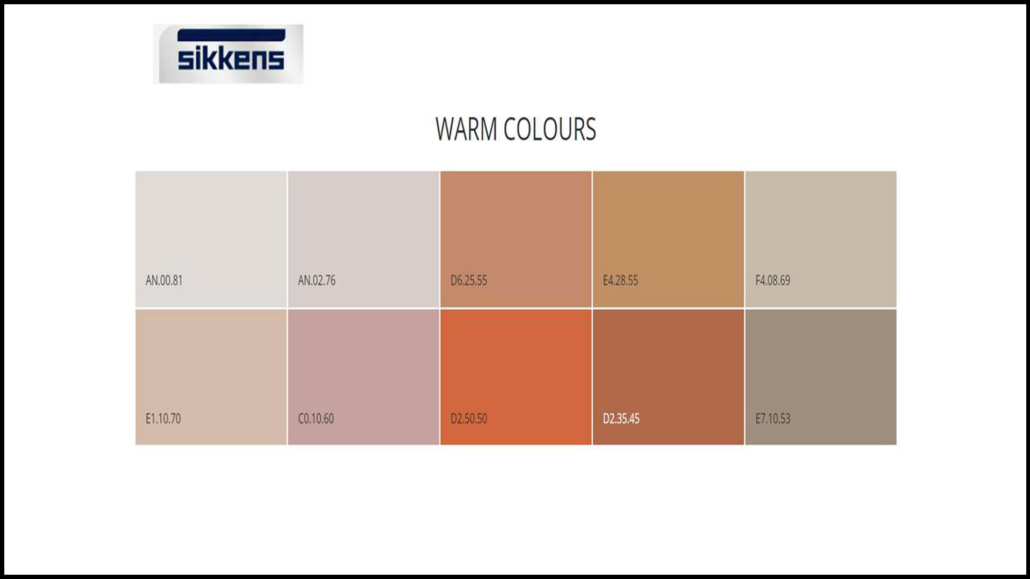
Similar to last year, Sikkens offers three color palettes to accompany Sweet Embrace:

– Warm Colors

These are natural earth tones to create environments that harmoniously connect with nature, establishing cozy and reassuring atmospheres.

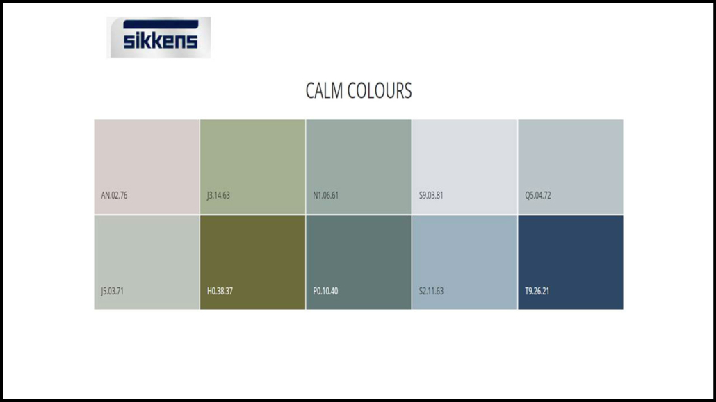
– Calm Colors

There are various shades of green and blue; these colors help create relaxing environments, making them well-suited for studies and offices.

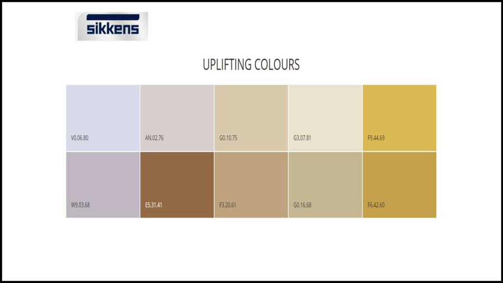
– Uplifting Colors

This palette is decidedly more vibrant, thanks to the yellow-leaning colors.

Shades of blue and violet serve to refresh the palette, making it youthful and dynamic!

What’s your favorite color?

Tell me in the comments!

I hope you found this article helpful and enjoyable. If you did, please let me know in the comments again!

Feel free to share it with anyone you think might be interested; I would be honored, and it will help me get noticed.

If you feel that your home or any part of it doesn’t reflect you enough, don’t wait any longer and book your consultancy!
 

Do you love colors? here is the color playlist on my YouTube channel!