
Decorating with colors… here is why and how!
Some homes instantly feel harmonious.
The colors seem to “talk” to each other, the spaces flow naturally, and everything feels balanced.
Other times, even with beautiful furniture, something feels off — maybe a wall color that’s too cold, an accent shade in the wrong place, or simply a combination that doesn’t feel like you.
The secret? Learning how to choose and use color mindfully.
In this article, I’ll walk you step by step through how to create the perfect color palette — one that enhances your home and, most importantly, makes you feel good in it.
Start with yourself (not the trends)
It is simple, yet it is worth repeating: the colors in your home should reflect who you are, not current trends.
Trends change, but the way you want to feel at home stays the same.
Do you need energy or calm? Do you feel more at ease surrounded by warm, cozy tones or light, fresh ones?
Before choosing any paint color, take a moment to ask yourself what emotion you want that space to evoke.
Your living room should make you feel comfortable and welcoming; the bedroom should invite you to rest; your kitchen should inspire you and fill you with energy.
When color aligns with your mood and your needs, your home begins to support you — gently, every day.
It is the foundation of my approach and the one shared with Dr. Basile in our guidebook, “Take care of your home & Take care of yourself – la cura della casa come strumento per la cura di sé.” (you can find it here)
Observe the light and architecture.
Even the most beautiful color in the world looks different depending on the light.
A warm beige might appear grayish at night; sage green can turn minty under cool lighting.
That’s why I always recommend testing colors directly on your wall, in different spots and at various times of day.
Notice how natural light enters the room:
- North-facing rooms need warmer tones to balance cool light.
- South-facing rooms can handle deeper or cooler hues.
Don’t forget to consider your floors, window frames, and existing materials.
Honey-colored wood flooring enhances warm, earthy tones, while gray tiles pair beautifully with cool, neutral palettes.
And pay attention to curtains — the light passing through them will change the color’s perception entirely.
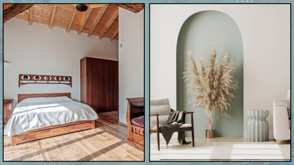
Even the architecture can guide your color choices: high ceilings, arches, or alcoves are perfect opportunities to play with contrasts or tone-on-tone effects.
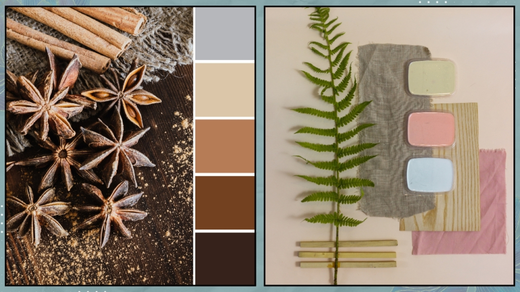
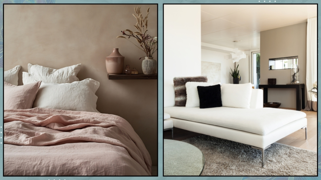
Build your palette
A color palette is simply the set of shades that define your home:
- a primary color that sets the base and recurs in multiple rooms,
- one or two neutral tones for balance,
- and a few accents used sparingly to add personality.
You can start from something you already love — a painting, a rug, a fabric, or even your flooring — and build around it.
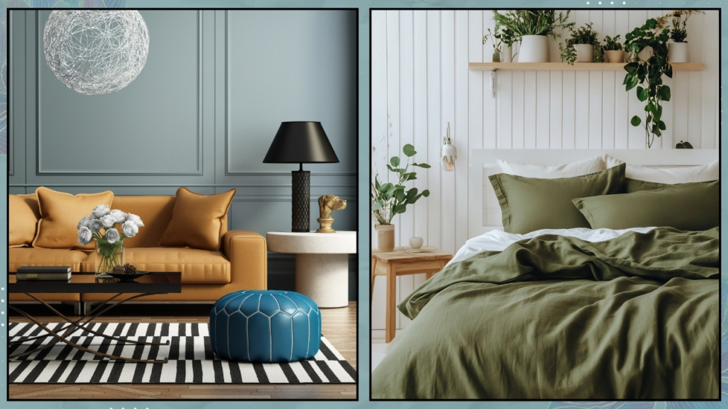
For instance, if your rug features deep blue and sand tones, choose warm beige walls and add brass or terracotta accents.
If you prefer bright, airy spaces, try a neutral base (ivory or greige) with sage green accents and coral or copper details for a refined yet cozy feel.
A little trick: think of color proportions as if you were putting together an outfit.
The base is your “clothing,” and accents are your “accessories.”
If everything stands out, nothing stands out; if everything is neutral, character is missing.
Use color with consistency.
One of the most common mistakes is using completely different colors in every room, as if they were separate worlds.
In reality, your home is a visual journey — it needs a connecting thread, even if each room has its own identity.
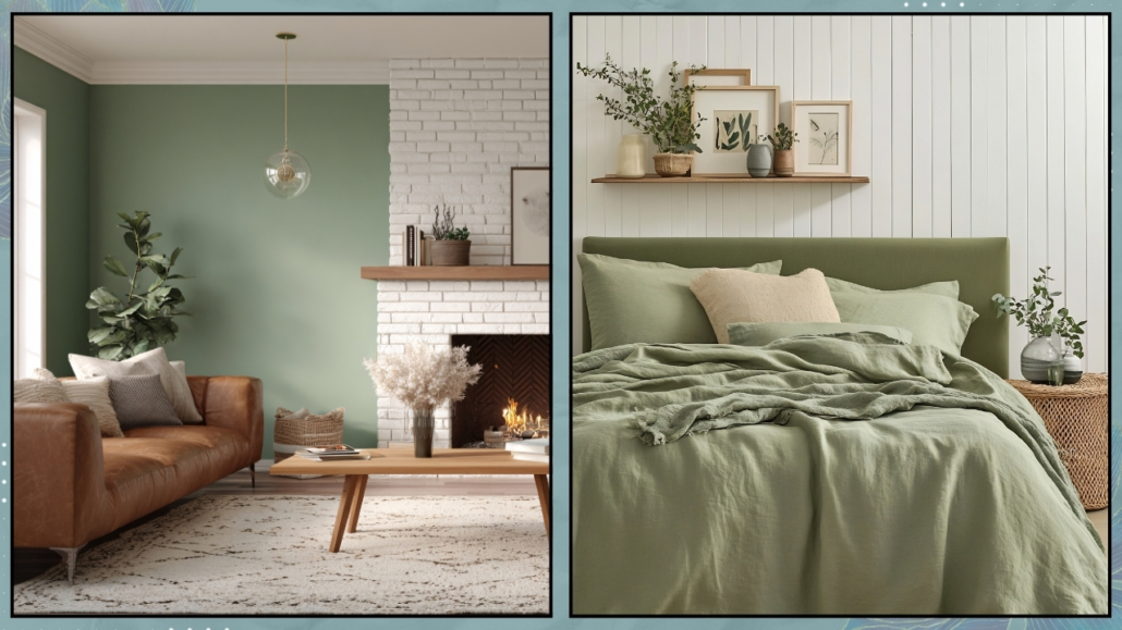
A simple way to create harmony is to repeat a color from one room to the next, adjusting only its tone or intensity.
You might echo a wall color through small details, such as cushions, artwork, lamps, or create a flow with a shared undertone.
Imagine a living room in sandy and sage tones, and a bedroom where that sage deepens into moss green.
The transition feels natural, and the whole house appears cohesive rather than disjointed.
Common color mistakes to avoid.
Now that you’ve got the basics, here are a few common traps to watch out for:
- Using too many colors.
Even if you love them all, too many shades create confusion.
Limit your palette to 3–4 primary colors and play with variations.
- Overdoing neutrals.
An all-gray or beige room can feel lifeless.
Add texture, natural materials, and a few accent tones to warm up the atmosphere.
- Choosing color from a sample alone.
The lighting in your home isn’t the same as in the store.
Always test real swatches on your wall and observe them throughout the day to ensure the color matches your expectations.
- Using the same tone everywhere.
Even if you love one color, vary it slightly from room to room — it adds depth and movement.
Color, like light, is alive.
It changes, breathes, and transforms how you perceive space.
Nurture it with care and attention, and your home will reward you with harmony every day.
In conclusion
Choosing the right colors isn’t about following a formula or a trend — it’s about listening to yourself and to your space.
When your color palette mirrors your style and tastes, every room becomes a natural extension of you.
If you feel your home’s colors no longer represent you, or you’re ready to create a new sense of balance, I can help you find the palette that truly tells your story and reflects your style. You can contact me here.
This post is also available in: Italian


Leave a Reply
Want to join the discussion?Feel free to contribute!