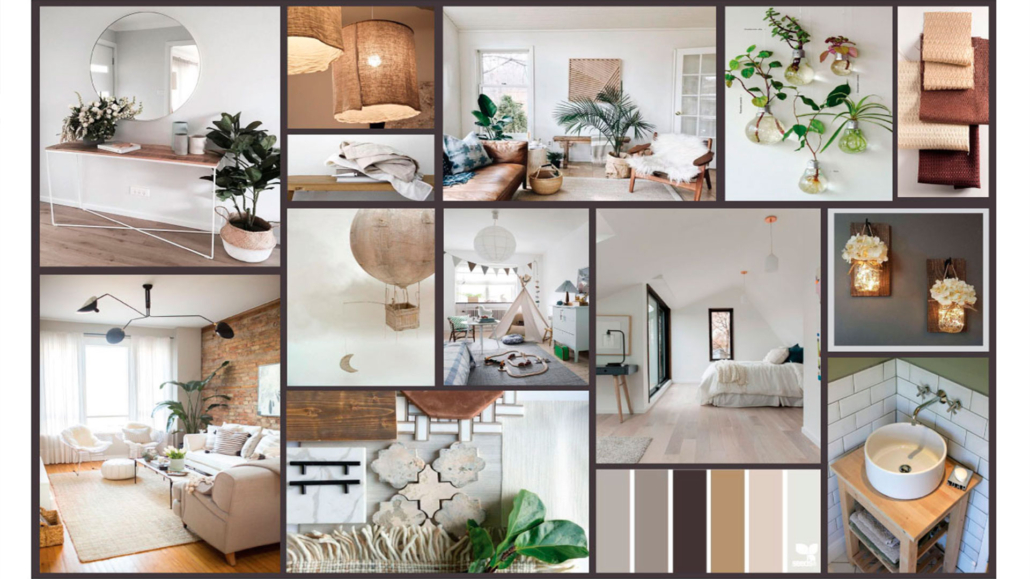
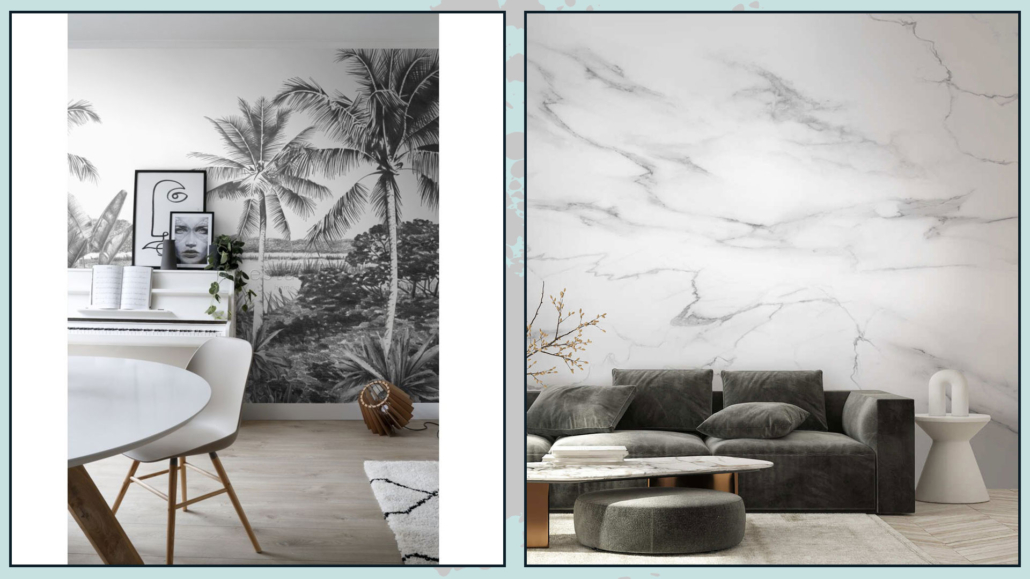
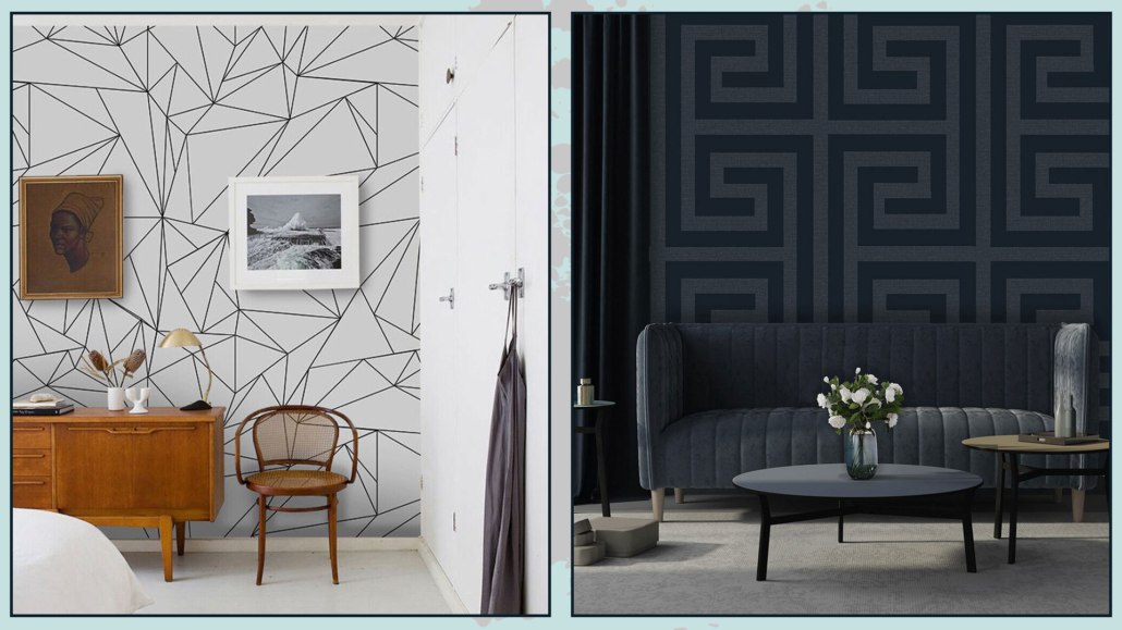
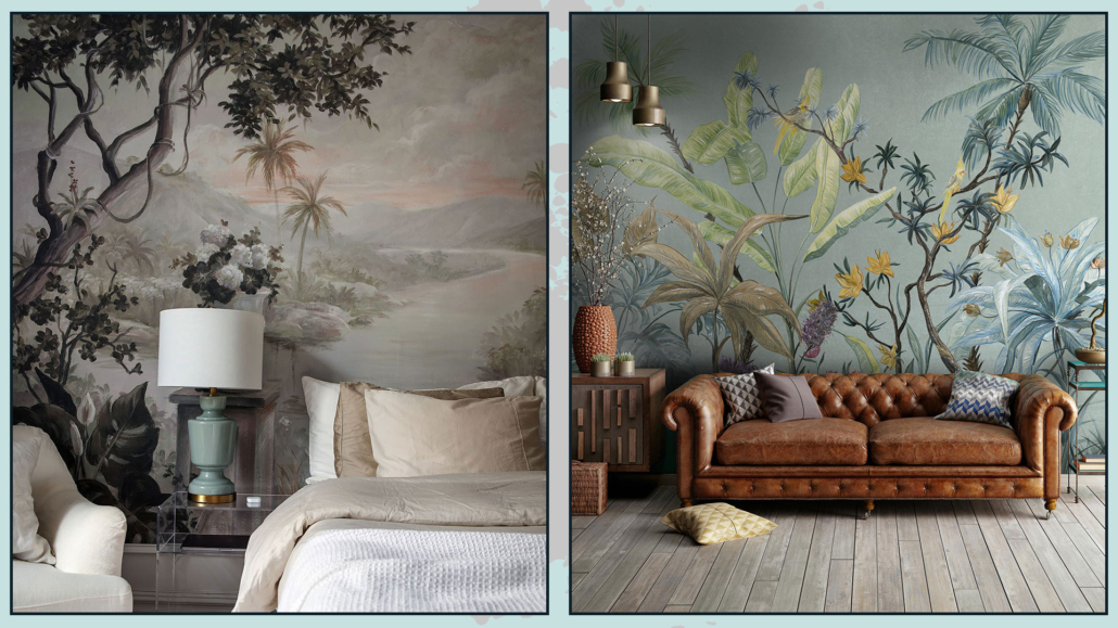
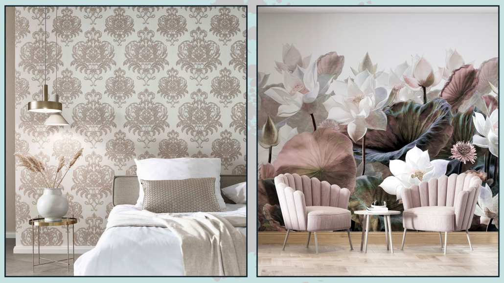
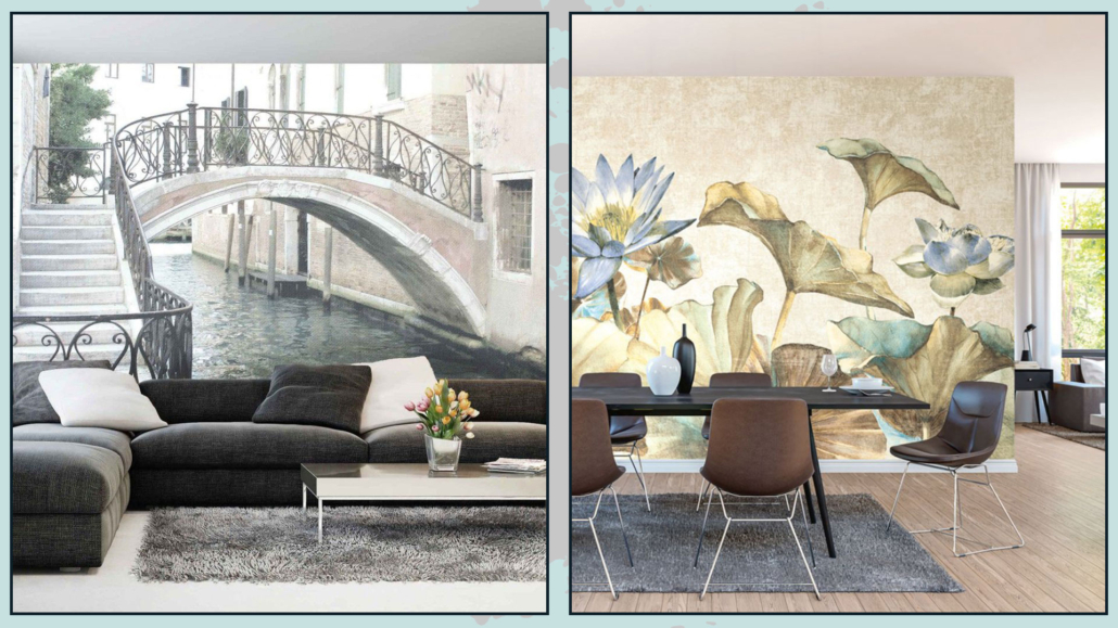
Today, I would like to share with you some tips and tricks used by interior designers to decorate home with style!
A few suggestions are really very simple and usable right away in your home!
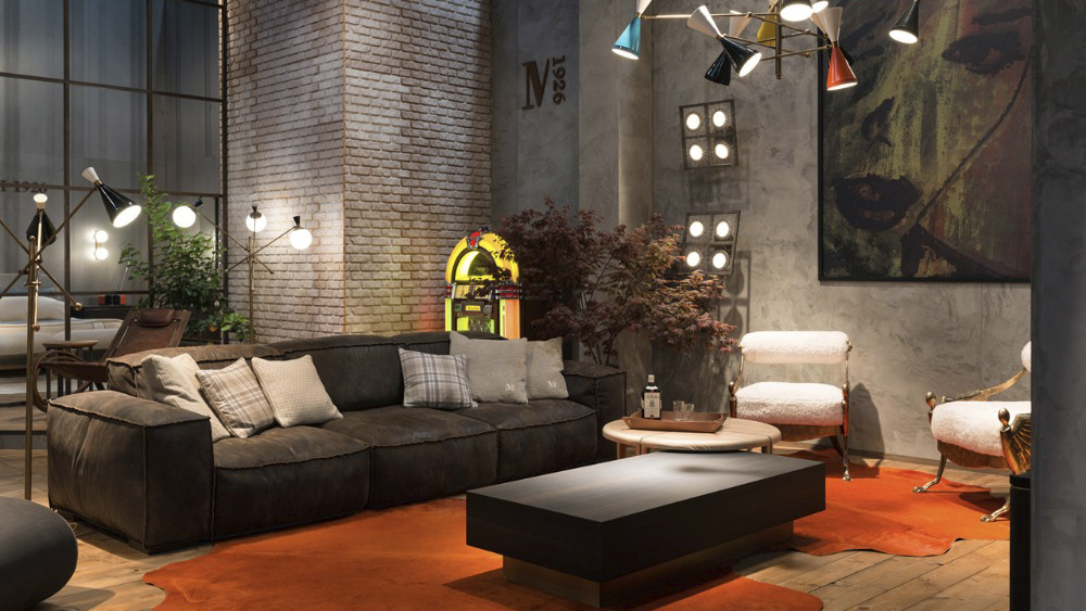
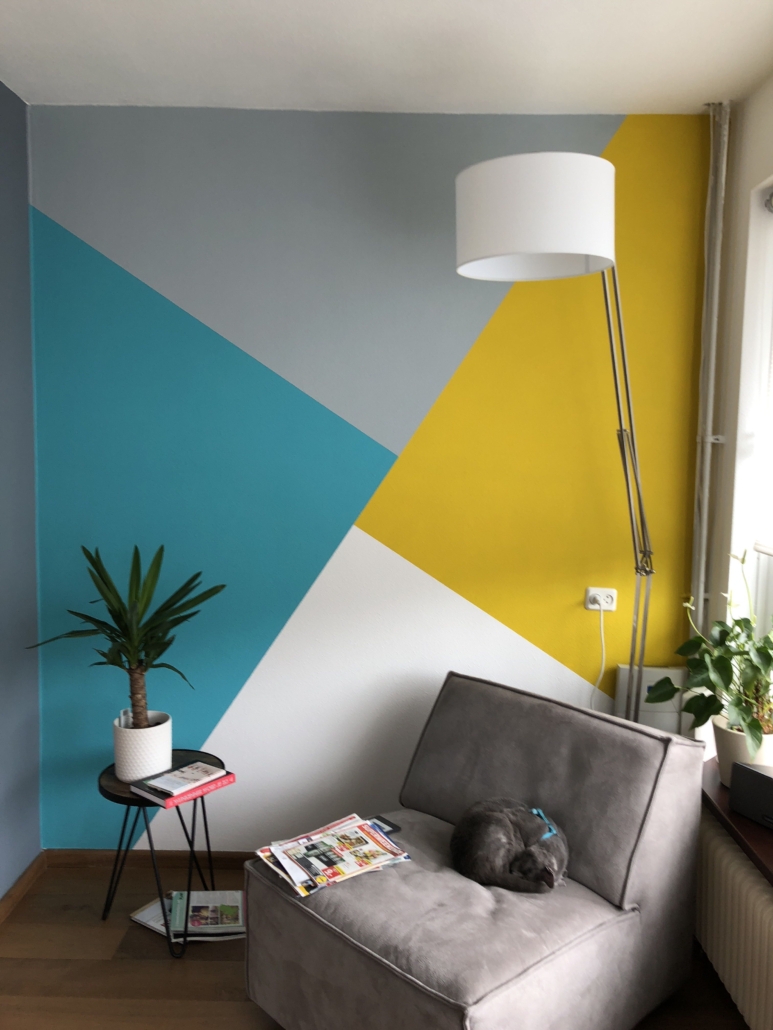
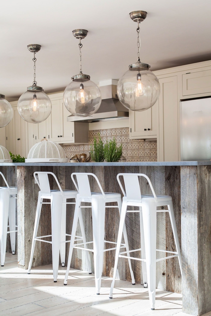
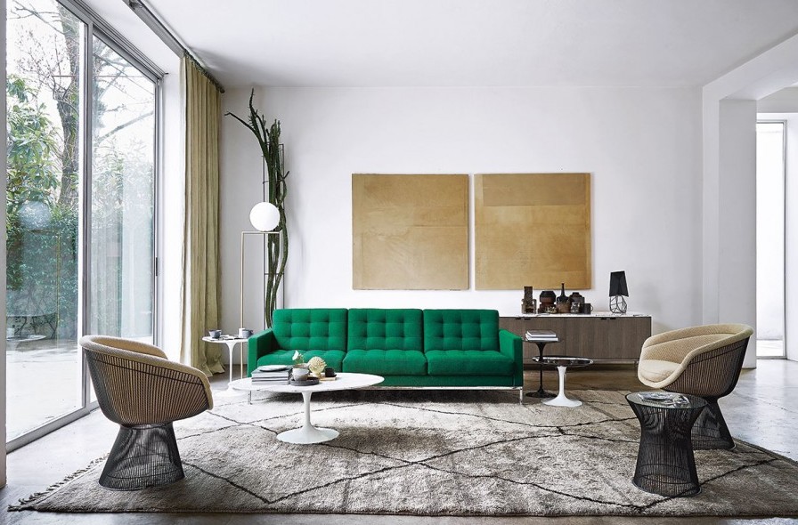
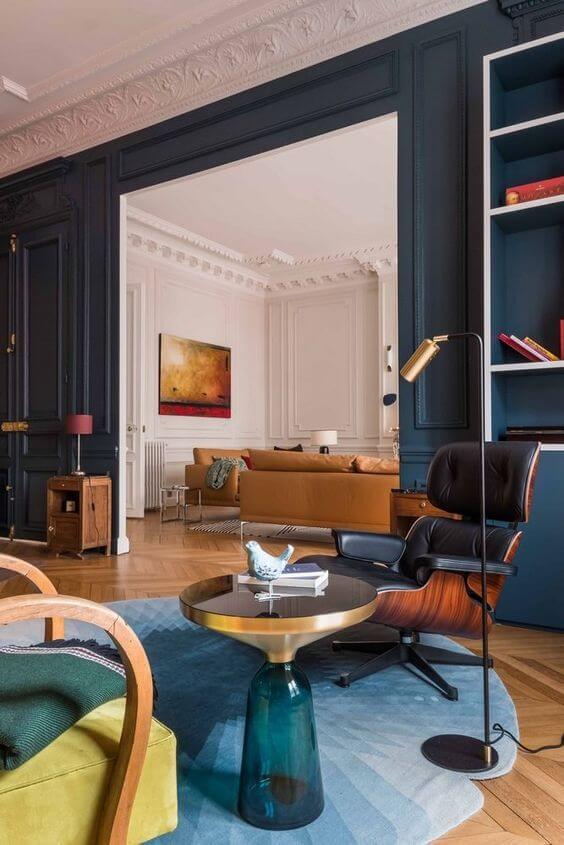
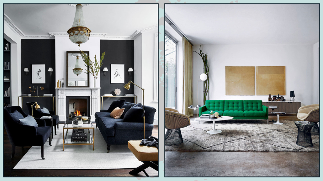
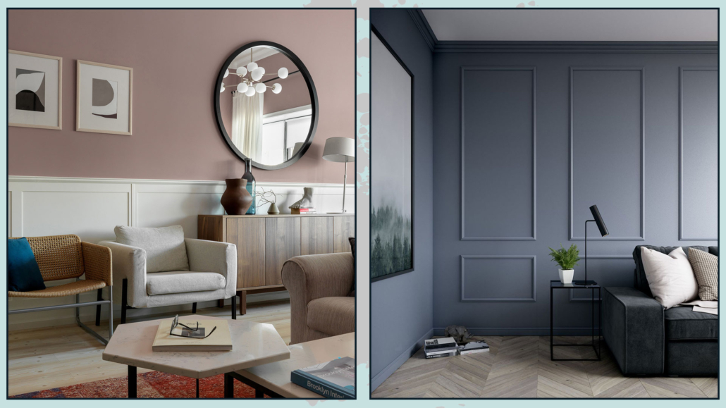
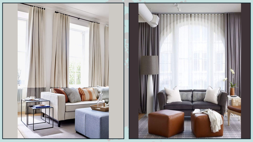
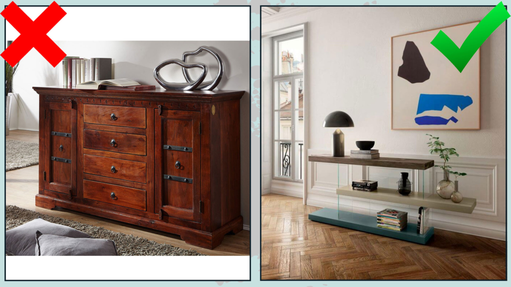
– SCALE AND PROPORTIONS
It is paramount that furniture and accessories are correctly scaled to the size of the room and in proportion to each other.
Furniture or elements that are too large will give a feeling of an overstuffed and confusing environment.
Conversely, too small will be lost, giving the feeling that something is missing.
So to furnish and decorate in style, it is really essential to measure the space and buy items with the correct size for that specific place and in relation to the rest!
(credits: artheco.it; Bronxes Studio)
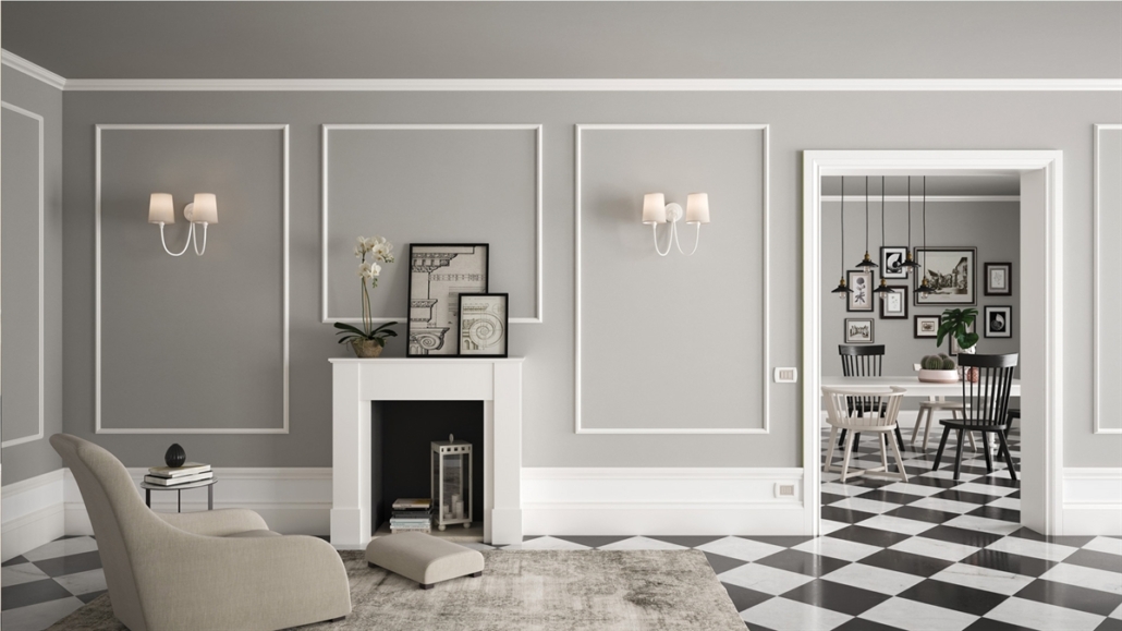
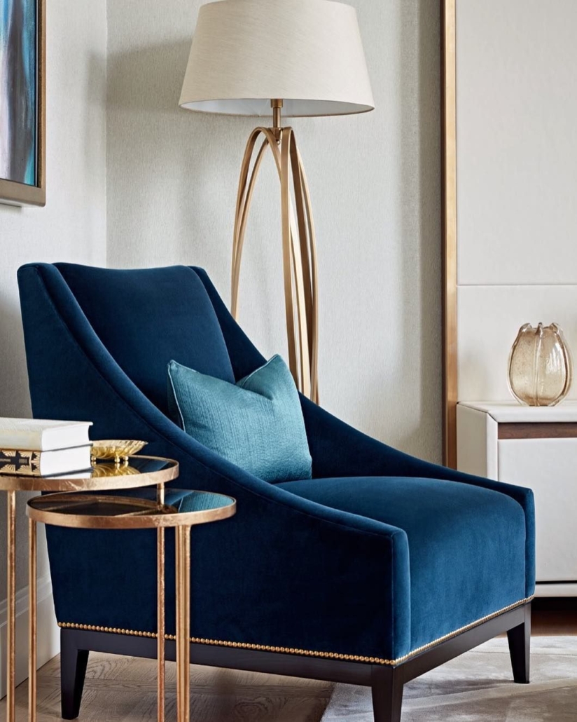
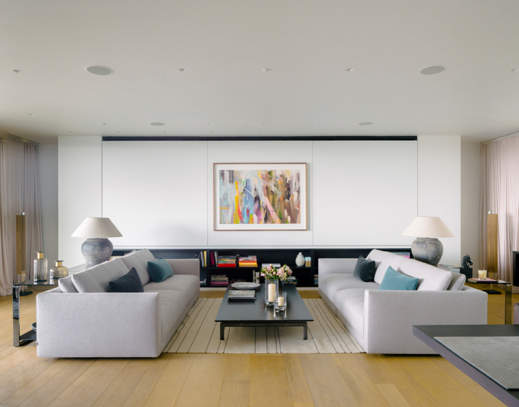
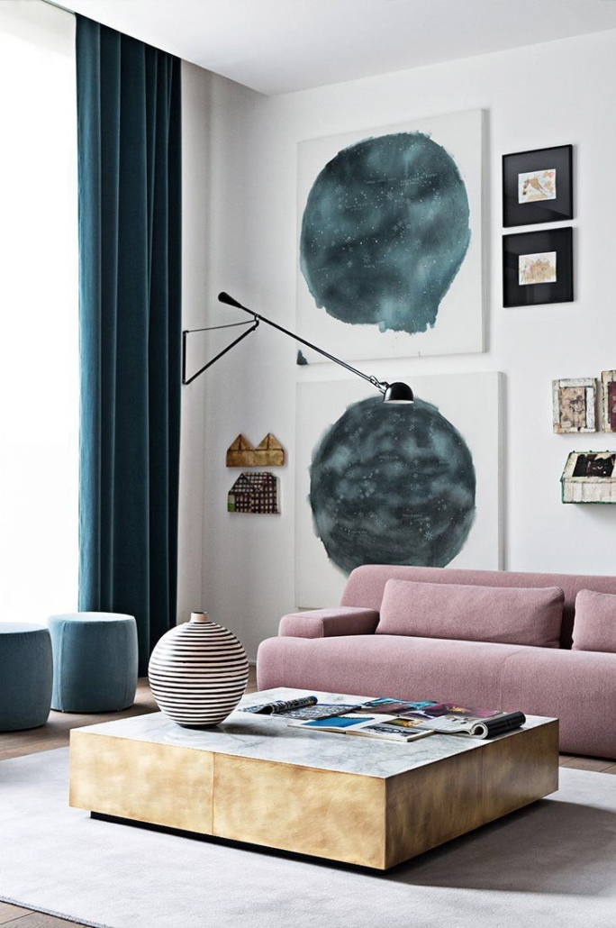
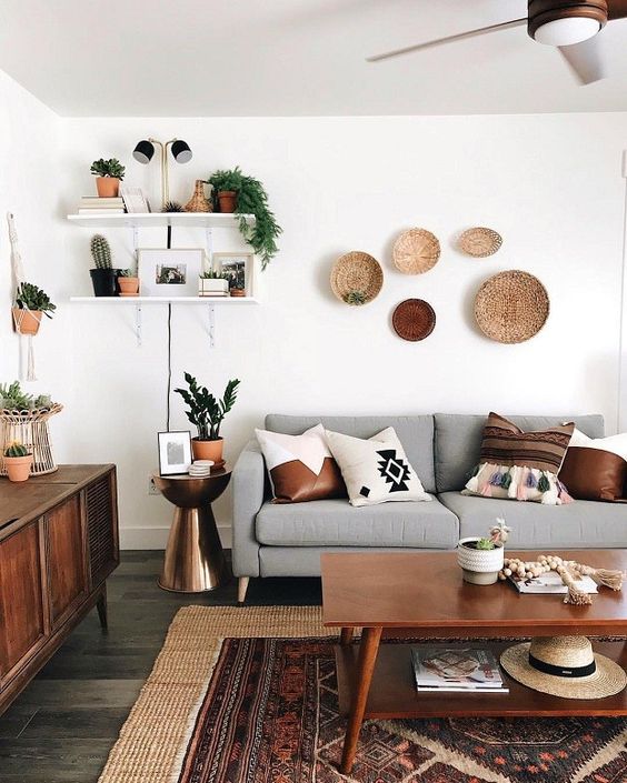
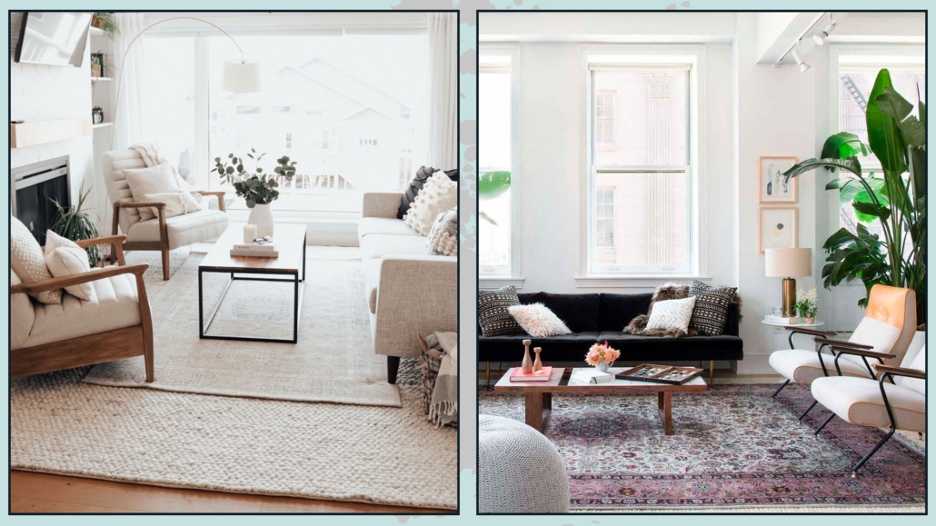
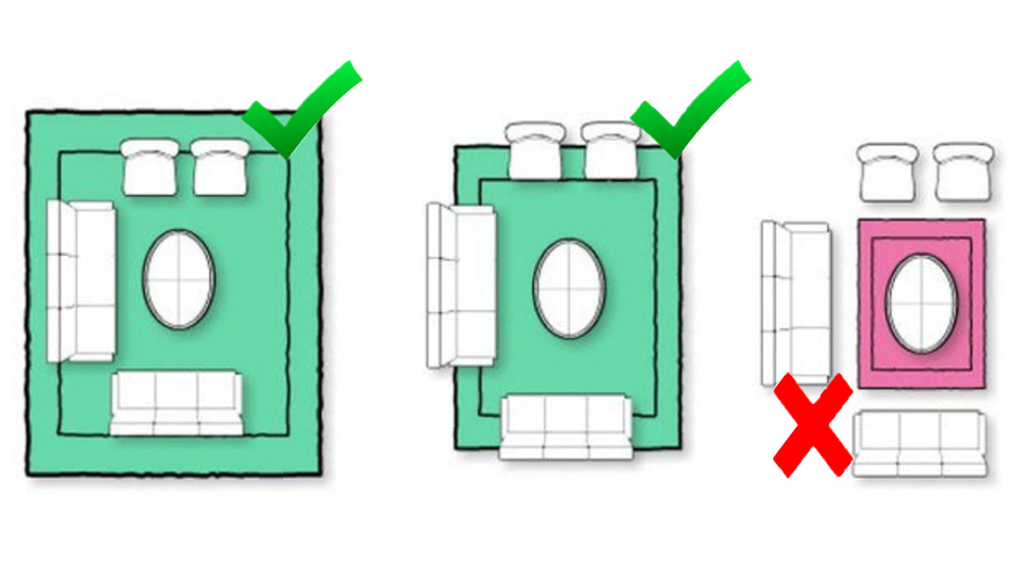
– BALANCE AND SYMMETRY
Our eyes really like symmetry: it is something that subconsciously calms us!
Decorating your home in style using symmetry is undoubtedly a great thing to do…
BUT, as always, without overdoing it, because then it can get boring!
Perfect symmetry, if repeated over and over again, loses its appeal then, making the environment flat.
The key word is always BALANCE, so don’t be afraid to use asymmetry you only need to balance it visually!
Now let me explain:
If, for example, you decide to put a picture above the couch but not centered, you can balance on the other side with a beautiful floor or wall lamp.
Balancing visual weights will maintain a balance even without perfect symmetry!
The important thing is not to decorate only one side of the wall or place all the furniture in one area of the room without balancing it with something: otherwise, it will look like something is wrong.
(credits: neptune.com; Knoll)
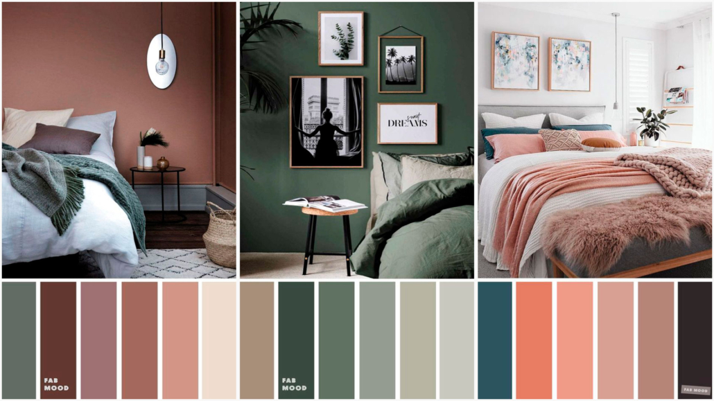
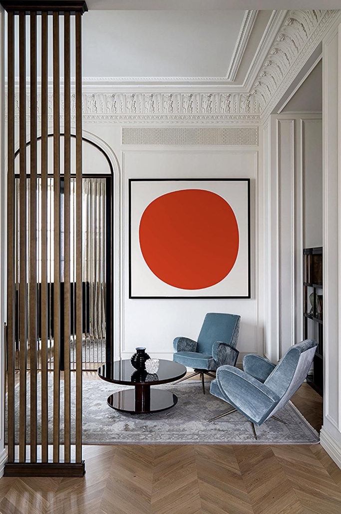
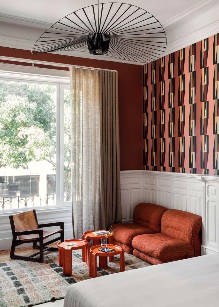
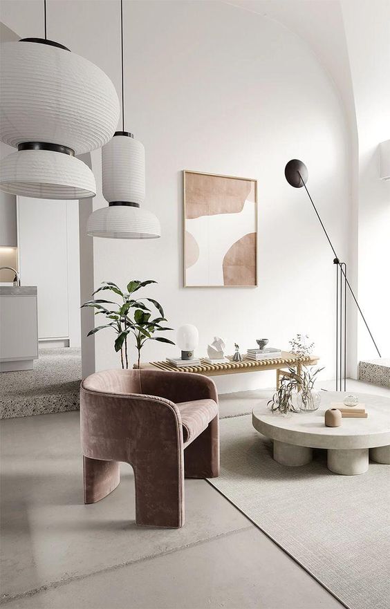
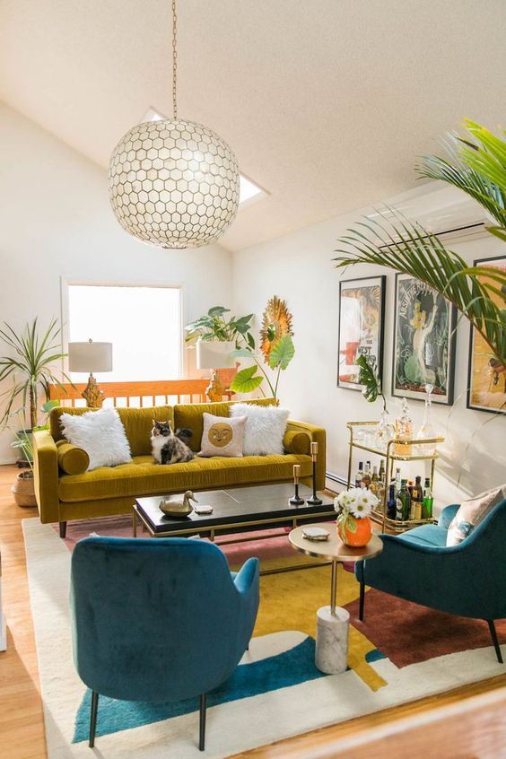
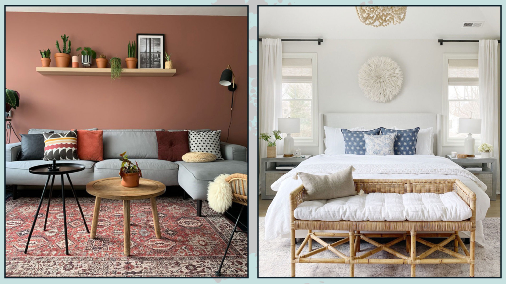
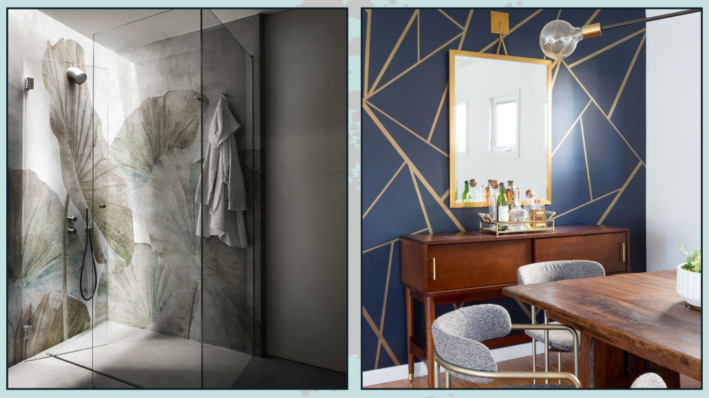
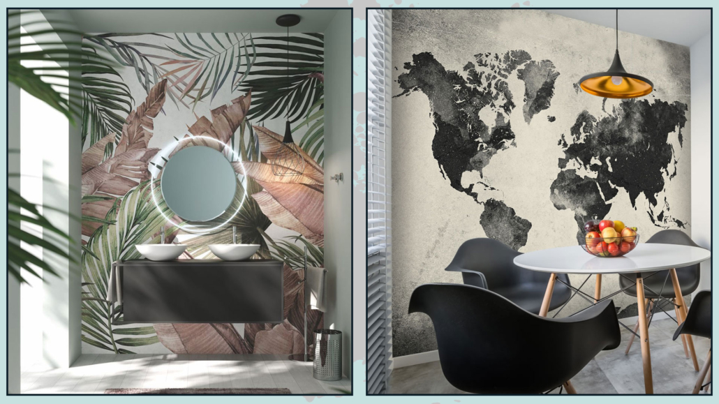
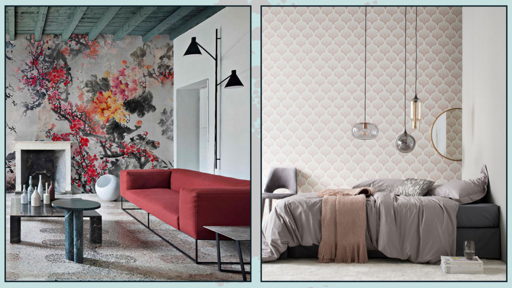
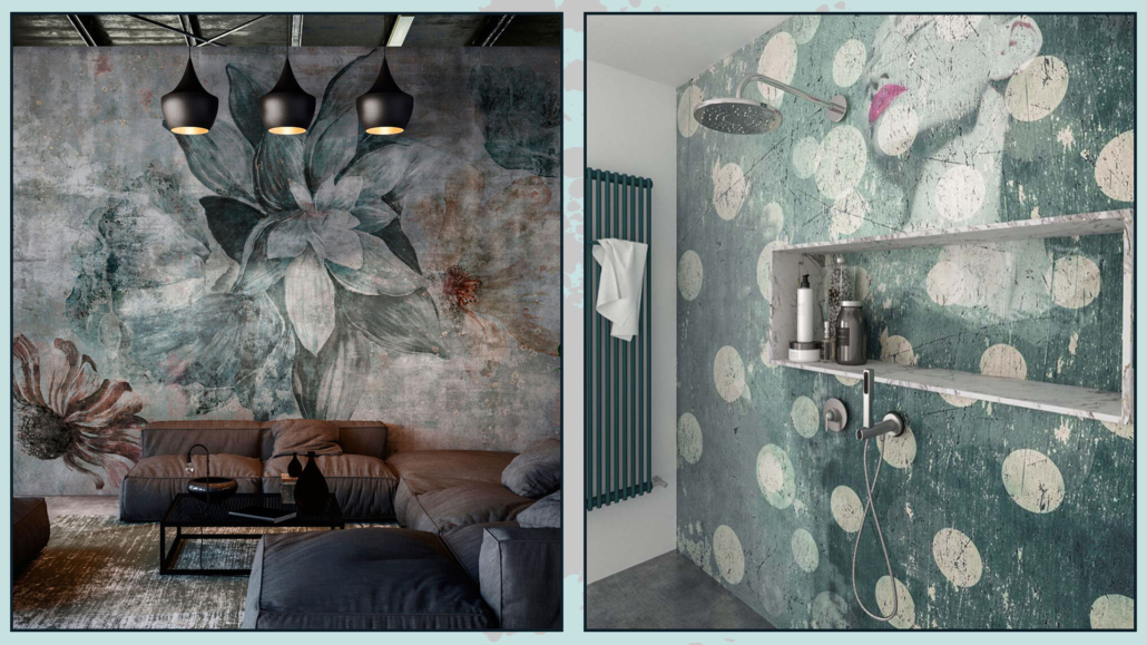
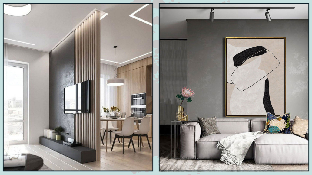
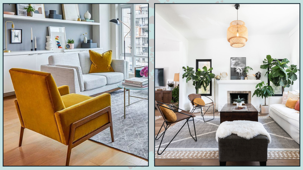
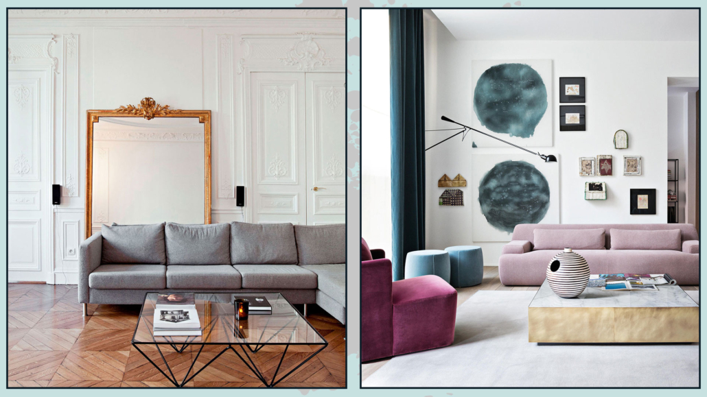
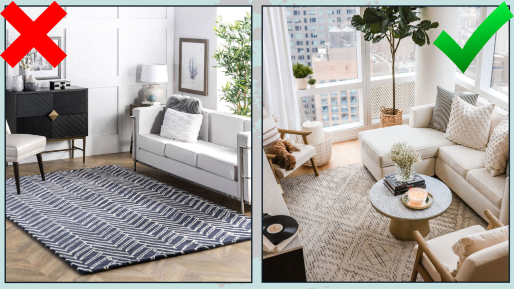
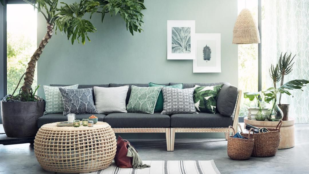
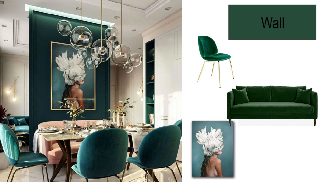
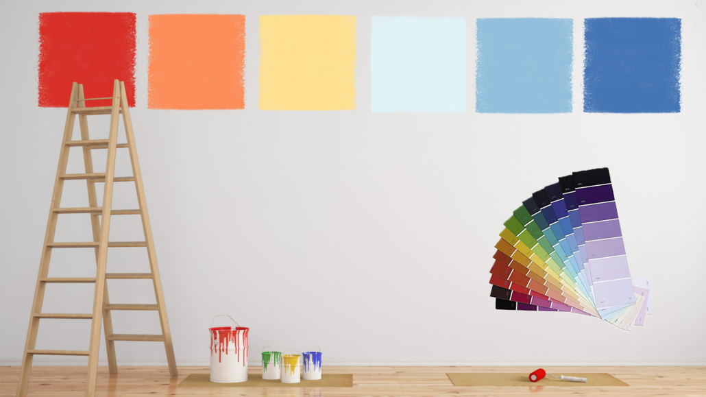
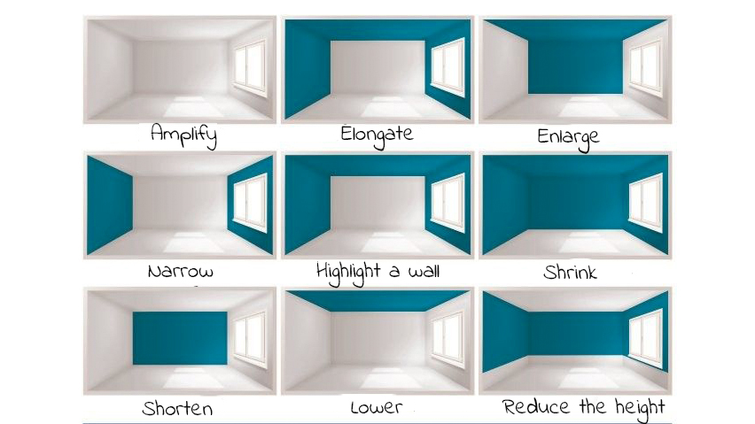
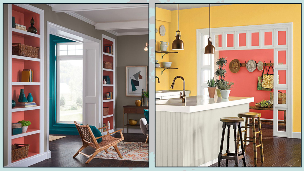
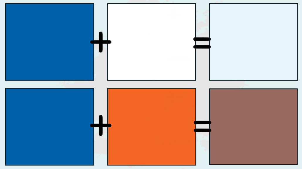
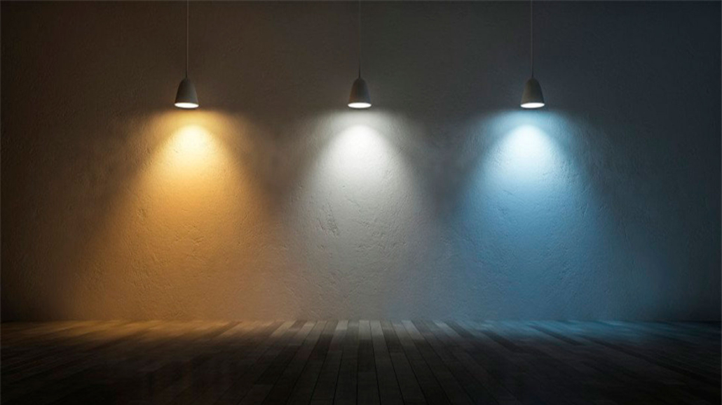
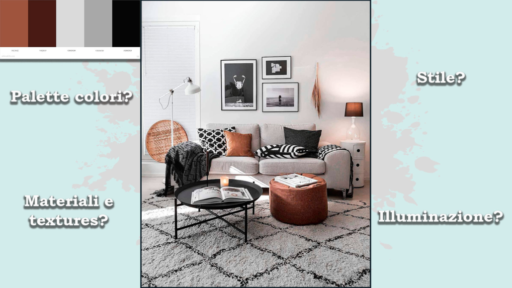
– ATTENTION TO THE USE OF COLORS
The right or wrong use of color will make a big difference in decorating your home in style.
Color has deep psychological significance and is a fantastic ally for our homes.
You can use it on walls, furniture, and decorations, such as pictures, pillows, and vases…
Unless you want a total white or total black or total grey home, you certainly use some colors: in fact, neutrals are colors because they will have a definite undertone (actually, unless you use pure colors white, black, and gray, do too).
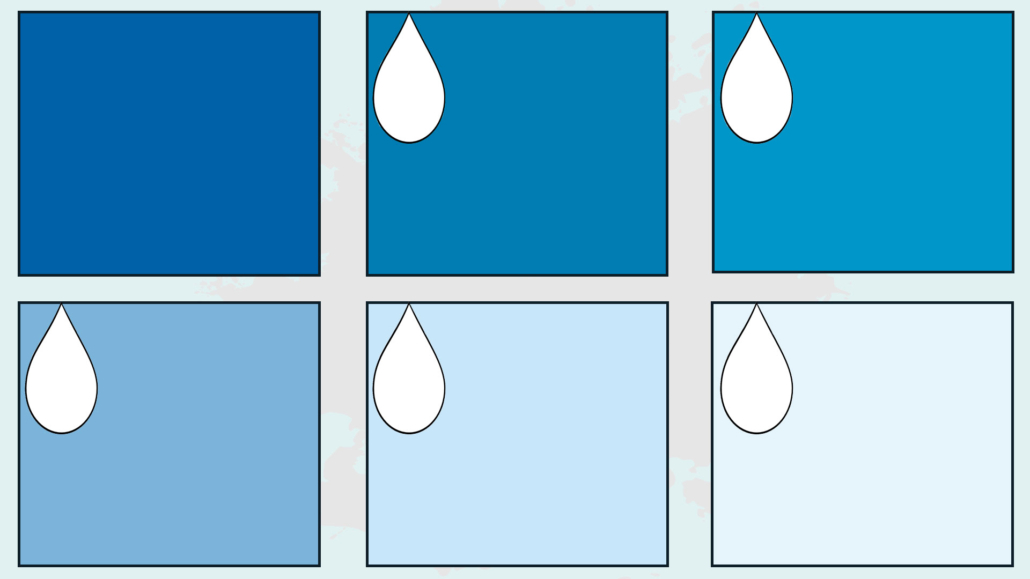
You can have a monochromatic home, that is, using the same color everywhere, changing the saturation and intensity: this creates rhythm and does not make everything flat.
You can also use color just in small touches, so in a room, which tends to be neutral, add a few colorful elements here and there (a pillow, an ottoman, an armchair… for example!).
Then, again, you can use different shades of this color to give that sophisticated and stylish touch.
Of course, you can also use more than one color by creating a well-thought-out color palette that allows you to have a balanced and harmonious environment.
If you are afraid to use color, proceed in small steps, with small elements first!
(credits: mooielight.com; Sean Litchfield)
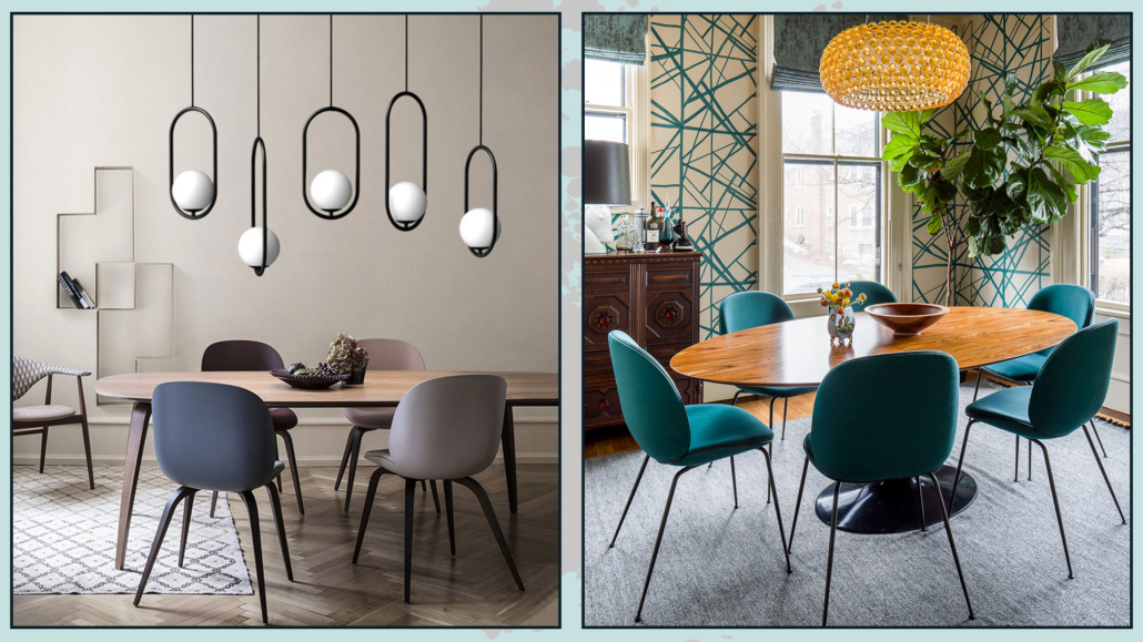
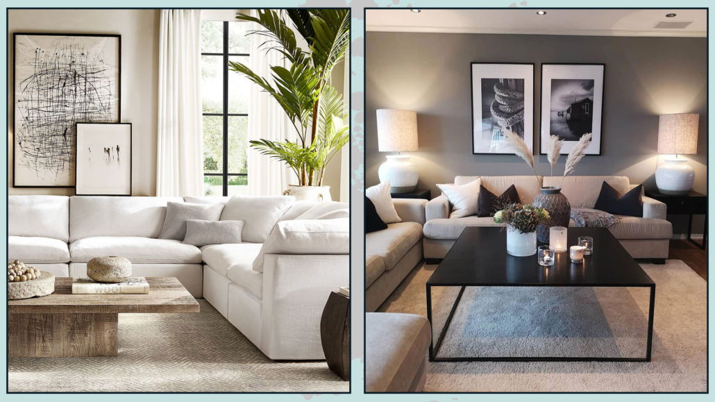
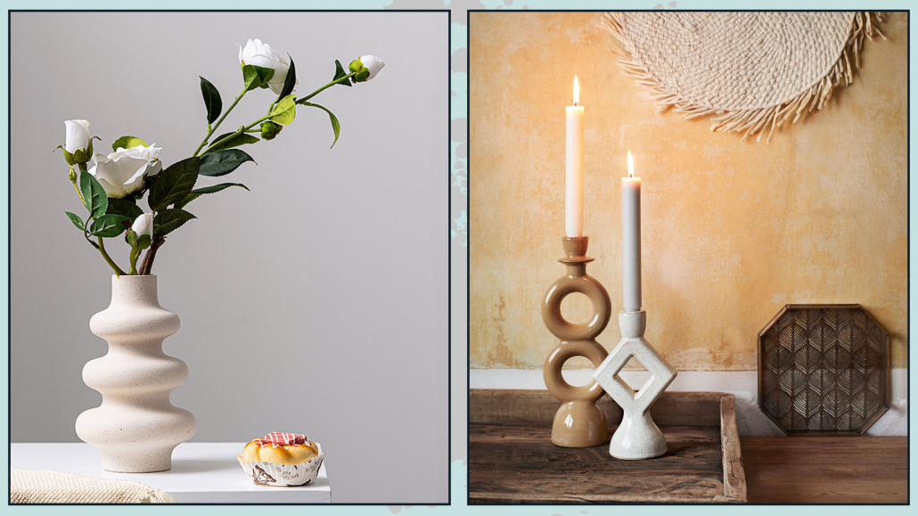
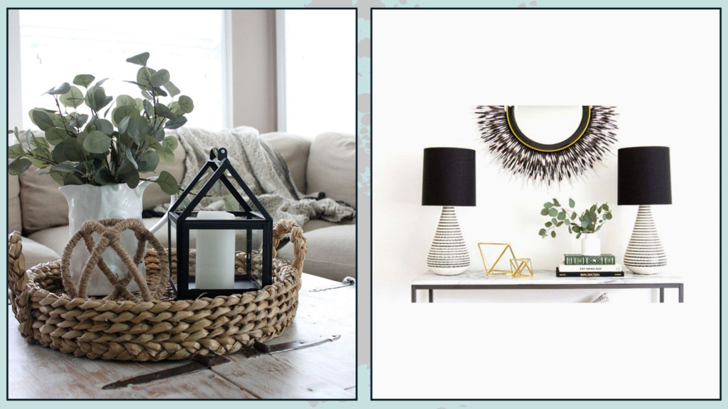
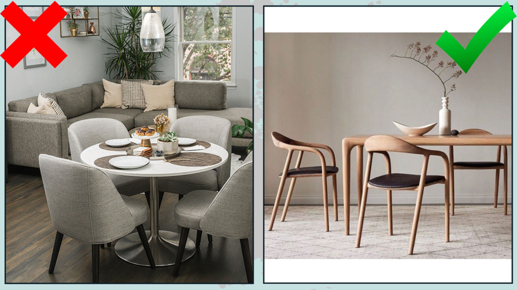
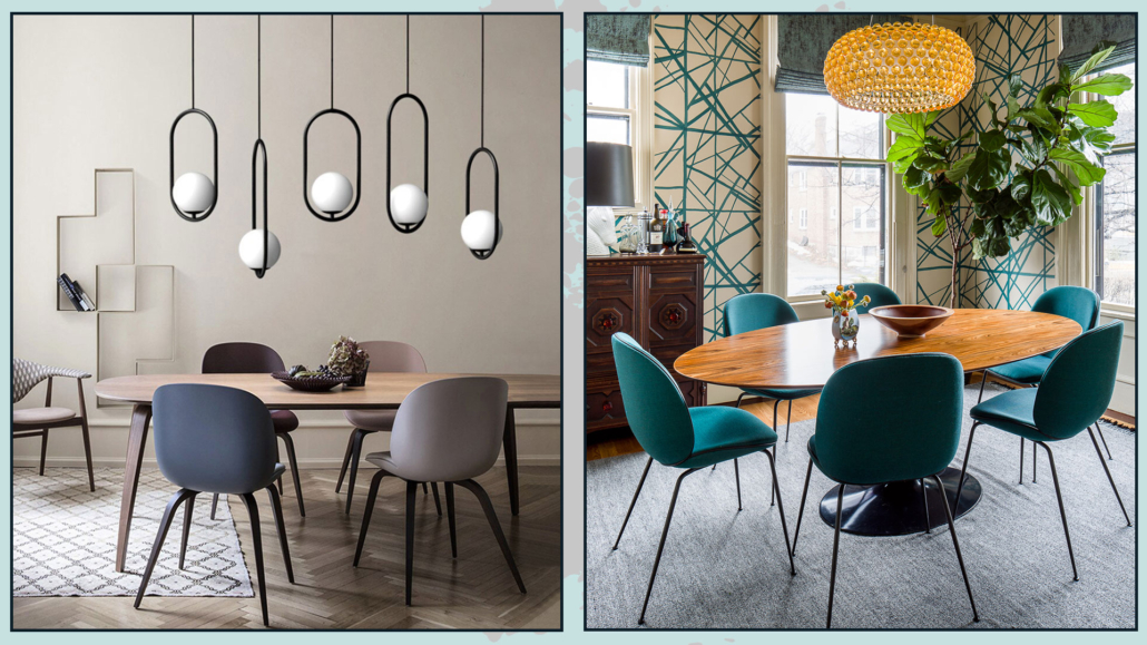
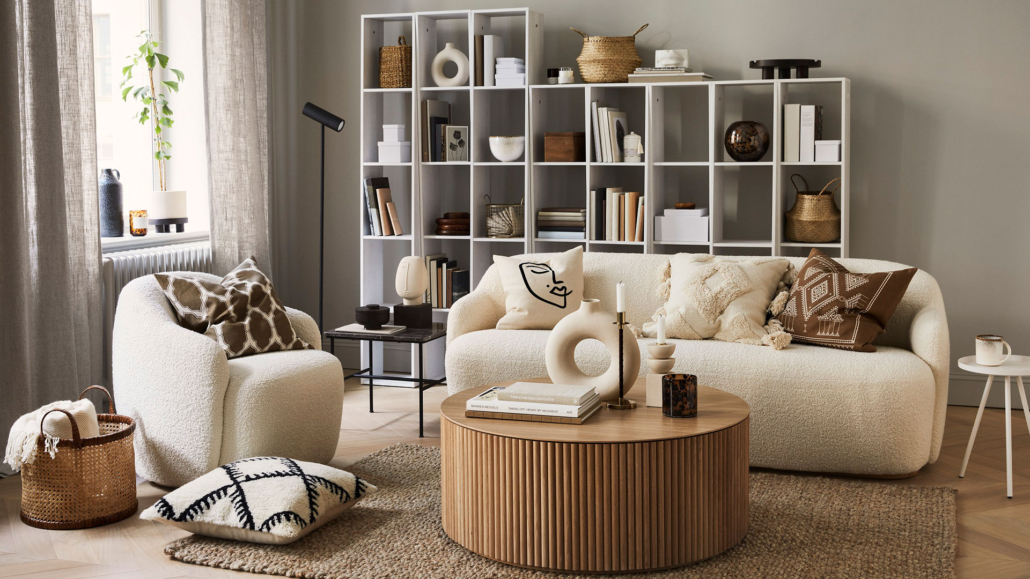
– ALWAYS MAKE COMPOSITIONS IN ODD GROUPS
When making your decorations on a coffee table, a console table, the shelves, or a bookcase, always make compositions with an odd number of elements.
If you put only two elements next to each other, there will be a bit of a feeling of something incomplete; something put there somewhat randomly.
One is an odd number, so, especially on the dining or coffee table putting only one object, perhaps a vase with flowers, may be an option; the only caution will be that it be proportionate to the surface on which it is placed.
The fact remains that three is always the perfect number, although nothing prohibits making five-element compositions as well.
Small clarification, if you put books on top of each other and place an object on there, the whole thing will be considered as one element of the composition!
When making these groups, to make them attractive and sophisticated, always remember to play with different sizes, materials, colors, and finishes.
The elements should create a triangle or diagonal, as always, to give rhythm and dynamism.
Also for compositions, pay attention to the things mentioned in the previous point, namely, the proportions between the elements that make up the composition itself and this in relation to the place where it is placed!
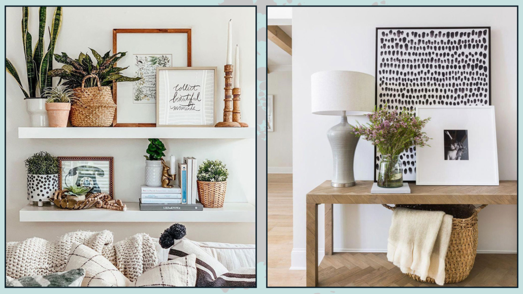
(credits: boho-farmhouse-decor-home-tour-2020; Scout & Nimble)
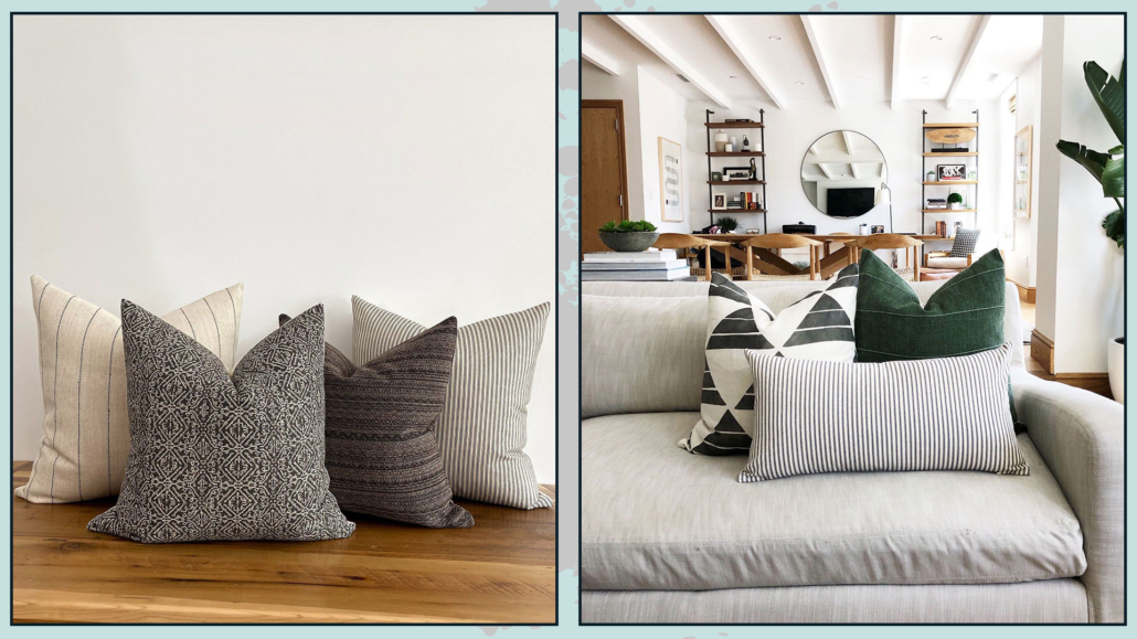
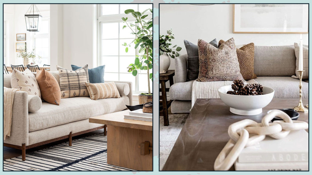
– THROW PILLOWS
Throw pillows are a quick, easy, and inexpensive way to decorate your home in style.
It will also allow you to change the face of your environments whenever you want!
In fact, once you have bought different-sized and shaped interiors, you can purchase different slip-coverings that you can replace at every change of season, for example, or whenever you see fit.
The slipcovers do not take up too much space and, as just seen, allow you to renovate your home with ease.
I recommend considering throw pillows as any decorative object and so, also with them, as mentioned in the previous point, make compositions in groups of three, or at any rate, always in odd numbers on the couch or bed.
Therefore, even with throw pillows, it is good to use different sizes, colors, patterns, and textures in the composition to give some rhythm and dynamism.
Be careful how you mix patterns, keep in mind the colors, but also the scale of the designs so that each piece blends well with the other (I talk in detail about how to mix patterns here).
Avoid, unless you are in an armchair, leaving a pillow alone, it would seem to be put there a bit haphazardly!
A well-designed composition will immediately give a sophisticated and elegant effect.
(credits: Enorm d’Acheteromme; lifeoncedarlane.com)
Little Tips:
– to get pretty filled pillows, get interiors a little bigger than the covers.
– if you like to give a magazine look to your pillows, get interiors that you can shape well (not too dense, to be honest), and then once it’s pretty filled, you can karate chop it with your hand in the middle!
It is very trendy, but, actually, it gives that feeling of something more studied.
(credits: Etsy.com)
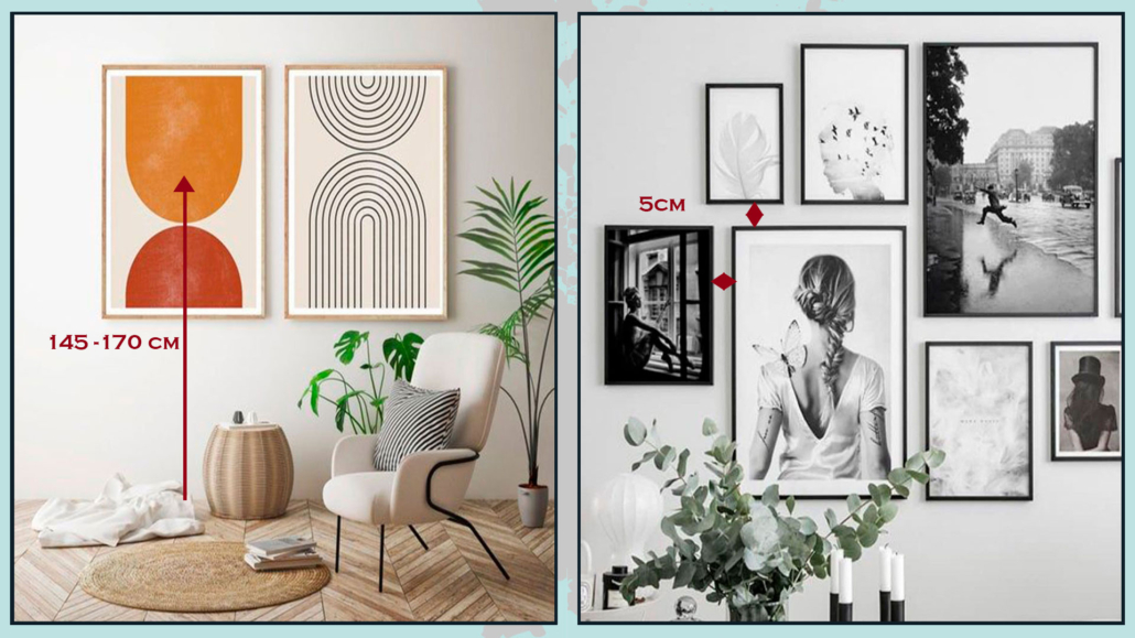
– WALL DECORATIONS
Decorating walls with style is not as easy as it looks, and mistake is really just around the corner!
On the wall, you can put mirrors, pictures, or photographs; you can put one or two pieces or a whole gallery, and, in all cases, the first thing, the most important, is to hang at the right height!
Mirror or pictures, or, better, the center of them, should be hung at eye level, being around 145 and 170 cm from the floor; it will depend on your height, of course!
If you hang the picture or mirror too high, it looks like its own thing, separate from everything else.
In the case of a composition, this measure should be taken for the center of it.
The distance between the various elements on the gallery wall is also significant, which must always be the same and is around 5 cm, both in height and sideways.
If the paintings are too close together, it will create confusion, while if they are too separate, they will look like stand-alone pieces and will not form a cohesive and harmonious composition.
(credits: etsy.com; posterstore.it)
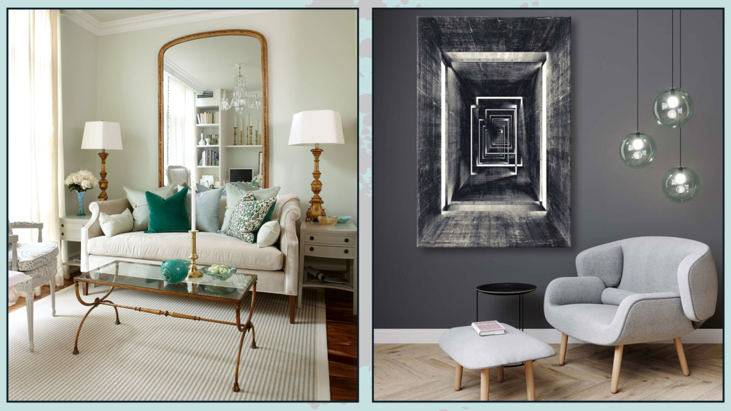
Small cautions:
Regarding mirrors, as seen on other occasions, you can also dare to use huge mirrors, perhaps resting on the floor; they will double the light and give an incredible touch of elegance and style.
For paintings, on the other hand, I recommend avoiding buying elements mass-produced because they will not bring originality.
Of course, I understand that one cannot always afford an auteur painting, but if you look well, you might find a large number of emerging artists who have really cool and distinctive works.
Another way to have original paintings is to create them yourself: if not painting, you can use fabrics, for example… don’t limit your creativity.
The important thing, however, is to look for elements that represent you and tell who you are so that you can decorate in style, your style, your home!
(credits: Sarah Richardson Design; hepsiburada.com – Voovart)
I hope this article was helpful and you love it; in case, let me know in the comments!
Feel free to share it with anyone you think might be interested, I will be honored, and it will help me get my name out there.
If you feel that your home, or some environment of it, does not reflect you enough, do not wait any longer and book your advice: just contact me!
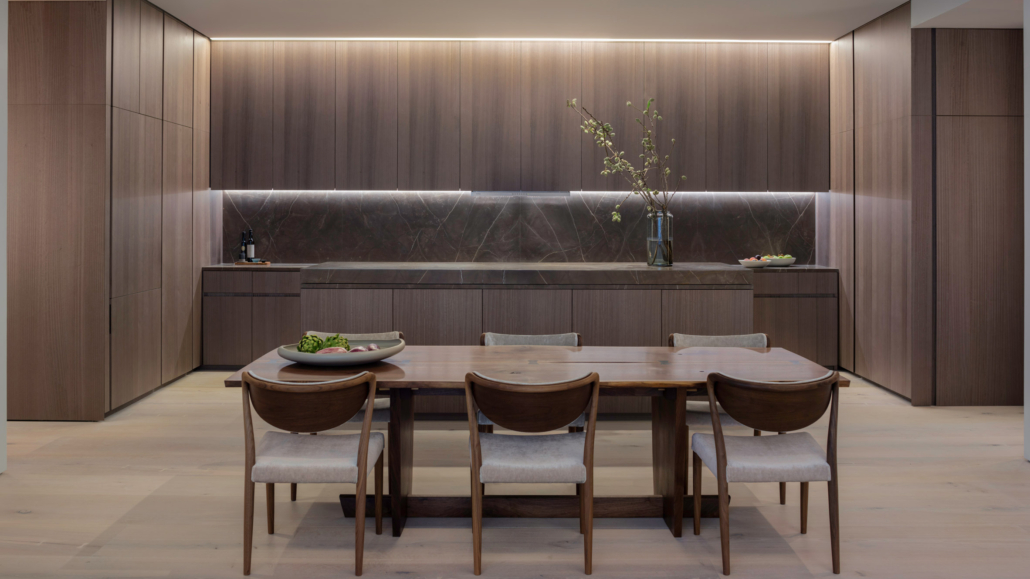
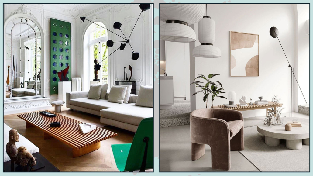
 3 – DIFFERENT AND CONTRASTING FLOORING
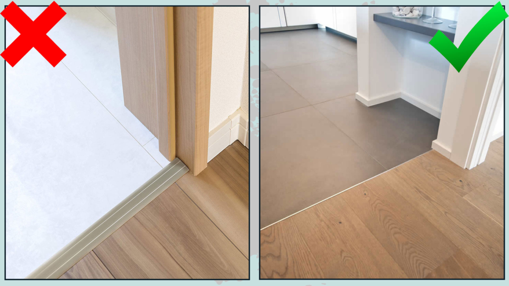


 (credit mk.nordic)