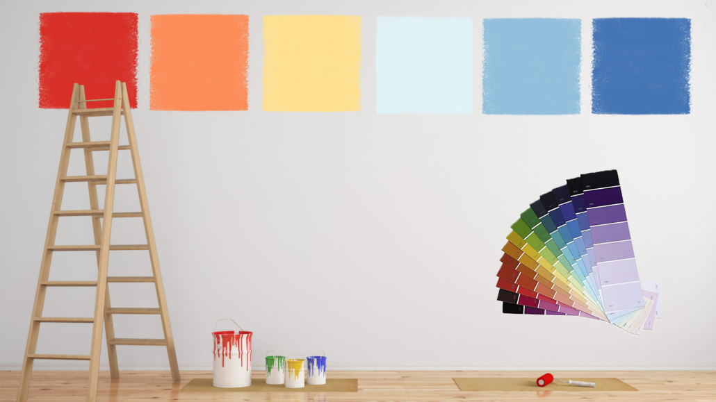
We are now in the last part of the year, and like every year, we start talking about home color trends for the coming year, each brand proposing its color of the year 2023.
While waiting for the very familiar color of the year 2023 by Pantone, let’s see what other brands in the industry are offering us!
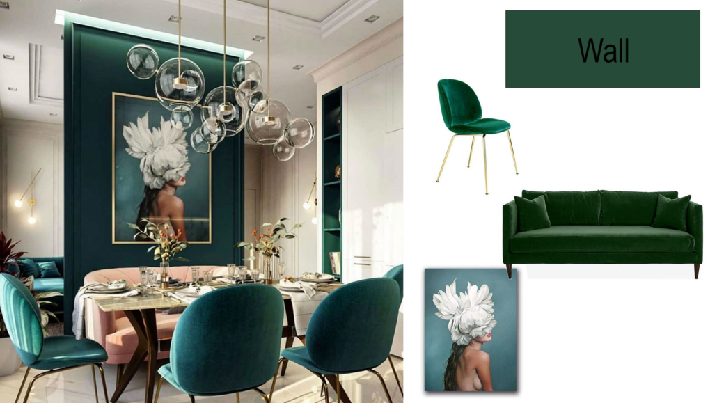
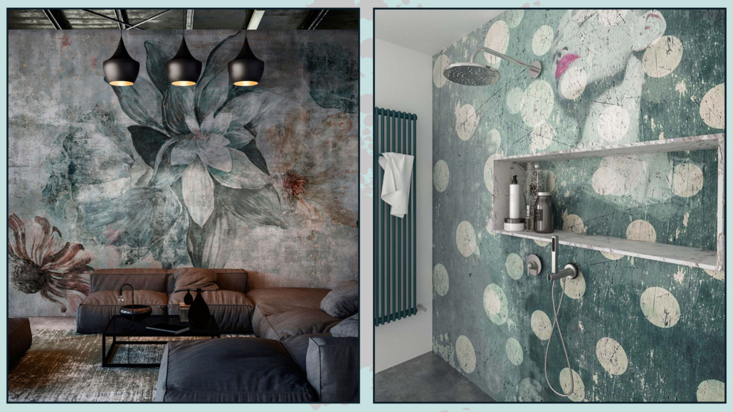
This year too, the call is to nature, although no longer only on the green, is very strong, but some dared a little more!
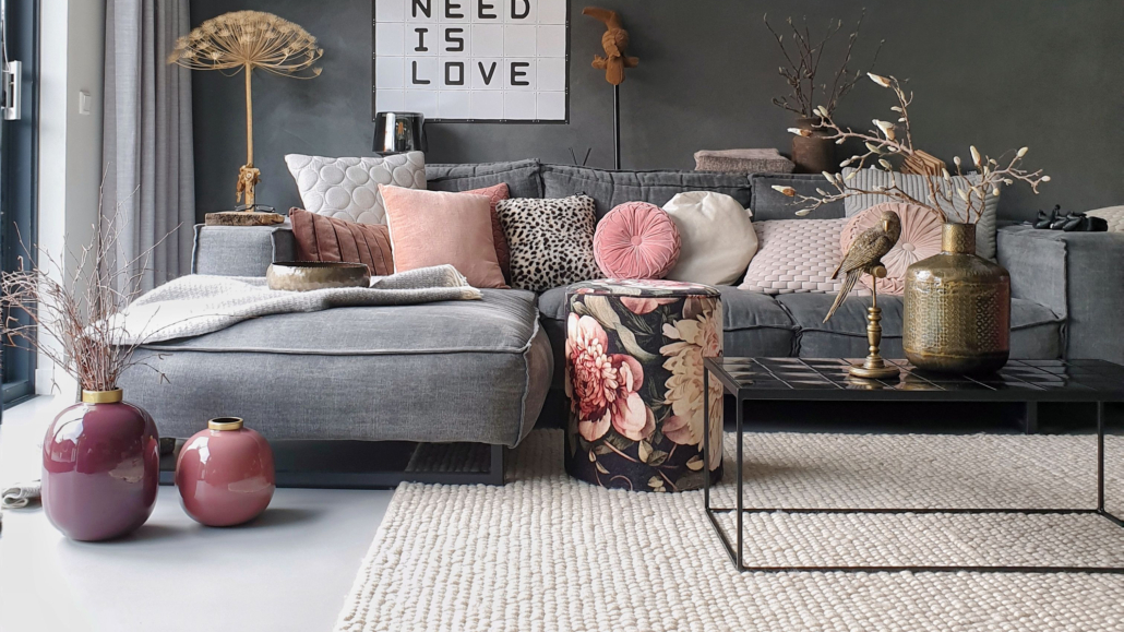
– BENJAMIN MOORE: Raspberry blush
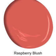
Benjamin Moore offers a vibrant and charismatic color this year, a coral mixed with red.
“Raspberry blush enlivens the senses with electrifying optimism!”
It is a powerful color, far from the neutrals proposed in 2022, which will give a touch of character to rooms.
You can use it in small doses, but you can also dare on doors or furniture up to walls!
Fun fact: To commemorate this year’s selection, Benjamin Moore collaborated with electro-funk duo Chromeo to highlight the optimistic tone of the palette and the dynamic role that color plays in personal expression, just like music (you can find the track on their website)
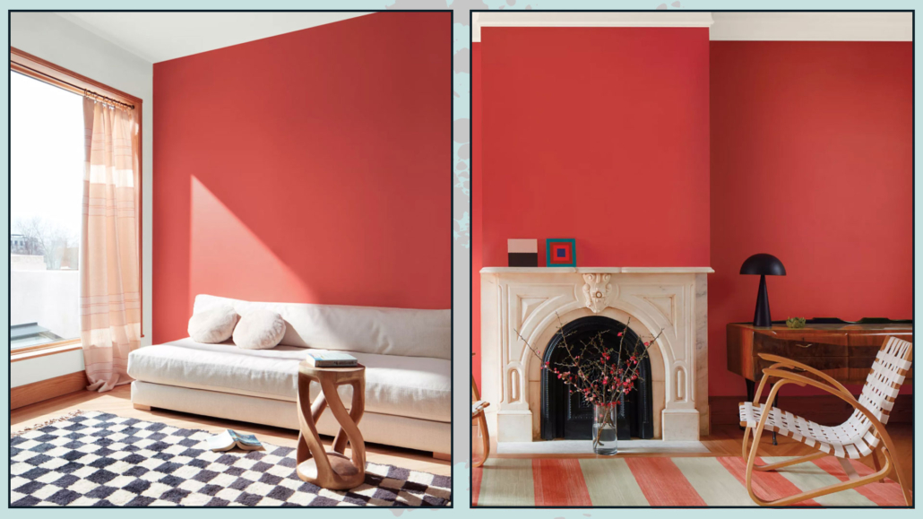
(credit Benjamin Moore)
Benjamin Moore proposes a whole palette of colors, which, for them, will be the trend of 2023.
As you can see, the colors, if you exclude conch shell and new age, are all quite bold and intense.
When using these colors, I recommend calming them down with neutrals, like the four proposed by Benjamin Moore himself!
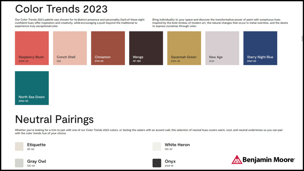
(credit Benjamin Moore)
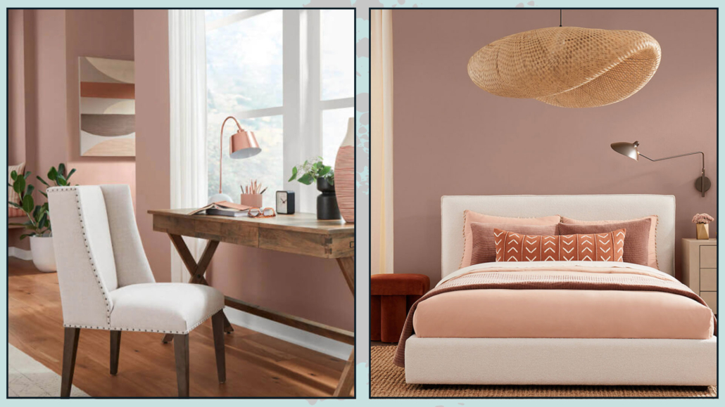
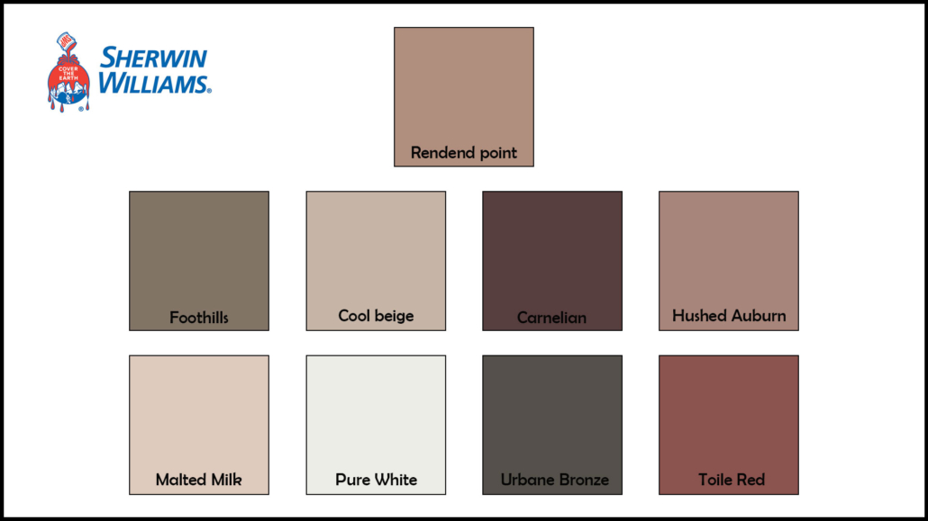
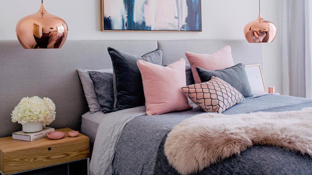
– SHERWIN WILLIAMS: Rendend point
Sherwin-Williams offers a warm and intriguing color that goes well with all styles.
Basically, it is a neutral color, an earthy color with a hint of pink, a color that helps you feel rooted!
It is a soothing color, so it is also suitable for the bedroom, giving a touch of personality.
It is versatile, so in addition to fitting all styles, it also goes well with most colors, although it gives its best with white and other warm colors!
(credit Sherwin Williams)
Fun fact: Sherwin-Williams worked with Etsy to find a selection of items that would go well with this color.
Sherwin-Williams also offers a whole palette of colors that you can safely pair together!
(credit Sherwin Williams)
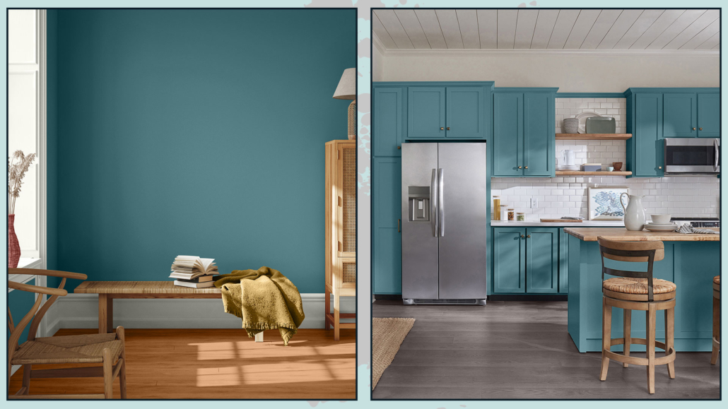
– PPG: Vining ivy
PPG stays in shades of green, although this year’s is a bolder green!
“It’s a deep, shaded Caribbean aqua with turquoise undertones” that goes with any style!
It is an elegant color that becomes truly gorgeous when paired with warm wood tones.
Relaxing, refreshing, and revitalizing, you can use it in all rooms, either as furniture or on walls!
(credit PPG)
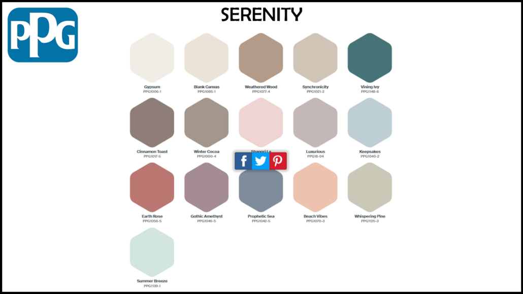
This year too, PPG offers three color palettes that include Vining ivy:
– Serenity
It is a color palette that combines pastels, watery tones, and warm neutrals, all calming and soothing colors that bring serenity precisely!
(credit PPG)
– Duality
It is a palette that plays with contrasts: there are, in fact, pastel colors and very bright colors; it is for those who like to dare and give a touch of powerful character!
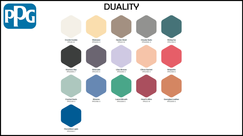
(credit PPG)
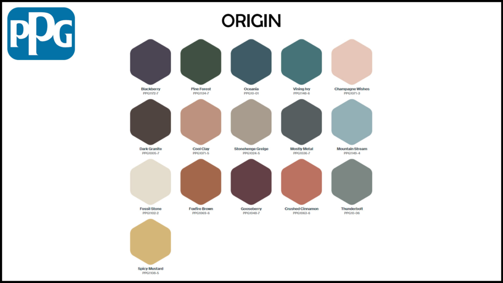
– Origin
It is a palette that takes inspiration from the natural world, picking up the colors of nature, forests, earth, and sea…
(credit PPG)
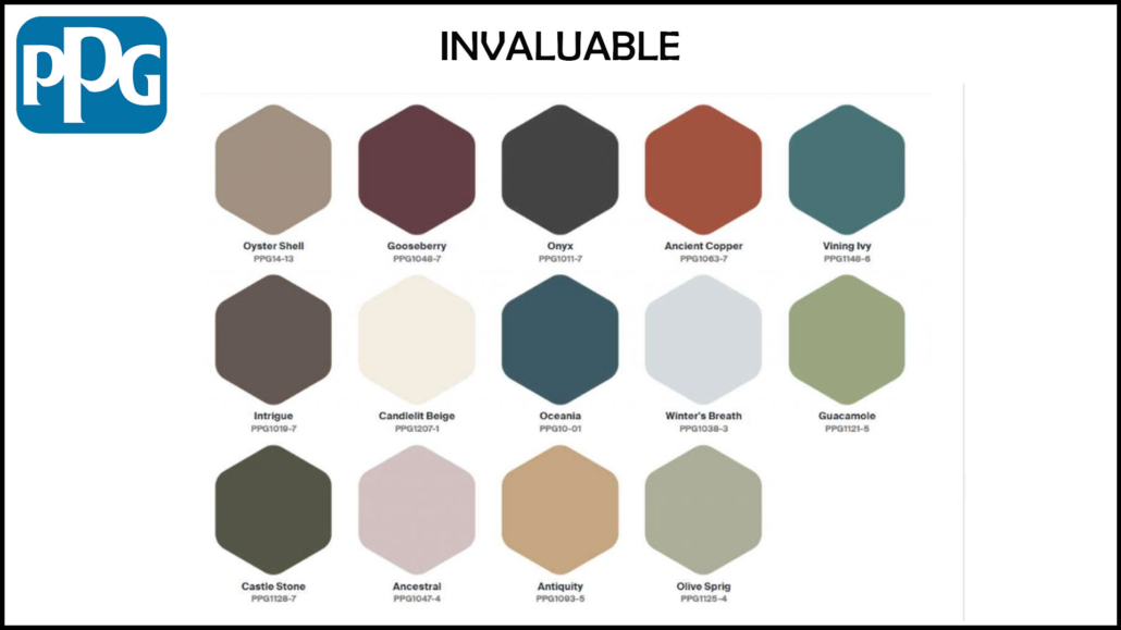
We can also find this color in one of the three color palettes proposed last year:
– Invaluable
Dark, refined hues, in short, an elegant color palette that winks at traditions!
(credit PPG)
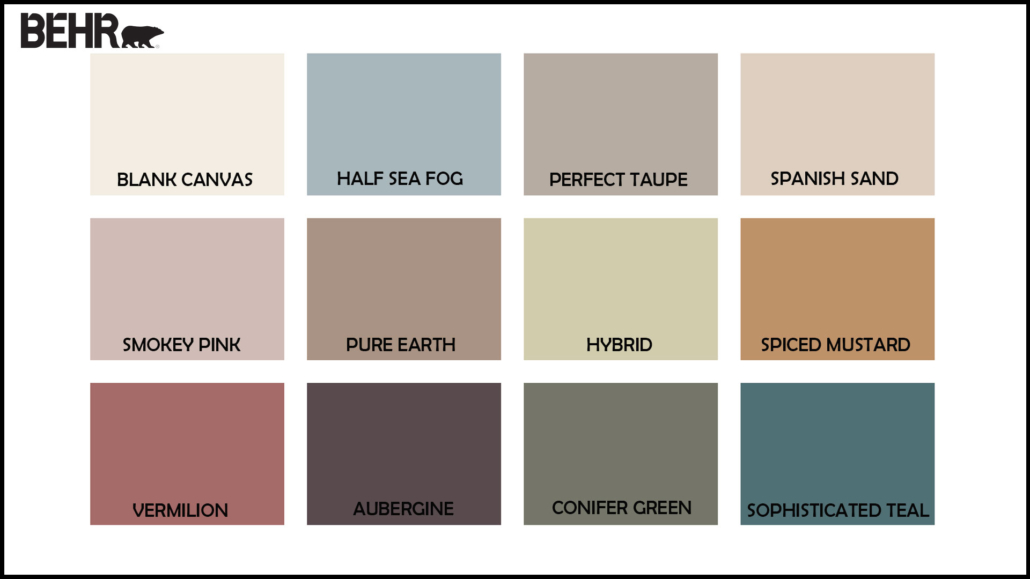
– BEHR: Blank canvas
The Behr brand chooses, as the color of the year 2023 Blank canvas, a warm, buttery, and enveloping white.
It is a calming and soothing color that you can use with all styles and in all rooms; you can use it alone, but it will be an excellent glue for many other colors.
It is less rigid and austere than pure white, it nevertheless retains its brightness, so it’s excellent on walls.
In an exclusive interview with AD, Erika Woelfel, vice president of color and creative services at Behr, described the shade as “that perfect artistic color to allow people to start expressing their creativity.”

(credit Behr)
Behr, too, offers a color palette that can be used in conjunction with the blank canvas.
They are all dusty colors, many of them echoing the colors of nature and the earth.
(credit Behr)
– SIKKENS: Wild wonder
Sikkens, too, draws on nature with its Wild wonder, a color that echoes that of wheat.
A warm, positive color that reconnects us precisely with nature, bringing calm and serenity.
That, too, is a color that goes with all styles and can be used in all rooms, from the furniture to the walls, for a definitely relaxing and bright environment.
(credit Sikkens)
This brand is no exception and creates no less than 4 palettes around its color of the year, all inspired by nature:
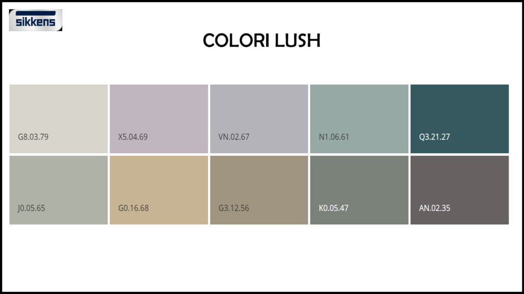
– Lush colors:
Resumes forest shades “help us make our homes feel part of the world”.
(credit Sikkens)
– Buzz colors:
echoes the bright colors of the meadow and flowering fields; they are shades that “give energy, harmony, and joy”
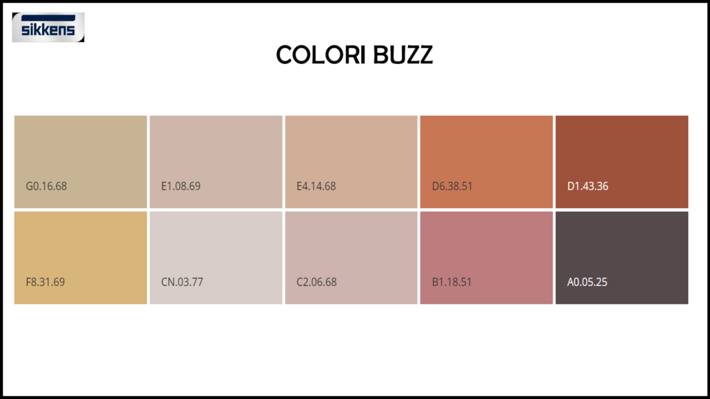
(credit Sikkens)
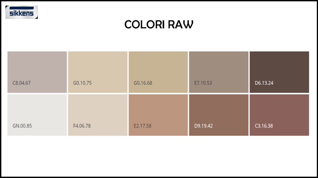
– Raw colors:
echoes the hues of the harvest, conveys “the wonder of nature’s products, and can give a sense of richness and creativity to the environment.”
(credit Sikkens)
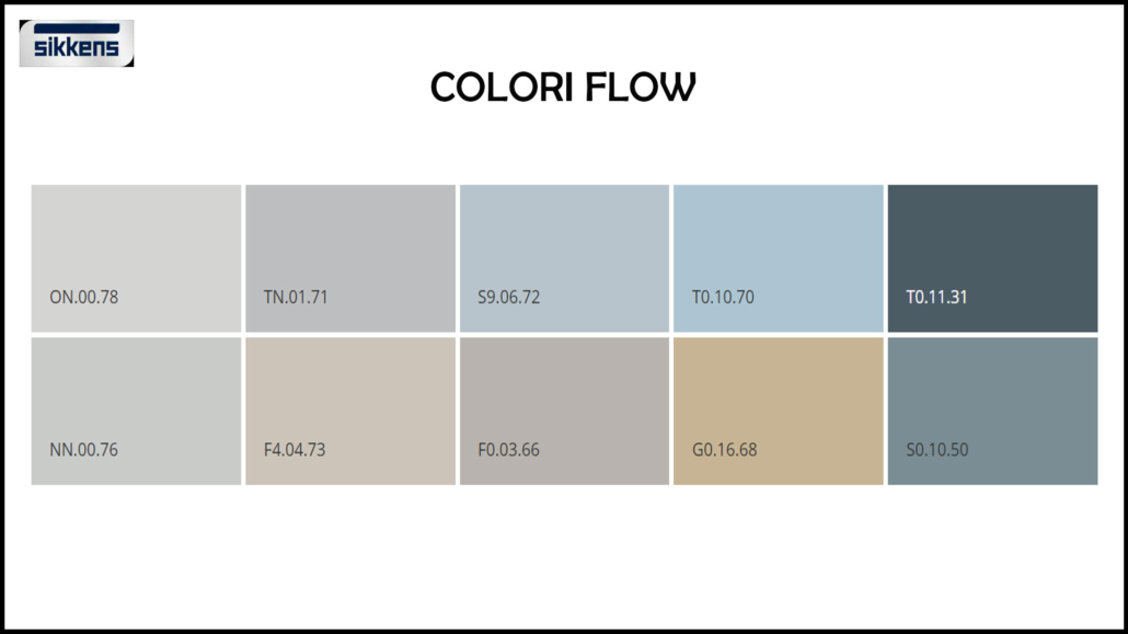
– Flow colors:
echoes the hues of the sea; they are delicate shades “capable of conveying a sense of balance in our hectic lives.”
(credit Sikkens)
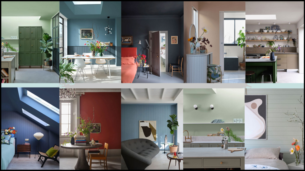
– FARROW & BALL:
As always, this brand offers more than one color each year: this year, as many as 11, all inspired by moments of joy, comfort, and refreshment.
Bamboozle is the somewhat bolder and more vibrant of these colors; the others are a bit more neutral.
All of them, however, including bamboozle, fit well with any style and can be used together to create an original palette that will give your home some character!
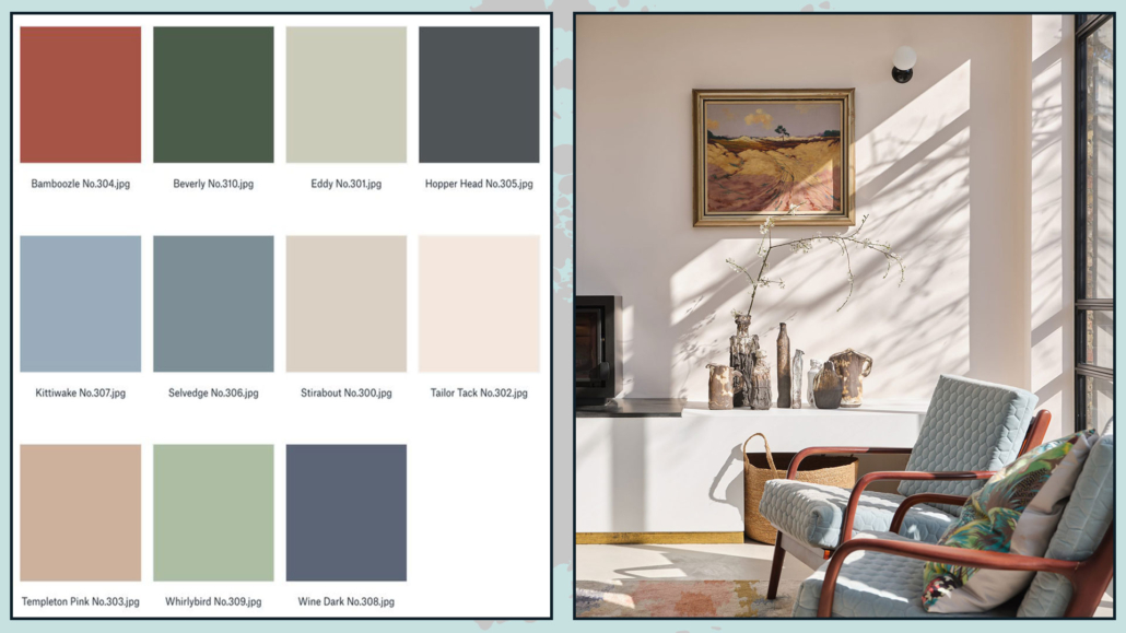
(credit Farrow & Ball)
(credit Farrow & Ball)
I hope this article was helpful and you love it; in case, let me know in the comments!
Feel free to share it with anyone you think might be interested, I will be honored, and it will help me get my name out there.
If you feel that your home, or some environment of it, does not reflect you enough, do not wait any longer and book your advice: just contact me!
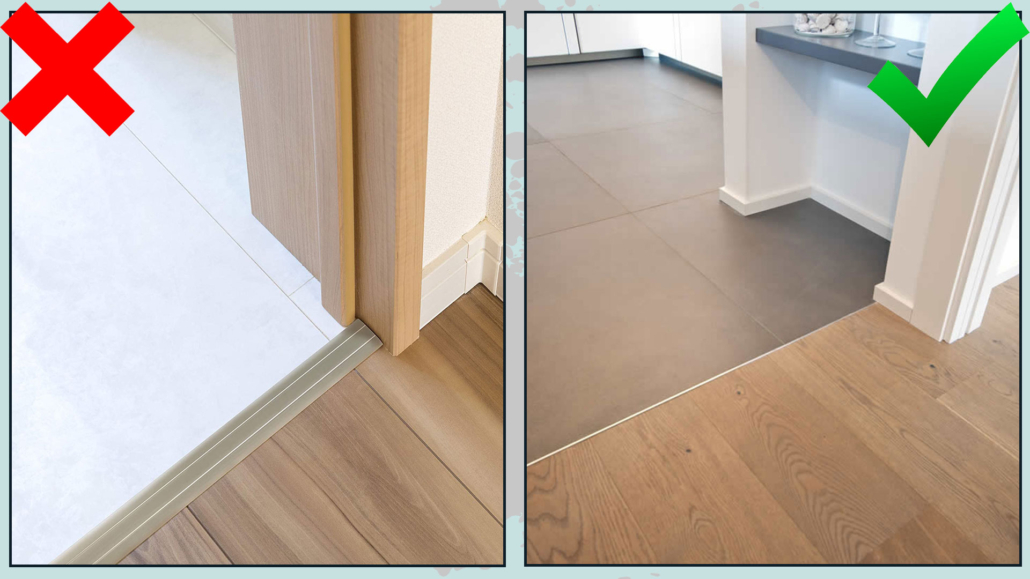
 3 – DIFFERENT AND CONTRASTING FLOORING