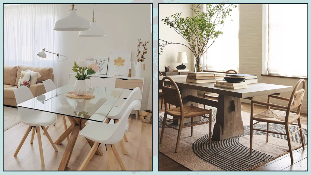
Who doesn’t love the idea of having a luxurious and sophisticated living room?
But is it necessary to spend crazy amounts of money to have such a living room?
No! It is not mandatory: some tips and tricks will help to achieve great results without having to “splurge”!
Let’s see them together
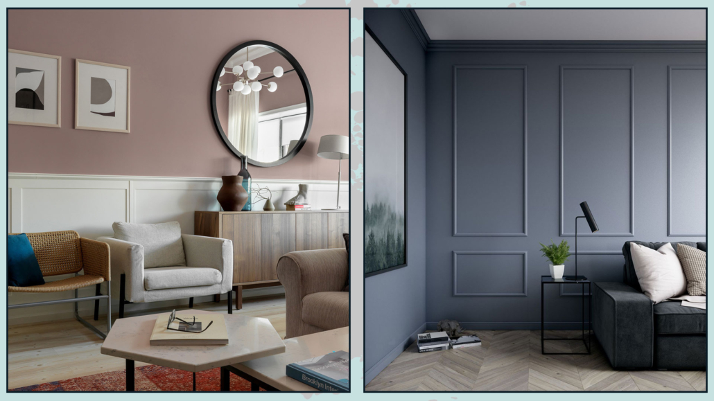
1 – COLORS: START FROM A NEUTRAL BASE
Luxurious environments, regardless of style, have in common that they use neutral colors, at least as a base.
Neutrals make spaces relaxing, elegant, and sophisticated, and because of their versatility, they match any style!
Use neutrals for walls, floors, and larger furnishings, then give them a pop of color with smaller furnishings and decorations!
I remember that when I talk about neutrals, I am not just talking about white, gray, and beige, but any color to which a lot of white (to get a light neutral) or a lot of black (for a dark neutral) is added.
Adding white or black to the color will allow color lovers to not give it up!
The neutrals thus obtained will lose their exciting component but will maintain the mood of that color that will still remain in the background.
If you want to learn more about neutral colors, I describe them in detail here!
(credits: rh.com; interiorbutikker.no)
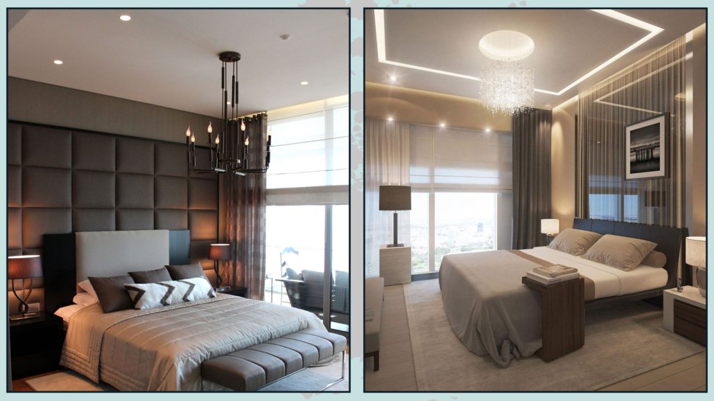
2 – BOISERIE AND MOLDINGS
Moldings on the walls help give some movement and depth to the room, especially when you have neutral-colored walls.
They also provide textures and warmth, make the room more “rich”, and create visual interest.
Simple and linear moldings go very well with modern or contemporary styles but also with the minimalist one.
The slightly more elaborate ones will go better with the classic style!
You can use low paneling, about a meter high, this has a high visual impact giving importance to the room, especially if colored differently from the wall.
If you make this paneling a little overhanging, you can use this shelf to put decorative objects or frames on it!
Alternatively, but also in addition, you can use full-wall moldings to create frames that will give a very stylish and sophisticated effect.
It is better, in this case, to keep the same color between the wall and the boiserie.
(credits: Sergey Krasyuk; leroymerlin.fr)
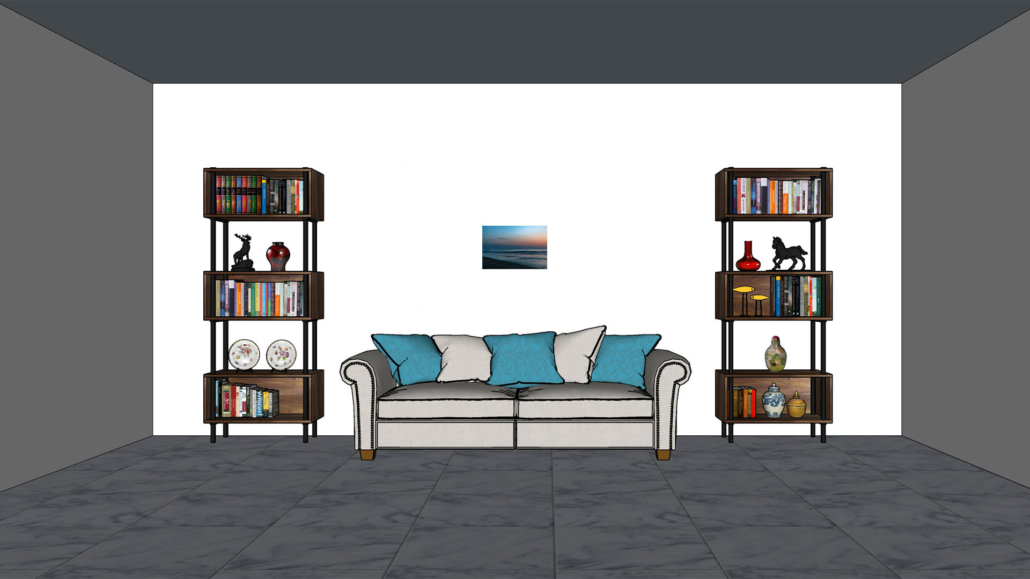
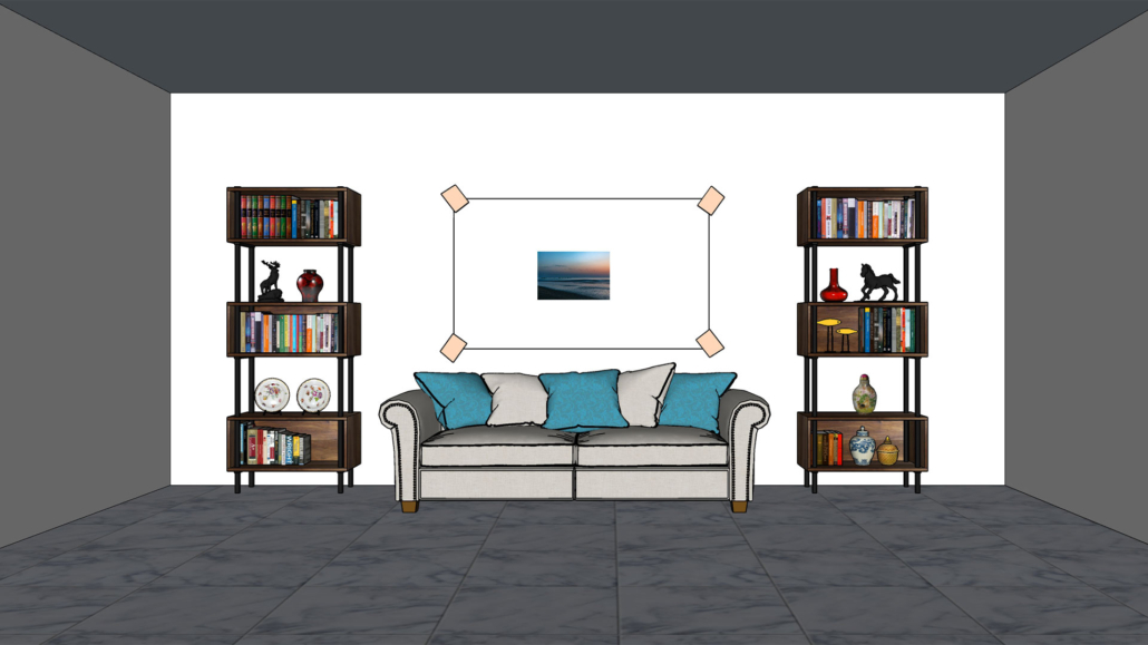
– CREATE A FOCAL POINT
The focal point is an essential element in interior design: it catches the eye by creating visual interest!
It is always relevant, but it becomes even more so when you want to make your environments sophisticated and luxurious!
In the living room, the focal point can be the sofa wall or, if well-designed, the TV wall!
For the lucky ones, of course, it could be a beautiful fireplace or a window with a stunning view.
It must be something that “dominates” the rest of the room and around which everything else revolves.
You can use a different wall color to make what is placed next to it stand out.
You could also use a particular wallpaper, a large mirror, or an important painting.
The focal point doesn’t need to be the wall; it could be the sofa itself or a piece of furniture perhaps of particular value (not necessarily economic value!)
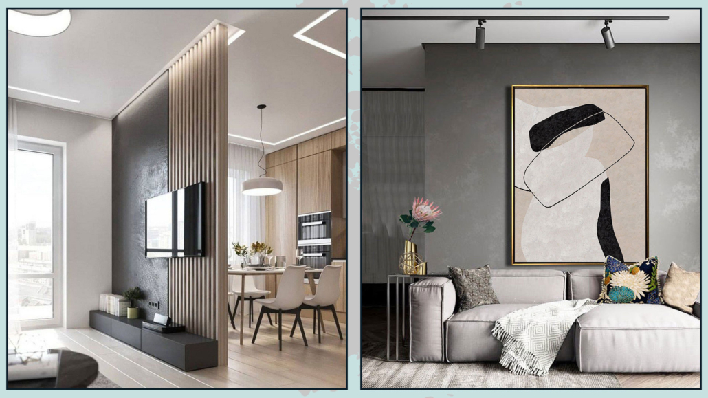
(credits: Shiri Ganesh Home Solutions; Etsy- ArttideArt)
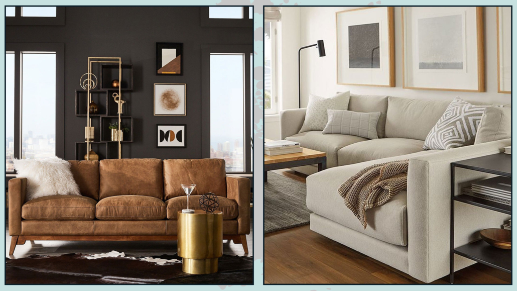
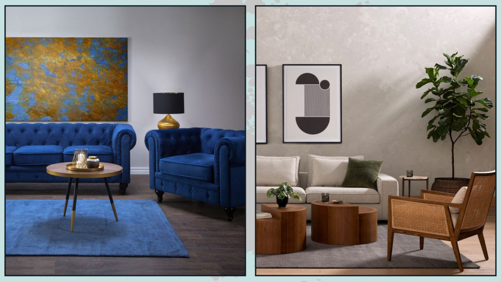
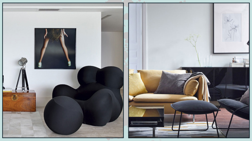
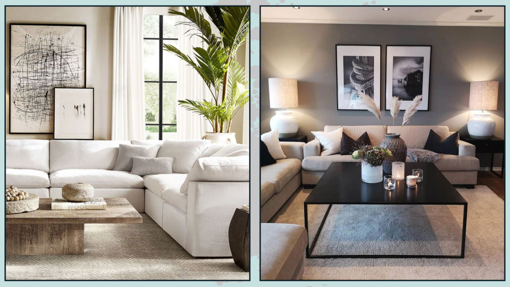
4 – CONTRASTING SEAT
Buying coordinated furniture, we have seen it before, is a “mistake” that people often make, for fear of making a wrong…
So people often buy the sofa-armchair set and, in fact, miss out on great opportunities.
For a more luxurious, sophisticated, and studied living room, it is a good thing to have one or two seats contrasting with the sofa.
Different shapes, textures, and colors will break the monotony and make the environment even more interesting, giving it character.
If the seat is totally different from the sofa, “justify” it by picking up the color in the covers of the decorative pillows: this will harmonize the whole thing!
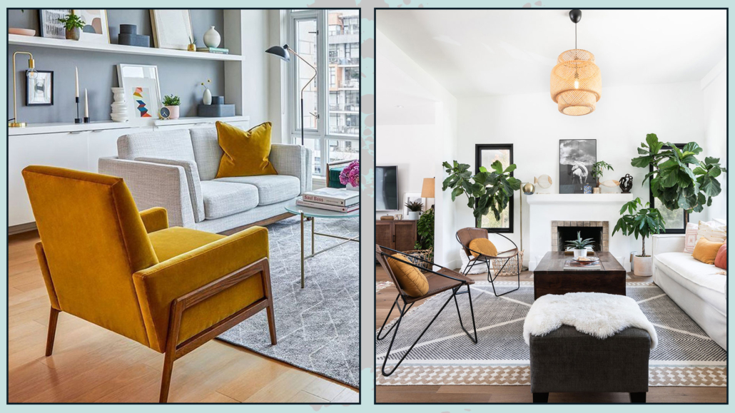
(credits: article.com; textureliving.com)
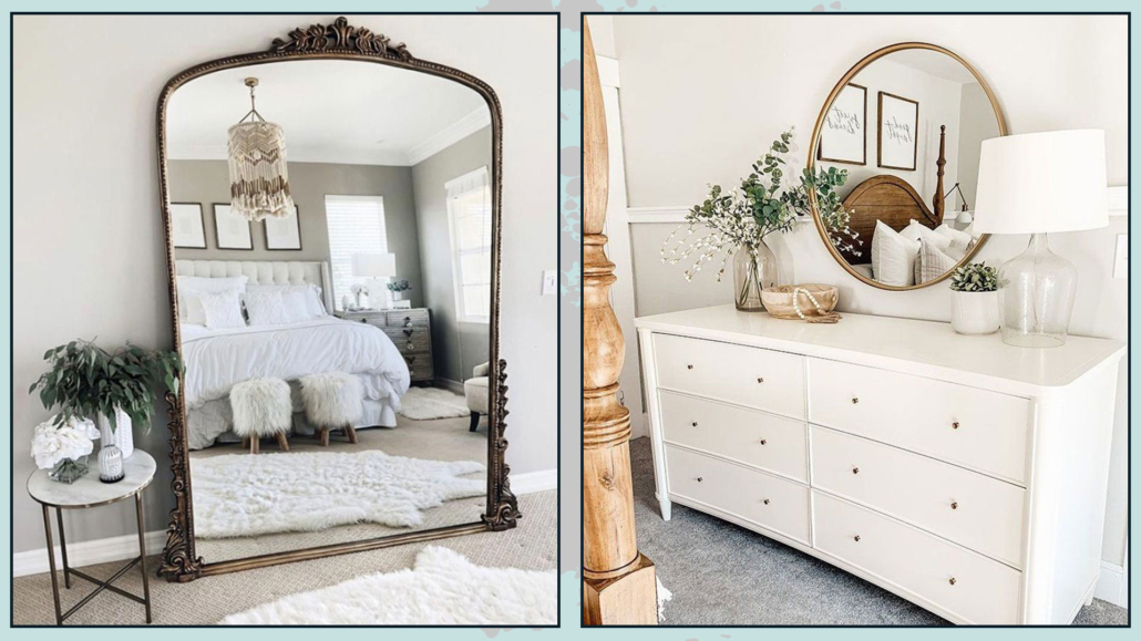
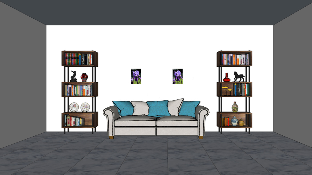
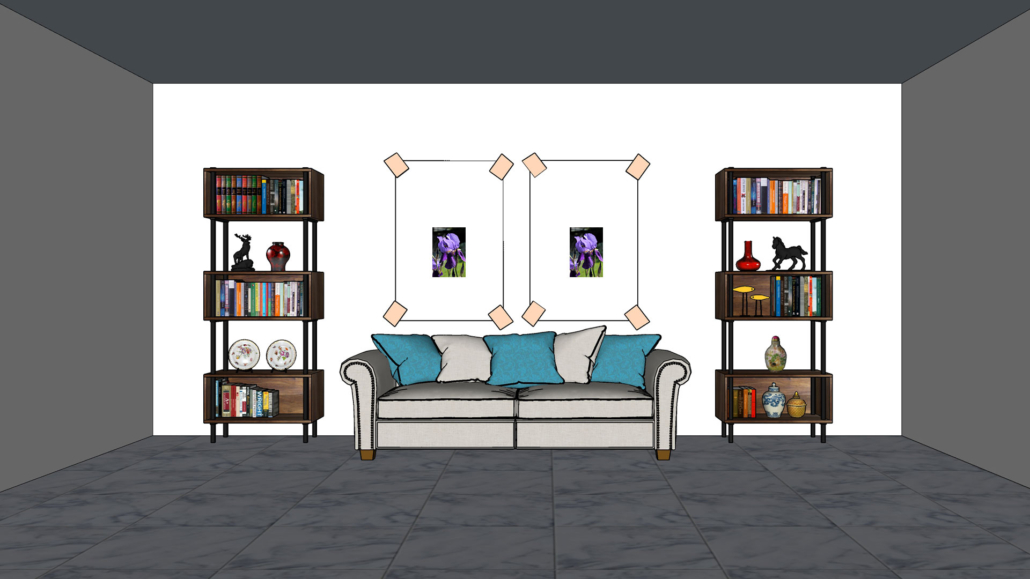
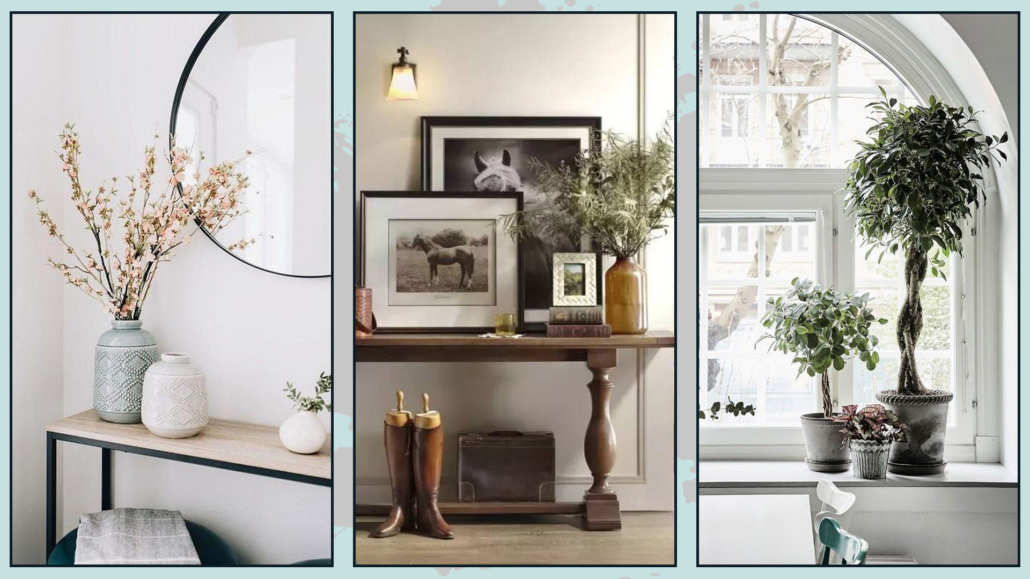
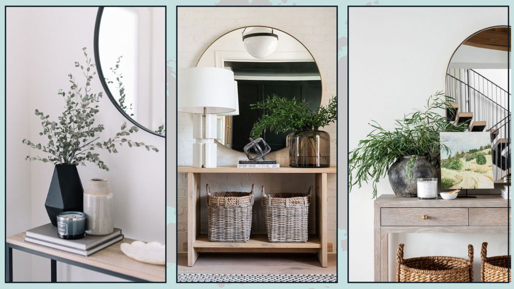
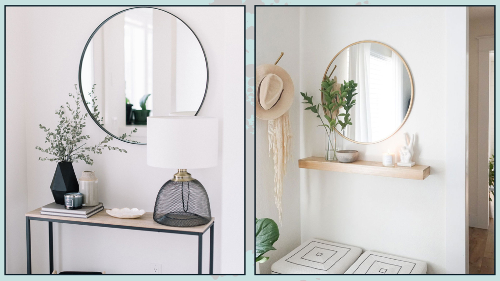
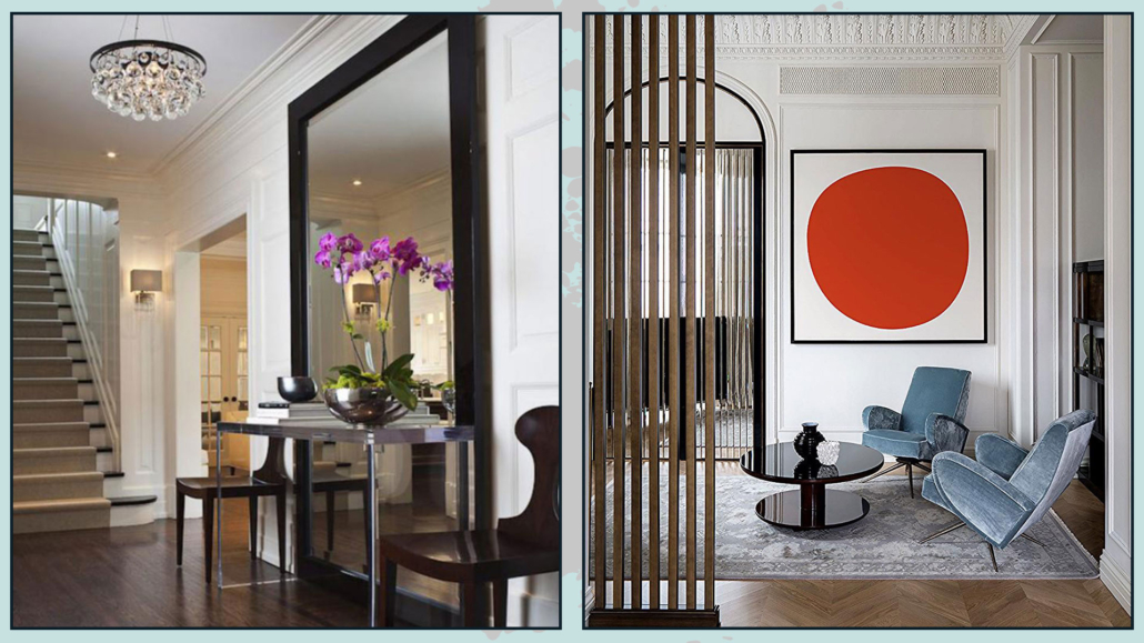
5 – MIRRORS (AND PICTURES)
Mirrors amplify space and natural light, making the environment more refined, elegant, and luxurious.
Ideally, put them near a window to amplify the light as much as possible; however, be careful what it reflects, that it is a tidy area, or you will duplicate the clutter!
Dare with even oversized mirrors resting on the floor: you’ll give an extra touch of character; by doing so, the mirror could become the focal point of the living room!
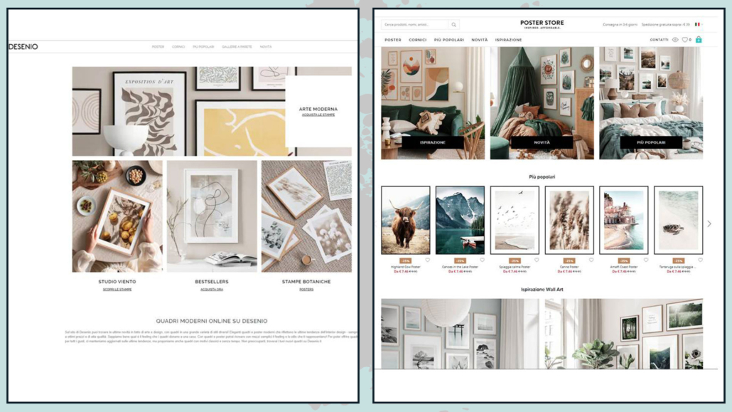
That also applies to paintings: compositions of several small-medium-sized paintings are all right, but if you want something to make the living room look more luxurious and sophisticated, then dare with large ones!
They have a higher visual impact and make the environment less stuffy, more linear, and clean!
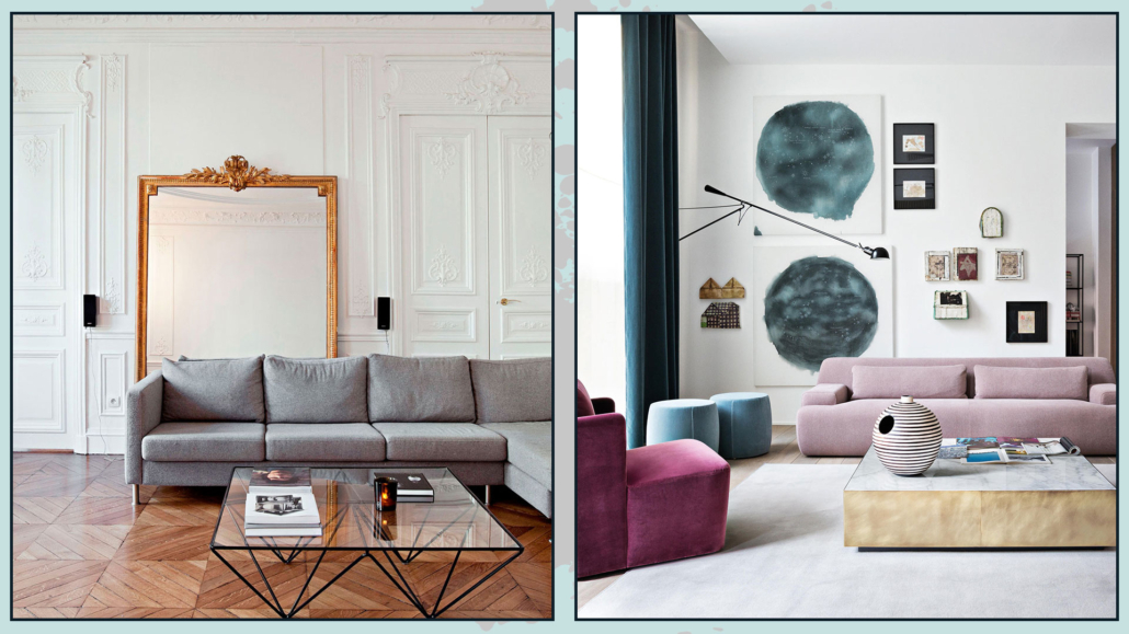
(credits: living-corriere; Meridiani living)
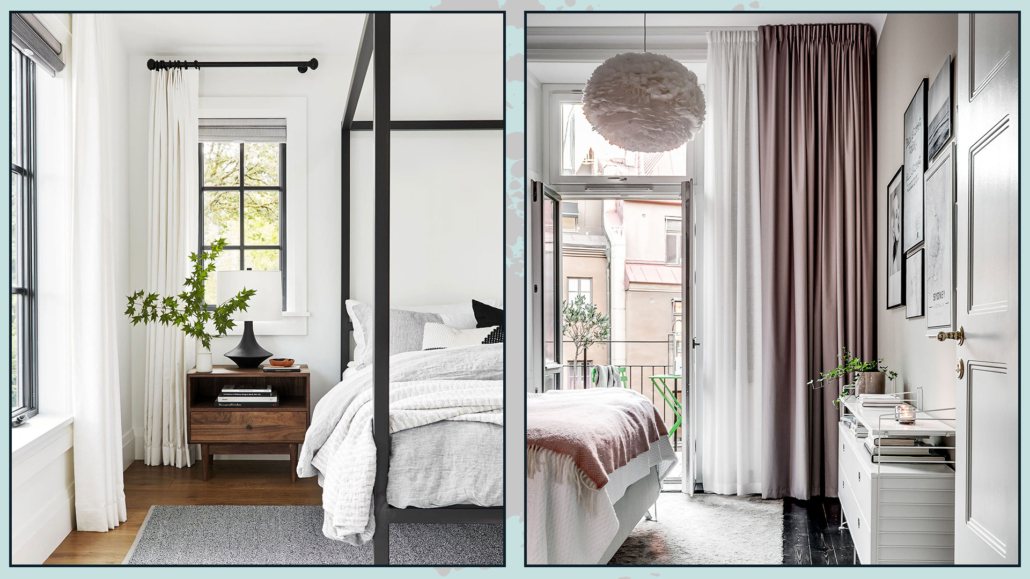
6 – CURTAINS
Curtains, in general, dress a home by bringing warmth, texture, and color.
They become significant when you want to add a touch of elegance and luxury to your living room.
They don’t have to be super expensive because it’s their scenic effect that changes the perception of the environment!
The best choice, in this case, is drapery curtains, perhaps a double curtain, with a filter curtain and a blackout curtain always open at the sides.
The double curtain brings a bit of contrast and color, making the living room even more elegant and luxurious.
For a perfect result, the rod should be as close to the ceiling as possible to enhance the heights and give more breathing space to the window.
When ceilings are really very high, the rod should still be placed at least 15-20 cm above the window.
It is also important that the stick is wider than the window by at least 10 cm on each side so that the curtain, when open, does not block the passage of light.
The curtain then can rest lightly on the ground or barely touch it; short curtains shrink the room and look “unfinished”!
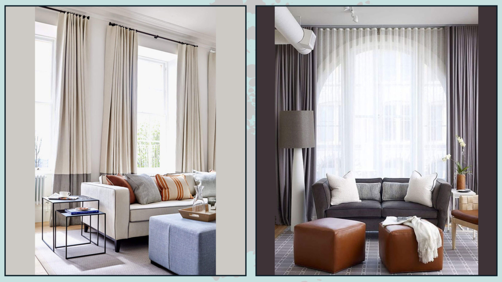
(credits: pinimg.com; Tom Stringer)
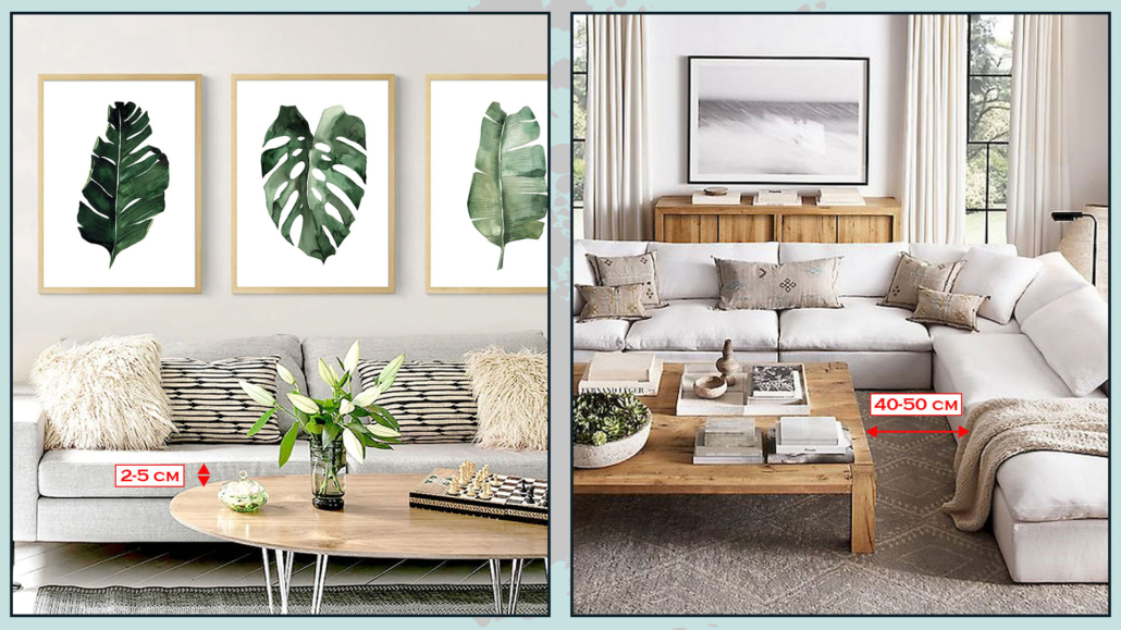
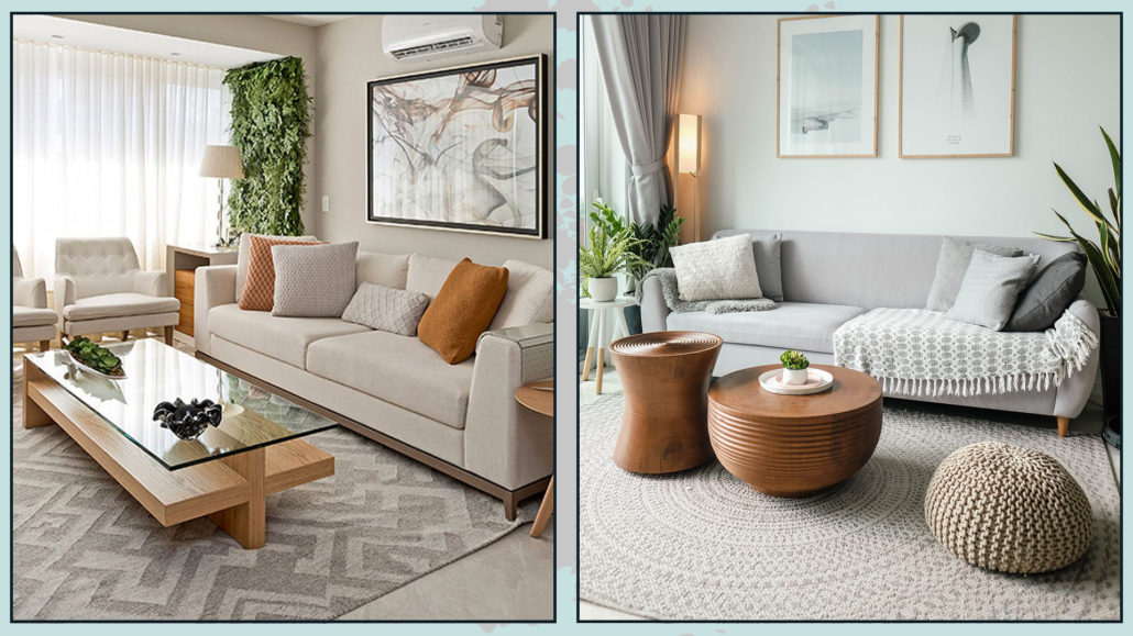
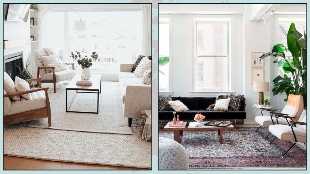
7 – RUGS
I know this point is controversial because many people do not like rugs, yet, in the living room, it is an essential element to make it elegant and sophisticated.
The rug brings warmth and texture, but most importantly, it ties the elements together!
A large rug that encloses the sofa, seats, and coffee and side tables will create a conversation area, a more intimate and welcoming environment.
I’m talking about rugs here!
(credits: theblushhome.com; @homepolish)
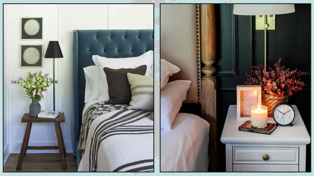
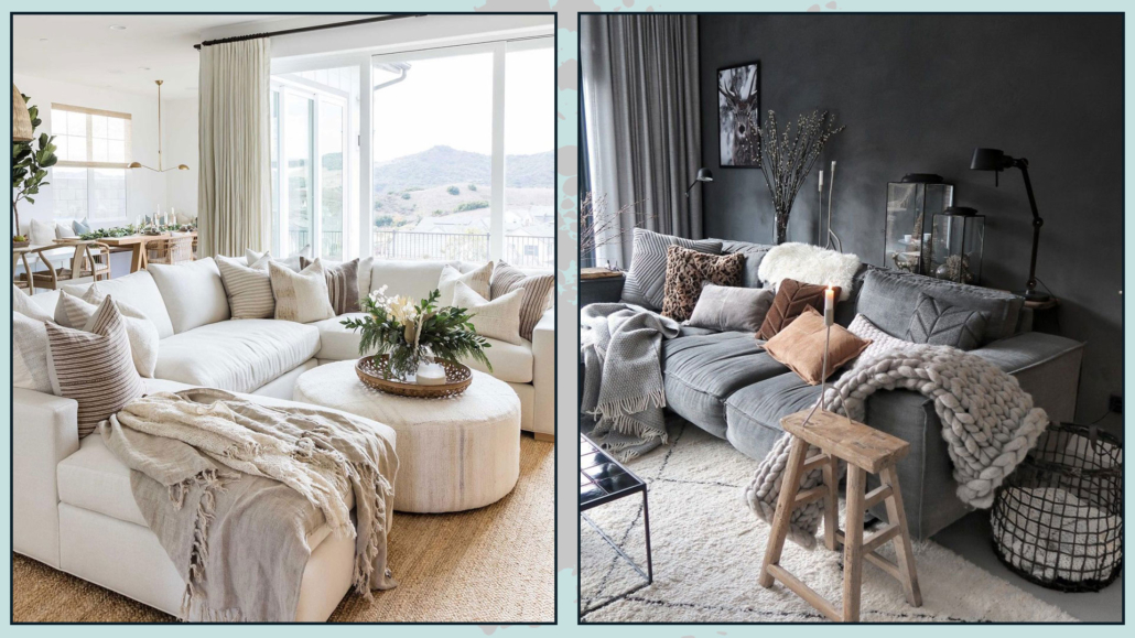
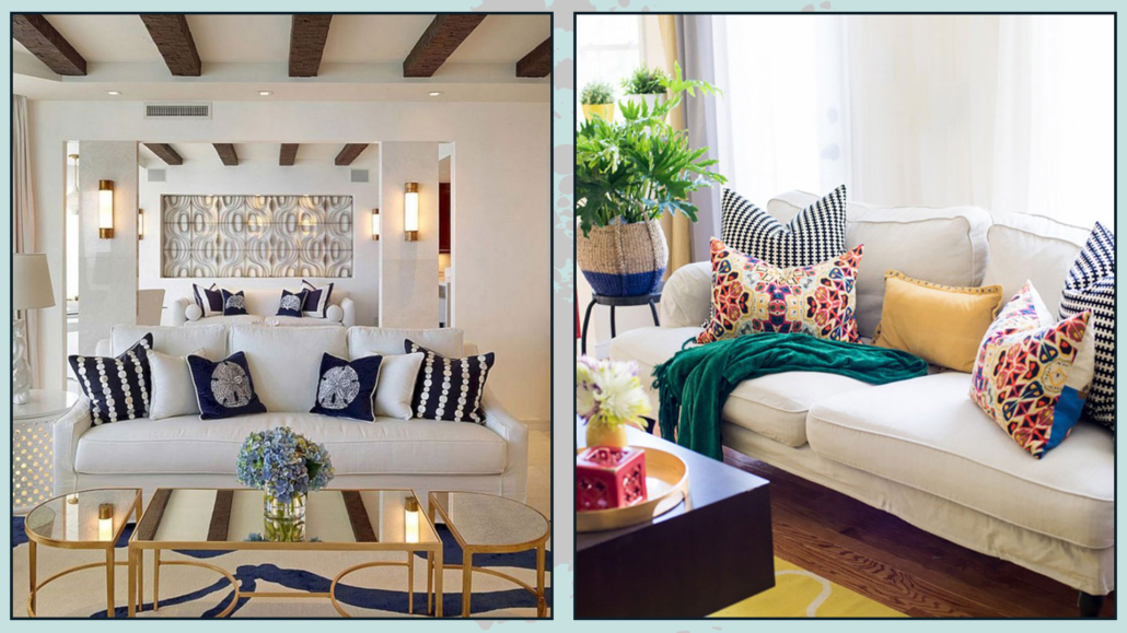
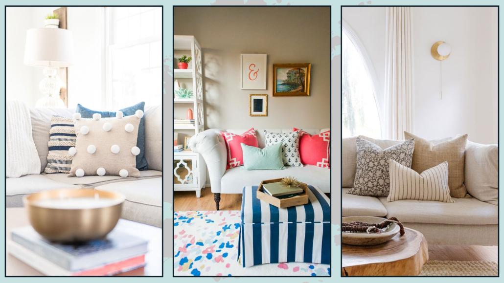
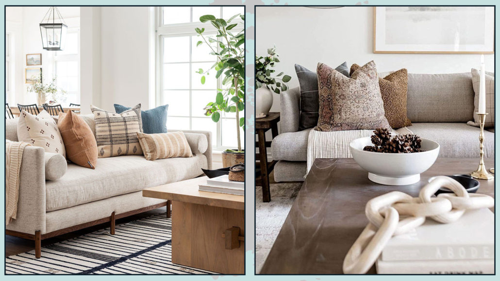
8 – PILLOWS
Dressing the sofa with some decorative pillow (and maybe a blanket) is extraordinary for a luxurious living room!
The pillows, such as the curtains and the rug, bring texture and color, and this creates rhythm and contrast.
It is important to alternate between large patterns, solid colors, smaller patterns, and even geometric designs (I’m talking about how to mix patterns here).
Also, use different textures by alternating smoother fabrics with rougher and more worked ones; this tip will make the sofa look more sophisticated and elegant.
A little trick for pretty puffy pillows: get the inside of a material that can be easily “molded” like down and then always take it a little larger than the lining (example: 45×45 pillow with 40×40 lining).
(credits: studio mcgee; french.alibaba.com)
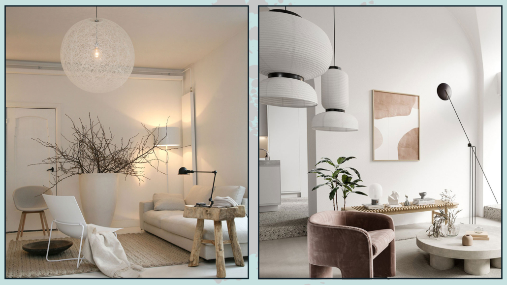
9 – LIGHTS
Artificial lighting will play a significant role in the final result!
First of all, there must be good general light for visual comfort, but ambient and task lights (perhaps near the sofa for reading) should still be added to the general one.
Having multiple types of light helps create contrast and depth.
Where possible, use dimmable lights to manage the intensity of the light as needed!
Then, in choosing lights, be daring, as with mirrors and pictures: get large, distinctive chandeliers or floor lamps that immediately grab attention!
(credits: nomadbubbles.com; Bronxes Studio)
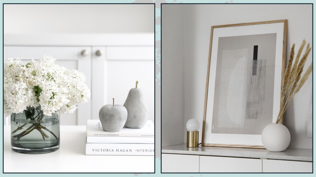
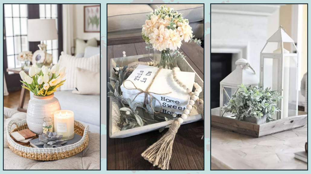
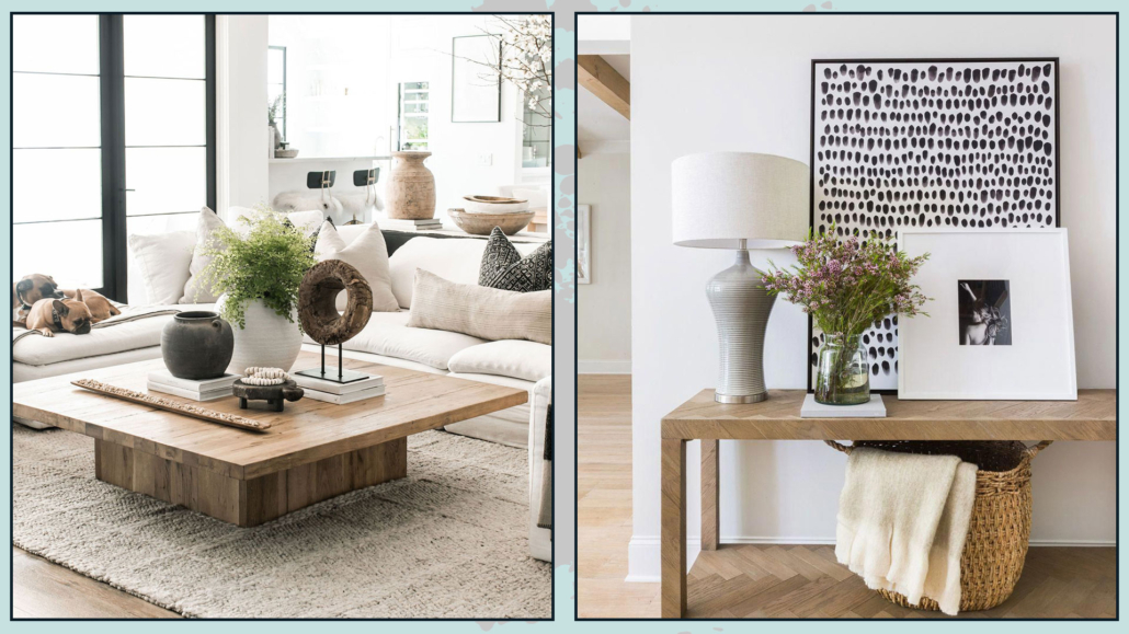
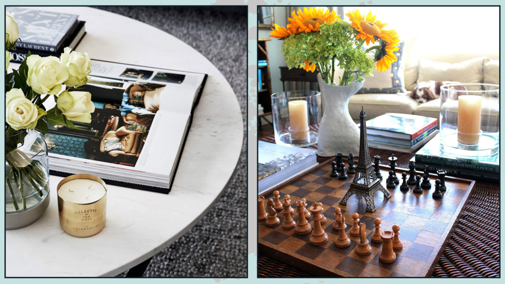
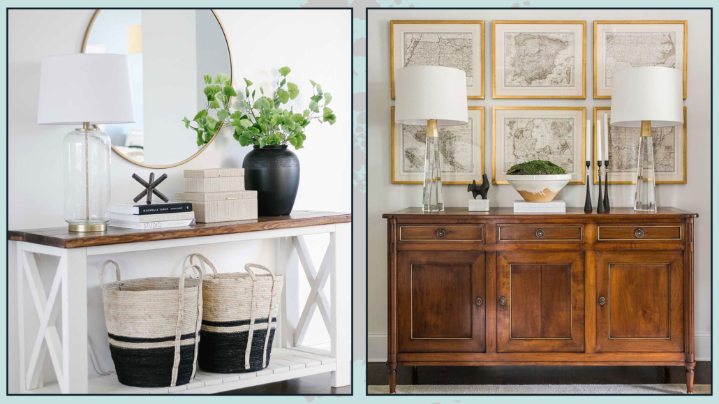
10 – SEARCH FOR PARTICULAR ITEMS
When looking for decorative accessories, avoid ordinary objects; instead, search for unique and out-of-the-ordinary items.
For example, look for vases and candle holders with unusual shapes and finishes.
Buy also trays and create inside your compositions: giving it a sort of border, you will set it more importance.
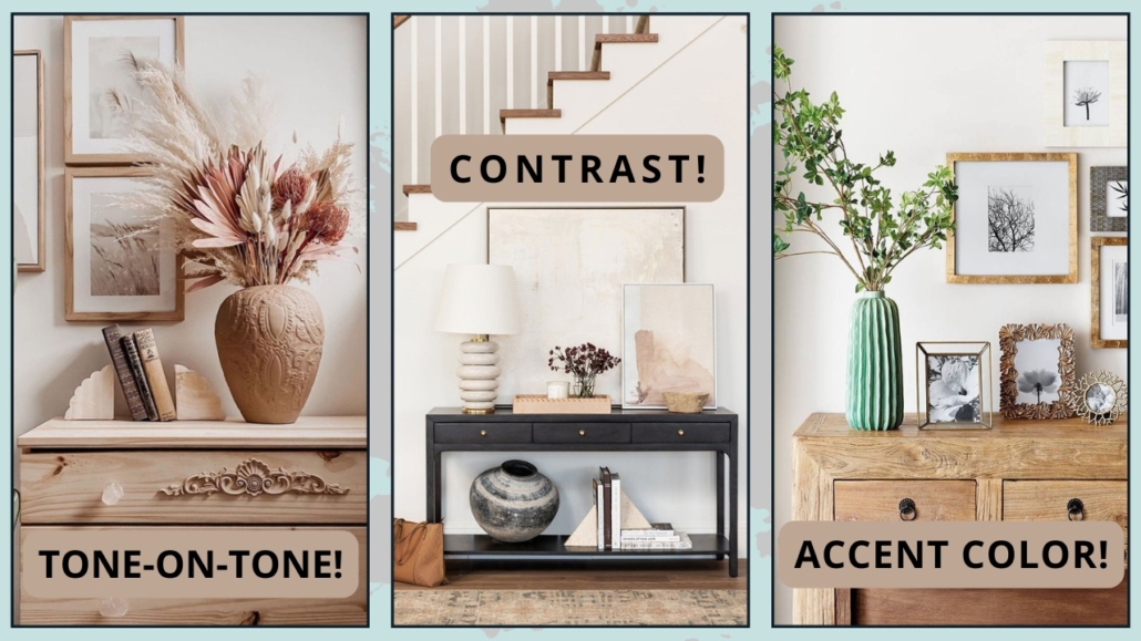
Remember to create compositions with an odd number of objects, which have different heights and sizes, and distinct colors and finishes.
Another trick that gives a touch of sophistication and luxury is to use, here and there, the principle of symmetry; for example, on the sideboard, you could put two equal lamps on the sides and a beautiful central painting.
It is not to be done constantly and at all costs: on the contrary, it would become boring, but the principle of symmetry immediately gives the impression of something sophisticated!
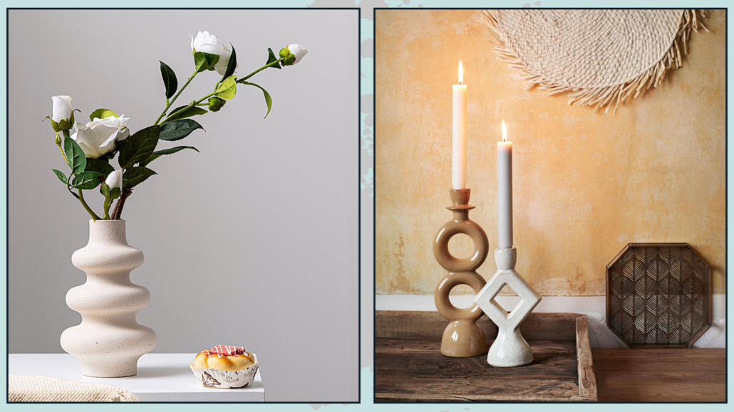
(credits: etsy.com; east.co.uk)
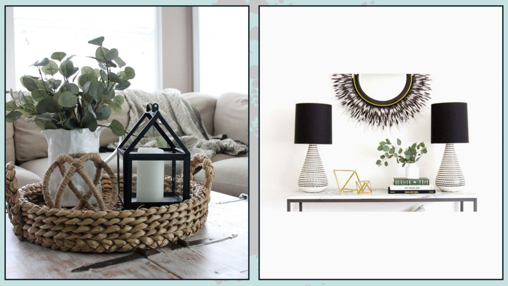
(credits:pinimg.com;sarahshermansamuel.com)
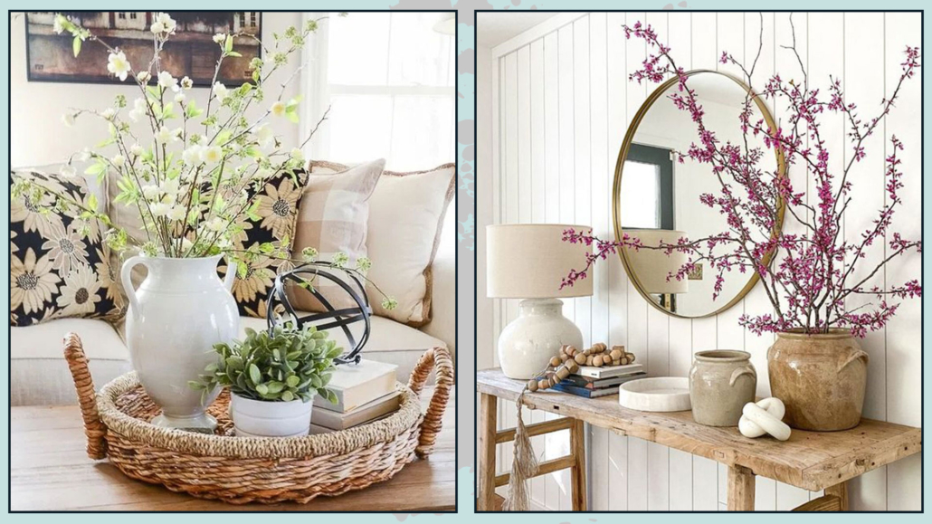
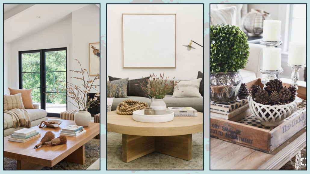
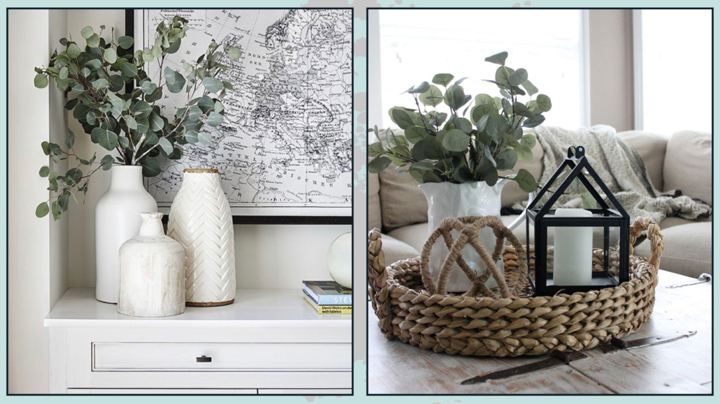
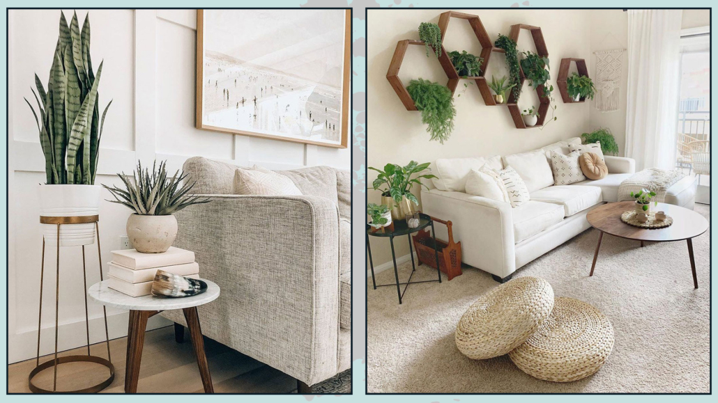
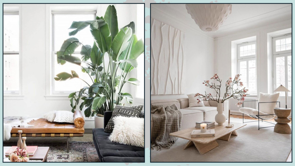
11 – PLANTS, FLOWERS, BRANCHES, AND ESSENCES
Plants bring a touch of nature into the house, and this is really very important; they also purify the air and elevate the perception of the environment!
They immediately give that touch of elegance and sophistication!
Fresh flowers are also great, but for a more low-cost elegant effect, you can also decorate with branches!
Even these bring movement and freshness with simplicity!
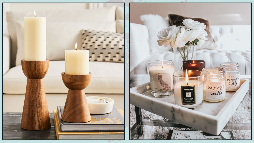
The perception of spaces is not only visual but also concerns what we feel with touch and smell.
The scents of fresh flowers immediately elevate the perception of the environment, but of course, you can also help yourself with candles and diffusers.
Perfumes do not have to be aggressive, it goes without saying, but adding them in the living room will immediately make it more refined and luxurious.
(credits: @homepolish; tileclub.com)
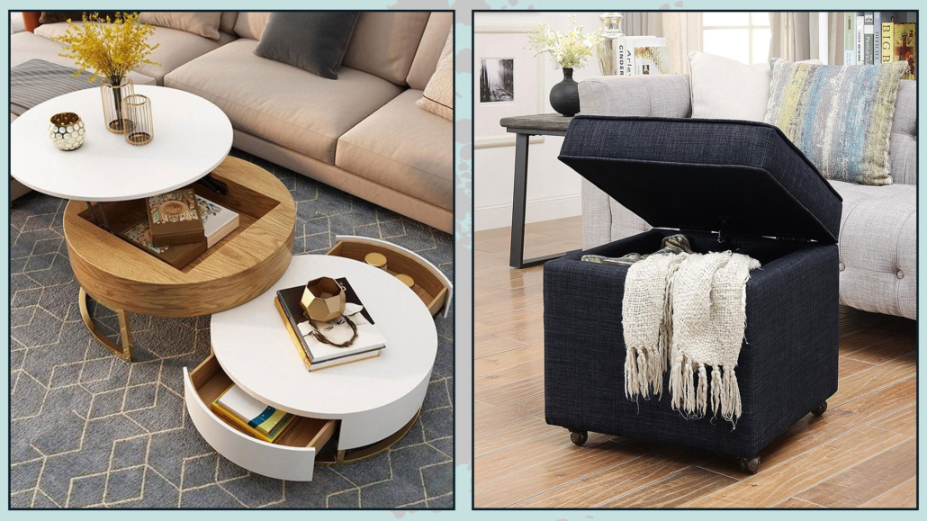
12 – ORDER!
It seems obvious, but clutter is the exact opposite of luxury, even the visual one: a living room too full of things is not good.
We need to embrace a little more of the rules of minimalism, including “less is more”!
Then use storage furnishing to store things that are too much!
Poufs, coffee tables, benches, or baskets are excellent allies for this purpose.
(credits: coffeetableonline.com; wallmart.ca)
I hope this article was helpful and you loved it; in case, let me know in the comments!
Feel free to share it with anyone you think might be interested, I will be honored, and it will help me get my name out there.