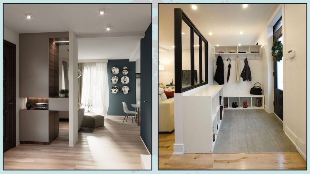
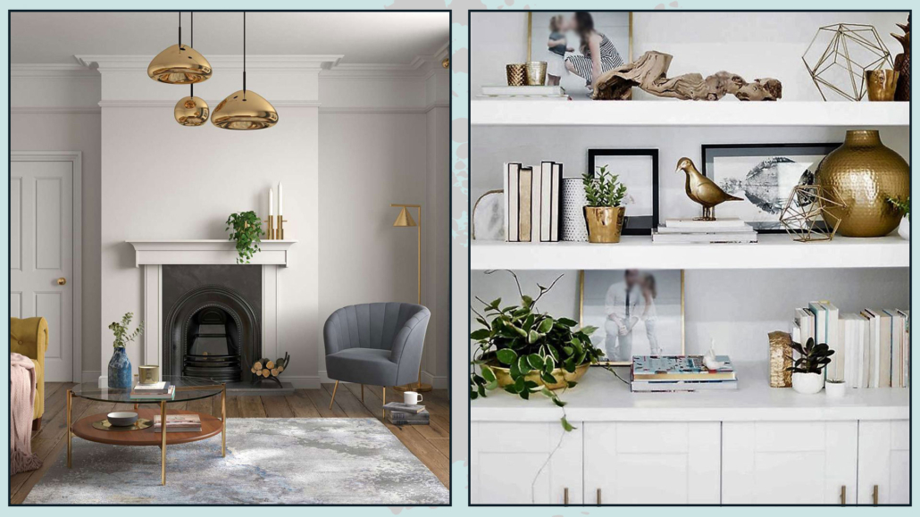
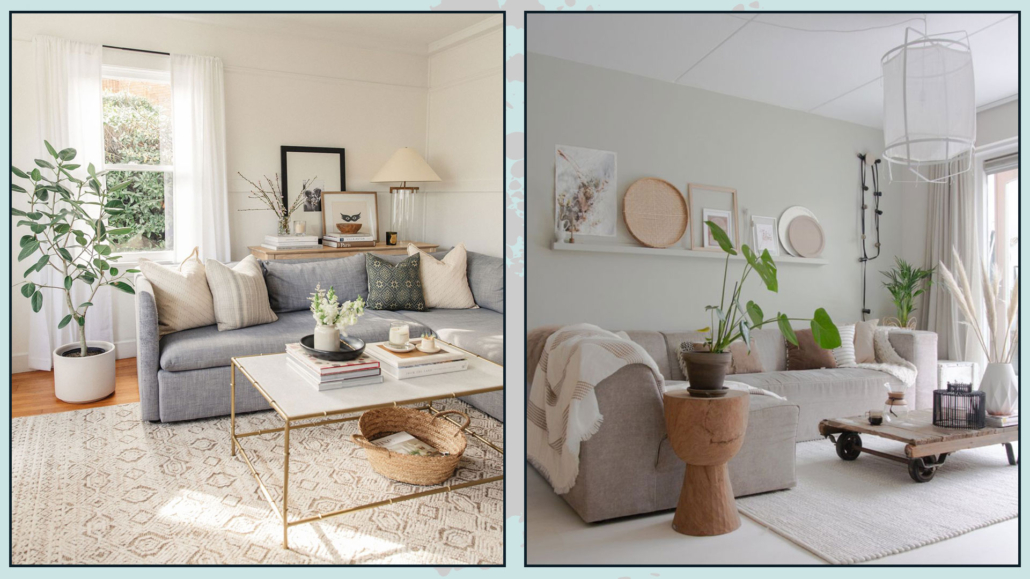
Today I would like to talk about designing the perfect bedroom so that it is a super inviting, relaxing, and beautiful room!

The bedroom is the most intimate and personal room, and it is often the one we care for the least because “only I see it anyway”!

Actually, it should be the one we pay the most attention to because it is the one where we drop all our defenses when we go to sleep, so it is the one that should make us feel the best of all!

So let’s look at some suggestions to make the perfect bedroom for you!

– USE THE RIGHT COLORS

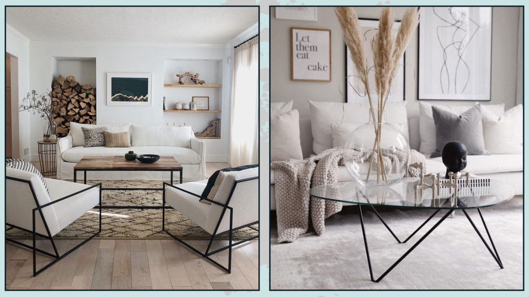
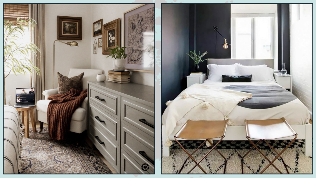
Use soothing and cozy colors, colors that can make you feel good.

Recommended colors for the bedroom are shades of green, beige, and light blues, but really any color that you feel is yours will do!

The only caution will be not to use too vivid colors, except as an accent, but try to make it more neutral by adding white if you want light colors or black or gray if you want darker colors.

Doing this will allow you to have your favorite color, making it softer.

As you noticed, I mentioned not only light colors but also dark colors; this is because dark colors make the room more intimate, and therefore, it could really be a good idea for the bedroom!

(credits: lillytaylorinteriors; Pella Hedeby)

– CUSTOMIZE THE BED WALL

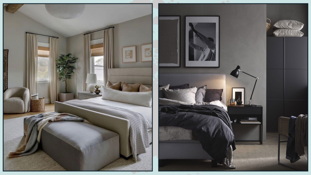
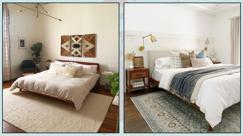
In most cases, the bed wall is the focal point of the room, so make it significant for you!

It could be a simple painting that has a special meaning or excites you, or a photo gallery or the display of particular objects; there is no rule: the important thing is that it draws you in and excites you!

Here are some ideas on how to decorate a bed wall.

(credits: bobbyberk.com; Bria Hammel Interiors)

– CHOOSE THE RIGHT BED

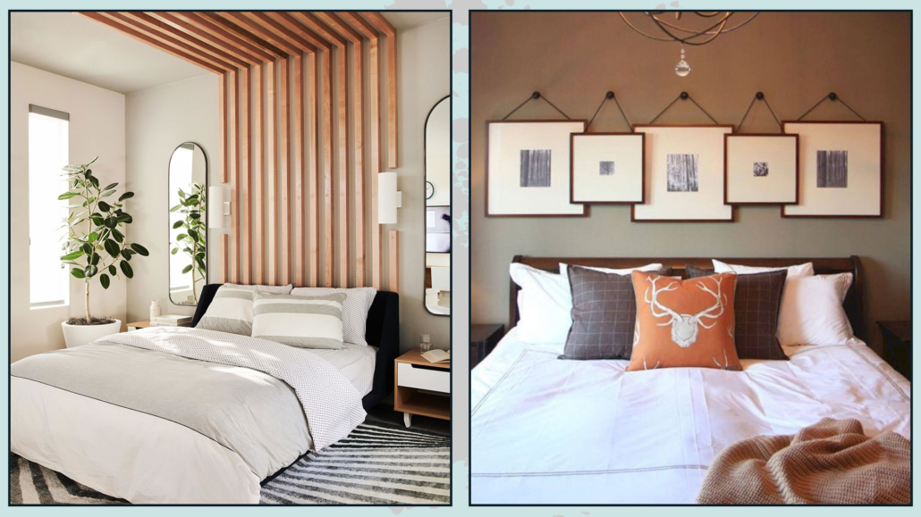
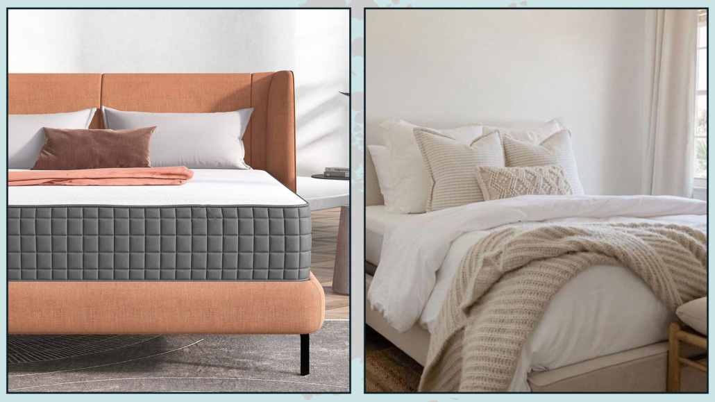
By the right bed, I don’t mean so much the aesthetic part, which certainly has its importance, as much as the bed base and mattress so that you can have a good sleep!

These are two items, especially the mattress, that you really cannot go cheap on!

It is absolutely essential to get the right products that will allow you to get the best rest because only then will you be fresh and relaxed to face the coming day!

The bed frame is an extra, which will undoubtedly be important aesthetically but not functionally.

You might even decide to have only one particular headboard, maybe only designed on the wall on the wall!

(Here you can find some ideas for the bed headboard!)

(credits: amazingbargains.com; @CarleysWorld)

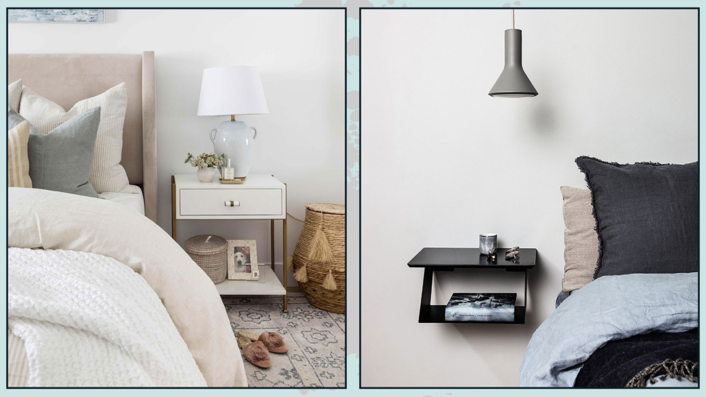
– I RECOMMEND THE NIGHTSTANDS!!!

No matter how small the bedroom is, it is really paramount to have something to serve as a countertop next to the bed!

That is for being able to rest the necessities, from an alarm clock to a book or even the phone (although that would be better not to have it near at night)!

If you don’t like classic nightstands, you can use a chair or place a super simple shelf, but it’s really mandatory to have something!

It will also be relevant to pay attention to the height of this tabletop for easy use, which should be at mattress height.

When this is not possible, it should be a little higher, but a maximum of 10cm!

(credits: shoppe.puresaltinteriors.com; royaldesign.se)

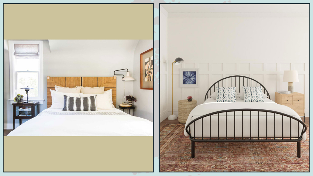
– DON’T PURSUE SYMMETRY AT ALL COSTS!

When choosing nightstands, you don’t have to feel compelled to buy them the same, perhaps coordinating with the bed and closet.

This choice is often made because symmetry is thought to be visually more beautiful in the bedroom!

Well, NO, it is not mandatory; an asymmetry, on the contrary, if well balanced, could make everything much more interesting!

Also, if there are two of you, you likely have different tastes and, above all, different needs, so one type of nightstand may suit one but not the other!

So don’t worry if there are two different nightstands in terms of shape: the important thing will be that they can perhaps have a commonality like color or material!

If then the two nightstands were also very different as visual weights, you could balance them with lamps, pictures, or, why not, a plant!

(credits: stylebyemilyhenderson.com; modsy.com)

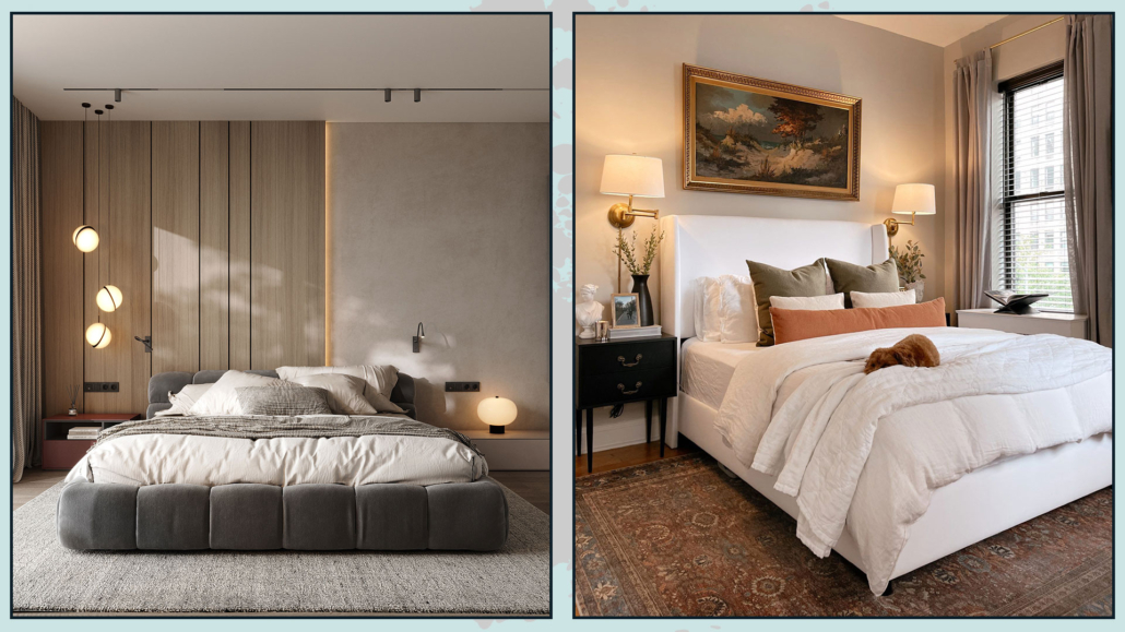
– ABATJOUR

While having multiple lighting points is always very important, in the bedroom even more so: it is essential to have a light near the bed.

It can be a table lamp to rest on the nightstand, a sconce light, or even (and we increasingly see more and more of these) pendant lights.

Some renovation work obviously needs to be done for the latter, but they have a spectacular effect that is truly amazing!

Wall lamps might be more functional where the bedside table top is cramped to avoid “stealing” practicable space for something else!

Another crucial thing in designing the perfect bedroom is the color temperature of the bulbs!

In the bedroom, it is preferable to use warm lights because they remind our brain of the color of the sunset, and this puts us in a position to relax and then sleep better.

(credits: behance.net; target.com)

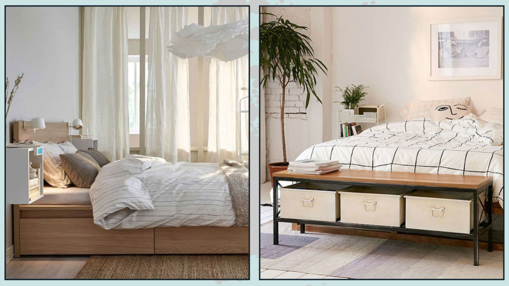
– THINK ABOUT CONTAINING

It may sound silly to you because you definitely have a closet, but it’s essential that the bedroom is really uncluttered!

That is because the disorder creates unconscious discomfort that can also disrupt sleep.

So think about having more storage elements: in addition to the possible dresser, it can be the bed with a box or drawers, but it can also be boxes to put under the bed.

It could be a bench at the foot of the bed or even a simple ottoman.

(credits: Ikea; urbanoutfitters.com)

– ADD A SITTING

The bed should only be used for sleeping, so here, to make the room functional, it is relevant to add extra seating.

That can be useful for sitting down when you need to put on socks or shoes or to lay down a dress without precisely touching the bed!

Moreover, as seen in the previous point, the seat could be a container, thus also becoming a multifunctional element!

Not only that, it brings shapes and textures, and this gives some rhythm and movement to the room.

(credits: Pretty-Honeydew;  Homepolish)

– USE THE RUG

The rug, as always, is a controversial element: if you think about it for the living room, it is much more difficult for this to happen in the bedroom!

And I’m not talking about the bedside rugs, which, let’s face it, are kind of sad!

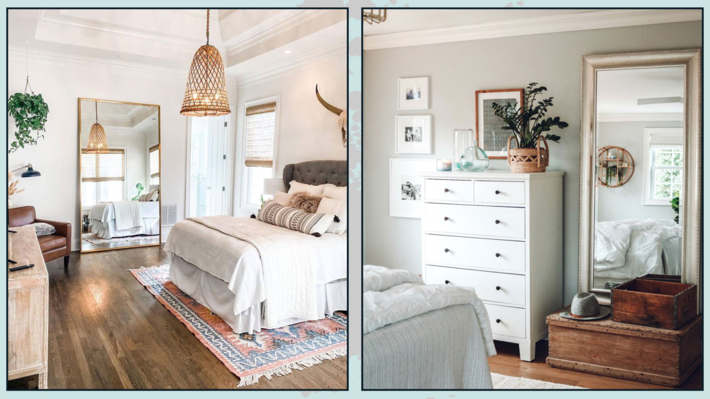
I’m talking about a nice big rug to accommodate the bed, nightstands, and possible bench at the foot of the bed!

That will create an even more intimate sleeping area, but more importantly, it will be functional to avoid resting your feet on the cold floor!

And, again, it will contribute textures and colors, making the room more inviting!

(credits: Kristin DuFour; hartleyhomedesign.com)

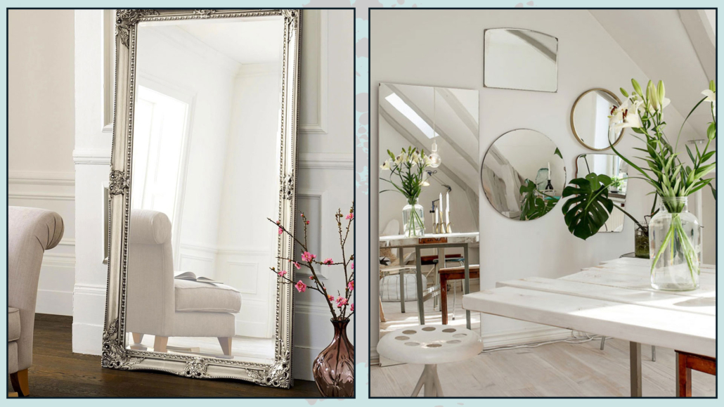
– DON’T FORGET THE MIRROR.

The bedroom is the place, 99 out of 100, where you dress and get ready for the day, so it is paramount to have a mirror where you can check that you are in order!

Personally, I really love the mirror resting on the floor, but the important thing is that it is a long mirror in which you can see yourself entirely!

The mirror also doubles the light giving more breadth to the room!

(credits: ideasdonuts.com; nestingwithgrace.com)

– CHOOSE THE SHEETS WELL

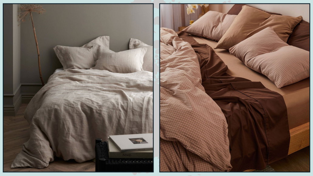
Like with the mattress and the bed base, it is important to feel “welcomed” by the bed sheets too!

As with room colors in general, I would advise against colors or patterns that are too strong because they excite and do not help sleep.

Choosing quality bedding that makes you feel a little snuggled and pampered will also be essential!

Therefore, choose good quality cotton or linen.

Of course, there are also satin and silk, and for them, allow me a very small digression: they are great for skin and hair care!

A satin or silk pillowcase will leave your facial skin brighter and the same for your hair by drastically avoiding knots, and for us curly-haired people, for example, it’s a boon!

Having closed this short aesthetic digression, having soft and snug sheets will surely help you sleep better!

(credits: ellos.se; sheetsociety.com)

– DRESS THE BED

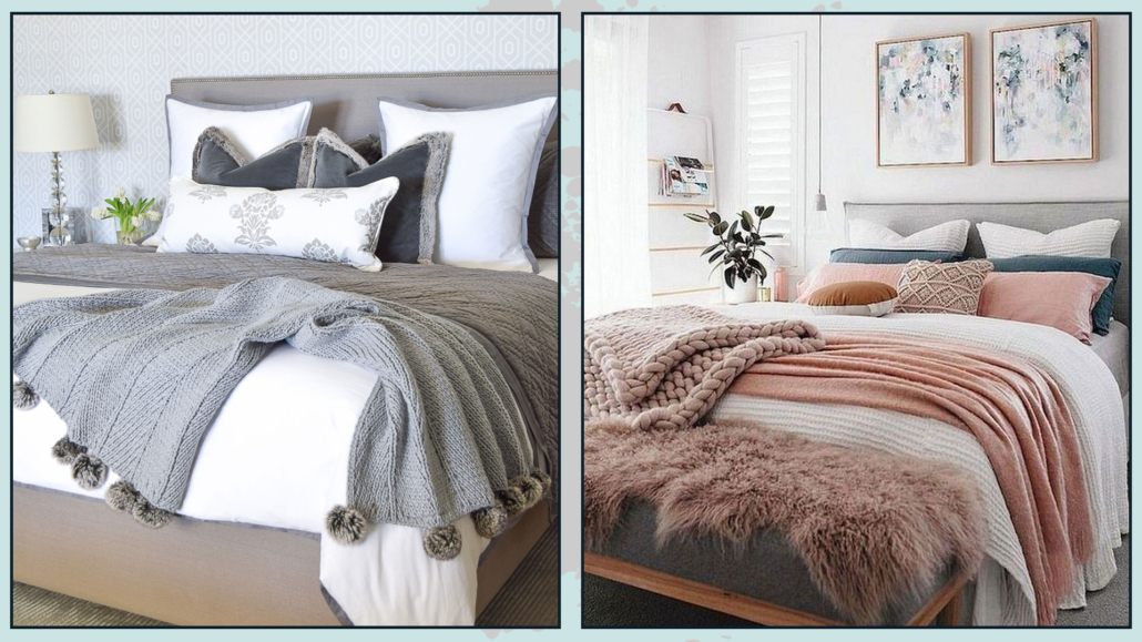
Don’t settle for putting a simple, albeit beautiful, bedspread on your bed: it would look a bit “incomplete”.

Add some decorative pillows and blankets to the bottom of the bed!

You might think it’s a bother to take everything off in the evening and put it back on in the morning, but this time will be amply rewarded!

Blankets and pillows will give that extra touch to your bed and the whole bedroom, especially if you choose different materials, textures, and colors, creating some contrast.

That will give some movement and character, but most importantly, it will make the bed and room even more inviting and cozy!

(credits: zdesignathome.com; messybits.com)

I hope this article was helpful and you love it; in case, let me know in the comments!

Feel free to share it with anyone you think might be interested, I will be honored, and it will help me get my name out there.

If you feel that your home, or some environment of it, does not reflect you enough, do not wait any longer and book your consultancy!
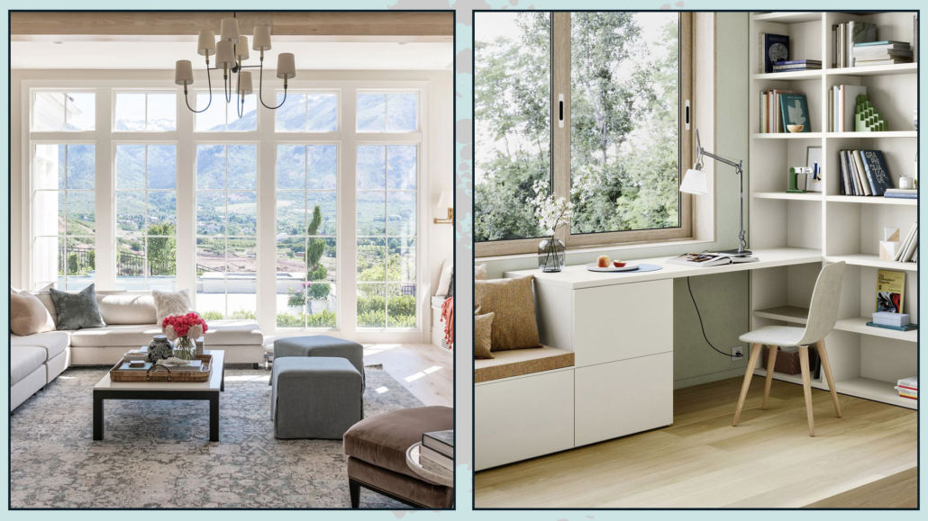
Designing the living room seems like a piece of cake, but in reality, it hides little pitfalls that can create settings that seem to lack something!

Today I would like to talk about the big little mistakes often made when designing a living room!

– ATTENTION TO THE DISTANCES BETWEEN THE VARIOUS ELEMENTS

That is a mistake that happens especially when the room is large enough: there is a tendency to arrange the various elements against the walls, even if they are far apart, to fill the space.

The furniture seems scattered here and there, creating dispersion; the room will really look a bit sad and without personality this way!

A living room should be cozy and inviting, encouraging conversation and activities around a central point.

This central point can be the television, the coffee table, or if you are lucky, the fireplace.

However, if you are too far from this central point, or if the various elements are not arranged to emphasize it, the space will look a bit “coarse”!

So try to arrange the main elements to make them somehow linked to each other, perhaps by the rug!

If the space is really that big, you might think about creating different zones, such as a music or reading corner or an even more intimate conversation area…

(credits: @amberinteriors; thisisnick.com)

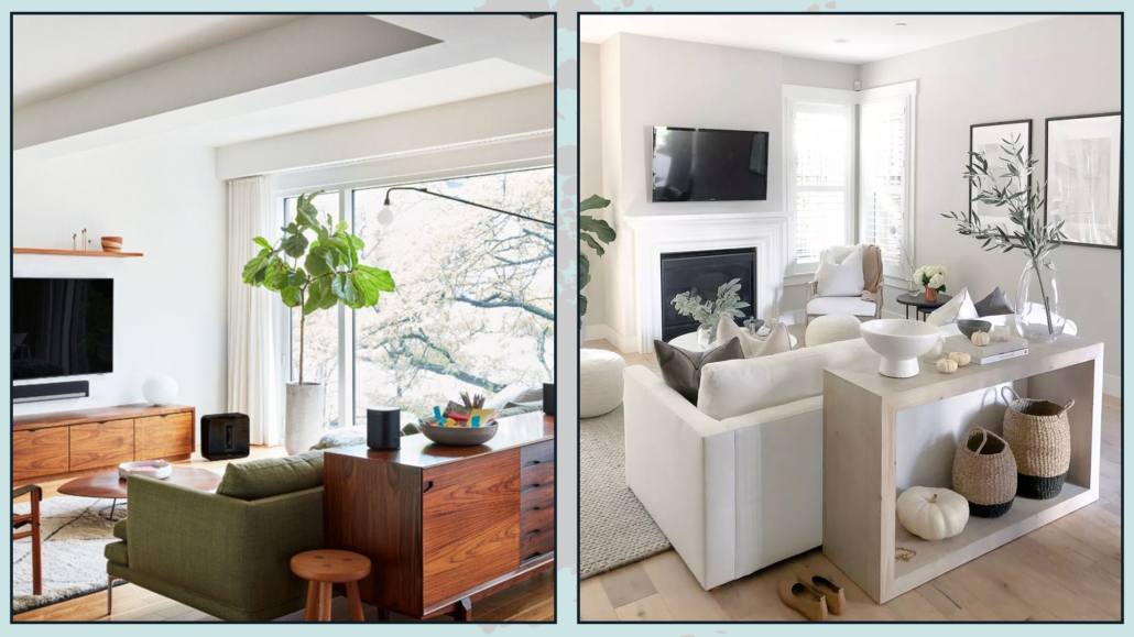
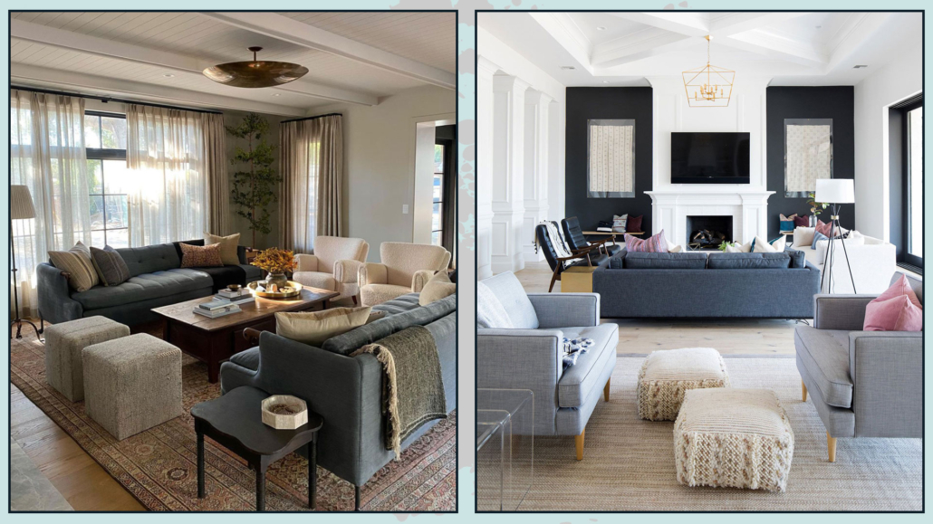
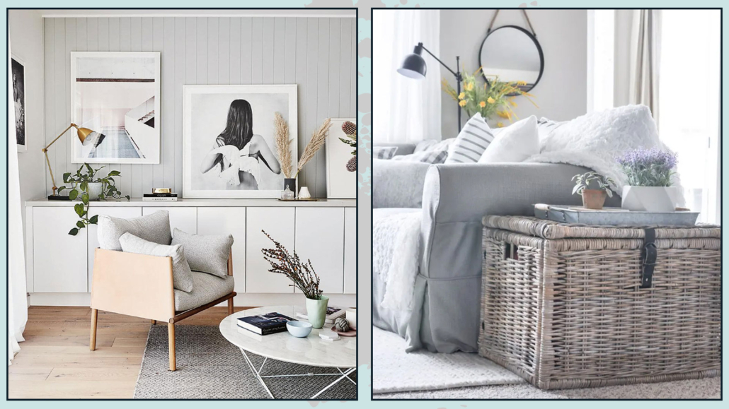
So divide the living room into several areas and remember not to be afraid to put the sofa “in the middle of the room”, leaving some passage behind; on the contrary, this is a pretty way to visually expand the space!

If you are lucky enough to have precisely that much space to go around the sofa and armchairs, I recommend decorating the backs!

There are many ways to do this: behind the sofa could be a console table or a beautiful blanket to add warmth and texture!

These small details will make your living room more complete and sophisticated!

(credits: midcentury585.com; shoppe.amberinteriordesign.com)

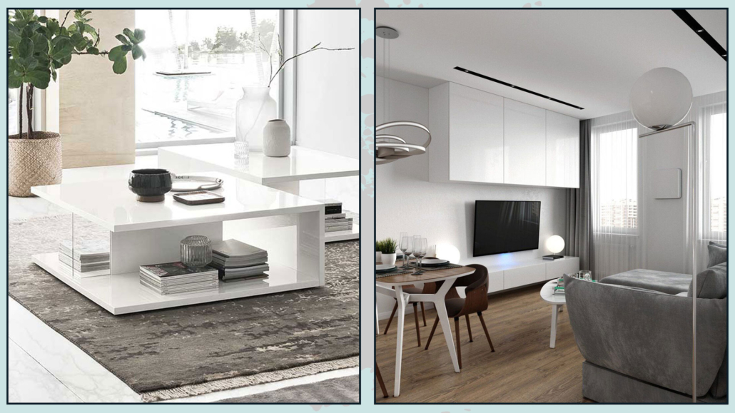
– PAY ATTENTION TO THE SIZE OF THE COFFEE TABLE

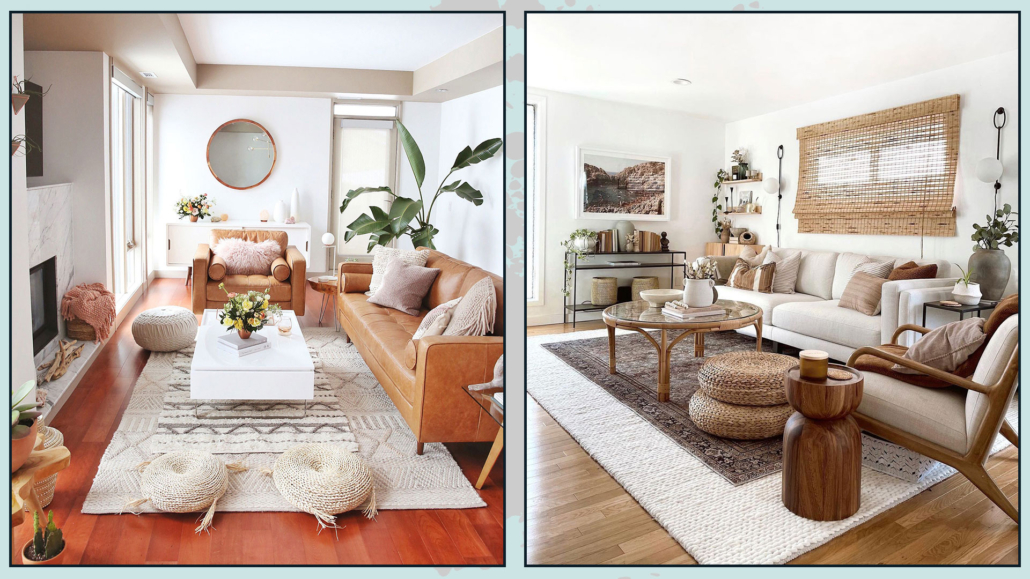
The coffee table is the element that somehow, along with the rug, links all the others in creating the conversation area.

It is, as well as decorative, a very functional item because it allows you to put down your things, such as your phone, or trays with food and drinks if you have guests!

The mistake that is often made is to get a coffee table that is too small; this definitely ruins the living room furniture design!

Not only does it somehow shrink the space visually as well!

The coffee table should be proportionate to the other elements and should be about two-thirds of the sofa.

A large table, however, could be expensive, but more importantly, it could be inconvenient if you wanted to, for whatever reason, move it…

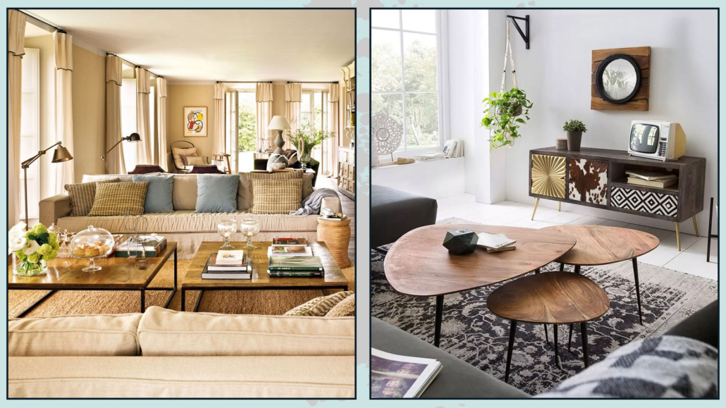
So here is a simple but effective idea: buy 2 side tables!

It can be two identical coffee tables to place side by side, or you can take a set of 2 or 3 coffee tables of the same shape but different sizes and heights!

That will make it much easier for you to maneuver them, even if it’s just for cleaning, and it will give some rhythm to the conversation area!

(credits: Isabel López-Quesada; vemzu.sk)

– PAY ATTENTION TO THE POSITION OF THE RUG

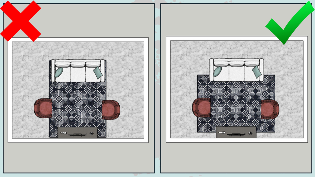
If I tell you that when getting a rug for the living room, it is paramount that it be large enough to fit under at least the front feet of the various elements to create a cozy conversation area, I am not telling you anything new.

However, there is another aspect to take into consideration, namely orientation!

The rug, which is most often rectangular, should follow the space’s shape.

If you turn it in the opposite direction, you will create a kind of barrier and visually shrink the space!

The rug should really be large and cover the floor abundantly and tie together the main elements such as the sofa, armchairs, and coffee tables!

It is, therefore, paramount first to consider the layout of the room, take a rug that follows this shape and arrange the various elements to create something functional and harmonious.

(credits: justinecelina.com; @indiebohonest)

– THINK ABOUT STORAGE!

Another mistake in living room design is not thinking enough about the elements to contain!

For functional and comfortable rooms, it is really essential to have storage elements to arrange everything that is not purely decorative.

For this reason, it is better to have closed elements to make the environment more linear and clean.

If the space is small, you can think of a storage coffee table or, directly, a storage sofa.

Of course, you can add baskets, which will also, as we have seen other times, give a warm touch to the living room!

(credits: homestolove.com.au; cherishedbliss.com)

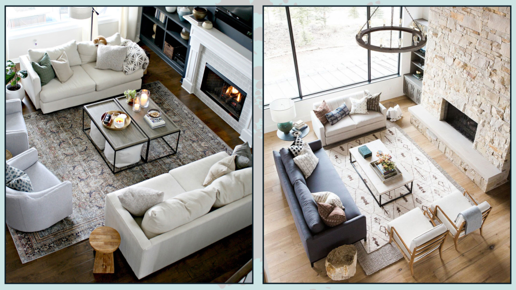
– DO YOU HAVE TWO SOFAS? BE CAREFUL HOW YOU POSITION THEM!

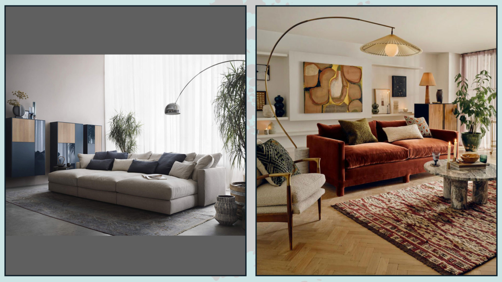
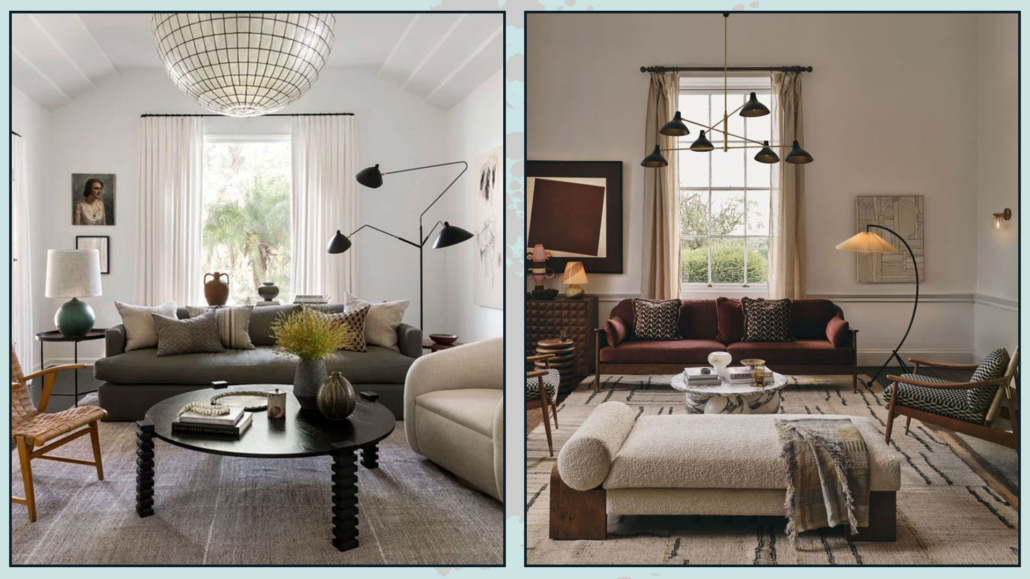
You may have two identical sofas, perhaps a three and a two-seater, and when you have these two items, it is actually common to see them placed angularly, perhaps with a small table or lamp in the corner.

Now, this is not a literal mistake, and sometimes you can’t really do otherwise; but it does make the living room a little monotonous and unbalanced.

When you have two identical sofas, it would be much better to put them facing each other and possibly add seating on the sides; it would make the living room look more sophisticated!

On the other hand, if you are forced to put the sofas perpendicularly, think about the possibility of taking a single corner sofa, it would make everything a bit more harmonious!

Or choose two sofas that are different because the play of different colors and shapes will break the monotony and look like a design choice!

(credits: thriftydecorchick.com;studio-mcgee.com)

– BEWARE OF VISUAL WEIGHTS!

Another thing to pay attention to, when designing a living room, that is not always done is correctly balancing the furniture’s visual weights!

What do I mean by that? I’ll tell you right now!

There are huger and visually heavier pieces of furniture than others: for example, a sideboard and a sofa versus a seat and a lamp…

That is also true when it comes to heights!

It is a mistake to put “heavy” furniture grouped together on one side and the others on the other.

Instead, it is paramount to balance and alternate weights and heights for an environment that is truly harmonious and inviting!

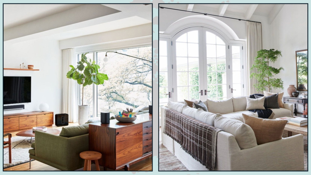
So, if, for example, you have a large piece of furniture on one side, it is essential to balance it on the other, perhaps with the sofa and a lamp or a beautiful tall plant.

To balance, also color theory can help: colors like red and yellow have very powerful visual weights, and small doses of that color can help balance a somewhat massive element on the other side!

(credits: lemamobili.com; sohohome.com)

– ATTENTION TO LIGHTING

By now, you’ve heard me say it many times: the light is what makes the difference in a good design project!

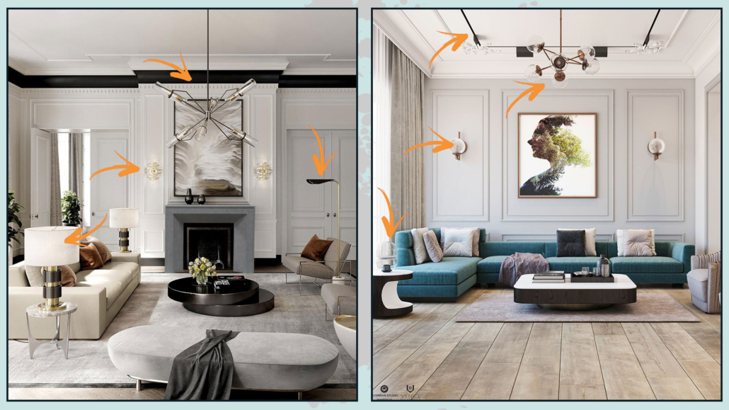
It is s always important to have multiple lighting points, but it becomes even more so in the living room to create the right atmosphere!

Even if it were a beautiful chandelier, general ceiling lighting is absolutely not enough!

When designing a living room, it is also good to consider floor and table lamps.

That is to provide depth and create some atmosphere making the space inviting and comfortable, as well as functional!

In fact, you can turn on the light(s) you need depending on the activity at hand!

Earlier I talked about decorating the back of a sofa when it would be away from the walls, and I talked about console tables… there it might be a great place to put a beautiful lamp.

Of course, you have to be careful about the wires: you should not see them, so if you have to renovate, you might even think about putting an outlet on the floor!

(This is one of the reasons I am so insistent that it is paramount to do a detailed project, including the furniture, when remodeling your house).

(credits: katiehodgesdesign.com; Soho Home)

I hope this article about the mistakes one can do designing a living room was helpful and you love it; in case, let me know in the comments!

Feel free to share it with anyone you think might be interested, I will be honored, and it will help me get my name out there.

If you feel that your home, or some environment of it, does not reflect you enough, do not wait any longer and book your consultancy!
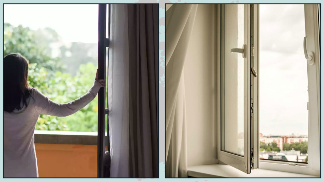
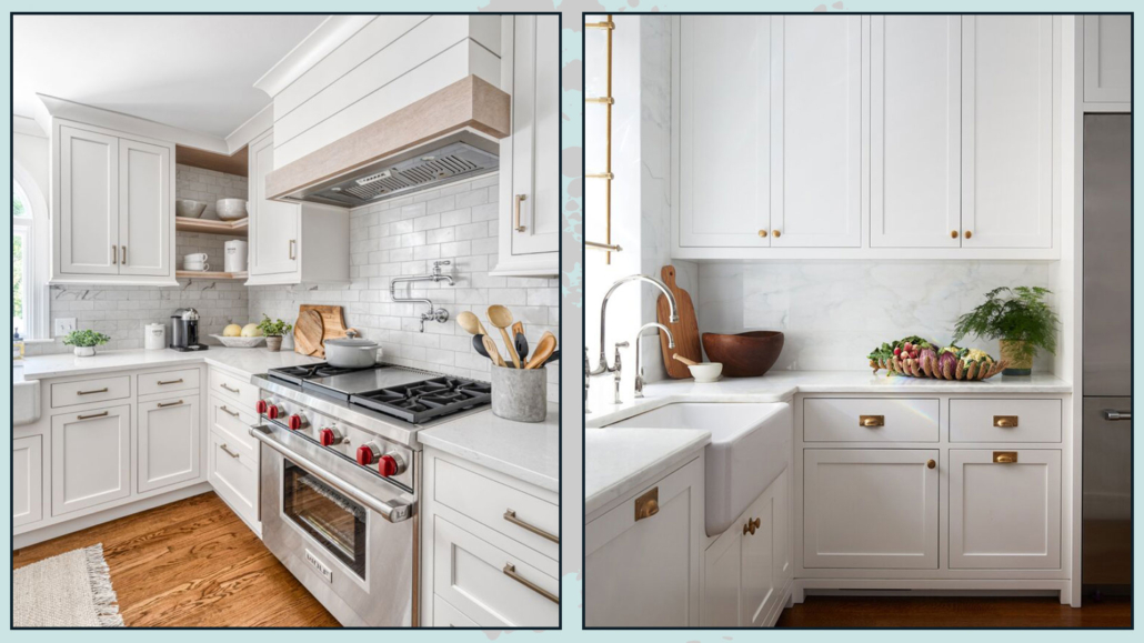
We all love the idea of having beautiful and elegant “cover” houses, but we often fall into the trap you have to spend a lot of money to have them!

Actually, it is a matter of using small attentions and a few tricks to immediately elevate the perception of our environments.

I have talked about how to do for the house in general, for the living room and the bedroom, today I would like to see how to make the kitchen feel more luxurious!

1 – ORDER AND CLEANLINESS

I apologize if there are sometimes suggestions that seem obvious but allow me not to take anything for granted.

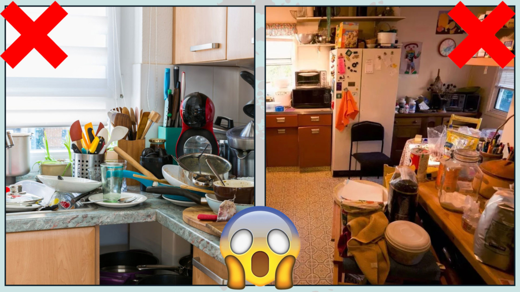
I will not dwell on cleanliness, but we know and have repeatedly said it does not go hand in hand with the idea of luxury!

We can say the same for clutter!

– FIX THE HANDOUTS

If we pay more or less attention to what we have immediately in sight, we don’t always do so with what is “hidden” in the cabinets; however, when we are forced to take them out, the chaos is immediate.

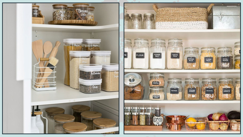
Having a thousand colored jars, tin, boxes, and packages creates visual clutter, even when they are more or less well arranged.

A good idea is to try neutralizing these shapes and colors a bit, using glass, tin, or ceramic containers; doing this would immediately elevate the perception of the kitchen.

Having the same type of container will immediately make everything much more harmonious!

These containers can be found almost everywhere and at all prices.

You can then put labels on them (especially for tin or ceramic jars) to remind you what is inside.

Of course, this can be done more with dry foods!

When you open the cabinets, everything will be tidy, and if you have to take them for cooking or put them on the table, you will be able to keep things in order!

(credits: littlelabelco.com; Laurel Bern)

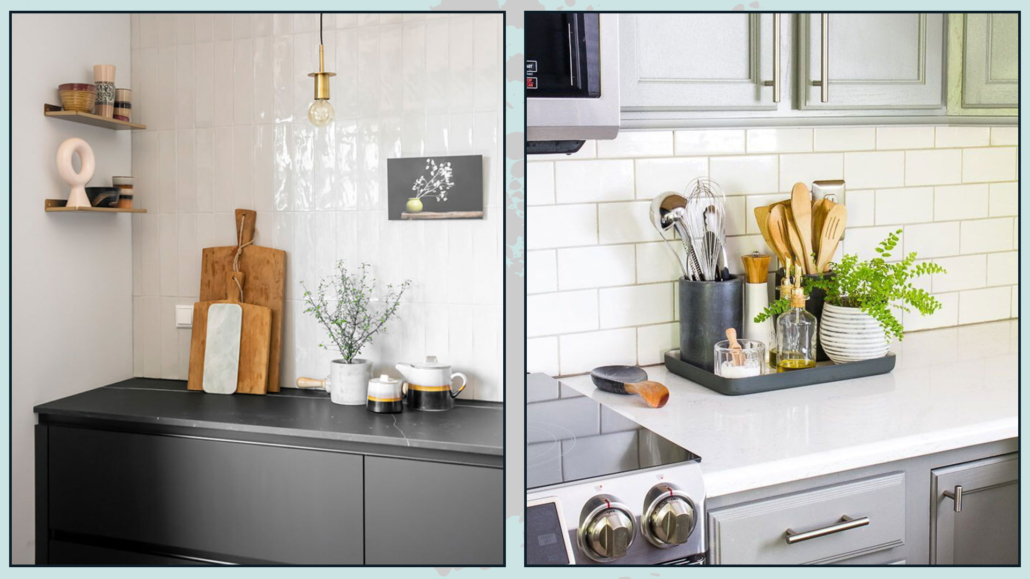
– FREE THE COUNTERTOP AS MUCH AS POSSIBLE

That is one of the 2023 trends we saw a short time ago that actually gives that touch of “luxury” that we are looking for.

To do this, one of the first things is to get all small appliances out of sight by arranging the ones we use infrequently and “hiding” in a lowered cupboard the ones we use daily, such as the coffee maker might be!

Maybe you don’t have the wall unit that goes all the way to the countertop to hide these items, and it’s probably not easy to add this element, in that case consider changing these small appliances by buying new ones that are, if not designer, at least particularly beautiful, that maybe even give a splash of color!

Only items that can also be decorative should remain on the countertop.

On the countertop, as already mentioned, you can leave the small appliance, if particular or design; small jars with spice plants are perfect; you can also leave jars with flour, sugar, and/or coffee in sight if placed in glass jars!

(credits: homebunch.com; jambk.com)

Still, you could think of a beautiful vase of branches or flowers and, if you like it, classic cutting boards!

For the latter, I recommend not putting the ruined plastic ones on display; better the wooden ones that also give a touch of warmth and texture!

Speaking of texture and warmth, another way to do this is to use baskets, where, perhaps, you can store things.

This is both in the cabinets and on the top!

Another lovely idea, if you really have a lot of elements, is to group them on a tray: this will give the composition boundaries making it more studied and less chaotic!

(credits: helladesignstudio.com; alyssahaun.com)

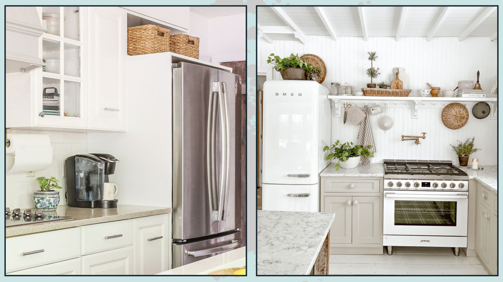
– LEAVE THE FRIDGE CLEAR!!!

It is increasingly easy to see kitchens with free-standing fridges, and we often fill them with magnets, photographs, and papers!

For a more luxurious kitchen, this is really not the best!

This, too, creates visual chaos.

If you like to have a few keepsakes, it is not that you have to give them up completely, but leave possibly a few choice pieces, and if you have many, rather change them often!

A clean and essential fridge will really make a big difference!

(credits: designingvibes.com; lizmarieblog.com)

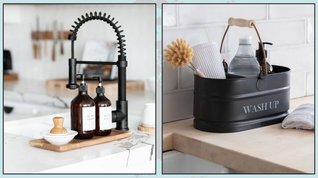
– WATCH OUT FOR THE SINK AREA!

Again as a matter of tidiness, avoid leaving the detergent bottle, whether it is for dishes or hands, as well as the dish sponge in sight.

That is unless you use special dispensers, as we saw when talking about decorating like a pro!

You could create a small arrangement with the dish detergent dispenser (and, if you use it, the one for your hands) placed on a small tray with, instead of the sponge, a dish brush, perhaps made of wood.

This small detail will make it more studied, elegant, and, therefore, luxurious!

(credits: public-311.com; gardentrading.co.uk)

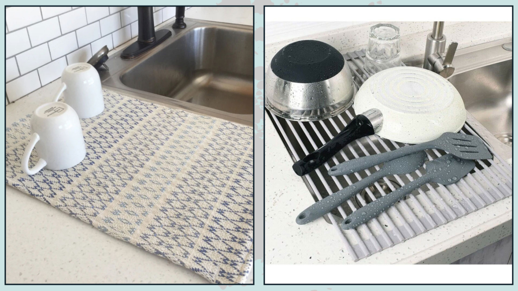
It’s hard not to have the drainer wall unit above the sink, but if so, I would say avoid the drainer resting next to the sink, preferring a drainer rug instead (beware of colors!).

That is because they have less visual impact, and you can put them away for ease once the dishes are dried!

(credits: etsy.com; ebay)

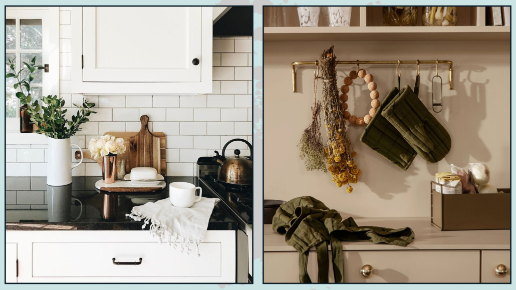
– DON’T UNDERESTIMATE TOWELS

To have a kitchen that looks luxurious, you shouldn’t underestimate the choice of potholders, towels, and aprons.

So choose towels that don’t look like rags, but can give that extra touch!

If you can get them to match the potholders and apron if you use them!

Change potholders when they get ruined because they will immediately jump out at you!

(credits: thelovedesignedlife.com; paperplanestore.com)

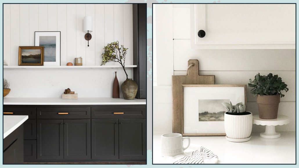
2 – BRING SOME ART INTO THE KITCHEN

We have also seen this among the kitchen trends for 2023: the kitchen is a room like the others in the house, and, therefore, it is good to use the same care in decorations.

It is not mandatory to have only paintings with food or drink as their subject or a board with magnets…

Bring to the kitchen a cute photo gallery or a beautiful painting, maybe abstract… use what you would also put in the living room or bedroom!

You don’t necessarily have to spend crazy prices; we have seen it before: you can also use a little imagination and, for example, create beautiful paintings with particular fabrics!

You can hang the pictures, but you can also put them on the countertop or shelves if you have them, and maybe even create a small composition with other items!

(credits: urbanologydesigns.com; woodsandivory.com)

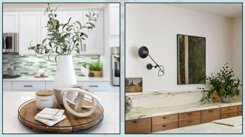
– CREATE A FOCAL POINT

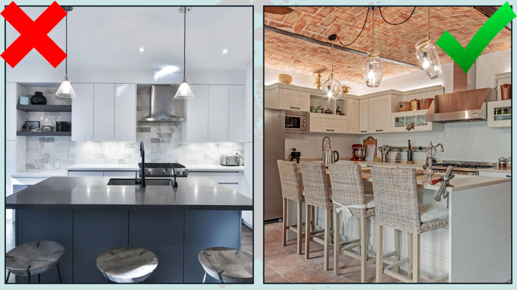
A simple yet brilliant way to make the kitchen look more luxurious, and cover-worthy, is to have a particular, high-end element to which you can add more “normal” pieces.

You will thus create a focal point that will immediately elevate the perception of the kitchen.

It can be anything from an impressive painting to a beautiful glass vase, a souvenir from a trip… in short, anything that you think would give that extra touch!

(credits: neatlyliving.com; earthencointeriors.com)

3 – USE DIFFERENT LIGHTINGS

Lighting is really super important for good design!

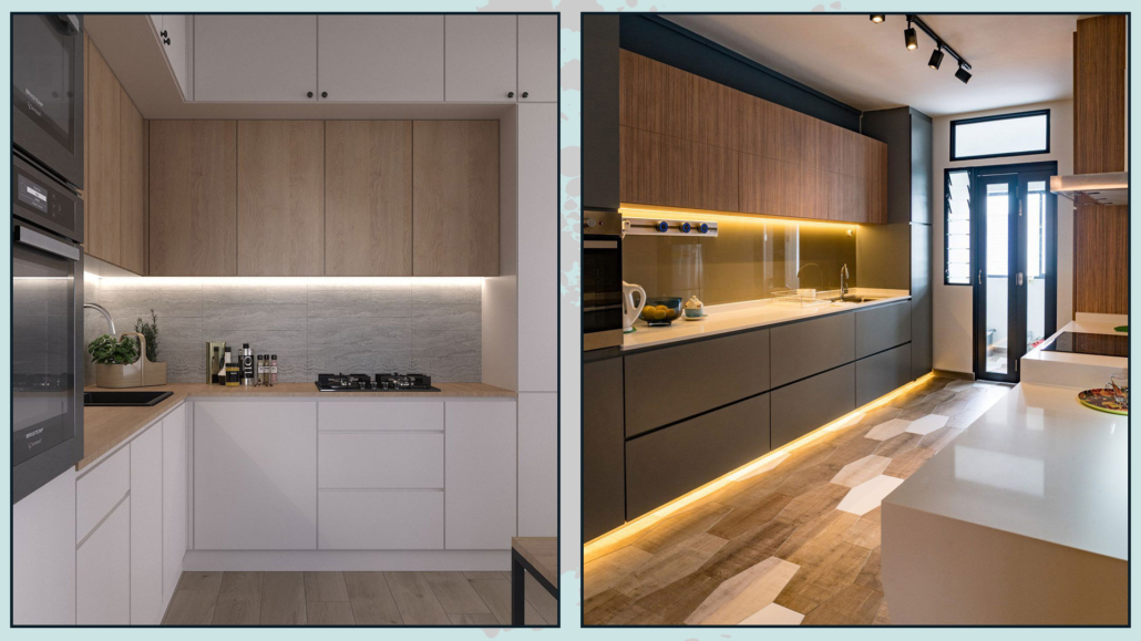
Add the under-cabinet light if you don’t have it yet; there are LED strips that you can easily install without having to do any work.

You might think about adding them, as well, above the wall cabinets to add some overall light and give some depth too!

Again to give depth and create something unusual, you could also put LED strips at the foot of the cabinets to illuminate the floor!

Lighting effects help give that extra touch to the environment.

ligthting luxurious kitchen

(credits: behance.net; www.easytopltd.com)

Also, you might think about putting on the countertop, or the island if you are lucky to have it, a lovely table lamp!

That sounds like a peculiar suggestion, doesn’t it? Actually, it’s a great way to add both: an additional source of light, which never hurts, and a little atmosphere!

That will make your kitchen even cozier and more studied!

(credits: chrislovesjulia.com; cgeniae.ml)

4  – CHANGE HANDLES AND FAUCET

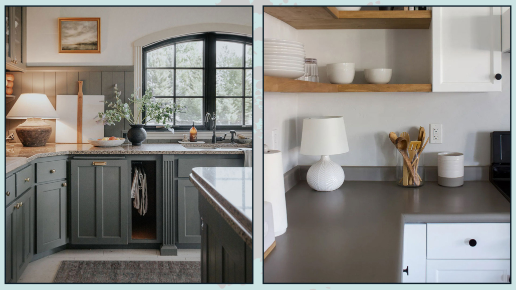
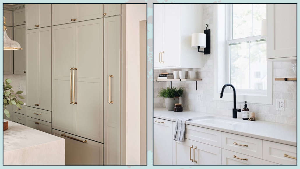
Details definitely make a difference: if you have a kitchen that maybe is already a few years old, changing the handles could really change its face and give it that extra touch!

All at an affordable price!

The same goes for the sink faucet: changing it could give a new look to the sink area!

All these great little touches will help you make your kitchen look more luxurious and studied!

Obviously, you don’t have to do everything immediately, but you’ll see that if you start taking your cues from a couple of these suggestions, you’ll see the difference right away!!!

more luxurious kitchen

(credits: inhonorofdesign.com; juliehowardhomedesign.com)

I hope this article about how to make a kitchen more luxurious was helpful and you love it; in case, let me know in the comments!

Feel free to share it with anyone you think might be interested, I will be honored, and it will help me get my name out there.

If you feel that your home, or some environment of it, does not reflect you enough, do not wait any longer and book your consultancy!
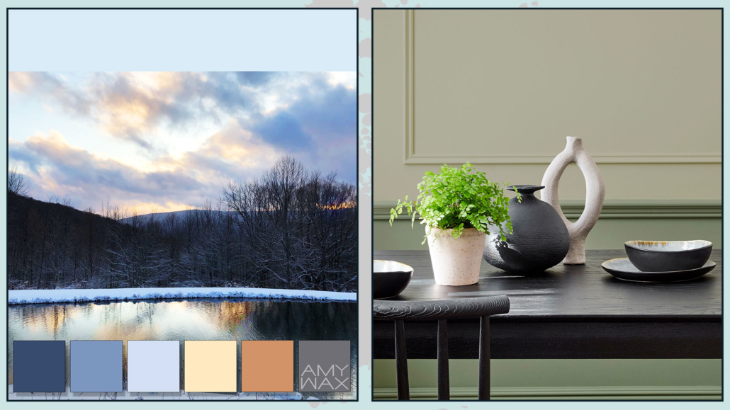
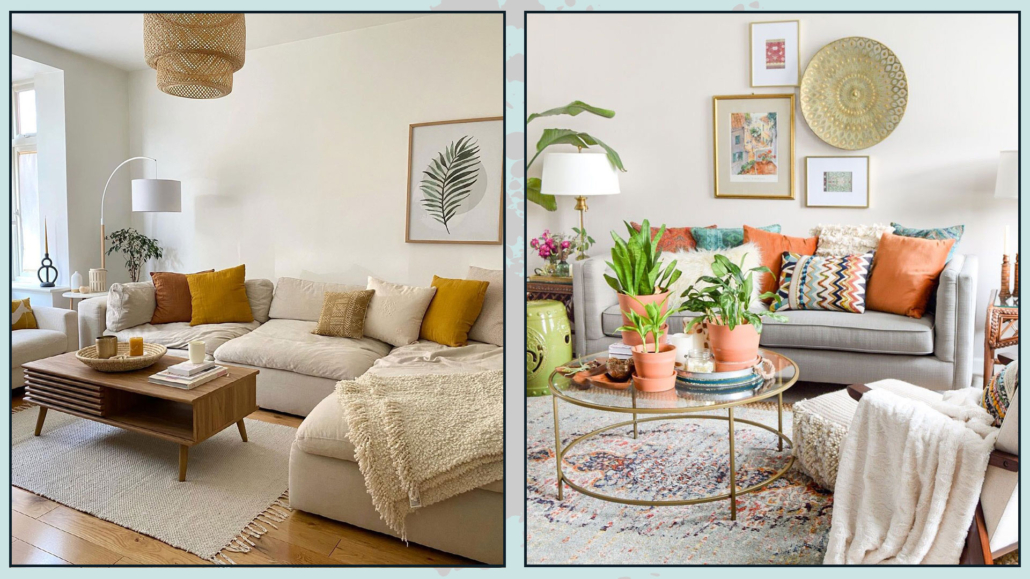
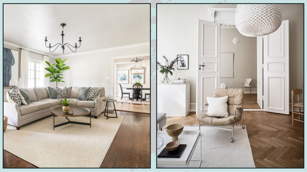
Using neutral colors without making them appear flat? Here is how!

Neutral colors, mainly warm neutrals, are popular in interior design because they make rooms cozy, inviting, and relaxing.

However, one must know how to use them to avoid making them flat and boring, that will lead to somewhat impersonal rooms.

Choosing a neutral-colored palette often stems from the fear of making a mistake or overdoing the colors.

But even the misuse of neutrals may not give the desired result and, most of all, may not fully represent one’s personality!

If you want to learn more about how to choose neutrals for the home, I talk about it here!

One nice thing about neutrals is that they are the perfect base for virtually any style and are very versatile for color matching.

So let’s see how to make the use of neutrals attractive and dynamic!

– GIVE VALUE TO WALLS (AND CEILINGS)

Walls and ceilings seem to be the easy part: I choose the color, I paint, and that’s it!

Instead, there are many ways, many finishes, and techniques regarding painting, which used with neutrals can really make a difference by making the color more vibrant.

In a simplified way, here are three techniques that enhance warm neutrals.

– there is lime wash which is made of lime and other minerals, is naturally based, and is given with a brush.

Glaze effects are created that give depth and dimension to the color.

– there is Venetian plaster formed from marble powders with lime putty.

It has a thick consistency, so it’s given with a trowel, which makes the surface perfectly smooth.

– there is roman clay, a thick paint made from chalk and other natural ingredients; it is given with a trowel.

It creates a finish similar to Venetian plaster and looks like natural stone.

(credits: cose di casa; stelianadesign.ro)

In addition to wall paintings, you can also think about using stones, bricks, or wooden laths to give the room a little more dimensionality!

It is not mandatory, as always, to use these elements on all walls; on the contrary, but they can be helpful to enhance an architectural detail or create an original focal point.

(credits: marianaorsi.com.br; behance.net)

For more rustic styles, wood can also be used in the ceiling by putting beautiful beams!

This will help to give some rhythm to the environment!

(credits: greybirchdesigns; shopltk.com)

– PLAY WITH SHADES AND TEXTURES

To make your rooms appealing, it’s a great idea to use different neutrals, so add some warm neutrals to a room with mainly cool neutrals and vice versa.

And especially to play with the different saturations and shades of the various neutrals.

This thing is actually always helpful to give depth and movement to rooms, but it becomes all the more so when you choose a monochromatic or precisely neutral-color palette!

With the same principle, it is also good to play with different textures by mixing smoother finishes (both in fabrics and objects) with rougher ones.

(credits: haymespaint.com.au; editionnoire.com)

– COMBINE DIFFERENT STYLES AND PATTERNS

Neutral colors are a great tie-in for different furniture and accessories.

Putting different styles together is another great way to liven up the neutral color palette.

You will be able to create a play of shapes giving, over all, personality!

The same goes for patterns: mixing different ones will help make your spaces dynamic and contemporary.

In mixing patterns, I would say to avoid too strong color contrasts: better a tone on tone.

(credits: tthese_beautiful_thingss; shoppe.amberinteriordesign.com)

– USE LARGE DECORATIVE ITEMS

We’ve said neutral colors are calming and relaxing, so create something unexpected using large paintings or mirrors!

It will obviously be the focal point of the room.

Use particular patterns and, above all, some contrast to the wall to make it stand out.

However, this doesn’t only apply to paintings but, if you wish, also to decorative objects: think, for example, of a man-high vase with branches in it!

Or even a large plant that almost reaches the ceiling!

These are all things that help give rhythm and vibrancy to environments!

(credits:@anthology_creative_studio; amdesigns.com)

Pay also attention when choosing decorative items in general, choosing original pieces that can attract the eye by guiding it from one corner of the room to another.

Think of elements that are a bit out of the ordinary by creating distinctive and eye-catching compositions!

Sometimes, for this purpose, street markets are really a gold mine!

(credits: H&M Home; @hoskelsa)

I hope this article was helpful and you love it; in case, let me know in the comments!

Feel free to share it with anyone you think might be interested, I will be honored, and it will help me get my name out there.

If you feel that your home, or some environment of it, does not reflect you enough, do not wait any longer and book your consultancy!
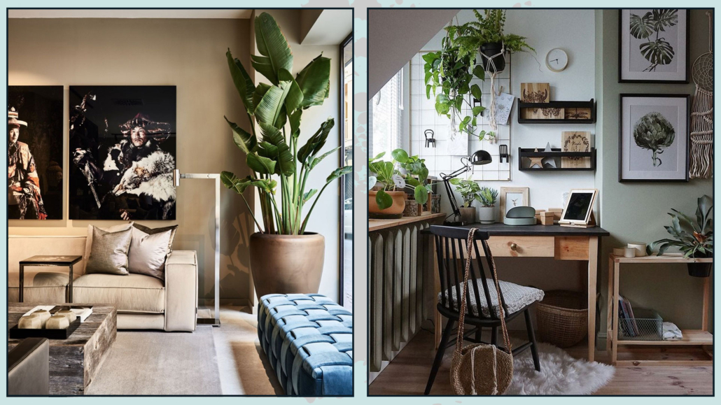
How to create a home gym without compromising the harmony of your home?

With everything that has happened over the past year and a half, the need to work out at home has increased.

But not everyone has the space to dedicate an entire room—even a small one—to a personal gym.

More often, it takes up just a corner of another space.

If you’re one of those people who love working out at home and don’t want to give it up, here are some tips for creating a gym corner without compromising the harmony of your home!

Finding the right spot and organizing it will depend on the activities you plan to do and the equipment required.

PRACTICAL TIPS

– WHERE TO STORE EQUIPMENT

To avoid clutter, it’s ideal to have a cabinet—even a low one—where you can store your equipment.

Consider a customizable cabinet to store your equipment efficiently and maximize space.

Place the cabinet as close as possible to your workout area.

Having easy access will make your workouts more enjoyable.

For larger equipment, if possible, choose foldable or easily movable pieces so you can store them quickly and conveniently.

(credit: thespruce.com; ebay.it)

(credit: Ikea; nelson-miller.com)

– PAY ATTENTION TO SPACE

Some equipment is incredibly sophisticated and high-tech – but don’t focus only on that.

Look at the dimensions too!

If you buy the latest high-tech machine but don’t have the right space, you’ll run into organizational problems—and it can also affect the style and design of your room.

Plus, if the space isn’t adequate, it may be uncomfortable or even unsafe to work out.

Set up your gym area in a room with windows: proper ventilation helps prevent odors and improve air quality.

It will also protect your walls, wallpaper, and furniture!

(credit: sharingmysole.com; onekindesign.com)

– FLOORING

In your gym area, I recommend avoiding regular rugs—keep the floor clear.

To protect the floor, use sports mats.

Store them away after your workout.

(credit: ad-italia.it; William- Waldronotto)

AESTHETIC TIPS

– COLORS AND DECORATIONS

Bright, vibrant colors can boost energy, but since this is a home gym—not a commercial gym—it’s better to maintain a relaxing atmosphere.

Keep your color palette in mind: using light or neutral tones is excellent for promoting a sense of calm and relaxation.

Natural materials and plants enhance well-being, and plants in particular help purify the air.

(credit: Cass + Nico; thespruce.com)

– THE RIGHT EQUIPMENT

Choosing the right equipment makes a difference!

Start by buying only what you really need.

If multifunctional equipment is available, consider choosing it.

You can get a complete workout without cluttering your home with too many pieces.

Pay attention to their colors, especially if some will still be visible even when stored.

(credit: lejournaldelamaison.fr; warehouse3e.top)

– ONE MORE IDEA…

As I mentioned before, it’s not always possible to hide your gym when it’s not in use, but there’s a trick:

Keep things as minimal as possible.

Store equipment in cabinets, consoles, or cube shelves, and add plants and cushions as decorations.

That will help make your home gym less intrusive and blend more seamlessly into your living space.

(credit: @tammyrara; ikea)

I hope this article on how to create a home gym has been helpful.

If it has, I’d love to hear from you—leave a comment and let me know!

If you’d like to share this article with someone who might find it helpful, I would be truly honored.

And if you still have questions or would like a consultation, don’t hesitate to get in touch!

Decorate with cushions.

Today, I would like to touch on a light yet important topic when it comes to decorating your home: cushions.

They are small details, yes, but they make a huge difference — adding personality, comfort, and warmth to any space.

Of course, arranging cushions with intention, rather than just tossing them around, will totally change the look of your room in terms of style and elegance.

We will mainly use cushions on sofas, armchairs, benches, beds, and — for the lucky ones — even on low windowsills.

Let’s see how to decorate with cushions, seeing how to choose and arrange them in each case!

SOFA

How to arrange them

Start from the armrests and move toward the center.

Begin with the larger cushions, then add the smaller ones, and finish — if you have them — with some that have a special shape or texture.

You can cover the whole sofa, but if you want the room to feel more spacious, keep the cushions mainly on the ends.

  • Perfect symmetry

Symmetry gives our mind a sense of calm and order.

That’s why arranging your cushions symmetrically is always a safe and elegant choice.

In this case, buy your cushions in pairs and create the same composition on both ends, starting with the larger ones.

Square cushions are usually the most versatile — they work with any sofa and any style!

That doesn’t mean you can’t use other shapes.

In fact, adding a different shape cushion in the middle can make the composition more dynamic and intriguing.

(credits: Your Space Furniture; olagiatingunaika.gr)

  • Asymmetrical style

Symmetry can sometimes feel too predictable.

If you prefer a more vibrant look, opt for an asymmetrical style.

Where you have fewer cushions, use slightly larger ones or choose brighter colors to maintain visual balance even without symmetry.

Sofa with chaise longue

If your sofa has a chaise longue, perfect symmetry won’t work — the shape itself is already asymmetrical!

To balance the look, you can add one or two extra cushions on the side without the chaise, or use larger/brighter ones there to even out the visual weight.

(credits: pianetadesign.it; Enorm d’ Acheteromme)

Corner sofa

With a corner sofa, symmetry usually works best.

Place a pair of cushions — one larger and one smaller — at each armrest.

In the middle corner, you have two options:

Add three cushions, repeating the side combination but doubling the smaller one and placing them toward each armrest for perfect balance.

Or choose a few unique cushions that echo the colors or textures of the side ones, maintaining harmony while adding a touch of personality.

(credits: studio-mcgee.com; homemakers.com)

HOW MANY CUSHIONS SHOULD YOU USE?

For the correct number of cushions to put, here are a couple of simple rules:

– Odd numbers usually look better.
Just like in styling surfaces, odd numbers create rhythm and visual movement — so go for three, five, or seven rather than even sets.

– Even if you don’t fill the whole back of the sofa, aim for one or two more cushions than the number of seats.
For example, a two-seater sofa looks great with three cushions — either all on one side or two on one side and one on the other.

(credits: Amber-Interiors; realestate.com.au)

MATERIALS, COLORS & PATTERNS

That is where the magic really happens!

Always start with the color palette of your room and stay consistent with it here, as well.

Cushions can match your sofa for a tone-on-tone look — you can play with different saturations to keep it lively.

Alternatively, choose a contrasting color, perhaps one from your accent chair or artwork.

In that case, use the color again elsewhere in the room to create balance and visual harmony.

As for materials, there are no strict rules — it’s all about the feeling you want to create.

You can even switch them by season: velvets and wool for winter, cotton and linen for summer.

When mixing patterns, choose different scales — for example, one with a larger design and one smaller, so they don’t compete.

When patterns are very different (stripes and florals, for example), identify at least one unifying element, for instance, color, to tie them together. (I’m talking about how to mix different fantasies here!)

(credits: jennakateathome.com; ruemag.com; Becca Booker)

ARMCHAIRS, BENCHES & WINDOWSILLS

ARMCHAIRS

Don’t overdo it — usually one cushion is enough, especially on a small chair.

Two can work too, as long as they’re in different sizes.

BENCHES AND LOW WINDOWSILLS

A simple approach works well in this case.

Benches often have a minimalist look, and too many cushions can clutter the space.

For windowsills, you don’t want to block the view!

Follow the same tips from the sofa section, using square cushions and avoiding fancy shapes.

(credits: homemakers.com; lindyegalloway.com; opo-7.top)

BED

Decorating your bed with cushions adds elegance, warmth, and that luxurious “finished” look.

Yes, it takes a bit of effort to remove and replace them every day, but it’s totally worth it when you see the result!

HOW MANY AND HOW TO ARRANGE THEM

Start with your pillows.

Whether you use a traditional bedspread or a duvet cover, you have a few options:

– Keep the pillows horizontal (under the bedspread if you use one).

– Stack two on top of each other (folding the cover if needed, as you would with a sheet).

– Place them vertically against the headboard.

The choice is obviously a personal one, which will not influence the decoration with the cushions.

Once you have placed the pillows, you can play with several setups:

– Two 50×50 cm cushions leaning against the pillows, plus one 40×40 cm in the center.

– Still two 50×50 cushions followed by one rectangular cushion.

– Or two 60×60, then two 50×50, then one 40×40 in the center.

– Two 60×60, two 50×50, and a rectangular one at the front.

These are the most common layouts — how to choose?

Principally based on practicality!

They all look great when colors, materials, and patterns are well balanced.

So, pick the one you like best and that you can easily redo every morning!

(credits: lifeoncedarlane.com; thelilypadcottage.com)

MATERIALS, COLORS & PATTERNS (for the bed)

When choosing, consider the color of your bed frame and bedspread or duvet cover.

As always, stay within your chosen color palette — and you have three main options:

– Tone-on-tone: cushions in the same colors as your bedspread/duvet but with different saturations.

– Contrast: cushions in completely different colors for a bolder effect.

– Mixed: one row in contrast and one tone-on-tone — this adds rhythm and depth.

Whatever you choose, play with tones and saturations to avoid a flat composition.

As for patterns, keep this in mind:

For particularly patterned bedspreads or duvet covers, select simple cushions, perhaps even plain.

If the bedspread is solid, feel free to have fun with prints and textures!

(credits: Lauren Ireland; H O O M S; Better Homes and Gardens)

As I said for the sofa’s cushions, you can mix different patterns, paying attention to their scales.

Cushions are small details, but they have the power to completely change the mood of a room — adding balance, energy, and comfort in just the right measure.

I hope you found the article on how to decorate with cushions enjoyable and helpful in understanding how to decorate with cushions!

If you need some help, don’t hesitate to contact me!

DECORATE SURFACES? HERE’S HOW TO DO IT!

A few weeks ago, we explored how to style a bookshelf (see the article here and the video here).

Today, I’d like to show you how to decorate other surfaces in your home, like the coffee table, nightstands, consoles, and more!

Styling the various surfaces in your home with care helps create an elegant and refined atmosphere.

Let’s start with some general tips and tricks, then look at how to apply them to each surface.

There are no strict rules, but these guidelines will help you create compositions that are well-balanced every time.

9 TIPS TO DECORATE SURFACES

– THE RULE OF THREE: THREE IS THE PERFECT!

The rule of three means grouping objects in groups of three or other odd quantities.

Compositions of three are more dynamic than pairs; they create rhythm and movement.

With two objects, the eye tends to move back and forth, but with three, there are more possibilities for movement, making the arrangement more interesting!

Arranging items in groups of three gives the impression of a thoughtfully designed composition rather than random placement.

Keep in mind that grouping by three doesn’t just mean placing three different objects together.

Similar objects stacked or placed close together are considered a single unit.

(credits: Hudson Home; theposterclub.com)

To create a proper composition, the objects should be distinct in the two ways explained in the following points.

– USE DIFFERENT HEIGHTS AND WIDTHS

Create arrangements where the three objects vary in height and/or width to generate visual interest.

When objects are too similar, they blend and fail to attract attention.

By varying their heights and widths, you allow the eye to notice each piece and focus on what’s beautiful and valuable.

(credits: Hudson Home; theposterclub.com; durangoboots.com)

– USE DIFFERENT SIZES, SHAPES, TEXTURES, AND FINISHES

Just like with height and width, using a mix of shapes and finishes helps draw the eye through contrast.

Try placing something shiny next to something matte, something larger beside something smaller, or something rough next to something smooth.

As mentioned earlier, it’s all about contrast—if everything looks the same, nothing will stand out.

(credits: crateandbarrel.com; bobbyberk.com; studio-mcgee.com)

– USE COLOR

Assuming you’ve created a color palette for your home, your decorative arrangements should follow it too!

You can stick to similar tones for a monochromatic look, or play with contrast by choosing objects in bolder shades.

Don’t forget to consider the surface where you’re placing your items—that’s a color too!

Start from the base and decide whether to go with coordinating tones or contrasting ones.

For instance, if the surface is light, you might choose light-colored items for a tone-on-tone effect, or darker ones to create contrast (and vice versa).

As for accent colors, remember they’re called accents for a reason—so use them sparingly!


(credits: mariangelavaralli.com; studio-mcgee.com; decorgan.com)

– USE TRAYS

It’s a trend that’s becoming more and more popular, especially in the U.S., and you’ve probably seen it all over Pinterest.

But why use a tray?

First, if you choose the right one, it can be a beautiful decorative element.

Plus, a tray helps define the space of your arrangement, making everything look neat, organized, and intentional.

(credits: amazon.it; Farmhouse Hub; pinterest.com)

– PAY ATTENTION TO DIFFERENT ANGLES

Your arrangement should look good from every angle!

Take picture frames, for instance: they work best when placed against a wall.

Why? Because the back side isn’t exactly the nicest thing to look at!

When you put a frame on a console table or inside a bookcase, you see only the front, so you notice the photo and the frame itself.

But it wouldn’t be the best choice for a coffee table, where your composition is visible from all sides.

(credits: Gladys Paulino; Scout & Nimble)

– USE PLANTS AND FLOWERS!

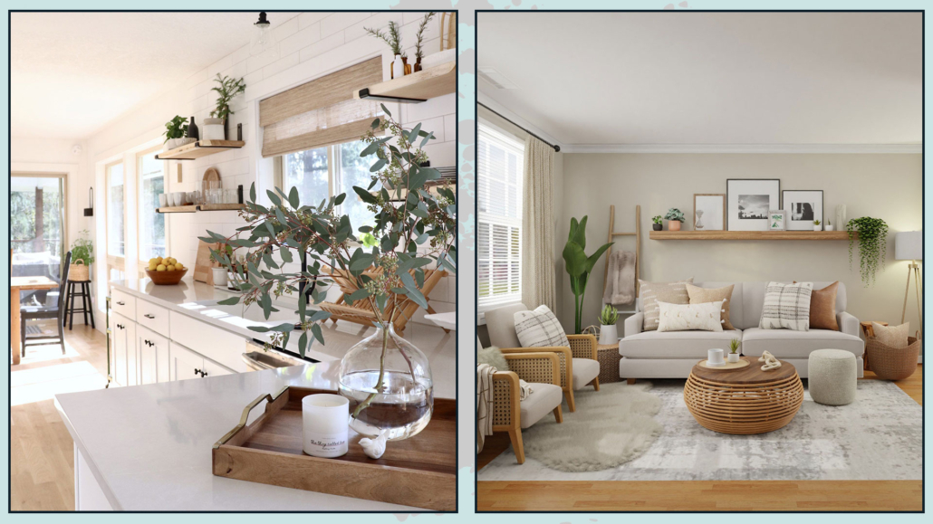
You’ve probably heard me say this a million times: bringing a touch of nature into your home is essential!

And that goes for styling surfaces, too—plants and flowers instantly add elegance and charm.

You can use a vase of flowers, a single leaf in a bottle, or a small succulent—what matters is adding a touch of nature into the arrangement.

Of course, you don’t need greenery in every single arrangement, but since you’ll be decorating several surfaces, be sure to add it here and there.

(credits: cottonhouse.es; thevintagerugshop.com)

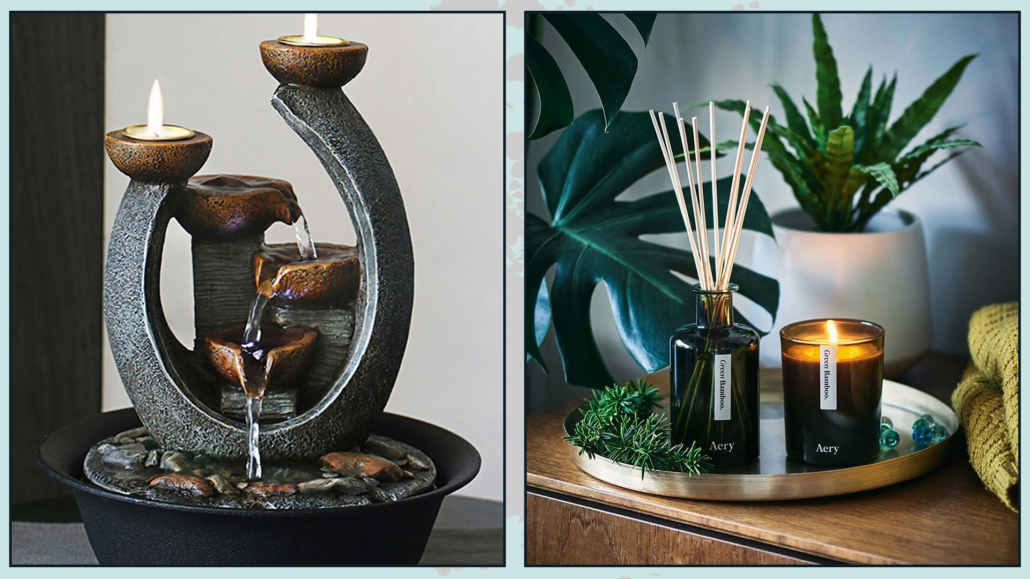
– ADD WARMTH WITH CANDLES

As we have seen before, candles—lit or not—bring warmth and a sense of intimacy to any space.

With the right holders, they can also be highly decorative.

You can create an arrangement with candles of different heights, or add one candle to a group of three objects to add a cozy touch.

(credits: westelm.com; blondieinthecity.com)

– DO NOT FORGET SOMETHING PERSONAL

Your home should reflect who you are, so use objects that hold meaning for you when decorating surfaces.

Let your arrangements tell a story—something about your passions, your memories, or what makes you feel at home.

You could also include items that invite interaction, like a photo album or a book opened to a favorite page.

That adds personality and can even spark conversations.

(credits: studiogriffiths.com; chess-site.com)

HOW TO APPLY…

Now that we’ve covered nine general tips for decorating surfaces, let’s get specific!

– COFFEE TABLE

The first thing to consider is the shape of your coffee table.

If you have a rectangular table, you can place a nice tray with a composition—of course, grouped in threes—and maybe add a beautiful vase of flowers or a plant next to it.

Your arrangement might include one or two stacked books, a candle, and a vase or another decorative item.

For a round table, it’s important to follow its shape by using a round tray or round vases.

If your table has a glass top and there’s a nice rug underneath, keep the decorations minimal and simple!

You can also switch up your décor with the seasons—fresh flowers and plants in summer, and leaves or pinecones in autumn and winter.

(credits: One Kindesign; homemakers.com; theturquoisehome.com)

– ENTRYWAY CONSOLE OR SHELF

We discussed this in the article (now also in video form): a console or shelf in the entryway is essential because it’s practical.

Having a mirror—either leaning against the wall or hung—is key so you can take a final look before leaving, and guests can quickly check themselves before entering.

You’ll also need a dish or tray to empty your pockets.

If there’s space, adding a lamp is a great idea: lighting is vital, and a table lamp creates a warm atmosphere.

And again, don’t forget to add a touch of nature here!

(credits: Decoist.com; ohmeohmyblog.com)

– NIGHTSANDS

Less is more—especially with nightstands.

The bedroom is for resting, so keep decorations to a minimum.

If you love bedside lamps, start with those, then add other items depending on the available space.

An alarm clock, a book, a small box, a photo—anything you love having close by will work perfectly!

(credits: savoldi.net; blogarredamento.com)

– SIDEBOARD

Decorate the entire surface by creating several small arrangements!

These arrangements should always follow the rules we discussed earlier and, of course, relate to each other, whether through materials or colors.

Another elegant idea is to place two identical lamps at each end for symmetry.

Then hang a painting or mirror in the center, finishing with a central arrangement that can be more or less prominent depending on the lamps and artwork.

Be sure to add some contrast—for instance, pair a wooden sideboard with metal or glass accents.

And if your sideboard is against a low wall, avoid tall items that could obstruct the sightline.

(credits: amazon.com; lighting)

JUST ONE MORE THING…

Before rushing out to buy anything new, try working with what you already have at home.

As I mentioned with the bookshelf, start fresh: clear everything out of each room, lay your items on the floor, and create your arrangements.

Start with the entryway and then move through the rest of the house!

You’ll refresh your space without spending a thing.

I hope you enjoyed this article on how to decorate surfaces and found it helpful.

If so, don’t hesitate to share it with someone you think might be interested; I would be honored, and it will help me gain more visibility.

If you need help with any room in your home, I would be honored to assist you. Book a personalized consultation today.

To decorate a home, a professional follows some concepts I talked about here (you can find the video here)

However, 3 elements are the very basis from which to start decorating your home like a pro would do…

Let’s see together what they are and how to use them at home easily using common things.

1 – EMPHASIS

This element is also known as the focal point.

To create eye-catching spaces, combine bold features with secondary details that still attract attention.

Start by identifying the area or feature you want to highlight.

Here are a few ways to create a focal point:

– Use color.

Paint a wall — or even just a portion of it — in a contrasting color.

Make sure to stick to your color palette, but choose a more saturated version of one of your preeminent colors to make it stand out!

(credits: Rugh Design; archimadestudio.com)

– Use wallpaper.

Wallpaper adds more than just color — it brings texture, depth, and movement.

It creates a bold visual statement that brings a sense of drama to the space.

Geometric patterns or bold prints work incredibly well!

(credits: vivadecora.com; etsy.com)

– Use artwork and mirrors.

Artwork and mirrors are fantastic for drawing attention.

Choose artwork, a gallery wall, or a mirror that fits the wall size and complements the surrounding furniture.

And don’t forget the lighting — a spotlight or two will help make your focal point even more effective.

(credits: pianetadesign.it; etsy.com)

– Use a piece of furniture.

Your focal point doesn’t have to be on a wall!

A designer armchair or a large sofa in a contrasting color can add personality and grab attention.

These pieces draw attention and maintain balance and warmth in the room.

(credits: casaclaudia.abril.com.br; ikea)

2 – COLOR AND PROPORTION (The 60-30-10 Rule)

A color palette should feel harmonious and balanced.

To achieve this, your palette needs to be carefully designed with a mix of neutral colors and accent colors!

Neutrals usually serve as the base or background because they are versatile and easy to pair with any style or color.

Accent colors give personality and character to the space!

To use colors in a balanced way—so they fit well within the space and work harmoniously together—you can follow the 60-30-10 rule.

Here’s how it works:

– 60% is the main color of the room, usually a neutral.
It covers most of the walls, the floor, and the larger pieces of furniture.

– 30% is the secondary color.
It supports the main color but should be different enough to attract attention and create visual interest.

The secondary color is often applied to one wall or part of a wall, or on smaller furniture like armchairs or rugs.

– 10% is the accent color, which can be bold or vibrant depending on the style or atmosphere you want to create.

The accent color stands out clearly.

It appears in small items such as cushions, decorative objects like vases or poufs, and artwork.

Following this rule will ensure your space feels balanced, well-proportioned, and visually appealing.

3 – MATERIALS AND TEXTURES

Materials and textures are truly essential elements in interior design because they add depth and character to a space, enhancing its overall look!

Every object has its own material and texture.

The secret is to find the right balance by mixing different materials and textures.

There are many ways to introduce textures and materials and create interesting, harmonious compositions:

– Mix different textures.

Add a throw blanket with a texture that contrasts with your sofa’s fabric, and maybe a few cushions in different fabrics. Don’t forget curtains and rugs, too.

Bring in an armchair made of contrasting materials.

The key is to place contrasting materials and textures close together.

(credits: casafacile.it; graziademonte.com)

– Add accessories.

Vases, baskets, trays, and candle holders bring texture and variety.

Group them with contrasting colors or materials for visual interest.

(credits: orsipanosinteriors.com; pinimg.com)

– Include plants and flowers.

Whenever I talk about plants and flowers, I mention how they add color and texture, so it’s no surprise to see them here again!

Plants are wonderful because you can add them to any style or color scheme.

Depending on the size of the plant or the pot, you can place them almost anywhere: from a corner of the room to your coffee table!

(credits: Brianne Penney; decor.by.dp)

These three elements are fundamental for creating truly amazing atmospheres.

They are the secret to decorating your home like a pro!

I hope you enjoyed this article and found it helpful.

If so, don’t hesitate to share it with someone you think might be interested; I would be honored, and it will help me gain more visibility.

If you need help with any room in your home, I would be honored to assist you. Book a personalized consultation today.

HOW TO USE AND FURNISH AN EXTRA ROOM

Let’s face it: it’s not often you have it… but if you do, let’s explore how to use and furnish an extra room!

If you’re lucky enough to have an extra room, you have a few options:

– Home office

– Guest bedroom

– Walk-in closet

– Home gym

– Playroom (for those with kids)

Let’s look at each option one by one.

HOME OFFICE

We’ve all seen how important it is nowadays to have a dedicated area at home for studying or working remotely!

If you’re lucky enough to have an extra room — even a small one — it could be the perfect spot to create your own home office.

Here are the essentials:

– A desk — and if it’s not large enough, consider adding a small side table for your printer.

– At least one bookcase.

– Proper lighting — general and, most importantly, task lighting for your desk.

Place your desk where it can receive as much natural light from the window as possible and, when done, arrange everything else.

Don’t be afraid to place the desk in the center if it doesn’t block the flow, but make sure you have a floor outlet.

Otherwise, keep it closer to the wall: loose cables are a tripping hazard!

Make the space comfortable using colors that help with focus, like blues or purples, or calming shades like greens.

Of course, stay within the color palette you’ve chosen for the rest of your home.

Add a few plants to purify the air and bring a bit of nature indoors.

And finally, personalize it with the decor you love so you positively feel at ease in your space!

(credits: yellowa.it; Decoist.com)

GUEST ROOM

If you often host friends and family, turning your extra room into a guest bedroom is the perfect choice.

Here are the must-haves:

– bed

– one wardrobe

– mirror — ideally full-length so guests can see their entire reflection

– Good general lighting and at least one bedside lamp

The wardrobe doesn’t need to be huge, but it should be empty and ready for guests to store their stuff.

Stick to mostly neutral colors so anyone can feel at ease; color preferences are very personal, so if you want to add color, do it in small accents.

Style the bed with simplicity but invitingly: use a soft bedspread and a few decorative pillows to add a touch of elegance.

To give it that extra flair, casually drape a throw blanket over the bed — ideally in a color that contrasts with the bedspread and matches the pillows.

Add cozy rugs so your guests feel pampered, especially if they walk barefoot.

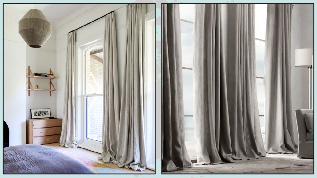
Curtains are a must — not only for privacy but also to filter out light that might disturb their sleep.

A great idea is to use layered window treatments, with blackout curtains added for maximum comfort.

If you have space, include a small seat — even a pouf can work. It adds a decorative touch and gives guests a place to sit or remove their shoes.

Candles and home fragrances are also great finishing touches to create a warm, welcoming atmosphere.

(credits: studio-mcgee.com; duomodesign.it)

WALK-IN CLOSET

That is the (not-so-secret) dream of almost every woman!

But throwing four wardrobes into a room isn’t enough to make it a proper walk-in closet.

First, it’s paramount to understand how many clothes you need to hang and how many to fold.

That will help you determine the type of wardrobes or drawer units you need.

You might also want a dedicated shoes section — it’s something worth planning carefully.

Include a large mirror to see your total reflection while trying on outfits.

It can be wall-mounted or freestanding.

Consider adding a valet stand for clothes you have worn but don’t need to wash yet.

It’s also helpful to have a seat — it can serve as a handy surface and make it easier to put on or take off shoes.

A clever addition is a wide central surface (may be an island) where you can easily fold clothes.

It also doubles as extra storage space.

If you have enough room, consider adding a vanity where you can do your makeup and keep your jewelry.

It’s a chic and elegant touch that adds genuine charm to the space.

As always, pay attention to general and task lighting to see clearly inside your wardrobes.

(credits: NaturallyMary; bassettfurniture.com)

HOME GYM

If you’re into fitness, why not turn your extra room into your gym?

Start by ensuring the lighting is appropriate, then set up the equipment you use most often for your workouts.

A small cabinet or wardrobe can be helpful, too, for storing things like workout shoes and accessories.

Use vibrant, energizing colors like yellow to boost your motivation, but try to stay within your home’s overall color palette.

And yes, add some plants!

They help purify the air and bring a touch of nature into your workout space.

(credits: casamagazine.it; warehouse3c.top)

GAMES ROOM

If you have young (or not-so-young) kids, you surely know one thing: there’s never enough space!

So, dedicating your extra room to playtime might be the perfect idea.

This way, their bedroom can be reserved just for sleeping and studying, helping to separate different activities in a more functional way.

In a playroom, clever organization is key.

Use plenty of storage units and cabinets — ideally placed along the walls to keep the center of the room open for play.

A large, soft, easy-to-clean rug is essential so they can play on the floor without getting cold.

You might also create a cozy little reading nook with a bookshelf, a comfy seat, and (of course) a dedicated reading light.

Here’s your chance to go wild with colors: feel free to step outside your home’s usual palette and have fun with it!

(credits: adventuresofatwinmom.com; inspio.it)

HOW TO DECIDE?

How to choose the best way to use and furnish an extra room?

The answer starts with your needs: think about what you’re missing in your home and prioritize that.

You can also mix and match some of the options we’ve seen.

For instance, if you don’t have guests so often, you could place a sofa bed in your home office and have a space that combines a guest room and a workspace.

Or maybe you’d love a home gym, but you could still include extra storage for off-season clothes — the two can absolutely coexist!

(Credits: Liliana Zenaro Interiores; litzrealestate.com)

In short, there are no strict rules — just helpful ideas to guide you.

To get the most out of your extra room, focus on what you truly need and then plan the layout and design that best fits your lifestyle.

I hope you enjoyed this article on how to use and furnish an extra room and found it helpful.

If so, don’t hesitate to share it with someone you think might be interested; I would be honored, and it will help me get known.

If you feel that your home, or any part of it, doesn’t reflect you enough, don’t wait any longer: fall in love with your place again and book your consultancy!
Decorating a home with geometric shapes and patterns is a great way to add character to a space and make it feel special and unique!

Geometric shapes and patterns are versatile and unique elements for decoration!

Today, I’d like to explore with you how and where to use these designs to give your spaces an eye-catching and original look!

GEOMETRIC SHAPES AND PATTERNS

Let’s start by taking a look at different shapes and what patterns actually are.

GEOMETRIC SHAPES

The basic geometric shapes are the square, the circle, and the triangle.

Just like colors, these three shapes have symbolic meanings that are good to know to use them in the best possible way:

– The square is a symbol that represents the Earth.

Thanks to its straight, parallel sides, it conveys a sense of solidity, stability, balance, and protection.

– The circle is a symbol that represents the sky.

Its shape, with no sharp edges, feels like an embrace!

And since it has no beginning or end, it also represents spirituality and the idea of cycles and continuity.

– The triangle sits in between.

It has a stable base like the square, but its two slanted sides point upward, giving it energy, movement, and vibrancy!
(credits: Anjo Tintas e solvente;blog.mybespokeroom.com; Decoideas)

LINES

– Vertical lines symbolize strength – when used on walls, they visually make a space appear taller.

– Horizontal lines symbolize balance – when used on walls, they visually make a room look wider.

– Diagonal lines, often used in contrast to each other to create the pattern known as Chevron, are dynamic and lively.

When applied to walls, they can also make a space feel broader!

(credits: verniciroma.it; tuttocasa-piemonte.com; cityfarmhouse.com)

PATTERNS

A pattern is a decorative design that repeats vertically, horizontally, or diagonally.

There are countless types of patterns in all shapes, sizes, and colors, and they definitely add movement and rhythm to a space!

(credits: Serena & Lily; archiproducts.com; medium.com)

HOW AND WHERE TO USE THEM?

How and where to use geometric shapes and patterns to decorate your home?

FURNITURE & DECOR

That is the best way to introduce these types of designs in small doses!

You can find furniture or accessories with geometric shapes or patterns.

Textiles are an easy win: you’ll definitely come across lots of curtains, cushions, and rugs featuring these motifs.

You can also decorate your walls with geometric-patterned artwork, which you can make yourself!

Try using colorful wall decals, or if you are a bit crafty, paint directly onto the surface.

If you love patterns, you can also create wall art using fabrics in the designs and colors you like most.

These will be truly unique and personal touches for your space!

(credits: tikamoon.it; margoselby.com)

(credits: americanflat.com; livingspaces.com)

WALLS

You can decorate your walls with geometric shapes and patterns in many ways:

– Tiles

– Paint

– Wallpaper

– Wall decals

– Wainscoting or paneling

– TILES

Tiles are most commonly used on walls in the kitchen—usually as a backsplash—and in the bathroom, especially around the shower or bathtub area.

There’s a great variety to choose from: you can go for hexagonal tiles or ones with decorative patterns.

There are even 3D tiles that add texture and a tactile feel to your space!

And don’t forget—mosaic is also a pattern in its own right!

tiles to decorating geometric shapes and patterns

(credits: designmag.it; cesiceramica.it; dom_ceramiche)

– WALL PAINTINGS

Beyond vertical and horizontal stripes, it’s quite common to see walls divided by diagonal lines forming large triangles, each painted in different colors.

But really, you can get creative with circles and squares, too – offering terrific alternatives!

For instance, a circle or square can frame artwork, shelves – or even highlight a sofa or dining table, giving these elements extra emphasis.

You can also use them to liven up a section of the wall that might otherwise feel a bit empty.

As always, it all depends on what you want to convey and the style of your home!

Remember, you don’t have to paint all four walls – even the chosen wall doesn’t need to be fully covered.

The goal is to create a focal point in the room!

(credits: clubedastintas.com; pinterest; danilocesana.com)

– WALLPAPER

These days, wallpaper comes in every style imaginable – including tons of options with geometric shapes and all kinds of patterns!

Finding one that perfectly fits your home’s style and color palette won’t be hard.

Like with paint, you don’t have to cover all four walls.

You can wallpaper an entire wall, or just a portion of it, to create that famous focal point!

Study the space and your furnishings carefully to decide where the wallpaper makes the most impact and how much to use.

wall paper to decorating geometric shapes and patterns

(credits: caselio.com; etsy.com; newwalls.as-creation.com)

– WALL DECALS

A creative and definitely budget-friendly way to decorate your home with geometric shapes and patterns is by using wall decals!

You can buy them in ready-made shapes or get colorful adhesive sheets and cut them into any shape you like.

A little tip: before sticking anything to the wall, try laying out your design on the floor or a flat surface to see if it looks balanced and visually pleasing.

You could even test it directly on the wall using painter’s tape to hold the shapes in place—then, if you like the result, go ahead and stick them on for good.

Better safe than sorry!
decals patterns

(credits: wandtattoos.de; dreamstime.com)

– WAINSCOTING OR PANELING

When I talk about wainscoting, as I said other times, I don’t mean the old-fashioned kind our grandparents used to have!
At its core, wainscoting is simply wood used as a decorative element on walls—and there’s so much you can do with it!

You can really get creative by designing geometric shapes with the wood, and if those shapes are repeated, they can even become patterns in their own right.

play with WAINSCOTING -decorating geometric shapes and patterns

(credits: The Light Shade Studio; salvatoriofficial.com)

FLOORING

If you think about it, all floors are made up of geometric shapes and, through the repetition of tiles, create patterns.

But there are also creative ways to design more playful, eye-catching flooring!

– MIXING FLOORING TYPES

It’s absolutely possible to use two different types of flooring in the same room—especially if your entry opens into the living area or you have an open-plan kitchen and living space.

Changing the flooring is a great way to divide the two areas visually.

There are three main ways to transition between flooring types:

– Clean break

– Jagged edge

– Degraded

A clean break is easy to understand: a straight, defined line separating the two materials.

A jagged edge is when the tiles are cut to fit into each other in a fun, irregular way—like a plank meeting a hexagon tile.

Finally, a degraded not only uses a jagged edge but also gradually mixes elements of one material into the other, creating a soft, seamless transition.

patterns on flooring

(credits: homepro.co.th; Tua Casa; wowdesigneu.com)

– PATTERNS CREATED BY TILE DESIGNS

Some tiles have decorative designs that, on their own, might not seem particularly striking—but when placed together, they can form stunning patterns!

It’s all about how the individual pieces come together to create an exceptional, more impactful visual.

patterns on tiles - decorating geometric shapes and patterns

(credits: casafacile.it)

SOME PRECAUTIONS…

Decorating your home with geometric shapes and patterns can create striking and inspiring spaces—but the golden rule is: DON’T OVERDO IT!

– Avoid filling every surface—walls, floors, and decor—with these types of designs.

– When the geometric shapes or patterns are bold or oversized, keep the furniture and other decor more minimal to prevent the space from feeling overwhelming.

– You can mix different geometric shapes and patterns, but they should have something in common—like color—and vary clearly in scale.

One should always stand out more than the other!

I hope you enjoyed this article about decorating your home with geometric shapes and patterns and found it helpful.

If so, don’t hesitate to share it with someone you think might be interested; I would be honored, and it will help me get known.

If you feel that your home, or any part of it, doesn’t reflect you enough, don’t wait any longer: fall in love with your place again and book your consultancy!