Are you attracted to minimalist style but worried it might be a bit too “cold”? Then come and discover warm minimalism!
It may sound funny, but warm minimalism, in recent years, has been a major popular trend!
What does a warm minimalistic style entail?
Let’s start by providing two pieces of information about traditional minimalistic style!
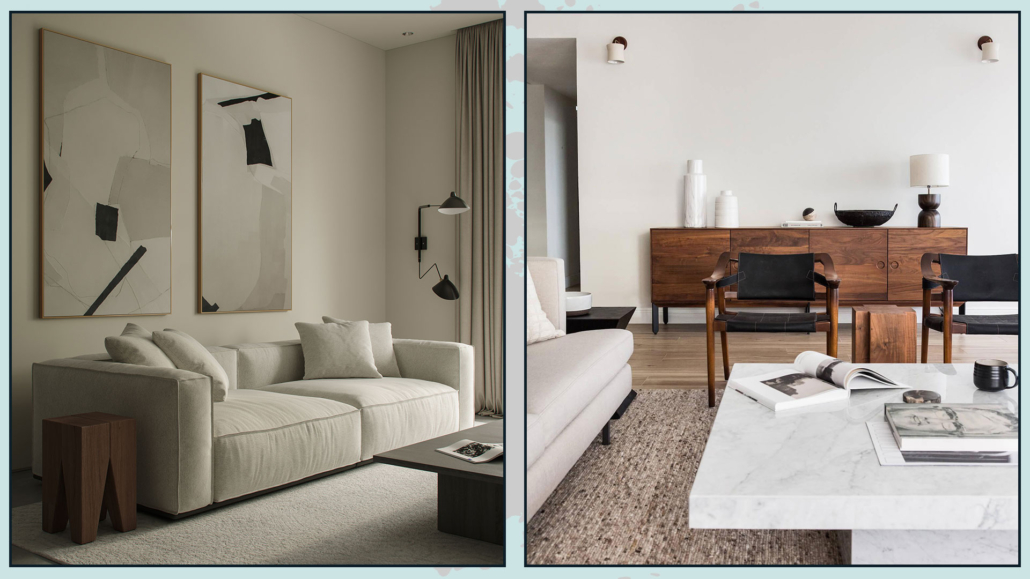
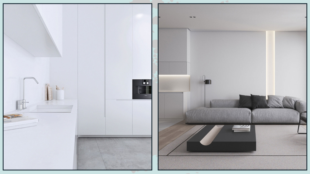
Traditional minimalistic style is based on the concept of “less is more,” where anything that is “more” is eliminated to make room for only the essential!
With the emergence of the minimalist style, new materials such as concrete, glass, and steel are also used, and there is a kind of rejection of the use of decoration and colors.
White, black, gray, and some cool neutrals are the most commonly used colors.
Furniture and accessories have clean, essential, and highly geometric lines, somewhat “sharp-edged”!
For this reason, the traditional minimalist style can appear a bit cold and impersonal, at least in terms of interior design.
(credits: ArtPartner Architects)
So here is where the minimalist style evolves, keeping the philosophy of less is more, but in a less extreme way, where you don’t have to give up decorations but use them more intentionally!
Let’s go over the principles of warm minimalism:
– LESS IS MORE
As mentioned earlier, this is the fundamental principle of minimalist style, which also applies to warm minimalism!
Minimalism focuses on quality rather than quantity.
So, better have fewer elements, well-thought-out, functional, and with superior quality!
(credits: unplash; anthologycreatives.com)
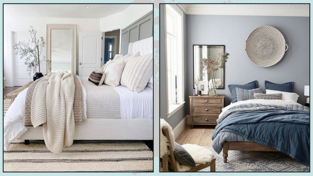
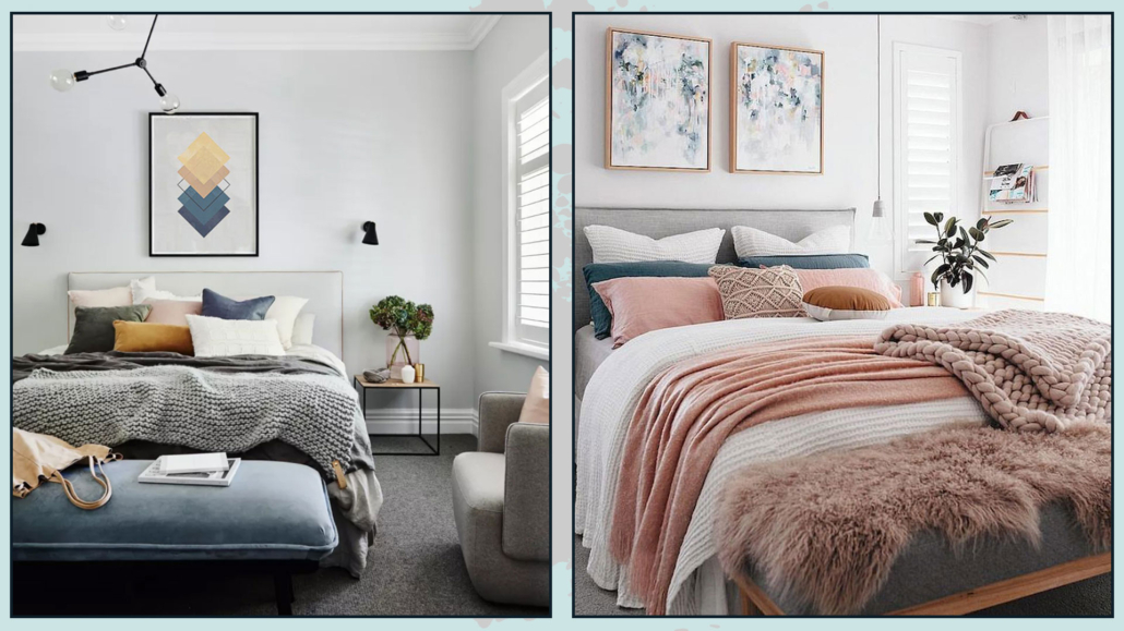
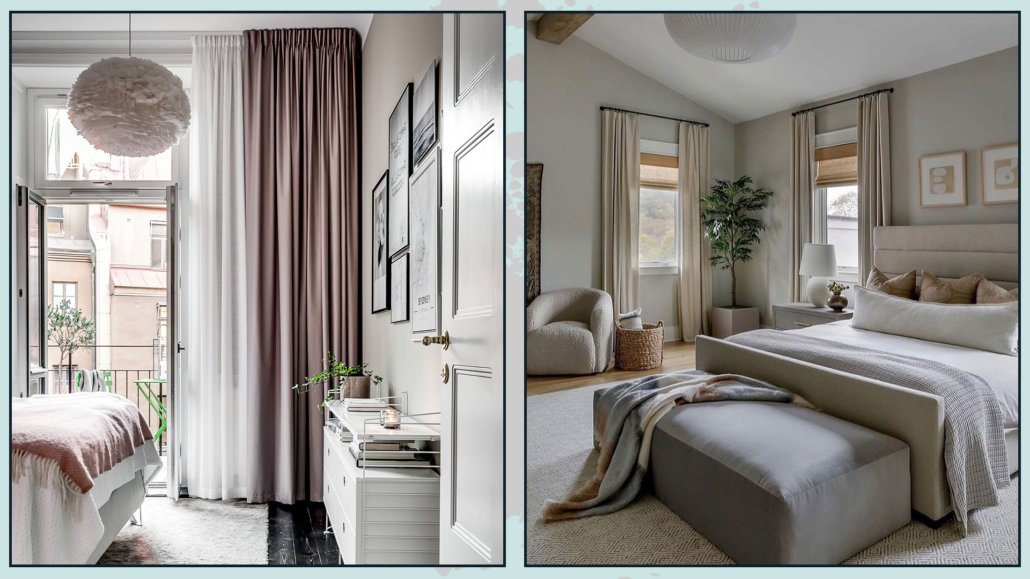
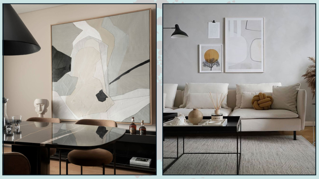
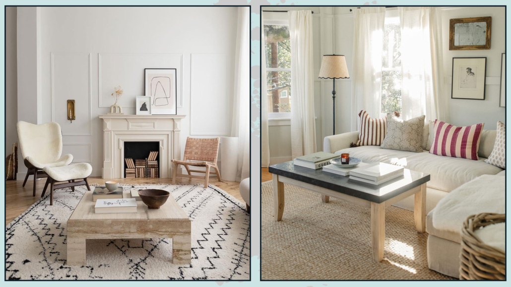
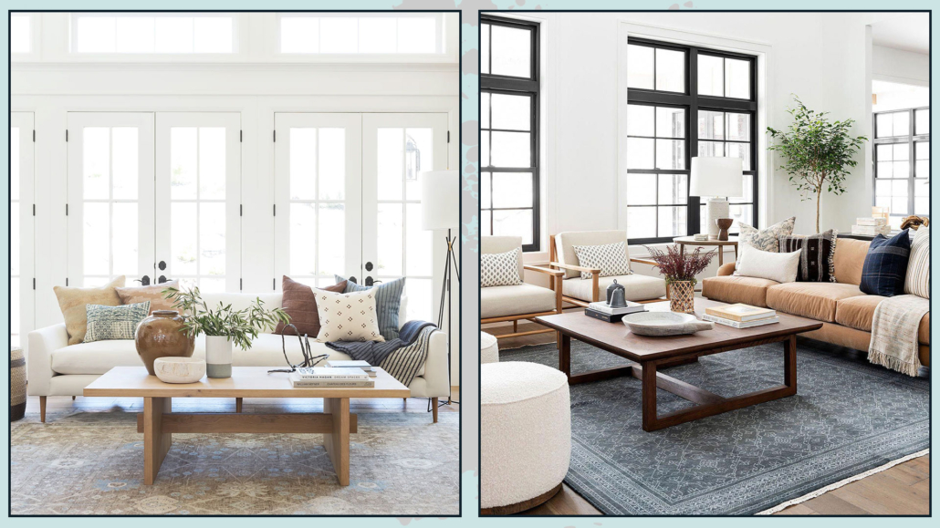
– WARM NEUTRALS
While maintaining the principle of a limited color palette, warm minimalism focuses on warm neutrals and earthy tones.
Beige, cream, and taupe are the foundational colors for this style, and they create a cozy and inviting atmosphere in the home.
These colors can be used in all their shades, tints, and tones to add movement and depth.
If you don’t enjoy colored walls, you can naturally use white, but remember to choose a white with a warm undertone! (I’m talking about undertones by talking about neutrals: you can find the video here).
Adding a touch of black will further enhance the overall composition.
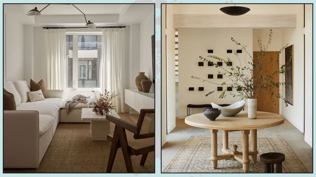
(credits: ruemag.com; studio-lifestyle.com)
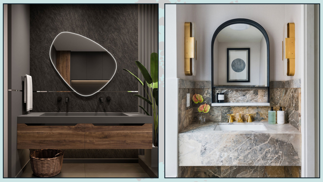
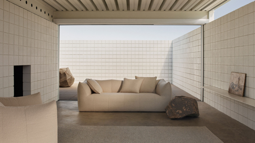
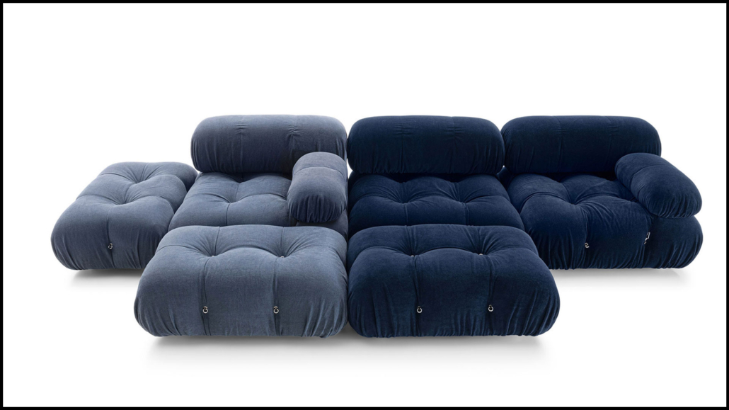
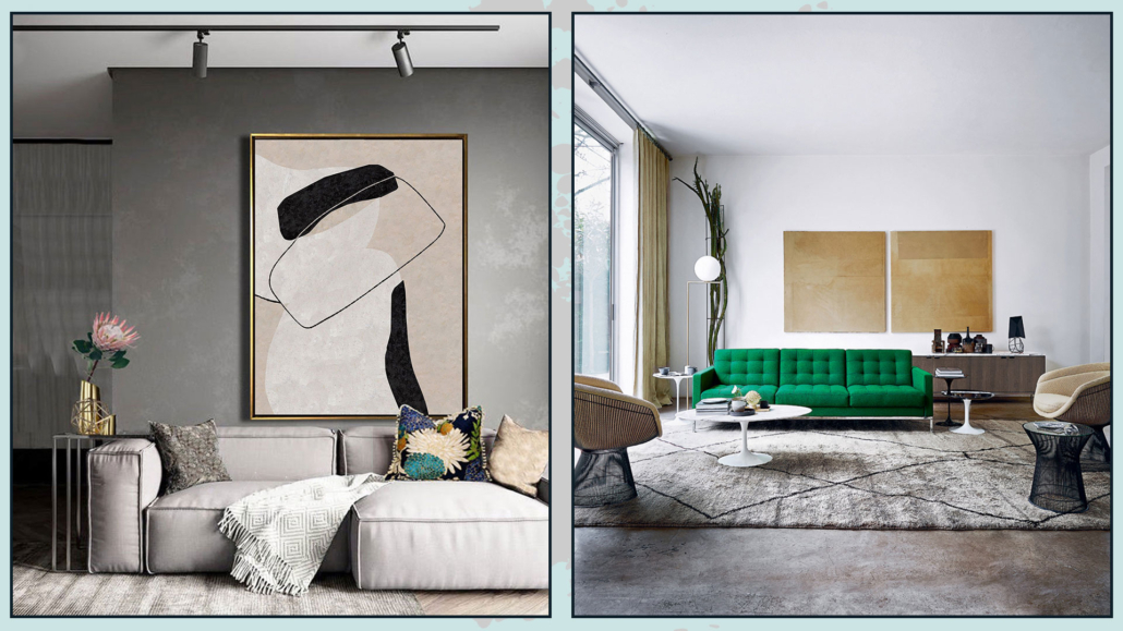
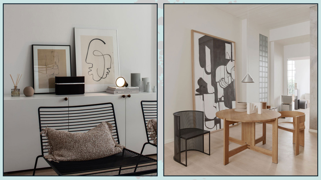
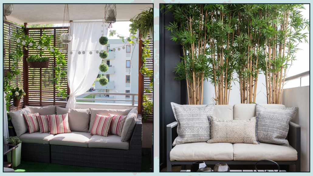
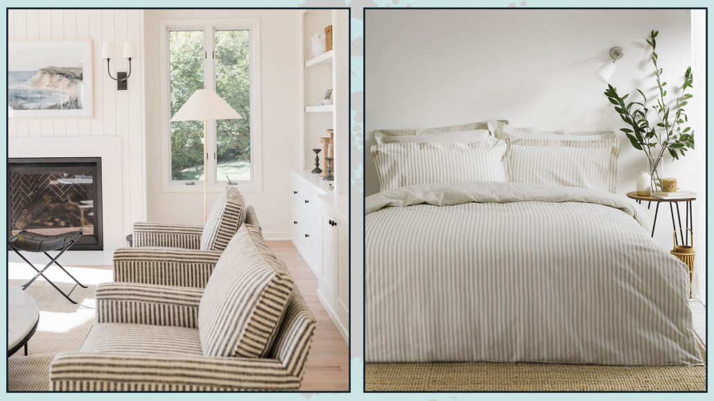
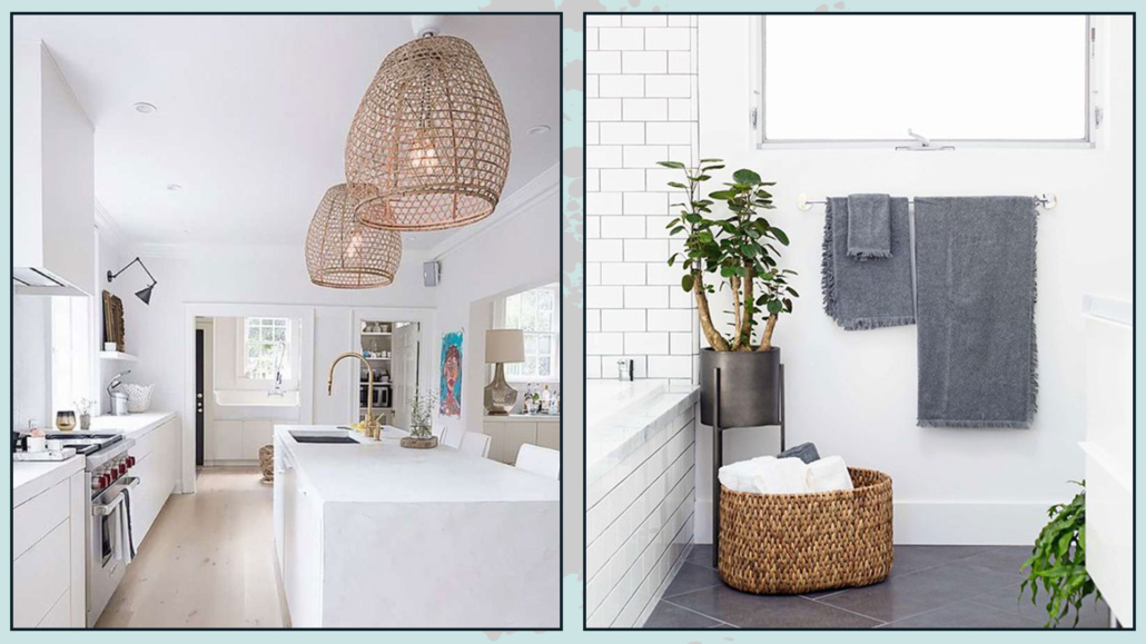
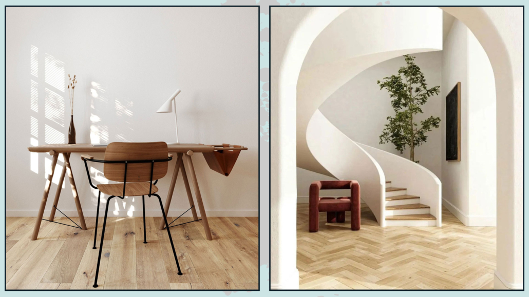
– ORGANIC SHAPES
A substantial difference between traditional minimalist style and warm minimalism lies in the shapes of furniture and elements.
While maintaining simple and essential lines, warm minimalism favors organic shapes that are slightly softer and more inviting.
Incorporating furniture and elements with soft, organic shapes makes the environment less austere and more welcoming.
(credits: Roman-Plyus; anthologycreatives.com)
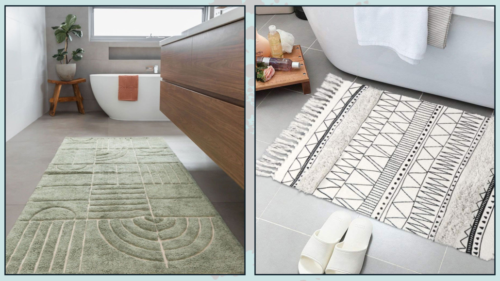
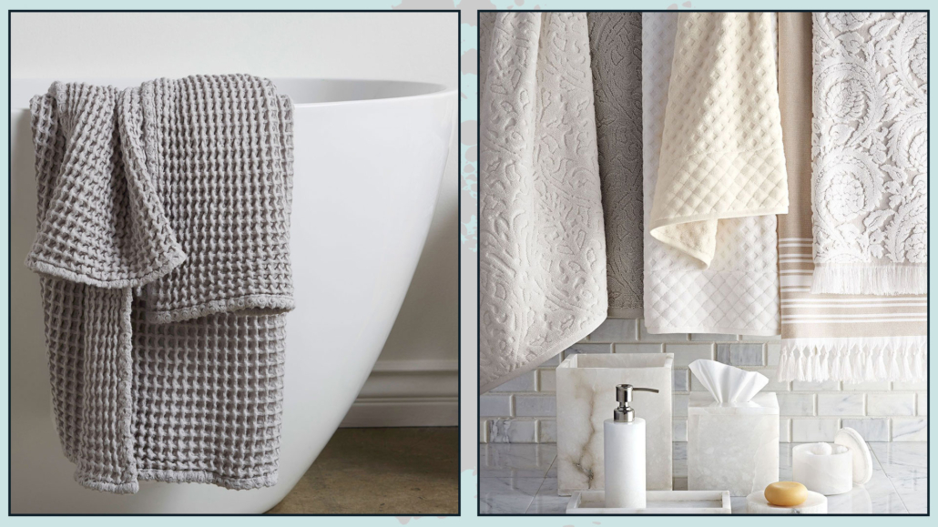
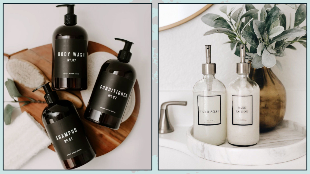
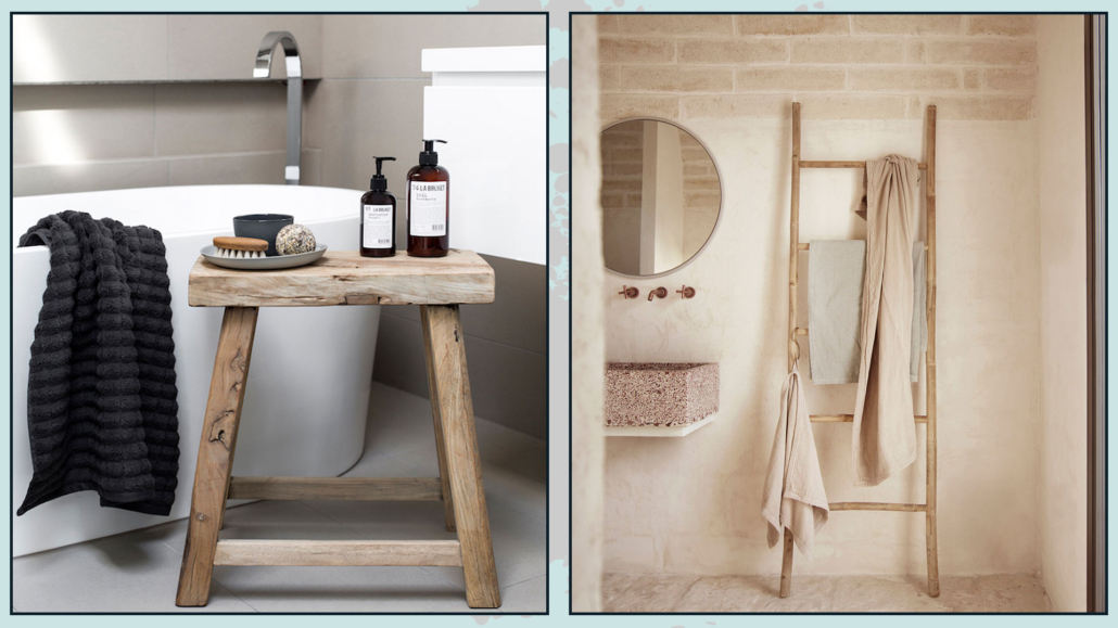
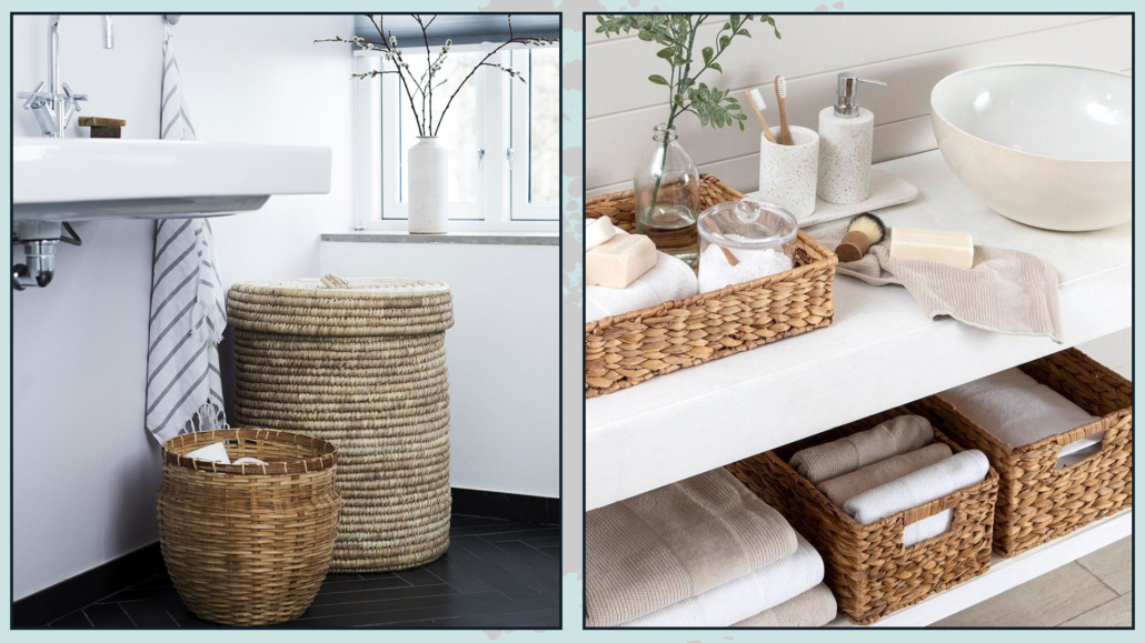
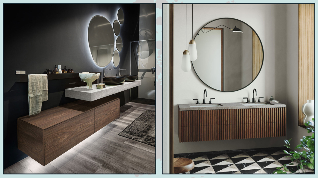
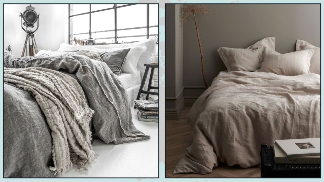
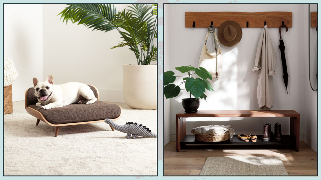
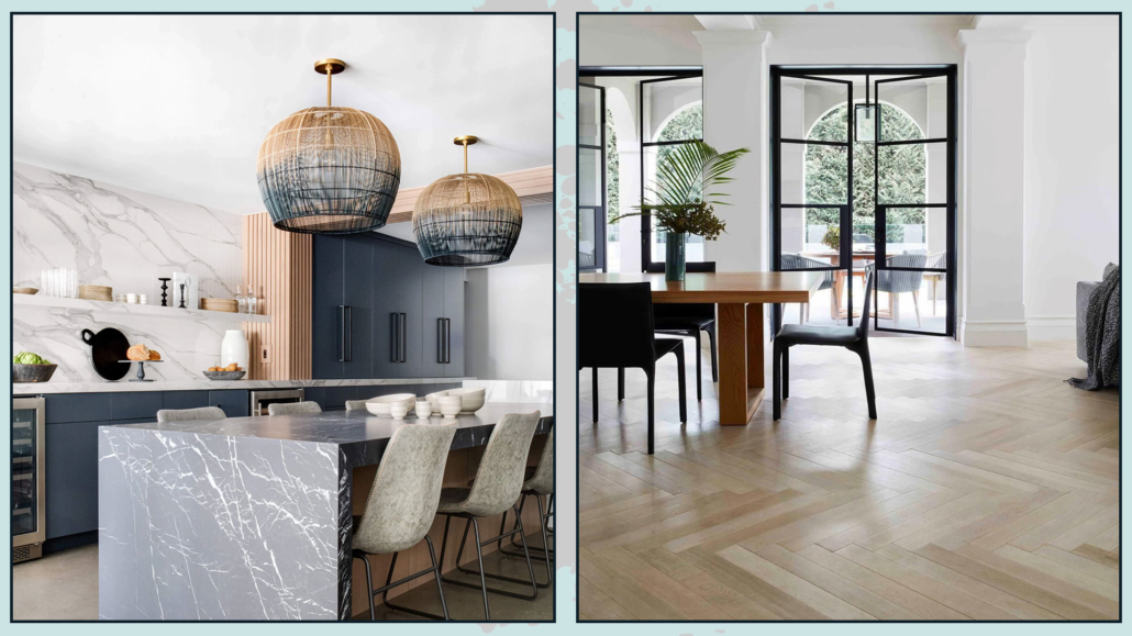
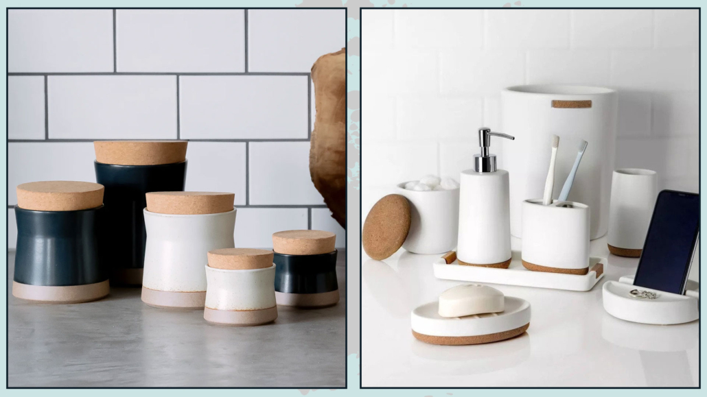
– MATERIALS AND TEXTURES
Another key difference with the traditional minimalist style is the introduction of different textures to create movement and bring life to the spaces.
In warm minimalism, wood, antique ceramics, stone, natural elements like jute (for example, in rugs), and natural textiles such as wool, linen, and cotton are introduced.
Forget about perfection – incorporating some rustic and raw pieces will bring warmth, depth, and personality to the spaces!
Look for unique pieces, perhaps artisanal or even antique, to add that extra characteristic touch!
(credits: westwing.it; stylebyemilyhenderson.com)
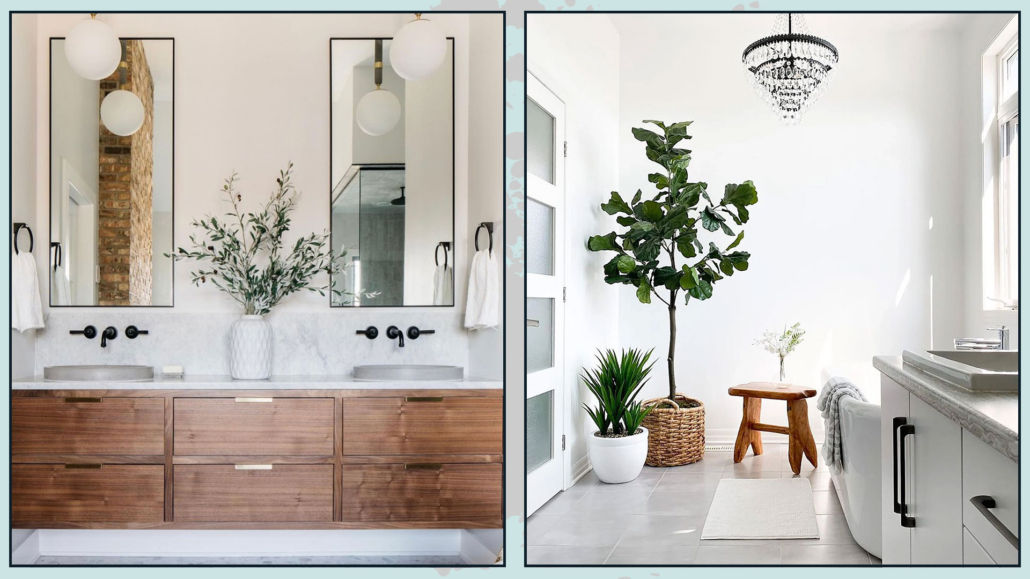
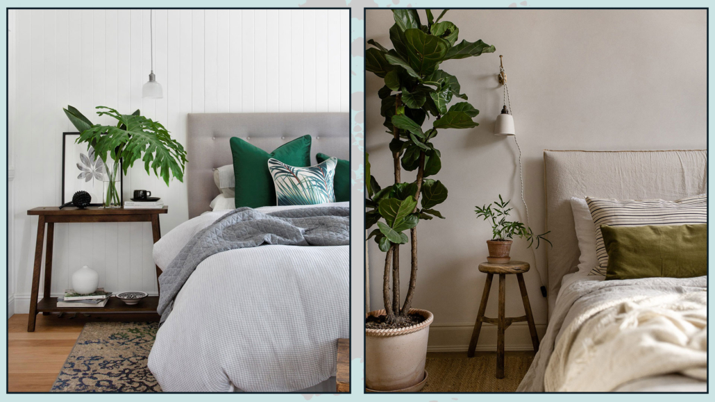
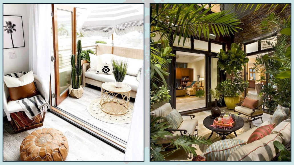
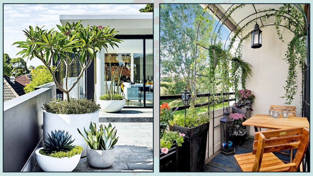
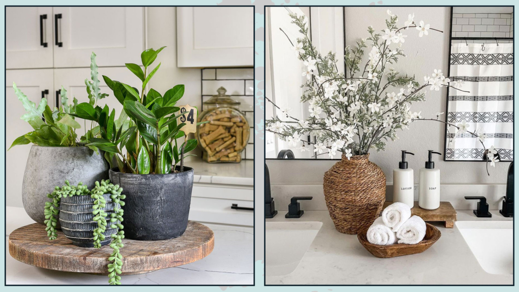
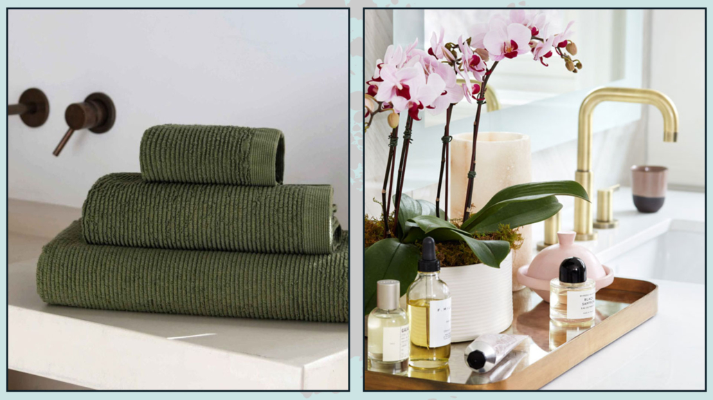
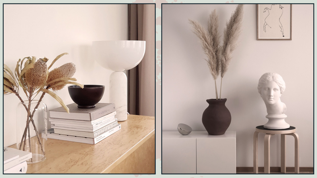
– NATURE
Bringing nature indoors, as we have seen many times, is a great way to add warmth to your home.
So, it won’t surprise you when I say that plants are paramount in warm minimalism.
In this case, the ideal approach is to have a few but large plants with significant foliage and deep green color.
That will maintain the simplicity and linearity of the style while providing visual interest without creating chaos!
Another way to bring nature inside is by using large branches in vases, whether they are made of glass or ceramic.
That is especially useful if you don’t have a green thumb, like me!
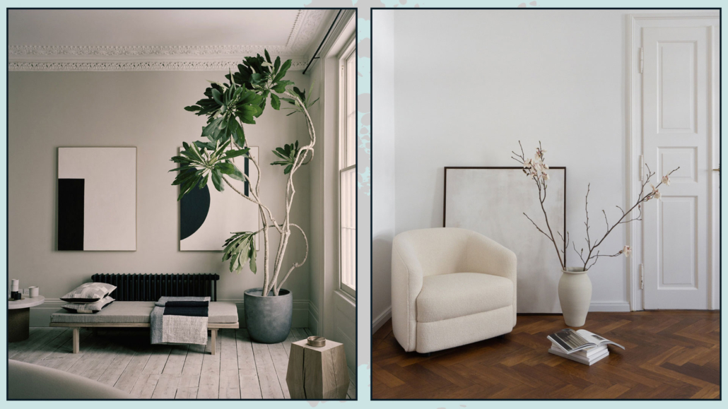
(credits: @houseofgreylondon; rgdaily.com)
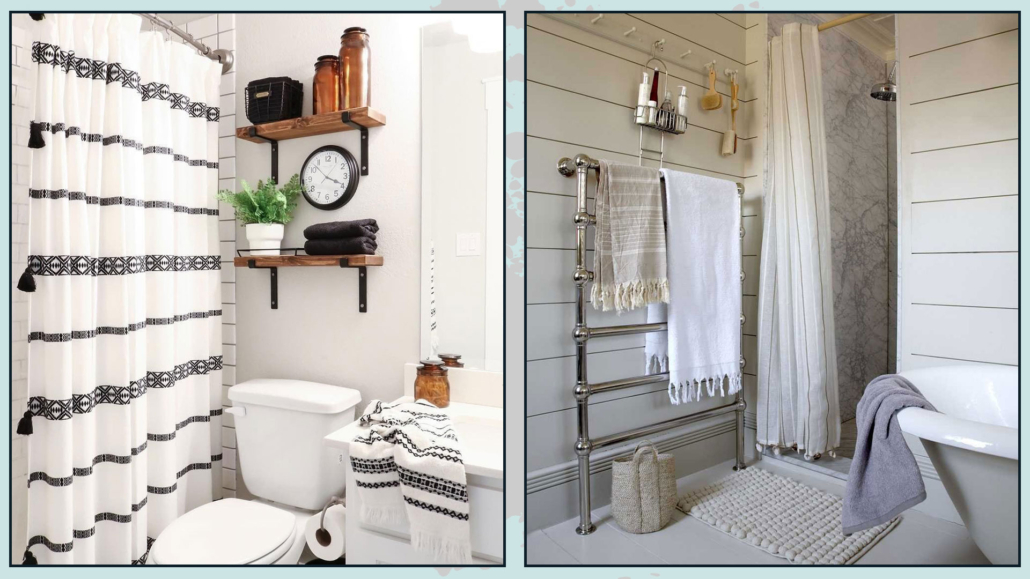
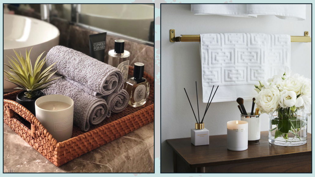
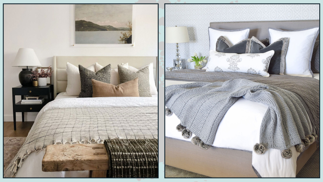
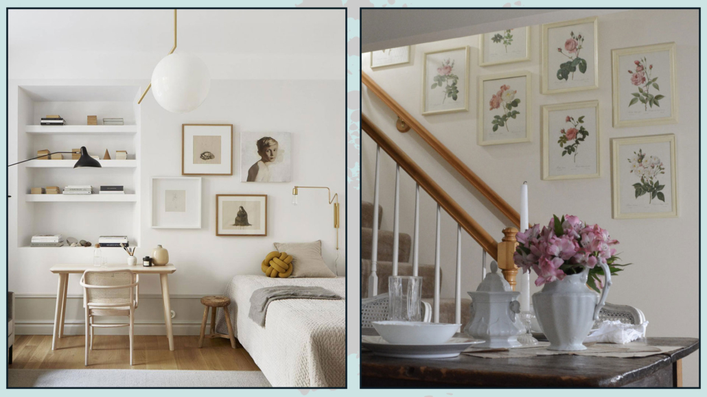
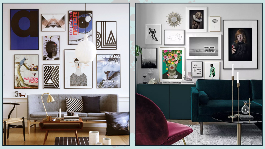
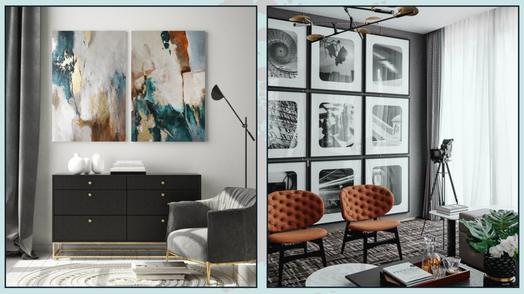
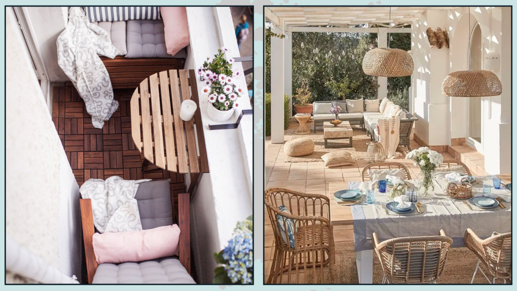
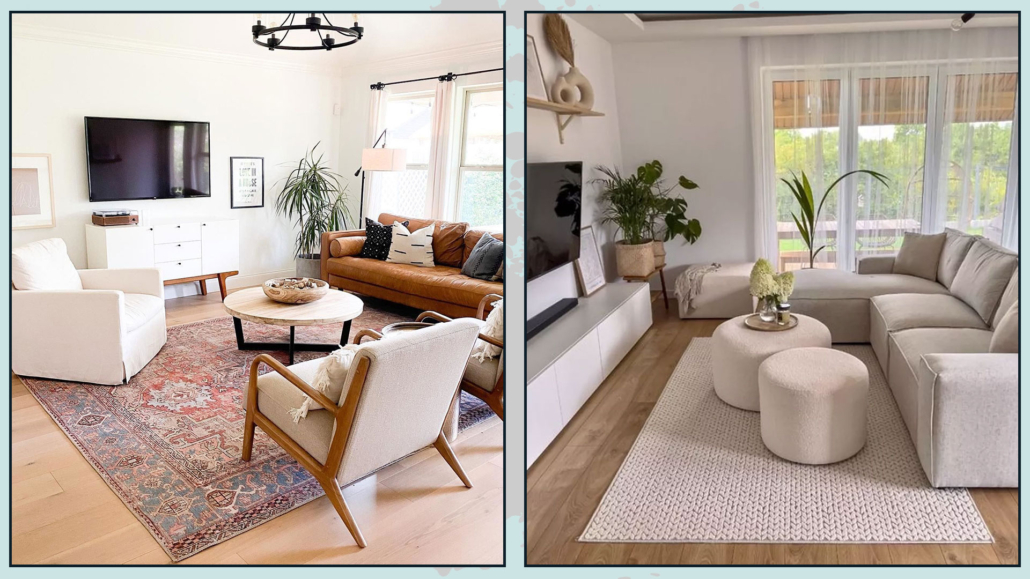
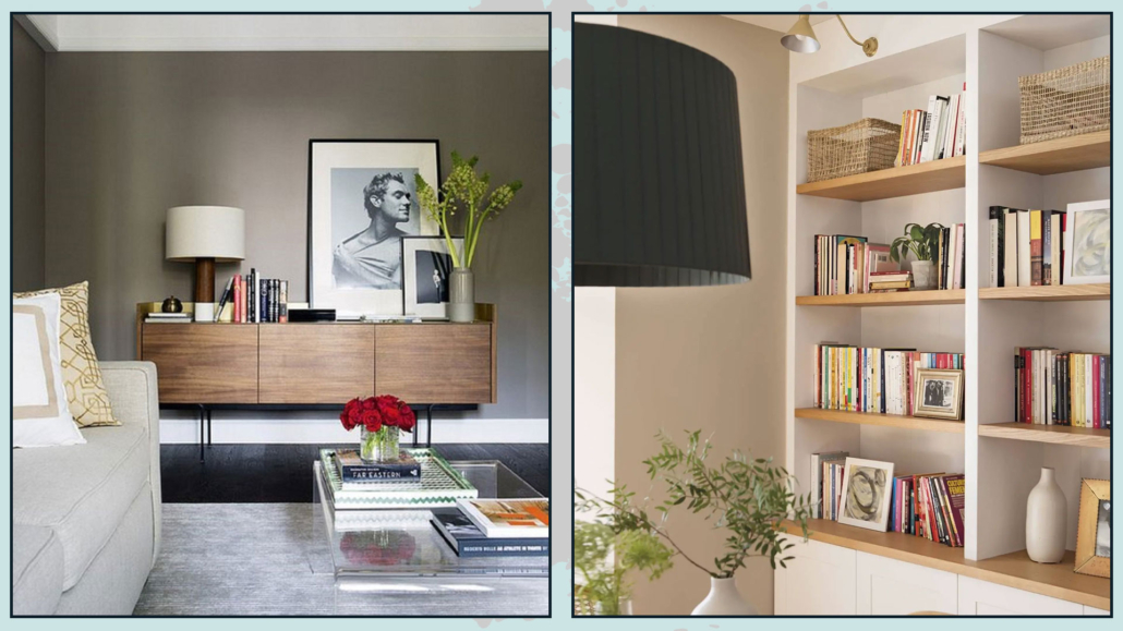
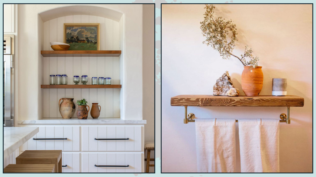
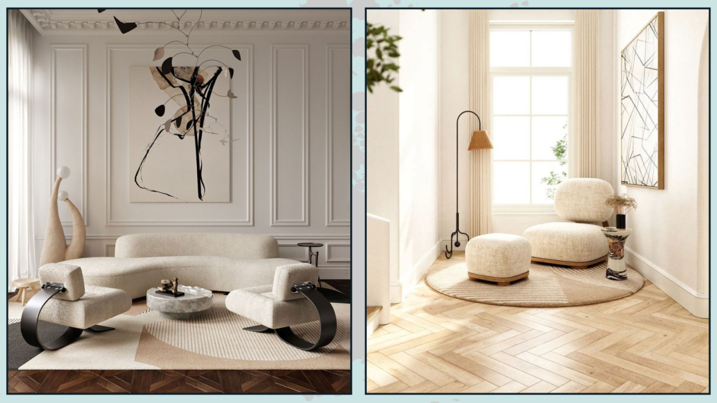
– DECORATE, BUT WITH CONSCIOUSNESS!
Unlike the traditional minimalist style, you can decorate a bit more, but it should be done with consciousness.
Use elements and objects that you actually love and have meaning for you, expressing your personality.
Decorate, but avoid filling every inch, leaving empty spaces to give even more importance to what is displayed!
(credits: septemberedit.com; @jaana__n)
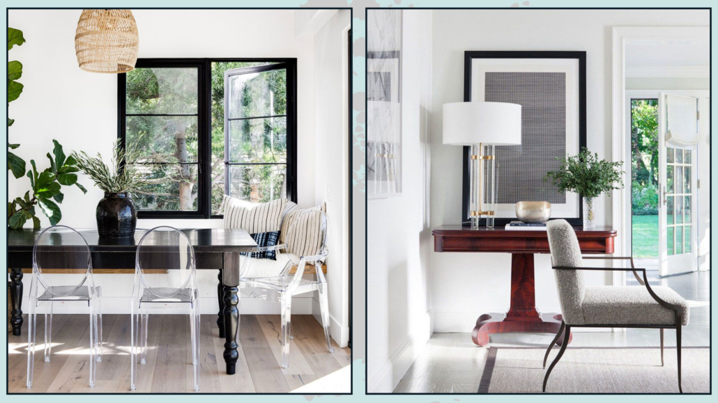
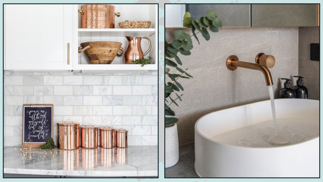
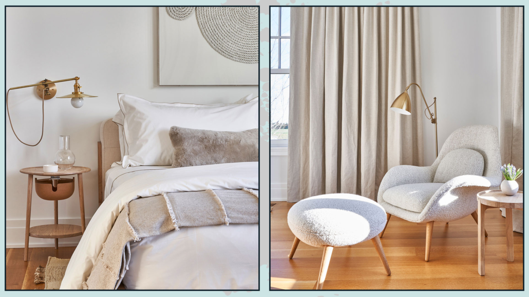
– USE WARM METALS
We have seen that classic minimalist style introduced steel…!
Metal is quite helpful to brighten and give a bit of playfulness to the spaces.
When it comes to warm minimalism, use warm metals like gold, bronze, brass, and copper!
You can also use black, as we’ve seen with colors, as it helps tie all the elements together and adds a touch of elegance!
Again, be careful not to overdo it – small touches of metal are more than enough.
(credits: sissyandmarley.com)
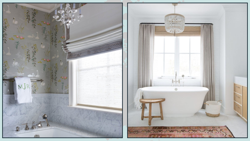
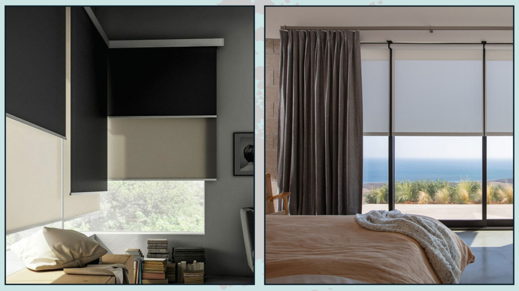
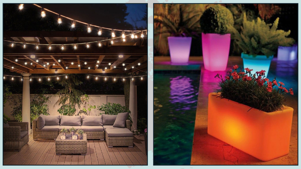
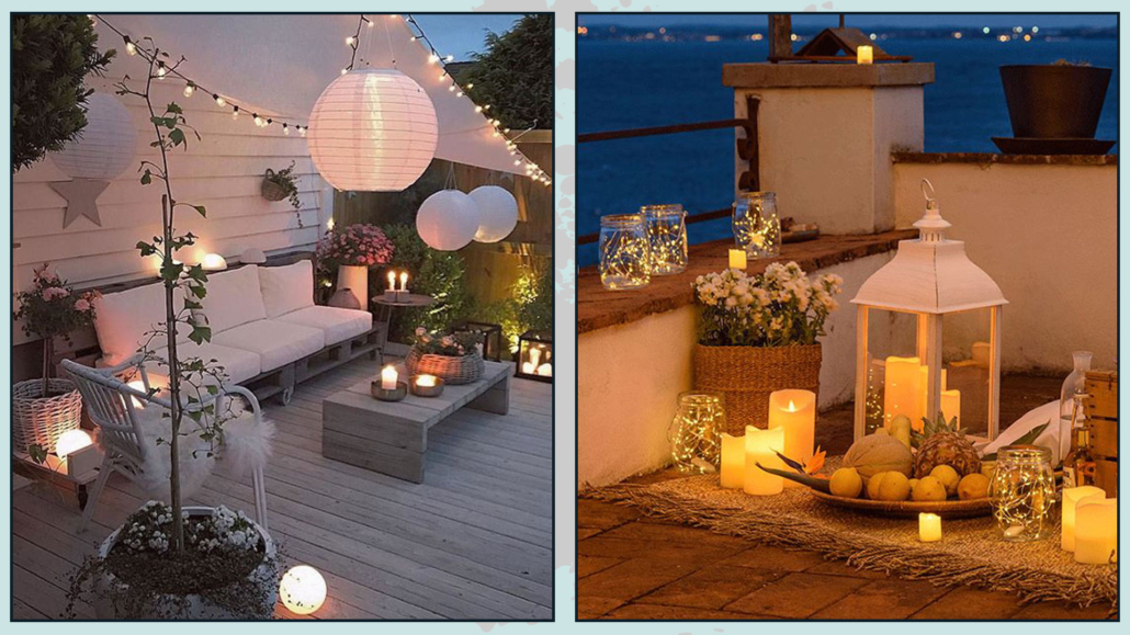
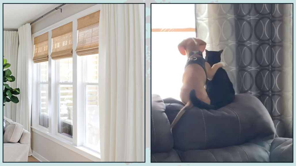
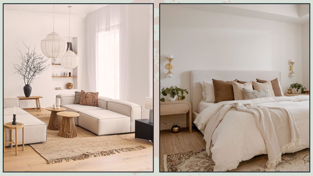
– SOFT AND WARM LIGHT
Always filter the light, both natural and artificial, to create a cozy atmosphere.
Use soft filtering curtains on the windows and lampshades for the lamps.
That way, the light will be softer and more delicate.
Furthermore, use warm-toned light bulbs to add warmth to the space!
I have often emphasized the importance of using natural light bulbs for general lighting, but in the case of warm minimalism, it’s best to aim for warm light.
You can increase the wattage slightly to ensure proper illumination if needed!
(credits: karimoku-casestudy.com; Meta Design)
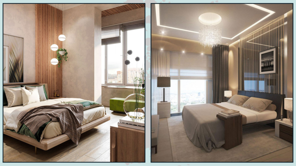
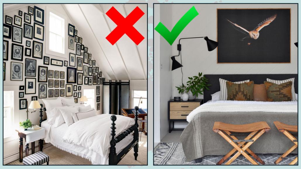
– ASYMMETRY
Traditional minimalism focuses heavily on perfect symmetry, while warm minimalism also embraces asymmetry to create visual interest.
Use unique and distinctive pieces to draw attention and then balance them with other elements of similar size in other parts of the room!
Avoid going overboard with either symmetry or asymmetry, as too much can diminish its interest and charm!
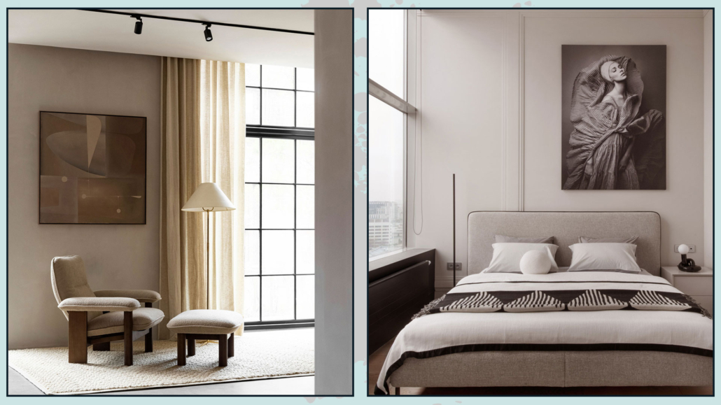
(credits: nordicdesign.ca; Daria Maksimova)
I hope this article has been helpful and enjoyable for you. If so, let me know in the comments!
Feel free to share it with anyone you think might be interested—I would be honored, and it will help me gain more exposure.
If you feel that your home, or any specific area of it, doesn’t reflect your personality enough, don’t wait any longer and book your consultancy!