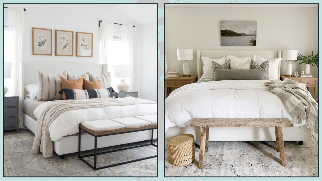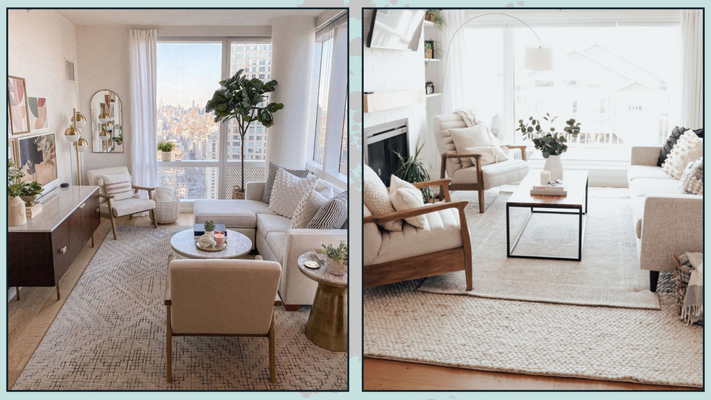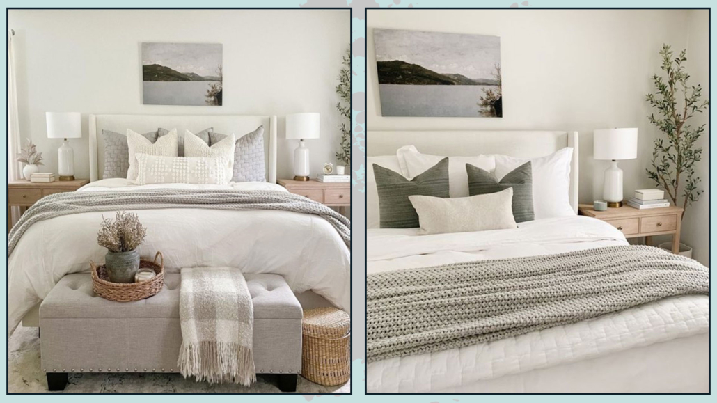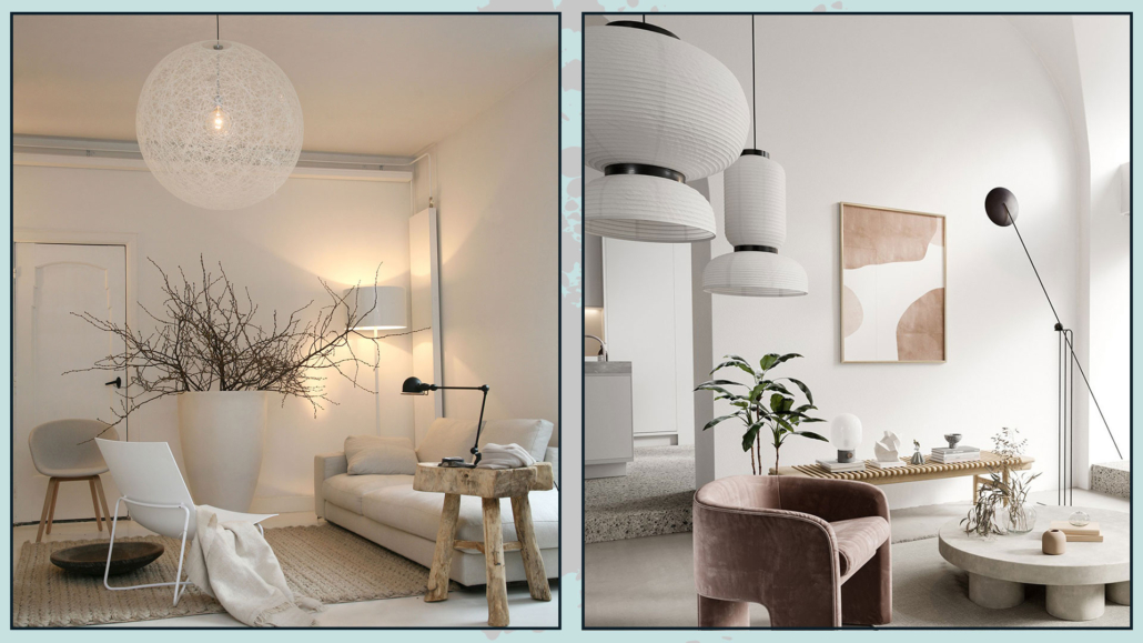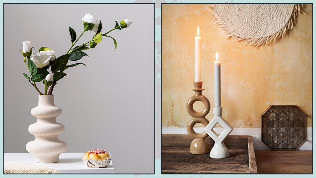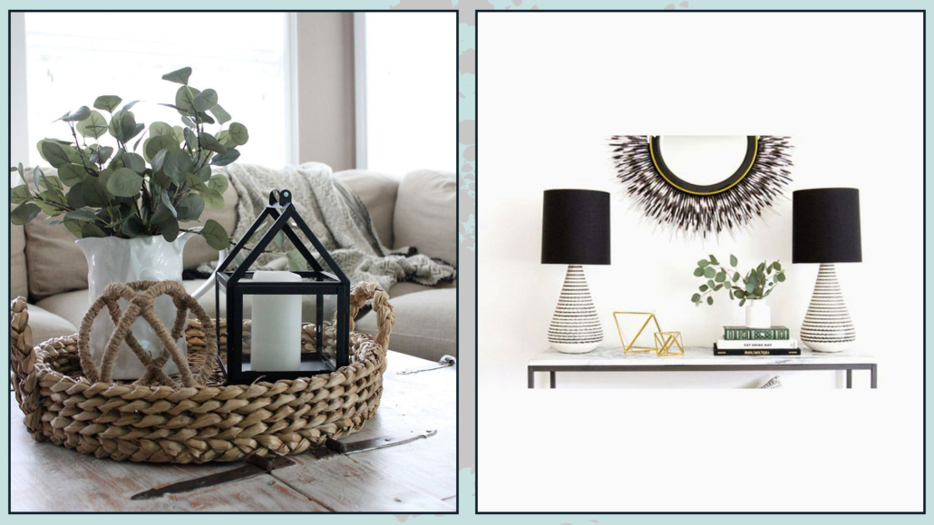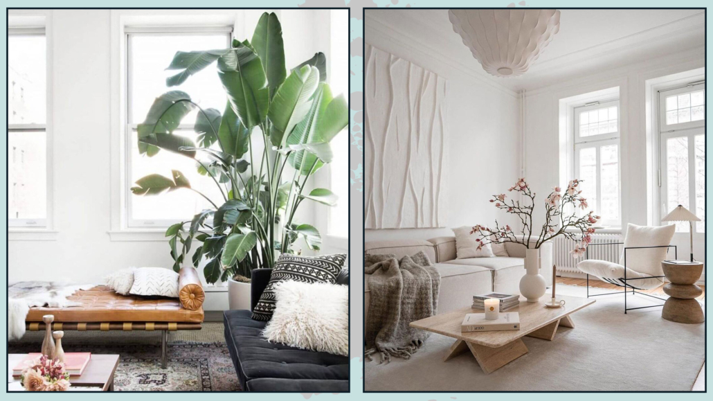
A couple of weeks ago, we looked together at some tips for decorating a home in style (you can find it here),

Today I would like to give more tips on decorating a home like a real pro!!!

– AVOIDING VISUAL CHAOS

Avoiding visual chaos will definitely make a big difference in the perception of your space!

By visual chaos, I mean anything that is unnecessary or can be a disruptive element, one on all television and computer cables!

But not only that, any toys around if you have small children and all those non-purely decorative items like remote controls can be!

Try to hide, settle everything that is not “needed”!

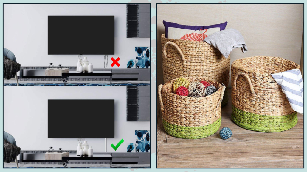
For TV, computer, or video game cables, there are conduits that you can also paint with the color of the wall if needed.

For toys, you can put them away in boxes or baskets, the latter decorate and give warmth to the room, you would have the classic “two birds with one stone”!

Avoid visual chaos - decorating like a pro

(credits: aliexpress.it; etsy.com)

Put the remotes arranged on a tray or buy those pockets that you can put on the sofa’s armrest.

Avoid visual chaos - decorating like a pro

(credits: marthastewart.com; greatusefulstuff.com)

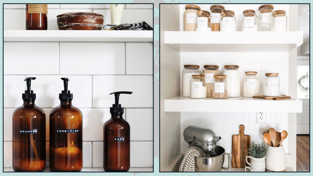
In the bathroom, you might think about getting all the same containers to fill with shampoo, conditioner, and liquid soap so that everything is coordinated and there are fewer colored bottles.

The same goes for the kitchen, for those products you may have on the countertop!

Doing this makes everything more intentional and studied like a pro!

Avoid visual chaos bathroom and kitchen - decorating like a pro

(credits: nestingwithgrace.com; etsy.com)

– USE PAINTER’S TAPE!

Does that sound like strange advice?

In fact, it may not be usual, but it could make a big difference in decorating like a real pro!

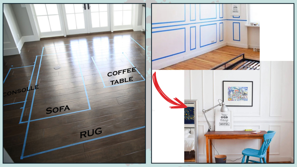
Now, if you were to do color blocking on some wall or decide to paint only a portion, you would use this tape to mark off the part to be colored, right?

Well, think about also using it to calculate the footprint of the furniture or to hang a picture or even a wall sconce.

It’s a tremendous help because it allows you to really see what a piece of furniture might look like there, whether the rug is the right size, whether the picture is proportionate and at the right height…

All with an investment that could be called zero!

We talked about moldings and paneling to add sophistication to the room… Do you want to know how it would look? Well, draw it with the tape, and you will see it immediately.

There is nothing like seeing something with our eyes to see if it is for us or not, so draw your ideas with tape to see if it really works!

By the way, regarding paintings and wall sconces, if you poke holes in the tape, you will protect the plaster from those micro flaking, which can happen by driving a nail or using a drill.

use painters tape - decorating like a pro

(credits: thesunnysideupblog.com; littlehouseonthecorner.com)

– DOUBLE-SIDED RUG TAPE

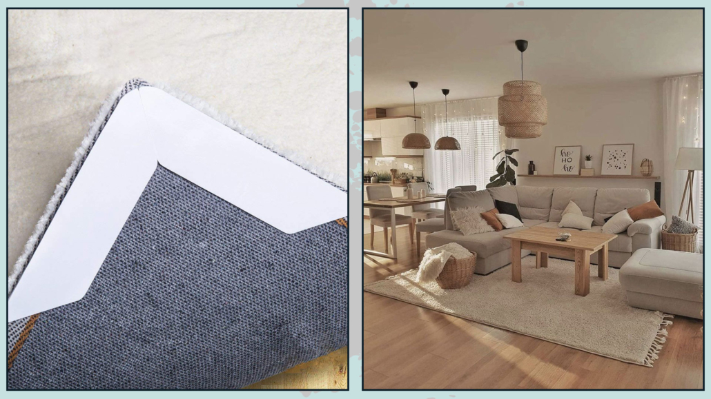
If you use rugs, this tape really becomes indispensable!

First of all, blocking the rug with tape will prevent it from shifting and thus moving from where you have placed it (this is avoided or at least greatly limited if heavy furniture or furnishings is blocking it)

The main reason is that you will prevent corners or edges from rising this way, making the rug less attractive to look at, but more importantly, risking then tripping over it!

That also applies if you put a rug on top of each other, as is very fashionable in America.

It is a double-sided tape that is really easy to remove and precisely avoids that unsightly twisting of the edge or corner!

(credits: amazon; Home interior)

– VASES WITH FLOWERS AND BRANCHES

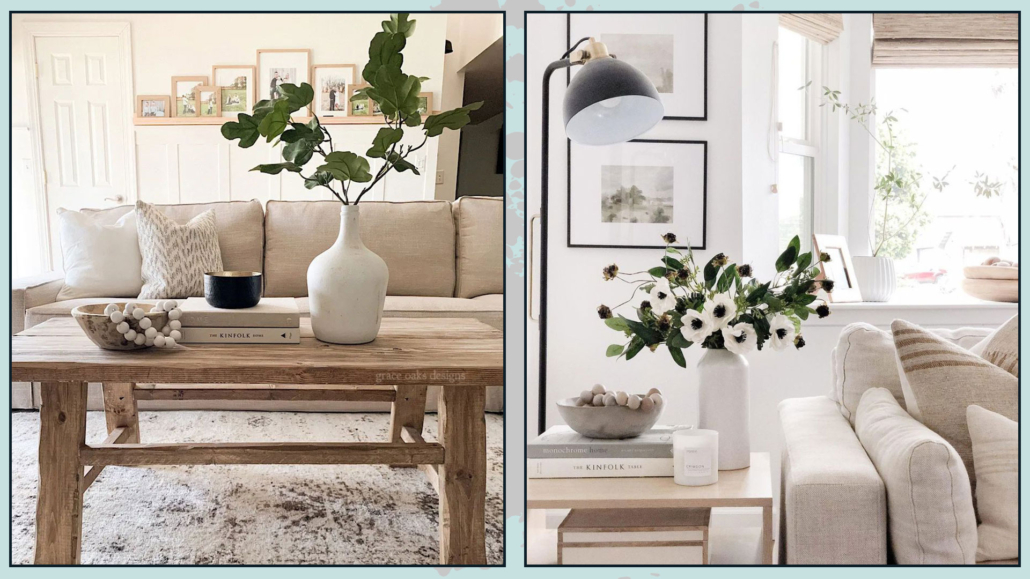
If you are not sure how to decorate a surface or what object to buy, the simplest and most impactful solution is to use vases with flowers or branches!

They bring color and vibrancy to the environment.

Adding something organic into the home is always a positive and stylish thing to do, and for decorating like a pro is really a must-have!

While it is true that in the case of plants these must be real, when it comes to small and potted arrangements, an exception can be made!

Let’s face it, flowers are an investment you can’t always make, not only financially but also in terms of time; going to the florist often may not always be feasible.

The same goes for looking for branches: if you don’t have a garden (and even then), you may not have time to go search for them.

Nowadays, finally, there are also really well-made fake flowers and branches that look real, so if you don’t overdo it, you can make decorations like that!

Then to give an extra touch of authenticity, if you put these flowers and/or branches in glass vases, add some water, and you’re done!

(credits: grace oaks designs; afloral.com)

– BLANKETS

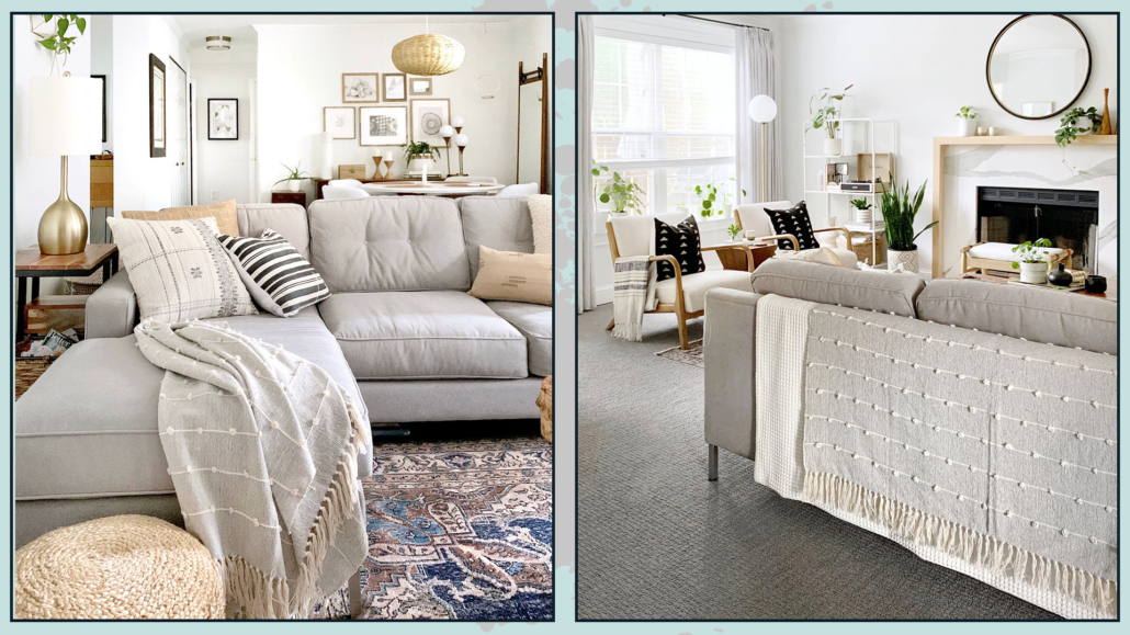
Last time we talked about throw pillows, but don’t underestimate the decorative touch of blankets!

Blankets give that touch of warmth and color to any room.

You can put it on the back of the sofa in case it isn’t pretty to look at or, otherwise, to give it that extra interest.

You can lay it on the armrest either neatly folded or a bit like it was thrown for a more casual look.

Still in the living room, you could put one or more blankets in a basket beside the sofa.

(credits: sigridandco.com)

Even on the bed, putting a blanket over the bedspread, more or less width and more or less folded or ” thrown”, will give it an extra touch.

Blankets are really a classic that a pro uses to decorate the home and give it warmth and elegance!

(credits: wovennook.com; sherricalnanhome)

– ATTENTION TO THE LOCATION OF FURNITURE

It is paramount to create a comfortable, as well as a beautiful, environment, and this can only be done by functionally arranging the furniture.

In the living room, arranging the furniture in such a way as to create a conversation area is particularly relevant.

If the seats are all facing the same side, there will be a sense that something is missing.

The excuse of the small living area is not valid, because we have seen that even there, you can still add a seat, even if it is just an ottoman!

Doing this will make the environment much more inviting!

(credits: Margaret Boatner; theblushhome.com)

– EVERY ONCE IN A WHILE, GIVE NEW LIFE TO ENVIRONMENTS!

It might also be interesting to refresh your rooms, giving them a new life!

You can do this in essentially two ways:

– occasionally, try to move some furniture to give a new layout to the room; you could also find more functional solutions!

– If you don’t want to twist everything all the time, however, you can decorate, for example, according to the season!

We’ve talked about it for fall, but it’s not like you necessarily have to fill the house with decorations, as you maybe do at least at Christmas… in fact, you’ll merely need to change colors, textures, and patterns here and there.

The simplest thing is to change the slipcovers of pillows and perhaps the blankets.

If you have double curtains, you could change the colorful ones, or have some paintings to which you could merely change the inside print!

These are all things that don’t take up too much space but will give you different environments with delivered different feelings and emotions.

(credits: sherricalnanhome)

These are little tricks a pro uses to decorate homes, always making them dynamic and never ordinary.

I hope this article on how decorating like a pro was helpful and you love it; in case, let me know in the comments!

Feel free to share it with anyone you think might be interested, I will be honored, and it will help me get my name out there.

If you feel that your home, or some environment of it, does not reflect you enough, do not wait any longer and book your consultancy!

We are now in the last part of the year, and like every year, we start talking about home color trends for the coming year, each brand proposing its color of the year 2023.

While waiting for the very familiar color of the year 2023 by Pantone, let’s see what other brands in the industry are offering us!

This year too, the call is to nature, although no longer only on the green, is very strong, but some dared a little more!

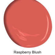
– BENJAMIN MOORE: Raspberry blush

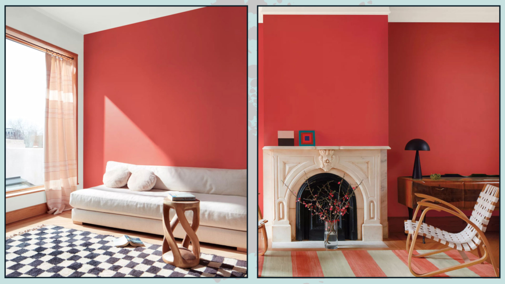
Benjamin Moore offers a vibrant and charismatic color this year, a coral mixed with red.

“Raspberry blush enlivens the senses with electrifying optimism!”

It is a powerful color, far from the neutrals proposed in 2022, which will give a touch of character to rooms.

You can use it in small doses, but you can also dare on doors or furniture up to walls!

Fun fact: To commemorate this year’s selection, Benjamin Moore collaborated with electro-funk duo Chromeo to highlight the optimistic tone of the palette and the dynamic role that color plays in personal expression, just like music (you can find the track on their website)

Benjamin Moore 2023

(credit Benjamin Moore)

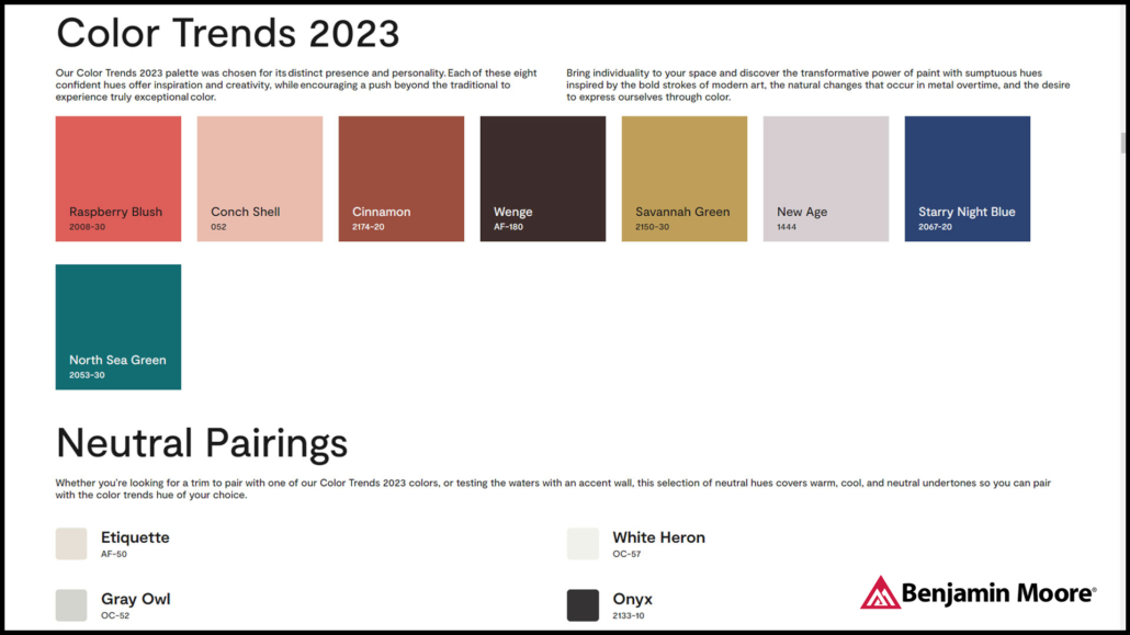
Benjamin Moore proposes a whole palette of colors, which, for them, will be the trend of 2023.

As you can see, the colors, if you exclude conch shell and new age, are all quite bold and intense.

When using these colors, I recommend calming them down with neutrals, like the four proposed by Benjamin Moore himself!

Benjamin Moore 2023

(credit Benjamin Moore)

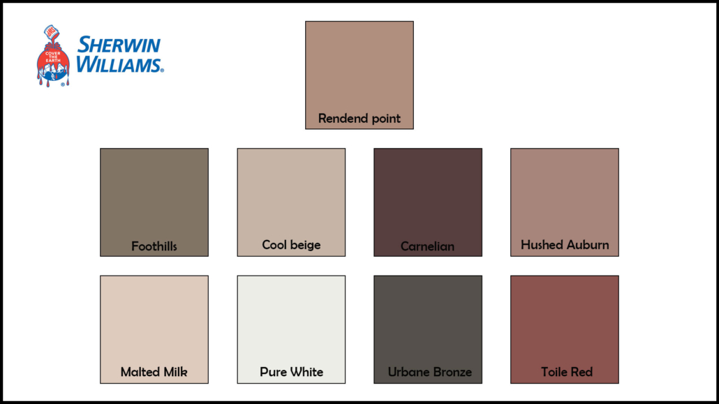
– SHERWIN WILLIAMS: Rendend point

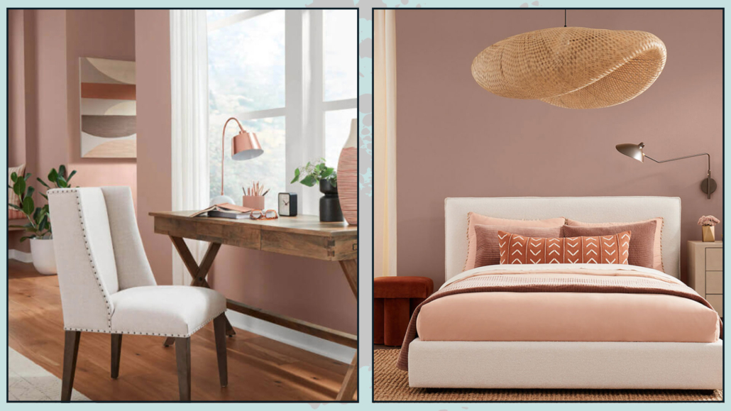
Sherwin-Williams offers a warm and intriguing color that goes well with all styles.

Basically, it is a neutral color, an earthy color with a hint of pink, a color that helps you feel rooted!

It is a soothing color, so it is also suitable for the bedroom, giving a touch of personality.

It is versatile, so in addition to fitting all styles, it also goes well with most colors, although it gives its best with white and other warm colors!

Sherrwin Williams 2023

(credit Sherwin Williams)

Fun fact: Sherwin-Williams worked with Etsy to find a selection of items that would go well with this color.

Sherwin-Williams also offers a whole palette of colors that you can safely pair together!

Sherrwin Williams 2023

(credit Sherwin Williams)

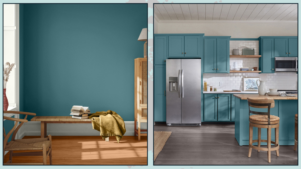
– PPG: Vining ivy

PPG stays in shades of green, although this year’s is a bolder green!

“It’s a deep, shaded Caribbean aqua with turquoise undertones” that goes with any style!

It is an elegant color that becomes truly gorgeous when paired with warm wood tones.

Relaxing, refreshing, and revitalizing, you can use it in all rooms, either as furniture or on walls!

PPG 2023

(credit PPG)

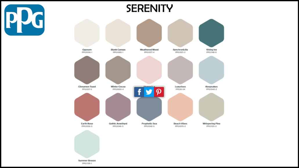
This year too, PPG offers three color palettes that include Vining ivy:

– Serenity

It is a color palette that combines pastels, watery tones, and warm neutrals, all calming and soothing colors that bring serenity precisely!

PPG 2023

(credit PPG)

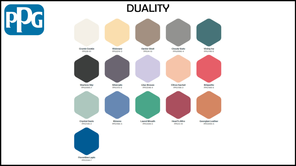
– Duality

It is a palette that plays with contrasts: there are, in fact, pastel colors and very bright colors; it is for those who like to dare and give a touch of powerful character!

PPG 2023

(credit PPG)

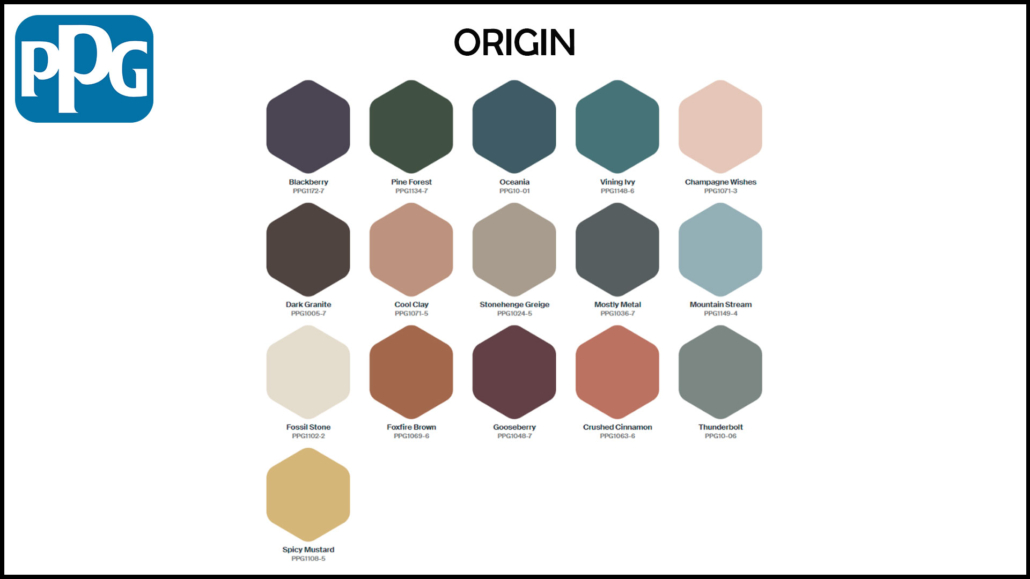
– Origin

It is a palette that takes inspiration from the natural world, picking up the colors of nature, forests, earth, and sea…

PPG 2023

(credit PPG)

We can also find this color in one of the three color palettes proposed last year:

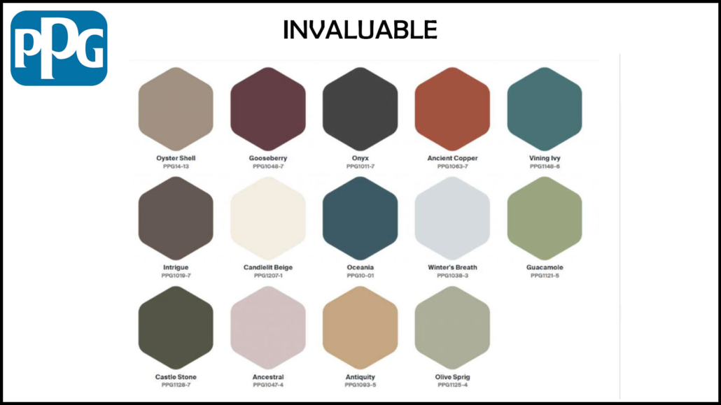
– Invaluable

Dark, refined hues, in short, an elegant color palette that winks at traditions!

PPG 2022

(credit PPG)

– BEHR: Blank canvas

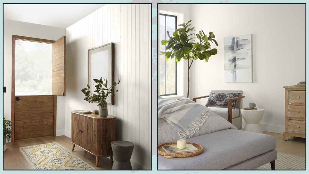
The Behr brand chooses, as the color of the year 2023 Blank canvas, a warm, buttery, and enveloping white.

It is a calming and soothing color that you can use with all styles and in all rooms; you can use it alone, but it will be an excellent glue for many other colors.

It is less rigid and austere than pure white, it nevertheless retains its brightness, so it’s excellent on walls.

In an exclusive interview with AD, Erika Woelfel, vice president of color and creative services at Behr, described the shade as “that perfect artistic color to allow people to start expressing their creativity.”

Behr 2023

(credit Behr)

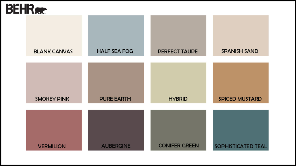
Behr, too, offers a color palette that can be used in conjunction with the blank canvas.

They are all dusty colors, many of them echoing the colors of nature and the earth.

Behr 2023

(credit Behr)

– SIKKENS: Wild wonder

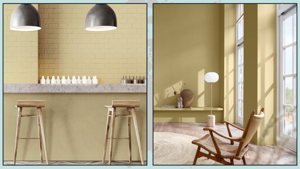
Sikkens, too, draws on nature with its Wild wonder, a color that echoes that of wheat.

A warm, positive color that reconnects us precisely with nature, bringing calm and serenity.

That, too, is a color that goes with all styles and can be used in all rooms, from the furniture to the walls, for a definitely relaxing and bright environment.

Sikkens 2023

(credit Sikkens)

This brand is no exception and creates no less than 4 palettes around its color of the year, all inspired by nature:

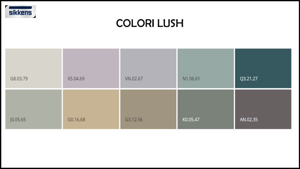
– Lush colors:

Resumes forest shades “help us make our homes feel part of the world”.

Sikkens 2023

(credit Sikkens)

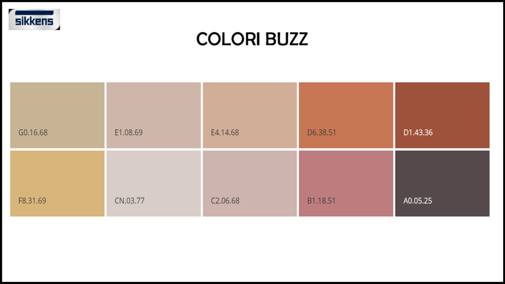
– Buzz colors:

echoes the bright colors of the meadow and flowering fields; they are shades that “give energy, harmony, and joy”

Sikkens 2023

(credit Sikkens)

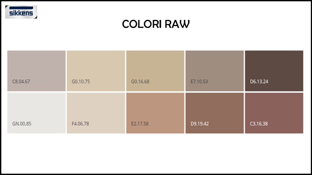
– Raw colors:

echoes the hues of the harvest, conveys “the wonder of nature’s products, and can give a sense of richness and creativity to the environment.”

Sikkens 2023

(credit Sikkens)

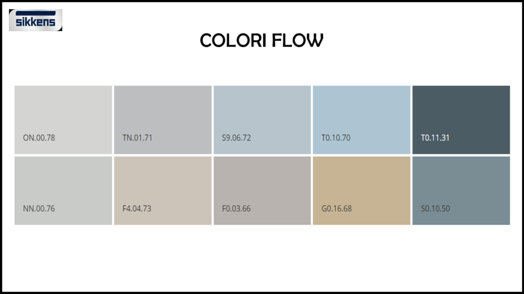
– Flow colors:

echoes the hues of the sea; they are delicate shades “capable of conveying a sense of balance in our hectic lives.”

Sikkens 2023

(credit Sikkens)

– FARROW & BALL:

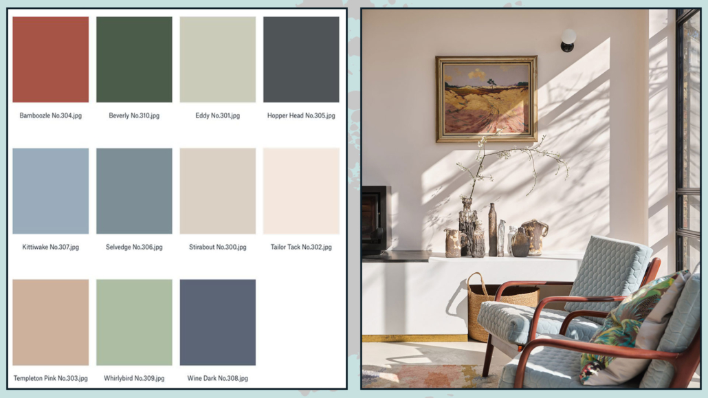
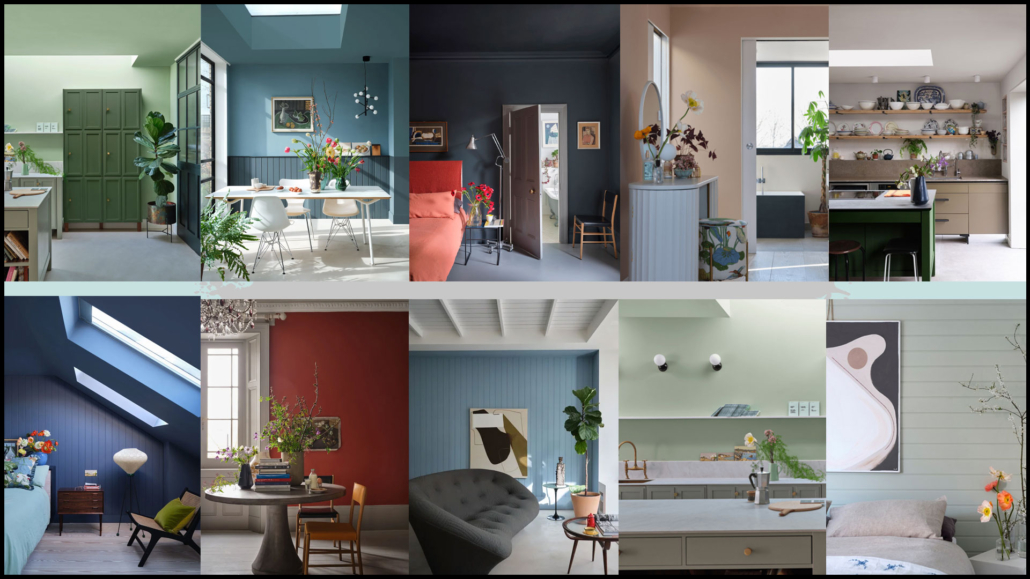
As always, this brand offers more than one color each year: this year, as many as 11, all inspired by moments of joy, comfort, and refreshment.

Bamboozle is the somewhat bolder and more vibrant of these colors; the others are a bit more neutral.

All of them, however, including bamboozle, fit well with any style and can be used together to create an original palette that will give your home some character!

Farrow & ball 2023

(credit  Farrow & Ball)

Farrow & ball 2023

(credit  Farrow & Ball)

I hope this article was helpful and you love it; in case, let me know in the comments!

Feel free to share it with anyone you think might be interested, I will be honored, and it will help me get my name out there.

If you feel that your home, or some environment of it, does not reflect you enough, do not wait any longer and book your advice: just contact me!

Today, I would like to share with you some tips and tricks used by interior designers to decorate home with style!

A few suggestions are really very simple and usable right away in your home!

– SCALE AND PROPORTIONS

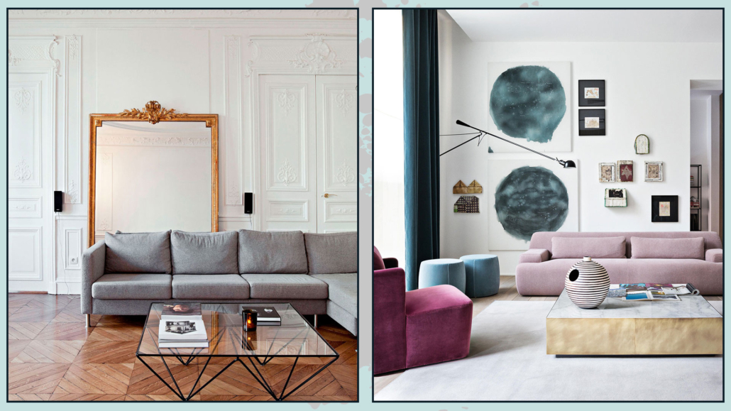
It is paramount that furniture and accessories are correctly scaled to the size of the room and in proportion to each other.

Furniture or elements that are too large will give a feeling of an overstuffed and confusing environment.

Conversely, too small will be lost, giving the feeling that something is missing.

So to furnish and decorate in style, it is really essential to measure the space and buy items with the correct size for that specific place and in relation to the rest!

(credits: artheco.it; Bronxes Studio)

– BALANCE AND SYMMETRY

Our eyes really like symmetry: it is something that subconsciously calms us!

Decorating your home in style using symmetry is undoubtedly a great thing to do…

BUT, as always, without overdoing it, because then it can get boring!

Perfect symmetry, if repeated over and over again, loses its appeal then, making the environment flat.

The key word is always BALANCE, so don’t be afraid to use asymmetry you only need to balance it visually!

Now let me explain:

If, for example, you decide to put a picture above the couch but not centered, you can balance on the other side with a beautiful floor or wall lamp.

Balancing visual weights will maintain a balance even without perfect symmetry!

The important thing is not to decorate only one side of the wall or place all the furniture in one area of the room without balancing it with something: otherwise, it will look like something is wrong.

(credits: neptune.com; Knoll)

– ATTENTION TO THE USE OF COLORS

The right or wrong use of color will make a big difference in decorating your home in style.

Color has deep psychological significance and is a fantastic ally for our homes.

You can use it on walls, furniture, and decorations, such as pictures, pillows, and vases…

Unless you want a total white or total black or total grey home, you certainly use some colors: in fact, neutrals are colors because they will have a definite undertone (actually, unless you use pure colors white, black, and gray, do too).

You can have a monochromatic home, that is, using the same color everywhere, changing the saturation and intensity: this creates rhythm and does not make everything flat.

You can also use color just in small touches, so in a room, which tends to be neutral, add a few colorful elements here and there (a pillow, an ottoman, an armchair… for example!).

Then, again, you can use different shades of this color to give that sophisticated and stylish touch.

Of course, you can also use more than one color by creating a well-thought-out color palette that allows you to have a balanced and harmonious environment.

If you are afraid to use color, proceed in small steps, with small elements first!

(credits: mooielight.com; Sean Litchfield)

– ALWAYS MAKE COMPOSITIONS IN ODD GROUPS

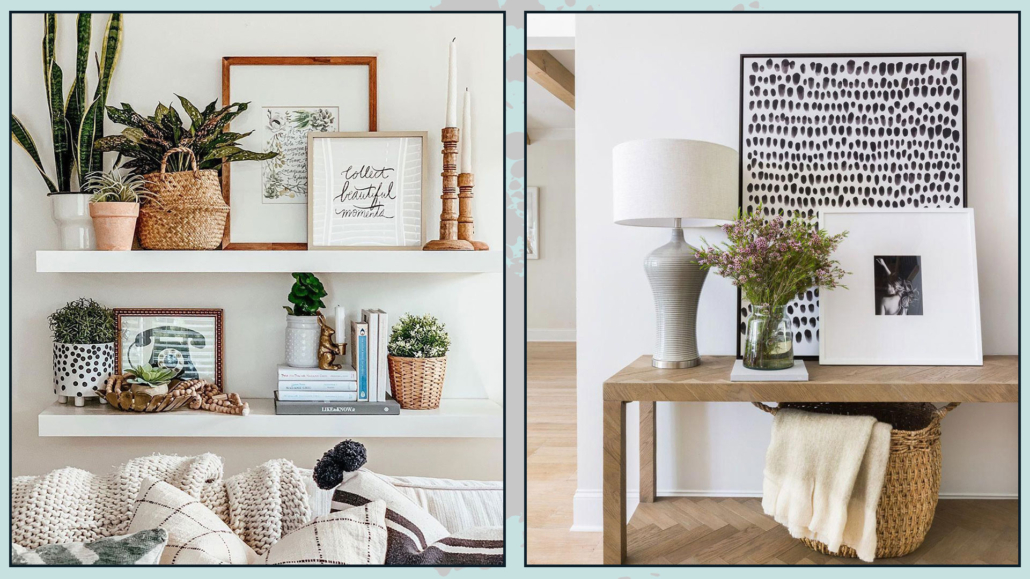
When making your decorations on a coffee table, a console table, the shelves, or a bookcase, always make compositions with an odd number of elements.

If you put only two elements next to each other, there will be a bit of a feeling of something incomplete; something put there somewhat randomly.

One is an odd number, so, especially on the dining or coffee table putting only one object, perhaps a vase with flowers, may be an option; the only caution will be that it be proportionate to the surface on which it is placed.

The fact remains that three is always the perfect number, although nothing prohibits making five-element compositions as well.

Small clarification, if you put books on top of each other and place an object on there, the whole thing will be considered as one element of the composition!

When making these groups, to make them attractive and sophisticated, always remember to play with different sizes, materials, colors, and finishes.

The elements should create a triangle or diagonal, as always, to give rhythm and dynamism.

Also for compositions, pay attention to the things mentioned in the previous point, namely, the proportions between the elements that make up the composition itself and this in relation to the place where it is placed!

(credits: boho-farmhouse-decor-home-tour-2020; Scout & Nimble)

– THROW PILLOWS

Throw pillows are a quick, easy, and inexpensive way to decorate your home in style.

It will also allow you to change the face of your environments whenever you want!

In fact, once you have bought different-sized and shaped interiors, you can purchase different slip-coverings that you can replace at every change of season, for example, or whenever you see fit.

The slipcovers do not take up too much space and, as just seen, allow you to renovate your home with ease.

I recommend considering throw pillows as any decorative object and so, also with them, as mentioned in the previous point, make compositions in groups of three, or at any rate, always in odd numbers on the couch or bed.

Therefore, even with throw pillows, it is good to use different sizes, colors, patterns, and textures in the composition to give some rhythm and dynamism.

Be careful how you mix patterns, keep in mind the colors, but also the scale of the designs so that each piece blends well with the other (I talk in detail about how to mix patterns here).

Avoid, unless you are in an armchair, leaving a pillow alone, it would seem to be put there a bit haphazardly!

A well-designed composition will immediately give a sophisticated and elegant effect.

(credits: Enorm d’Acheteromme; lifeoncedarlane.com)

Little Tips:

– to get pretty filled pillows, get interiors a little bigger than the covers.

– if you like to give a magazine look to your pillows, get interiors that you can shape well (not too dense, to be honest), and then once it’s pretty filled, you can karate chop it with your hand in the middle!

It is very trendy, but, actually, it gives that feeling of something more studied.

(credits: Etsy.com)

– WALL DECORATIONS

Decorating walls with style is not as easy as it looks, and mistake is really just around the corner!

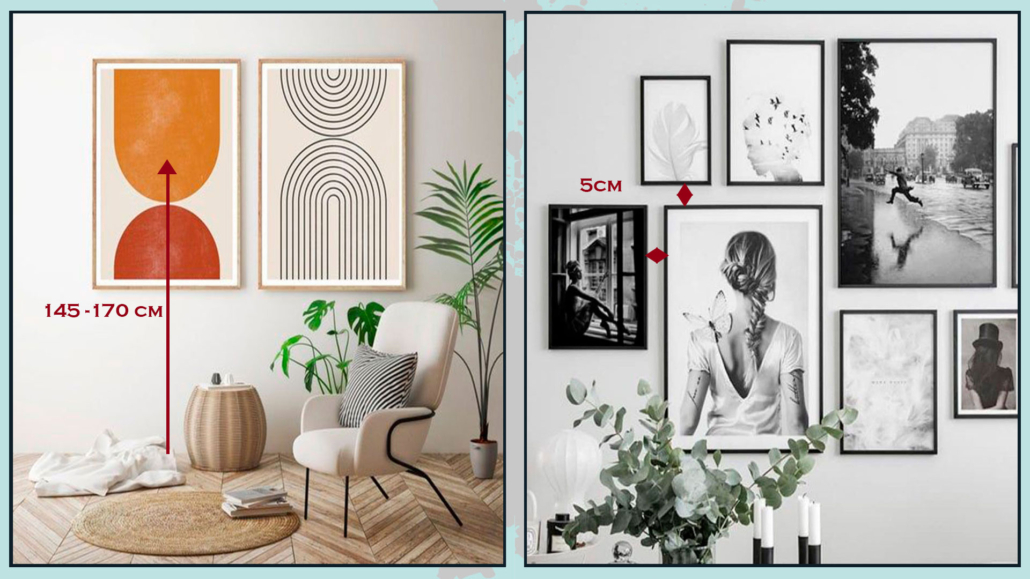
On the wall, you can put mirrors, pictures, or photographs; you can put one or two pieces or a whole gallery, and, in all cases, the first thing, the most important, is to hang at the right height!

Mirror or pictures, or, better, the center of them, should be hung at eye level, being around 145 and 170 cm from the floor; it will depend on your height, of course!

If you hang the picture or mirror too high, it looks like its own thing, separate from everything else.

In the case of a composition, this measure should be taken for the center of it.

The distance between the various elements on the gallery wall is also significant, which must always be the same and is around 5 cm, both in height and sideways.

If the paintings are too close together, it will create confusion, while if they are too separate, they will look like stand-alone pieces and will not form a cohesive and harmonious composition.

(credits: etsy.com; posterstore.it)

Small cautions:

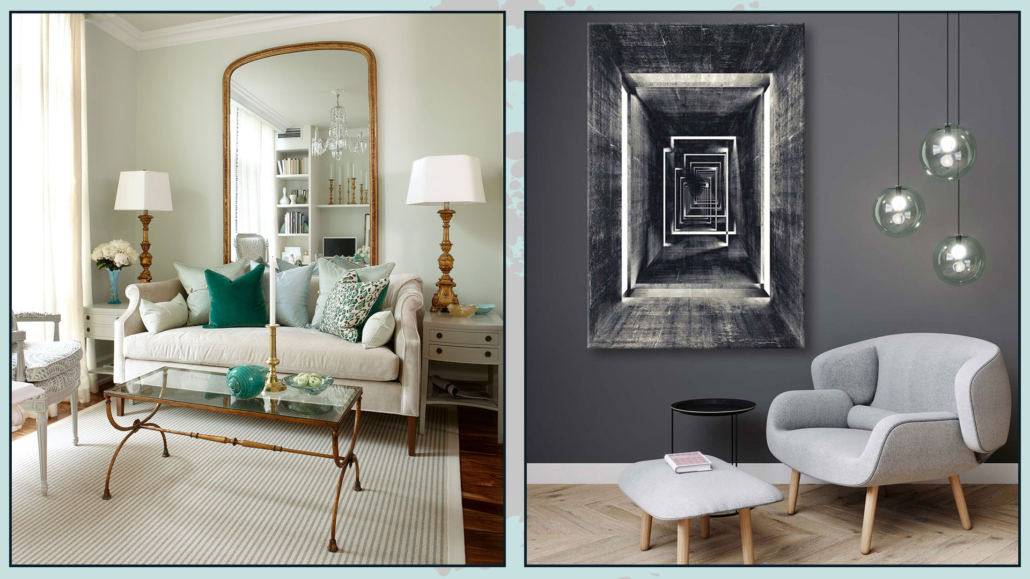
Regarding mirrors, as seen on other occasions, you can also dare to use huge mirrors, perhaps resting on the floor; they will double the light and give an incredible touch of elegance and style.

For paintings, on the other hand, I recommend avoiding buying elements mass-produced because they will not bring originality.

Of course, I understand that one cannot always afford an auteur painting, but if you look well, you might find a large number of emerging artists who have really cool and distinctive works.

Another way to have original paintings is to create them yourself: if not painting, you can use fabrics, for example… don’t limit your creativity.

The important thing, however, is to look for elements that represent you and tell who you are so that you can decorate in style, your style, your home!

(credits: Sarah Richardson Design; hepsiburada.com – Voovart)

I hope this article was helpful and you love it; in case, let me know in the comments!

Feel free to share it with anyone you think might be interested, I will be honored, and it will help me get my name out there.

If you feel that your home, or some environment of it, does not reflect you enough, do not wait any longer and book your advice: just contact me!

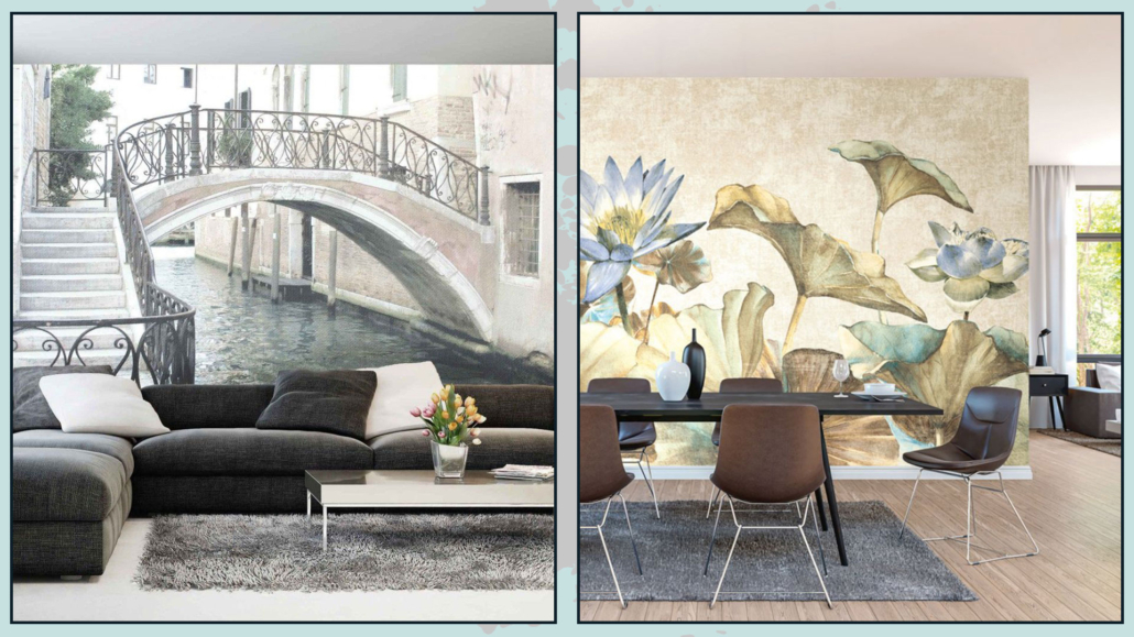
It’s been some time now that wallpaper has been back on trend, but, as you know by now, it’s nothing like what our grandparents used!

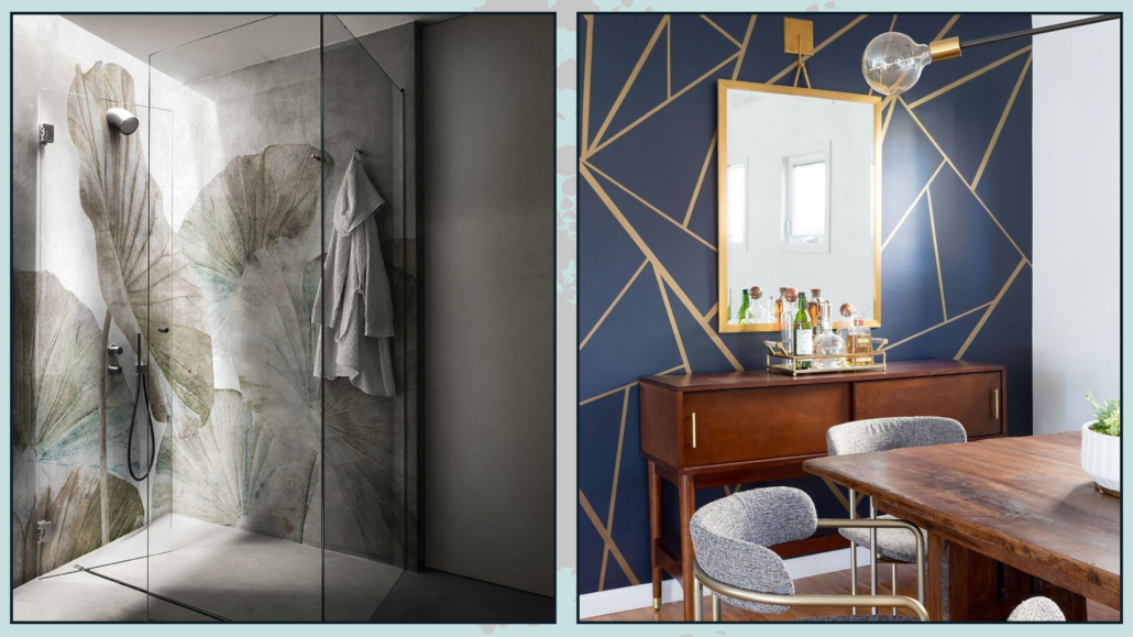
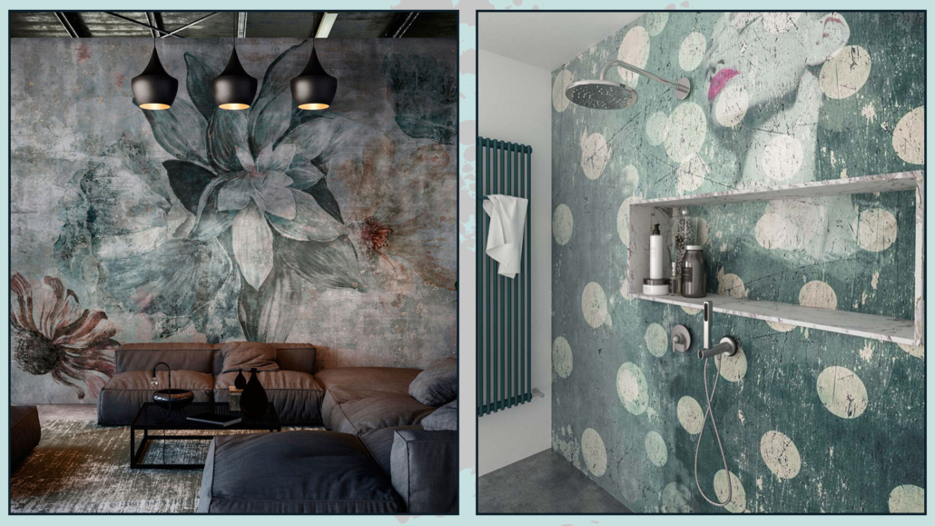
With modern technologies, there are wallpapers of different materials which can now be adapted to any environment, even unthinkable ones such as kitchen and bathroom, even in the shower interior!

Even in terms of colors and patterns, there really is such a varied and wide choice that getting lost is a snap!

How to choose the best wallpaper?

EVALUATE THE MATERIAL

The first thing to figure out is WHERE we want to put the wallpaper; this is important to understand the most suitable material!

As I mentioned earlier, today, wallpapers are made of different materials, not only pure paper; in fact, there are also fabric wallpapers, vinyl wallpapers, fiberglass wallpapers, etc.

Depending on where the wall to be decorated is, there will be the best material:

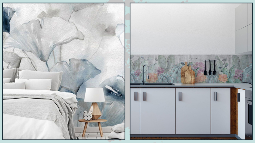
– for example, to use wallpaper as a kitchen backsplash, the ideal is to use fiberglass one, in the bathroom, and even in the shower vinyl or PVC paper will be suitable.

– in all other rooms that do not have as much humidity and thermal stress, all kinds of paper will do, although perhaps the best is a nonwoven paper composed of fabric and vinyl, making this paper durable, washable, and also very pleasant to the touch.

(credits: wallsauce.com; Lime Lace)

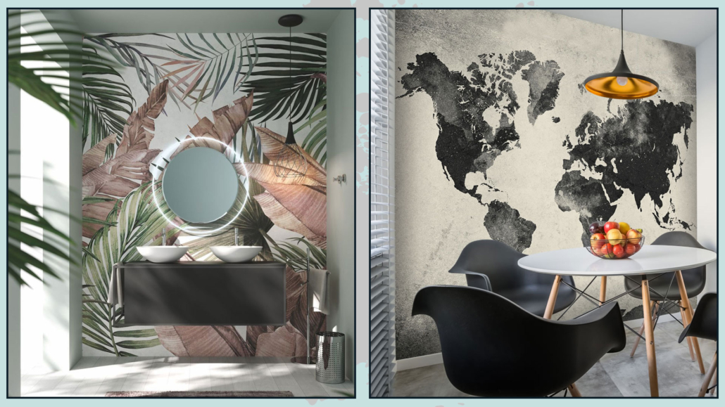
(credits: london-art-naiadi-wallpaper; Jenn Feldman)

ATTENTION TO THE CONFIGURATION OF THE ROOMS

For the correct choice of paper, it will be essential to consider the condition of the room where you want to put the wallpaper.

Patterns, especially, should also be chosen according to the size and lighting conditions of the room.

For example, if the room is small, better to use wallpapers with light contrasts and designs that are not too small to avoid over-saturating.

You could even dare with decidedly oversize patterns because that also tricks the eye and makes you perceive larger spaces.

In small spaces also better not to put the paper on all four walls.

The thing that actually, I personally advise against regardless, is to avoid “trivializing” the choice of wallpaper, but mainly because the eye also needs solid colors to rest!

However, it is clear that, in huge environments, you can dare a little more!

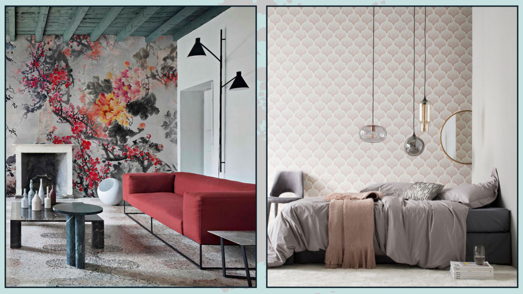
(credits: archiproducts; cartadaparatiartistica.com)

For the other walls, you can use colors similar to the paper ones to harmonize it better or neutral and simple colors to enhance it more.

Wallpaper is a great way to emphasize a wall, and create a focal point, so choose the most important wall in the room, the one where you want to draw the eye!

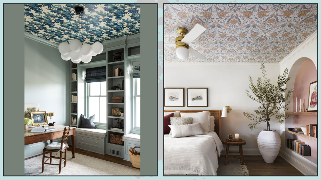
N.B. the focal point doesn’t have to be the wall…it could also be the ceiling!!!

That would undoubtedly give a strong personality to the environment!

(credits: wdesigncollective.com; Magnolia Network)

FOLLOW THE STYLE

Having figured out the best material, the room configuration, and on which wall (or ceiling) to put the paper, you can choose colors and patterns!

Wallpaper is a piece of furniture in its own right; it must coexist with the rest harmoniously.

Then it will be necessary to look for papers with colors included in the palette selected for the house and from the patterns that can enhance the chosen style.

For colors, the “rules” for choosing solid colors apply, so in addition to referring to the palette, it will be based on the feelings you want to experience.

Light-colored papers will visually enlarge spaces, while dark ones will create more intimate environments.

You can also combine it with the other elements using the color wheel and its various combinations (I’m talking in detail about this here).

(credits: wallpaperdirect.com; cutewallpaper.org)

As mentioned earlier, for these reasons, it will be paramount to look for something that enhances the style you choose and can perfectly complement your type of decor.

In general:

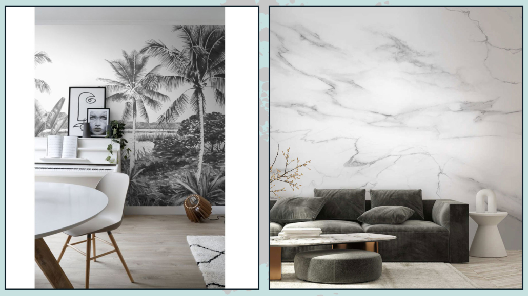
– Black and white papers fit well or poorly with all styles and match any floor easily

(credits: estahome.it; uwall.it)

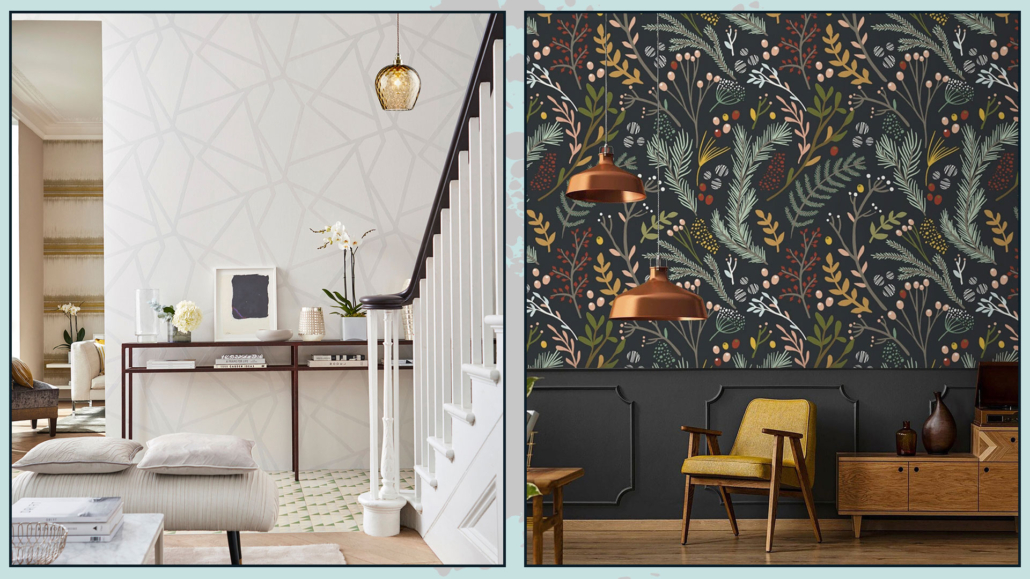
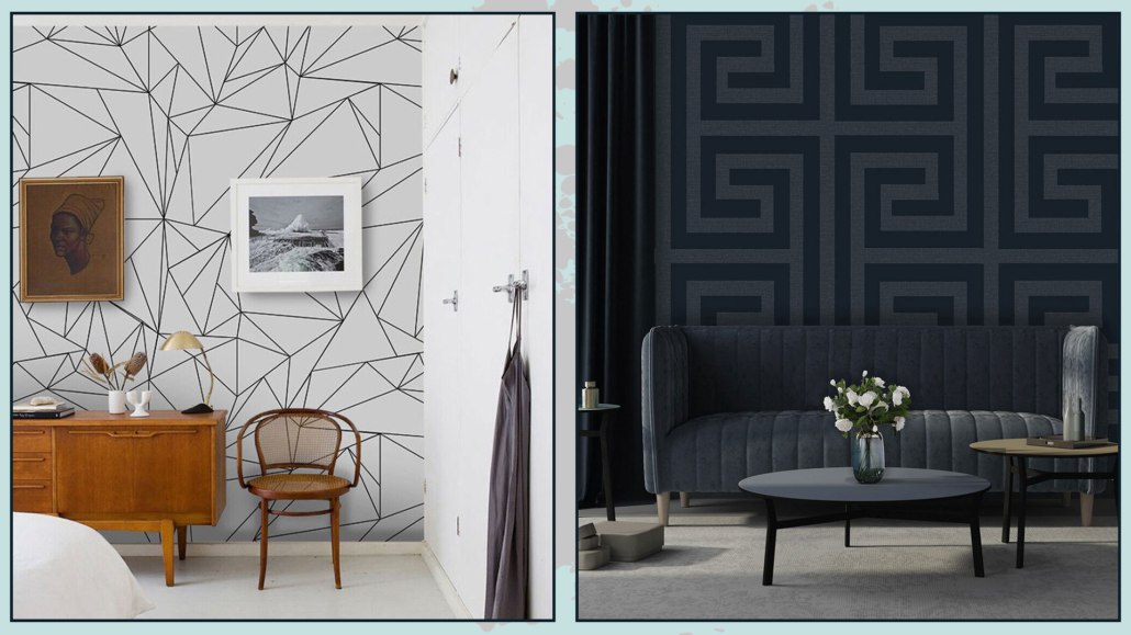
– Geometric wallpapers combine well with modern and contemporary style

(credits: ebay.com)

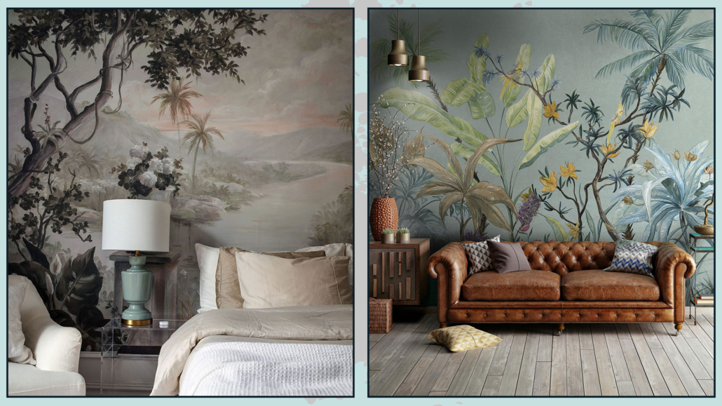
– jungle-style cards go well or poorly with all styles, even maybe it may sound strange to you!

(credits: artofit.org; tecnografica.net)

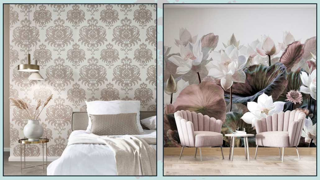
– Damask and floral cards give a retro and romantic touch.

(credits: nattyandpolly.com.au; leroymerlin)

I recommend you to think carefully about your choice so that you don’t have to get bored soon, and by the same token, get something you love madly!

(credits: mobilipolizzidesign.it; sancarwallcoverings.com)

WARNING…

If you decide to use wallpaper in your home, as always, I recommend not to overdo it; not only is it better not to paper all four walls, but it is also good to avoid putting it in every room of the house.

That is because otherwise, this choice will become less distinctive and original!

Also, if you choose striking patterns, don’t repeat them too often because instead of characterizing the environment, they can annoy the eye.

(credits: stan-concept.com; bricoflor.it)

Many brands study custom designs so that the pattern is proportionate and in scale to the size of not only the wall but also the rest of the room.

Finally, I recommend not skimping on choosing suitable wallpaper; if you choose low-quality materials, it will be ruined soon!

If you want to make the investment, do it well by choosing the most suitable material!

(credits: tecnografica.net; edilcomes.com)

I hope this article was helpful and you loved it; in case, let me know in the comments!

Feel free to share it with anyone you think might be interested, I will be honored, and it will help me get my name out there.

If you feel that your home, or some environment of it, does not reflect you enough, do not wait any longer and book your advice: just contact me!

A defining element in the bedroom is the headboard because it somehow determines the style and mood of the whole room.

I have already covered the topic of the bedroom with tips on how to decorate it in general and how to decorate the bed wall in particular; today, I would like to focus on this detail, which can actually make a real difference!

Of course, there are bed frames that already feature a headboard, and honestly, you can really find all kinds and tastes of them.

But, if you are an imaginative person and want to customize the headboard to your liking, you can do so, just buy a sommier bed, that is, a bed that has only the base!

Let’s now see some types of headboards to choose from!

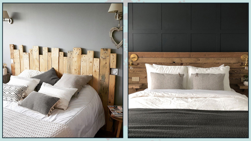
1 – WOODEN

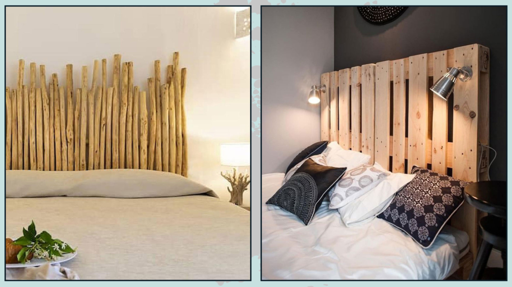
Wood is a versatile and, if desired, low-cost material for a headboard.

The easiest solution is to use wooden planks vertically or horizontally!

(credit: shop8.onlinestoresoutlet.ru; colorsandcraft.com)

You can use bamboo rods or thin logs, or even, you can use pellet pallets.

With pallets, you could also create side niches using their thickness.

(credit: booking residence-capraggia.de; shop04004.shadrychant.com)

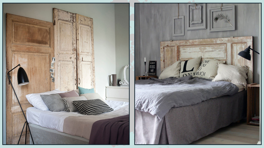
In all cases, you can leave the wood raw, pickle it for a shabby style, or stain it with the colors you have chosen as a palette.

You could also make a low boiserie that takes the length of the wall, or even, for an original idea, you could think of using one or two old doors!

(credit: mondadori editore; var-dags-rum)

2 – PADDED

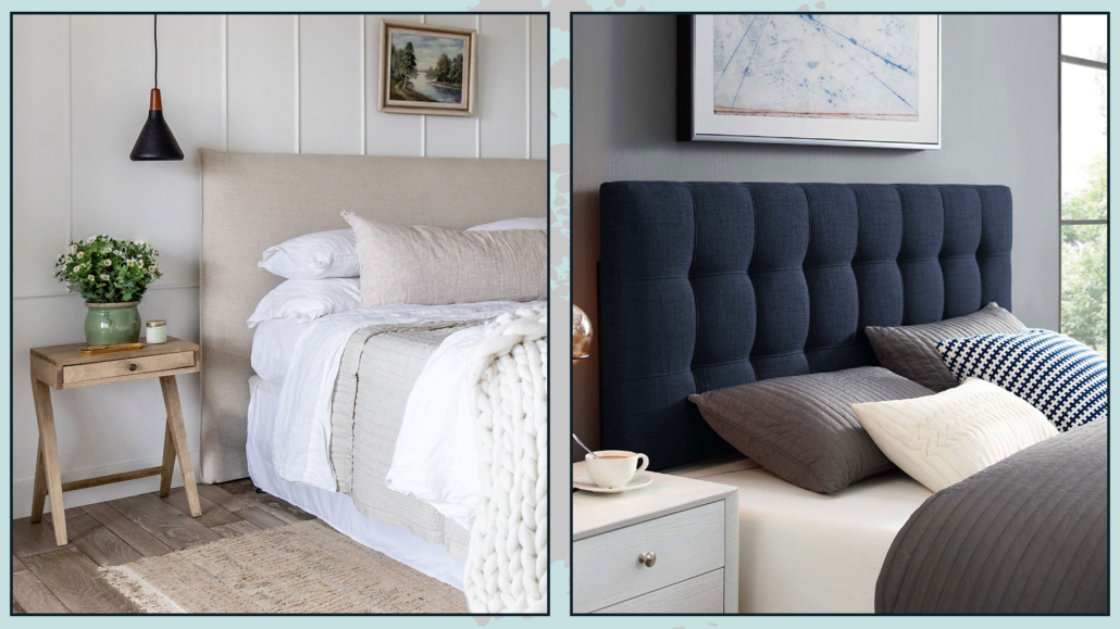
You can find pre-made ones on the market, you can have it made by an upholsterer, but if you want to, you could make it yourself by creating something really unique!

All you need to do on your own is a wooden panel, some foam, and the fabric you like.

You can make it smooth for a more modern room, but if you have craftsmanship, you can also do some work like the quilted effect for a classic bed!

(credit: Holms Homes; overstock)

It must be well-padded for a more elegant and refined effect.

You can choose a headboard in fabric, velvet, as well as leather, or faux leather for a more impactful effect!

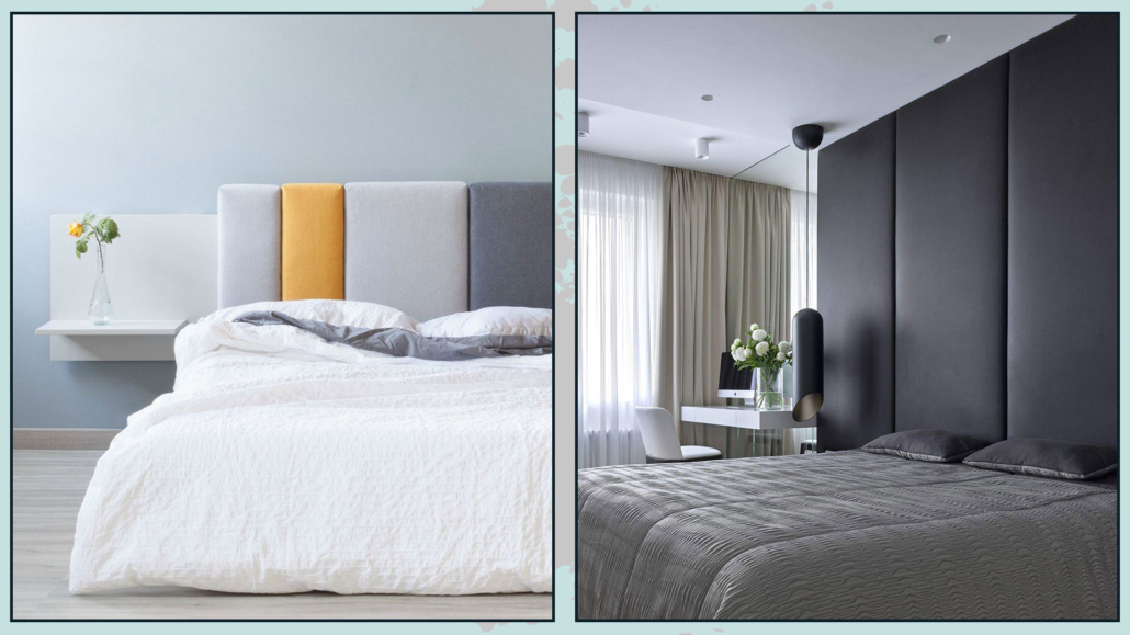
There are also modular panels and modules on the market for a unique and original bed headboard!

If you like, you could even cover the whole wall with these modular modules!

(credit: archiproduct.com; Alessandra Fedorova)

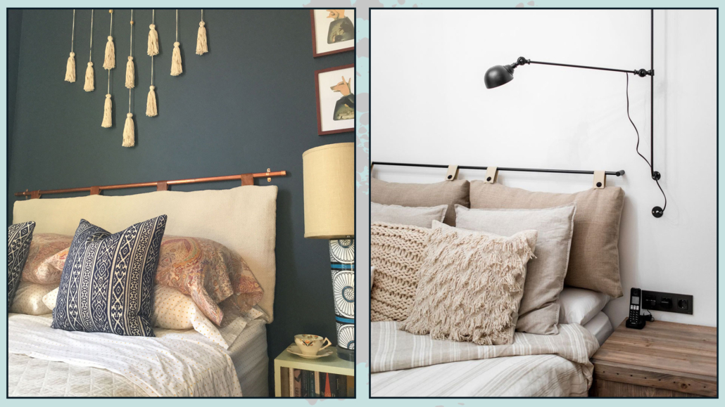
3 – WITH CUSHIONS

If a fully padded headboard seems too much, but you like the idea of something soft, you might want to think about hanging pillows!

They will be cushions (two separate ones or a single one doesn’t matter) with large loops to be stuffed into a rod and hung on the wall!

The rod can be a simple curtain pole and can be of wood or metal: the important thing is that it is at least as long as the bed.

(credit: @sarahmontgomerydesign; drom living)

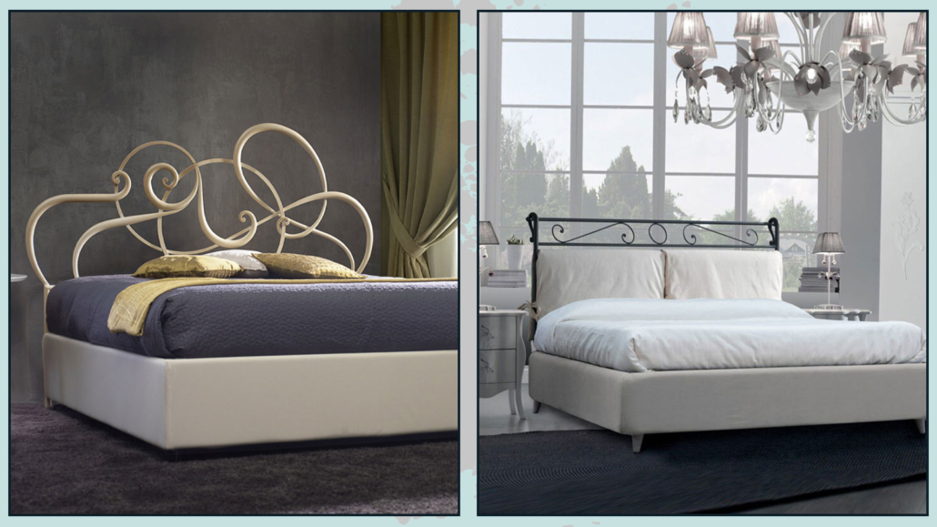
4 – WROUGHT IRON

It is not mandatory to have the entire wrought iron structure: you can only have the headboard!

Here too, there is plenty of choices, from simple and linear headboards to very elaborate ones.

You can also have a padded wrought iron headboard or attach cushions to it, to maintain the charm of the iron as well as the comfort of the padding!

(credit: cosatto; aliexpress)

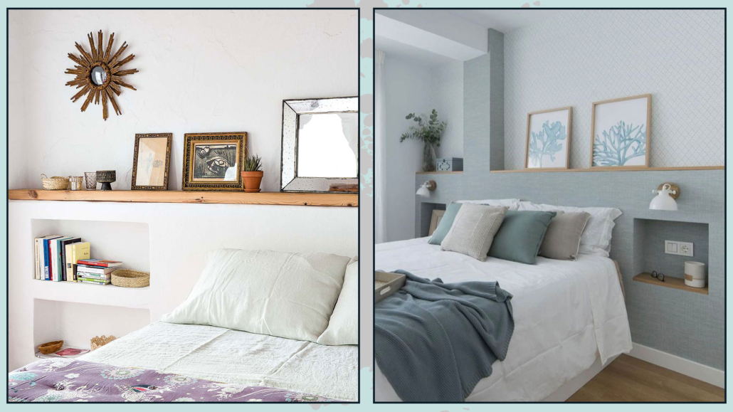
5 – MASONRY

It is possible to create a small counter-wall, in masonry or plasterboard, which can be as long as the wall, or just a little wider than the bed, at the desired height.

In this counter wall, you can make niches that can act as bedside tables.

If this wall is high enough, you could think of a long niche at the top.

(credit: Jover Construcciones; @vevamall)

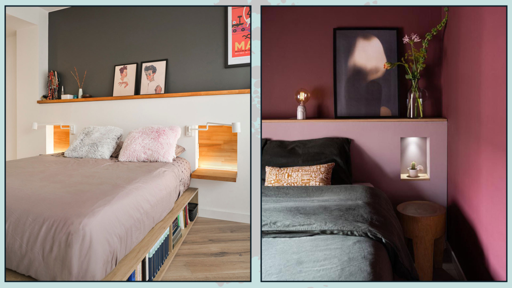
Finally, the thickness of this wall will serve as a shelf to rest what you prefer, from decorative objects to lamps!

Of course, these niches can also be illuminated, thus creating a bit of play and atmosphere.

(credit: estudiomatmata.es; Ons Haarlemse Huisje)

6 – WITH FURNITURE

Do you like the idea I gave you before but don’t want to do the masonry work? You can use a piece of furniture!

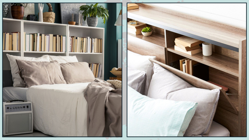
It can be a low, perhaps modular bookcase: you would always have the top shelf and space to use as a nightstand, actually freeing up space near the bed.

(credit: iStock; uoifa.com)

7 – DRAWN

Why not draw it? Nowhere is it written that the headboard must be something physical!

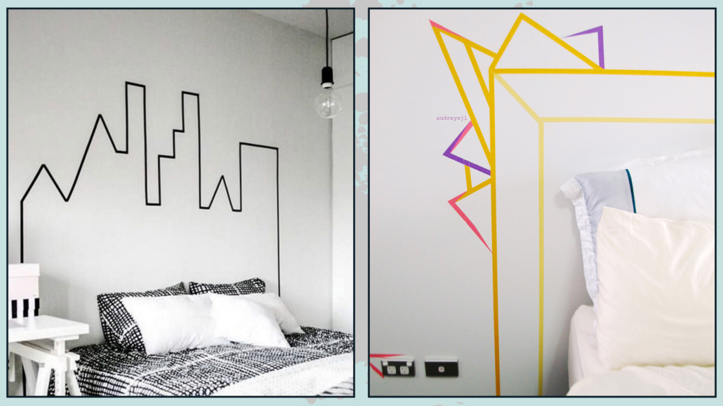
If you are an original person, you can draw a headboard of the shape and size you want: using stickers or washi tape.

(credit: clemaroundthecorner.com; audreysjl)

This solution would allow you to change the headboard whenever you want, just detach the tape and create a new one.

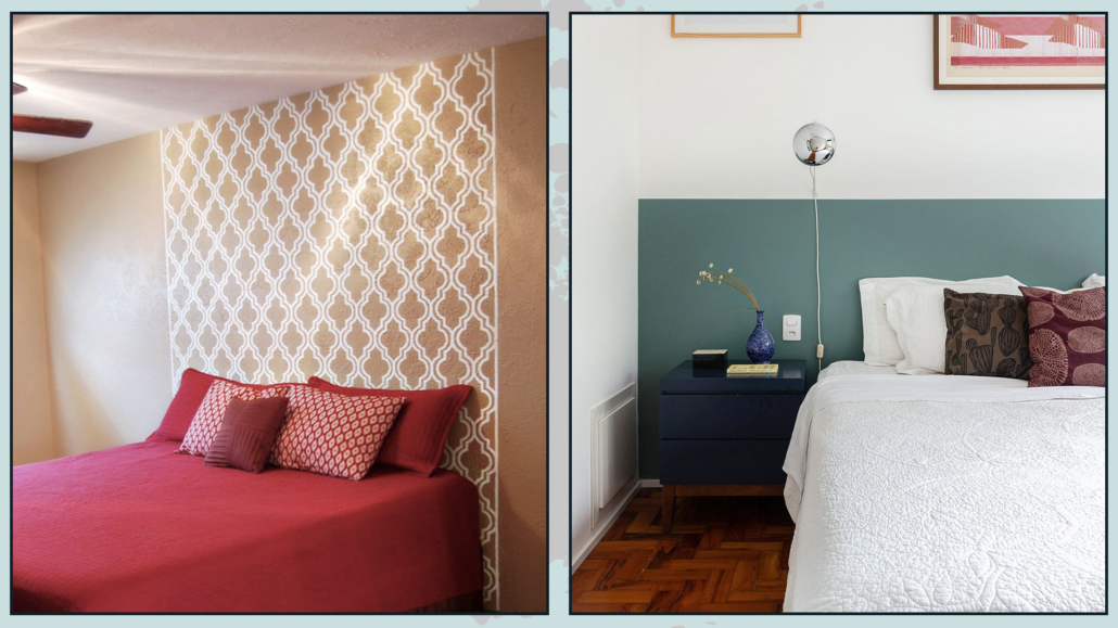
You can use the stencil and, again, give your headboard the shape you want or just use color blocking!

(credit: Sarah Cooper; historiasdecasa.com.br)

8 – WITH TILES

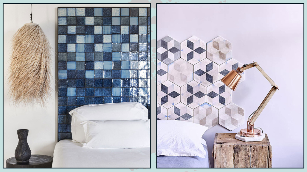
That is not a solution you often see, but you can also make the headboard of your bed with ceramic tiles or porcelain stoneware, the same used for the coatings of bathrooms and kitchens.

Like the masonry option, this is a more “invasive” and, I dare say, definitive solution, but also of considerable scenographic impact.

The modularity and various tile sizes allow you to create a wide variety of wall designs.

Here you can really give space to your imagination!

A not insignificant advantage of this solution is that it is really easy to clean, thus being very hygienic!

(credit: beriestain.com; Patchwork Harmony)

Which of these ideas did you like the most? Let me know in the comments!!!

Whichever type of headboard you choose, remember that for a regal and distinctive look of the bed and the room in general, the headboard will have to be huge!

I hope this article was helpful and you enjoyed it; in case, let me know in the comments!

Feel free to share the article with anyone you think might be interested, I will be honored and it will help me get my name out there.

And if you need advice for your home, do not hesitate to contact me!

Who doesn’t love the idea of having a luxurious and sophisticated living room?

But is it necessary to spend crazy amounts of money to have such a living room?

No! It is not mandatory: some tips and tricks will help to achieve great results without having to “splurge”!

Let’s see them together

1 – COLORS: START FROM A NEUTRAL BASE

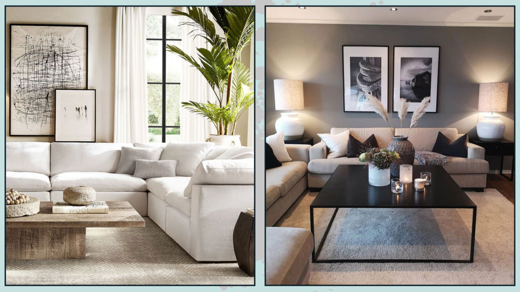
Luxurious environments, regardless of style, have in common that they use neutral colors, at least as a base.

Neutrals make spaces relaxing, elegant, and sophisticated, and because of their versatility, they match any style!

Use neutrals for walls, floors, and larger furnishings, then give them a pop of color with smaller furnishings and decorations!

I remember that when I talk about neutrals, I am not just talking about white, gray, and beige, but any color to which a lot of white (to get a light neutral) or a lot of black (for a dark neutral) is added.

Adding white or black to the color will allow color lovers to not give it up!

The neutrals thus obtained will lose their exciting component but will maintain the mood of that color that will still remain in the background.

If you want to learn more about neutral colors, I describe them in detail here!

(credits: rh.com; interiorbutikker.no)

2 – BOISERIE AND MOLDINGS

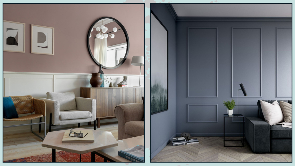
Moldings on the walls help give some movement and depth to the room, especially when you have neutral-colored walls.

They also provide textures and warmth, make the room more “rich”, and create visual interest.

Simple and linear moldings go very well with modern or contemporary styles but also with the minimalist one.

The slightly more elaborate ones will go better with the classic style!

You can use low paneling, about a meter high, this has a high visual impact giving importance to the room, especially if colored differently from the wall.

If you make this paneling a little overhanging, you can use this shelf to put decorative objects or frames on it!

Alternatively, but also in addition, you can use full-wall moldings to create frames that will give a very stylish and sophisticated effect.

It is better, in this case, to keep the same color between the wall and the boiserie.

(credits: Sergey Krasyuk; leroymerlin.fr)

– CREATE A FOCAL POINT

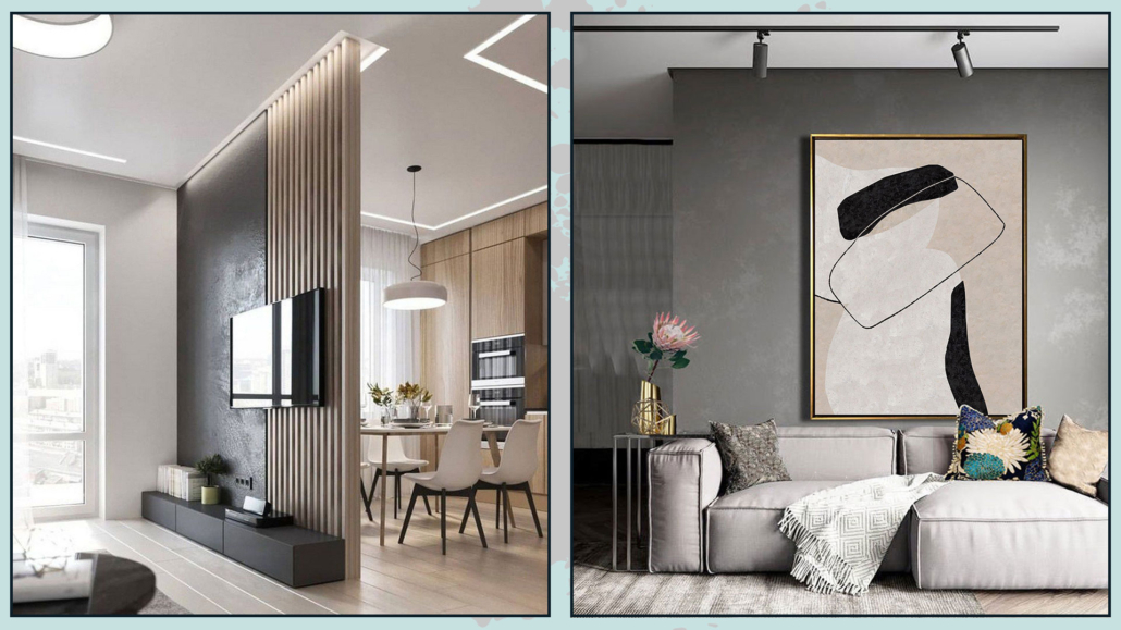
The focal point is an essential element in interior design: it catches the eye by creating visual interest!

It is always relevant, but it becomes even more so when you want to make your environments sophisticated and luxurious!

In the living room, the focal point can be the sofa wall or, if well-designed, the TV wall!

For the lucky ones, of course, it could be a beautiful fireplace or a window with a stunning view.

It must be something that “dominates” the rest of the room and around which everything else revolves.

You can use a different wall color to make what is placed next to it stand out.

You could also use a particular wallpaper, a large mirror, or an important painting.

The focal point doesn’t need to be the wall; it could be the sofa itself or a piece of furniture perhaps of particular value (not necessarily economic value!)

(credits: Shiri Ganesh Home Solutions; Etsy- ArttideArt)

4 – CONTRASTING SEAT

Buying coordinated furniture, we have seen it before, is a “mistake” that people often make, for fear of making a wrong…

So people often buy the sofa-armchair set and, in fact, miss out on great opportunities.

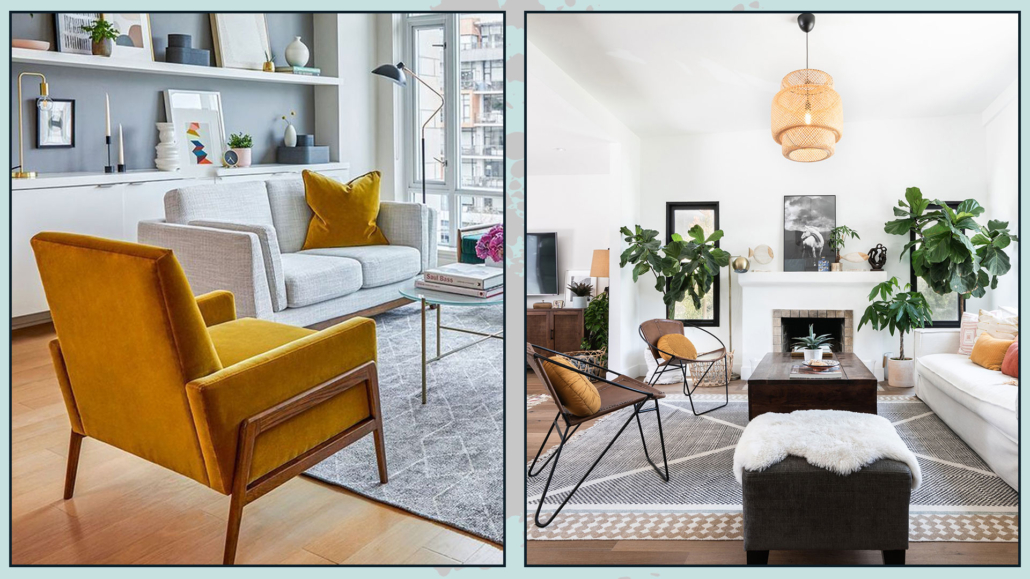
For a more luxurious, sophisticated, and studied living room, it is a good thing to have one or two seats contrasting with the sofa.

Different shapes, textures, and colors will break the monotony and make the environment even more interesting, giving it character.

If the seat is totally different from the sofa, “justify” it by picking up the color in the covers of the decorative pillows: this will harmonize the whole thing!

(credits: article.com; textureliving.com)

5 – MIRRORS (AND PICTURES)

Mirrors amplify space and natural light, making the environment more refined, elegant, and luxurious.

Ideally, put them near a window to amplify the light as much as possible; however, be careful what it reflects, that it is a tidy area, or you will duplicate the clutter!

Dare with even oversized mirrors resting on the floor: you’ll give an extra touch of character; by doing so, the mirror could become the focal point of the living room!

That also applies to paintings: compositions of several small-medium-sized paintings are all right, but if you want something to make the living room look more luxurious and sophisticated, then dare with large ones!

They have a higher visual impact and make the environment less stuffy, more linear, and clean!

(credits: living-corriere; Meridiani living)

6 – CURTAINS

Curtains, in general, dress a home by bringing warmth, texture, and color.

They become significant when you want to add a touch of elegance and luxury to your living room.

They don’t have to be super expensive because it’s their scenic effect that changes the perception of the environment!

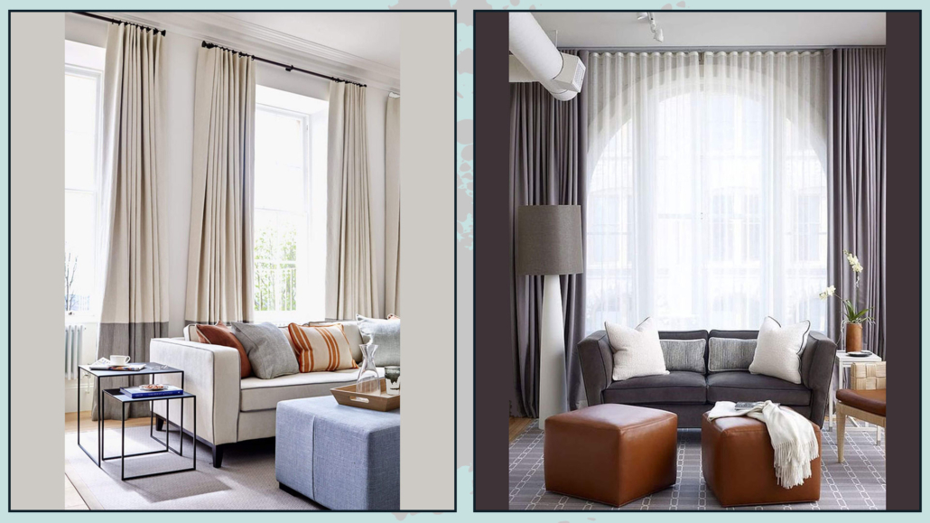
The best choice, in this case, is drapery curtains, perhaps a double curtain, with a filter curtain and a blackout curtain always open at the sides.

The double curtain brings a bit of contrast and color, making the living room even more elegant and luxurious.

For a perfect result, the rod should be as close to the ceiling as possible to enhance the heights and give more breathing space to the window.

When ceilings are really very high, the rod should still be placed at least 15-20 cm above the window.

It is also important that the stick is wider than the window by at least 10 cm on each side so that the curtain, when open, does not block the passage of light.

The curtain then can rest lightly on the ground or barely touch it; short curtains shrink the room and look “unfinished”!

(credits: pinimg.com; Tom Stringer)

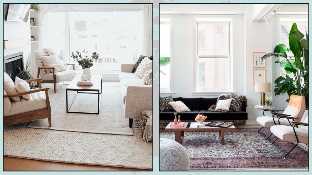
7 – RUGS

I know this point is controversial because many people do not like rugs, yet, in the living room, it is an essential element to make it elegant and sophisticated.

The rug brings warmth and texture, but most importantly, it ties the elements together!

A large rug that encloses the sofa, seats, and coffee and side tables will create a conversation area, a more intimate and welcoming environment.

I’m talking about rugs here!

(credits: theblushhome.com; @homepolish)

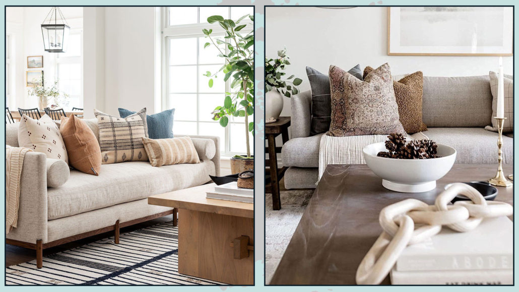
8 – PILLOWS

Dressing the sofa with some decorative pillow (and maybe a blanket) is extraordinary for a luxurious living room!

The pillows, such as the curtains and the rug, bring texture and color, and this creates rhythm and contrast.

It is important to alternate between large patterns, solid colors, smaller patterns, and even geometric designs (I’m talking about how to mix patterns here).

Also, use different textures by alternating smoother fabrics with rougher and more worked ones; this tip will make the sofa look more sophisticated and elegant.

A little trick for pretty puffy pillows: get the inside of a material that can be easily “molded” like down and then always take it a little larger than the lining (example: 45×45 pillow with 40×40 lining).

(credits: studio mcgee; french.alibaba.com)

9 – LIGHTS

Artificial lighting will play a significant role in the final result!

First of all, there must be good general light for visual comfort, but ambient and task lights (perhaps near the sofa for reading) should still be added to the general one.

Having multiple types of light helps create contrast and depth.

Where possible, use dimmable lights to manage the intensity of the light as needed!

Then, in choosing lights, be daring, as with mirrors and pictures: get large, distinctive chandeliers or floor lamps that immediately grab attention!

(credits: nomadbubbles.com; Bronxes Studio)

10 – SEARCH FOR PARTICULAR ITEMS

When looking for decorative accessories, avoid ordinary objects; instead, search for unique and out-of-the-ordinary items.

For example, look for vases and candle holders with unusual shapes and finishes.

Buy also trays and create inside your compositions: giving it a sort of border, you will set it more importance.

Remember to create compositions with an odd number of objects, which have different heights and sizes, and distinct colors and finishes.

Another trick that gives a touch of sophistication and luxury is to use, here and there, the principle of symmetry; for example, on the sideboard, you could put two equal lamps on the sides and a beautiful central painting.

It is not to be done constantly and at all costs: on the contrary, it would become boring, but the principle of symmetry immediately gives the impression of something sophisticated!

(credits: etsy.com; east.co.uk)

(credits:pinimg.com;sarahshermansamuel.com)

11 – PLANTS, FLOWERS, BRANCHES, AND ESSENCES

Plants bring a touch of nature into the house, and this is really very important; they also purify the air and elevate the perception of the environment!

They immediately give that touch of elegance and sophistication!

Fresh flowers are also great, but for a more low-cost elegant effect, you can also decorate with branches!

Even these bring movement and freshness with simplicity!

The perception of spaces is not only visual but also concerns what we feel with touch and smell.

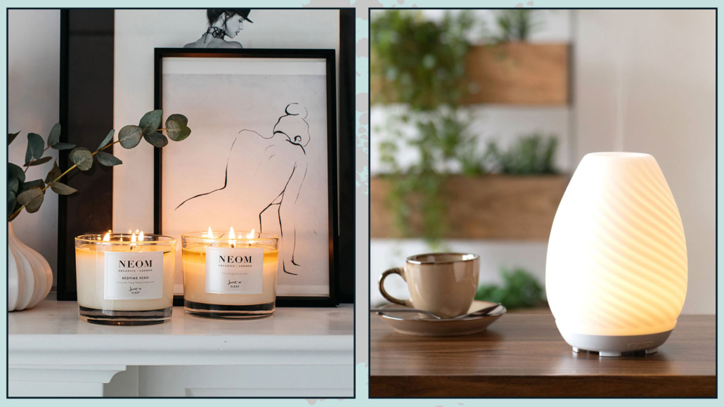
The scents of fresh flowers immediately elevate the perception of the environment, but of course, you can also help yourself with candles and diffusers.

Perfumes do not have to be aggressive, it goes without saying, but adding them in the living room will immediately make it more refined and luxurious.

(credits: @homepolish; tileclub.com)

12 – ORDER!

It seems obvious, but clutter is the exact opposite of luxury, even the visual one: a living room too full of things is not good.

We need to embrace a little more of the rules of minimalism, including “less is more”!

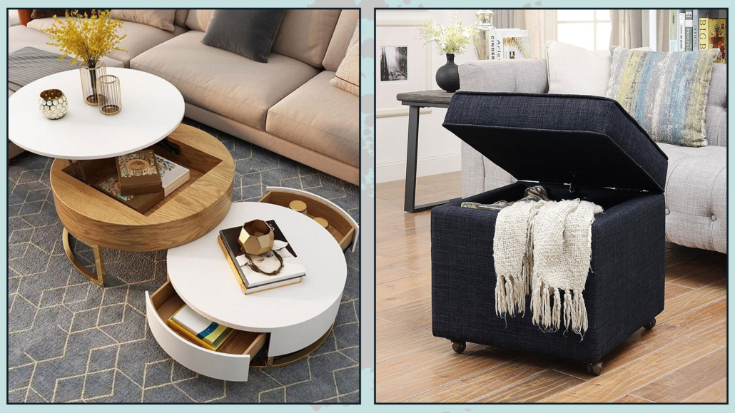
Then use storage furnishing to store things that are too much!

Poufs, coffee tables, benches, or baskets are excellent allies for this purpose.

(credits: coffeetableonline.com; wallmart.ca)

I hope this article was helpful and you loved it; in case, let me know in the comments!

Feel free to share it with anyone you think might be interested, I will be honored, and it will help me get my name out there.

If you feel that your bedroom, or some other room in the house, does not reflect you enough, don’t wait any longer and book your consultation, all you need to do is contact me!

Want your bedroom to look and feel more luxurious?

Then you’re going to love this article.

A while ago, I shared tips on how to make your home feel more luxurious—and that video quickly became one of the most-watched on my channel.

So, since you loved that topic, today we’re taking it a step further and focusing on one specific space: the bedroom.

Leonardo da Vinci once said, “Simplicity is the ultimate sophistication.”

And this applies to everything—think of Audrey Hepburn in Breakfast at Tiffany’s… and yes, it applies to interior design too!

So, if you want a bedroom that feels elegant, inviting, and luxurious, the first thing to focus on is simplicity.

1 – NEUTRAL COLORS

If you want your bedroom to feel elegant and look more luxurious, choosing the right color palette is essential.

The best approach is to go with neutral tones—like white, beige, and gray—for your walls and larger furniture pieces.

Neutrals are the perfect choice to express luxury and elegance. They’re versatile, easy to combine, and help create a calm, relaxing atmosphere.

What if you love color?

Bright colors tend to stimulate the mind and may not help you fully relax—but that doesn’t mean you can’t use them!

Here are three ways to do it:

– Use a desaturated version of your favorite color

As I mentioned before, when you add a lot of white to a color, it becomes a softer, more neutral tone with that color as an undertone. (You can also add black to create a darker neutral.)

This way, you can still enjoy your favorite color without it feeling too intense.

– Go for pastel shades

Soft blues, greens, or pinks can add a touch of movement while still keeping the space calm and balanced—especially when paired with neutrals.

– Use bold colors in small doses as accents

You don’t have to give up vibrant colors if you love them!

Just use them in small details, like throw pillows or decor pieces.

If you pair that same color with a more muted version on the walls, you’ll create a beautiful, cohesive—and yes, wow—effect.

The neutral you choose will also depend on your style.

Styles such as minimalist, Scandinavian, and contemporary favor pure neutrals like white, black, and gray to maintain a clean, structured look.

Other styles—such as classic, Japandi, or boho—work beautifully with warmer neutral tones.

(credit: Westwing Italia; thespruce.com)

2 – WALLPAPER

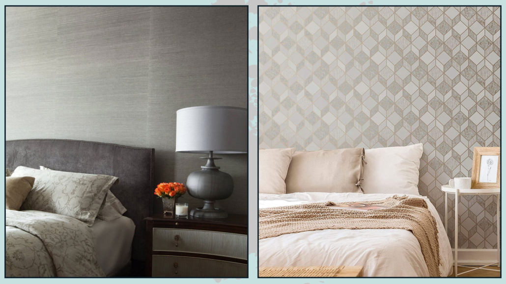
Today, there are so many wallpaper options available, and this can be a great way to make your bedroom feel more sophisticated and luxurious.

By sticking to neutral or soft tones, as mentioned earlier, you can use wallpaper to decorate the wall behind the bed.

By doing this, you will turn that area into a focal point and, if chosen carefully, highlight the bed even more—since it’s the main feature of the room.

(credit: westwing.it; istockphoto.com)

3 – SPACE PLANNING

Space planning is essential if you want a room that feels pleasant and well-balanced.

It’s not just about aesthetics, and it’s not just about functionality—it’s about finding the right balance between the two.

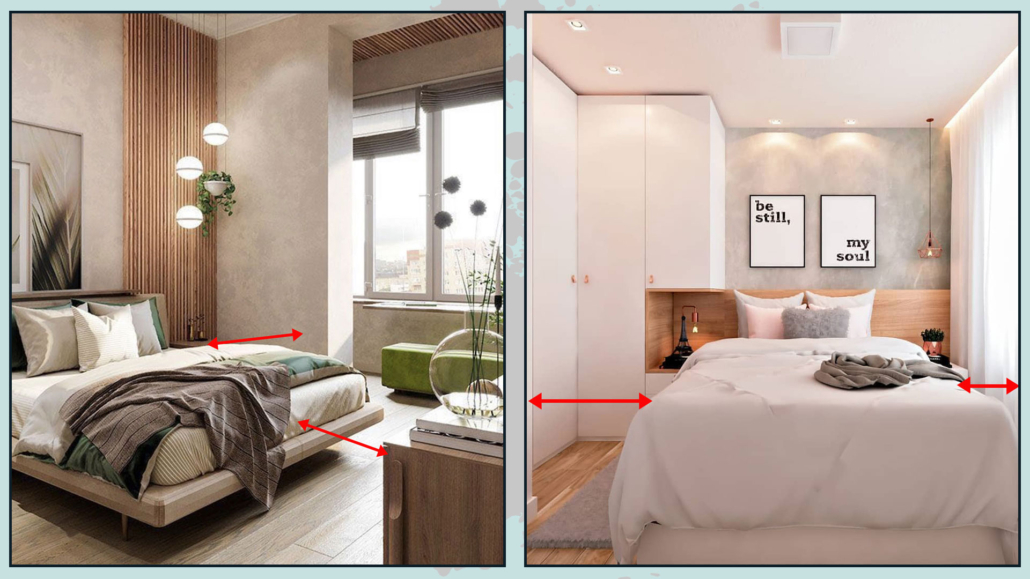
For a bedroom to feel more luxurious, it’s especially important to plan your layout carefully and allow enough room to move comfortably.

The space between furniture pieces should be generous enough to move around easily.

These empty spaces also help your eyes rest, making the room feel calmer and more harmonious.

That’s why, before buying any furniture, it’s important to create a scaled floor plan of the room, including everything you’d like to add.

This approach will help you arrange each piece in the best way and adjust anything that might feel too bulky.

Start by making sure doors and windows can open freely.

Then, aim for about 80 cm (around 30 inches) of clearance between furniture pieces.

If your bedroom is small, consider multifunctional furniture—like a storage bed—to reduce the number of items in the room and avoid both visual and physical clutter.

(credit: Akahana Homes Residences; Solteiras Noivas Casadas)

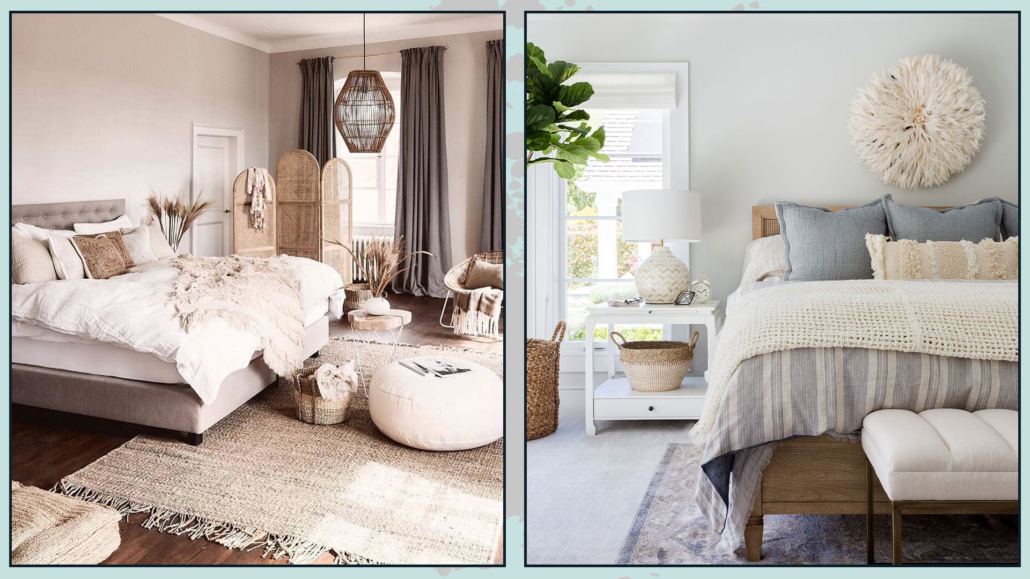
4 – DRESSING THE BED

As mentioned earlier, the bed is the main feature of the bedroom and deserves special attention.

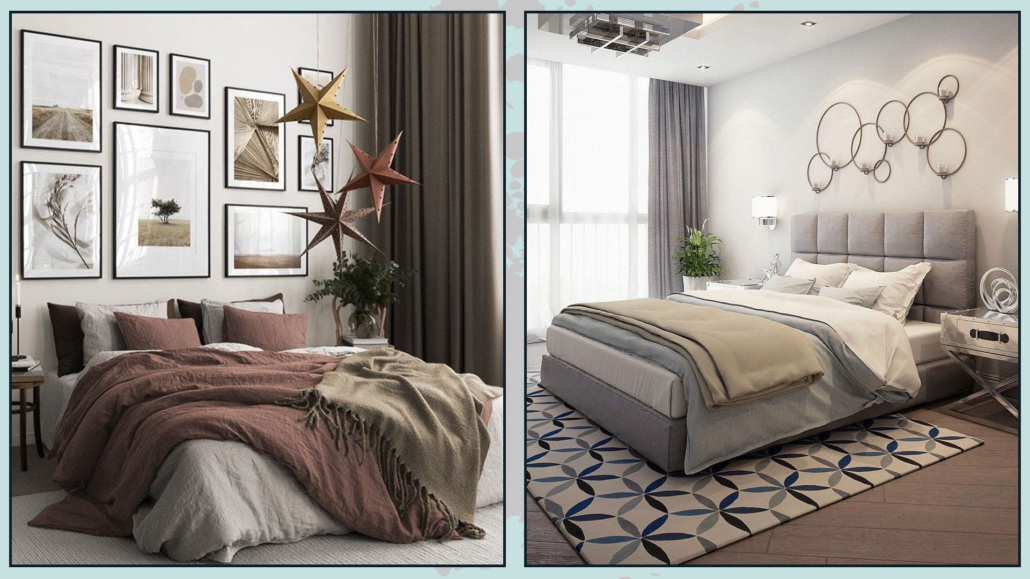
For a more sophisticated look, try layering different types of fabrics—ideally with varied textures.

And no, your bed doesn’t have to be all white to feel elegant!

Just like with colors in general, stick mostly to neutrals, possibly in different shades, and mix in a variety of textures.

To elevate the look, use a beautiful bedspread, but also add a throw in a different fabric.

You can fold it neatly at the foot of the bed for a more classic look

Or drape it casually for a more relaxed feel

This contrast will add depth and visual interest to the room.

Pillows also play a key role; they add richness, making the bed feel more inviting.

(I talk more in detail about pillows here!)

(credit:desenio.it; decoraideas.com)

5 – CURTAINS

Curtains play a key role in making your bedroom feel more luxurious.

To achieve an elegant look, it’s important to choose the right curtains—with the right size and proportions for your space.

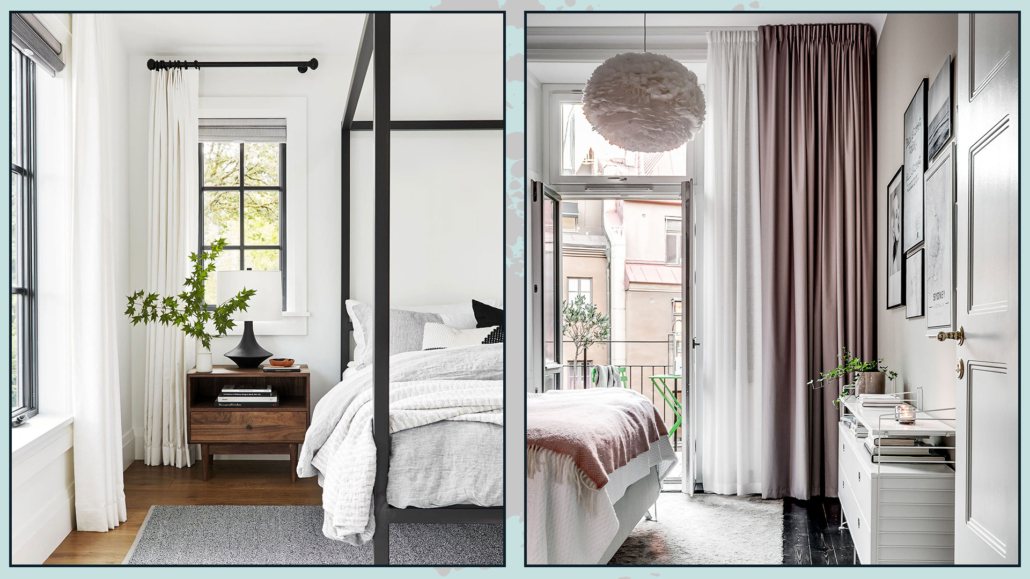
Whatever style you choose, keep this in mind: curtains should be about 1.5 to 2 times the width of the window.

They should also extend slightly beyond the window frames, by about 10 cm (around 4 inches).

Extending the curtains beyond the window will make the window appear wider and allow more natural light into the room when the curtains are open.

Try to place the curtain rod as close to the ceiling as possible to create a sense of height and make the window feel larger.

If you have very high ceilings, make sure to place the rod at least 15 cm (about 6 inches) above the window.

Always choose floor-length curtains—short curtains tend to make the space feel smaller.

If long curtains aren’t practical, a glass panel curtain (or a more minimal solution) is a better option.

Choose a beautiful curtain rod—metal or wood both work well—and, if appropriate, add decorative finials that match the room’s style.

Pay attention to fabrics as well. When it comes to sleeping, it’s important to block out light completely.

If you don’t have shutters or blinds that can do this, consider layering your curtains: one sheer and one blackout.

Layered curtains also add contrast, making the bedroom feel even more elegant—and more luxurious.

(credit: mydomaine.com; inredningshjalpen.com)

6 – SCENTS

As we’ve already seen, the perception of a space is not only visual, but also shaped by other senses—like touch and smell.

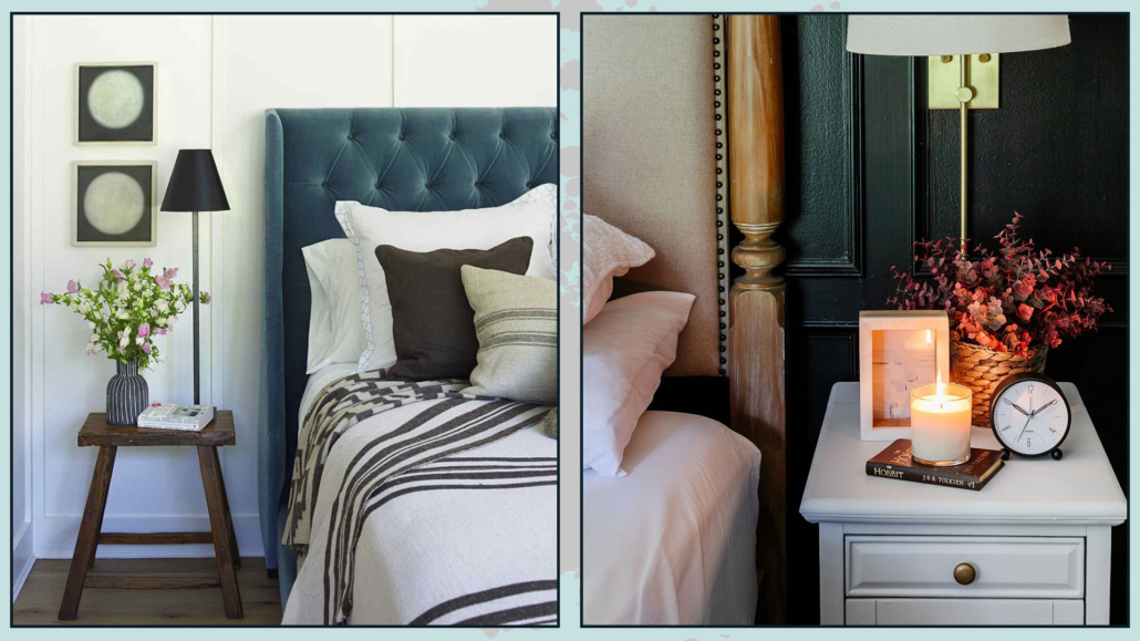
Scents play an important role. They shouldn’t be overpowering, of course, but adding subtle fragrances to your bedroom will instantly make it feel more sophisticated.

You can do this with scented candles, essential oil diffusers, or fresh flowers.

A delicate scent helps you fully relax and unwind.

(credit: westwing.it)

7 – PLANTS

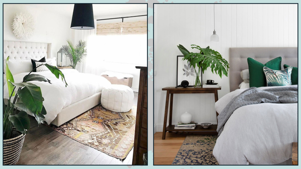
Speaking of scents, plants bring in the natural fragrance of the outdoors—but that’s not all.

They also add a sense of elegance and luxury to a bedroom.

On top of that, they help purify the air, making it healthier and more pleasant to breathe.

If you’d like to discover the best plants for a bedroom, you can check out this video!

(credit: westwing.it)

8 – MIRRORS

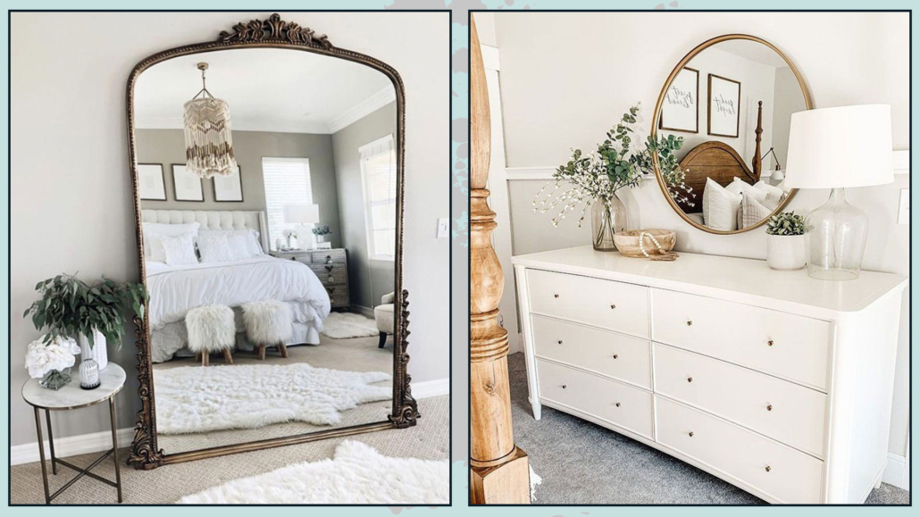
No matter the size of your bedroom, if you want the space to feel elegant and luxurious, a large mirror is essential.

Mirrors help brighten a room by reflecting light and also create the illusion of a larger, more spacious environment.

They’re not just functional elements—they also enhance the overall style, adding character to the space.

You can hang them on the wall or, if they’re particularly large, lean them directly against it.

The key is to choose a mirror whose style, shape, and frame material complement and enhance the overall design you’ve chosen.

If your bedroom is small, I recommend placing the mirror where it can best reflect natural light—but most importantly, where it reflects an orderly area.

This trick will instantly make the room feel larger.

(credit: ramadaneidrecipes.com; Micheala Diane Designs)

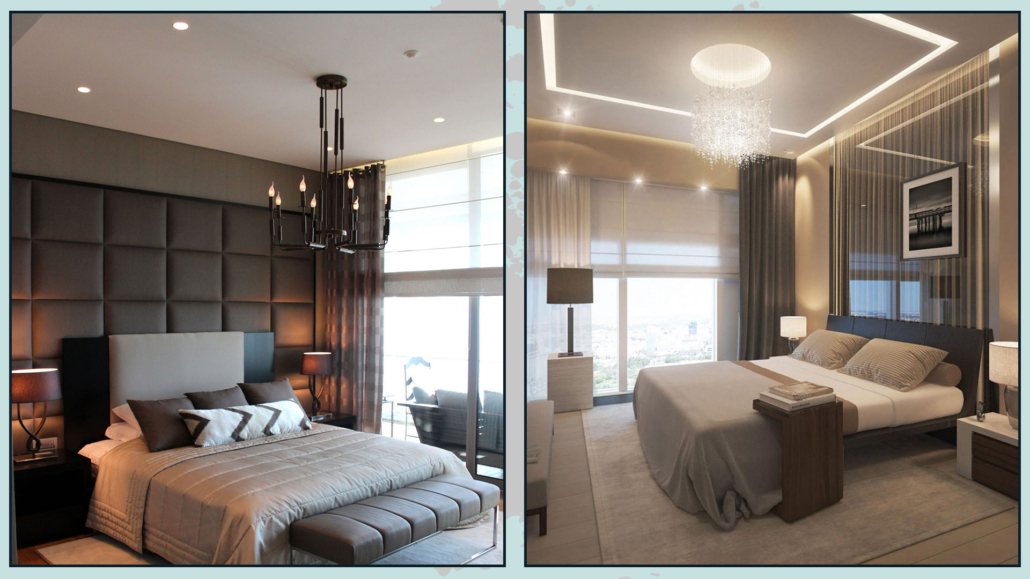
9 – LIGHTING

Lighting is essential—it can completely change how a space feels.

If you want your bedroom to feel more luxurious, avoid relying on a single ceiling light.

Instead, distribute light through multiple sources:

– hidden LED strips inside a ceiling recess that follows the room’s perimeter, for general lighting

– dedicated lighting inside wardrobes

– bedside lamps

– floor lamps

The more light sources you have, the greater the visual comfort—and, of course, the more decorative impact you’ll create.

As always, the shape and materials of your lighting fixtures should enhance the overall style of your bedroom.

When it comes to bedside lamps, don’t be afraid to be bold. You don’t have to use identical lamps—in fact, mixing two different designs can create contrast and visual interest.

The key is that the two lamps share at least one common element, such as shape, color, or material.

If you want to learn more about choosing lighting, I talk about it here!

(credit: ramadaneidrecipes.com; lights.com)

I hope you found the article helpful and enjoyable! If you did, let me know with a comment.

Feel free to share this video with anyone who might be interested — I’d be honored.

If your home — or even just a part of it — doesn’t feel like it truly reflects you, don’t wait any longer: book your consultation today!

Flush-to-wall solutions: what are they and how to use them?

If you have a minimalist home, flush-to-wall solutions are perfect for keeping your spaces clean, simple, and, of course, minimal.

That said, they also work beautifully with other styles, helping to highlight and enhance your overall design choices.

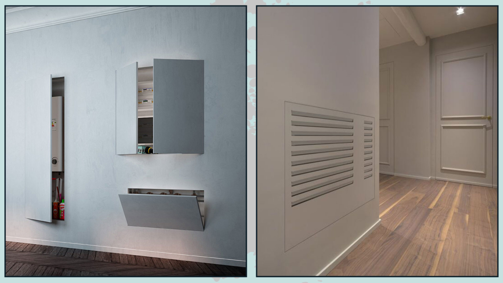
Flush-to-wall solutions generally refer to built-in elements—features that don’t protrude from the wall or ceiling, blending seamlessly into the space.

Let’s look at 11 of them!

1 – DOORS

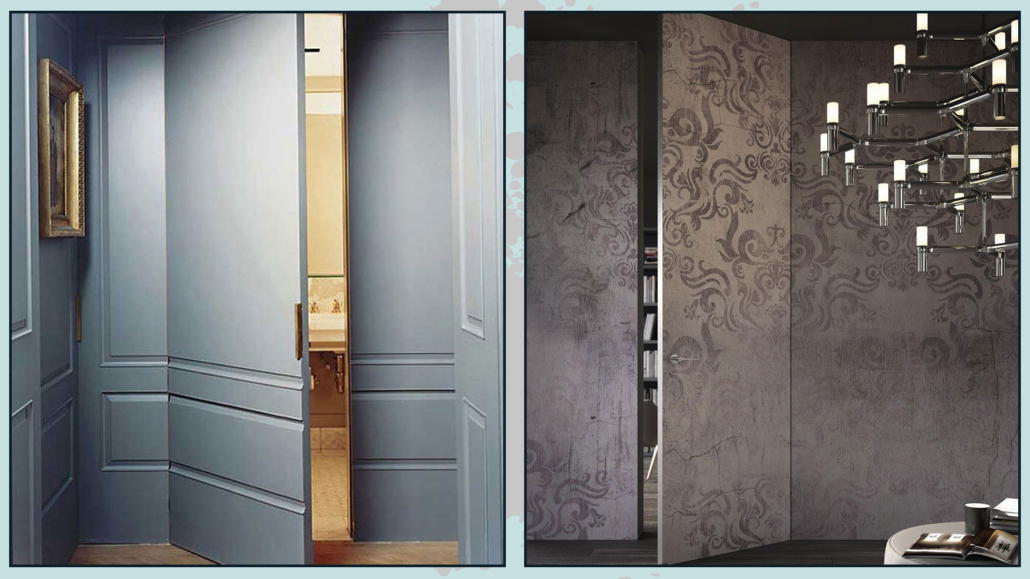
Flush-to-wall hinged doors are among the most well-known and widely used elements in this category.

They have no frames or trims, feature hidden hinges, and when closed, they almost disappear—except for the outline and handles.

Since these doors are thinner than the wall, the “invisible” effect is visible from one side only, so you’ll need to decide where you want to highlight it.

You can also get creative: these doors can be installed full height (reaching the ceiling) or finished to match the wall—whether with paint, wallpaper, or even wood paneling.

(credits: lasartoriadellarchiettura.tumblr.com; CeramicheeDintorni)

2 – DOORS AND FLAPS

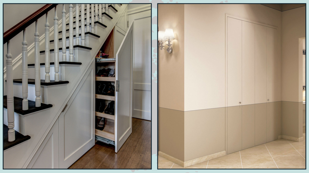
If you have niches, storage areas, or even space under the stairs that you want to close off discreetly, flush-to-wall doors are a great solution.

You can use them to hide a laundry area—whether it’s in the bathroom, the kitchen, or elsewhere in the home.

You can also create a built-in wardrobe with flush doors for a fully seamless look.

In entryways and hallways—especially smaller ones—this type of solution, particularly when full height, helps keep the space from feeling cramped.

(credits: comearredare.com; vertical.it)

3 – PANELS

We all have areas that house technical systems, such as water manifolds or electrical panels.

They’re not exactly visually appealing and usually come with panels screwed onto the wall.

If planned, you can use flush panels that close these openings in a clean, minimal, and discreet way.

The same applies to ventilation grilles for air systems.

(credits: eclisse.it; aurainfissi.it)

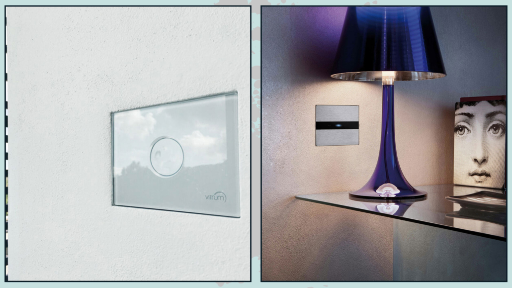
4 – SWITCHES

Even light switches can be flush-mounted!

It’s a very original solution.

For tech enthusiasts, there are also touch models, with controls hidden behind a glass plate and a small LED light that remains on to make them easy to find in the dark.

(credits: it.aliexpress.com)

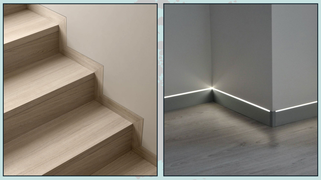
5 – BASEBOARDS

Baseboards can also be flush with the wall, meaning they don’t protrude at all.

One of the biggest advantages is that furniture can sit perfectly against the wall, eliminating the annoying and unattractive gap caused by traditional baseboards.

It also makes cleaning much easier—there are fewer surfaces for dust to settle on.

For those who love design details, there are even versions with integrated LED lighting… perfect for guiding you at night without turning on the main lights.

(credits: protoporte.com; allegro.pl)

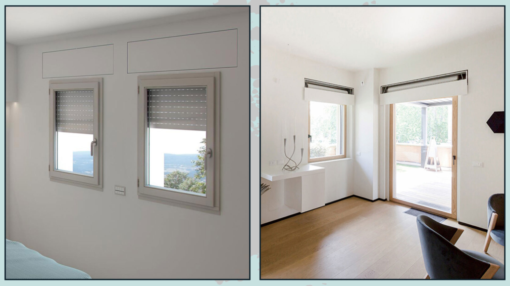
6 – SHUTTER BOXES

Let’s be honest: shutter boxes are often unattractive and can make it difficult to install curtain rods.

Today, however, they can be recessed with flush covers, making them much less visually intrusive.

(credits: sistemirasoparete.it; madewithhome.com)

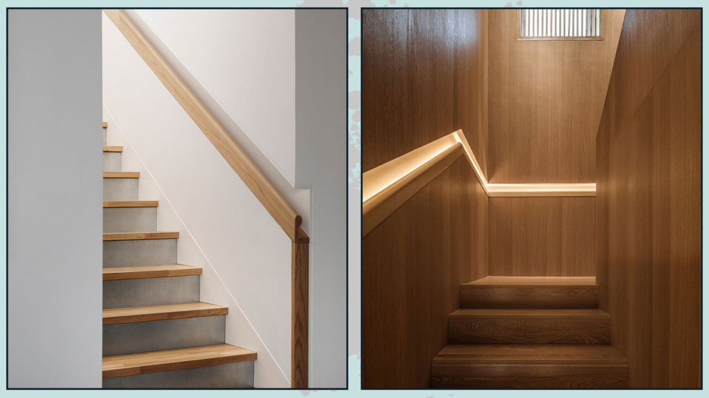
7 – HANDRAILS

I’ll admit it—I discovered this solution recently, and it really impressed me!

Integrating the handrail into the wall is ideal for narrow staircases, as it frees up a surprising amount of space.

Like baseboards, these can also include integrated LED lighting, adding both function and style.

(credits: designboom.com; architonic.com)

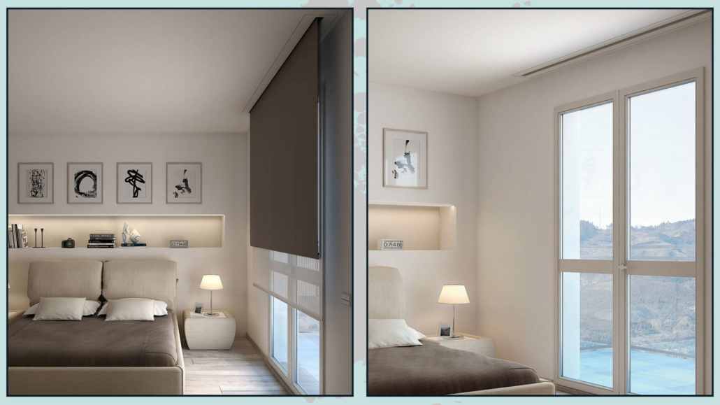
8 – ROLLER SHADES

When I talked about window treatments (you can find the video here), I also mentioned roller shades.

Here, we’re referring to flush-to-ceiling solutions, not flush-to-wall ones.

Roller shades are not very common, but they’re perfect for those who love a minimalist style.

For a cleaner look, you can conceal the rolling mechanism inside a drywall ceiling.

This way, when the shade is fully open, it disappears completely.

For added convenience, motorized options are also available.

This solution works well for hiding a projector screen too—perfect for an office!
(credits: gaiamiacola.it)

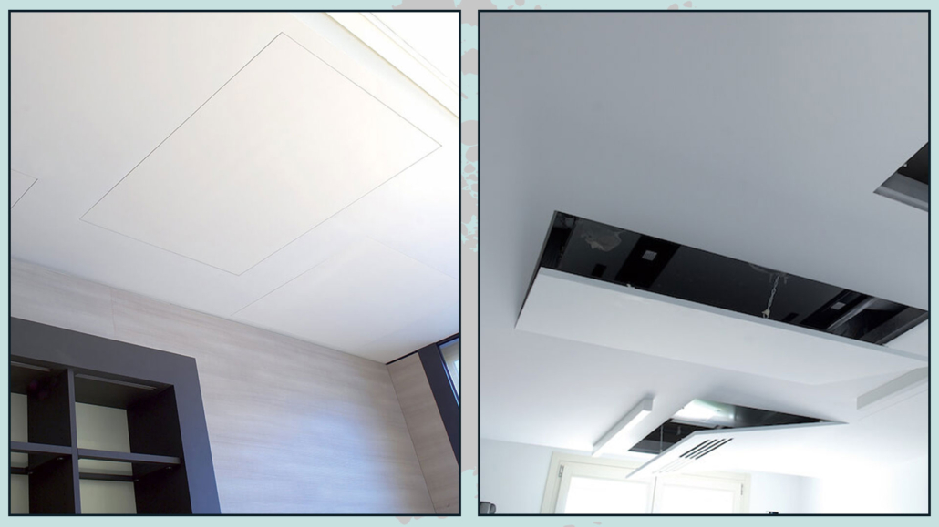
9 – FLUSH CEILING ACCESS HATCH

Staying with flush-to-ceiling solutions, if you have an attic or a suspended ceiling with a technical area, a flush ceiling access hatch allows you to conceal these openings while keeping them easily accessible.

(credits: 2.teknoring.com; sistemirasoparete.it)

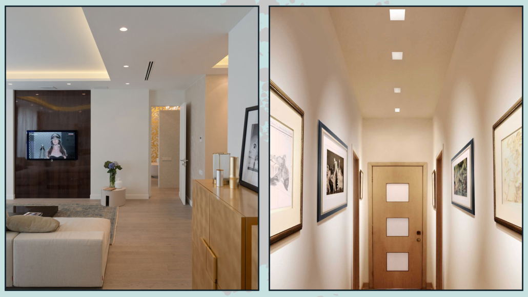
10 – RECESSED LIGHTS

Still on the ceiling, we can’t forget recessed spotlights.

Installed in a drywall ceiling, they’re already quite discreet—but frameless versions take it a step further, creating an even cleaner and more seamless look.

(credits: m.zxzhijia.com; Lighting Stores)

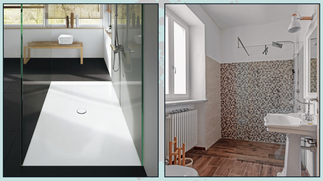
11- SHOWER TRAYS

Here we’re referring to flush-to-floor, not flush-to-wall ones.

There are shower trays that can be fully recessed into the floor, eliminating any step—even a minimal one—when entering the shower.

With proper floor slope and good drainage, you can even use the same flooring throughout,  allowing you to move beyond standard shower sizes.

(credits: tavolla.com;vivere lo stile)

Did you already know all these flush-to-wall solutions?

Do you have any of them in your home?

I hope you found the article helpful and enjoyable! If you did, let me know with a comment.
Feel free to share it with anyone who might be interested — I’d be honored!
If you need a consultation for your home, don’t hesitate to contact me!
I’ve already mentioned how important it is to create a mood board when refreshing your home.

It’s just as important to create one during a renovation, so you can have a clear overall vision—from materials and finishes all the way to decorative details.

Today, I’d like to dive deeper into this and show you how to create the perfect mood board for your spaces!
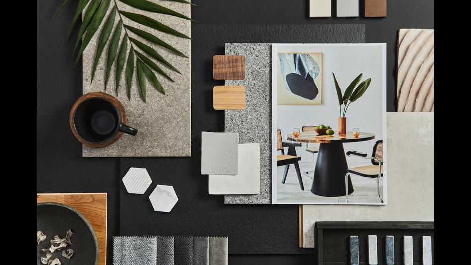
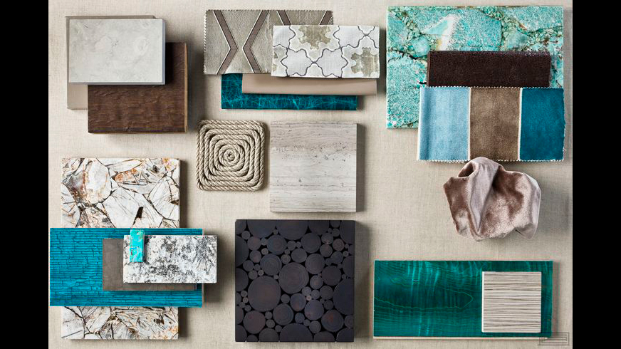
A mood board is often physical, combining images with real materials such as tile samples and fabric swatches.

When created this way, it becomes a true sensory board—you don’t just see it, you can touch it too.

(credit:freepik)

(credit: Charles Allem Design)

That said, it’s not always possible—or easy—to create a mood board like this.

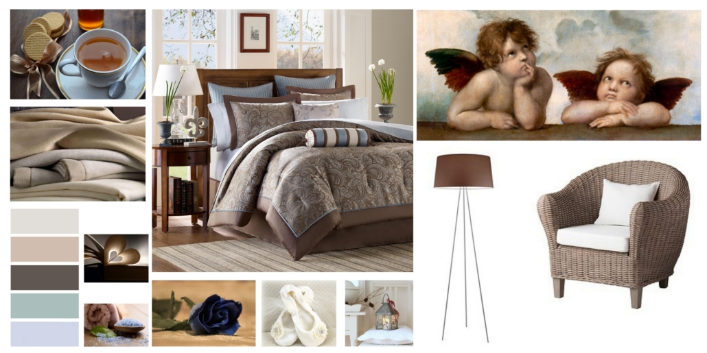
It’s often much simpler to build one digitally using images.

Technically, a digitally created and well-structured board is called a concept board, but most people still refer to it as a mood board— and I will too for simplicity.

So, how can you create a mood board?

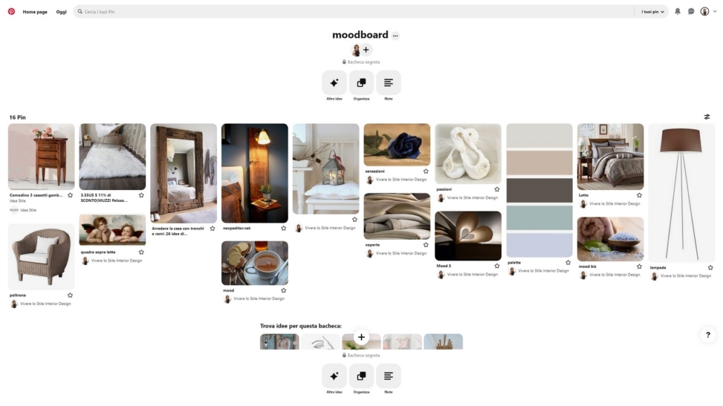
– PINTEREST

I believe most people already have this app, and it’s truly an endless source of inspiration.

Using it is one of the easiest and fastest ways to create a mood board.

Create a board for each room in your home and start collecting images of furniture, accessories, and colors you’d love to use.

You can save images directly from Pinterest, but—at least on desktop—you can also upload your own. So, if you already know which sofa you want, for example, add that exact one in the right color!

Try to avoid saving images of entire rooms. Instead, focus on single elements, so backgrounds and other details don’t interfere.

This way, your board will include everything that inspires you, and you’ll immediately see whether things work well together or not.

You can add or remove items with just one click.

It’s fun—and incredibly useful.

One of the best things about Pinterest is that you can create both public and private boards.

It is possible to share private boards with others if you’d like feedback or even to collaborate.

You can also add notes to each image.

I often use this method with my clients, especially at the beginning, because it helps me better understand their tastes and create highly targeted proposals.

Unfortunately, you can’t export a board directly from the app.

And if your board contains many images, a regular screenshot isn’t very helpful, but there’s a workaround: a browser extension called “Full Page Screen Capture.”

This tool allows you to capture the entire page—in this case, all the images in your board—and save it as an image or a PDF.

Et voilà—your mood board is ready to print!

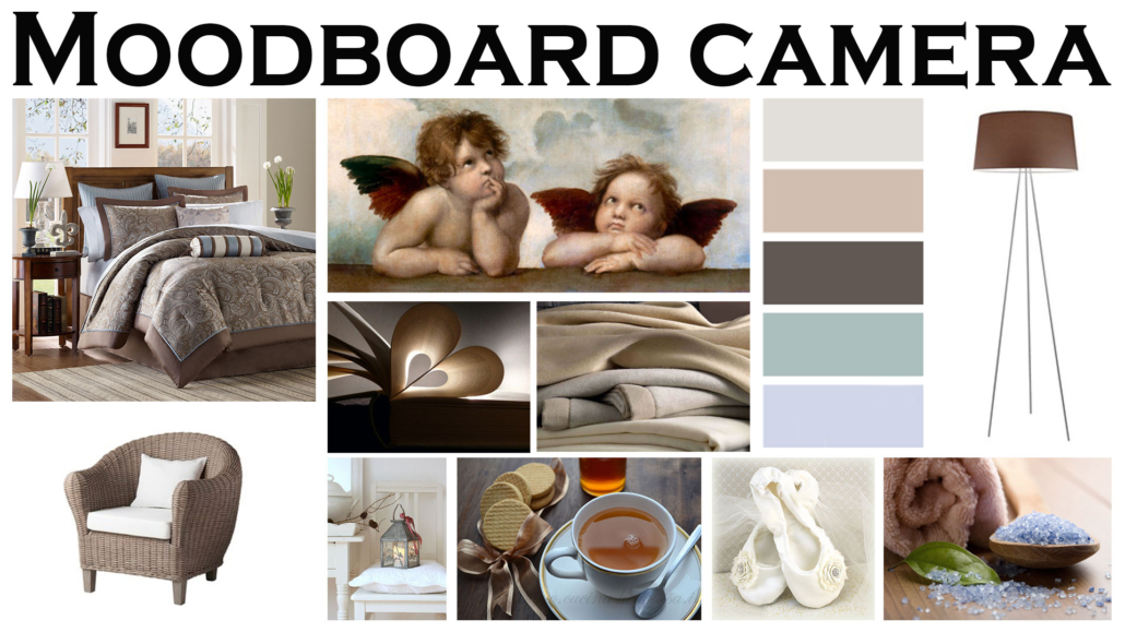
– POWERPOINT OR CANVA

Canva is an online tool similar to PowerPoint, with the added advantage that you can customize the file size from the start.

There’s a free version and, of course, a paid one—but the free version is more than enough to create a moodboard.

In both cases, start by collecting all the images you love into a folder on your computer.

As with Pinterest, I recommend using images of products and materials with clean, simple backgrounds.

Once you have everything, open PowerPoint or Canva and start arranging your images, resizing them so they fit well together.

Again, it’s easy to remove, add, or adjust images until the overall composition feels cohesive and harmonious.

For example, you might realize that the sofa you chose works well, but the color needs to change to achieve a better balance.

– PHOTOSHOP OR ILLUSTRATOR

These are both Adobe programs and extremely versatile tools.

Just like in Canva, you can choose your canvas size and easily set it up for printing.

With these programs, you can really get creative—playing with layouts, backgrounds, and image sizes.

Thanks to guides, you can also align everything perfectly, a small detail that makes a big visual difference.

They’re not difficult to use, but if you’re not familiar with them, they can take some time to learn.

I recently came across another online tool called Milanote.

It’s not designed just for mood boards, but for interior design projects more broadly.

I haven’t explored it fully yet, so I’m just mentioning it in case you’re curious—but I’ll definitely look into it more in the future!


As you can see, there are many ways to create a mood board.

The key is to use it correctly: the images you choose should reflect you, your personality, and your lifestyle.

Once your mood board is ready, take a moment and ask yourself:

Do I like what I see?

Does it truly represent me?

Can I improve it?

Play with the images, trying different color combinations, details, and moods until the result truly feels right to you.

The goal is to create a space that reflects who you are—one you’ll genuinely love.

Seeing everything together will guide you in the right direction and help you choose the right pieces for your space.

Otherwise, the risk is going out and buying things with only a vague idea in mind.

I hope this article on how to create a mood board was helpful!

Have you ever created one? If so, let me know in the comments!

If you need advice for your spaces, don’t hesitate to contact me!

Is purchasing furniture really as easy as it seems? Do you actually know what to look for when buying furniture for your home?

That is a decision you shouldn’t take lightly. Kitchens, sofas, and bedrooms are all major purchases that can easily cost several thousand dollars.

Buying furniture for your home is exciting, but it can also feel a little overwhelming. As mentioned before, you know you’re about to make a significant investment, and you want to be sure you’re making the right choices.

So here are some tips to keep in mind, along with the questions you should ask yourself when it’s time to take action.

LIVING ROOM

SOFA

The sofa is undoubtedly one of the biggest and most expensive pieces in this room, so let’s look at what you should consider:

– It needs to be sturdy

Sofas with a solid wood frame are ideal because they’re strong and long-lasting.

Yes, this usually increases the price, but it’s actually the best choice you can make.

We all know there are very “affordable” sofas out there, but that often comes at the expense of quality and durability.

Replacing a sofa after just a few years is definitely not ideal!

(credit: overstock.com; roomandboard.com)

– It needs to be comfortable

I’ve often met friends or clients who fell in love with a sofa’s design, only to realize later that it was very uncomfortable.

Your sofa should be a place where you can truly relax!

One helpful detail to check: ask whether the sofa has coil springs or serpentine springs.

Coil springs tend to be more durable and comfortable because they’re much more elastic.

(credit: yirilom.com; pinterest)

– Pay attention to the padding

Most sofa cushions use high-resilience polyurethane foam.

It’s a durable and easy-to-maintain material, but pay close attention to its density.

If the foam is too thick, the sofa will feel too firm; if it’s not dense enough, it will sink too much.

A quick note on density: polyurethane foam contains tiny air bubbles—the more bubbles, the denser the material.

For sofa seats, it’s paramount to find the right balance between density and weight support. A good medium density usually falls around 30–40.

For backrests, which don’t need to support as much weight, a lower density can work just fine.

(credit: puresaltinteriors.com; bassettfurniture.com)

– Choose the upholstery

Cotton, linen, and leather are classic sofa coverings and are very durable.

Synthetic materials such as microfiber are easy to clean and maintain.

If you have kids or pets, microfiber might be the best solution due to its practicality.

– Pay attention to the dimensions

The sofa must be proportional to the room: one that’s too large will overwhelm the space, while one that’s too small will get lost.

Also, make sure to consider every passage the sofa needs to go through to get inside—not just doors and windows, but also hallways and staircases!

ARMCHAIR / EXTRA SEATING

Adding an armchair or extra seating near the sofa instantly adds style to the room, making it a worthwhile investment.

This piece can match the sofa perfectly (a classic armchair that feels like a natural extension), or it can contrast with it, adding rhythm and visual interest.

When choosing a contrasting seat, pay close attention to style, materials, and all those small details that truly make a difference.

(credit: beliani.it; artesanosdesign.com)

COFFEE TABLE

A coffee table should be proportionate to the sofa, slightly lower than the seat height, and placed at a distance of approximately 40–50 cm (16–20 inches)

(credit: Pinterest)

Material choice should reflect the overall style of your home.

One tip: avoid glass if you have children!

As for shape, it’s best to follow the room’s layout:

– in a rectangular room, rectangular or oval tables work best;

in a square room, square or round tables are ideal.

Round tables have a huge advantage, especially in small spaces, because they allow for smoother movement around them.

(credit: vivadecora.com.br; robadadonne.it)

BEDROOM

BED

One of the principal elements to consider is the mattress.

It needs to be extremely comfortable so you can truly relax and enjoy restorative sleep.

(Fun fact: you spend about one-third of your life on a mattress!)

When it comes to the bed itself, don’t focus only on shape and style.

The bed base is just as important: even the best mattress will lose some of its benefits if placed on a poor-quality base.

Slatted bases are usually the best option, especially those with flexible, curved slats rather than rigid ones.

Some slats support different weight loads.

(credit: coppel.com; duomodesign.it)

Pay attention to height!

The bed base raises the mattress, and one should choose its height based on the mattress thickness so you can get in and out of bed comfortably.

There’s no single “ideal” height—it depends on your height, age, and even your health.

In terms of style, consider the overall look and atmosphere of the room.

As always, the bed can either coordinate with the rest of the furniture or become a contrasting statement piece.

Start with your color palette and wall color.

From there, decide whether you want a tone-on-tone look, a soft contrast, or a bolder one.

For materials—wood, metal, or upholstered—also think about ease of cleaning.

(credit: duomodesign.it; Tatiana Gedike; duomodesign.it)

WARDROBE AND NIGHTSTANDS

Just like with the bed, your wardrobe, nightstands (and any dresser) don’t have to match perfectly.

Matching everything is a safe choice, but it might not fully represent your personality.

Mixing different pieces creates rhythm and movement, making the space feel more dynamic.

(credit: ourhouseofmodesty.nl; Ikea)

DINING ROOM

The table is the true star of the dining area, so focus on its style and materials.

A glass table feels very formal and has the advantage of reflecting light, which is excellent for small spaces—but it does require constant cleaning!

Wood, on the other hand, is a durable and timeless choice.

Just like in the bedroom, chairs and table don’t have to be a matching set.

Mixing is also an option here.

If you choose wooden chairs, you can either keep them in a similar tone for a cohesive look or go for a strong contrast.

(credit: decorqeeny; thenordroom.com)

KITCHEN

My first piece of advice is to start with the appliances, since they usually have the highest impact on the budget:

– Built-in or freestanding refrigerator?

– Type and size of the oven

– Size and type of the cooktop

– Type and size of the sink (not an appliance, but there are many options, and it highly affects usability)

– Dishwasher: yes or no? 24-inch or 18-inch? Built-in or not?

Choose appliances that match your kitchen habits. (I talk about this in an interview with Chef Patty Smit)

Once you find the best appliances for your needs, choose their finish. White, black, stainless steel, and more.

The right choice depends on your home’s style.

Once the appliances are selected, you can design the rest of the kitchen around them.

(credit: Marmoraria Felcon)

MORE…

Of course, you’ll need to consider your budget, but one thing I truly recommend is this: buy what you love.

If you’ve fallen in love with a piece and can’t stop thinking about it, go for it!

If you know you’re investing in something that’s both beautiful and long-lasting, you’ll be happy in the end.

Remember: spending less can sometimes mean spending more.

Choosing a cheaper, lower-quality option may force you to replace it sooner, ultimately costing you more.

Start with the essential pieces, and don’t be afraid to buy things little by little.

I hope you found this article on what to look for when buying furniture for your home helpful!

If you did, I’d love to hear from you—drop me a comment and let me know.

If you think someone else might enjoy it, I’d be truly honored if you shared it with them.

And if you still have questions or would like some personalized advice, don’t hesitate to get in touch—I’d be happy to help!