Often, I receive questions about how to make one’s home cozier, warm, and inviting, so I’ve decided to answer with this article.
When designing a house, commonly, we focus on the aesthetic aspect, neglecting the emotional one: that is what we want to feel in that particular environment!
But to truly feel comfortable and relaxed 100%, the house, besides being beautiful, must also be welcoming and inviting.
So today, I want to share five essential elements to make your home cozier and inviting, regardless of your style!
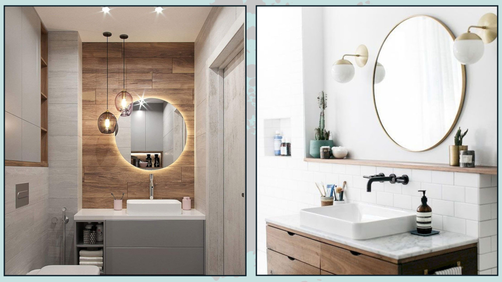
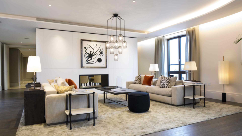
– WARM LIGHT
Light is a fantastic ally for changing the mood of a room.
The same room, colors, and textures visually change depending on the type of light or, more precisely, the light color temperature chosen (I discuss lighting in detail here).
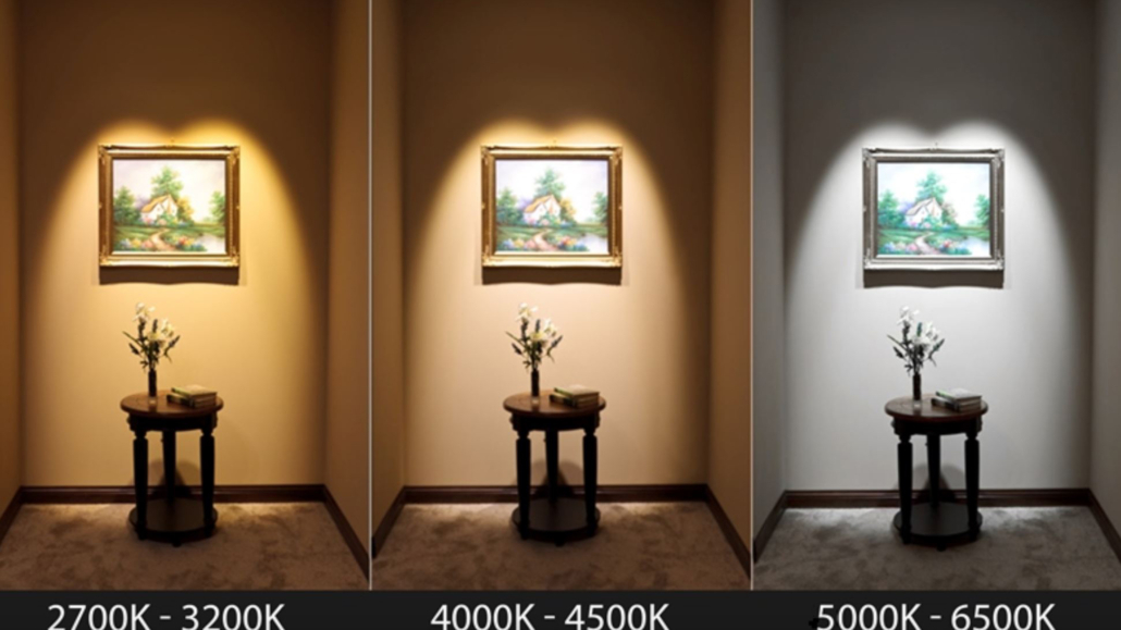
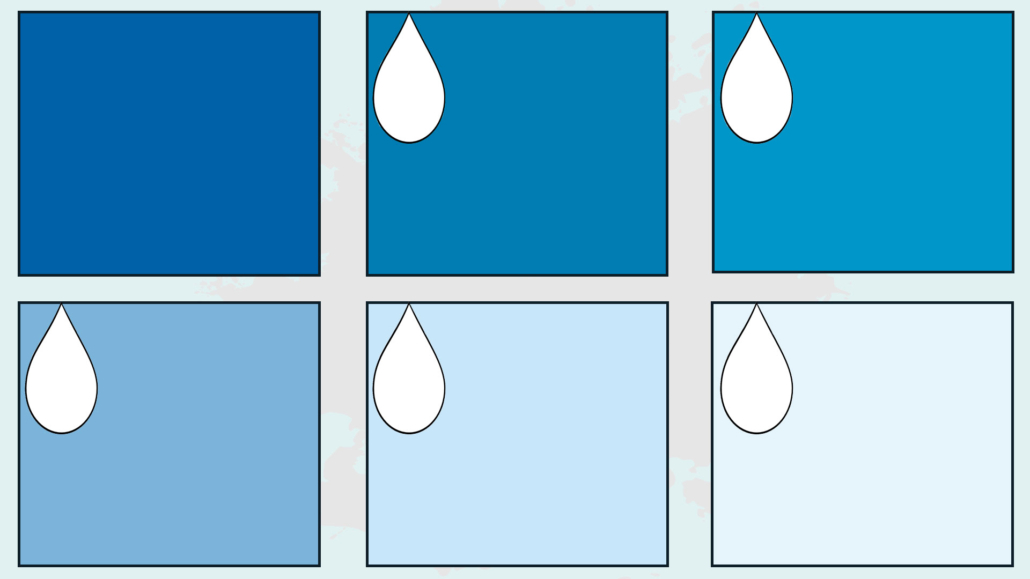
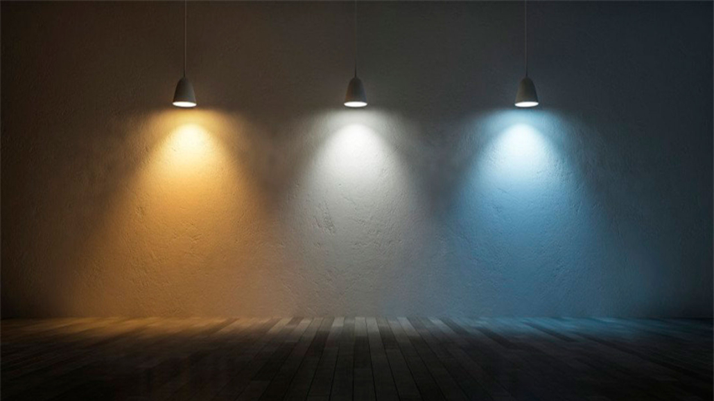
Lighting with a cool color temperature (above 5000 Kelvin) will give environments tending toward blue, and the perception will be of cold and unwelcoming rooms.
Using instead lighting with a warm color temperature (between 2700 and 3000 Kelvin) will change everything radically, without having to change anything in the room.
This color temperature produces a light that slightly veers towards yellow, creating inviting and warm atmospheres.
(credit: housmag.it)
(credit: morabitoimmobiliare.it)
But there’s a “problem”; this type of lighting changes our perception of colors and spaces, which could ruin some of your design choices.
I’ve said it often: you can design the most beautiful spaces in the world, but if you get the lighting wrong, you ruin everything.
So, what to do?
Well, since there are various types of lighting, the ideal is to use a neutral color temperature (around 4000 Kelvin) for general lighting and warm lighting for secondary lighting, such as table lamps or floor lamps.
(credit: jowebster.com)
Playing with different lights and different color temperatures will allow you to easily change the atmosphere of a room, all with just the use of different bulbs!
Today, there are even some special bulbs on the market that you can not only dim (meaning you can decide the light intensity) but also change the color temperature.
With these bulbs, you can modify the mood of your spaces whenever you want!
Another relevant element to consider is using lampshades that can soften the light.
That also helps to make the spaces warmer and more comfortable.
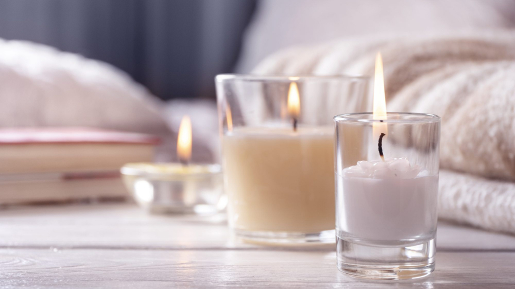
Additionally, to add a bit more warmth and romance, I suggest adding some candles
(credit: firstforwomen.com)
Candles not only illuminate but also immediately create the atmosphere.
And if you get scented ones, you can give that extra touch that makes a difference!
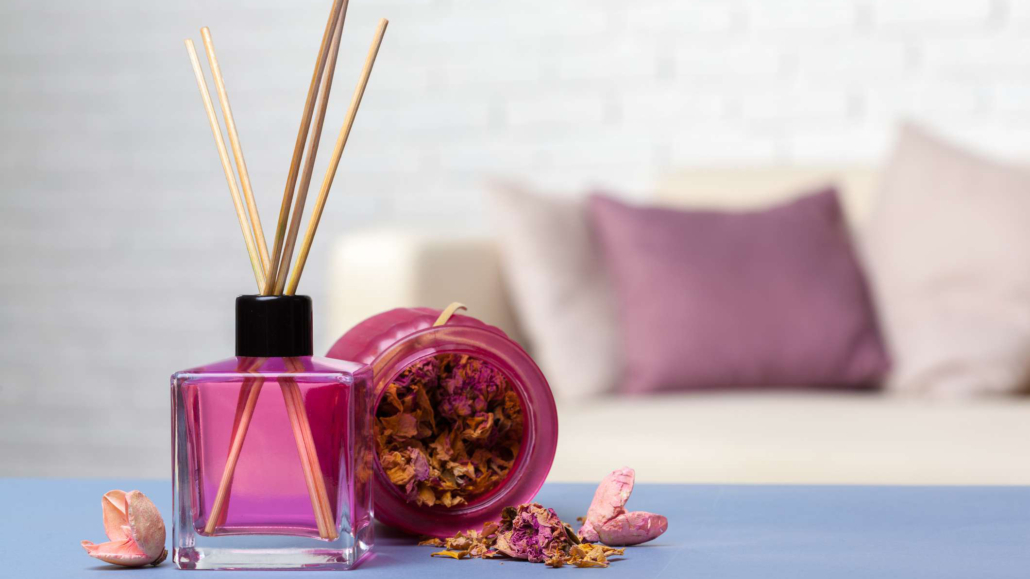
– SCENTS
As I’ve mentioned before, good design goes beyond aesthetics, and how we perceive spaces through all our senses can also improve our quality of life.
So, we should use everything at our disposal to stimulate the senses and create the atmosphere we want to live in.
(credit: istock.com)
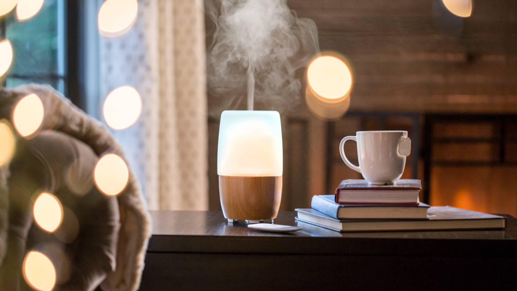
Stimulating the sense of smell is a simple way to make instantly a home more welcoming and inviting.
In addition to scented candles, as mentioned earlier, you can use small aroma diffusers.
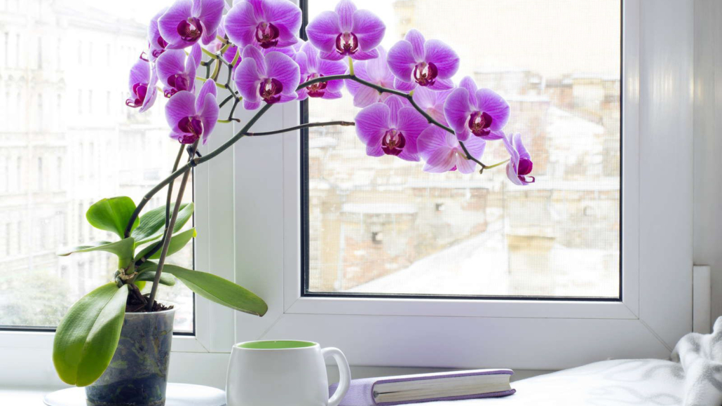
Of course, you can use fresh flowers, adding a little color and freshness.
(credit: shutterstock.com)
Some inviting and enveloping essences that help with relaxation and feeling good are cinnamon, orange, cedar, lavender, chamomile, jasmine, rose, and vanilla.
These essences help slow down the nervous system and thus bring many benefits to the mind and body.
(credit: homedics.it)
Of course, be careful not to overdo it with essences, especially with chemical ones; too much could have the opposite effect.
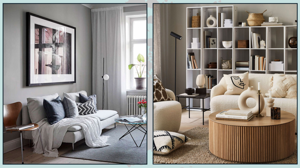
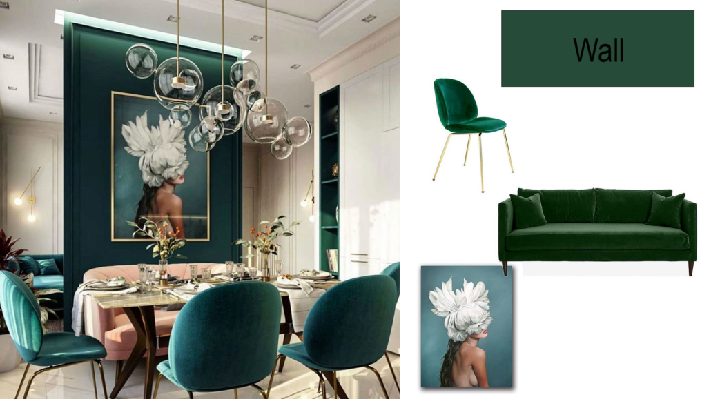
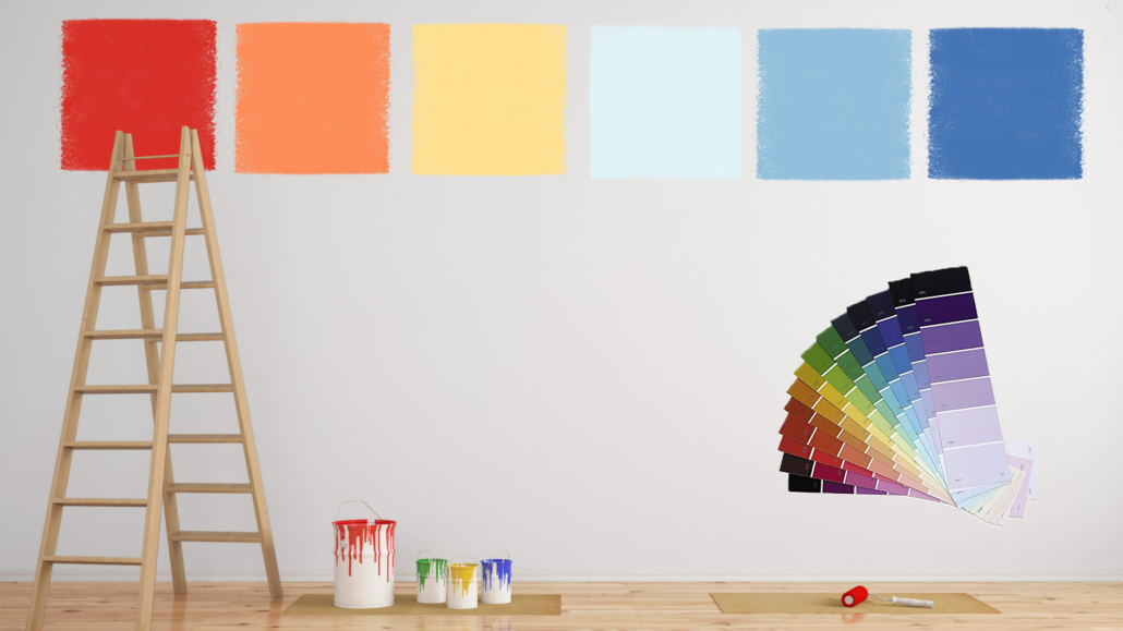
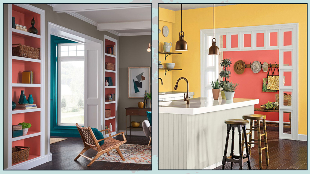
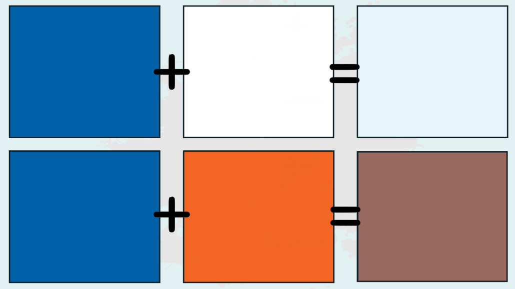
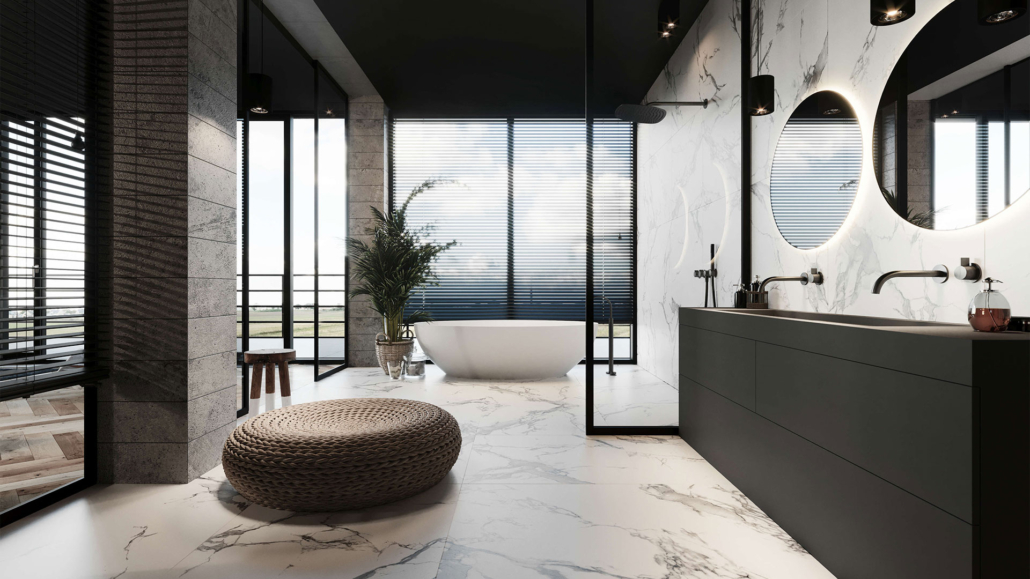
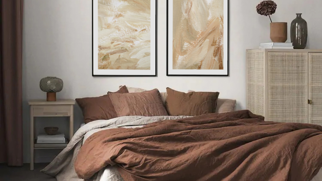
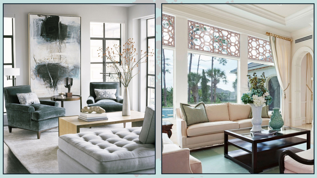
– WARM COLORS
It’s well known that colors have a strong psychological impact and are an excellent ally in creating elegant and attractive environments (I’m talking about color psychology here).
Warm colors, needless to say, are highly recommended for spaces where you want to feel immediately welcomed, almost like being in an embrace.
(credit: desenio.it)
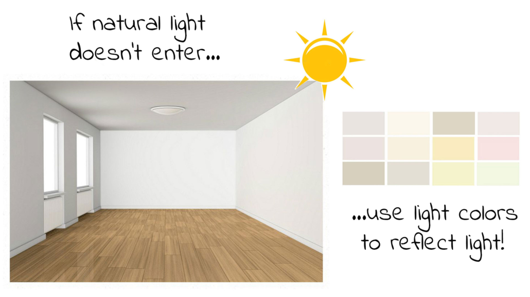
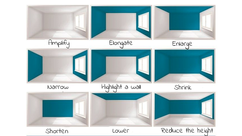
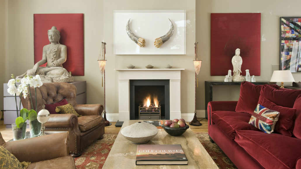
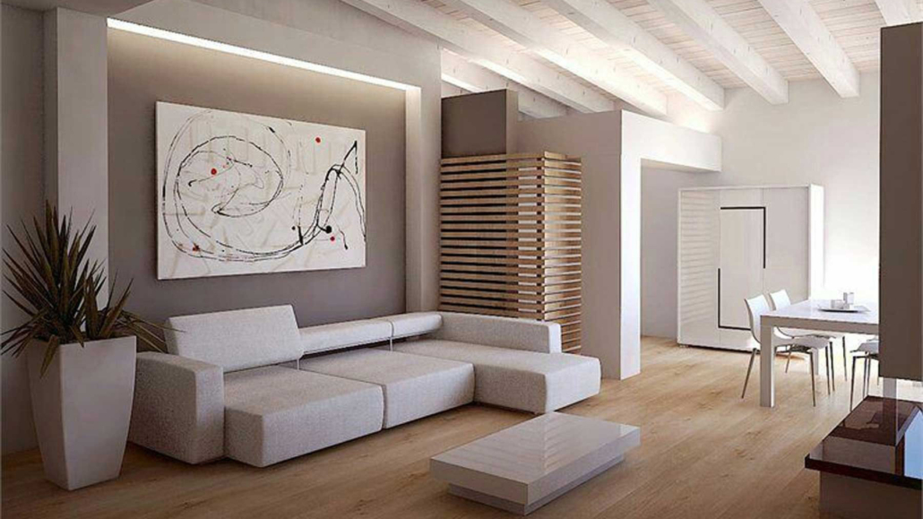
Using warm colors is even more vital in large rooms or open spaces, which otherwise could feel empty, somewhat impersonal, and especially cold.
(credit: larizzadesign.com)
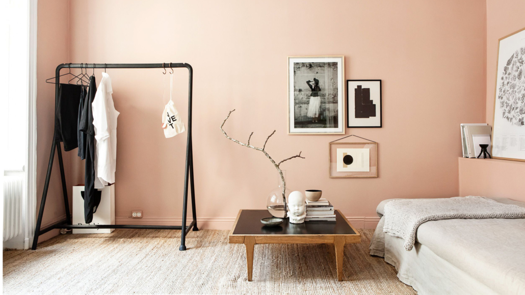
In smaller spaces, the key is to use light shades to maintain that sense of warmth without overwhelming the space.
(cretid: living corriere)
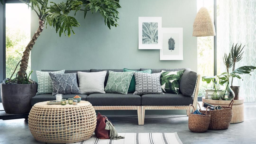
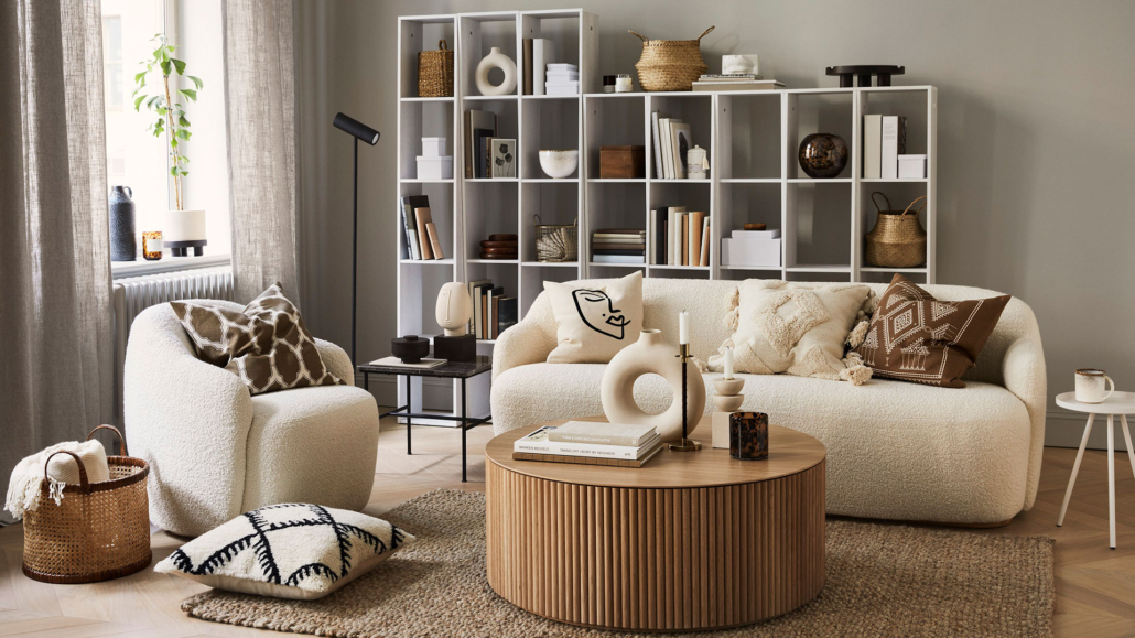
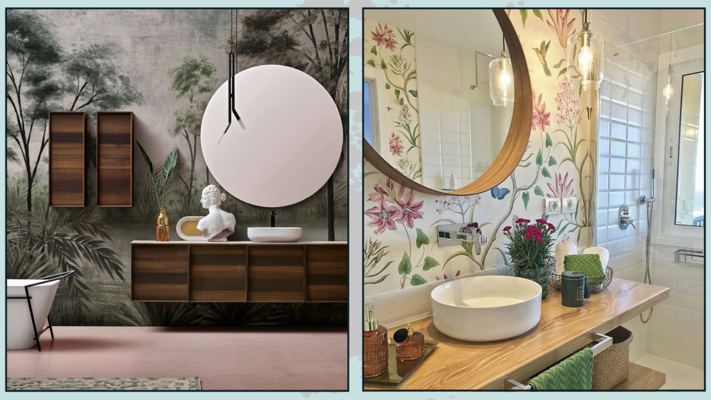
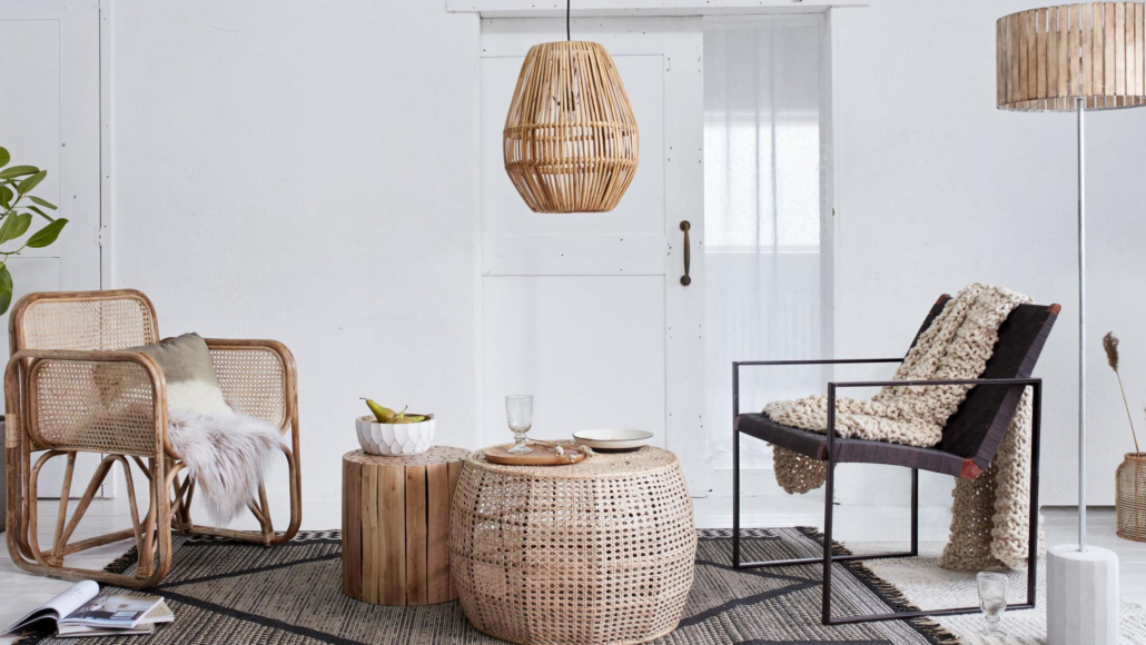
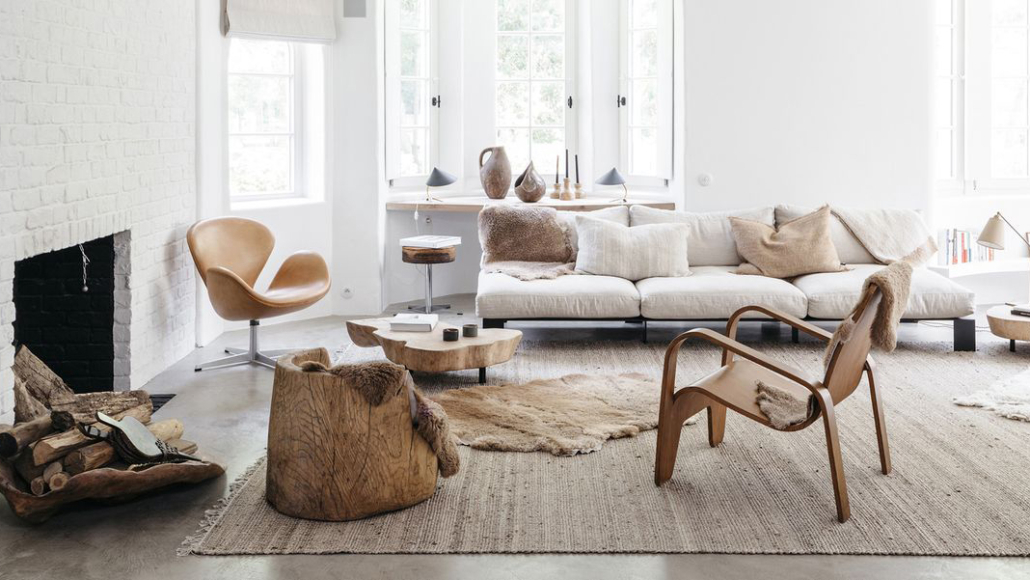
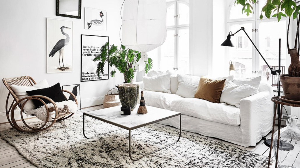
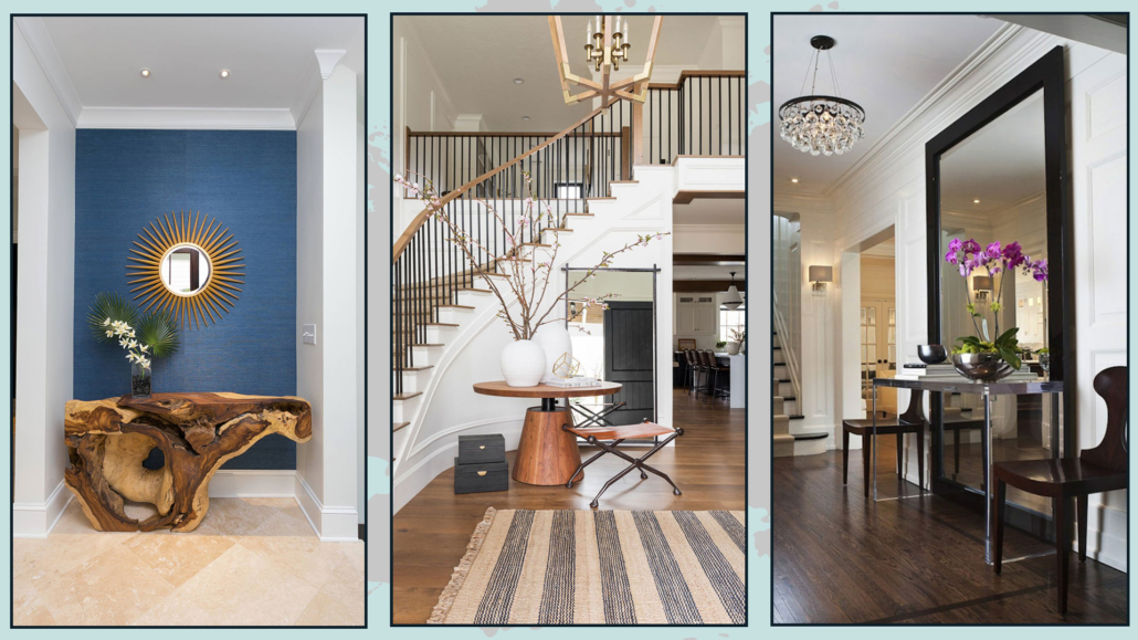
– NATURAL ELEMENTS
Plants, in particular, are an incredible way to make a home comfortable and inviting!
(credit: istock.com)
Regardless of your style, a plant will liven it up and add that extra touch of elegance.
Not only that, plants help purify the air, making it healthier!
Additionally, as mentioned other times, they bring shapes, textures, and a touch of color that never hurts!
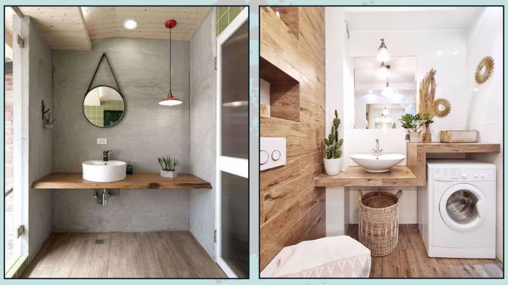
Other natural elements like wood, terracotta, rattan, or fibers such as linen help us feel closer to nature, which relaxes us and makes us feel good!
(credit: H&M)
(credit: Sebastian Erras)
If you like, you can also add nature sounds in the background at home: for instance, classical music accompanied by the sound of the sea, rain, or crackling fire.
That could also be a great way to feel even more relaxed!
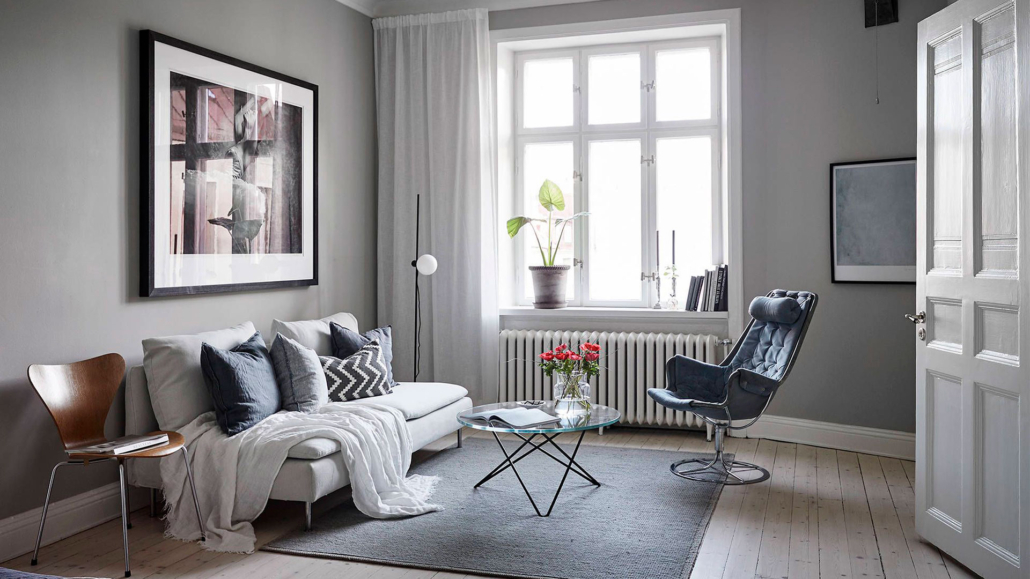
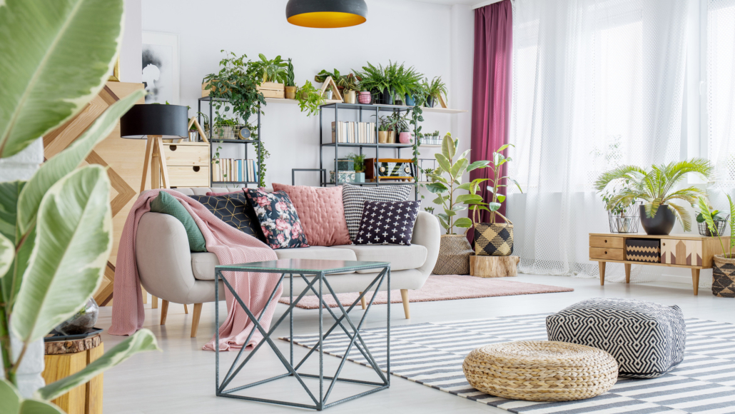
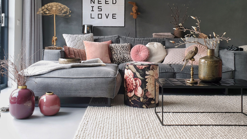
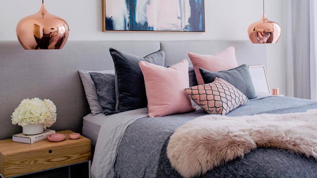
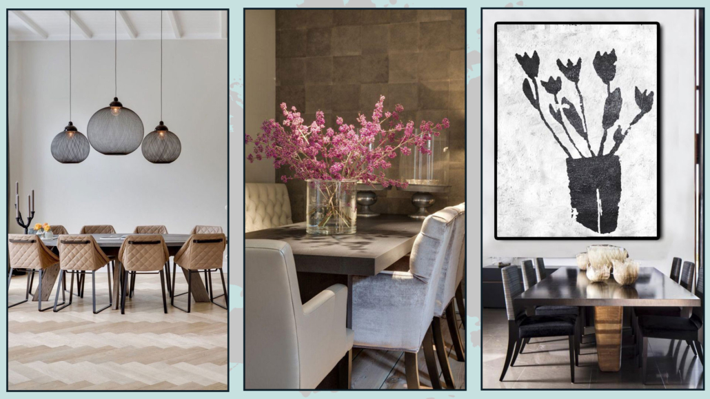
– TEXTURES
Soft textures are essential to create a warm and enveloping home feel and stimulate the sense of touch.
Look for materials that are pleasant to the touch and can make spaces more comfortable and inviting.
(credit: entrancemakleri.se)
A soft rug will immediately help warm up the environment, and walking barefoot on it will help you relax!
(credit: soopush.com)
Blankets, casually draped over the sofa or bed, immediately give a sense of warmth, also adding a touch of color!
Likewise, cushions are indeed the best way to add comfort and decorate a sofa or bed.
(credit: favim.com)
As you can see, making a home more welcoming and inviting is not difficult.
Use what you have, make changes if necessary, such as changing a few light bulbs, and add some details, and you’re all set.
Your home should represent you and, most importantly, make you feel good and comfortable.
Choose things based on your style and personality!
I hope this article on how to make your home cozier and inviting has been helpful and enjoyable for you. If so, let me know in the comments!
Feel free to share it with anyone you think might be interested, I would be honored, and it will help me gain more exposure.
If you feel that your home, or any specific area of it, doesn’t reflect your personality enough, don’t wait any longer and book your consultancy!
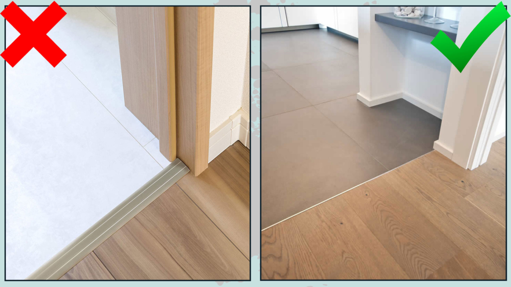
 3 – DIFFERENT AND CONTRASTING FLOORING