The bedroom is where we spend a third of our lives, and it’s where we should successfully get a good, restorative sleep to recharge our batteries and face the following day.
Proper bedroom design becomes truly vital, as the risk, otherwise, is to spoil your rest.
The bedroom should give us a feeling of calm, relaxation, and serenity to promote sleep.
Let’s see how to design the bedroom, regardless of its size, style, or budget available!
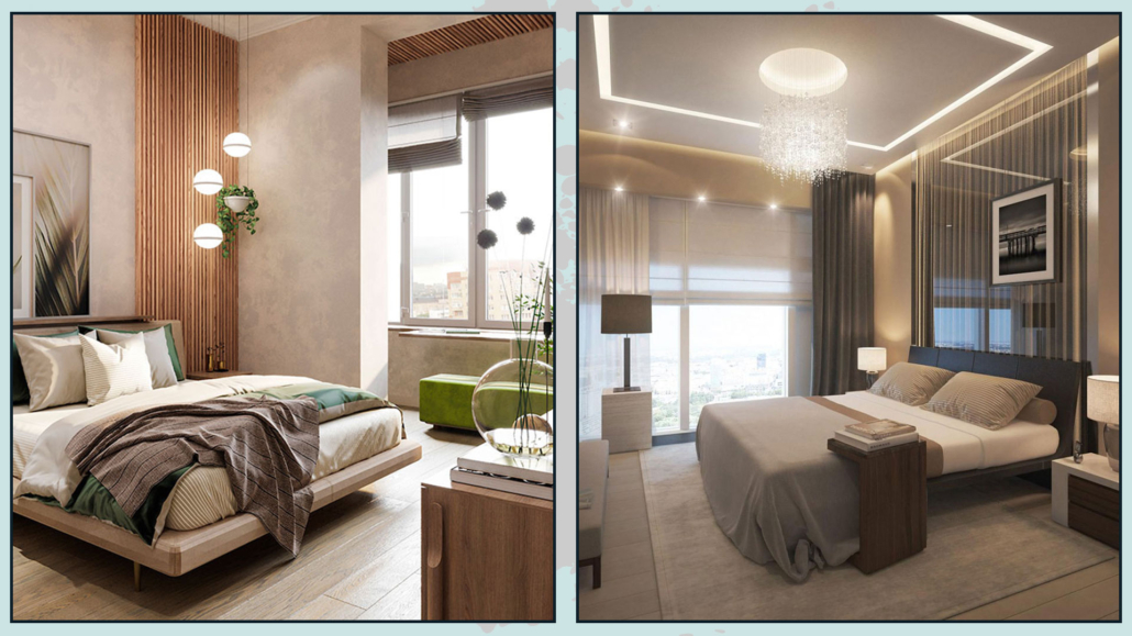
1 – PAY ATTENTION TO COLORS
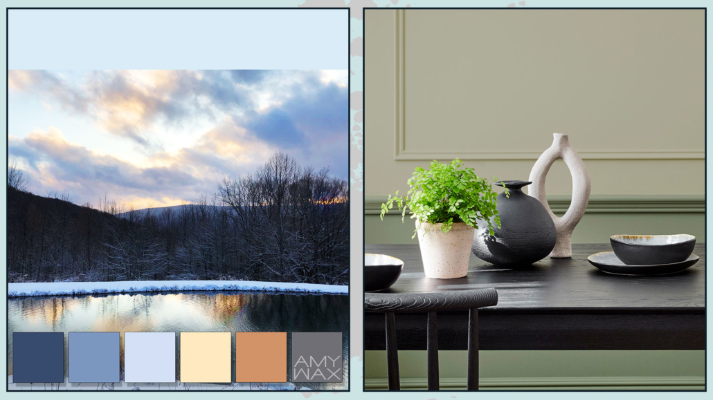
Color has a powerful psychological impact (I talked about it here), so it’s paramount to have a relaxing color palette!
The colors should be soft and inviting.
Neutral colors are definitely a great choice, but in general, you can also choose colors like blues and greens, which remind us of nature’s colors!
You can also combine these colors to create a pleasant, calming, and relaxing palette.
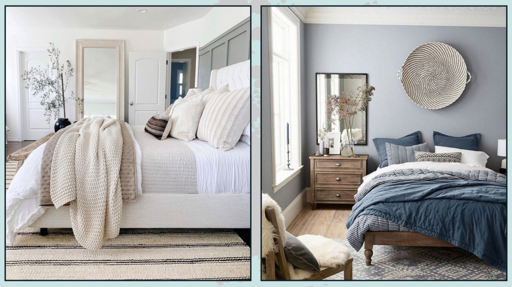
(credits: athoughtfulplaceblog.com; Domino)
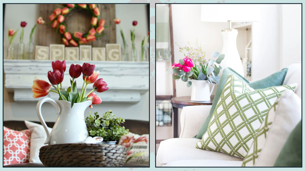
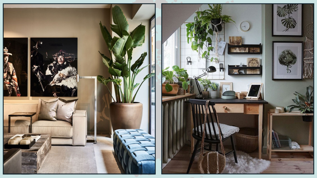
If your home has a vibrant color palette, you don’t have to give it up for your bedroom.
Just make it more neutral by adding white for light colors or black for dark colors.
If you love vibrant colors, you can still use them but in littler elements, like pillows or decorative blankets.
That will allow you to have that vibrant touch while maintaining a calm and serene mood.
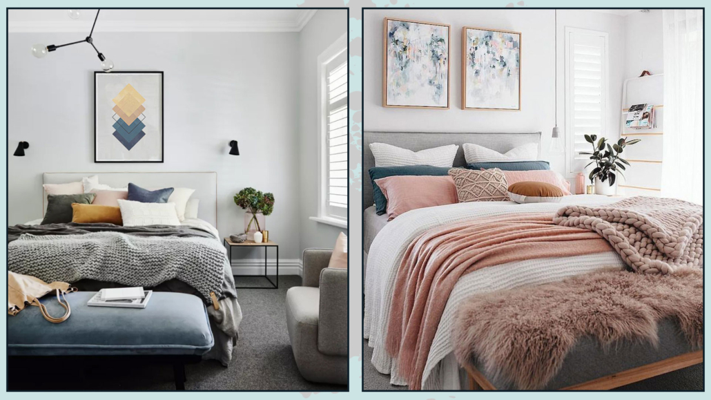
(credits: homesweethome.co; etsy.com)
2 – PAY ATTENTION TO LIGHT
For a good rest, it’s essential that the room is completely dark; it has been scientifically proven.
If you have blinds that can be fully closed, adjustable slatted shutters, or blackout shutters, you won’t have any problems.
However, if that’s not the case, it’s essential to use the proper curtains to darken the room.
If you like draped curtains, you can opt for double-layered curtains with sheer panels and blackout ones.
If you find double-layered drapery too classic and prefer a more modern look, you can always mix two types of curtains!
You can combine draped curtains with roller blinds.
For example, you could have sheer draped curtains with a blackout roller blind, or vice versa!
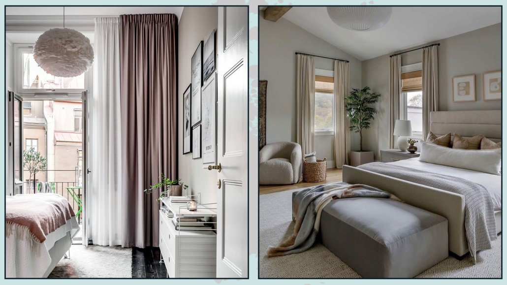
(credits: inredningshjalpen.com; lillytaylorinteriors)
There’s also the option of having double-layered roller blinds for an ultra-modern style.
Whichever type of double-layered curtains you choose, not only will help darken the room better but also add some movement and contrast, creating visual interest.
The colors of the curtains, needless to say, should harmonize with the rest of the room’s colors.
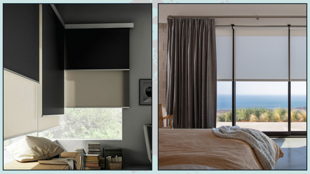
(credits: tau.com austarchitect.com)
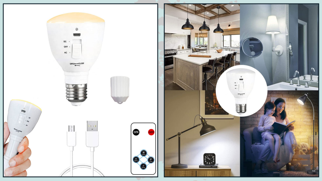
3 – PAY ATTENTION TO THE LIGHTING
In the bedroom, lighting must also be designed to promote sleep!
It will be crucial to choose, thus, bulbs with a warm color temperature, around 2700 degrees Kelvin.
This temperature reminds one of the sunsets and helps cellular relaxation.
Also, be careful with the wattage of the bulbs: they should not be too strong!
You can put some additional, punctual lights in the closet area to see better, but stay soft in the rest of the room.
Another great idea is to use lampshades that can further soften the light!
(credits: essenziale-hd.com; lights.com)
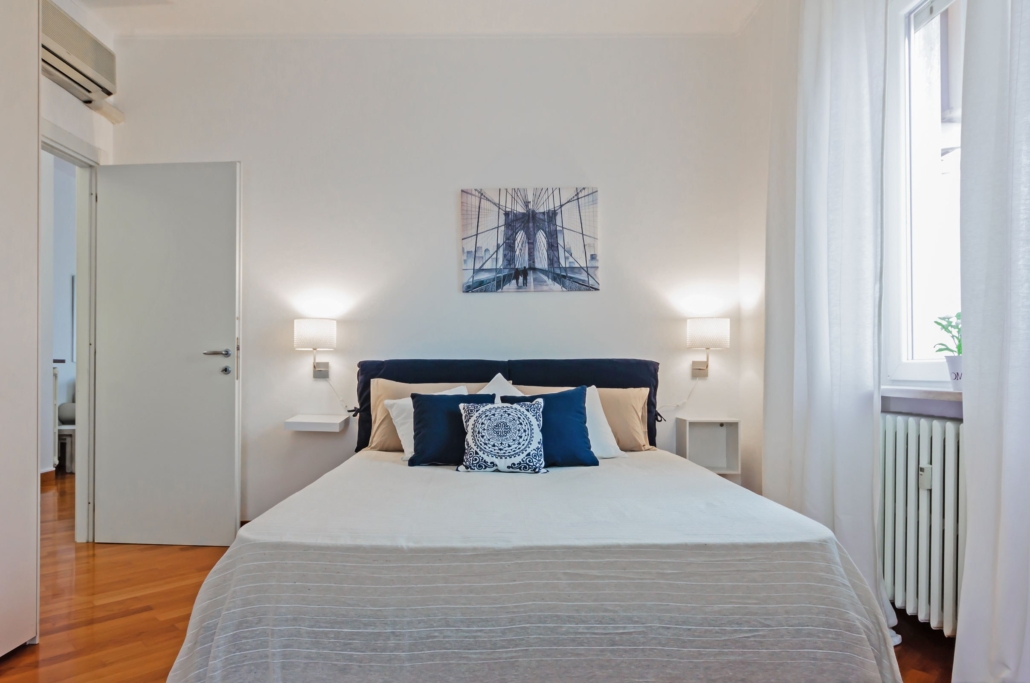
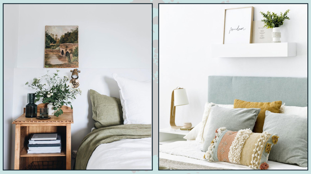
4 – TAKE CARE OF THE BED
To sleep well, the bed must be comfortable and inviting.
First and foremost, you should choose a suitable bed frame, mattress, and pillows according to your needs.
Then, it’s paramount to select the right bedsheets that are soft and pleasant to the touch, making you feel embraced and welcomed.
In addition to well-known fabrics like cotton, linen, and silk, you may not be aware of bamboo sheets!
They are said to be very soft, hypoallergenic, and temperature-regulating, preventing night sweats.
They are also reputed to be fantastic for skin and hair care, similar to silk.
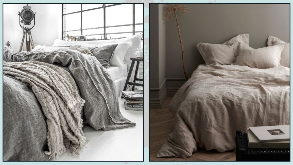
(credits: halemercantileco.com; ellos.se)
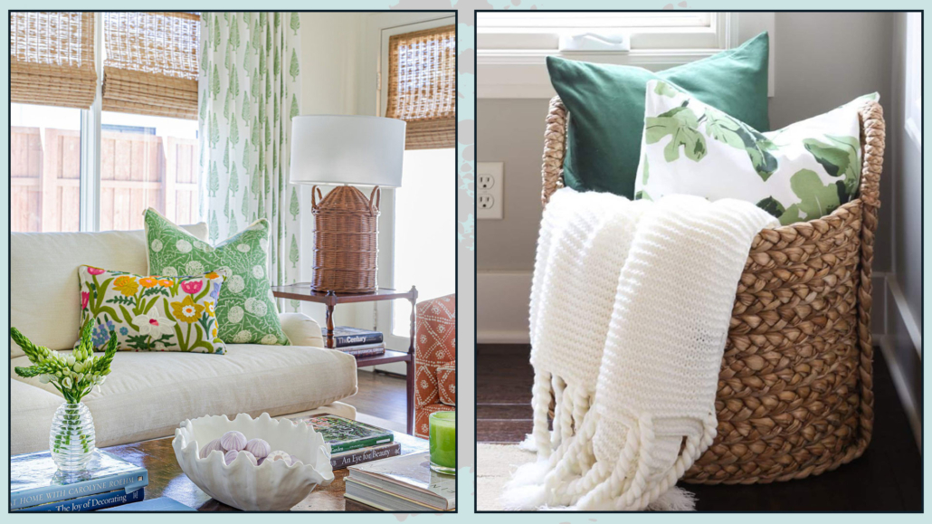
Make your bed inviting and attractive by “dressing it up.”
Use a beautiful bedspread or duvet, and add a blanket at the foot of the bed made of a different material to create some movement and subtle contrast.
Also, add some decorative pillows to add a touch of playfulness, patterns, and colors.
A well-cared-for bed not only adds a touch of elegance to the room but also makes it pleasant and enticing.
It will make going to bed even more enjoyable!
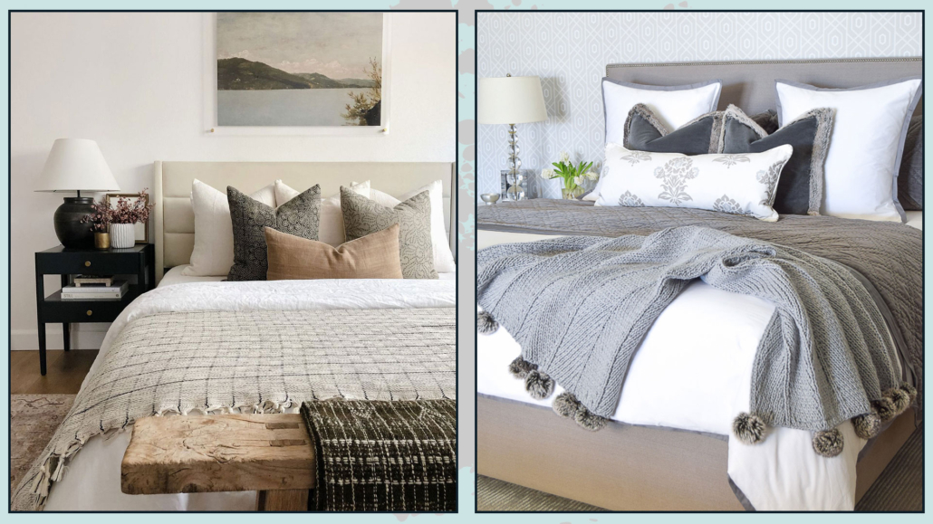
(credits: oneaffirmation.com; zdesignathome.com)
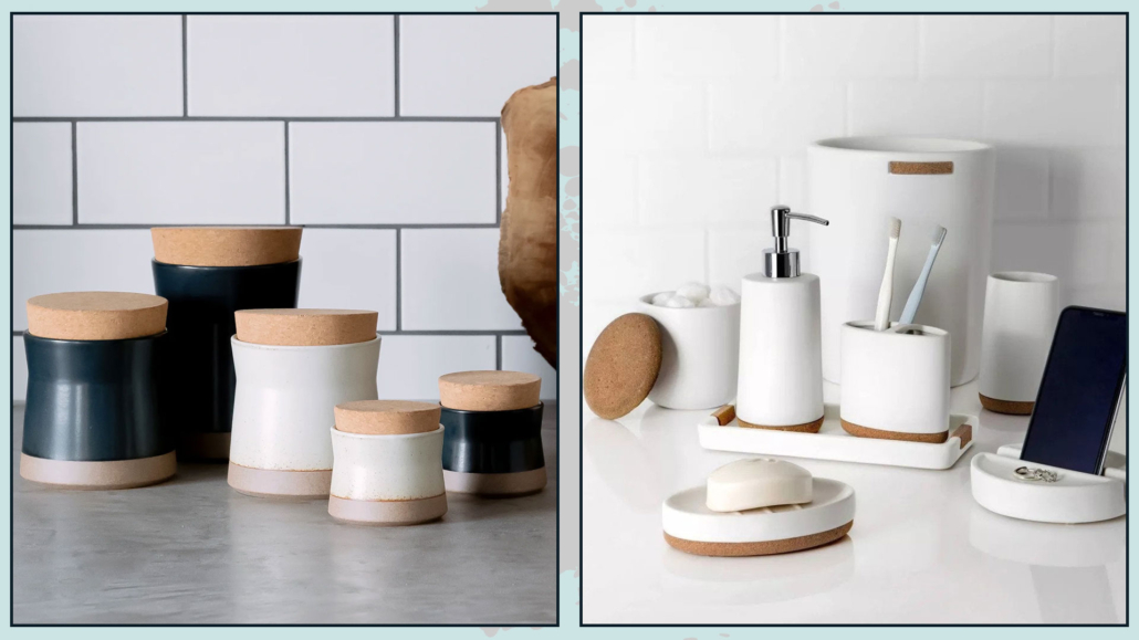
5 – KEEP THINGS TIDY!
Beyond the purely aesthetic aspect, having a cluttered or overly crowded bedroom creates a subconscious disturbance that can hinder a good night’s sleep.
It’s vital, therefore, to keep the room well-organized and everything in its place.
In addition to traditional furniture, you can add more storage under the bed or as a bench or ottoman.
If you have an open nightstand, consider placing baskets underneath to store items that may be visually bothersome.
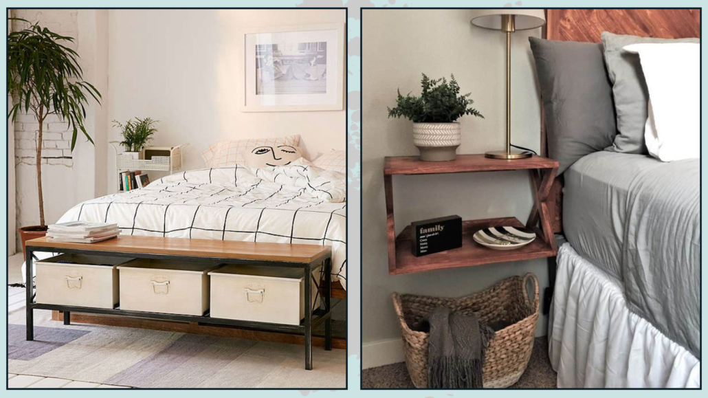
(credits: urbanoutfitters.com; joyfulderivatives.com)
That applies to decorations as well!
Avoid having too many pictures on the walls; it’s better to have a single large piece that serves as a focal point.
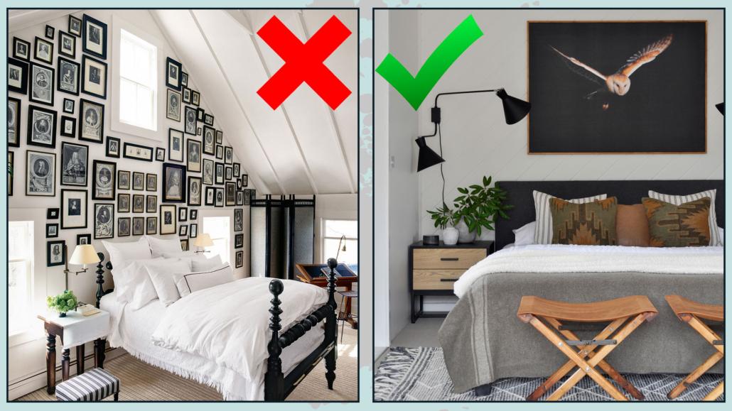
(credits: Laura Resen; stylecurator.com.au)
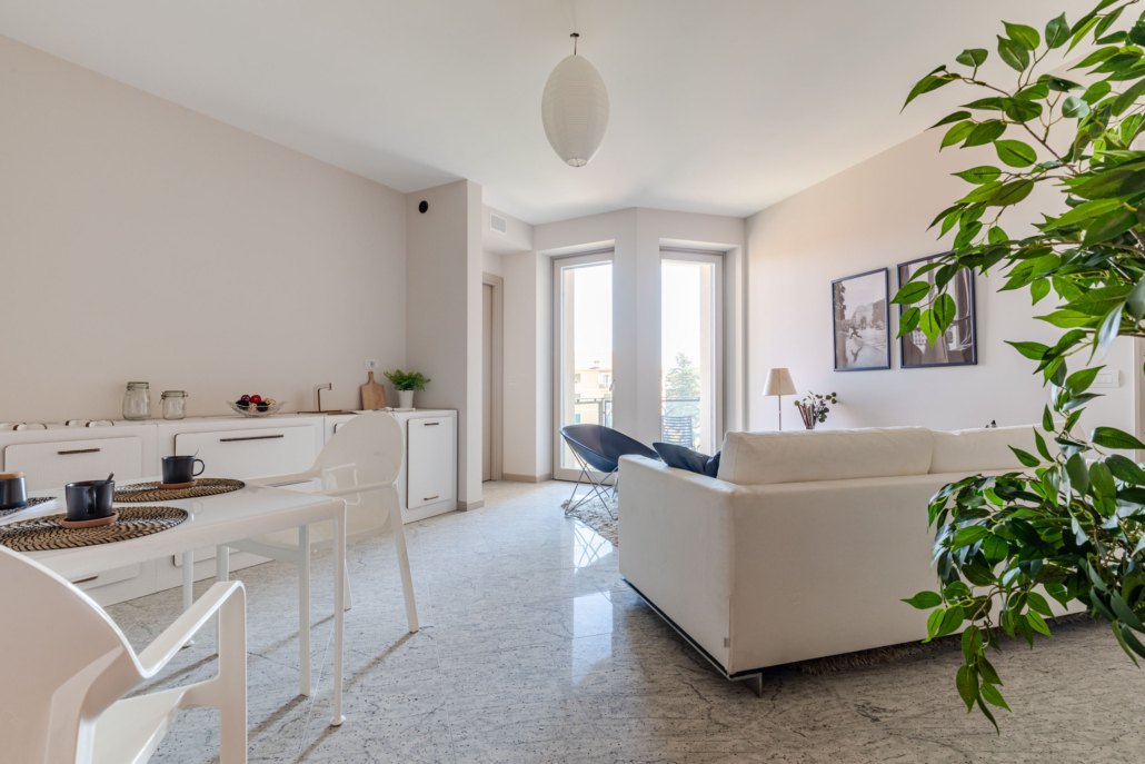
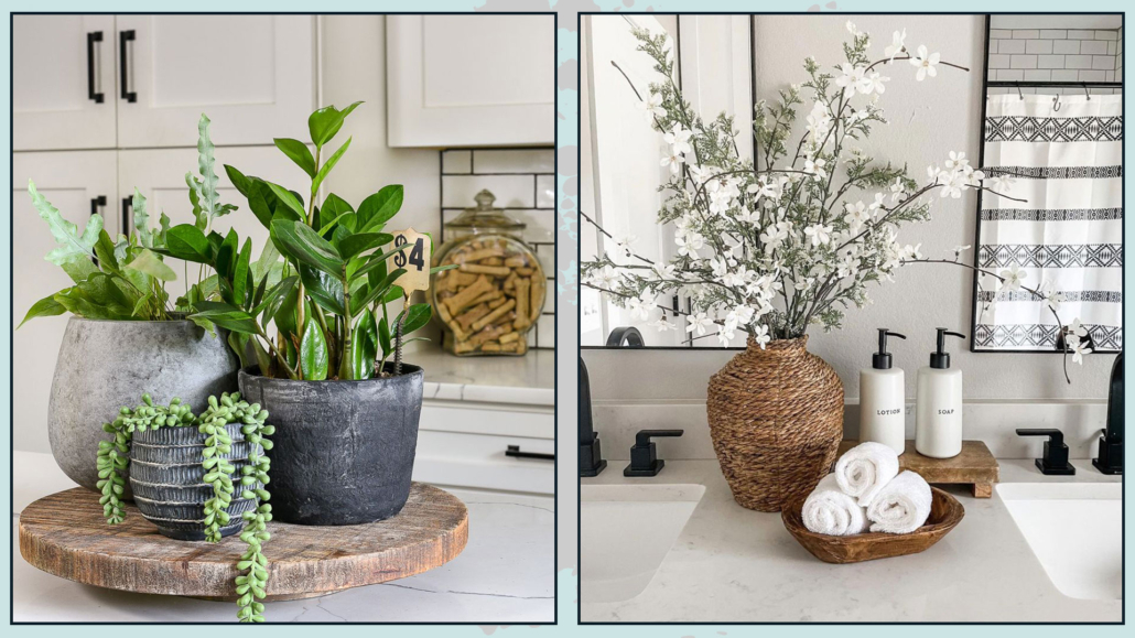
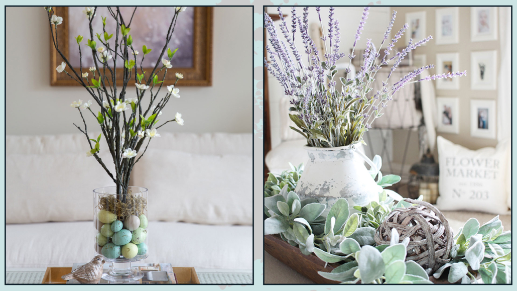
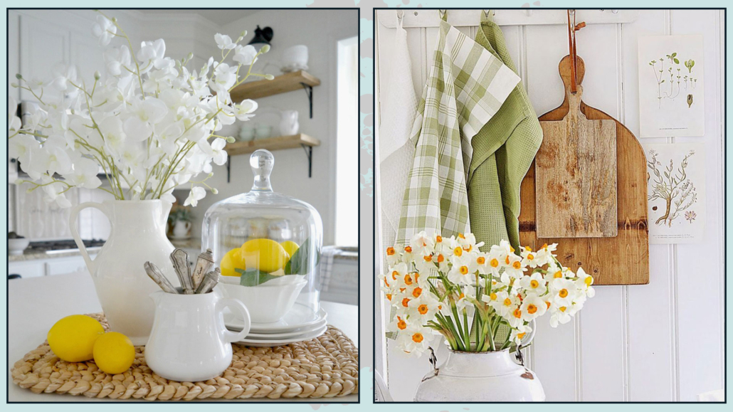
6 – BRING NATURE INTO THE BEDROOM
I couldn’t conclude without mentioning this point.
By now, we have established that the idea that having plants in the bedroom is harmful is incorrect (if you missed it, you find the interview with Simona, aka “Nina the urban gardener,” here).
On the contrary, Simona tells us that some plants even have purifying properties and, thus, they are beneficial to our health.
Having plants in the bedroom is psychologically beneficial because it makes us feel closer to nature, which aids relaxation.
They can only be vases with branches and leaves, but if space allows, you could even have large pots with big plants!
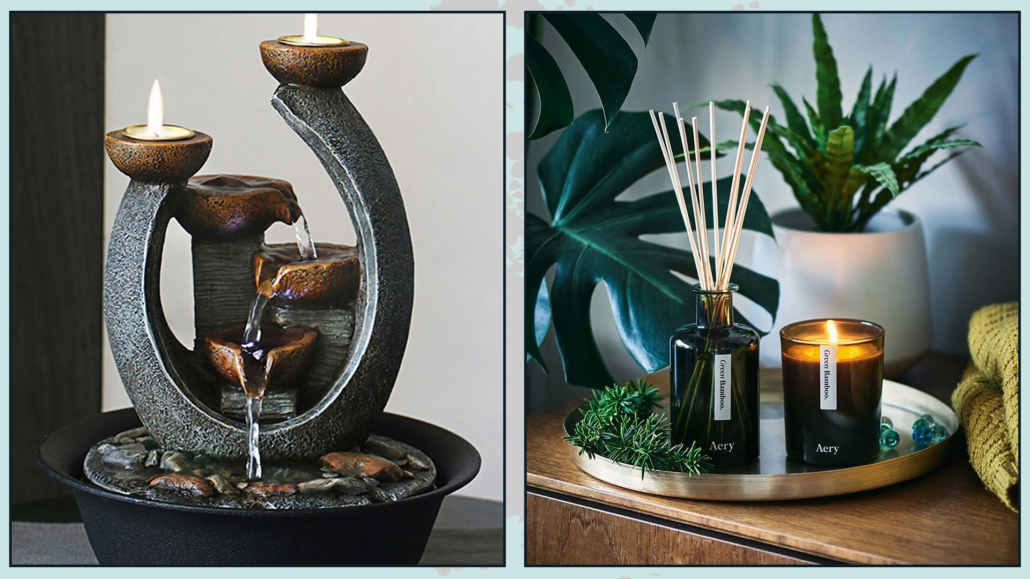
You can also enhance the ambiance with natural fragrances such as lavender, lemon balm, or chamomile.
These scents are subtle, relaxing, and promote sleep.
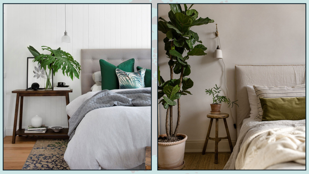
(credits: westwing.it; ingredientsldn.com)
I hope this article was helpful and you love it; in case, let me know in the comments!
Feel free to share it with anyone you think might be interested, I will be honored, and it will help me get my name out there.
If you feel that your home, or some environment of it, does not reflect you enough, do not wait any longer and book your consultancy!