I’ll never get tired of saying it: in a world that’s increasingly fast-paced, busy, and, if I may say, often superficial, creating spaces of well-being at home is absolutely essential!
Shapes, colors, materials, lighting, furniture placement, and a connection to nature are the key elements for spaces that promote relaxation and well-being!
To achieve this, you must start with mindful design that truly considers who we are and what we want to experience at home.
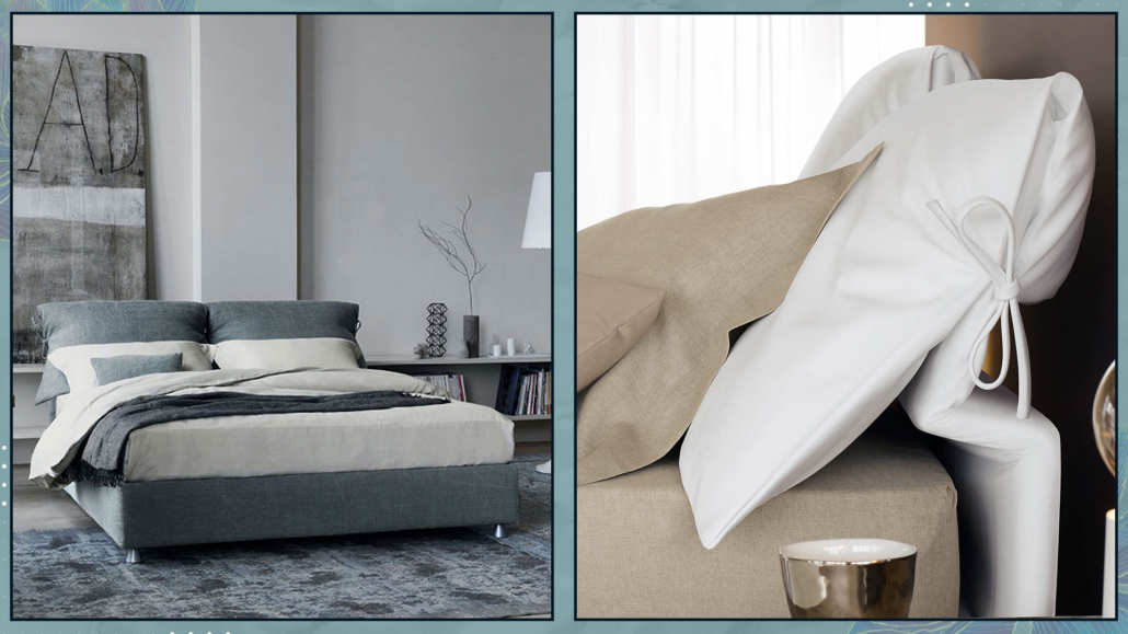
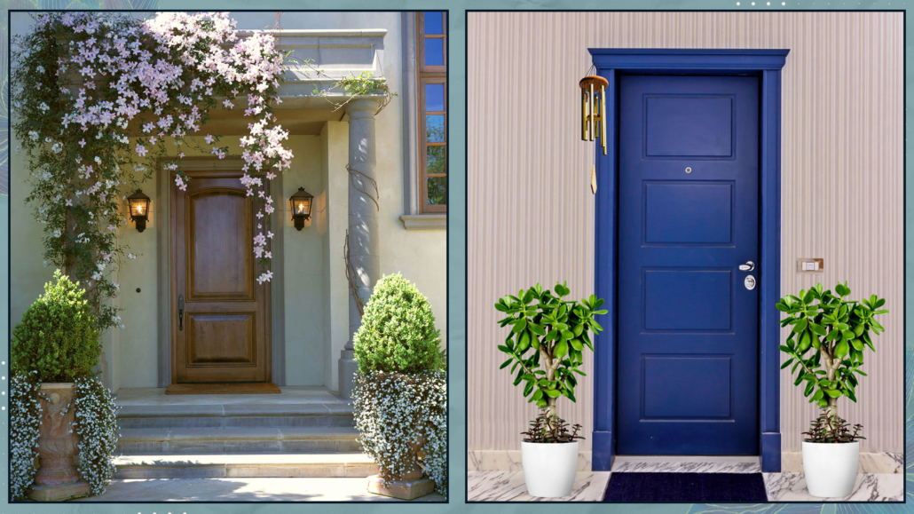
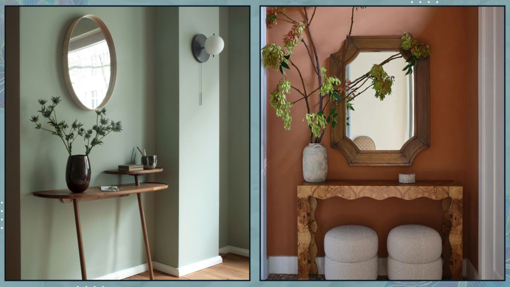
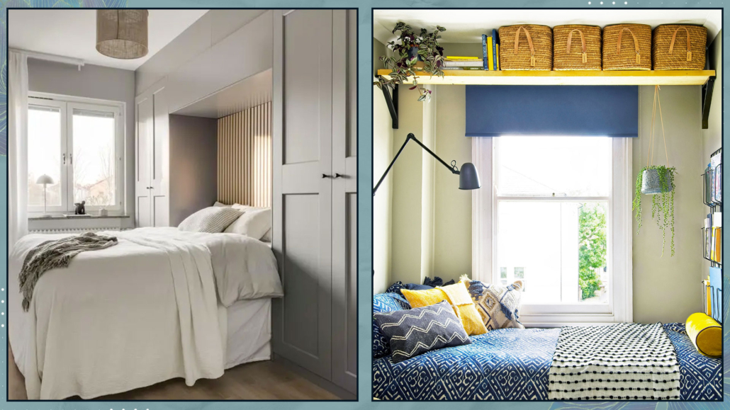
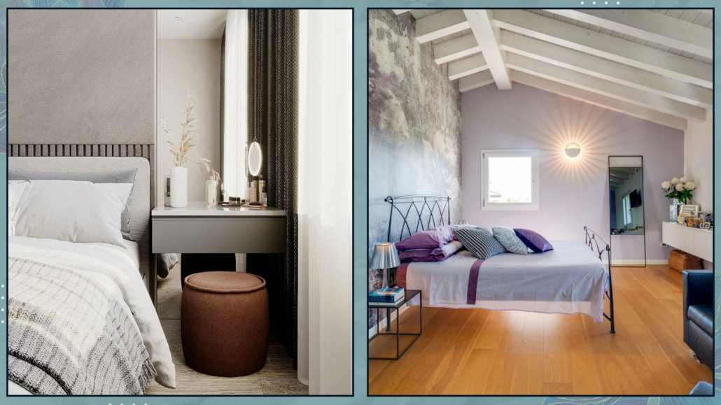
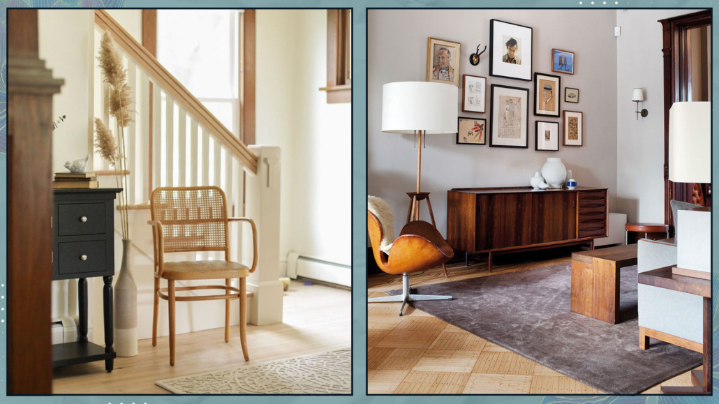
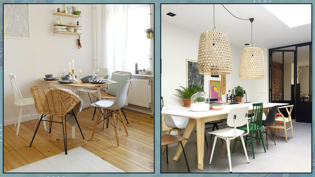
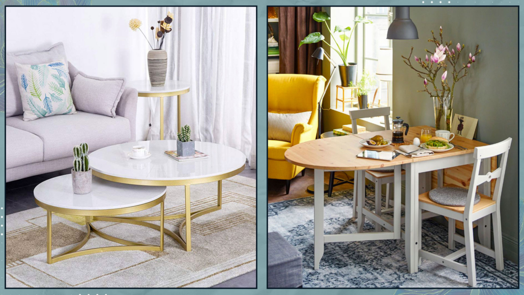
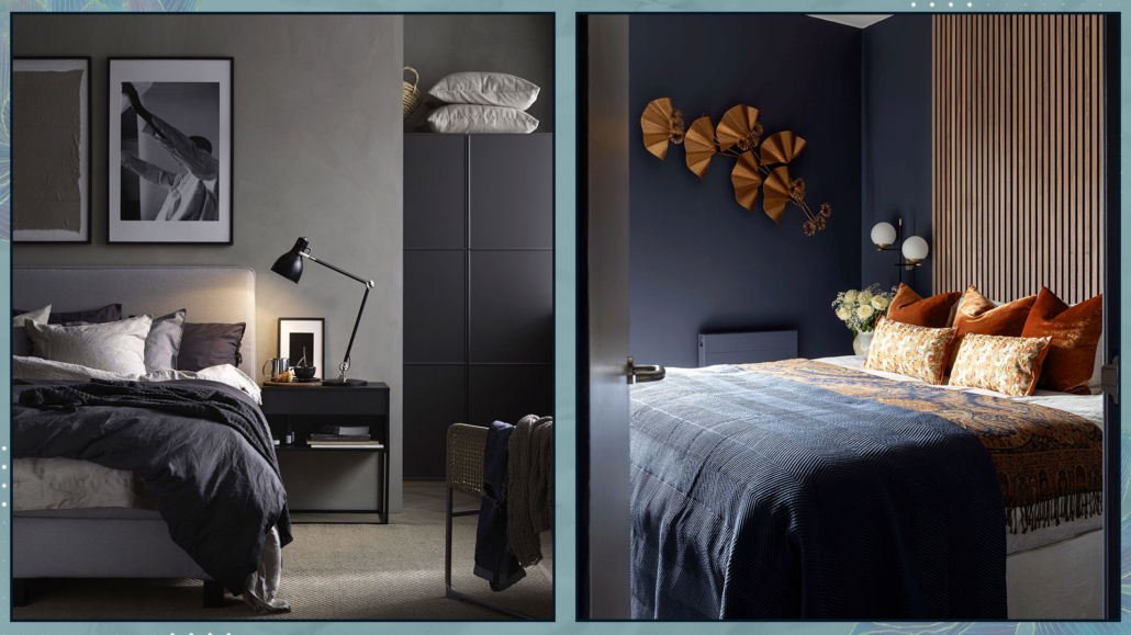
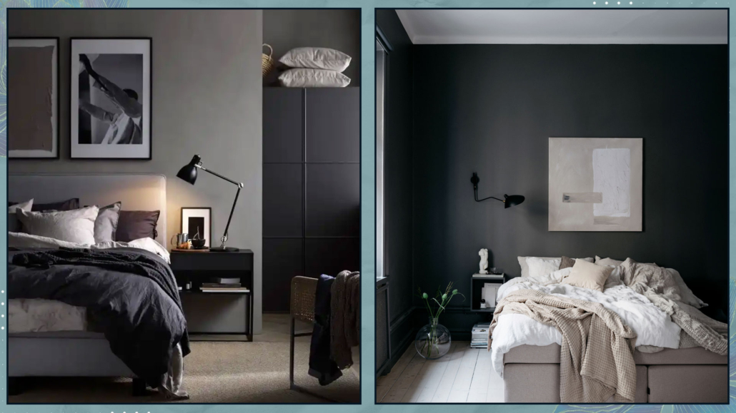
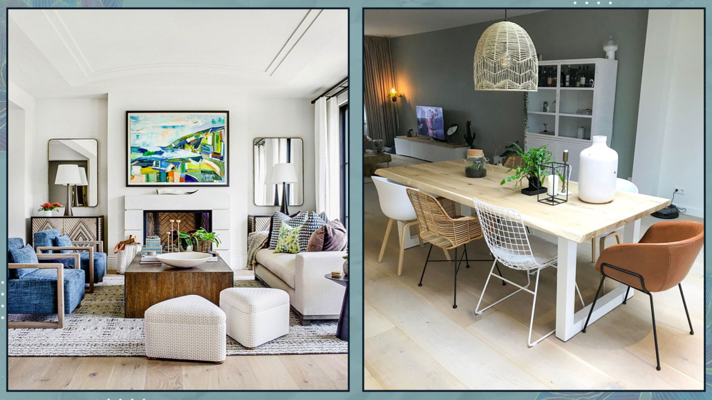
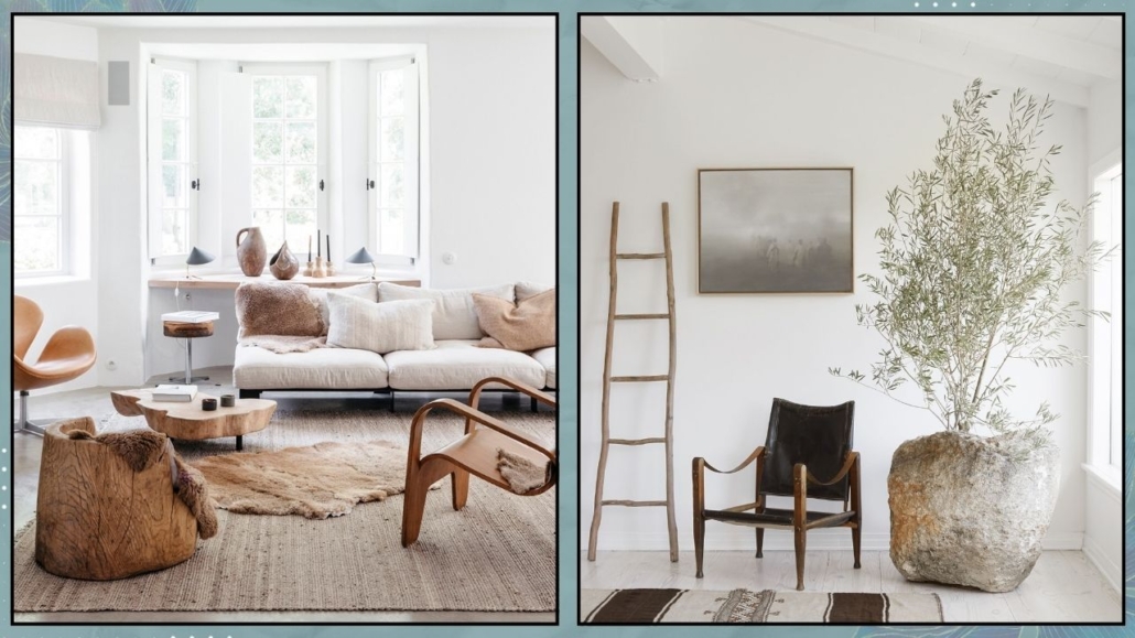
– SHAPES
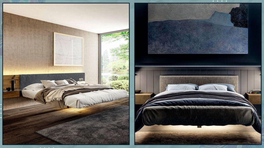
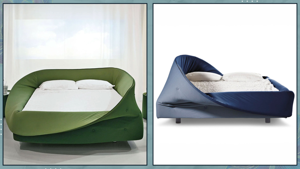
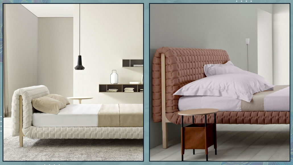
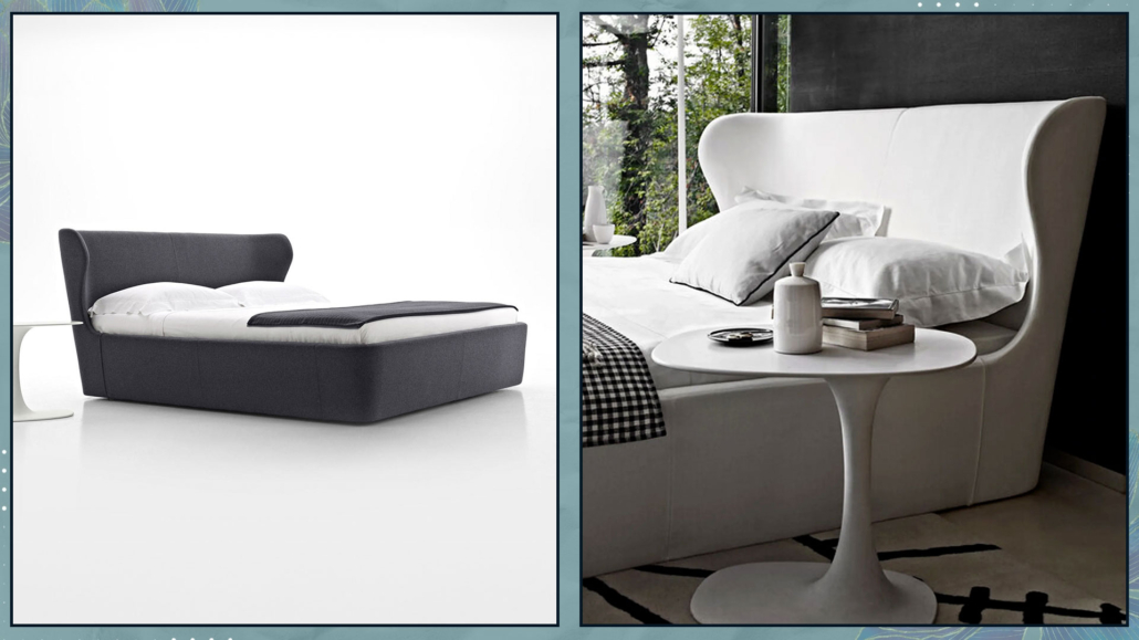
Furniture and decor with organic, soft shapes—what we might even call “curvy”—make spaces feel less formal and especially less rigid!
That somehow helps promote relaxation.
Of course, not everything needs to be curved, but it’s a good idea to “soften” the space with such elements.
From a feng shui perspective, it’s also important to limit, if not eliminate, sharp corners.
As mentioned before, not everything has to be curvy, especially if it’s not to your taste, but even furniture with rounded edges will make a big difference!
(credits: westwing.com; @vymir_design)
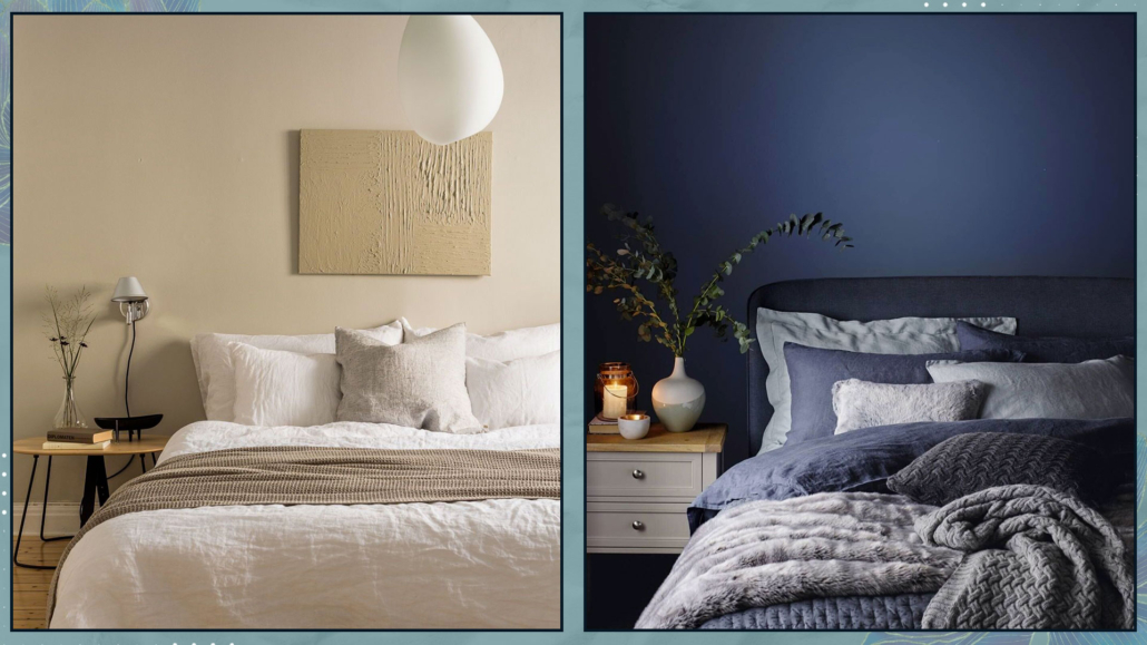
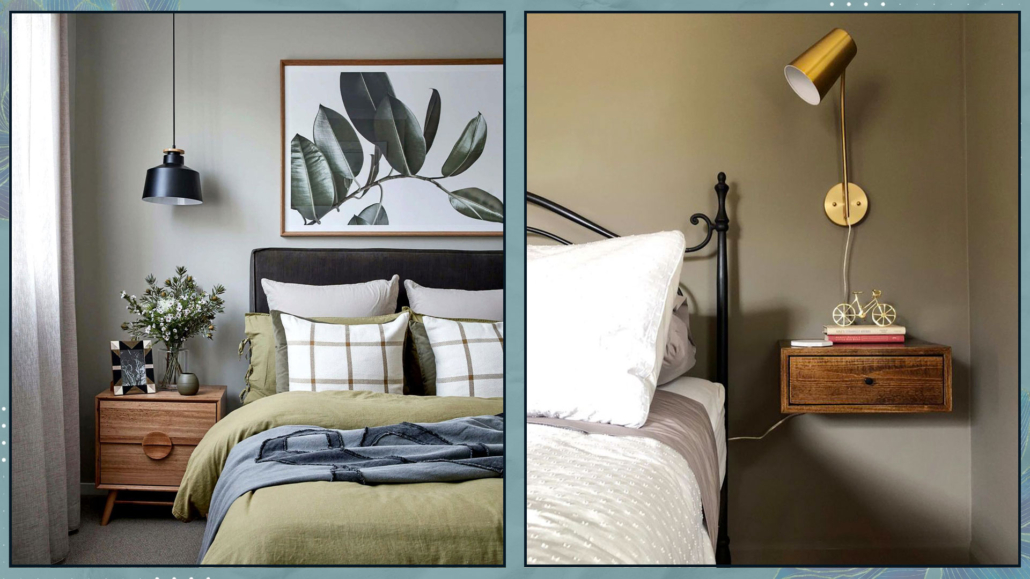
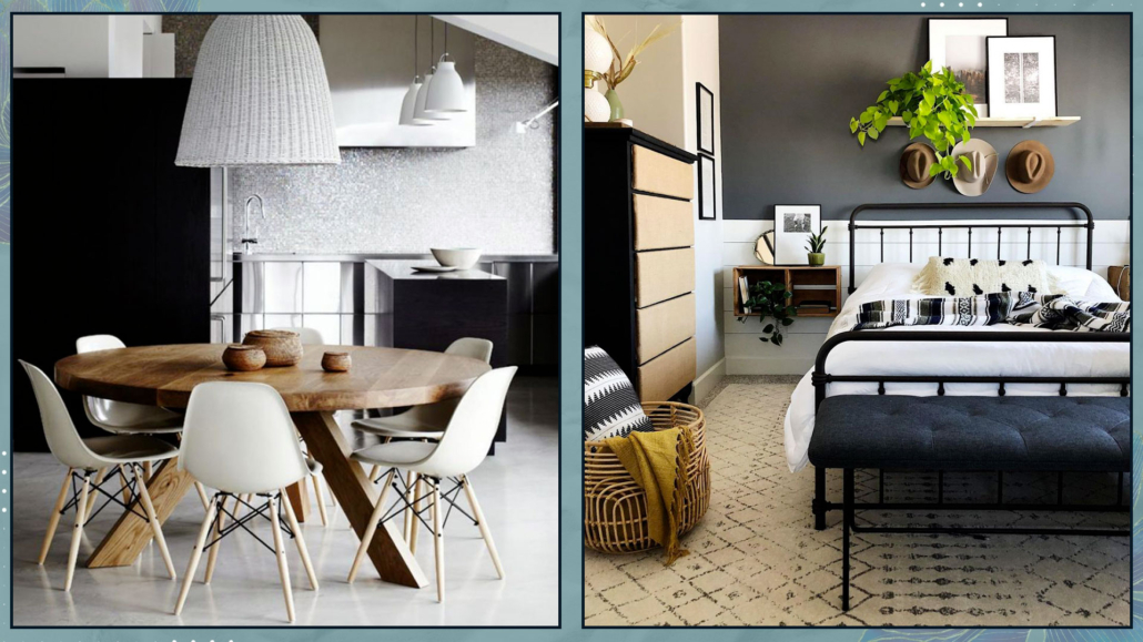
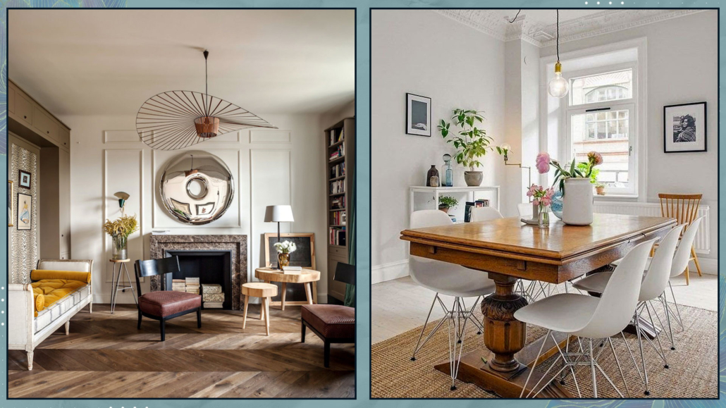
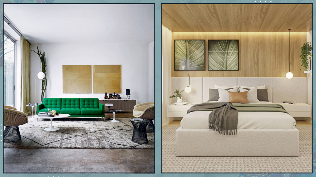
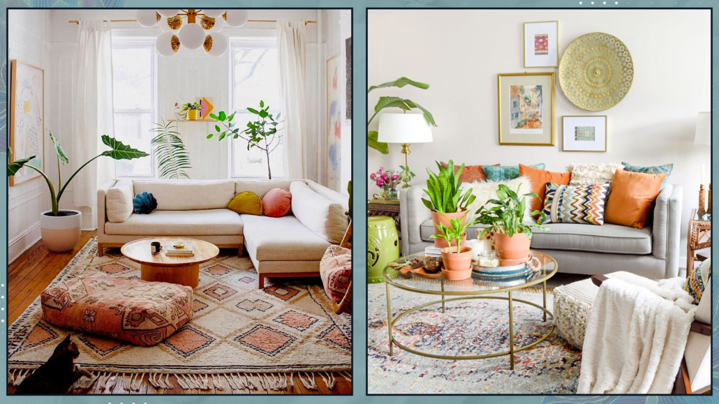
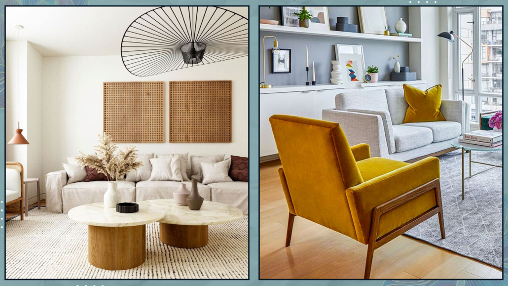
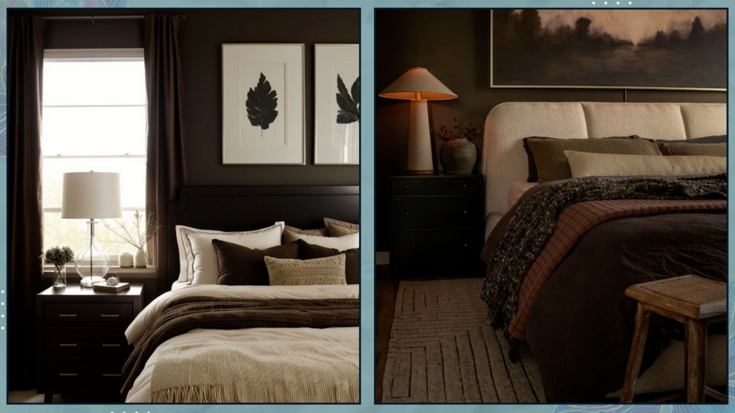
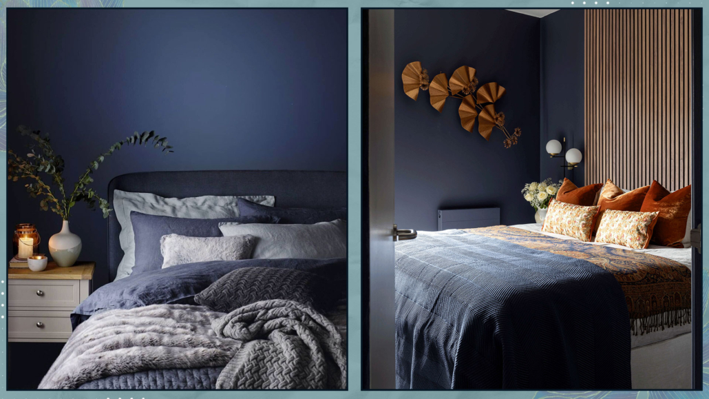
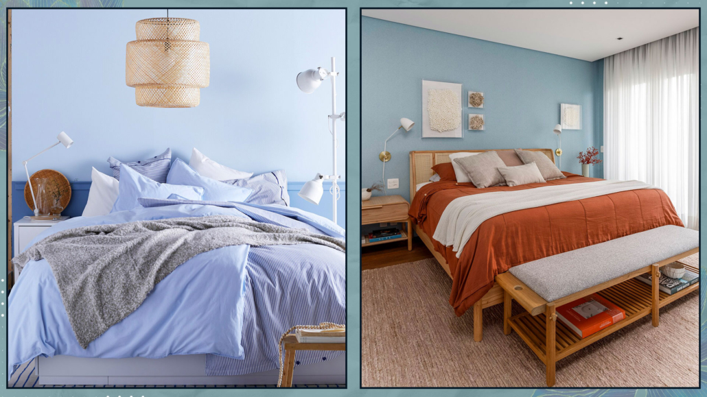
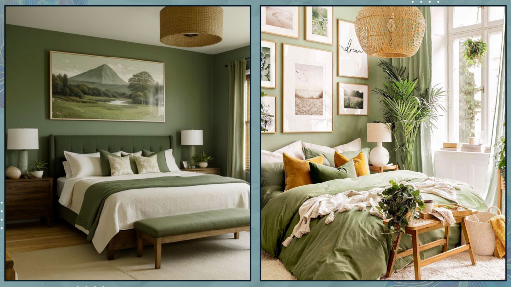
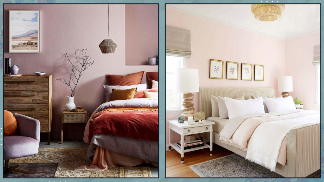
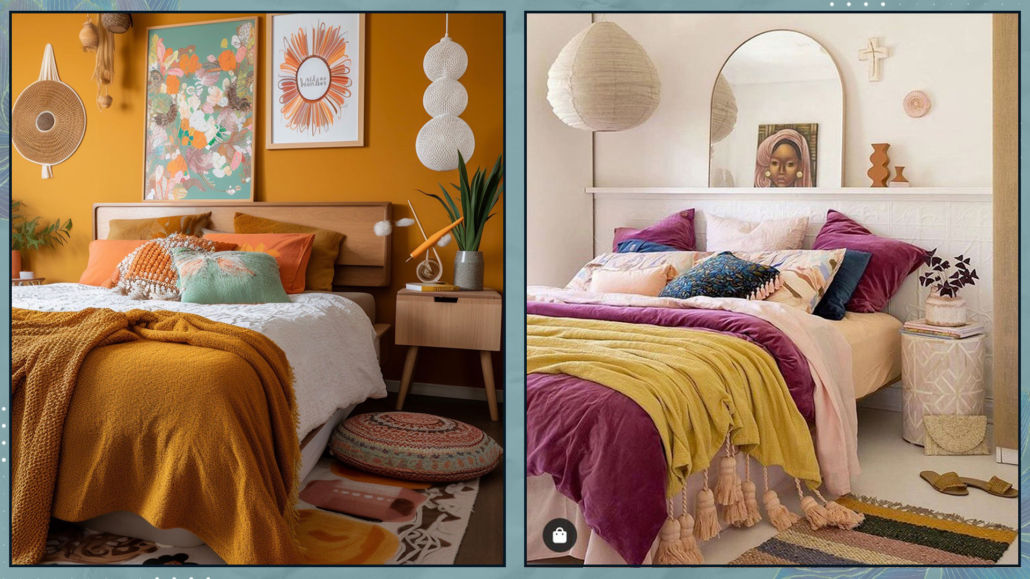
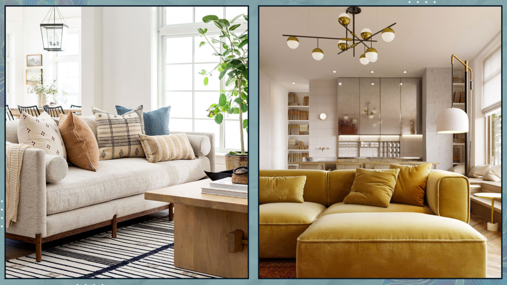
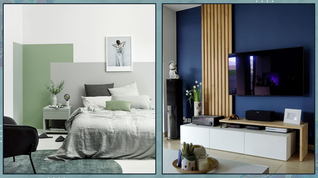
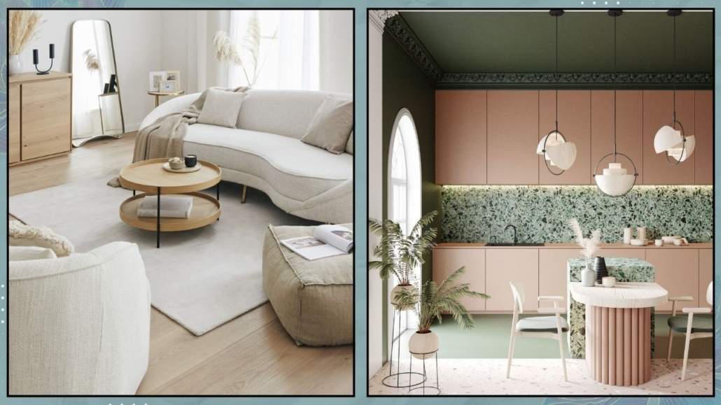
– COLORS
Neutral, natural colors like beige, blues, greens, and earthy tones are calming and relaxing. Using this type of palette at home helps promote well-being.
That doesn’t mean giving up on more vibrant or bold colors, but perhaps using them in smaller doses—think of the “60-30-10” rule, where they can be the famous 10%.
That will still help bring a bit of rhythm and energy to the space!
Alternatively, if you want to use them in larger doses, you could do so in more dynamic and active spaces, like the living room or the office.
That approach works well from a feng shui perspective because it helps balance Yin (passive, feminine, and calm) and Yang (active, masculine, and dynamic) energies, a fundamental principle in this discipline!
I suggest using the same colors throughout the house, obviously changing their saturation, to maintain a common thread between the rooms.
(credits: cocolapinedesign.com; Iba design Associates)
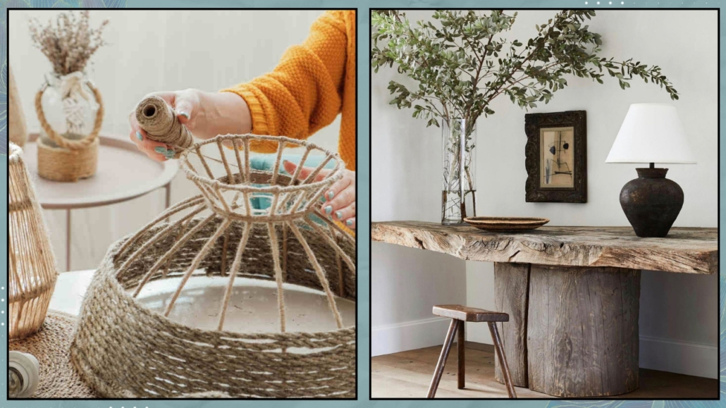
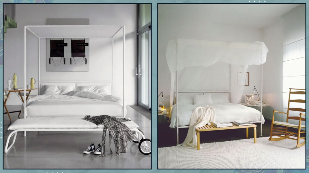
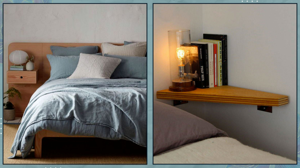
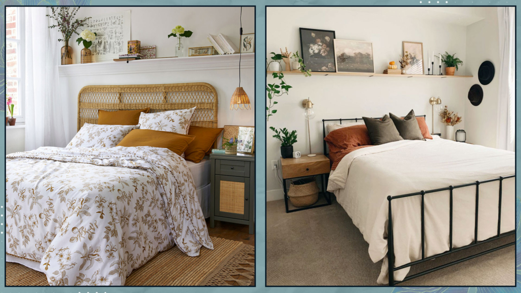
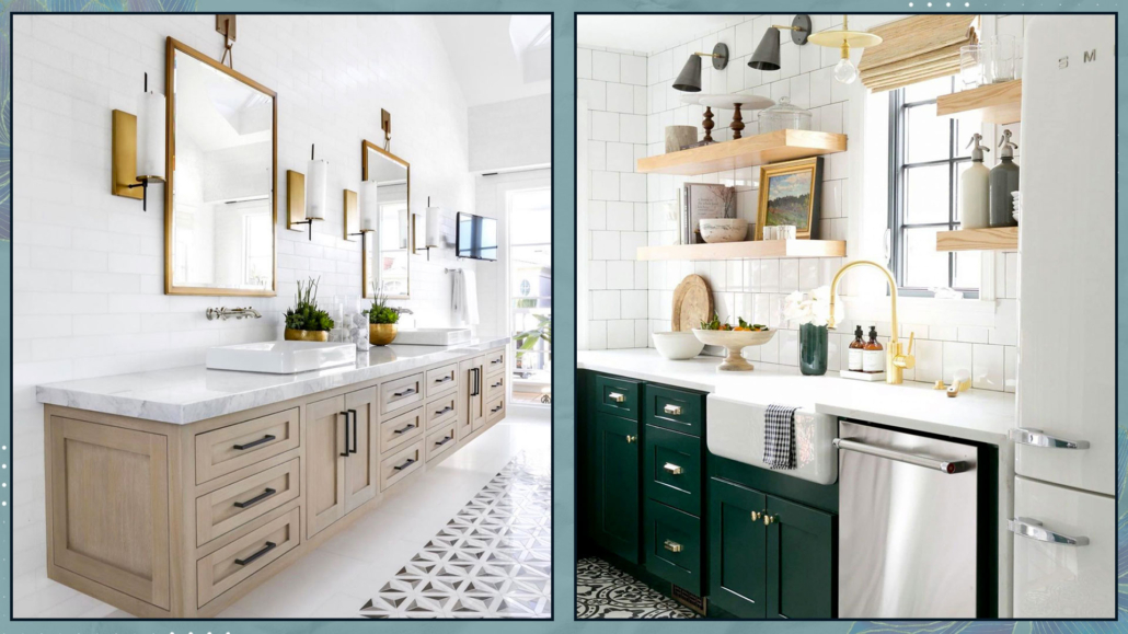
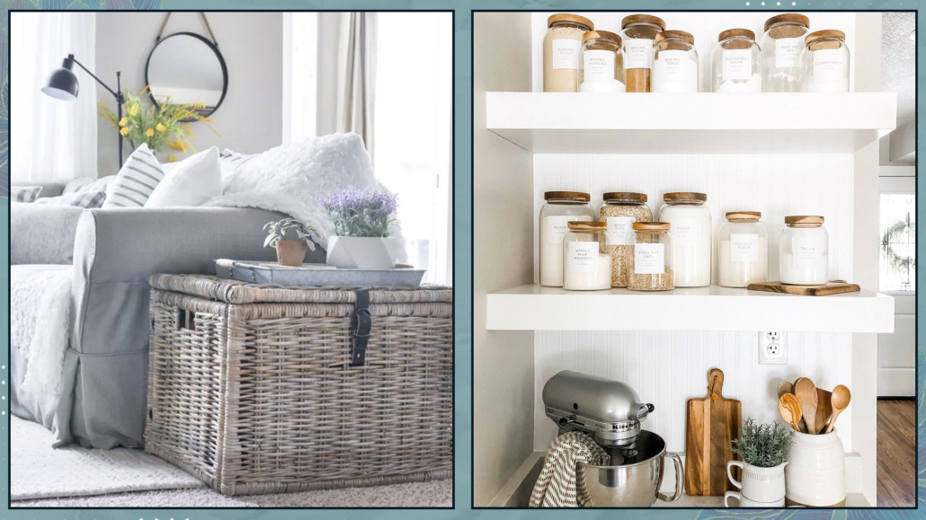
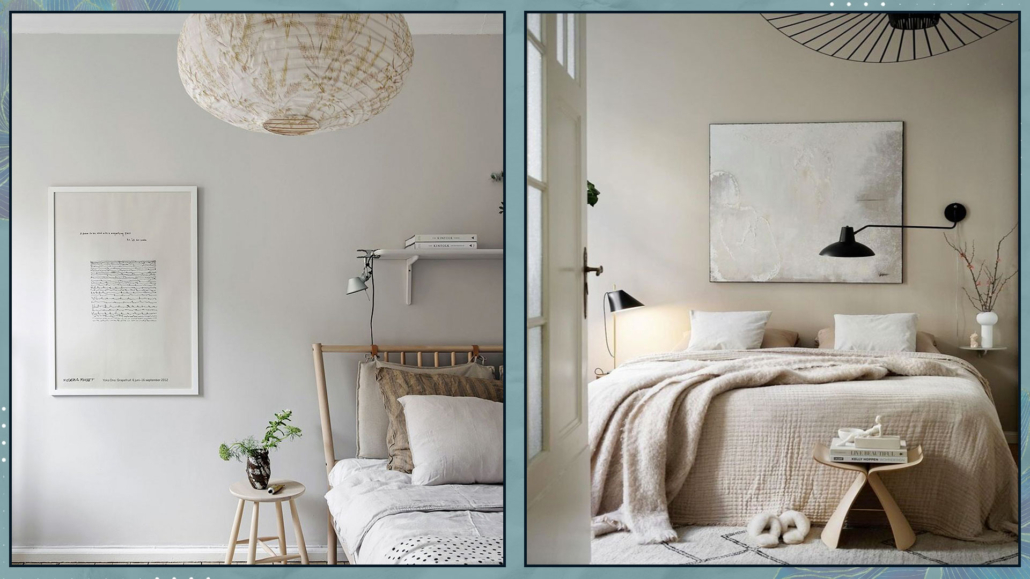
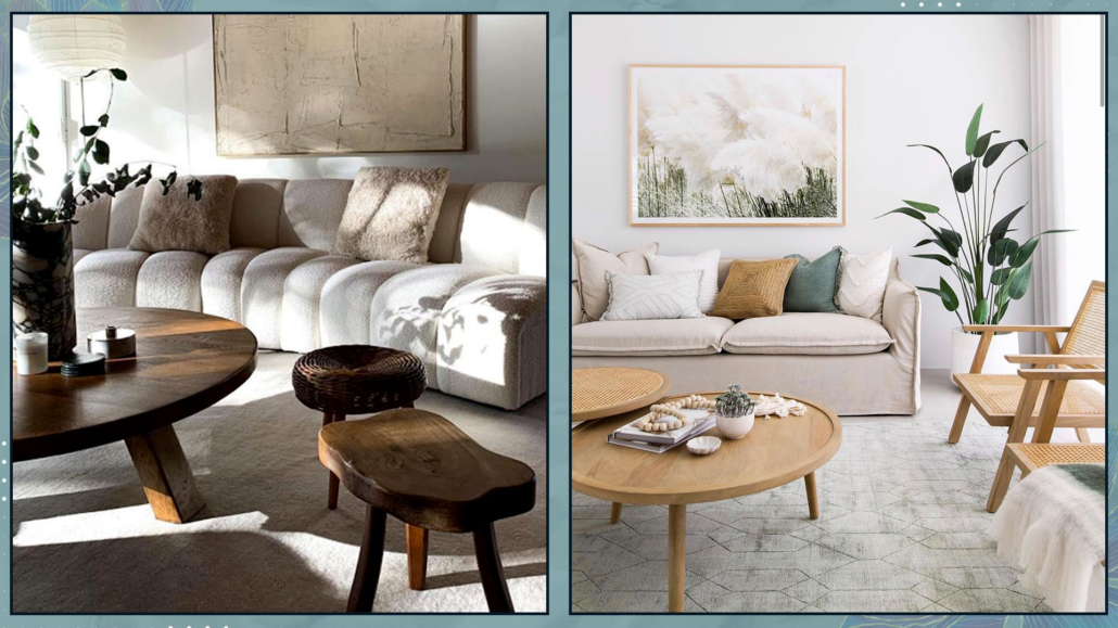
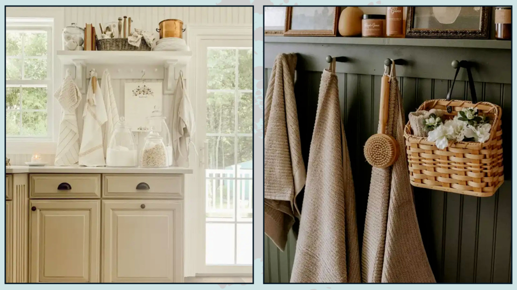
– MATERIALS
Using natural materials as much as possible is vital to creating spaces of well-being and health at home.
Wood and wicker, wool, velvet, cotton, and linen, not to mention stone, terracotta, and marble, are all natural and, therefore, healthy elements that promote well-being!
However, it’s also important to be mindful, whenever possible, of their sourcing and production processes.
That is something we often overlook and also applies to the paints we use on our walls: some may contain harmful substances!
We discussed this with Carla Spessato, a green lifestyle mentor, here!
The right choice of materials will create healthy spaces that contribute to our overall well-being while also helping to protect the environment.
(credits: Sebastian Erras; artdecorationcrafting.gr)
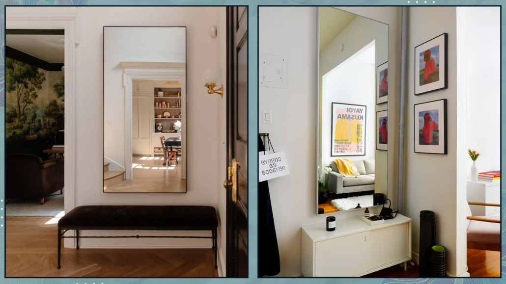
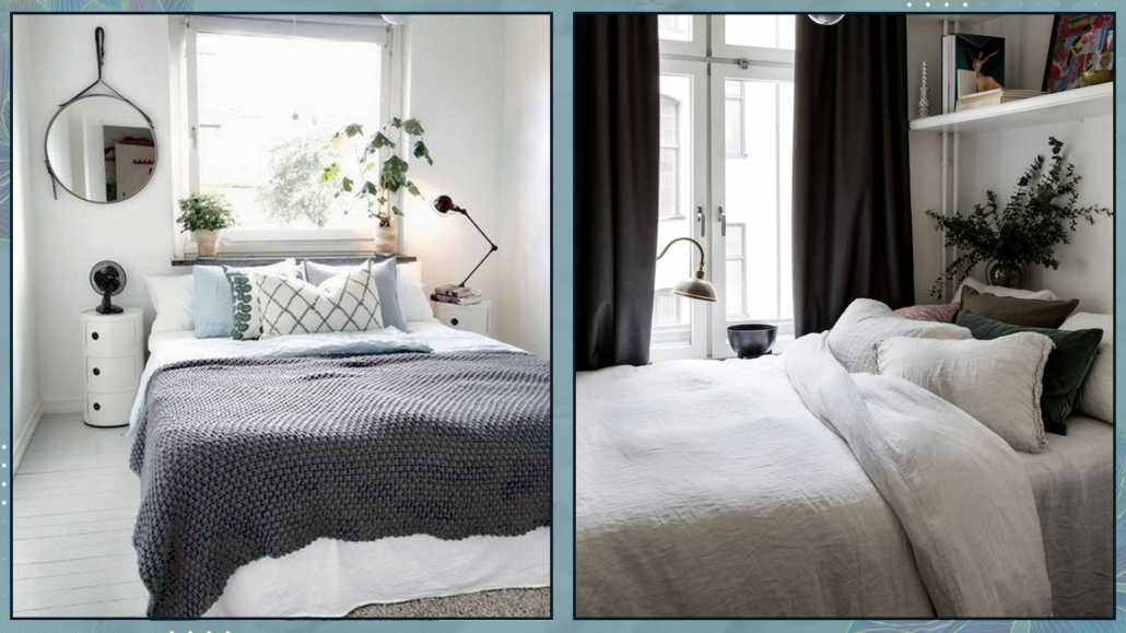
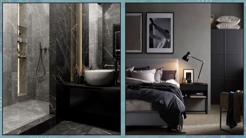
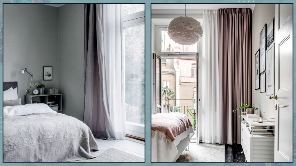
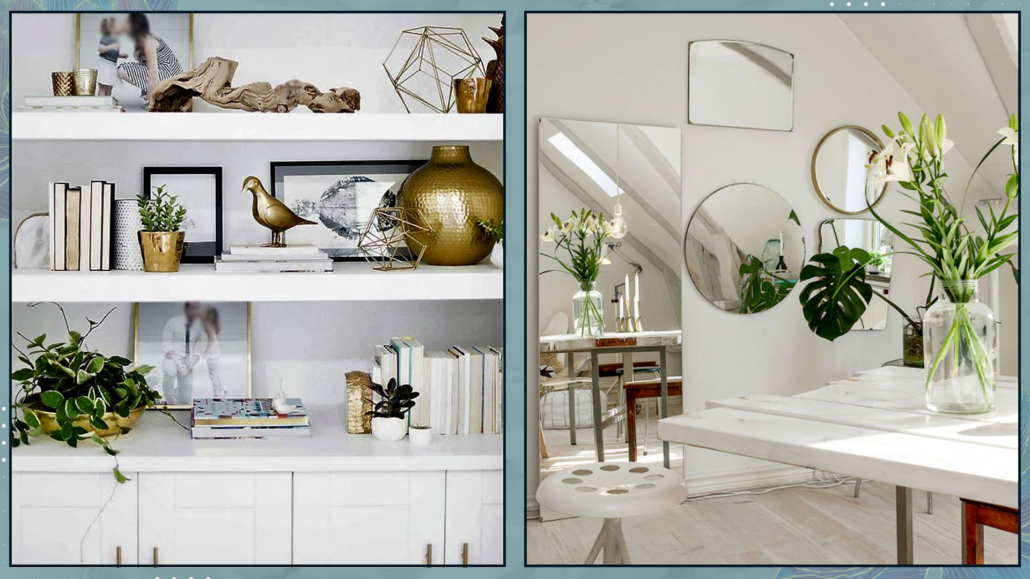
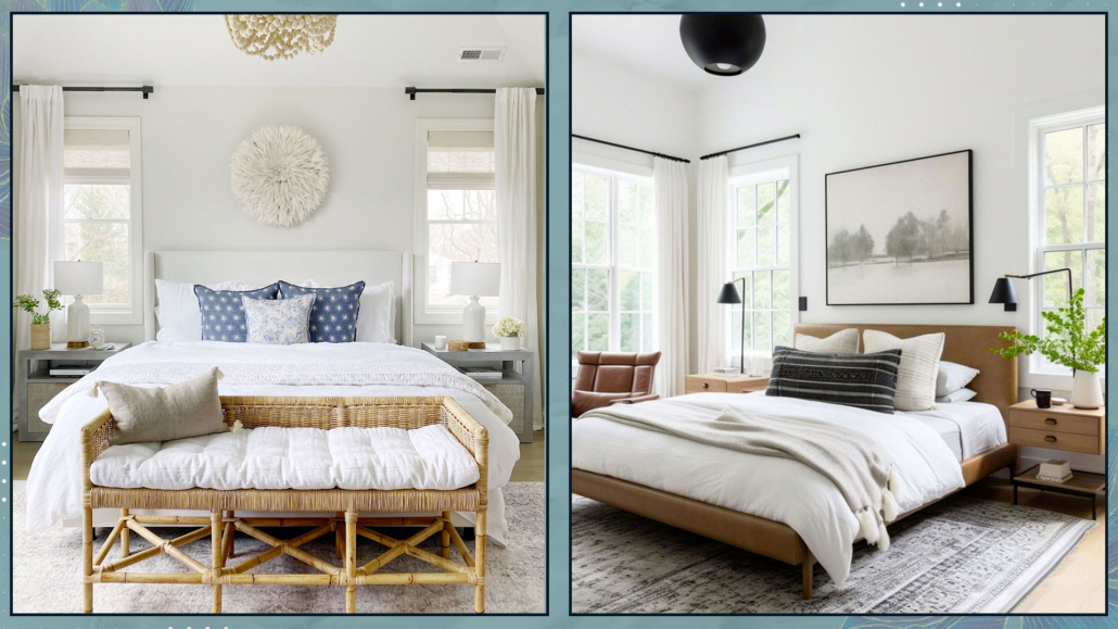
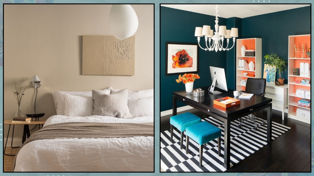
– LIGHT/ILLUMINATION
It is scientifically proven that light plays a fundamental role in our well-being.
Studies show that the incidence of depression is significantly higher in Nordic countries compared to other places.
Therefore, maximizing natural light by keeping windows clean and using sheer curtains is paramount.
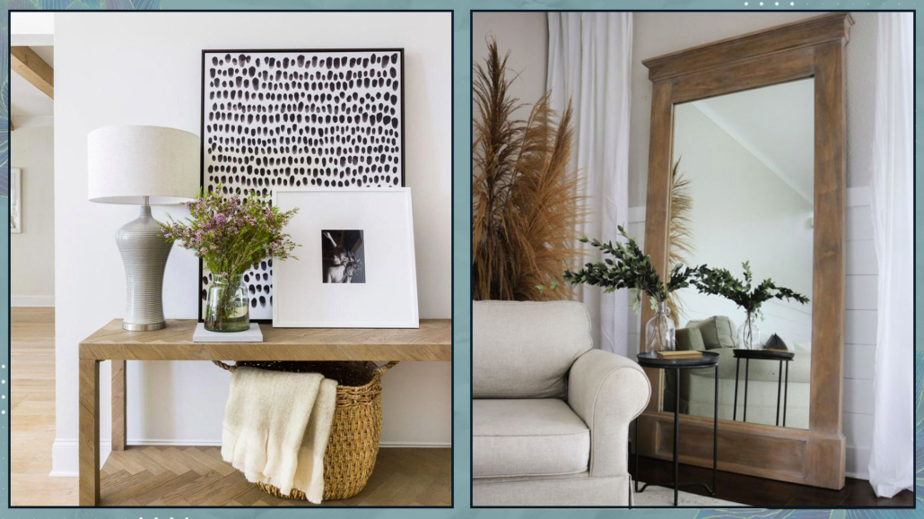
When the spaces are less bright, it becomes essential to use strategies like reflective colors, mirrors, and metals to expand light and increase brightness for less illuminated spaces.
Besides, it is also crucial to properly design artificial lighting using multiple light sources for visual comfort that promotes well-being!
Where possible, using dimmable lights would be ideal to adjust the atmosphere according to the moment’s needs.
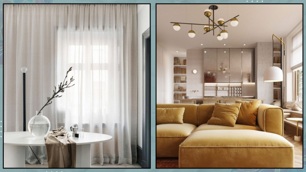
(credits: Katke Zavese; Studio design HDm2)
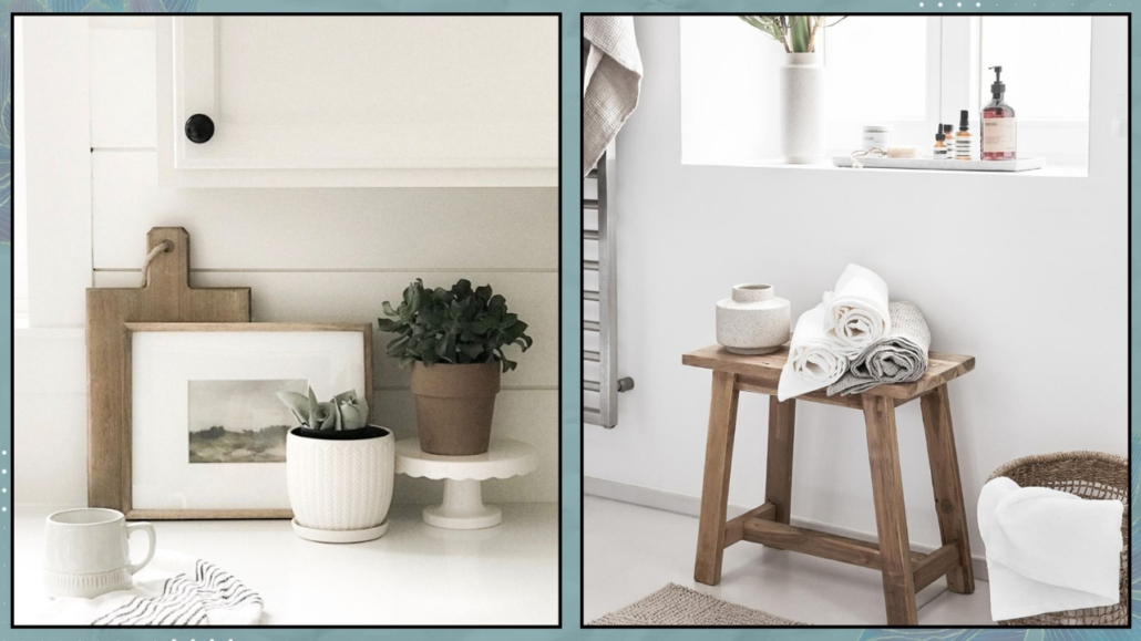
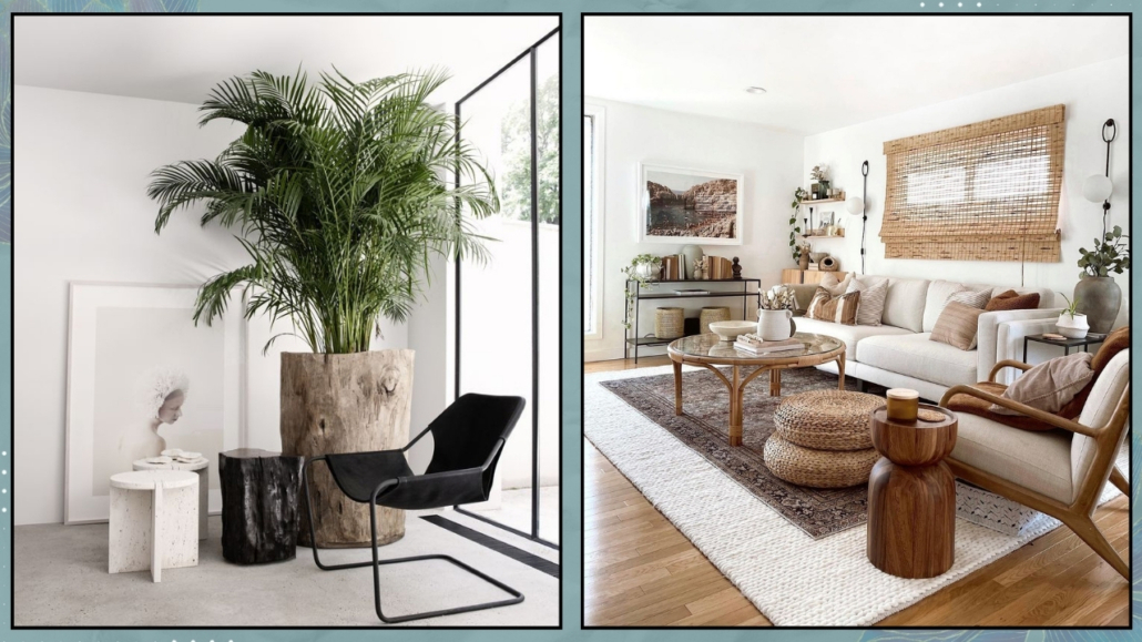
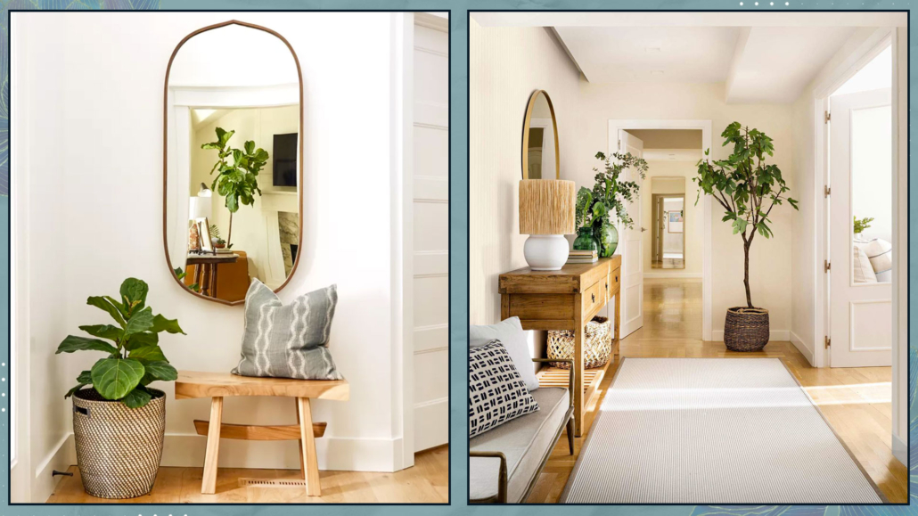
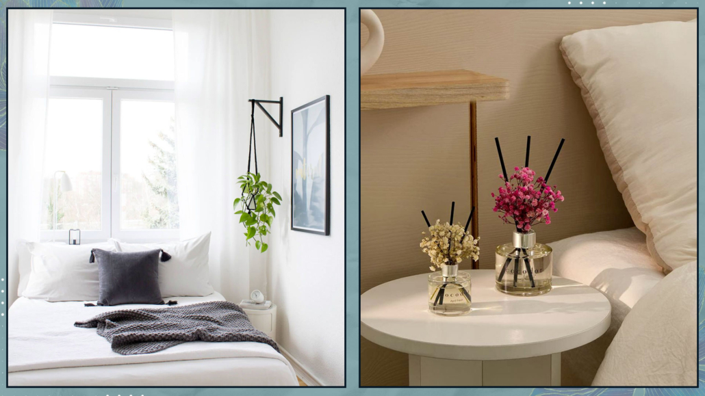
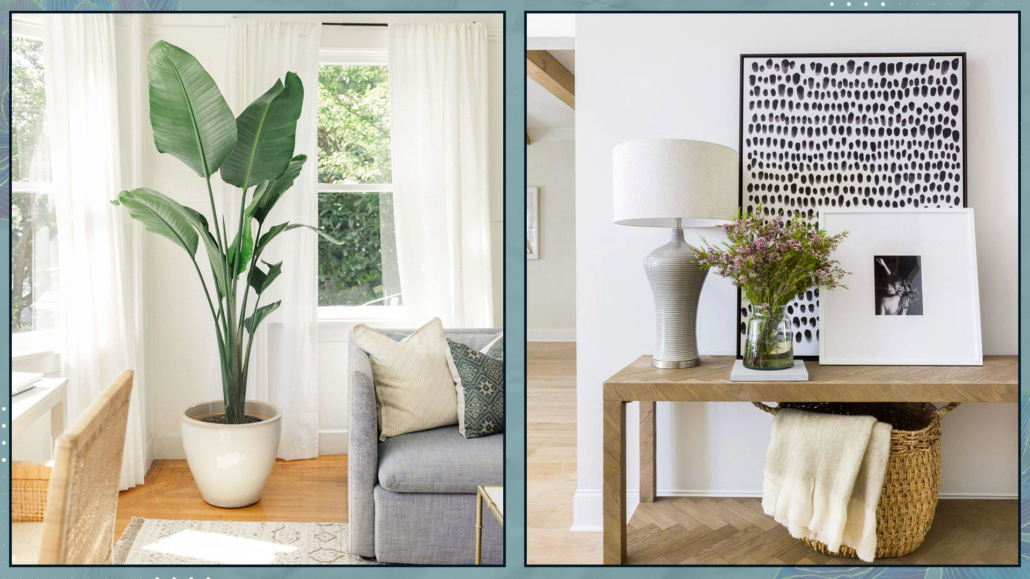
– NATURE
Feeling close to nature is another fundamental element in creating well-being spaces at home.
Having plants in various rooms is therefore essential!
Honestly, there’s no room – except perhaps for the storage room – that cannot have a plant, not even the bedroom!
Plants also have purifying qualities, which are very useful in our homes given, unfortunately, the pollution in our cities.
From a psychological perspective, caring for plants is also essential for relaxation (We discuss this in our guidebook with Dr. Francesca Basile and myself).
If you find it difficult, you can always use some succulents or place branches or leaves in vases, for instance, the Monstera leaf, which lasts a long time.
Finally, even if they lack purifying properties, you can also use artificial plants, as long as they are high quality and look realistic.
The mind won’t see the difference, so you’ll still benefit from the calming and relaxing properties!
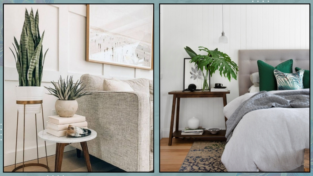
(credits: Brianne Penney; westwing.it)
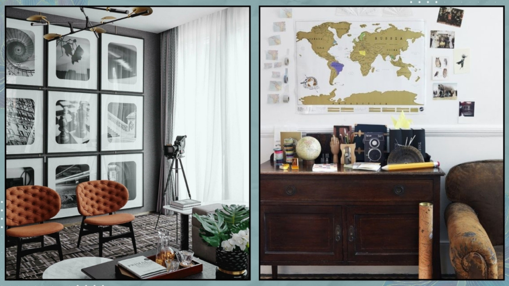
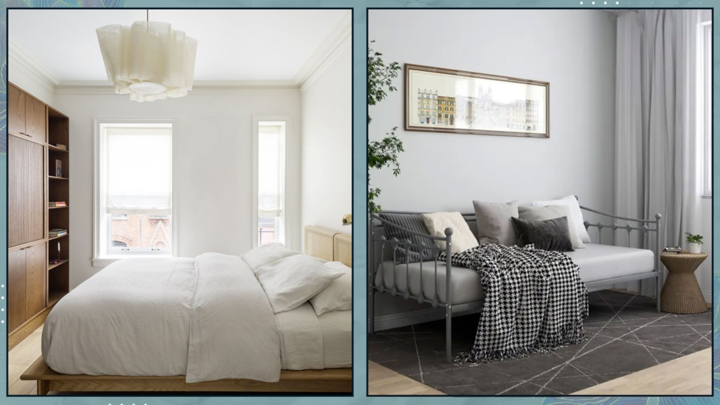
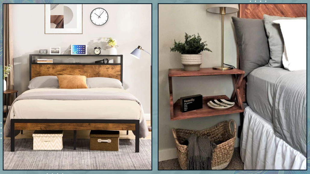
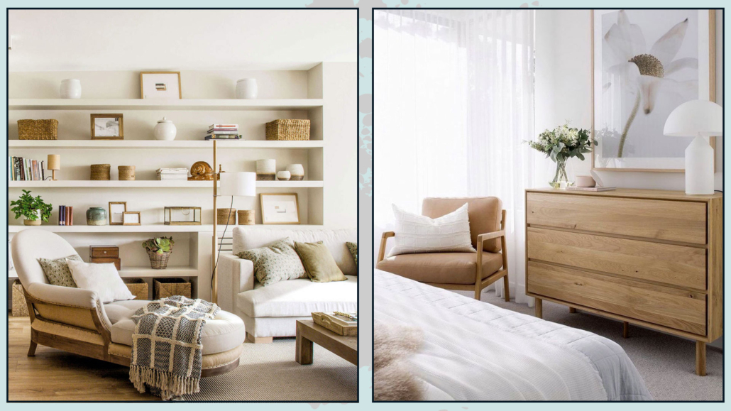
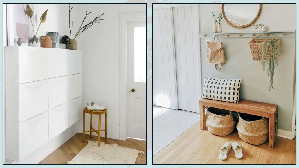
– FURNITURE PLACEMENT
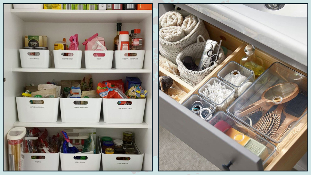
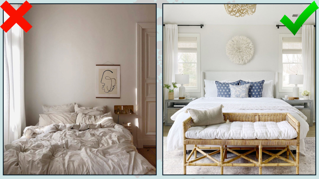
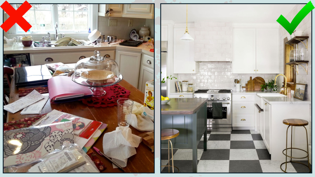
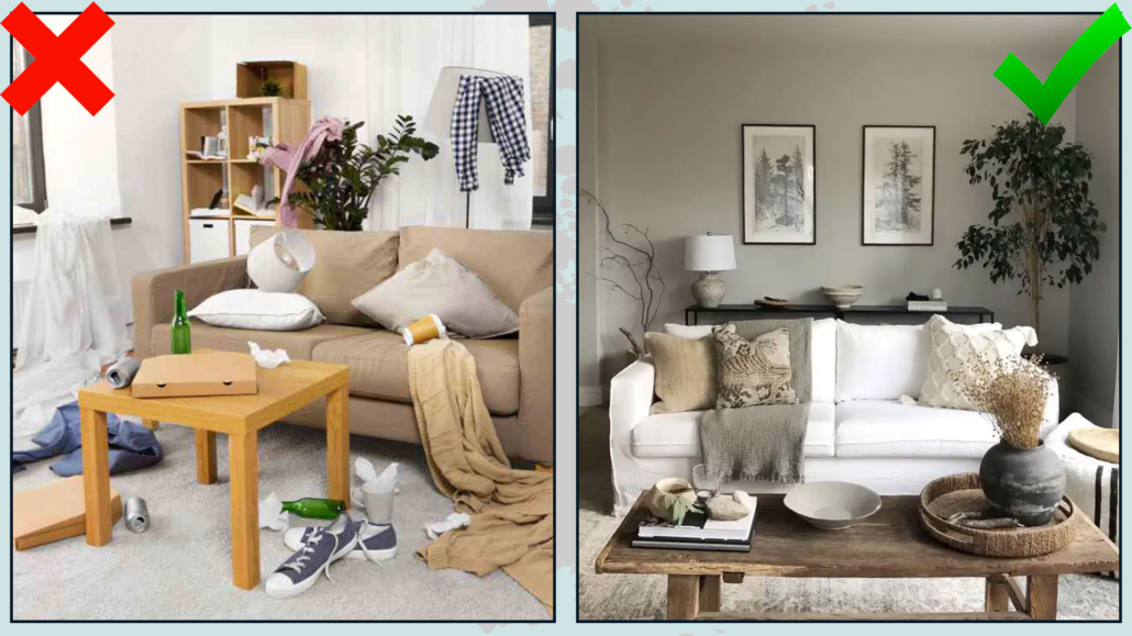
For well-being spaces, the various rooms mustn’t be too cluttered with furniture and objects, as this can create an unconscious feeling of suffocation.
That doesn’t mean minimalism at all costs, especially if that’s not your style, but as much as choosing things that are functional and meaningful to you!
Additionally, everything must be positioned so that it’s accessible.
Passages and pathways should be free from obstructions and “fluid.”
That is fundamental also in feng shui because it allows fair energy to flow freely.
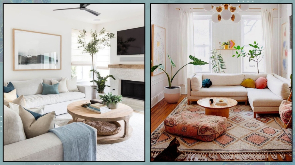
(credits: pure salt interiors; @reserve_home)
I hope you enjoyed this article and found it helpful.
If so, don’t hesitate to share it with someone you think might be interested; I would be honored, and it will help me get known.
If you feel that your home, or any part of it, doesn’t reflect you enough, don’t wait any longer: fall in love with your place again and book your consultancy!