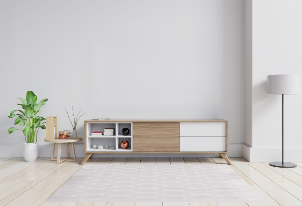
If you’re not a person who loves colorful walls in your home and prefers them white, then this article is for you because it’s easy to say white!
Often, white is thought to be the easiest choice: it’s a neutral and elegant color that goes with everything. In reality, it’s not as simple as it seems because there are at least 150 shades of white, and if you choose the wrong one, your walls can appear gray, yellowish, or bluish!
The shades of white depend on its undertone, which is the tiny hint of color present (I’m talking about undertones in terms of neutrals, and you can find more about it here), and as little as it is, it can completely change the perception of the environment!
So, how do you go about it? Let’s explore some tricks together to choose the most suitable white!
STUDY NATURAL AND ARTIFICIAL LIGHT
NATURAL LIGHT
Light greatly influences how white is perceived: depending on the room’s exposure and the amount of light that enters, the same white can have a different appearance!
Rooms facing north receive slightly cooler light with a hint of gray-blue, while those facing south receive warmer light with a touch of yellow.
Where the light is cold, it’s advisable to use a warm white to avoid making the room feel too “clinical” and off-putting.
When the light is warmer, you can choose based on the mood you want to create:
– With a warm white, you’ll have super inviting and cozy spaces, but they may appear slightly smaller visually.
– With a cold white, you’ll have cooler and more contemporary environments and rooms that visually seem a bit larger!
Exposures to the east and west are different as well and change throughout the day:
– to the east, you have warm light in the morning and cold light in the afternoon.
– to the west, the light is cold in the morning and warmer in the afternoon, eventually tending towards orange at sunset!
The amount of light that enters also helps you determine the best brightness of white, i.e., how much light it reflects.
In a room with limited natural light, it’s better to use a highly reflective white, while you have more flexibility in a well-lit room.
The reflectance level of white (and all colors, to be honest) is marked with the LRV code: the higher this value, the more it reflects light!
(credits: thelifestyledco.com; designperte.it)
ARTIFICIAL LIGHT
Naturally, the same considerations apply to artificial lighting, as they, too, will reflect on the shade, altering the perception of color.
If you have light bulbs at home with a warm color temperature (around 3000K or lower), your walls will tend to look slightly yellowish with cool whites but can turn orangish if with warm white.
In the case of natural light (around 4000K), white will behave like sunlight.
If, by any chance, you have cool lights (which are not recommended for home use), you’d end up with walls appearing gray-blue, creating an impersonal and somewhat unwelcoming atmosphere!
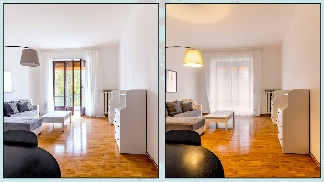
(credits: Vivere lo Stile)
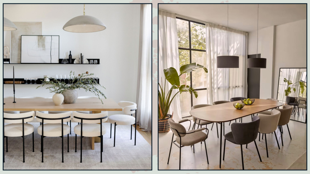
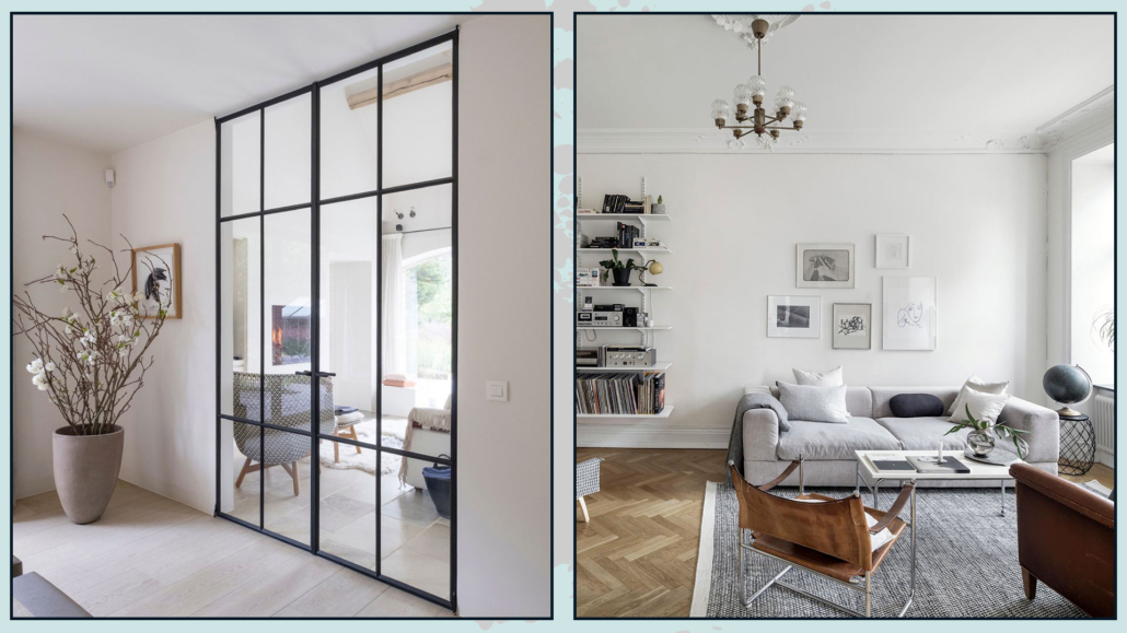
THE COLORS OF FLOORING AND FURNISHINGS MATTER!
It’s crucial to consider the color of your furniture and flooring because they will have an impact on your walls.
The flooring, in particular, will significantly influence how white appears because it covers a large surface area!
Take into account doors and baseboards, especially if they are white and perhaps semi-glossy.
If you don’t want the semi-gloss effect on your walls, it’s better to opt for a different shade of white and create a subtle contrast.
Placing the same color but with different finishes close to each other isn’t the ideal choice!
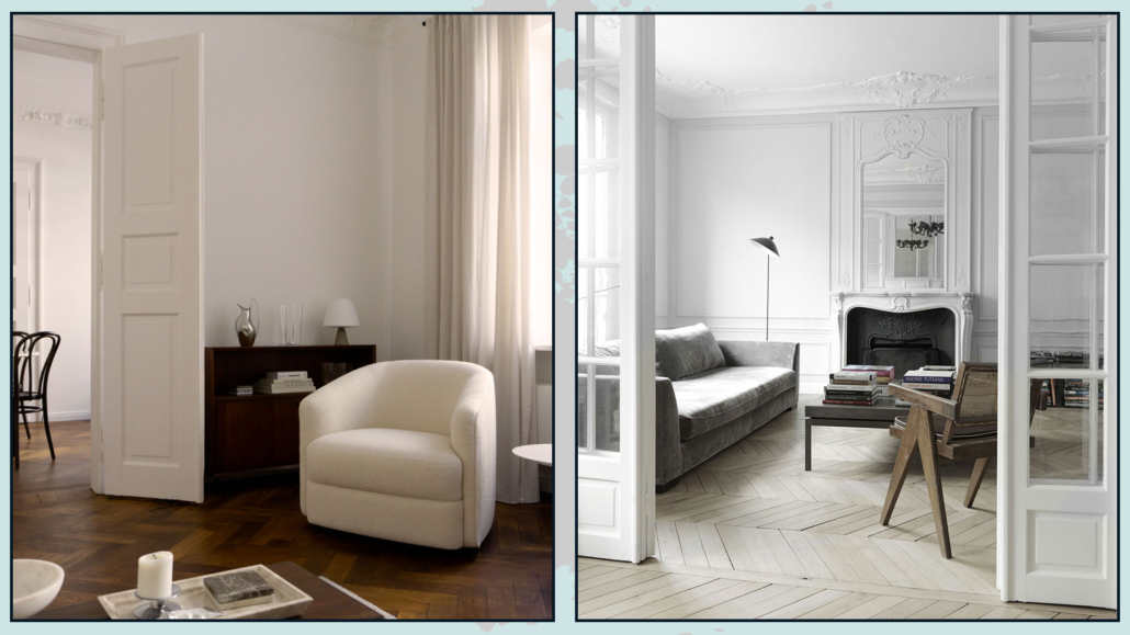
(credits: arde.dk; Nicolas Schuybroek)
USE THE SAME WHITE EVERYWHERE
When painting the walls with colors, in most cases, the ceiling is painted white, often pure white.
However, when using white also for walls, even with a specific warm or cool undertone, the contrast might not be noticeable unless the white distinctly leans towards the color of its undertone.
Therefore, using different shades of white becomes unnecessary.
If you like the idea of having some contrast, you can achieve it by changing the sheen on the ceiling!
At the same time, you can opt to change the shade of white from one room to another, keeping in mind the points mentioned above for each room, all while aiming for some degree of consistency in every space.
(credits: staalmetstijl.be; kvarteretmakleri.se)
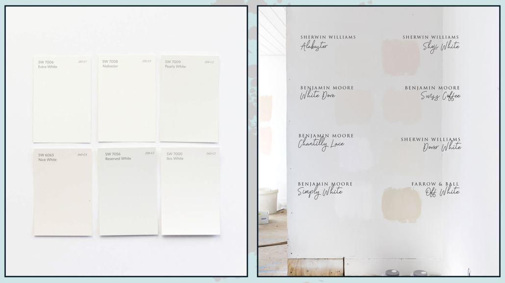
SOME PRACTICAL TIPS
As you can see, choosing the right white for your home’s walls isn’t as straightforward as it might seem. Here are some practical tips to help you select the best white for you:
– Get as many samples as possible: there’s nothing better than seeing how whites react with your own eyes and in your specific location.
Due to all the factors I mentioned earlier, a white that looks good on paper might not work well on your walls.
So, don’t hesitate to request multiple samples and try them out on various walls and in different rooms.
– Assess how they look in both natural and artificial light: Artificial lighting, in particular, is crucial because the lighting in your home is likely different from that in the store.
If you still have doubts about two or three different whites, you can paint a hugger section of the wall to get a better sense of their appearance, making your decision easier!
(credits: vintagerevivals.com; thegritandpolish.com)
I hope this article has been helpful and enjoyable for you. If so, let me know in the comments!
Feel free to share it with anyone you think might be interested, I would be honored, and it will help me gain more exposure.
If you feel that your home, or any specific area of it, doesn’t reflect your personality enough, don’t wait any longer and book your consultancy!
This post is also available in: Italian


Leave a Reply
Want to join the discussion?Feel free to contribute!