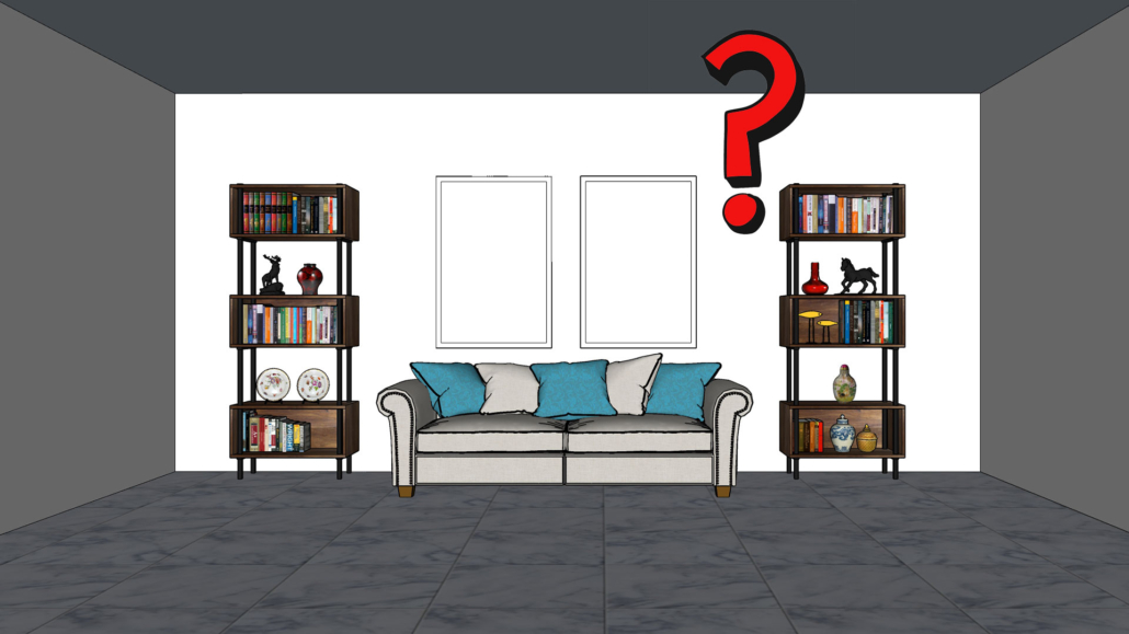
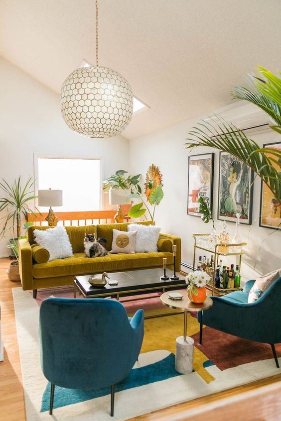
DECORATE SURFACES? HERE’S HOW TO DO IT!
A few weeks ago, we explored how to style a bookshelf (see the article here and the video here).
Today, I’d like to show you how to decorate other surfaces in your home, like the coffee table, nightstands, consoles, and more!
Styling the various surfaces in your home with care helps create an elegant and refined atmosphere.
Let’s start with some general tips and tricks, then look at how to apply them to each surface.
There are no strict rules, but these guidelines will help you create compositions that are well-balanced every time.
9 TIPS TO DECORATE SURFACES
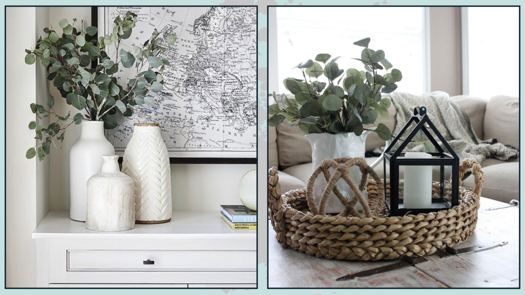
– THE RULE OF THREE: THREE IS THE PERFECT!
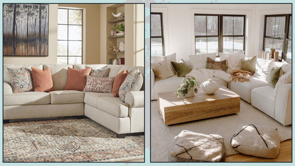
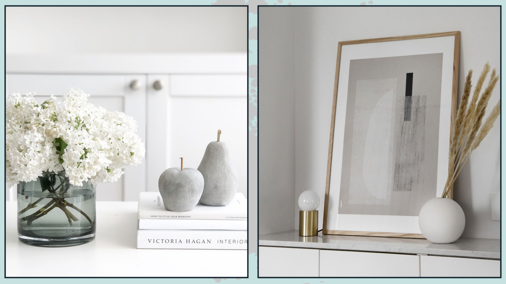
The rule of three means grouping objects in groups of three or other odd quantities.
Compositions of three are more dynamic than pairs; they create rhythm and movement.
With two objects, the eye tends to move back and forth, but with three, there are more possibilities for movement, making the arrangement more interesting!
Arranging items in groups of three gives the impression of a thoughtfully designed composition rather than random placement.
Keep in mind that grouping by three doesn’t just mean placing three different objects together.
Similar objects stacked or placed close together are considered a single unit.
(credits: Hudson Home; theposterclub.com)
To create a proper composition, the objects should be distinct in the two ways explained in the following points.
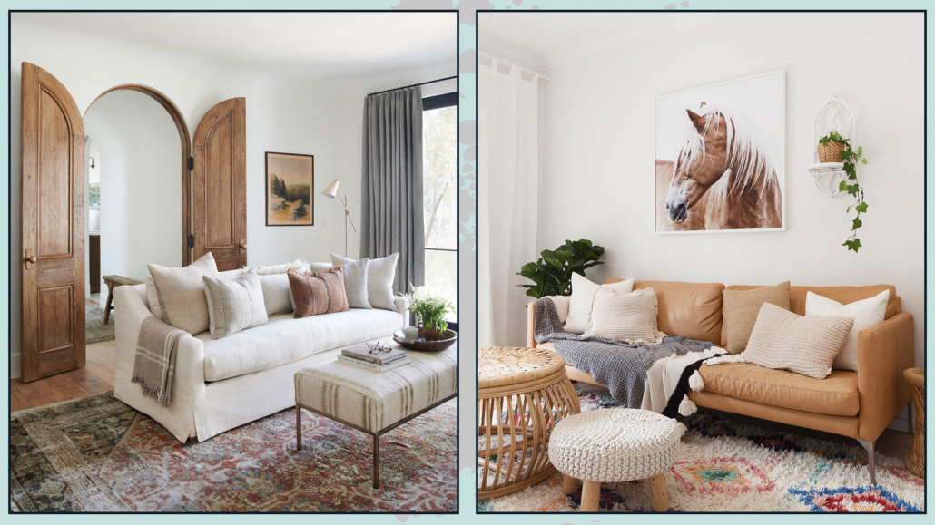
– USE DIFFERENT HEIGHTS AND WIDTHS
Create arrangements where the three objects vary in height and/or width to generate visual interest.
When objects are too similar, they blend and fail to attract attention.
By varying their heights and widths, you allow the eye to notice each piece and focus on what’s beautiful and valuable.
(credits: Hudson Home; theposterclub.com; durangoboots.com)
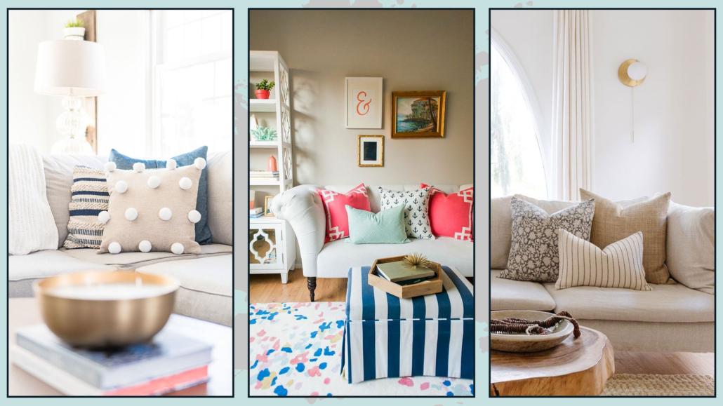
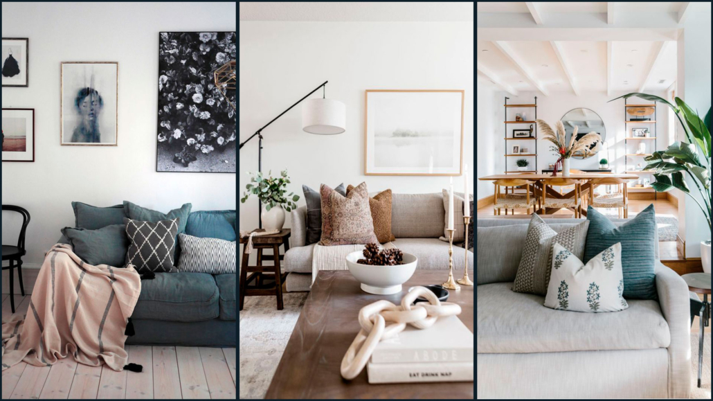
– USE DIFFERENT SIZES, SHAPES, TEXTURES, AND FINISHES
Just like with height and width, using a mix of shapes and finishes helps draw the eye through contrast.
Try placing something shiny next to something matte, something larger beside something smaller, or something rough next to something smooth.
As mentioned earlier, it’s all about contrast—if everything looks the same, nothing will stand out.
(credits: crateandbarrel.com; bobbyberk.com; studio-mcgee.com)
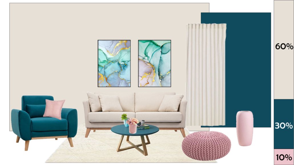
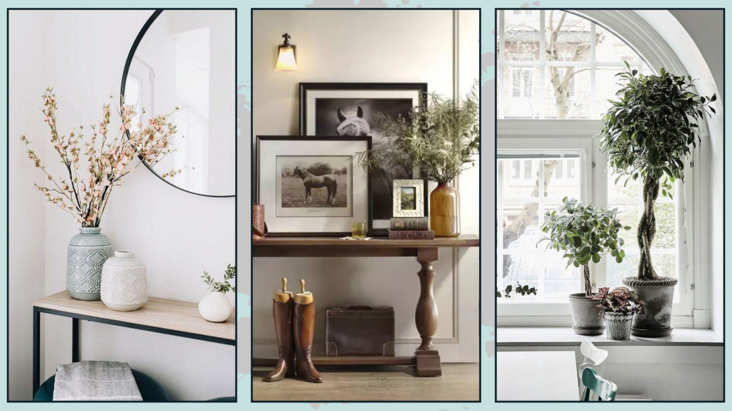
– USE COLOR
Assuming you’ve created a color palette for your home, your decorative arrangements should follow it too!
You can stick to similar tones for a monochromatic look, or play with contrast by choosing objects in bolder shades.
Don’t forget to consider the surface where you’re placing your items—that’s a color too!
Start from the base and decide whether to go with coordinating tones or contrasting ones.
For instance, if the surface is light, you might choose light-colored items for a tone-on-tone effect, or darker ones to create contrast (and vice versa).
As for accent colors, remember they’re called accents for a reason—so use them sparingly!
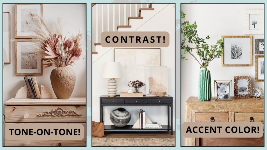
(credits: mariangelavaralli.com; studio-mcgee.com; decorgan.com)
– USE TRAYS
It’s a trend that’s becoming more and more popular, especially in the U.S., and you’ve probably seen it all over Pinterest.
But why use a tray?
First, if you choose the right one, it can be a beautiful decorative element.
Plus, a tray helps define the space of your arrangement, making everything look neat, organized, and intentional.
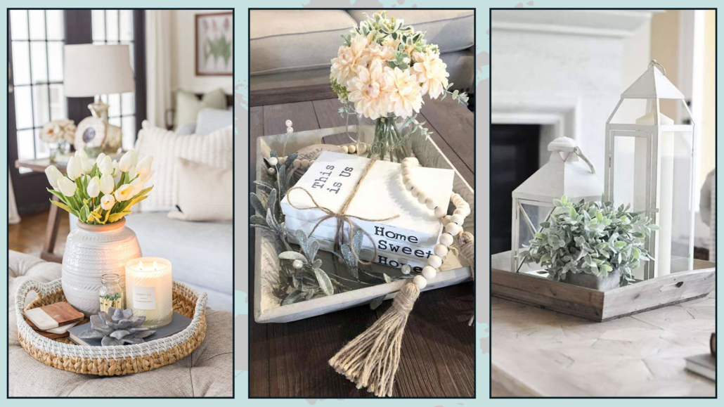
(credits: amazon.it; Farmhouse Hub; pinterest.com)
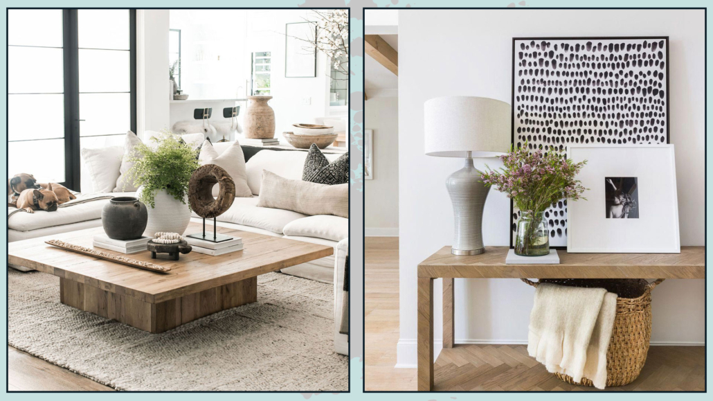
– PAY ATTENTION TO DIFFERENT ANGLES
Your arrangement should look good from every angle!
Take picture frames, for instance: they work best when placed against a wall.
Why? Because the back side isn’t exactly the nicest thing to look at!
When you put a frame on a console table or inside a bookcase, you see only the front, so you notice the photo and the frame itself.
But it wouldn’t be the best choice for a coffee table, where your composition is visible from all sides.
(credits: Gladys Paulino; Scout & Nimble)
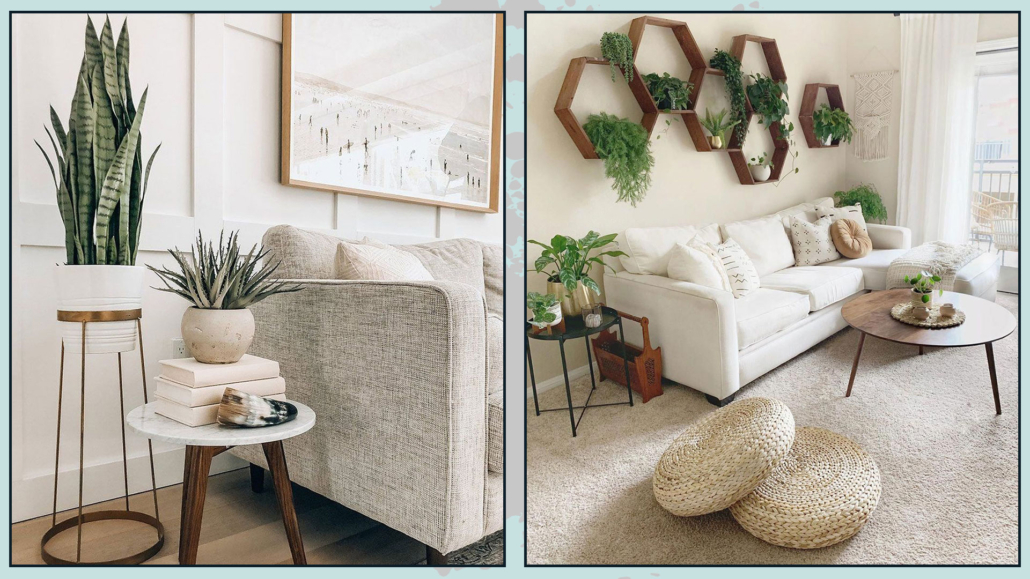
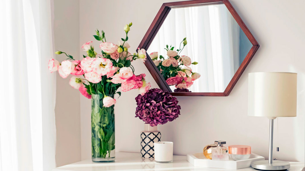
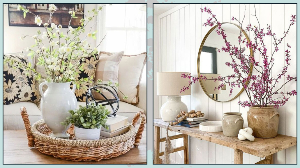
– USE PLANTS AND FLOWERS!
You’ve probably heard me say this a million times: bringing a touch of nature into your home is essential!
And that goes for styling surfaces, too—plants and flowers instantly add elegance and charm.
You can use a vase of flowers, a single leaf in a bottle, or a small succulent—what matters is adding a touch of nature into the arrangement.
Of course, you don’t need greenery in every single arrangement, but since you’ll be decorating several surfaces, be sure to add it here and there.
(credits: cottonhouse.es; thevintagerugshop.com)
– ADD WARMTH WITH CANDLES
As we have seen before, candles—lit or not—bring warmth and a sense of intimacy to any space.
With the right holders, they can also be highly decorative.
You can create an arrangement with candles of different heights, or add one candle to a group of three objects to add a cozy touch.
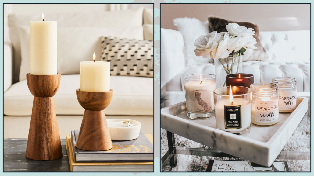
(credits: westelm.com; blondieinthecity.com)
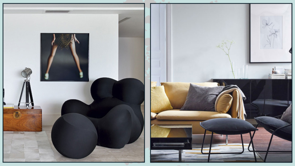
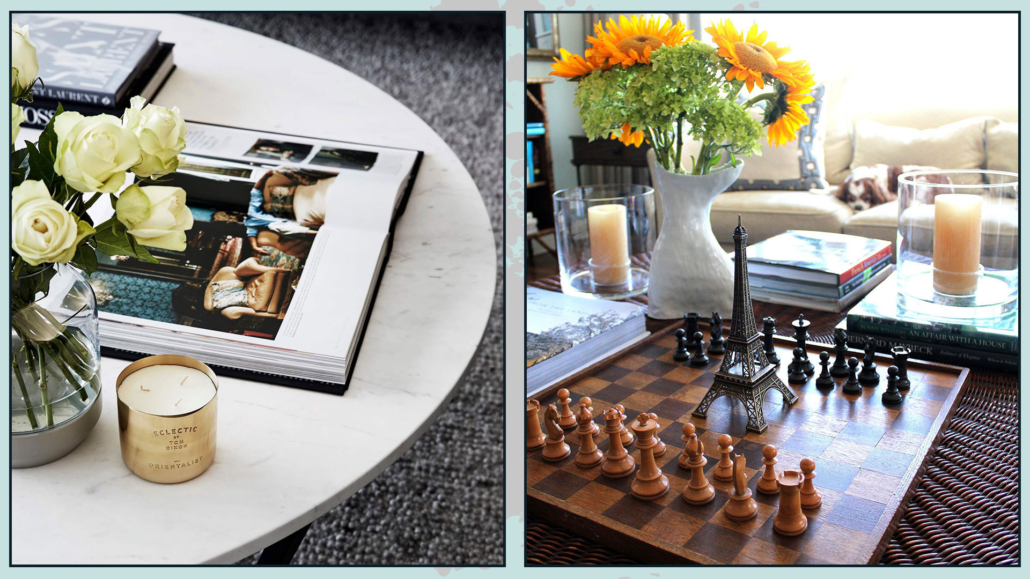
– DO NOT FORGET SOMETHING PERSONAL
Your home should reflect who you are, so use objects that hold meaning for you when decorating surfaces.
Let your arrangements tell a story—something about your passions, your memories, or what makes you feel at home.
You could also include items that invite interaction, like a photo album or a book opened to a favorite page.
That adds personality and can even spark conversations.
(credits: studiogriffiths.com; chess-site.com)
HOW TO APPLY…
Now that we’ve covered nine general tips for decorating surfaces, let’s get specific!
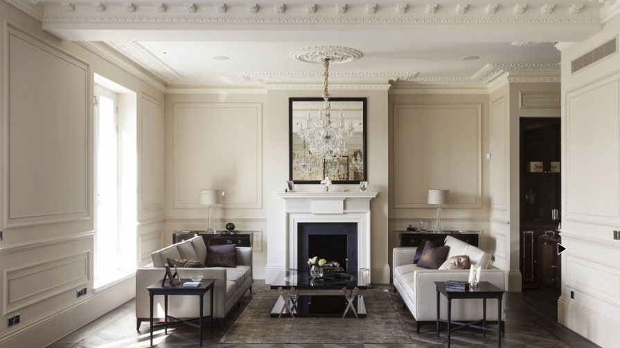
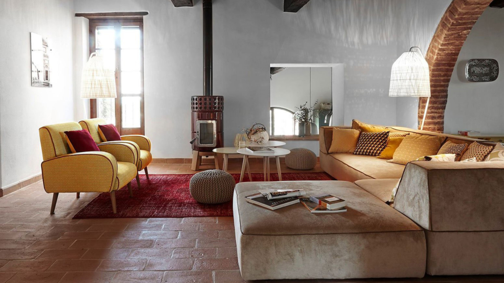
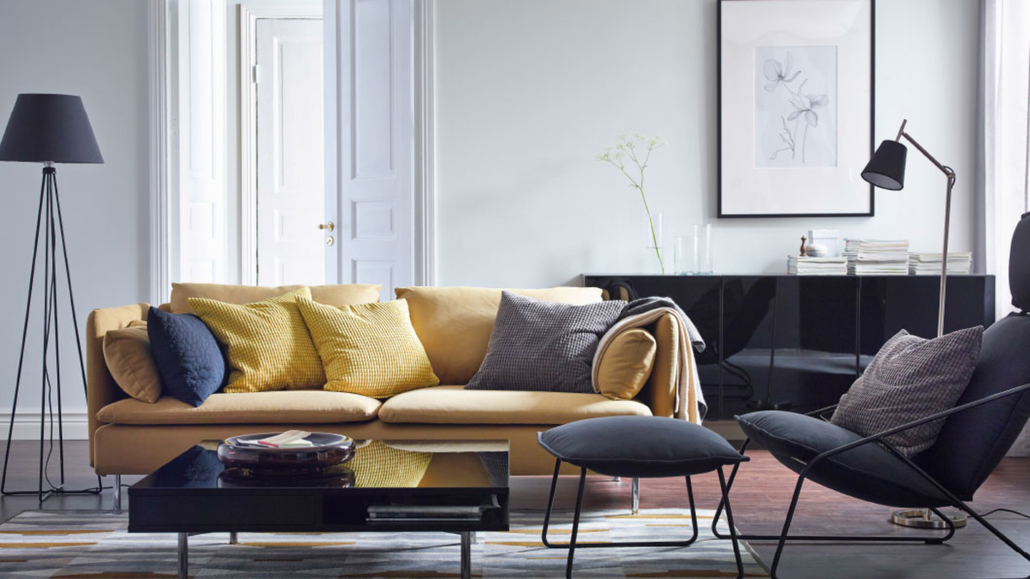
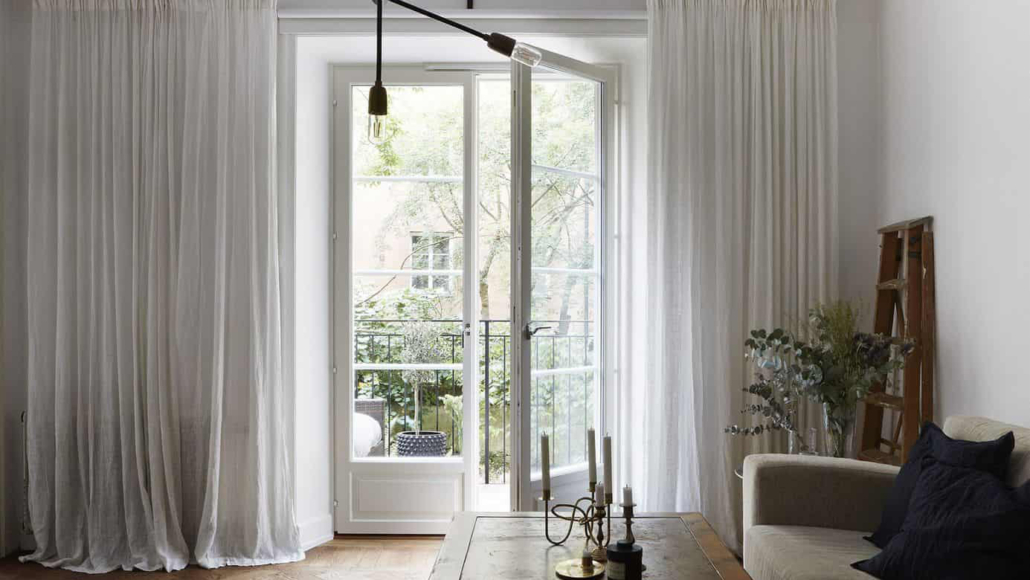
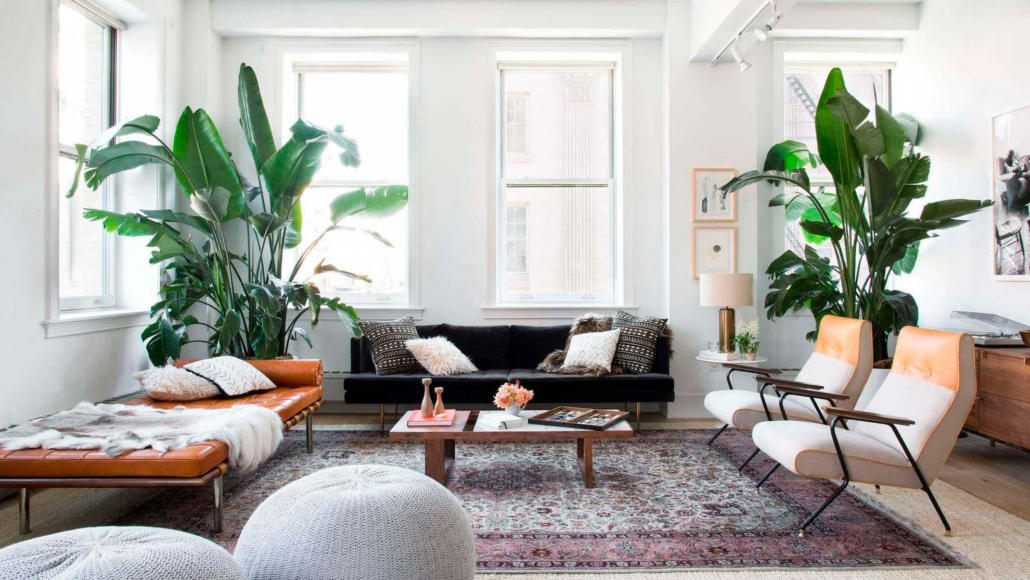
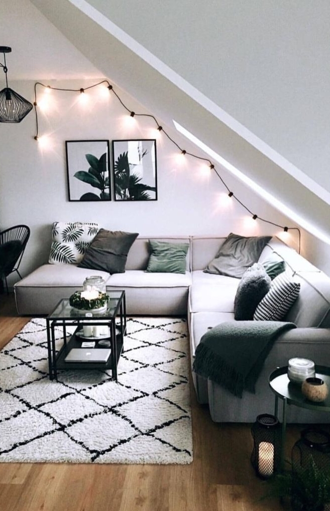
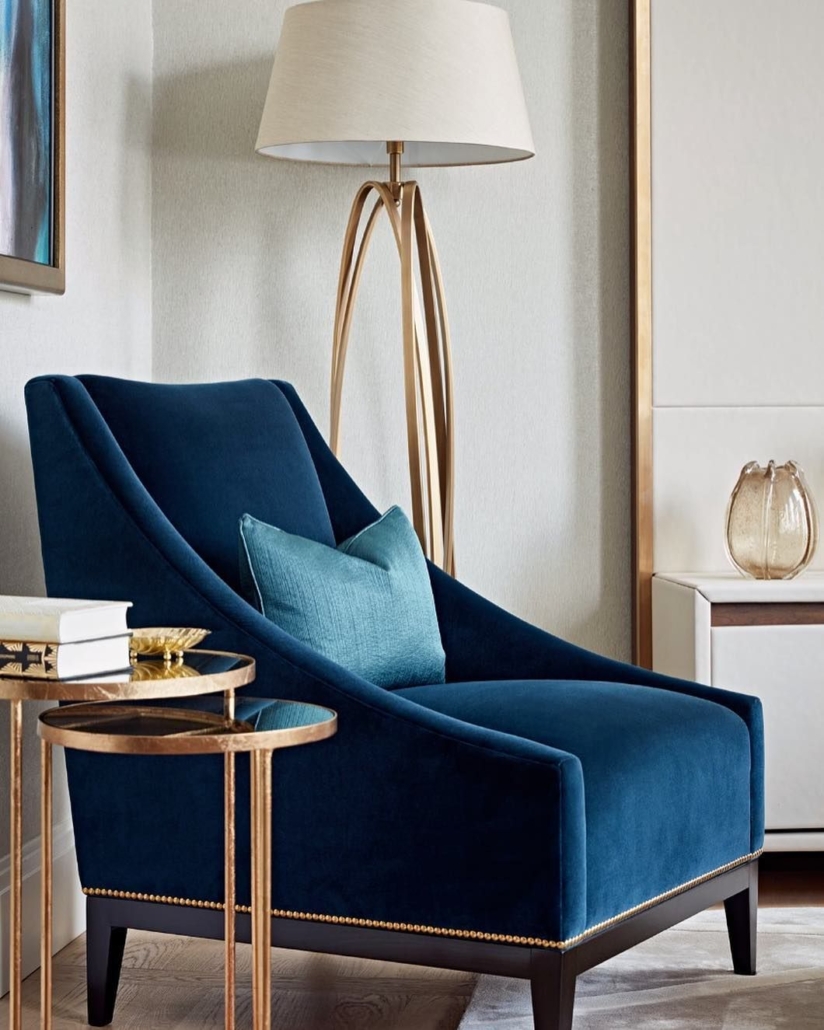
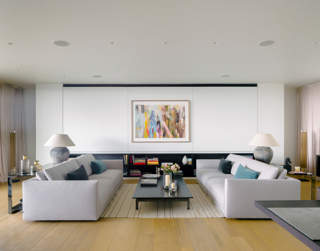
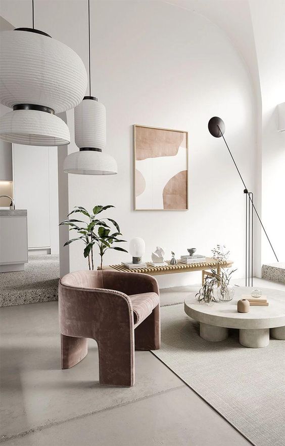
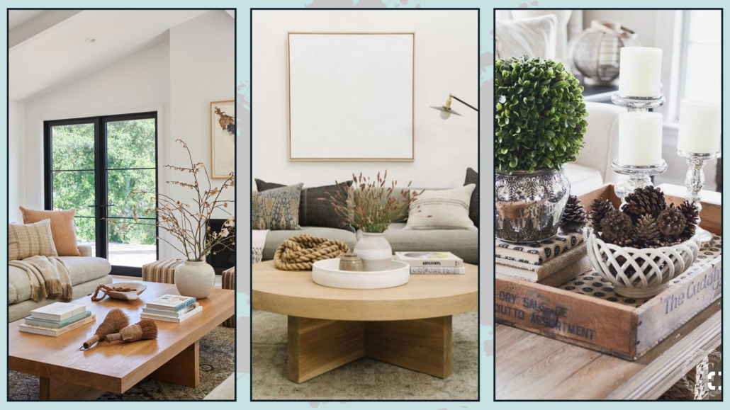
– COFFEE TABLE
The first thing to consider is the shape of your coffee table.
If you have a rectangular table, you can place a nice tray with a composition—of course, grouped in threes—and maybe add a beautiful vase of flowers or a plant next to it.
Your arrangement might include one or two stacked books, a candle, and a vase or another decorative item.
For a round table, it’s important to follow its shape by using a round tray or round vases.
If your table has a glass top and there’s a nice rug underneath, keep the decorations minimal and simple!
You can also switch up your décor with the seasons—fresh flowers and plants in summer, and leaves or pinecones in autumn and winter.
(credits: One Kindesign; homemakers.com; theturquoisehome.com)
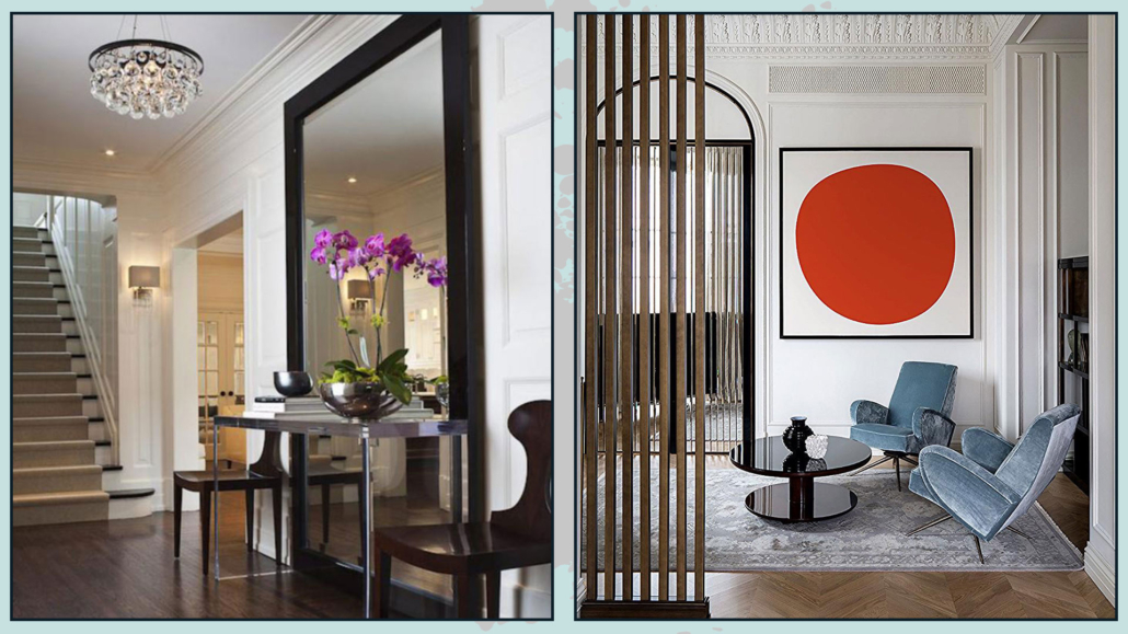
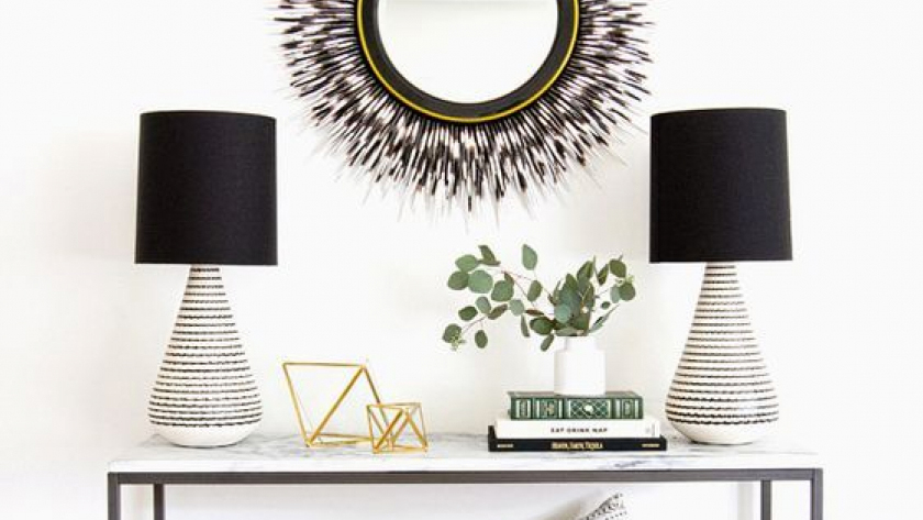
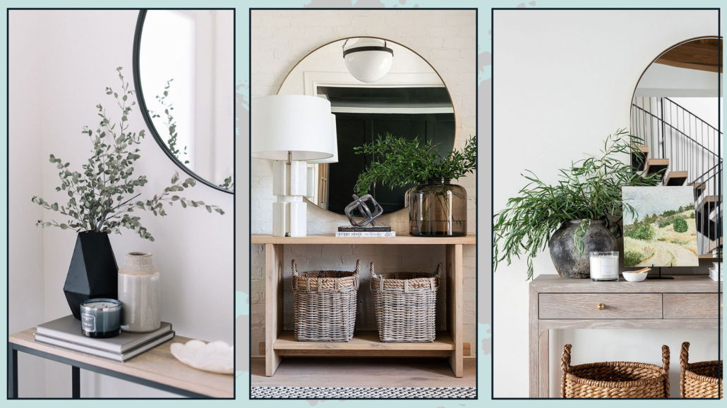
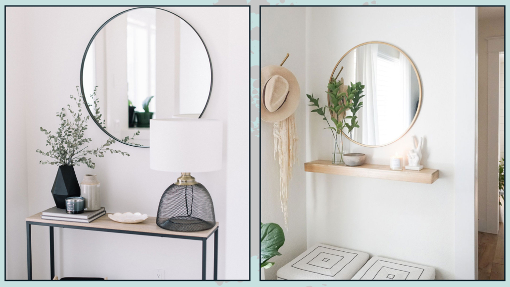
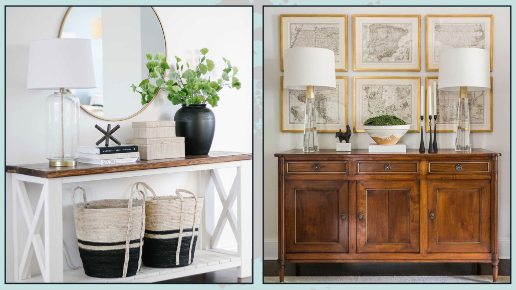
– ENTRYWAY CONSOLE OR SHELF
We discussed this in the article (now also in video form): a console or shelf in the entryway is essential because it’s practical.
Having a mirror—either leaning against the wall or hung—is key so you can take a final look before leaving, and guests can quickly check themselves before entering.
You’ll also need a dish or tray to empty your pockets.
If there’s space, adding a lamp is a great idea: lighting is vital, and a table lamp creates a warm atmosphere.
And again, don’t forget to add a touch of nature here!
(credits: Decoist.com; ohmeohmyblog.com)
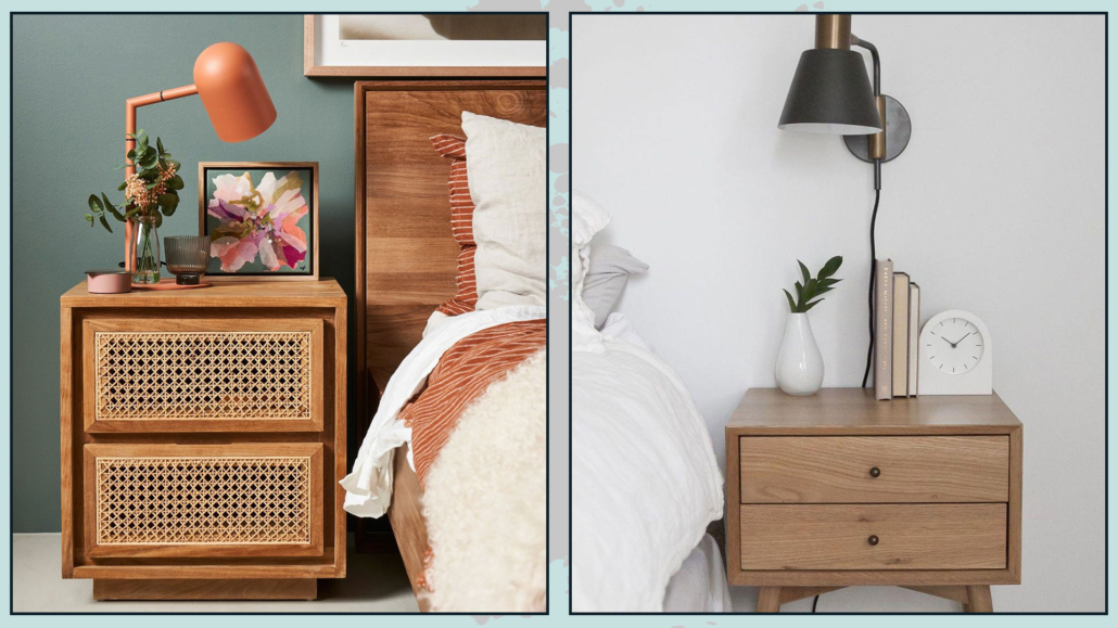
– NIGHTSANDS
Less is more—especially with nightstands.
The bedroom is for resting, so keep decorations to a minimum.
If you love bedside lamps, start with those, then add other items depending on the available space.
An alarm clock, a book, a small box, a photo—anything you love having close by will work perfectly!
(credits: savoldi.net; blogarredamento.com)
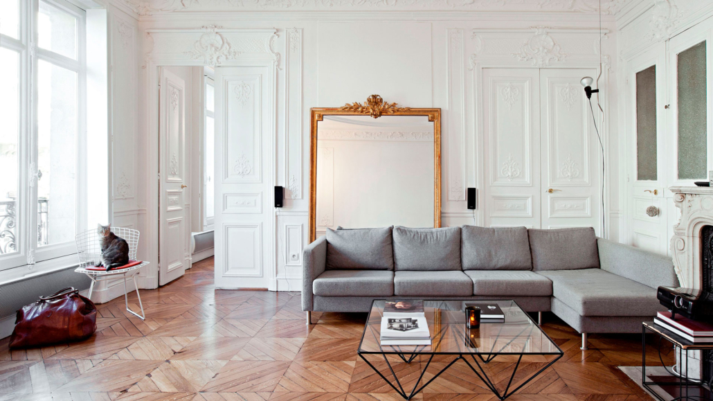
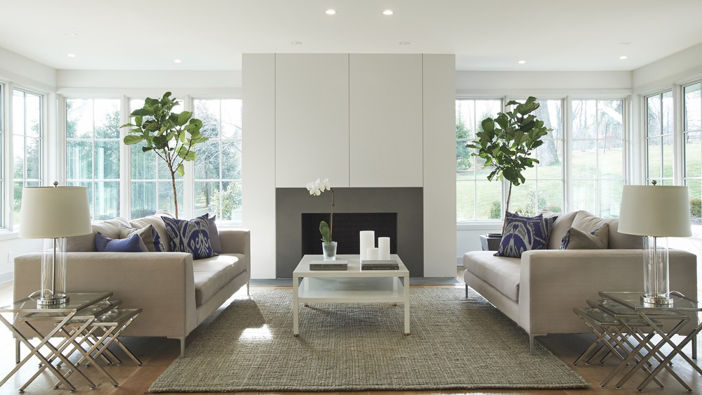
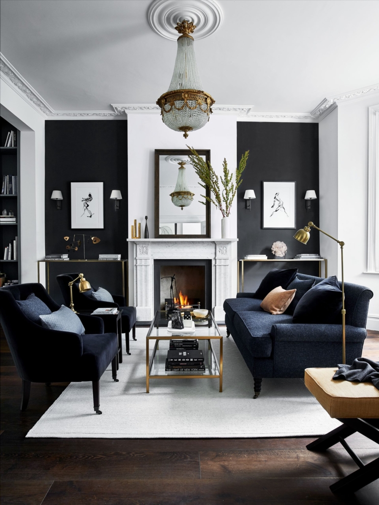
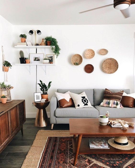
– SIDEBOARD
Decorate the entire surface by creating several small arrangements!
These arrangements should always follow the rules we discussed earlier and, of course, relate to each other, whether through materials or colors.
Another elegant idea is to place two identical lamps at each end for symmetry.
Then hang a painting or mirror in the center, finishing with a central arrangement that can be more or less prominent depending on the lamps and artwork.
Be sure to add some contrast—for instance, pair a wooden sideboard with metal or glass accents.
And if your sideboard is against a low wall, avoid tall items that could obstruct the sightline.
(credits: amazon.com; lighting)
JUST ONE MORE THING…
Before rushing out to buy anything new, try working with what you already have at home.
As I mentioned with the bookshelf, start fresh: clear everything out of each room, lay your items on the floor, and create your arrangements.
Start with the entryway and then move through the rest of the house!
You’ll refresh your space without spending a thing.
I hope you enjoyed this article on how to decorate surfaces and found it helpful.
If so, don’t hesitate to share it with someone you think might be interested; I would be honored, and it will help me gain more visibility.
If you need help with any room in your home, I would be honored to assist you. Book a personalized consultation today.