The other day a friend told me he wanted to change the colors of his home, that he had read all my posts on the psychology of color, that he had mulled over several times.
But… he absolutely could not decide.
This was because there were too many colors that he liked and somehow felt could represent him.
But, rightly and more importantly, he didn’t want to make his house a harlequin!
So how do you choose the colors of the house when there are so many ideas and maybe even a little confused?
THE FIRST WAY
First of all, we must start from two important data:
– floors and fixtures (especially internal ones such as doors)
– Presence of furniture.
If you don’t want to do a renovation, you have to keep the floors as they are!
There is the possibility to color them, but you absolutely must call a professional, to have a good and lasting result!
So that’s a COLOR already present… and you can’t underestimate it!!!
If the floor has neutral colors, there will be no problems, but if, for example, you have a yellowish floor, you will have to take this into account!
The same goes for interior windows and doors, sure they are definitely easier to stain eventually.
But if you didn’t have the manual skill, didn’t want to, or if you are renting a home and couldn’t, these windows and doors have a color, and you can’t pretend it’s not there.
Finally the furniture: if you already have it and, understandably, you don’t want to change it, even those have their color to keep in mind.
HERE HOW TO USE THE COLORS YOU ALREADY HAVE
Taking these colors already present in the home will be enough to maintain a monochrome house, that is, using the same color more or less saturated.
If you prefer, with the color wheel you can make the right combinations, and you can do them in various ways:
– one is by analogy, that is using the colors close to your main color;
– by extended analogy or not only the neighboring ones but also those immediately after your main color;
– by direct contrast, using the complementary ;
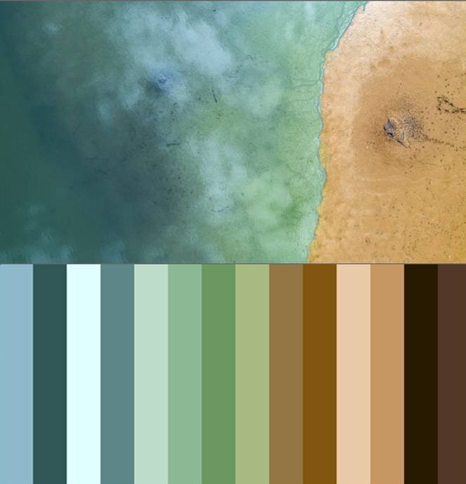
– or by divergent contrast, therefore not the direct complementary, but those on the side, exactly as you see in the picture!
– the last color scheme, the triadic, is obtained by drawing an equilàteral triangle in the wheel!
ANOTHER WAY
There is also another way to find the right colors to take home: it is an indeed funny way.
And this is true whether you start from scratch or have floors, fixtures, and furniture: to use a picture!
Why?
I will tell you.
You have a million pictures under your eyes every day and, among them, there will be some that excite you in a particular way, am I right?
Usually, those photographs have colors that we like and also represent us!
Of course, if you have floors, fixtures, or furniture, look among the photos you love for one that also has those colors or at least very similar.
Now you can take the colors in the photograph and bring them all to your home!
HOW TO PICK COLORS FROM A PICTURE
How to do it?
Well, if you don’t have photography programs, you can search for a program on the internet or an app on your mobile phone that can create color palettes for you from photos!
For pc, for example, you have HD Rainbow or Adobe color.
And for mobile there are many, but I can recommend Palette, which applies to both android and ios, or Adobe capture.
For example, from phone, I made this test:
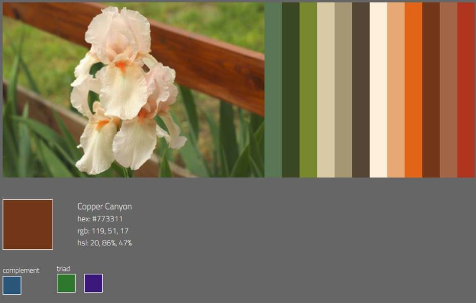
Can you see?
It also gives you the RGB color which is how much red, green, and blue are in this color, in every color.
You can also get, always with one of the many programs on the internet, to the colors NCS, Sikkens, or Ral which are the most used for the colors of the walls.
Not only that, it gives you, for each color also the complementary and some matches!
If the program would only give you Hex codes, you don’t have to worry: the color manufacturers will absolutely know how to convert them, or, even there, there are plenty of converters on the internet.
If a photo has struck you and makes you feel an emotion, easily also the colors captured will create it.
PAY ATTENTION!
Be aware, however! You have to know how to dose them!!!
They cannot all be used in a quantitatively undifferentiated way!
Neutral colors can be used with more lightness, but characterizing colors should be used as accent colors, in small to medium doses.
And especially they have to be calmed, and also emphasized, by neutrals, such as white.
They serve to give character, but too much can then stew!
If you are not sure how to change your home colors, if you are afraid of making a mistake, you can always contact me:
This post is also available in: Italian


Leave a Reply
Want to join the discussion?Feel free to contribute!