How to create a color palette for your home?
The topic of color is absolutely fascinating and quite beloved.
I often get questions about which colors to choose for your homes!
Knowing how to choose and manage colors isn’t easy, but it’s vital for creating harmonious environments that truly represent us.
Designing and choosing the colors and materials that will be present in your home is truly important to ensure that the various spaces communicate with each other in a coherent and balanced manner.
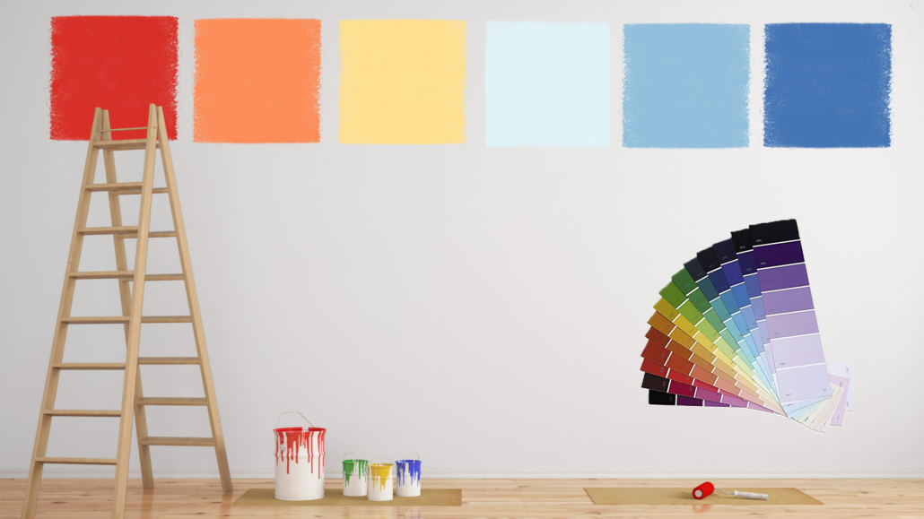
The color palette is really one of the first things to start with!
As we now know, colors create mood and evoke sensations and emotions, so choosing them carefully and consciously is paramount!
Therefore, let’s see the fundamental steps to create a color palette that suits you, your tastes, and your style!
– CONSIDER THE FUNCTION OF THE ROOM AND COLOR PSYCHOLOGY
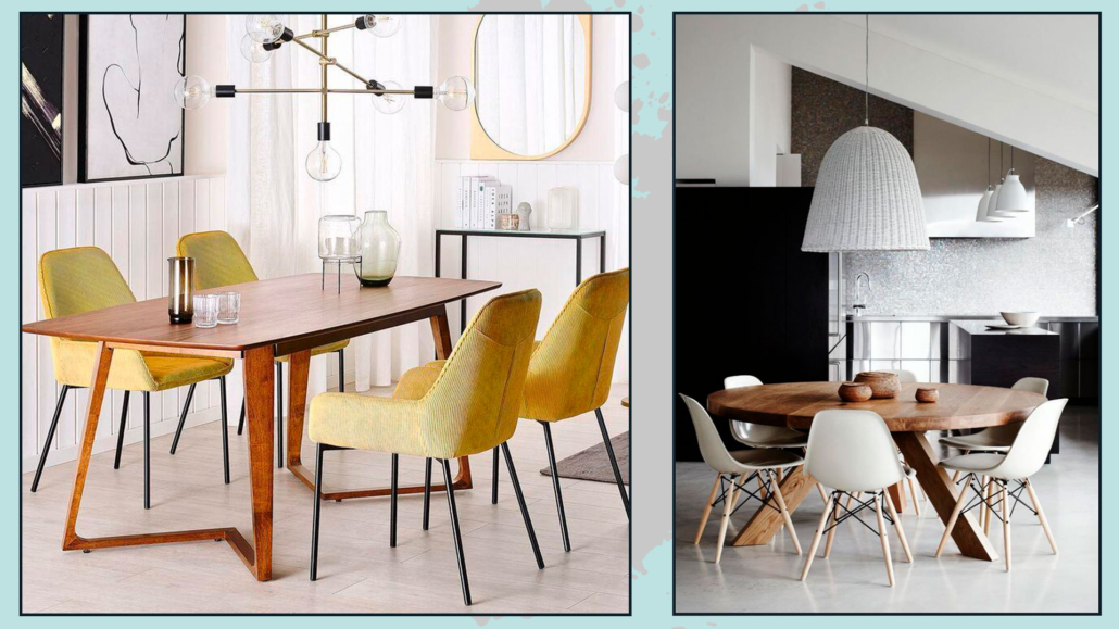
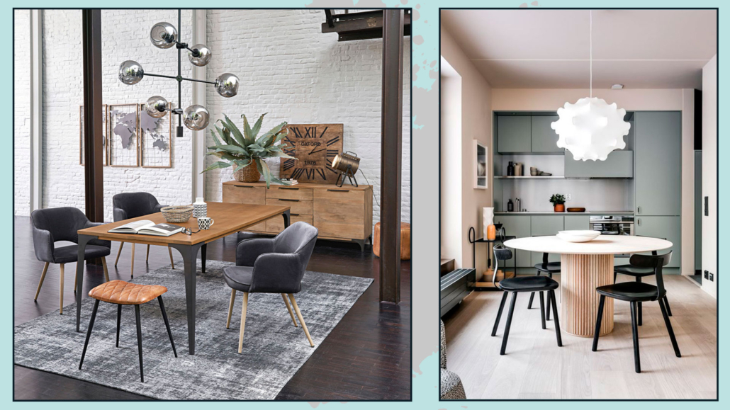
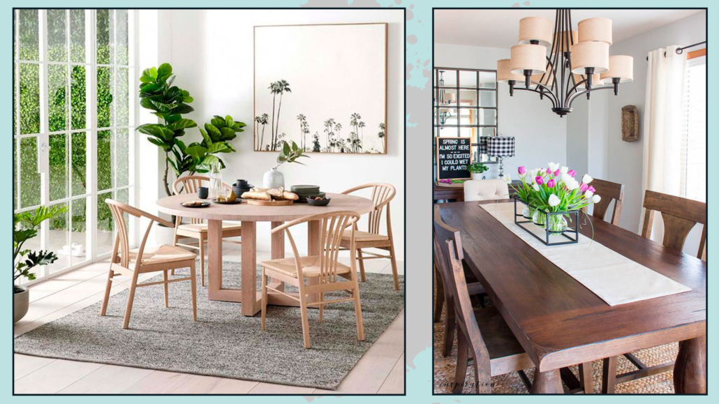
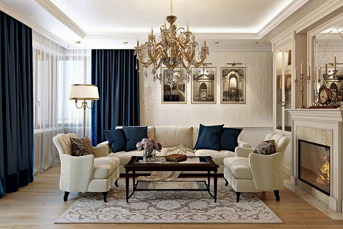
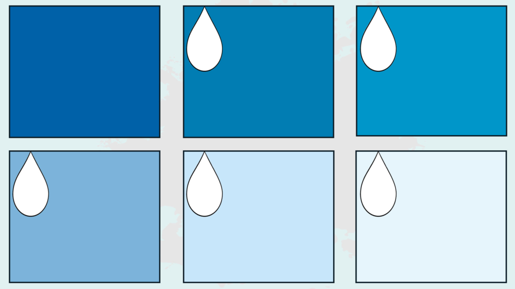
Different colors evoke diverse sensations, such as excitement, relaxation, introspection, mystery, passion, etc. (I talk about the color psychology here)

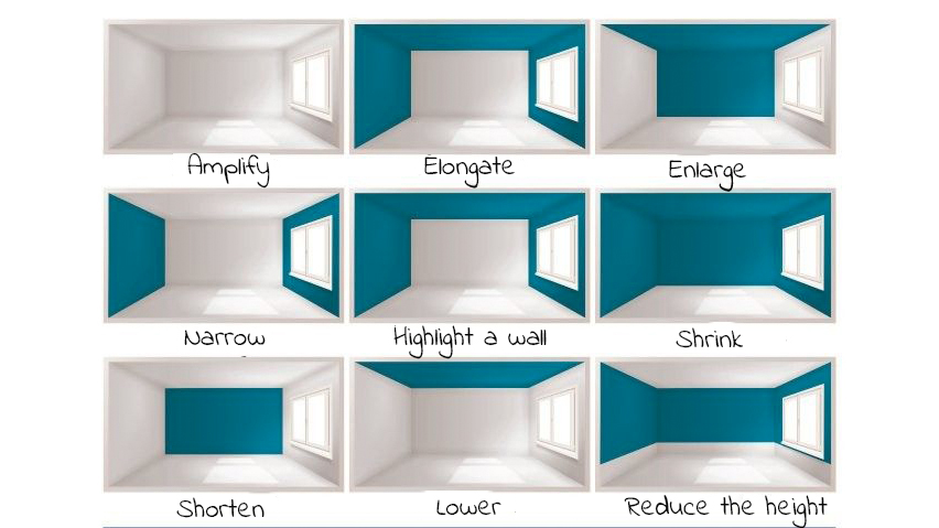
Color can transform a space:
– making it seem warmer or cooler.
– visually expanding the room.
– enhancing the sense of well-being.
– brightening up the space.
Color is indeed the fundamental tool for creating the right atmosphere!
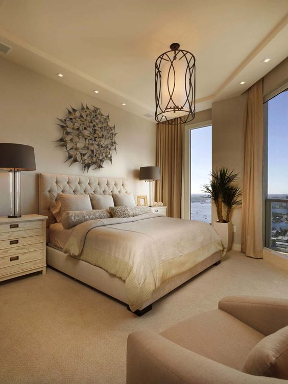
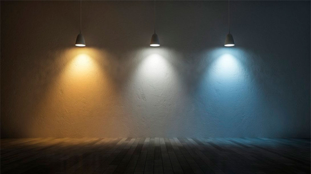
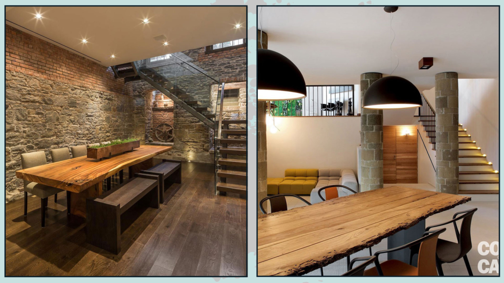
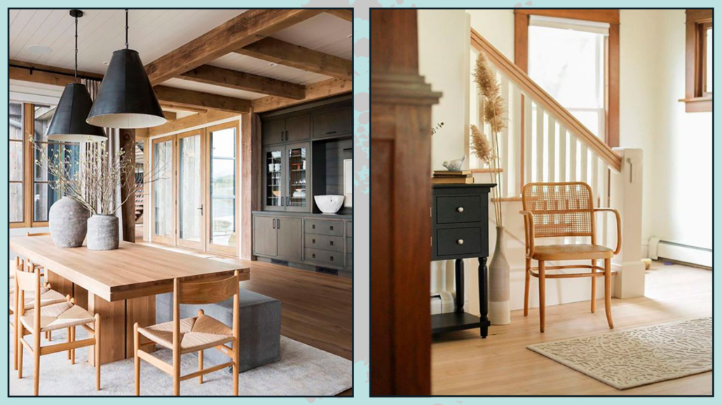
(different colors different atmosphere! Credits: mooielight.com; Sean Litchfield)
To choose a color, you need to ask yourself a few questions:
– What is the function and purpose of that room?
– What emotions do you want to experience in that space?
– Which color can help you achieve this goal?
The answers to these questions will help you find the right color!
This color will impact sensations and behavior, making the space functional and suitable for the specific activities of that environment.
PAY ATTENTION ALSO TO THIS…
There are other, somewhat more technical aspects to consider:
– Where is the room located?
– How many windows are there, and how are they oriented?
– Is there anything that could alter the perception of color in any way?
These questions give an idea of the room’s conditions and further aid in color selection (or at least in determining its brightness and saturation!).
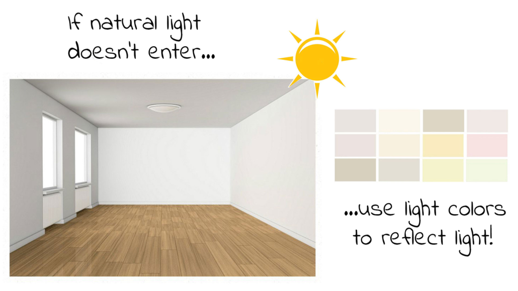
Let me give you an example: if a room doesn’t receive direct light, it’s better to use light colors to bring the space more breathing room and allow the indirect light to reflect more.
That will still enable you to make natural light more efficient, as it reflects better on lighter colors!
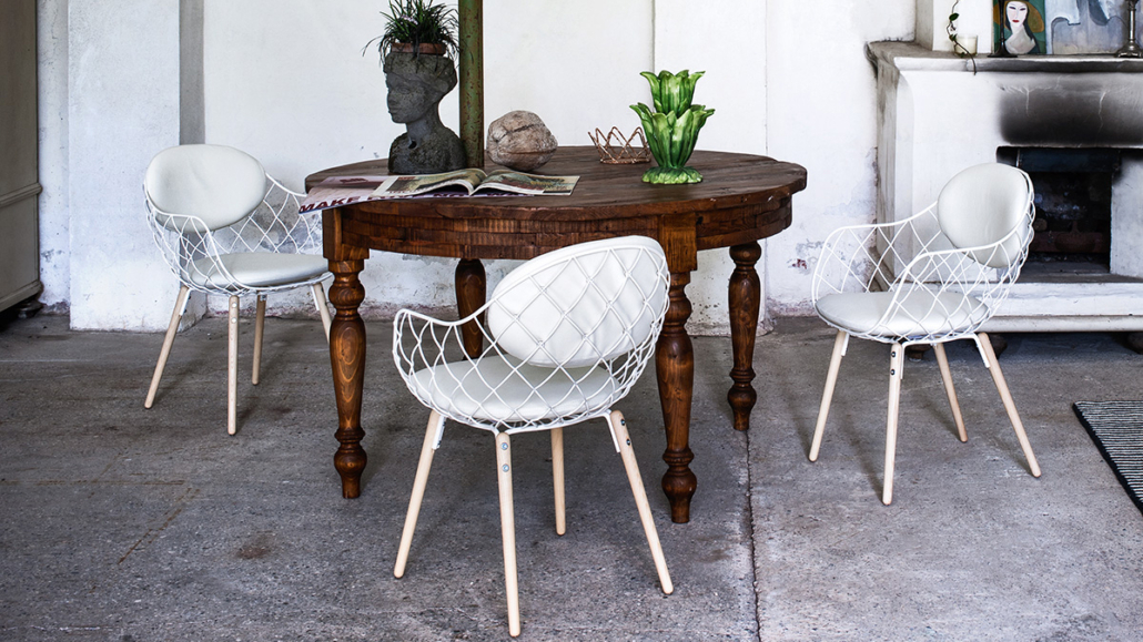
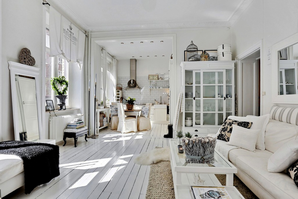
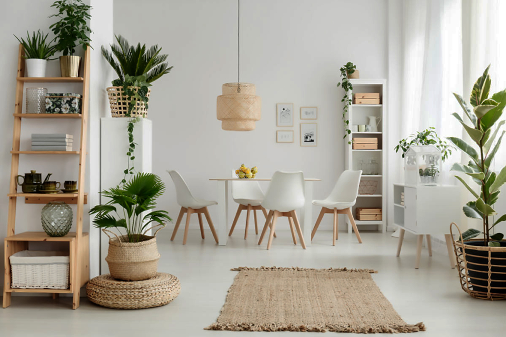
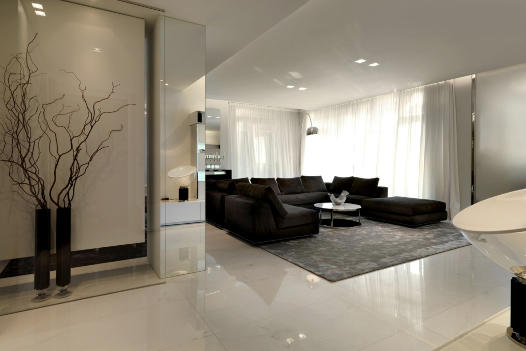
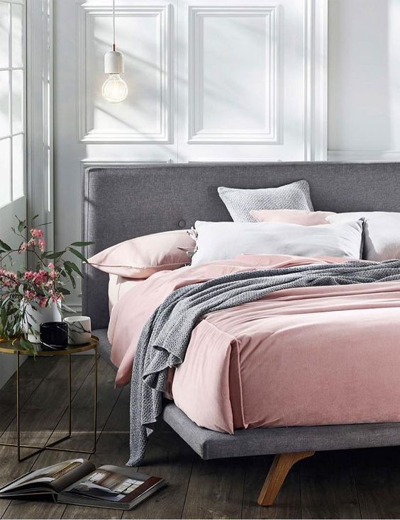
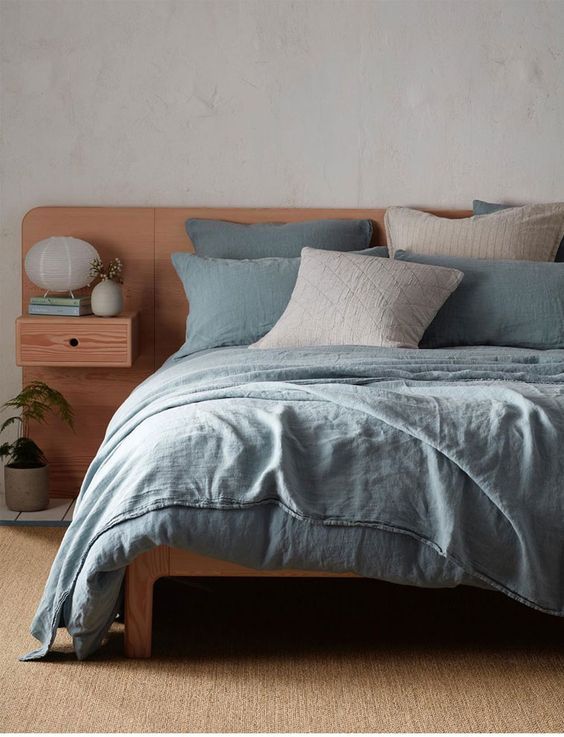
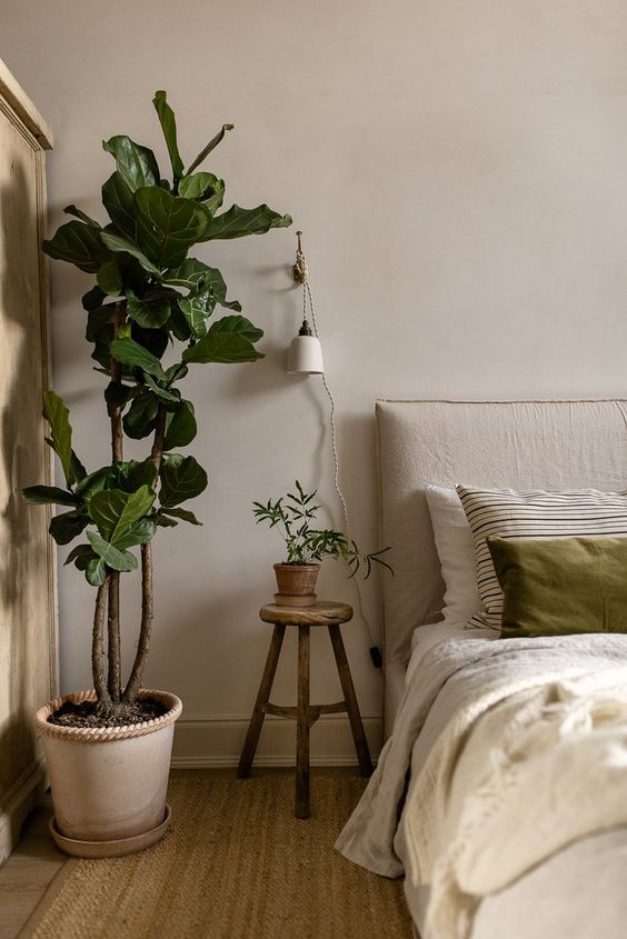
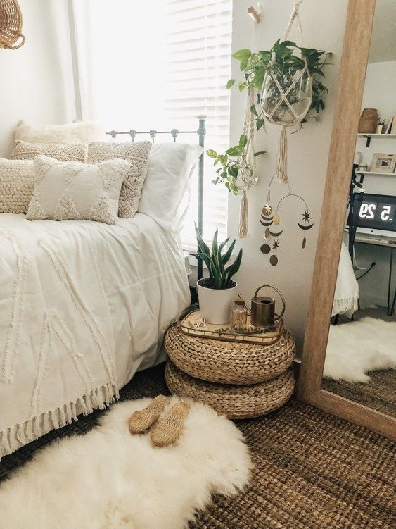
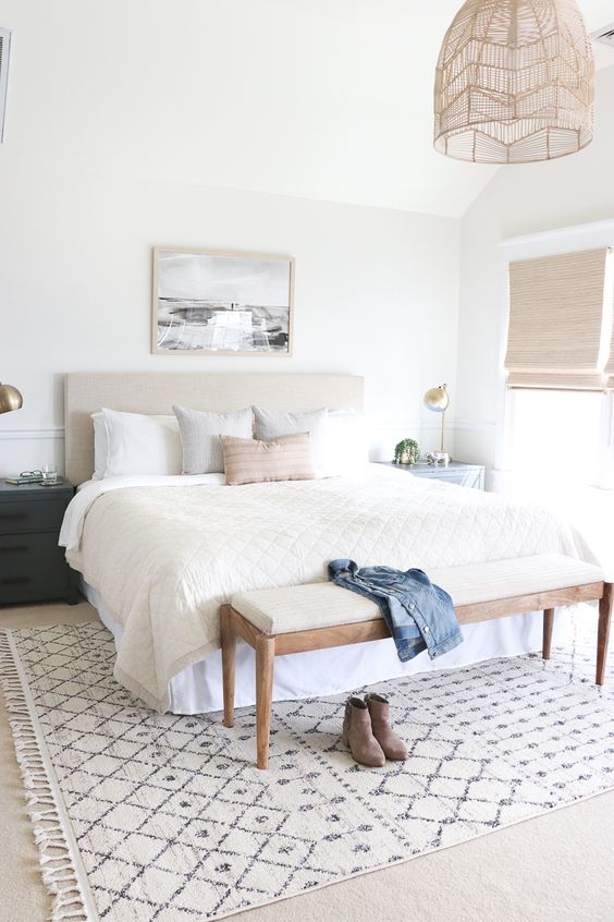
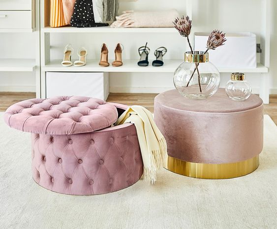
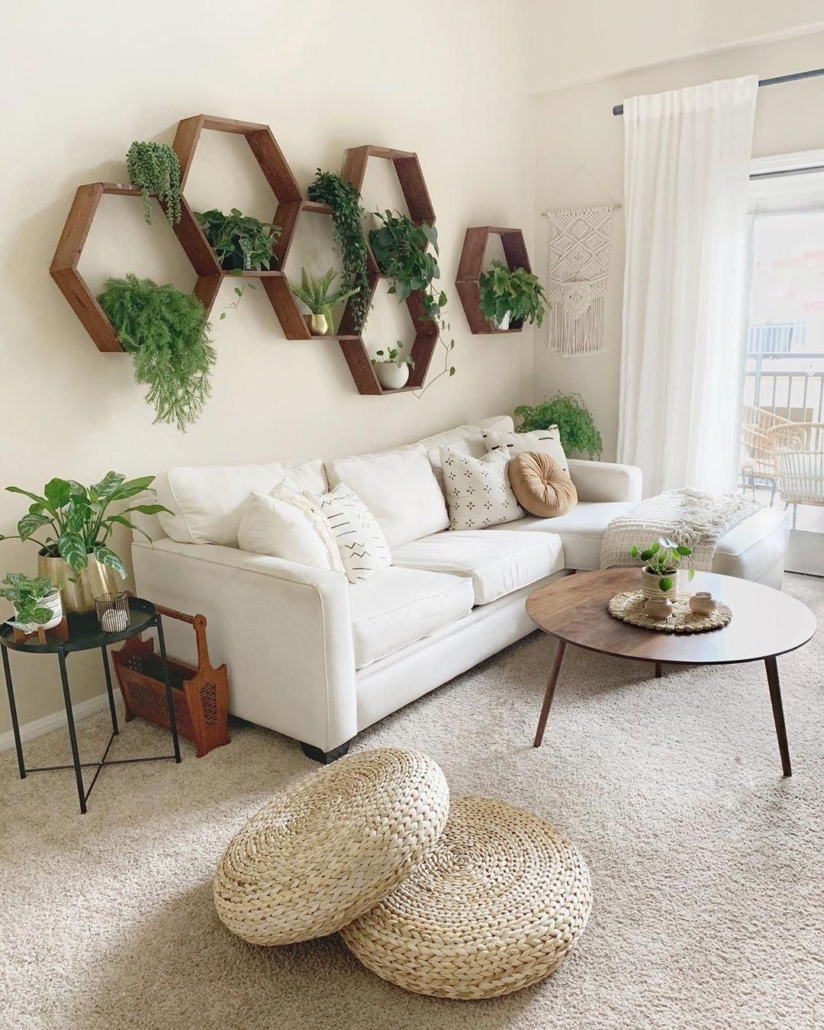
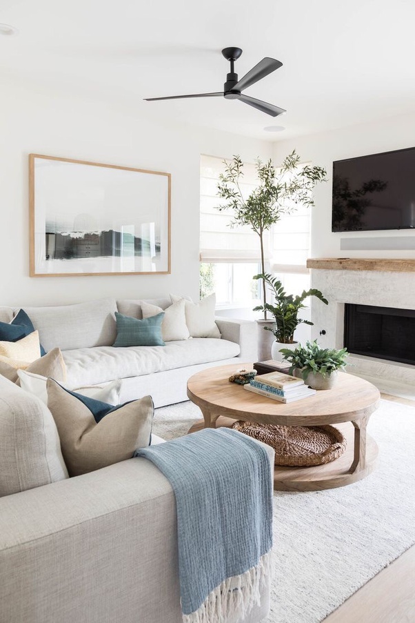
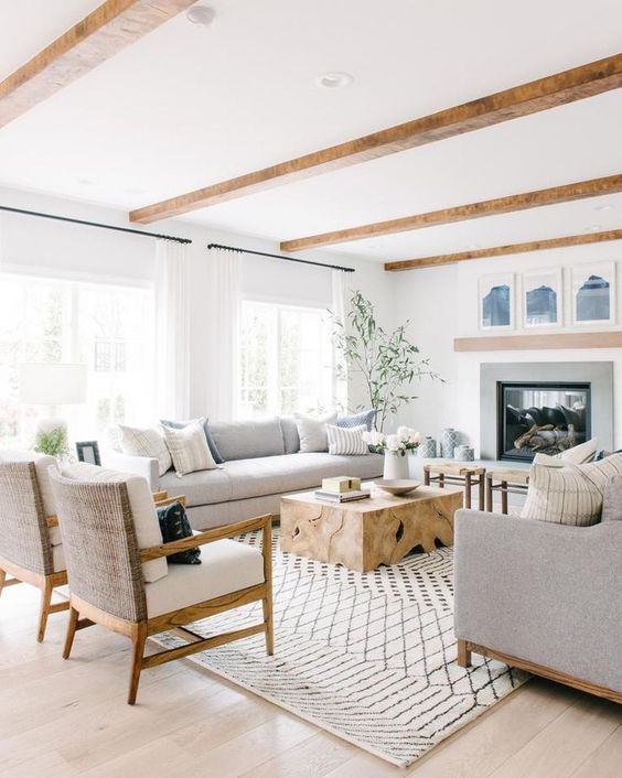
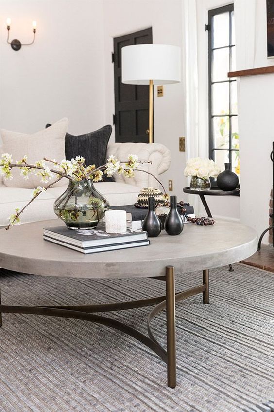
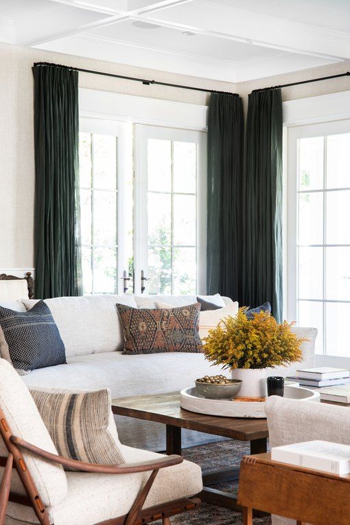
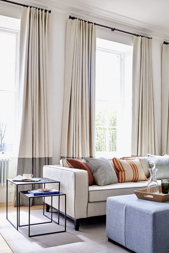
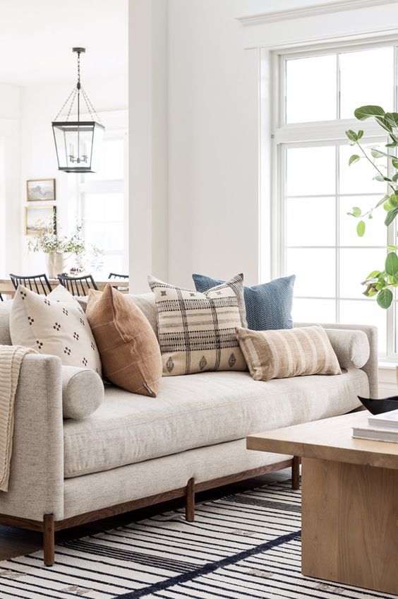
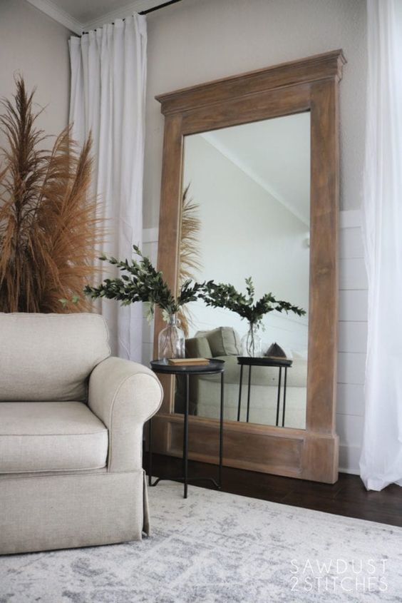
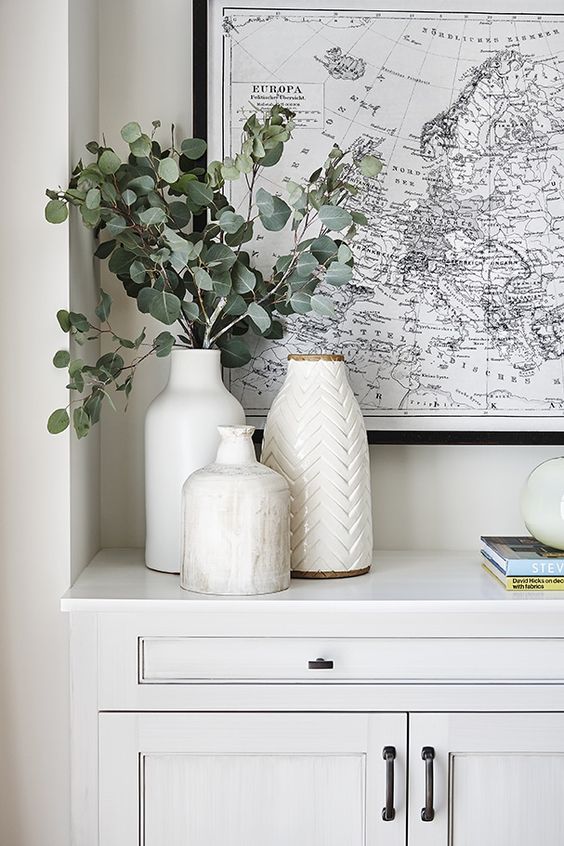
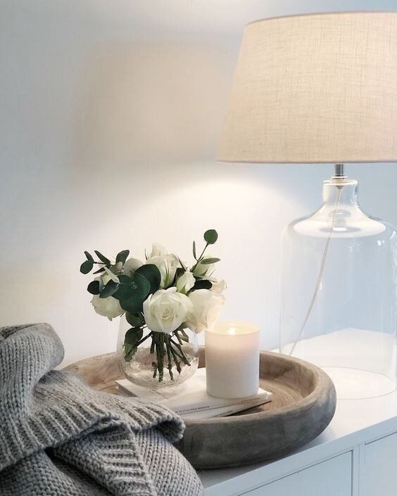
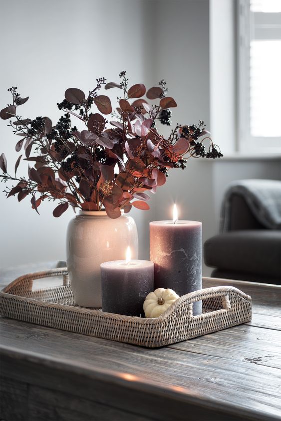
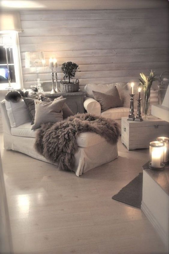
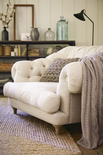
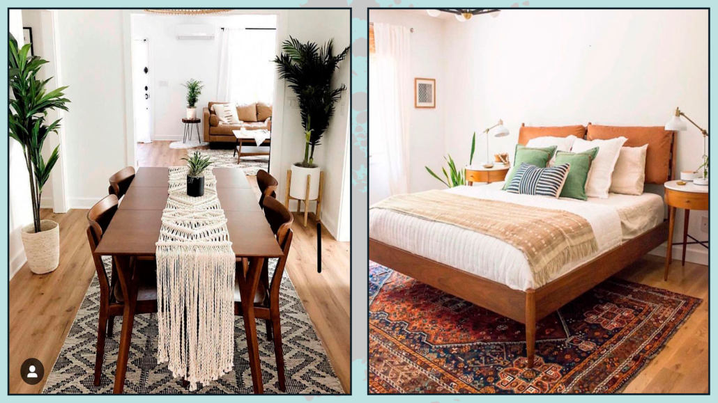
– CHOOSE NEUTRAL COLORS
Neutral colors are essential in a color palette because they serve as a backdrop and can enhance various furniture elements.
Walls painted in neutral colors open up numerous opportunities; they allow us to incorporate furniture pieces with stronger colors without overwhelming the space.
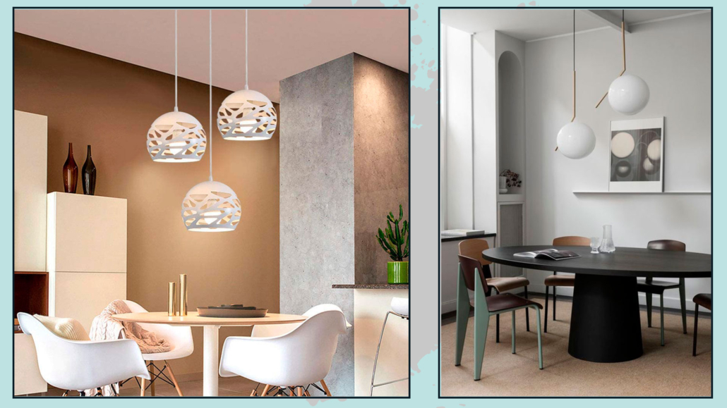
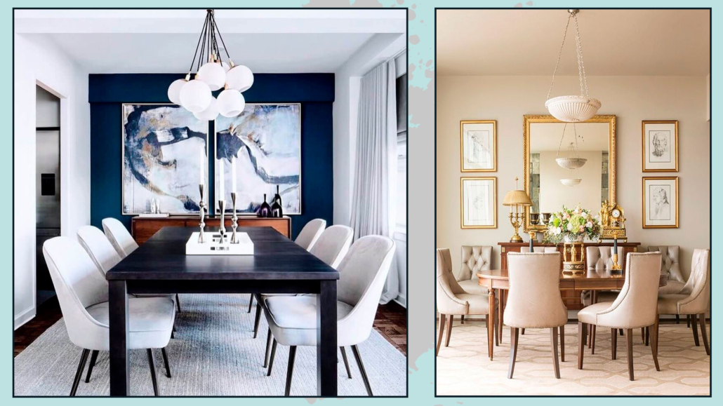
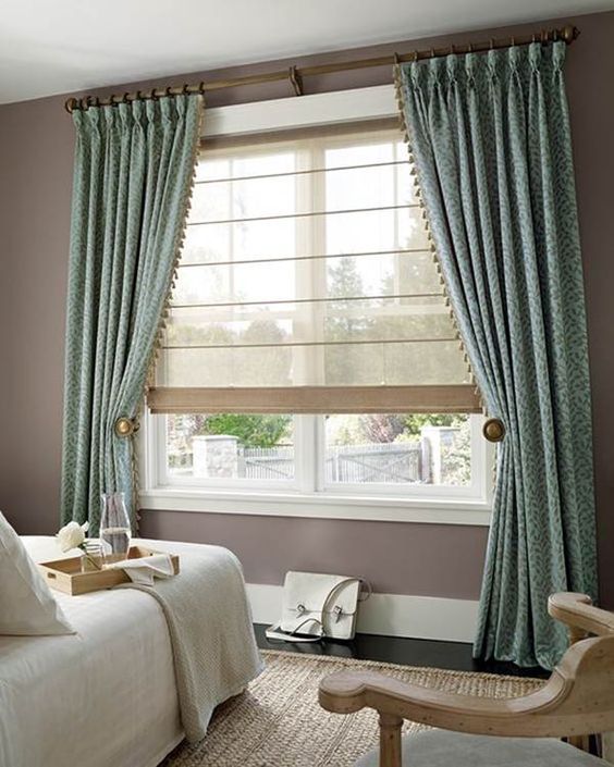
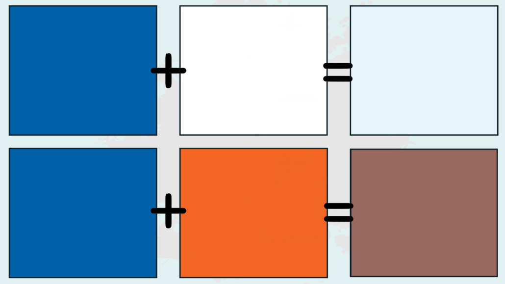
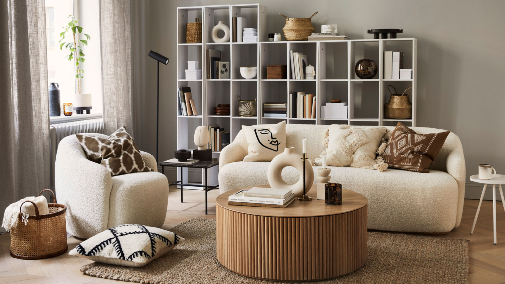
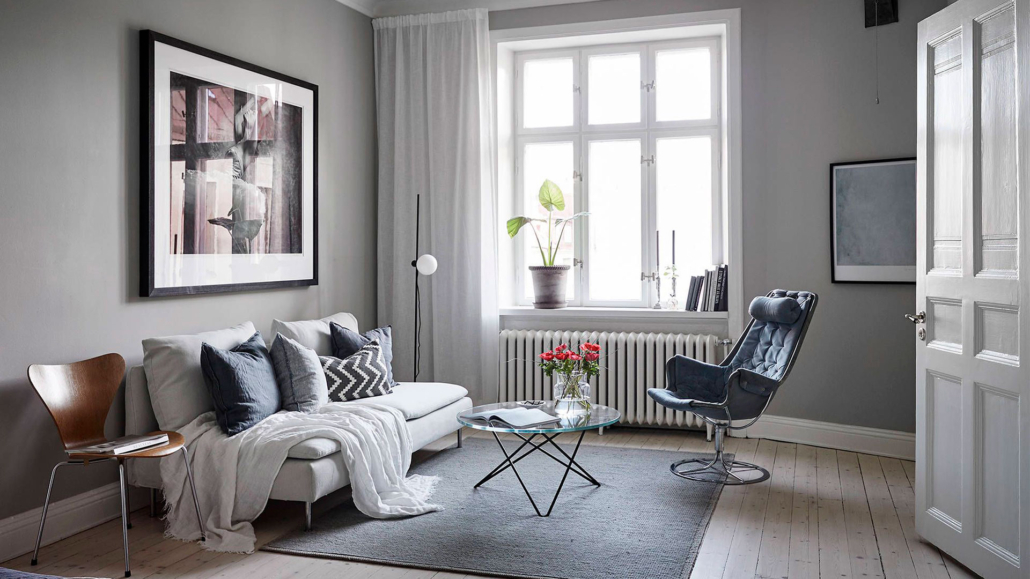
When selecting the right neutral, the first thing to do is to determine whether to choose warm or cool neutrals.
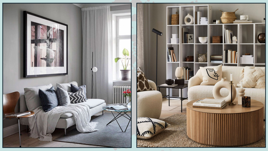
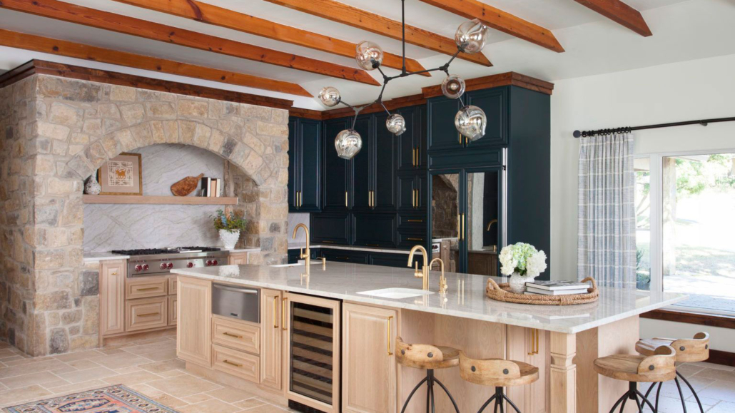
(Warm or cool neutral give a different result! Credits: cocolapinedesign.com; H&M)
Opt for those that best represent your personality and style and complement the other colors in the palette and furnishings.
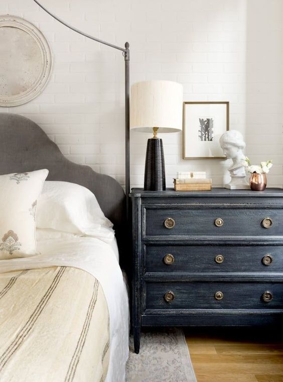
Choosing a warm or cool neutral may not be simple due to its undertone.
For example, you might choose a white color, but once the wall is painted, it may appear slightly yellowish or bluish.
That occurs due to the undertone.
Except for pure neutrals like white, black, and gray, all others are obtained by combining two complementary colors or adding a pure neutral to one color.
That results in a white, for instance, appearing pure, but ultimately, due to its undertone, it may indeed have a slight yellowish or bluish tint.

I discuss this aspect of neutrals in more detail here!
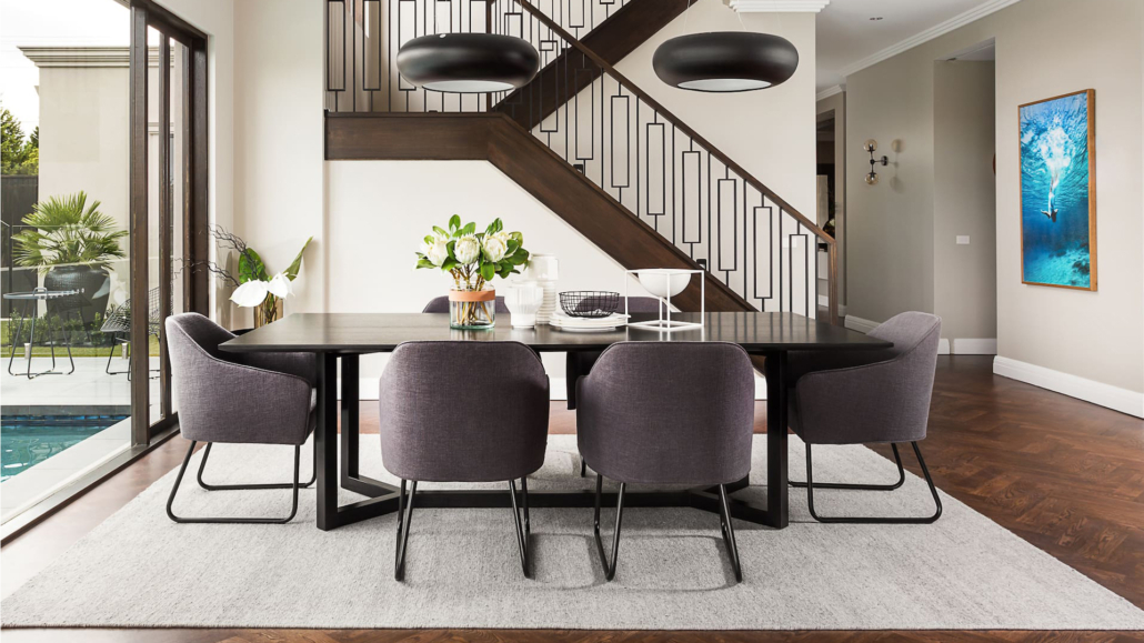
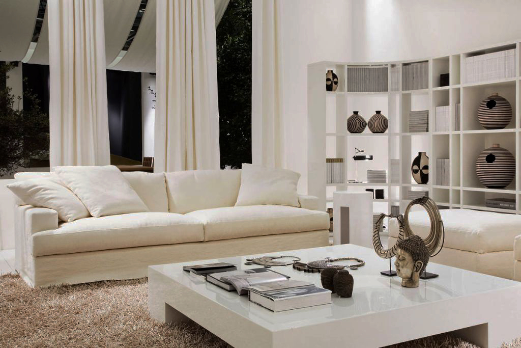
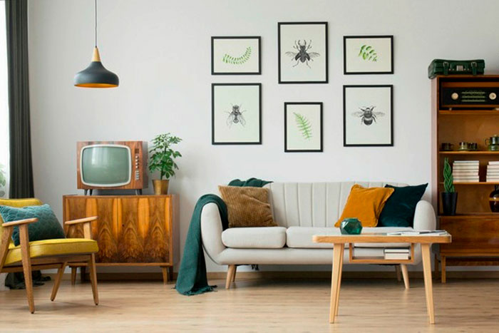
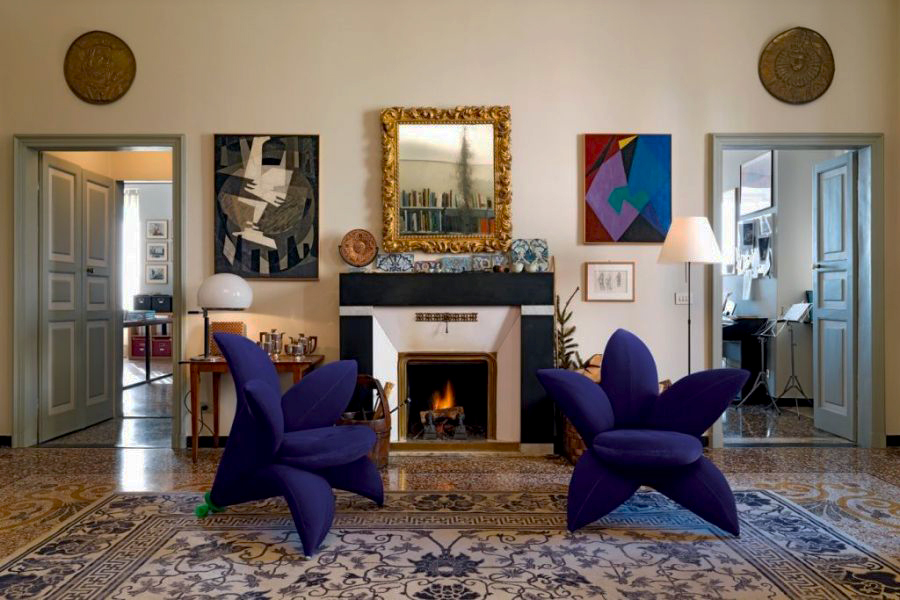
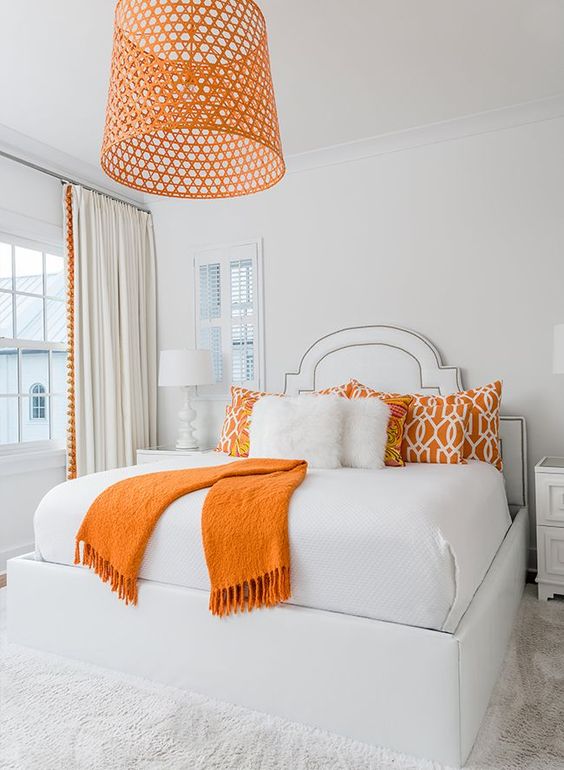
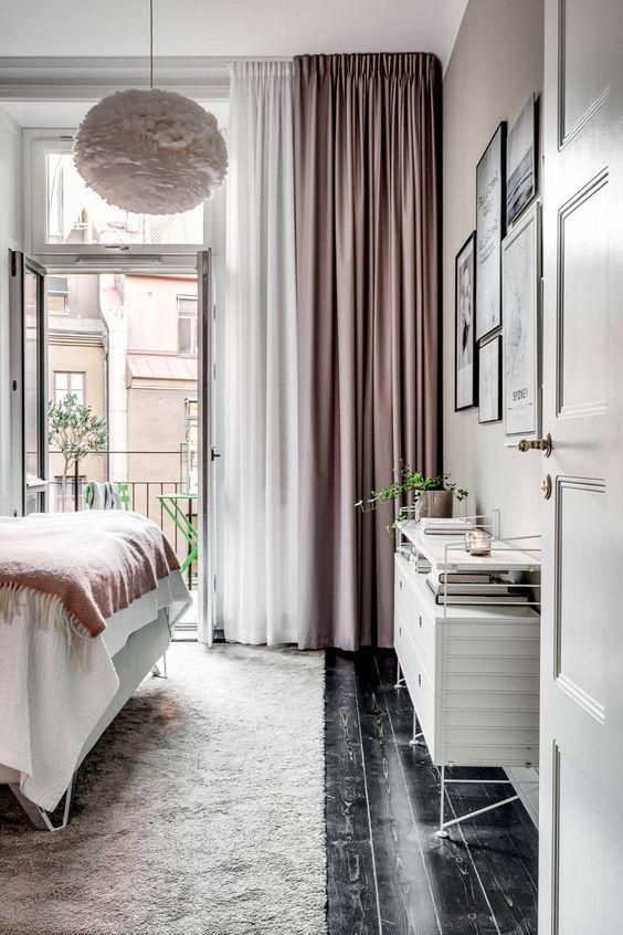
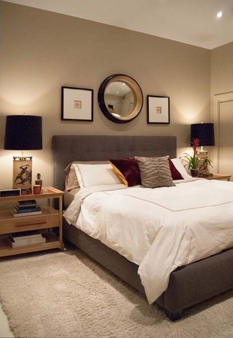
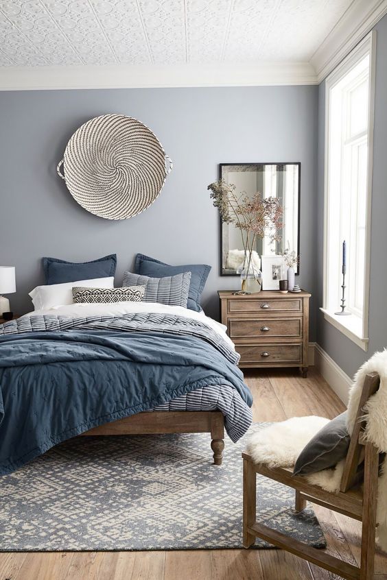
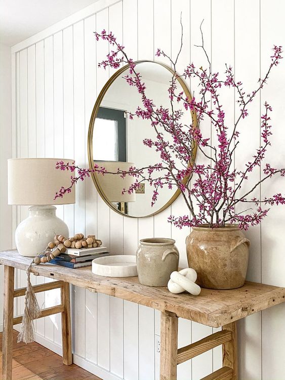
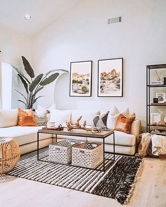
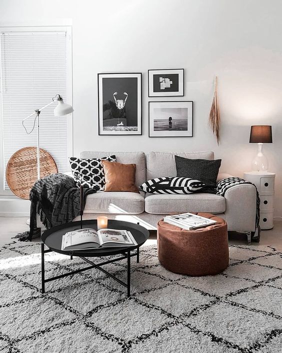
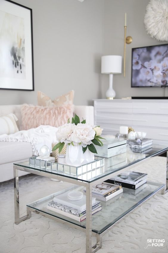
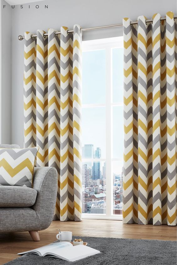
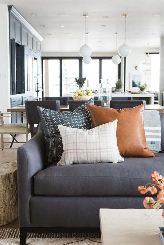
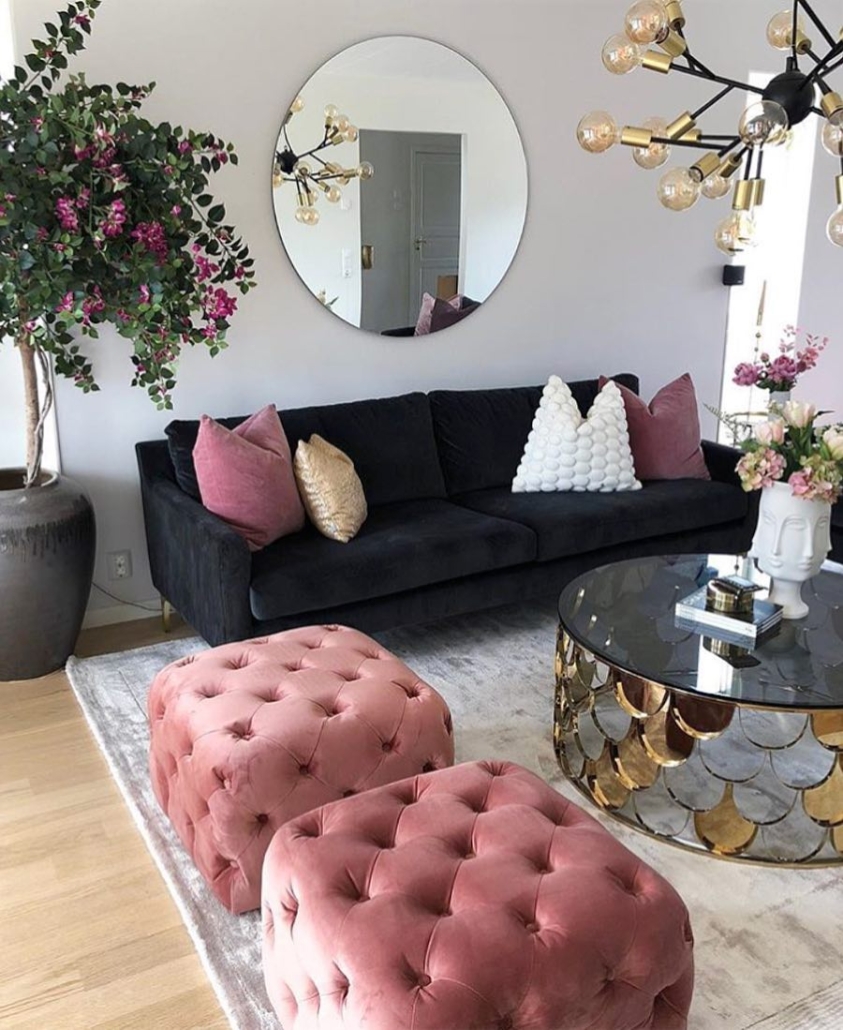
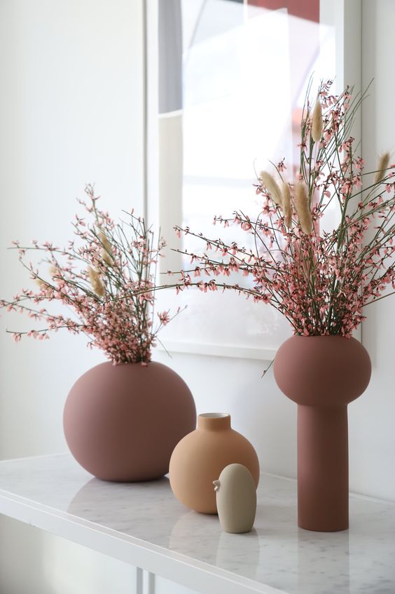
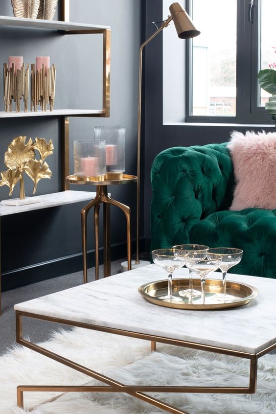
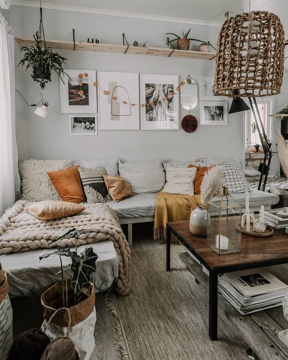
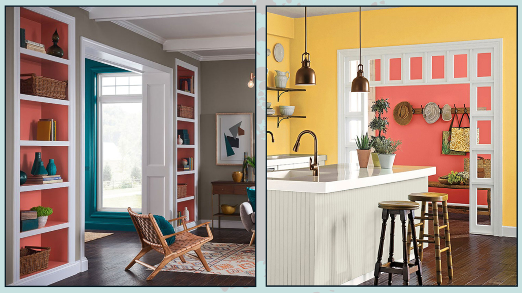
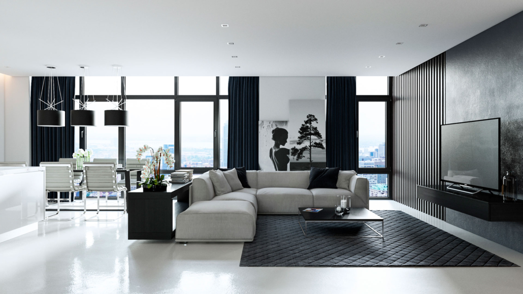
– CHOOSE AN ACCENT COLOR
Accent colors are crucial for creating movement and contrast and emphasizing significant elements of the environment.
Choosing neutral colors will facilitate the choice of an accent color, which doesn’t necessarily have to be vibrant but should contrast with the other colors.
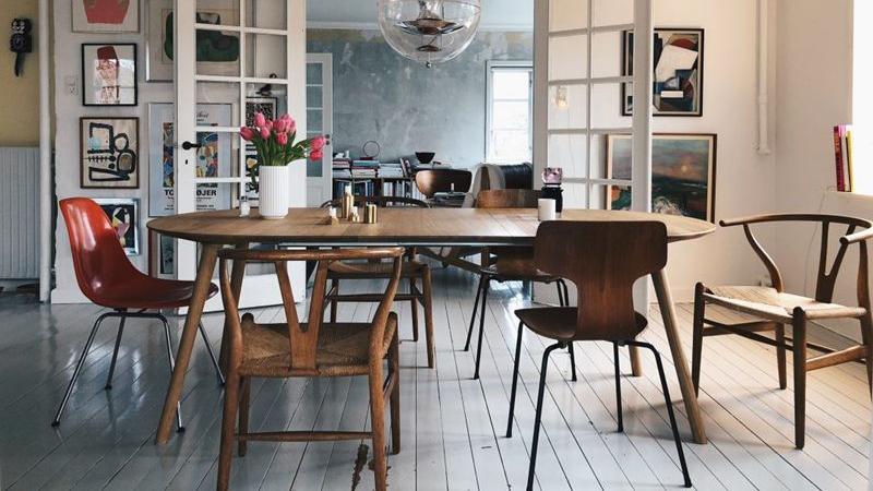
To better understand, if you had a home with a palette of soft neutral colors and added a bit of dark gray or black, that would still be considered an accent color because the contrast between light neutrals and dark gray or black is high.

(Credits: leclairdecor.com)
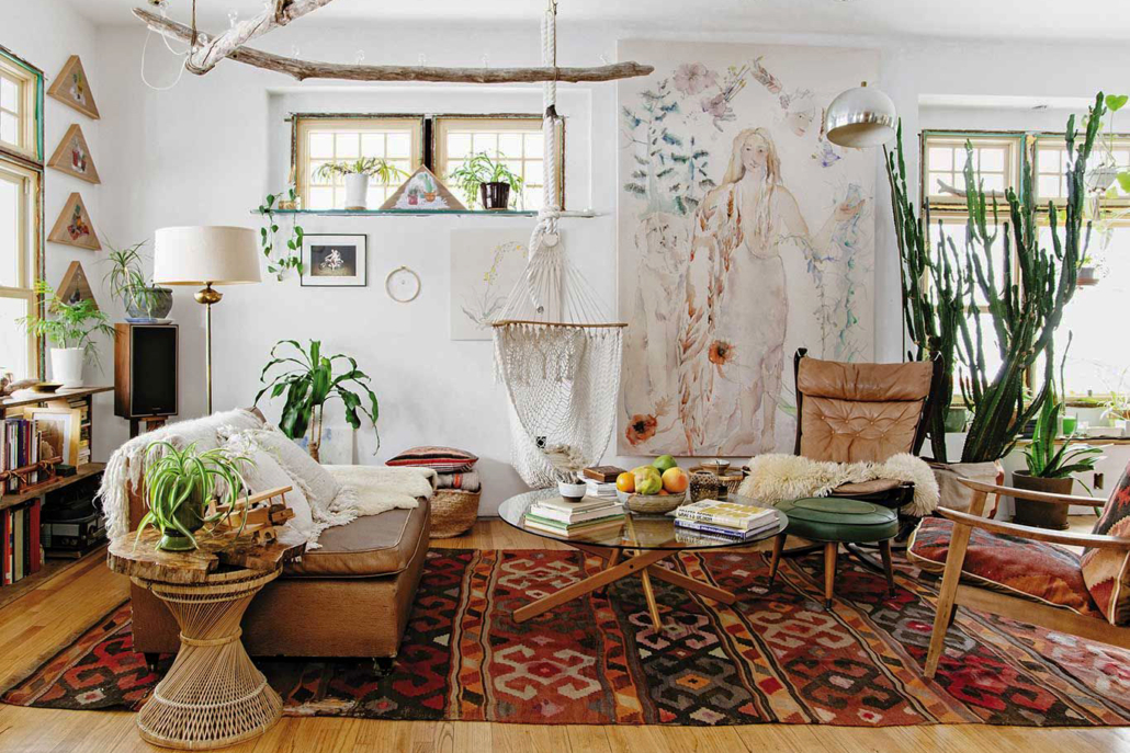
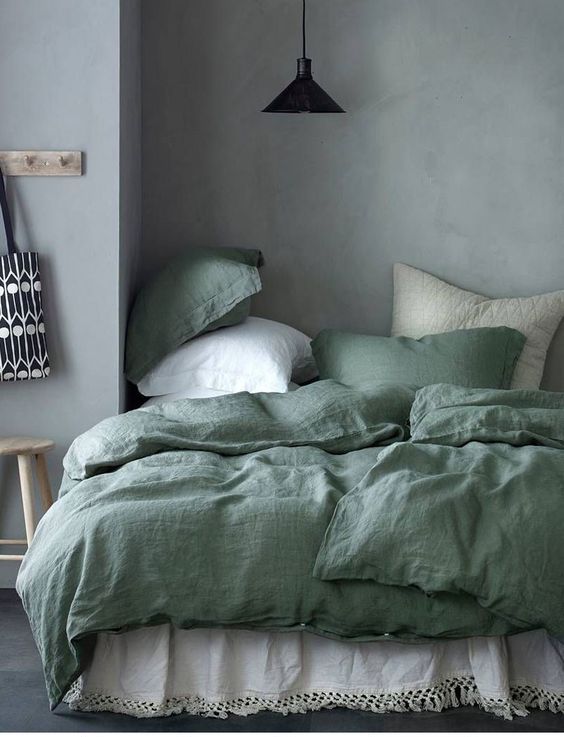
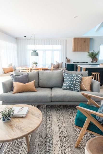
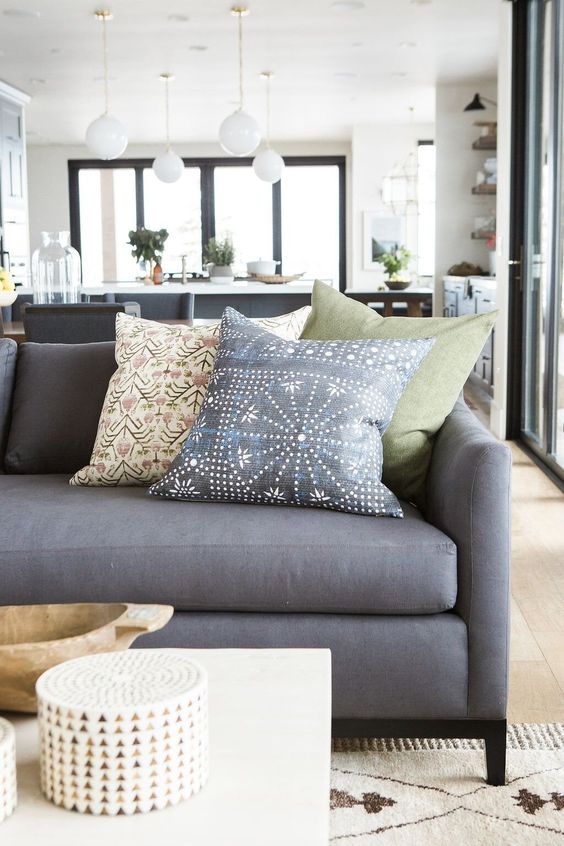
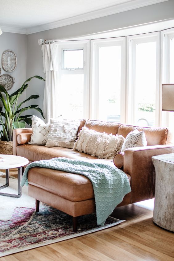
If, however, you want to add a touch of a “real” color, the questions we asked at the beginning will be helpful.
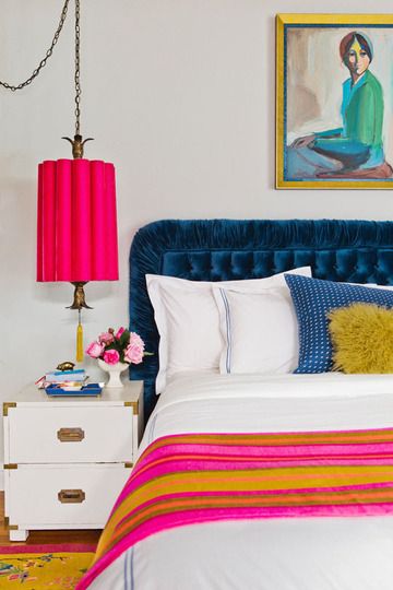
For example, green could be the right solution if you have a living room where you want to convey a sense of calm, relaxation, and freshness!
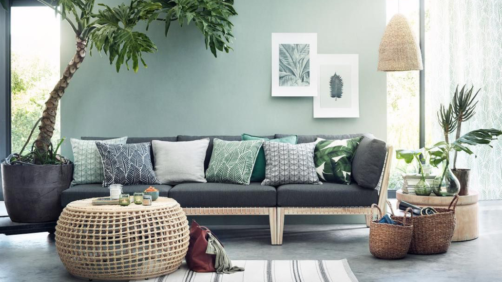
(Credits H&M)
If you decide to have more than one accent color, you need to know how to pair them, and for this, it’s essential to understand color theory and use the color wheel!
How??? Well, I explain it here.
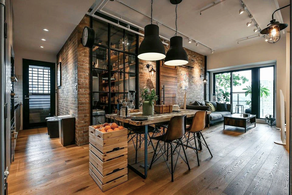
LOOK AT THIS
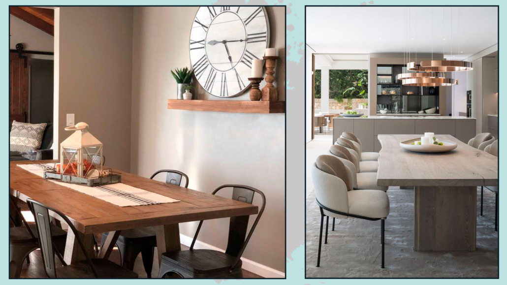
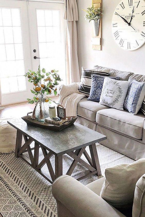
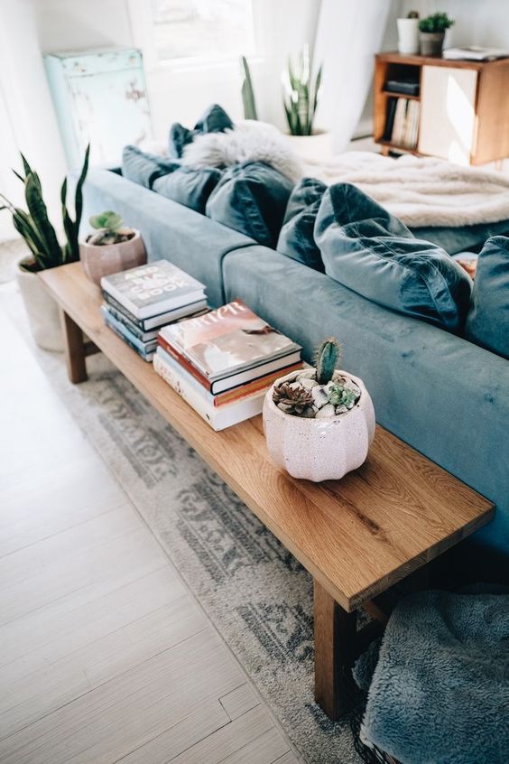
There’s a small detail to pay attention to when choosing one or more accent colors: it should be accurately distributed throughout the space.
Let me explain further: suppose you choose the color green; you should use it, for example, on a seating piece, in fabrics like cushions, rugs, curtains, objects, and artworks.
You can even paint a wall or a portion of it if you like!
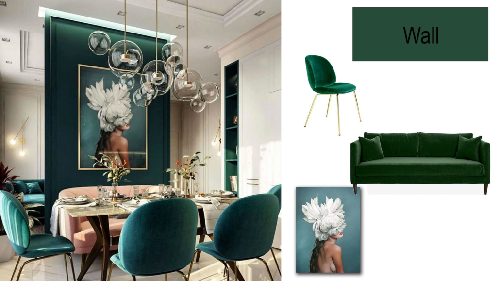
(Credit: interior by @interiors_dd)
In short, it shouldn’t be a single point of color that otherwise would seem randomly placed!
Doing this will help you create rhythm, one of the six basic concepts of interior design (I discuss it here), and make everything cohesive and harmonious.
That’s good: now you’re ready to create your color palette and bring it into your home!
– 3 SMALL CONSIDERATIONS
To avoid massive upheavals when using colors that you like on paper, follow these three little cautions:
- Start with one wall or room:
You never know, so begin with a small portion to be sure you like the colors!
- Test the shades:
unfortunately, a color swatch is NOT enough to understand how a particular color looks in your home, nor is seeing it in the store.
Where possible, get small samples and try them on the walls.
You’ll also see how they adapt to your spaces and the natural and artificial light you have.
Light can change the perception of colors.
- Choose where to use the color:
It’s not a trivial choice; light colors enlarge, while dark ones shrink, so using color in one place rather than another can change the perception of spaces!
If you use different colors in various rooms, consider how they communicate with each other; if you can see the dining room from the kitchen and decide to use two different colors, make sure they harmonize.
(Credits: Sherwin Williams)
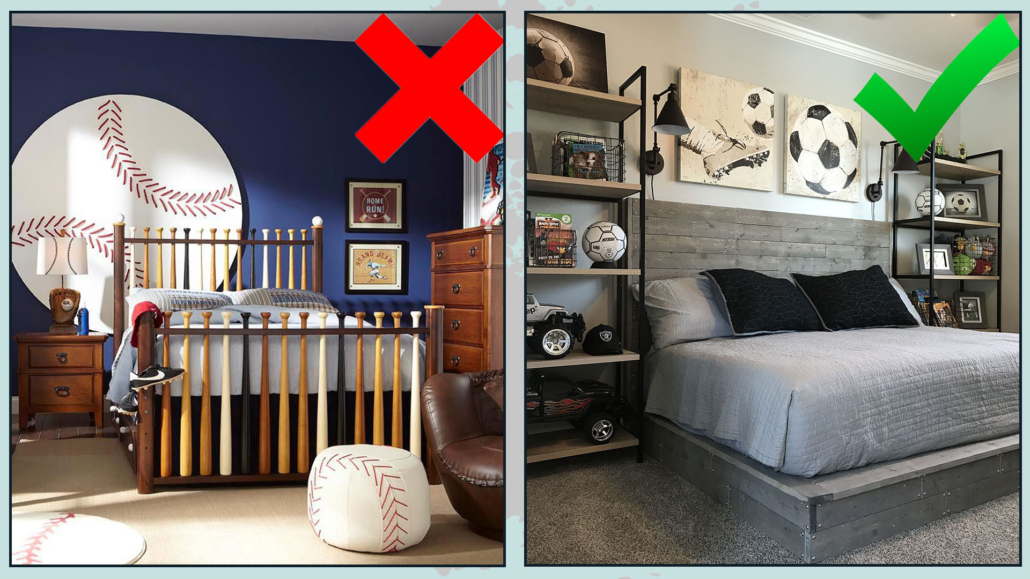
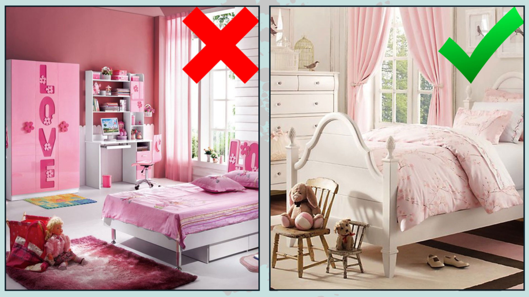
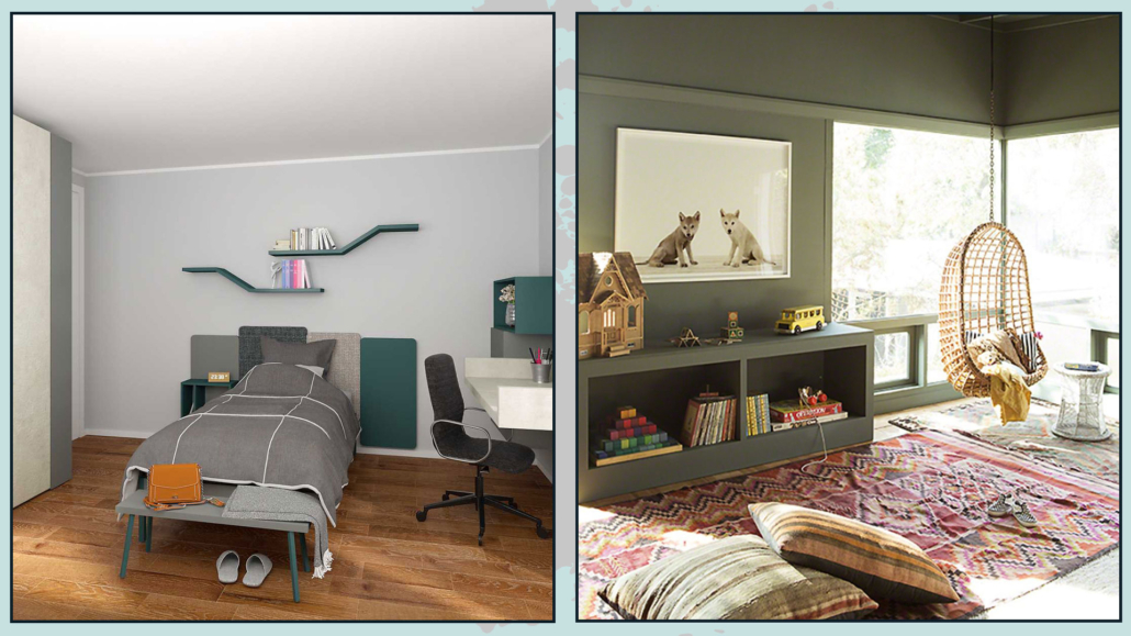
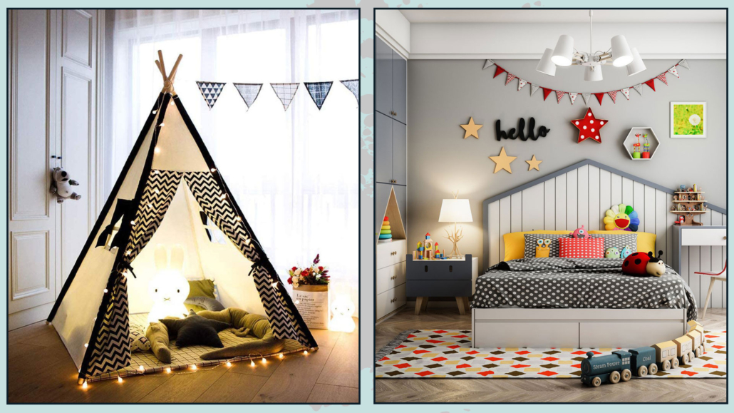
My suggestion is to use a single palette for the entire house, with the only exception being children’s rooms, and if necessary, use more than one color in one room and another in another.
That creates harmony and cohesion.
I hope this article about bedroom color combinations has been helpful and enjoyable for you.
If so, let me know in the comments!
Feel free to share it with anyone you think might be interested, I would be honored, and it will help me gain more exposure.
If you feel that your home, or any specific area of it, doesn’t reflect your personality enough, don’t wait any longer and book your consultancy!


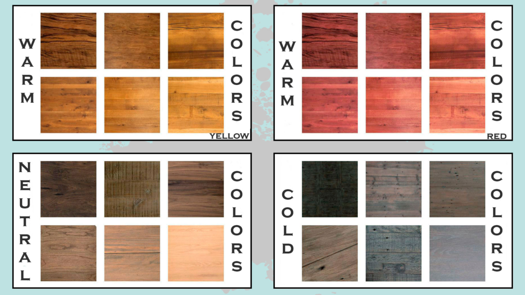
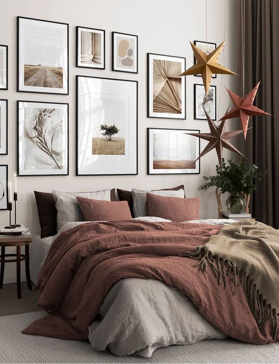
 (credit Bandd design-neutral and red warm)
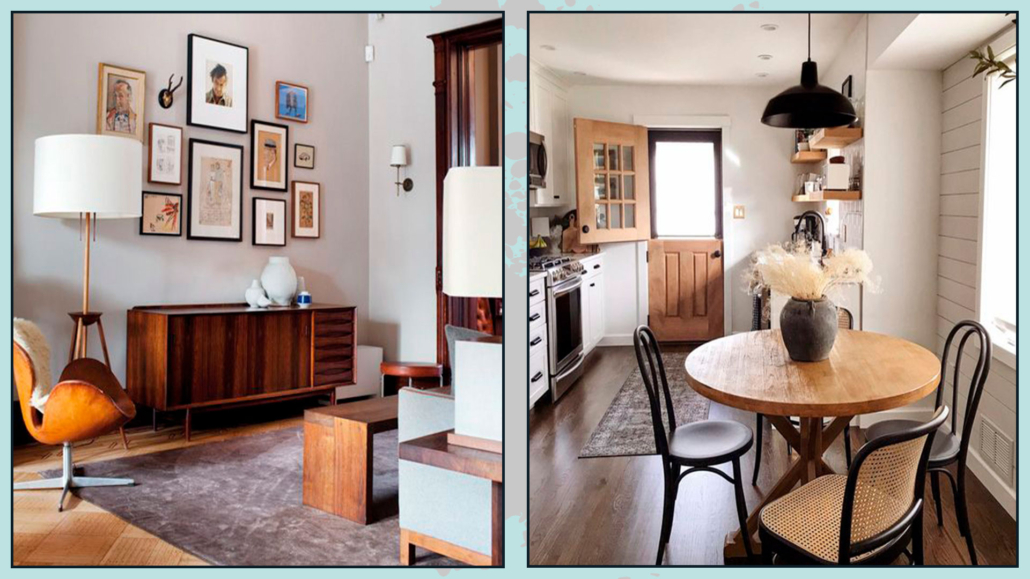
 (credit etsy.com: 123design)