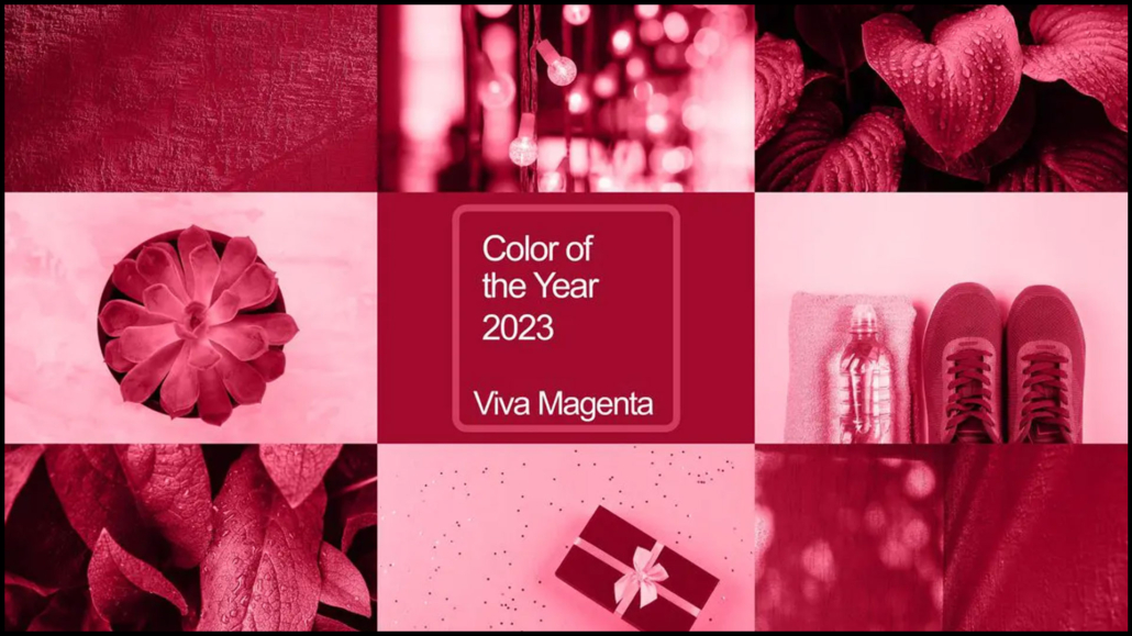
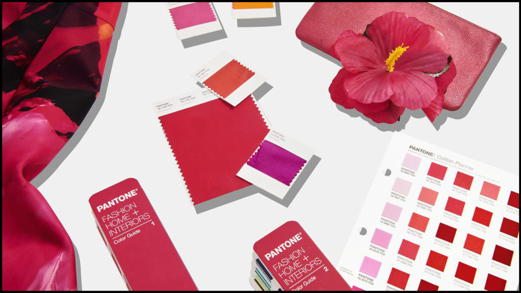
And, also this year, the Pantone color of the year 2023, Viva Magenta, has arrived!
(credits Pantone)
“In this age of technology, we look to draw inspiration from nature and what is real. PANTONE 18-1750 Viva Magenta descends from the red family, and is inspired by the red of cochineal, one of the most precious dyes belonging to the natural dye family as well as one of the strongest and brightest the world has known.”
These are the words of Leatrice Eiseman, executive director, of Pantone Color Institute, who also adds
“Rooted in the primordial, Viva Magenta reconnects us to original matter. Invoking the forces of nature, Viva Magenta galvanizes our spirit, helping us to build our inner strength.”
Once again, Pantone comes up with a color that can “help” us get through the tough times, including pandemic, war, and rising prices; Viva Magenta, in fact, is definitely vibrant, exuberant, and inspiring, but also sophisticated!
(credits Pantone)
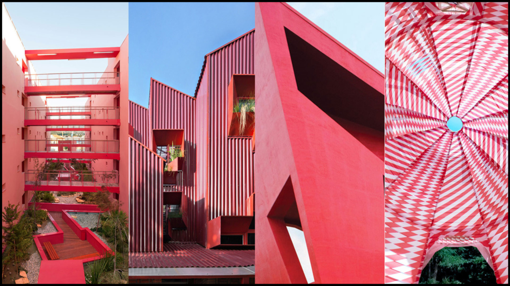
Can we bring Pantone color 2023 into our homes?
Of course yes, because this color will bring vibrancy to our environments!
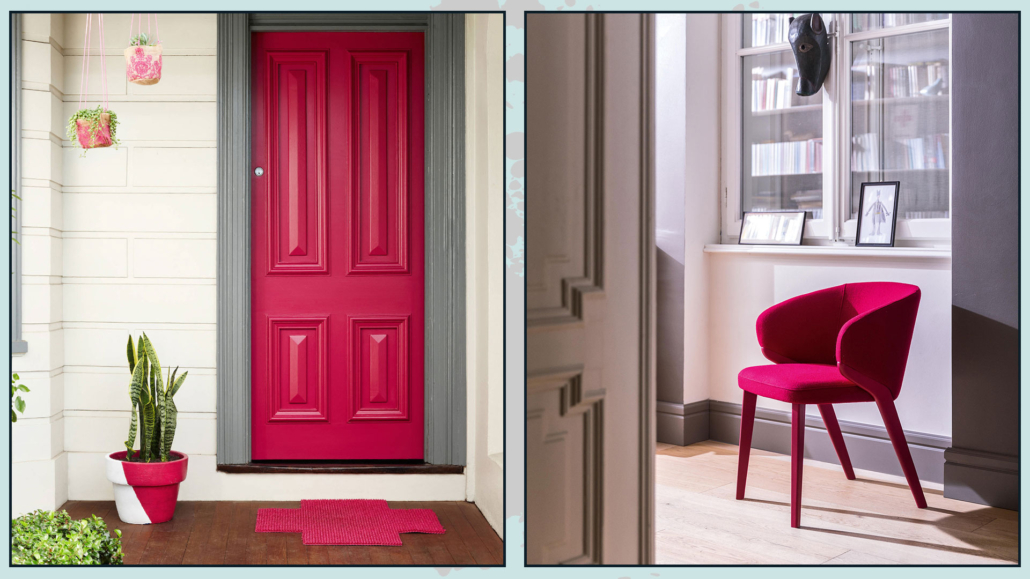
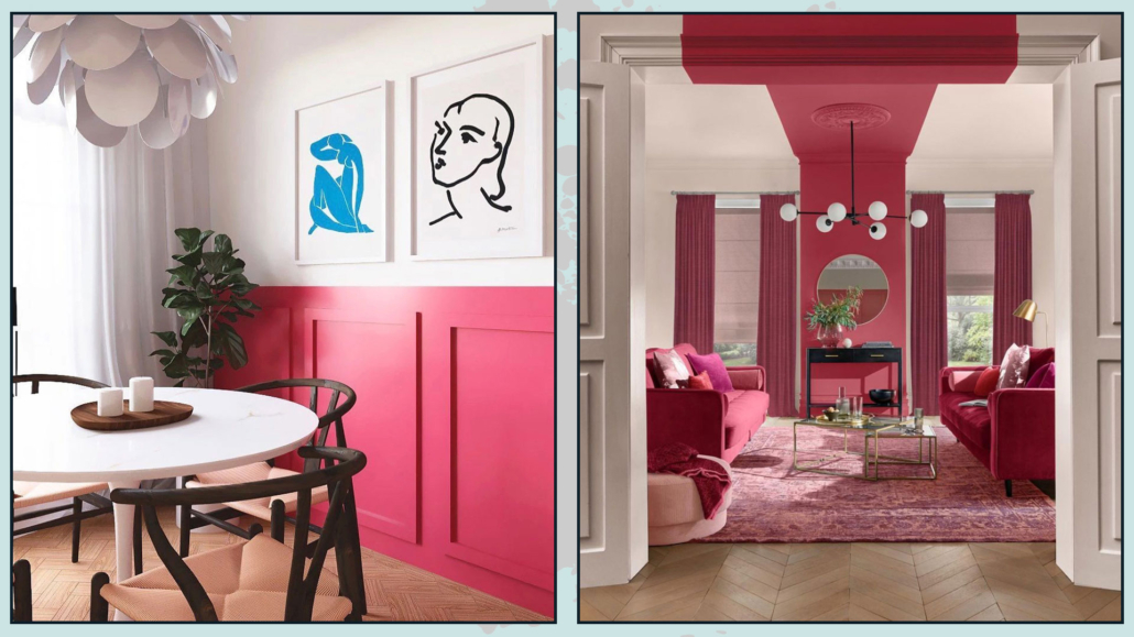
This color is perfect for kitchens because it is a red that is not too “aggressive” and creates an energetic atmosphere perfect for this environment.
Also, it is great when used as an accent color even with large-scale furnishings such as a sofa, but honestly, you can also venture to use it on the walls, making it the focal point of the room.
(credits Pantone)
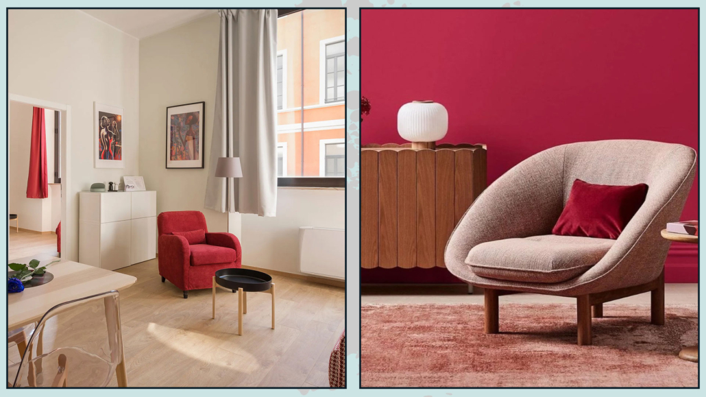
I would avoid coloring all walls with this color because, as they point out at the Pantone Color Institute, this color “packs a lot of drama even in small doses.”
Definitely to be used with caution in the bedroom: although the hint of blue certainly tones down the exciting component, it is still part of the red family!
(credits Pantone)
It’s a color you can pair with so many shades, both cool and warm, and Pantone is helping us again this year by offering 4 beautiful palettes to make the best use of Viva Magenta (at home, but of course not only!!!)
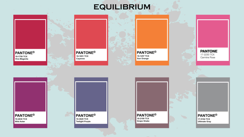
– EQUILIBRIUM
It is composed of warm and important colors in which Ultimate Gray and Grape Shape help calm this very vibrant palette down a bit.
My advice, if you want to use this palette in your home, is to use Ultimate Gray or Grape Shape as a base, Twilight Purple or Wilde Aster as a secondary color, and the others as accents.
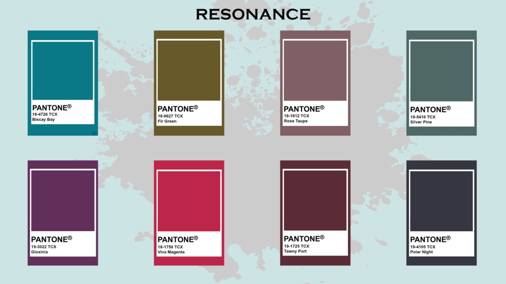
– RESONANCE
This color palette puts warm shades with cool ones together, but all are pretty dark.
In this elegant color combination, Viva Magenta gives a vibrant note!
Again, I recommend using these colors sparingly and calming them down with a bit of white so as not to make it too heavy!
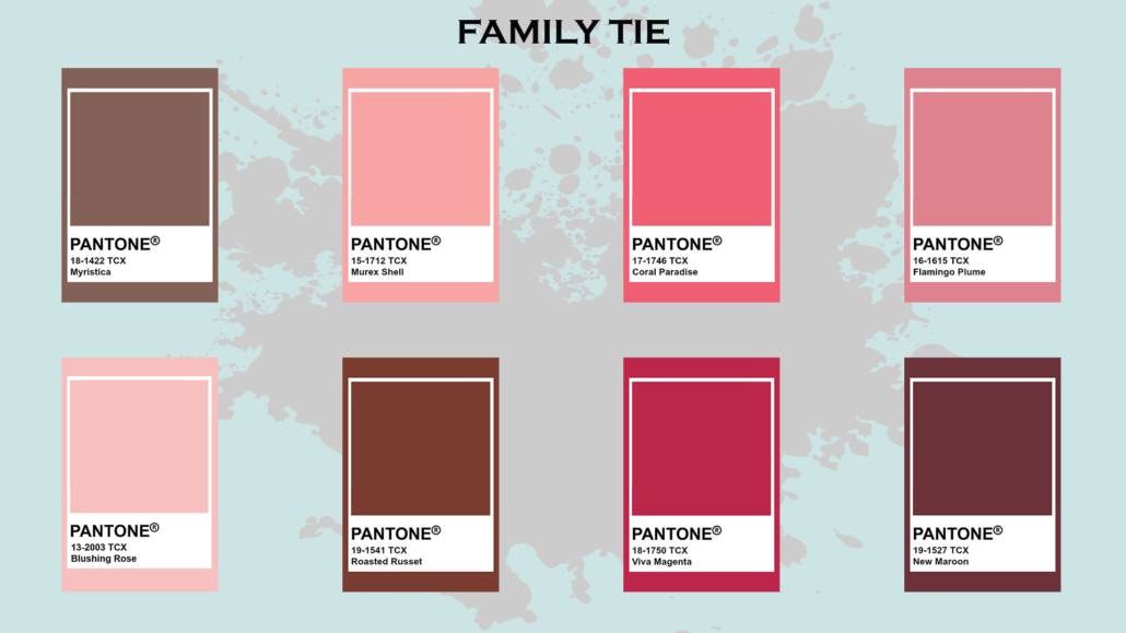
– FAMILY TIES
As the name suggests, this palette groups together colors of similar shades.
It is a combination of mainly pinkish colors with touches of browns that blend with Viva Magenta in a striking and lively tone on tone.
The colors are relatively light but still a bit bright, so they should be used carefully so as not to overdo it: don’t risk creating a house…wedding favors!
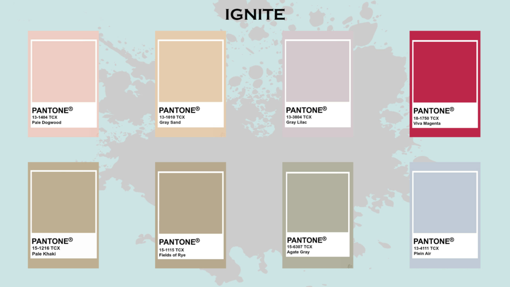
– IGNITE
It is a very bright pastel color scheme where Viva magenta stands out and brightens up the other shades.
Compared to the other palettes, it is a color palette therefore you can use it more lightly because of these somewhat neutral tones!
What do you think about this Pantone color 2023? If you like it, will you wear it or bring it into the house as well? In case how? Let me know in the comments!!!
(credits Pantone)
I hope this article was helpful and you love it; in case, let me know in the comments!
Feel free to share it with anyone you think might be interested, I will be honored, and it will help me get my name out there.
If you feel that your home, or some environment of it, does not reflect you enough, do not wait any longer and book your consultancy!