Is it possible to mix different patterns?

Polka dots, stripes, paintings, flowers, and so forth… are patterns that bring joy and a touch of character to the home.

As for the different styles, even with the patterns, you can play by combining them together, of course, all with some criteria to avoid falling into exaggeration: not all the various prints placed close together fit well!

Again, therefore, the key word will be balance!

First of all, we must keep in mind that this type of combination does not only concern textiles, but also walls (maybe if you use wallpapers) and rugs!

Starting with textiles, such as bedspreads, plaids, curtains, and pillows, remains the easiest thing to do, also because it is more easily correctable in terms of time and money!

So how do you mix two or more different patterns together?

Here are some small tips to be able to combine different patterns perfectly and have a home that reflects your personality!

START WITH TWO PATTERNS

The first suggestion is to start with only two patterns!

The easiest match is the tone on tone, different patterns, perhaps geometric, but the same color.

(from Pinterest)

Vice versa same fantasy with different colors

(from Pinterest)

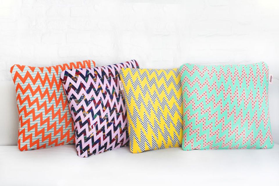
You can also use similar patterns on contrasting colors like in this example.

(from Pinterest)

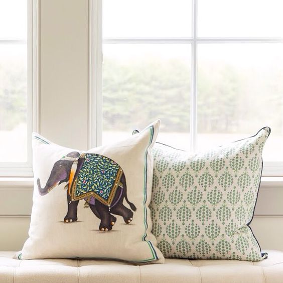
If, on the other hand, you love a pattern with more colors, the second pattern should have at least one color in common in this way, the melange will undoubtedly be harmonious.

There are so many patterns, you’re spoiled for choice, so to start, choose what will be the main fabric, the one you like most of all.

Once this is chosen, the second pattern must be a little more neutral, or with at most a touch of color that is present, as mentioned before, also in the first fabric.

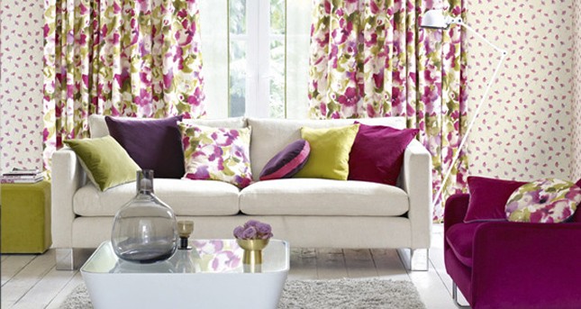
PAY ATTENTION TO SCALE

Another attention to pay off in choosing different patterns is the scale of the chosen designs, i.e. their size, better if the sizes are different!

Observing the scale, especially when there are multicolor fabrics, is essential for an optimal result so, if the first pattern has a large design, you will have to then, in the second pattern, choose a small design.

For example, suppose that the first textile has large flowers, as for the second textile you can choose a small geometric pattern (stripes, squares…).

The geometric prints are excellent as a second pattern because they are really flexible.

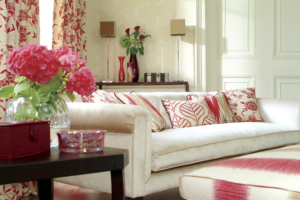
The gist is that one of the two fabrics should definitely stand out over the other with more striking colors and patterns, and the other should be a little more neutral!

(from Pinterest)

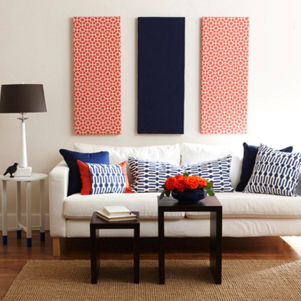
NOW TRY WITH THREE PATTERNS!

Since three is considered the perfect number, even in interiors: when choosing fabrics combining three types of textiles becomes really an ideal choice!

In order not to exaggerate, I suggest you use a solid color that ties the two patterns together; if they have a color in common, for example, that will undoubtedly be a perfect combination!

Otherwise, choose a color present in the main fabric.

Don’t use more than three shades, but also use them throughout the rest of the house, including furnishing accessories!

(from Pinterest)

If you are afraid to make some mistakes don’t hesitate to contact me!


Paintings, prints, and photographs are decorative elements on walls that immediately catch the eye!

Deciding, on a given wall, which and how many paintings, taking the measurements, and planting the nails is not as simple as saying it!

It happens, in fact, that you spend time on this work only to see that:

– the paintings are badly placed,

– too close together or, on the contrary, too far apart,

– they do not all have the same distances.

– or perhaps there are frames that don’t fit at all with the others!

Placing paintings according to specific criteria will have a different effect than arranging them randomly.

So what to do to get a good result? Here are some tips for you!

CHOOSE THE PAINTINGS TO PUT TOGETHER

The first thing you need to do is to group everything you would like to hang in specific groups such as frame color, frame type, or according to content (i.e., prints, photographs, graphics, and so on).

Exclude those paintings that have nothing to do with the style and furnishings of the house.

If they have a sentimental value better to keep them in a different place, the risk indeed is, if it is not the right place to put them, to end up “hating” them!

You can try to transform them by changing the frame or painting it, but even so, it doesn’t mean that they fit the rest of the elements!

Or maybe you could also find a way to make it “the unique piece”, giving it importance with proper lighting too!

However, it’s better to not mix them with other paintings that are too different!

Made the groups, you have to decide where to place each of them based on the style and color of the room: in a rustic environment, for example, it is better to avoid pop art paintings!

HOW TO PUT PAINTINGS AND WHERE?

Once you have chosen the paintings and the room you will have to find where to hang them: if you have the impression that a wall is a bit empty and sad, it is undoubtedly the right place!

Now, you have to decide how to place the paintings to have an attractive and pleasant composition.

You can take a whole picture (from floor to ceiling) of the wall where you want to place your paintings and then use some graphics program (even a simple PowerPoint) and from there study your schemes.

Or you can measure the part of the wall you want to decorate, taking care to leave enough space around it, especially if you have other furniture on the nearby walls.

Mark this space on the floor, then, knowing that the eye has a tendency to look initially to the upper left and then go in search of a focal point that is usually central, start the composition right by putting the main picture in the center.

From there, put the other pieces always remaining in the dèsignated space.

If the composition sits on top of a piece of furniture center the picture in relation to it!

Of course, the scheme you make, whether you do it “on the floor” or with a graphics program, doesn’t have to be made up only of paintings; you can also combine mirrors, letters, numbers, or other objects!

This could give your composition sparkle and personality.

LITTLE TRICK FOR A WALL WITHOUT TOO MANY HOLES!

Now… how to put the paintings exactly where you want, at the proper distances without puncturing all the walls?

Here is a little trick to avoid damages: take some sheets of paper and cut them according to the profiles of each frame, possibly from the back, to also mark the position of hooks.

Most importantly, to avoid forgetting the combination, you can write what picture it is.

After that, place your cutouts on the wall, following the composition you decided on the floor, or in your graphics program.

Fix these sheets of paper with paper tape (to avoid peeling off the plaster).

Also, I recommend using the level to be sure that all the cutouts are straight!!

In conclusion, when you are sure that everything is in order, plant the nails in the points corresponding to the hooks.

And then replace the papers with the paintings!

And voilà, the job is done.

From now on, your walls will be real works of art!!

Do you have any doubt about how to hang paintings on walls?

Don’t hesitate to contact me!

If you’d like more tips like this one come to see my YouTube channel!