Find the meaning of the colors and how to use them at home!
Each of us has his favorite color, which we wear as often as we can and which we often bring home coloring the walls or with textiles, objects, and paintings…
Colors have their meanings that give us an idea about who is wearing them.
Let’s see together the intrinsic meaning of the various colors and how to use them at home!
(if you prefer you can watch it on my YouTube channel!)
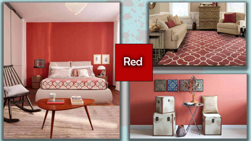
– RED:
it is the color of Love, Strength, Energy, Passion, and Excitement.
But it is also the symbol of blood and danger.
In interiors: very well in the living room and the kitchen, always taking care to balance it with some neutral colors, red is color really intense, it gives a strong personality!
Pay attention to its use in the bedrooms because its exciting component may not let you sleep well, as it speeds up the heartbeat!
To be avoided, except in small doses, if there is a hypertensive person in the house!
It is a color that goes with many colors, creating settings very different and suggestive!
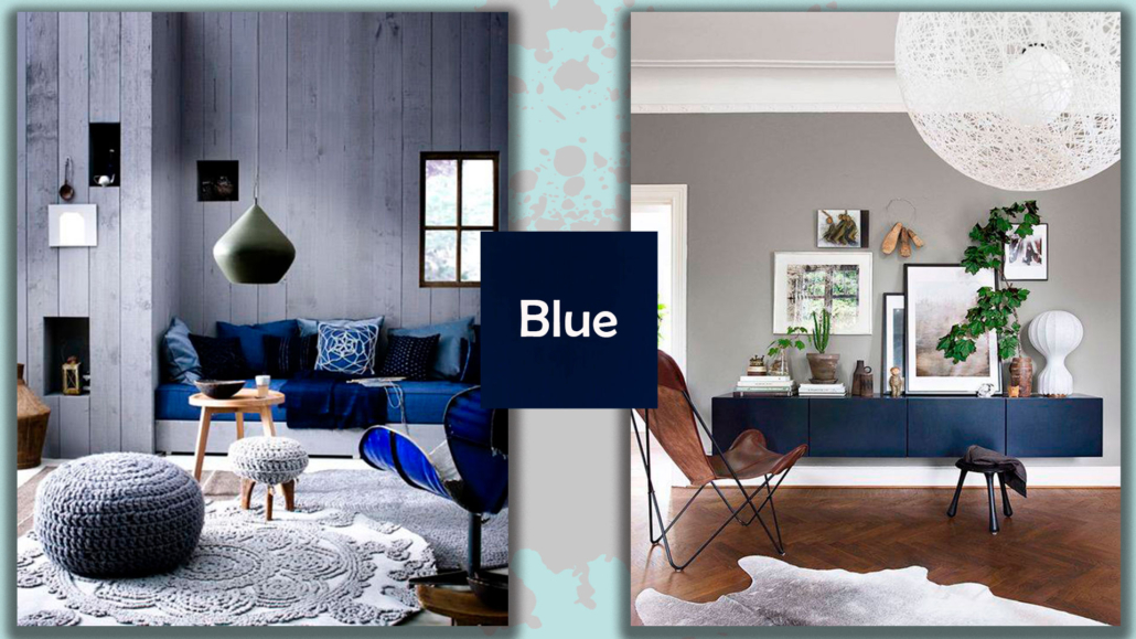
– BLUE:
it is the color that represents Trust, Loyalty, Competence, Intellect, Peace, and Elegance.
At the same time, it can generate sadness and coldness.
In interiors: you can use it in any environment, it is suitable everywhere, but you have to warm it up with some element of another shade!
A timeless and very elegant combination is with gray!
Pay attention in rooms exposed to the north because if not well balanced and heated, the blue will become bleak and even colder.
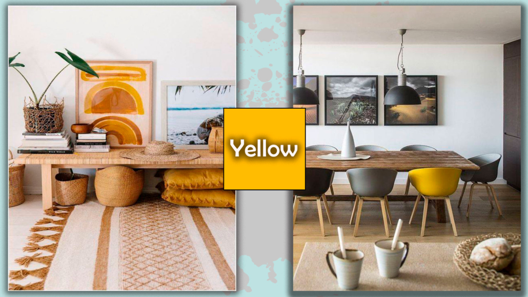
– YELLOW:
it is the color of Happiness, Carefree, Energy, Creativity, and Good Humor.
However, it has a downside because it can be an indicator of superficiality.
In interiors: be careful not to abuse it, because too many risks becoming really noisy, then balance it with other colors.
For example, with blue or with purple, if you like it, because they are actually good allies and, being his complementary, also give a lot of dynamism to the house.
Excellent for its use in the kitchen and the dining room.
But be careful, although it is the color that matches nature and the earth for its radiance, I suggest you avoid its use on outdoor textiles because it attracts insects!
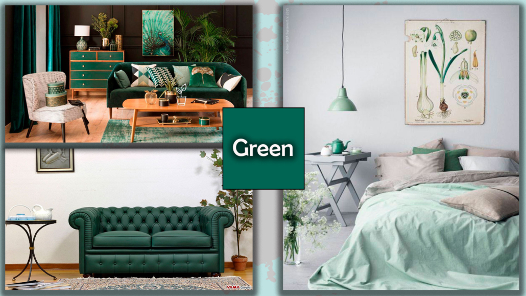
– GREEN:
it is easy to guess that it’s the color of Nature, but it also represents Freshness, Growth, Quality, and Tranquility.
Attention, however, that it could also turn into immobility.
In interiors: it helps concentration and rest, and promotes calm, so, if you like it as a color, it’s definitely great in the studio, in the bedroom, and in the living room!
To avoid making the rooms too fixed, enliven it with touches of other colors.
There are two places where it is better not to use it that are the kitchen and dining room, if not with small touches.
This is because you have to know that it does not favor digestion because green reflects on the faces giving the impression of unhealthy skin!
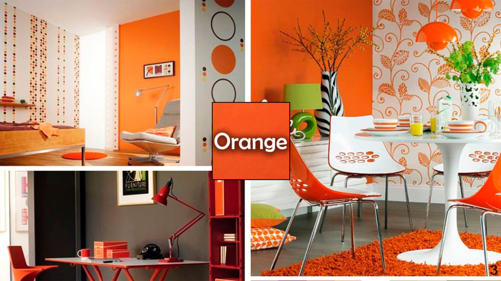
– ORANGE:
it is the color of Sociality, self-confidence, Boldness, Success, and Friendship.
On the other hand, it is a color that can generate distraction and chaos.
In interiors: f you love this color, you have to know that it promotes interpersonal relationships, so it’s good in common areas.
On the other hand, orange is not very proper for symbolizing luxury.
If you have children and want to use it in their room, just avoid applying it in front of their desk because they will have a problem concentrating on their studies!
Curiosity about this color: the dove-grey color, which was used very much a few years ago, is orange less saturated!
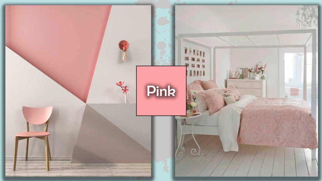
– PINK:
It is the color of Sweetness, Empathy, Sincerity, Sophisticated, and Playful.
At the same time, it can be a sign of fragility and transience.
By now, it’s a typically female color, but you must know that it was originally a masculine color because deriving from red, it also represented strength!
In interiors: it is a color that can be used in all environments giving a touch of glamour to the home!
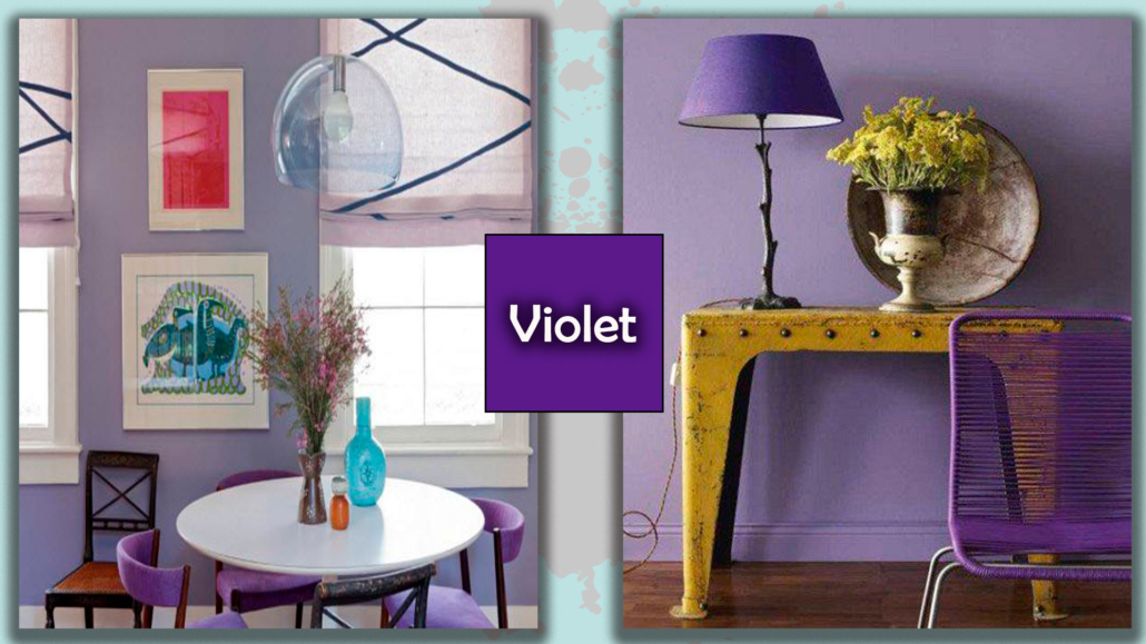
– VIOLET:
It represents Ambition, Luxury, Regality, Spirituality, and Balance.
On the other hand, especially in its darker shades, it could transmit anxiety.
In interiors: being a meditative color, you can use it anywhere; however, the ideal is to play it down with neutral colors.
In convivial areas, try to use it in little doses; it is an introspective color, so it does not promote sociability!!
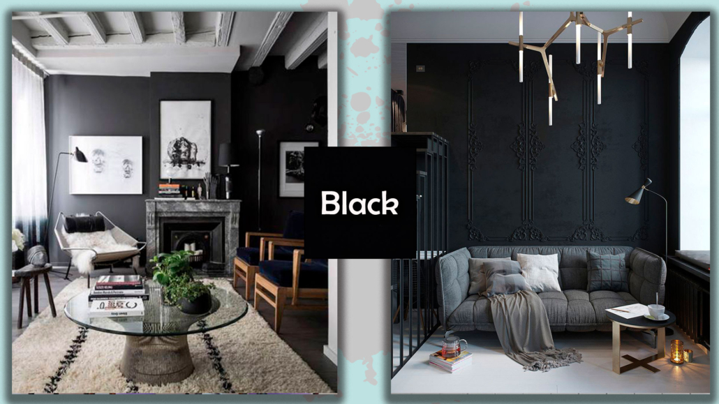
– BLACK:
it is a color in all respects.
It forever is the color that symbolizes Class, Elegance, Reliability, Formality, and Security.
On the other hand, it represents darkness and death.
It is the color of elegance par excellence.
In interiors: in order not to make it gloomy, it should be illuminated with sparkling ornaments such as gold, copper, or silver, played down with touches of light colors, and then it has to be softened with textiles such as silk, lace, and velvet.
The total black is not recommended, it can reach 80/90% of black, no more because the environment becomes very strong, but not in a positive sense, but in a negative one.
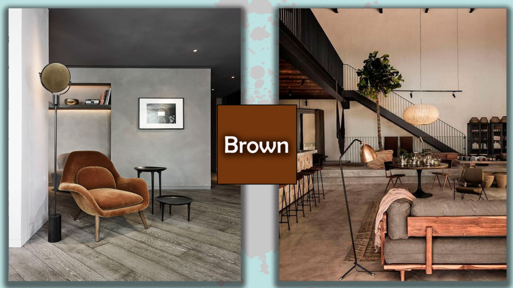
– BROWN:
this color represents Austerity, Longevity, Strength, and Vigor.
But it can also be an indicator of harshness!
It is a warm color, suitable in all environments. It is less “dramatic” than black, but also for brown, softening it with light colors is a good thing.
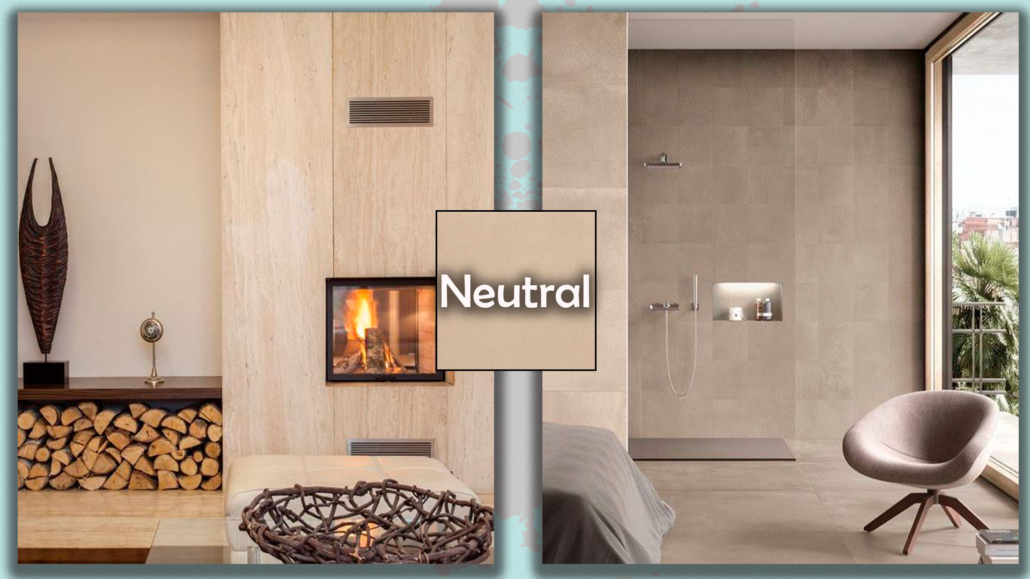
– NEUTRAL (Grays or Beige):
They are usually used as a background because they Calm and give much Tranquility!
Here too, there is the downside because they can generate melancholy and sadness.
In interiors: they are colors that usually everyone likes because they are a mix of various colors.
For this reason, they also adapt to all styles and multiple combinations.
A shrewdness, however, there are two types of beige: the taupe, which tends to pink, and the sand, which tends to yellow, it would be better to avoid mixing these two nuances that do not match well!
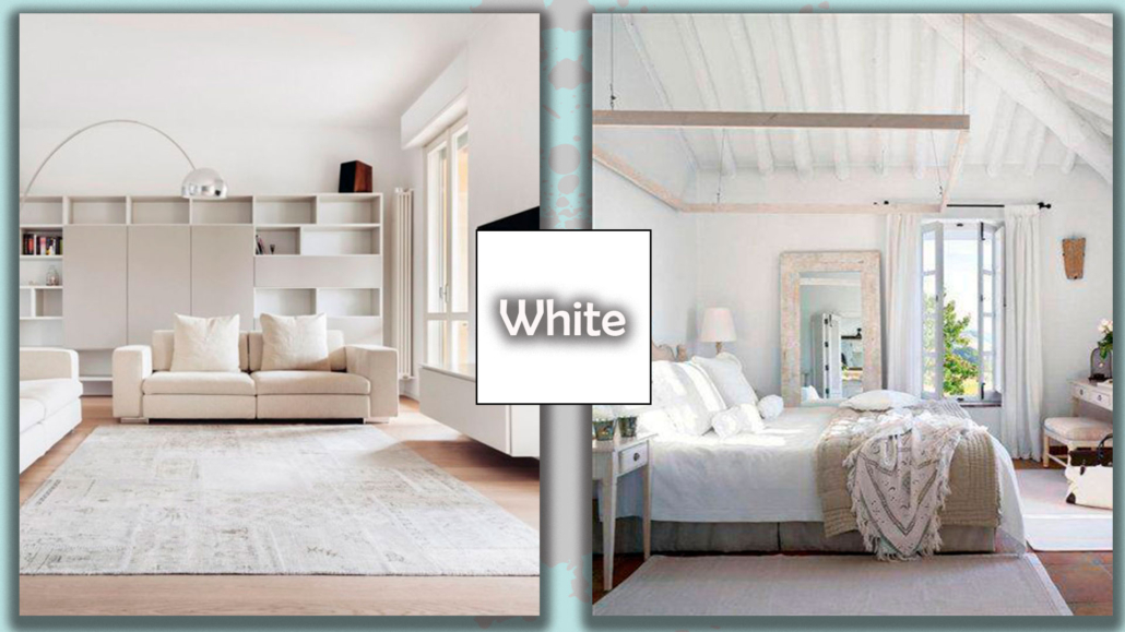
– WHITE:
as black, it is a color!
It is the color that indicates Purity, Freshness, and Candor.
At the same time, it creates detachment and the absence of references.
In interiors: he is often treated as a “non-color”, but although he is a neutral and helps to often downplay some other colors, he himself is a hue in his own right and should be managed!
If you like and want a total white house, remember to work well with surfaces, avoiding shiny ones, and putting textiles to prevent a cold and repelling environment!
If it is great in places where the climate is warm or in environments where it is crucial to emphasize hygiene is better to avoid it in places of socialization because it tends to make us close in on ourselves!
How about you? Which of these colors represents you, and which color meaning do you find yourself in the most?
Tell me about yourself by commenting below!
If you need a color consultation, don’t hesitate to contact me!
(photo from Pinterest)